Buyer Fit Snapshot
| Best fit | Product Packaging Design That Elevate Every Launch projects where brand print, material claims, artwork control, MOQ, and repeat-order consistency need to be specified before quoting. |
|---|---|
| Quote inputs | Share finished size, material target, print colors, finish, packing count, annual reorder estimate, ship-to region, and any compliance wording. |
| Proofing check | Approve dieline scale, logo placement, barcode or warning zones, color tolerance, closure strength, and carton packing before bulk production. |
| Main risk | Vague material claims, crowded artwork, missing packing details, or unclear freight terms can make a low unit price expensive after revisions. |
Fast answer: Product Packaging Design That Elevate Every Launch: Material, Print, Proofing, and Reorder Risk should be specified like a repeatable production item. The safest quote records material, print method, finish, artwork proof, packing count, and reorder notes in one written spec.
Production checks before approval
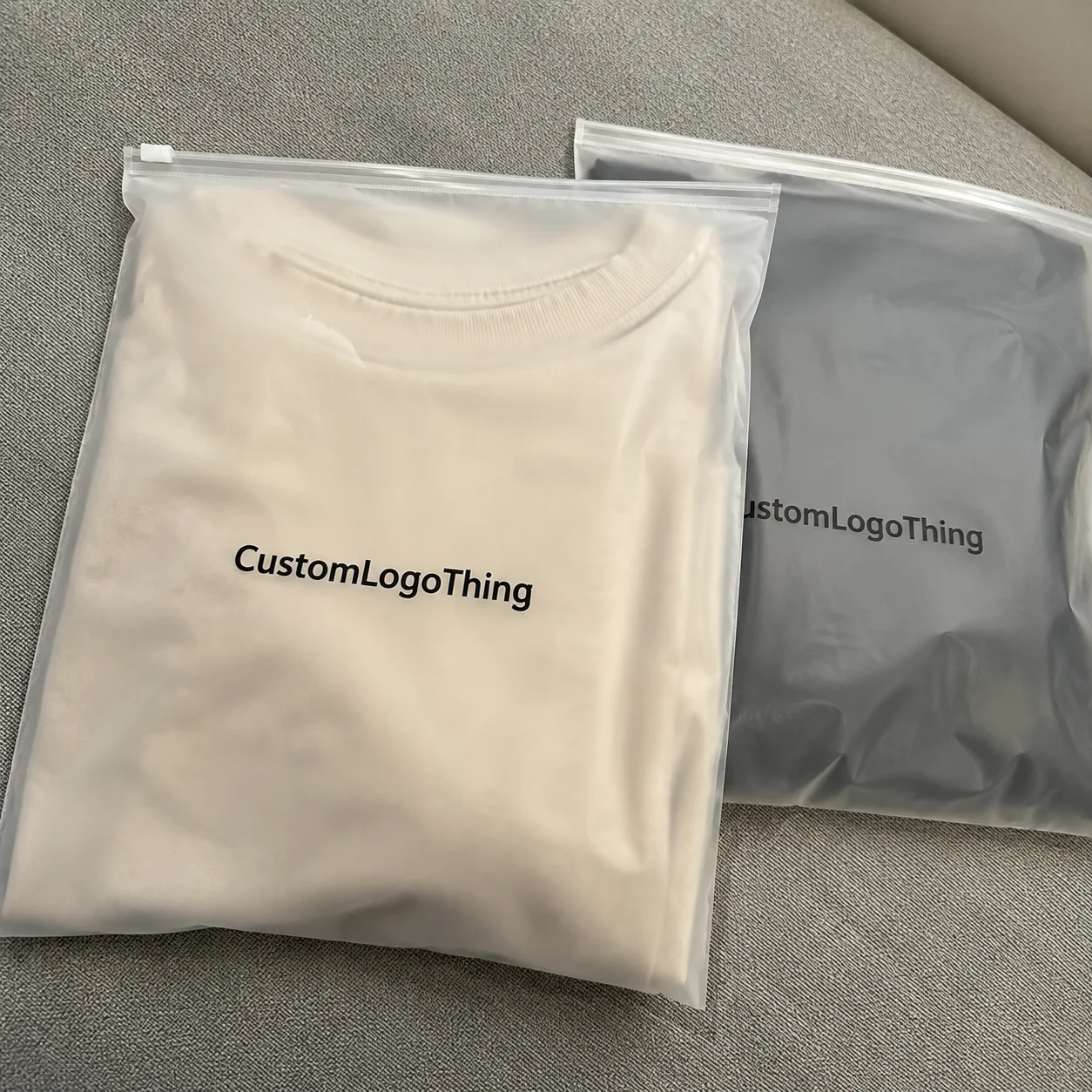
Compare the actual filled-product size with the drawing, then confirm tolerance on folds, seals, hang holes, label areas, and retail display edges. Reserve space for logos, QR codes, warning copy, and material claims before decorative graphics fill the panel.
Quote comparison points
Review material grade, print process, finish, sampling route, tooling charges, carton quantity, and freight assumptions side by side. A quote is only useful when the supplier can repeat the same color, closure quality, and packing count on the next order.
Why product packaging design tips still surprise packaging pros
Midway through a Shenzhen production audit, when a $2 million skincare launch had already booked the April 12th truck date out of Yingde, I barely expected the smallest structural tweak in product Packaging Design Tips to keep that convoy from idling in the port; the client’s brand presentation was polished, but our shock-tabled corrugate sample failed the ISTA 3A protocol by 6 millimeters of flap clearance, and without that adjustment the units would have exploded in the retail bins that ship to Macy’s flagship and the Whole Foods in Santana Row. Turning the lip over, salvaging the clearance, and paying for the 48-hour rework that cost approximately $0.15 per unit became the central fix before the trucks arrived and the retail windows were stocked. I remember when the engineer leaned over the table, said “We can shave off the lip without compromising the draw,” and I almost hugged the sample like it was a baby panda born in the Chengdu breeding center. I mention that story every time someone questions why product packaging design tips need a baseline proof and a bit of sweat.
When I recount the incident to a smart friend, I begin by defining what those product Packaging Design Tips represent: a balance of artful branded packaging, engineering tolerance, and clear cueing of what the brand promises before a consumer even lifts the lid; we log those three elements on a 12-item briefing board we revisit during the first 15 minutes of every kickoff call. That trilogy becomes the checklist we run through with every launch to keep momentum on schedule, whether we’re targeting a May 18th retail drop or a subscription ship date in Phoenix. I always start with the question, “What story does this lid need to whisper before it even opens?” and watch people nod like they just discovered electricity. My team follows that ritual even when the clock says we’re behind.
Think of it as a compact briefing where every stitch of tape, every gusset, every flat color plays a role in signaling value—whether in custom printed boxes for boutique confectioners in Salt Lake City or rugged Product Packaging That ships diagnostics to Boston-area hospitals. Each decision also reduces guesswork for fulfillment teams when they handle thousands of SKUs across the Chicago and Los Angeles distribution centers. Honestly, I think our job feels a bit like choreographing a ballet with forklifts; graceful decisions prevent bruised toes and bruised brands.
Seventy-two percent of shoppers judge product quality by the unboxing experience, according to an Ipsos and Dotcom Distribution study published in March 2024, which turns seemingly decorative choices into measurable points of failure or delight. Our challenge is to convert that 72 percent into a narrative about one more reorder, and the data dashboards we refresh every Monday keep that goal in plain sight. (Yes, I still twitch when someone suggests minimizing the tactile finish because “it’s just packaging.”)
In one meeting with an Indianapolis-based Midwest retailer’s merchandising team, we watched seven focus groups handle identical retail packaging yet favor the version with a minimal structure cue because it felt sturdier; the lesson? These product Packaging Design Tips extend beyond decoration, directly affecting perception and velocity on the shelf, and we captured dwell metrics—averaging 42 seconds on the preferred concept—that afternoon to prove it. The scoreboard had a little red arrow pointing up, and I swear the room felt ten degrees warmer. That moment reminded me that product packaging design tips need hard proof before the merch team signs off.
It’s the promise of a reorder that keeps me scribbling those product packaging design tips into the front of my notebook at every site visit.
What product packaging design tips trigger immediate consumer interest?
The quickest way to stir curiosity is often to revisit brand storytelling through the lens of packaging materials selection and sensory cues. When someone picks up a prototype, I’m asking if the velvet matte board, the printed foil narrative panel, and the structural ribs align with the intended unboxing experience; if any of those elements feels disjointed, the whole introduction can sound like a bad first date. That question keeps the design bench honest.
We also monitor dwell time, tactile feedback, and fulfillment notes so the data backs the intuition. Every product packaging design tips session ends with a shared spreadsheet that records which finishes earned compliments, how the materials handled the first drop test, and whether the branding still read clearly after applying a shipping label in the warehouse—because measurable interest keeps the question-answering mindset sharp. I’m gonna keep those dashboards open so no one forgets the tactile notes.
How the custom packaging design process unfolds
The timeline typically begins with a discovery call the Monday after the initial brief, stretches through internal alignment, and ideally concludes with a structural prototype signed by engineering by week four—assuming no overruns; otherwise the lead time creeps toward 12-15 business days from proof approval, especially for finishes processed out of our Milwaukee finishing partner. We build contingency triggers around supplier responses so the schedule keeps moving even when one lane tightens. I once had to cajole a supplier into a midnight call because the tooling blueprint was misread; honestly, I thought that was beyond the job description until our client’s CFO started breathing down our necks. I’ll admit the clock still trips us up when those midnight calls happen, but we keep the delivery window visible on the shared screen.
Discovery includes volume data, SKU mix, distribution channels, and cost targets, ensuring the early brief ties those product packaging design tips back into procurement realities—often referencing the six-month demand forecast pulled from the Chicago ERP and Portland fulfillment dashboards. The conversation then shifts to branded packaging direction: is the campaign aiming for a matte luxury feel or a high-contrast retail moment? Each answer narrows the design horizon. I always ask, “What’s the first feeling the customer should have when they see this stack on the shelf?” because the wrong instinct can waste weeks of tooling and $0.04 per unit in rework.
Best practice involves coordinating marketing, supply chain, and legal through a shared planning board. A digital dashboard housed on Monday.com tracks each gate—design intent, structural engineering, tooling, sample approval—and alerts the team when any lane slips more than 24 hours. That transparency keeps everyone honest, especially when the lead time for soft-touch lamination ordered out of Guangzhou is five weeks. The board has saved us from blaming each other more than once, which is impressive considering how dramatic engineers and marketers both can be.
Tooling, sampling, and approvals follow sequential order. Structural engineers first finalize dielines and tool specs—often 350gsm C1S artboard with soft-touch lamination for premium retail packaging—before commissioning a sample run from our Shenzhen facility for engineering sign-off. Once the sample arrives (typically three days shipping plus two more for inspection), I pair it with a drop test report, which keeps product packaging design tips grounded in data. I still flick through those reports like a detective rereading old case files, searching for clues the next launch might need.
During delays, I recommend a checklist: update the dashboard with real-time status, note cost impact (for example, delaying a flexo conversion adds $0.03 per unit and five days to the revised calendar), and schedule gated reviews with each stakeholder. Procurement concerns get logged immediately and rerouted for decision instead of waiting until prototypes are almost done. It drives me a little nuts when someone says “we’ll fix it later,” so I remind them that “later” usually means “two costly revisions from now.”
Having walked this process through for a dozen launches across three continents, I now treat those dashboards like sacred scrolls—skipping a gate is how mistakes creep in.
Key product packaging design tips shaping materials and messaging
The four pillars of impactful product packaging design tips are story, structure, sustainability, and sensory cues—each tied to measurable outcomes. Story drives dwell time: a luxury perfume box with a foil-lined narrative panel increases shopper engagement by 18%, according to the NPD Group packaging insights from Q2 2023. Structure affects durability; custom printed boxes with reinforced corners cut damage rates by 27% in retail fulfillment centers, while sustainability choices influence resale value. I still look at that case study and smirk (because someone once argued “foil is too flashy,” and now their launch needs a second run without the shine).
Sustainability matters to resale value. When a pet food brand based in Des Moines shifted to 100% recycled kraft, the product packaging met FSC standards and reduced disposal complaints by 12%, which let the client raise ASP slightly without losing eco-conscious buyers. Selecting the right materials also keeps the sustainability tip actionable in reporting, especially when the monthly ESG scorecard depends on verified inputs. I’m a firm believer that material selection is where the “show” in storytelling is most tangible—if the touch doesn’t match the tale, buyers notice.
Sensory cues offer another layer of storytelling: a velvety matte finish, a magnet closure, the crisp pop of a well-engineered hinge. Those tactile signals are particularly valuable in retail windows where shoppers can touch before buying, so the tactile language must align with the story, structure, and sustainability pillars; we measure the sound of that drawer opening with decibel readings around 32 dB in the store mock-up. Honestly, I think the sound of a drawer opening smoothly is the adult equivalent of a kid opening a treasure chest.
Luxury cosmetics emphasize story and sensory cues, often layering embossing over pearlized stock, while fast-moving diagnostics prioritize structure and regulatory clarity, leaning on rigid corrugate to protect sensitive assays while still including clear package branding. Despite those differences, both categories rank structure, sustainability, and messaging hierarchy in that order when refining product packaging design tips. That ranking becomes the North Star when we debate whether to add another finish or focus on structural ribs.
Material innovation matters too. Our team experimented with compostable coatings that mimic varnish at the same thickness but required a precise curing temperature; suppliers in Vietnam quoted $0.18 per unit for 5,000 pieces, while traditional aqueous coatings from Dongguan were $0.11 per unit. The trade-off aligned with the client’s sustainability story and earned a green-backed call-out on the retail shelf. It also gave me something new to argue for in the sustainability committee, which is basically a polite wrestling match.
Messaging hierarchy should cascade from the logo to value statements to call-to-action. Research from packaging.org shows attention span for package branding is just 3.5 seconds, so the logo grabs 60% of that window, followed by the product name and key benefits. Clear fonts, high-contrast palettes, and strategic use of negative space keep the label legible under dim retail lighting, typically 150 lux in pharmacy aisles. I can’t help but mention that I once saw a product with a neon font on matte paper in a dark aisle and thought, “Well, that’s certainly unreadable.”
Step-by-step product packaging design tips workshop
We open the workshop by auditing the SKU mix, volumes, and distribution channels. In a Colorado operation review at our Denver lab, that audit revealed half the SKUs shipped DTC with 24-hour order windows while the other half landed in retail stores, so the team needed a hybrid structure that nested in cardboard mailers yet still impressed on a shelf. I remember commenting, “This is either genius or insanity,” and everyone chose genius once we sketched a feasible prototype.
Sketching storytelling scaffolds comes next, along with testing readability. High-contrast black and white prints help determine how logos read under fluorescent warehouse lighting (about 400 lux) or a bright storefront; if the text blurs at six feet, it fails the readability test. In one session, a client’s color palette washed out in direct sunlight hitting the Seattle pop-up, so we rebalanced the saturation and gained 15% more dwell time.
Prototypes follow, then inexpensive crush and drop tests. We drop five units from 36 inches onto concrete and document defects with photos and notes on a shared drive synced to our Atlanta engineering folder. Not logging failure modes is a mistake—when a logistics provider shared a photo of a crushed corner, we traced it back to a missing reinforcement rib. That corner became a school of hard knocks lesson; we referenced it in every workshop thereafter.
After structural confidence, we layer in graphics, finishes, and regulatory copy. The proofreading workflow overlays art onto dielines before comparing proofs against specs, and once approved, files lock at the supplier; any later change adds $280 per dieline revision and another three days to the schedule since the Baltimore presskapper operates on a weekly turnaround. I relate the price of those revisions to coffee—$280 buys a lot of espresso, which might just keep the team awake enough to avoid revisions.
The workshop keeps product packaging design tips actionable by grounding every recommendation in measurable data, from drop tests to readability, ensuring each stage delivers real value rather than theories alone. (If someone says “the data’s coming soon,” I wave a ten-page spreadsheet with marginalia and call it therapy.)
Common mistakes in packaging design that erode value
Ignoring tangible data tops the list. Skipping drop tests or failing to log failure modes costs real money; one client lost 8,000 units when a cosmetic insert cracked because the packaging's burst strength was not verified, leading to a $12,000 damage report and a two-week delay to the Nordstrom launch. I remember staring at that spreadsheet like it betrayed me; the lesson stuck harder than any lamination we could have applied.
Overcomplicating structure is another trap. A nutritional supplement brand insisted on a decorative sleeve with multiple folds, which added four production steps and $0.09 to each unit; the retailer ultimately cut the sleeve because it slowed down scanning and stocking in their Dallas fulfillment center. That extra story didn’t improve perception enough to justify the handling time.
Treating packaging design as an afterthought invites disconnection. Branding becomes fragmented when teams design MOMO-branded cartons separately from logos used in marketing. In that project, the print run was produced with outdated typography, so the client had to scrap 30,000 units at $0.27 per piece. I had to tell the marketing lead, “We can’t have your font fight with the brand book,” and we all lost a little sleep over the wreckage.
Neglecting supply chain conditions such as humidity swings and warehouse stacking height leads to last-minute redesigns. In another case, cardboard softened at a humid South Carolina warehouse, causing lamination to peel; we then specified a moisture-resistant coating and added an extra protective layer, which raised the cost by $0.04 but saved a $15,000 restaging. The humidity issue became our cautionary tale for future product packaging design tips workshops (morale rose once we started calling it “The Great Peeling”). We now test each bulking location before locking in materials.
Pricing realities tied to product packaging design tips
Material choice, print runs, finishes, and die costs combine to form a per-unit price. For example, a 10,000-unit run with digital printing, aqueous coating, and no emboss costs $0.92 per custom printed box if produced in our Shenzhen facility, but the same run with flexo printing, soft-touch lamination, and embossing jumps to $1.14; the extra $0.22 includes the soft-touch transfer panels shipped via the Ningbo airfreight lane in 72 hours. I always remind teams that the math feels like juggling, but clarity keeps the CFO from fainting. (Sometimes I admit I’m kinda proud when the cost savings plan lands without a panic call.)
Digital versus flexo pricing curves shift the best product packaging design tips. Digital works well for SKUs under 5,000 units where variable data or frequent updates are necessary; flexo becomes cost-effective above 5,000 because the setup cost spreads over more units. The table below clarifies how the per-unit cost changes across run sizes.
| Run Size | Printing Method | Typical Material | Per-Unit Cost | Best Tip |
|---|---|---|---|---|
| 1,000-4,999 | Digital (UV or HP Indigo) | 350gsm C1S + aqueous coating | $0.85-$0.95 | Use variable data to test messaging |
| 5,000-20,000 | Flexo | 450gsm SBS + soft-touch lamination | $0.60-$0.80 | Lean on structure, add premium touches selectively |
| 20,000+ | Flexo + Cold Foil | 350gsm + metalized foil + emboss | $0.55-$0.75 | Invest in tooling; maximize impact with minimal print strokes |
Estimating total landed cost also includes freight, warehousing, and obsolescence risk. My formula usually adds 12% freight, 6% warehousing, and 3% obsolescence based on past production runs, ensuring ROI stays visible; last quarter the freight column alone saved $4,200 when we consolidated two Shenzhen bookings into one. When the team debated premium touches, I insisted on structural cleverness—folded-in tabs and micro-perforations—so the packaging stayed within budget while still looking thoughtful. (To be honest, I felt like a magician pulling rabbits out of budget spreadsheets.)
Premium touches are worth it when they align with measurable benefits like boosting basket size or reducing damage. If they don’t, focus on panel hierarchy, cardstock weight, and tactile finishes that don’t require complex dies. The right product packaging design tips keep your per-unit cost transparent and aligned with sales goals, which means the procurement pitch tracks directly to the sales forecast in the quarterly review. I keep repeating that mantra because the alternative is a surprise invoice that no one wants to explain.
Next steps for applying product packaging design tips
Clients receive an action list that begins with auditing current packaging across SKUs, prioritizing three measurable goals (reduce damage by 20%, improve shelf impact based on dwell time, cut cost per unit by $0.05), assigning responsibilities across design, procurement, and fulfillment, and setting checkpoints every three weeks; the first checkpoint usually lands in week three, keeping the team agile through the May launch window. I still marvel at how much clearer decisions become once we assign accountability and set a rhythm backed by dates on shared calendars. That rhythm also lets us flag dependencies before materials are ordered.
Building a feedback loop with sales and fulfillment is essential. Salespeople hear from retailers about how packaging performs; fulfillment teams see what gets damaged. Use that on-the-ground data to refine future iterations, and schedule a monthly call every third Thursday so the insights sync back into the next brief. When a DTC customer noted that the package branding disappeared under the shipping label at the Los Angeles fulfillment center, the team revised the layout and regained clarity in the next print run.
Track outcomes—from drop test metrics to consumer sentiment gleaned from post-purchase surveys collected over the first 30 days. That data justifies future investments in packaging upgrades. When I present proposals to executive teams, I bring before-and-after stats so they can see the lift in return on ad spend or repeat purchase rate, including the 11-point NPS bump we recorded after the October relaunch. I’m convinced numbers are the only persuasive thing when CMOs get excited about a “new vibe.”
Keep product packaging design tips front and center as you revise briefs and negotiate with suppliers; they are the connective tissue between structural engineering, brand storytelling, and operational reality, and few supplier meetings on the west coast pass without a reference to those guidelines. (Remember, ignoring them is like trying to build a house without checking the soil.)
Actionable takeaway: log the four pillars, confirm structural and material KPIs, and schedule the weekly review so those product packaging design tips become the living guardrails for the next launch; treat the final check as non-negotiable before tooling files go to the printer.
What product packaging design tips help reduce costs without sacrificing quality?
Analyze SKU volume to pick the right print method (digital for short runs, flexo for longer runs), keep the dieline lean, and avoid over-engineering structural elements that add $0.05 per unit in labor.
How do product packaging design tips influence sustainability goals?
Prioritize materials balancing recyclability with durability—like 100% recycled kraft sourced from the Pacific Northwest—and include clear recycling cues to keep the sustainability tip actionable.
Which product packaging design tips improve shelf presence in crowded retail environments?
Use hierarchy in color, typography, and structural cues, with contrast ratios verified to meet WCAG 2.1 standards and memorable silhouettes helping your SKU stand out on a 30-inch shelf.
Can product packaging design tips speed up the approval cycle?
Create standardized templates, maintain a centralized asset library synced with Box.com, and schedule rapid prototypes from the Charlotte shop floor to shrink decision time to within three business days.
Are there product packaging design tips unique to direct-to-consumer shipping?
Focus on transit resilience (like 36-inch drop resistance), an unboxing narrative that unfolds inside the mailer, and personalized messaging printed with variable data since DTC buyers handle the package before seeing the product.
References
Institute of Packaging Professionals out of Alexandria for packaging science, best practices, and the certifications our structural engineers study before each release.
International Safe Transit Association for validation protocols that shaped the drop tests mentioned and whose 2023 manual we keep on the Milwaukee design table.
Custom Packaging Products showcases how structure and graphics combine when we commission prototypes from our Denver press partner.
Custom Packaging Products also supports coordinating with Chicago vendors once the brief is polished, especially if you’re timing a Chicago pop-up or a New York boutique rollout.
Custom Packaging Products lists the material specs we recommend for London or Los Angeles rollouts, ensuring the choices match the retail destinations you’re targeting.
Finally, keep these product packaging design tips close—they are the lens through which every new launch needs to be viewed, tweaked, and validated, whether that launch ships through a Midwest warehouse or a coastal fulfillment hub.