Buyer Fit Snapshot
| Best fit | Retail Packaging Comparison projects where brand print, material claims, artwork control, MOQ, and repeat-order consistency need to be specified before quoting. |
|---|---|
| Quote inputs | Share finished size, material target, print colors, finish, packing count, annual reorder estimate, ship-to region, and any compliance wording. |
| Proofing check | Approve dieline scale, logo placement, barcode or warning zones, color tolerance, closure strength, and carton packing before bulk production. |
| Main risk | Vague material claims, crowded artwork, missing packing details, or unclear freight terms can make a low unit price expensive after revisions. |
Fast answer: Retail Packaging Comparison: Artwork Proof, Packing Count, and Landed Cost should be specified like a repeatable production item. The safest quote records material, print method, finish, artwork proof, packing count, and reorder notes in one written spec.
Production checks before approval
Compare the actual filled-product size with the drawing, then confirm tolerance on folds, seals, hang holes, label areas, and retail display edges. Reserve space for logos, QR codes, warning copy, and material claims before decorative graphics fill the panel.
Quote comparison points
Review material grade, print process, finish, sampling route, tooling charges, carton quantity, and freight assumptions side by side. A quote is only useful when the supplier can repeat the same color, closure quality, and packing count on the next order.
I still remember standing beside a flexo line in New Jersey while two skincare serums with nearly identical formulas were packed into different cartons. Same category. Same $18 retail target. Same buyer breathing down everybody's neck. The retail packaging comparison was ugly in the best possible way: one product sold faster because its 350gsm C1S artboard carton had a cleaner face panel and a sharper shelf read at 3 feet, while the other looked busy and got passed over before shoppers ever touched the bottle. One run of 5,000 pieces had a quoted unit price of $0.27 and the other came in at $0.31, but the cheaper one actually won because it fit the planogram and shipped in 12 business days from proof approval. That day was a reminder that packaging can do the heavy lifting, or it can quietly wreck a launch. I have seen both.
That is why I treat retail packaging comparison like a supply-chain audit, not a mood board exercise. The package has to sell, protect, and move without wrecking the margin. If it misses any one of those, the pretty render is just expensive wallpaper.
A retail packaging comparison matters because packaging is not a decoration exercise. It decides whether a product gets noticed, survives the trip, and still leaves enough margin to matter. I have seen pretty packs fail in the real world and plain ones carry a launch because they were easy to ship, easy to stock, and easy to sell. On one fragrance project in Chicago, a rigid setup box cost $2.18 per unit at 3,000 pieces, while a folding carton came in at $0.42, and the simpler option won because the retailer wanted 96 facings per pallet. Retail is not sentimental. It rewards the package that does the job. Honestly, it usually has no patience for anything else.
In practice, a retail packaging comparison goes far beyond aesthetics. I have watched a rigid box add 14 seconds to a packing station, a glossy label lose legibility under 4,000K store lighting, and a pouch save freight while creating stacking headaches in a Phoenix warehouse that hit 38 degrees Celsius in July. The right package has to do three jobs at once: sell the product, protect the product, and fit the business model without making the warehouse hate you. A custom printed box that saves 1.2 ounces in freight and still passes a 36-inch drop test is worth more than a beautiful render that falls apart in transit. And yes, the warehouse will absolutely tell you when it hates a package.
For custom packaging buyers, that means looking at retail packaging, branded packaging, Custom Printed Boxes, labels, cartons, inserts, shelf-ready packaging, corrugated trays, and retail-ready formats with the same blunt question: which option actually works for this SKU, this channel, and this launch window? I ask that question on every project, because pretty artwork does not make freight cheaper and it definitely does not calm a co-packer with a backed-up line in Dongguan at 6:45 p.m. on a Thursday. If the sample needs a new dieline, a new insert, and a new barcode zone, I want that known before the art board gets another round of applause.
What Should a Retail Packaging Comparison Include?
A retail packaging comparison should include shelf appeal, protection, usability, cost, timeline, and channel fit. If one of those pieces is missing, you are not comparing packaging. You are guessing with better lighting. I like a simple framework because it keeps the conversation honest and gives operations a seat at the table before the freight bill shows up.
I also like it because it stops teams from falling in love with the wrong thing. The glossy mockup gets attention. The structure that survives a pallet wrap test gets the launch. Those are not always the same package, and that is exactly the point.
Retail Packaging Comparison: What It Means and Why It Matters
A real retail packaging comparison starts with the shelf, not the spec sheet. I learned that lesson years ago while visiting a cosmetics buyer who kept three nearly identical eye cream cartons on her desk in Los Angeles. One had a soft-touch finish, one used a high-gloss UV varnish, and one was plain uncoated board with a single foil mark. The formulas were close enough to be twins. The packaging was not. The glossy carton reflected the store lighting so badly that the ingredient callouts disappeared from 2 feet away, and that tiny visibility problem changed the buyer's order recommendation for a 7,200-unit launch. I remember thinking, very clearly, that a package can lose before anyone even realizes it was in the race.
Shoppers judge the box before they read the copy. They catch shape, color, tactile finish, windowing, and print clarity in seconds. In a crowded aisle, seconds are expensive. A package can carry a strong story, but if that story is buried under cluttered graphics or weak contrast, it never gets a chance. I have watched shoppers pick up the product with the cleanest front panel almost every time, even when the other SKU had a better formula story and a lower $14.99 price point. People are busy. Their eyes are busier. A retailer in Toronto once told me the product with the strongest shelf read outsold the prettier one by 18% in the first 6 weeks, and the packaging was the difference.
A retail packaging comparison also needs to treat packaging as an operational decision. A format that looks elegant can still create pain in warehousing, replenishment, and fulfillment. I have watched a retail packaging comparison swing hard toward a simpler structure after a co-packer in Nashville pointed out that one design added 11 seconds per unit at the assembly table. At 20,000 units, that is not a rounding error. That is labor. That is overtime. That is somebody muttering under fluorescent lights because the box designer got creative. If the line rate is 28 units per minute and the fancy insert drops it to 22, the finance team will notice, even if the mockup smells expensive.
When I explain retail packaging comparison to clients, I define it as a side-by-side review of:
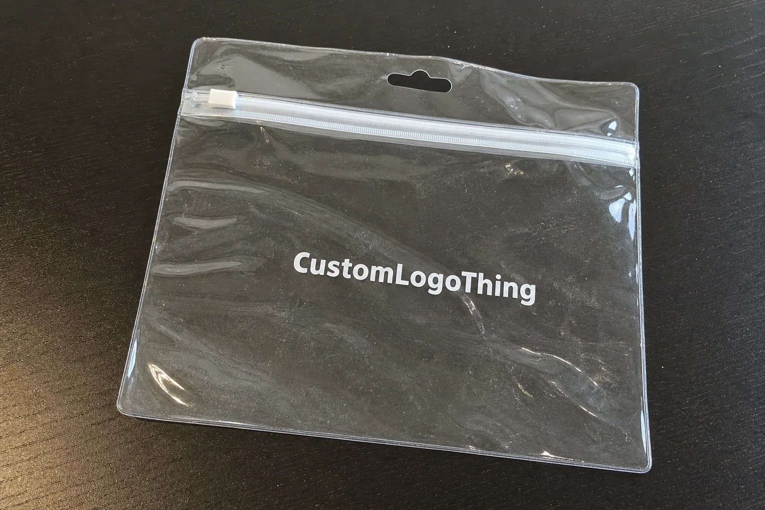
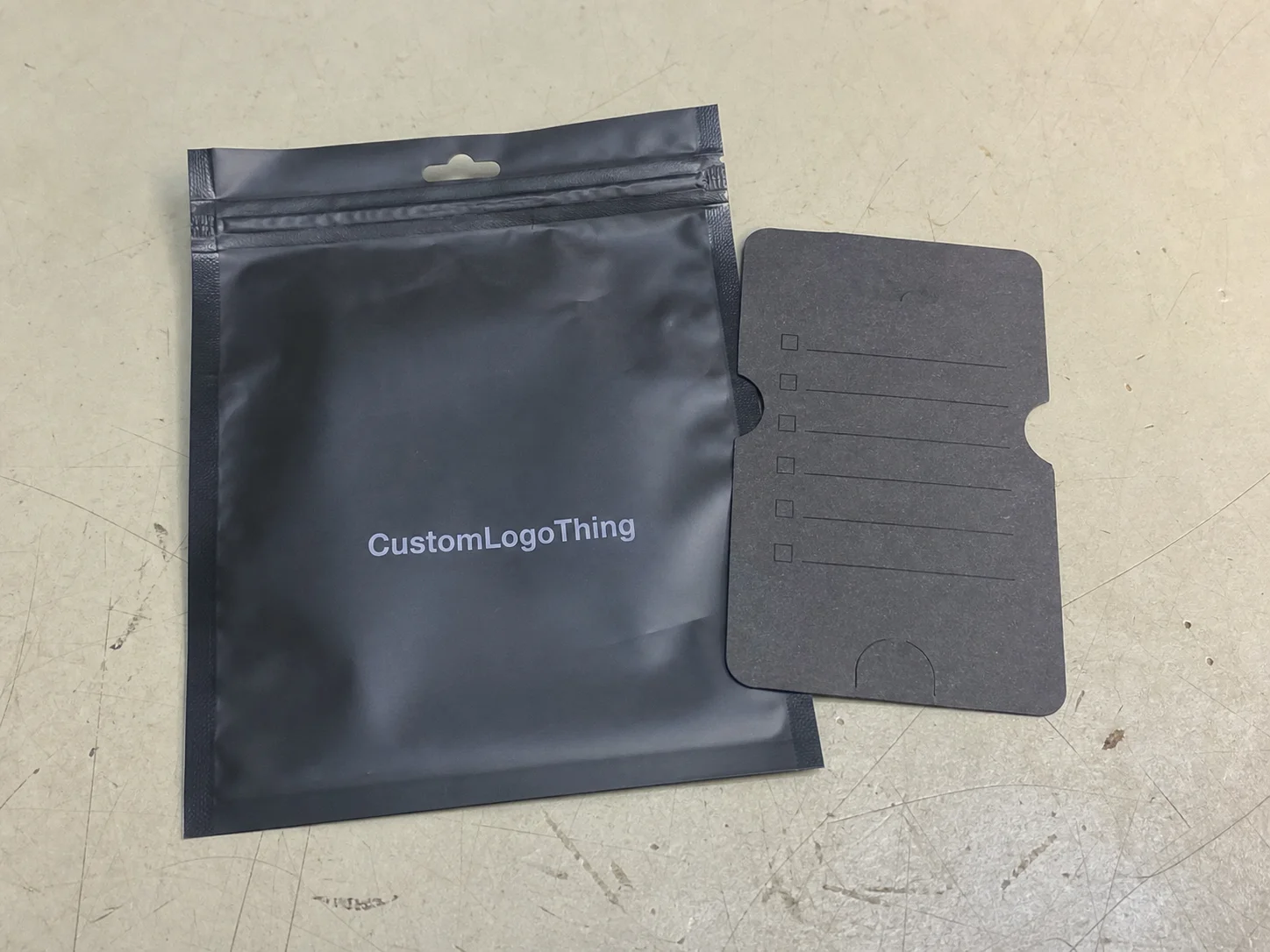
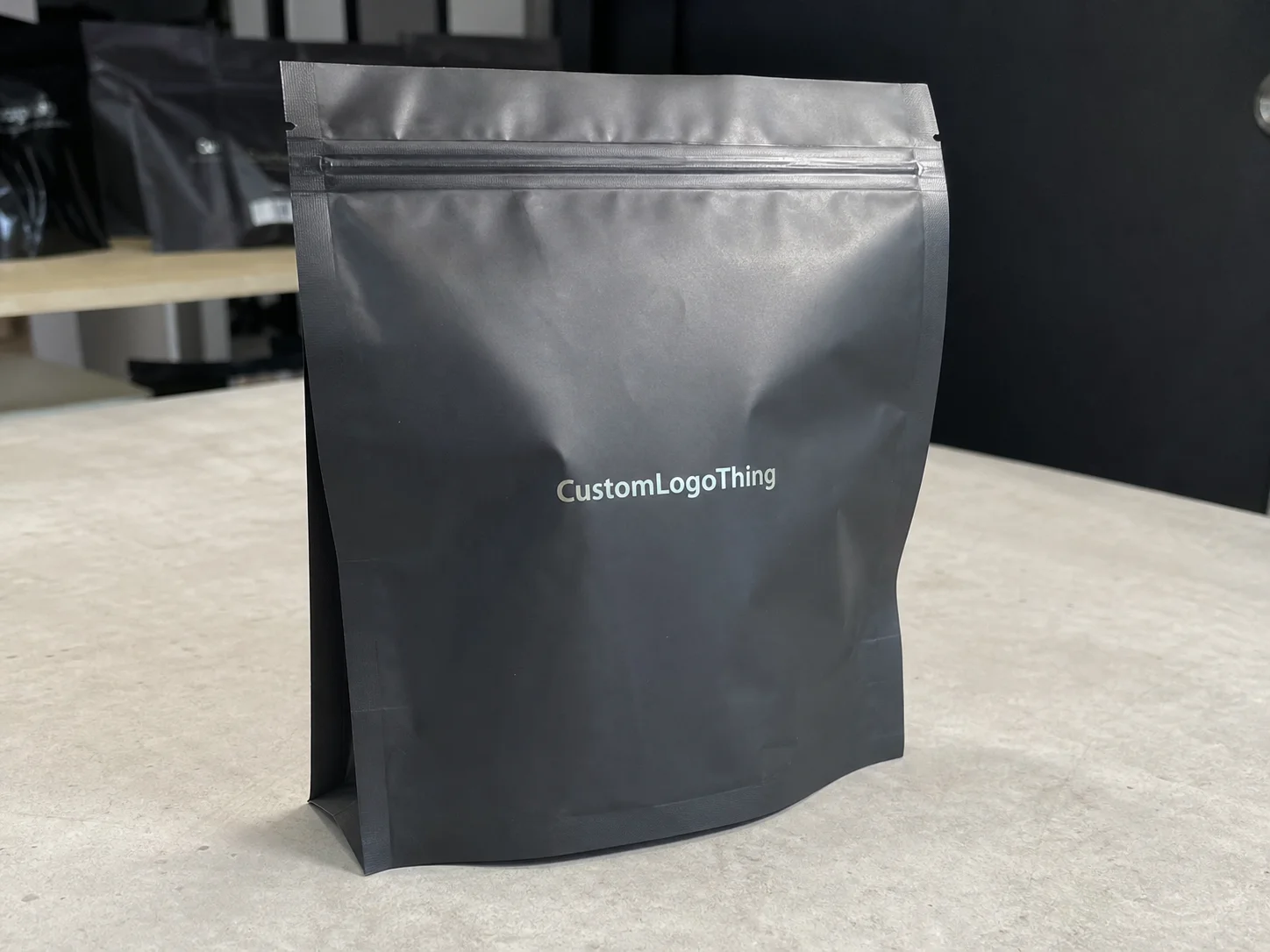
- Formats such as boxes, pouches, labels, cartons, trays, and inserts.
- Materials such as SBS board, kraft board, PET, paperboard, and laminated films.
- Print finishes such as matte varnish, soft-touch lamination, spot UV, embossing, and foil.
- Protection for crush, moisture, tamper evidence, and shelf handling.
- Cost including tooling, freight, setup, and waste.
- Operational fit including labor, storage, minimum order quantities, and retail compliance.
Teams underweight the operational side all the time. They spend 80% of the meeting on color chips and 20% on how the package will ship across 12 distribution points from Newark to Denver. That ratio is backward. A strong retail packaging comparison should tell you whether the package can carry the brand story and still survive a store planogram, a pallet, and a fulfillment table. I have been in too many meetings where the boardroom got very excited about embossing while the logistics manager quietly stared at the floor. That silence was not approval. It was usually the sound of someone calculating rework at $0.19 per unit.
A comparison framework keeps the conversation honest. You are not trying to crown a universal winner. You are trying to identify the best fit for one product, one channel, and one margin target. A pouch may beat a box on freight by $0.07 per unit on a 10,000-piece run. A carton may beat a label on shelf impact because it gives you 32 square inches of print area. A retail-ready tray may beat both if the store needs fast stocking and strong facing. The right answer depends on the job, not the mood board. Personally, I trust the job more than the mood board every single time.
Retail Packaging Comparison: How the Selection Process Works
The selection process works best when it moves in a straight line: define the product, define the channel, gather sample structures, compare them against the same criteria, and then test the finalists under realistic conditions. That sounds simple. It rarely stays simple. I have seen teams skip the middle steps and pay for it later. One beverage client in Atlanta approved a carton mockup from a computer render, only to discover that the actual board caliper made the pack 4 mm too wide for the shelf tray. The redesign pushed launch back by 9 business days. Nine. Because somebody trusted a screen more than a sample. That still annoys me.
A disciplined retail packaging comparison begins with the product itself. A fragile candle has different needs than a dry snack bar. A liquid with a pump closure needs different protection than a powder pouch. The package must match fill weight, dimensions, shelf life, temperature exposure, and the way the customer opens it. A 200 mL lotion bottle and a 60 g face cream jar may sit in the same category, but they do not deserve the same package structure. I have learned to ask boring questions early, because boring questions save very un-boring disasters later. If the product ships through a humid Miami DC and sits on shelf for 14 weeks, the board grade and coating need to reflect that reality.
Next comes the use case. A club-store SKU wants volume efficiency and pallet discipline. A boutique SKU wants premium presentation. An e-commerce SKU wants drop protection and quick packing. A hybrid retail model, which is common now, may need one structure that can support both brick-and-mortar and direct shipping. That is where retail packaging comparison becomes more like a decision tree than a design review. And yes, decision trees are less glamorous than mockups, but they also keep you from reprinting 12,000 units of something that only works on a computer render. I have seen that mistake cost a brand $8,400 in scrap and another $2,100 in rush freight.
I also advise teams to compare packages in four environments, not one:
- On shelf - Does the package stop traffic from 3 to 6 feet away?
- In transit - Does it survive a 36-inch drop or a rough-handling route?
- In storage - Can it stack cleanly for 8 to 12 weeks without warping?
- At the fulfillment table - How many seconds does each unit add to packout?
That four-part view is where the best retail packaging comparison work happens. One apparel client in a supplier meeting chose a sturdier mailer-style carton only after I asked the warehouse manager how often staff had to re-square damaged cartons. His answer was 1 in every 40 units. That was enough to change the discussion. A package that looks slightly cheaper on paper can become expensive when labor starts patching weak corners. I have a strong opinion about that now: if the warehouse already knows the carton is trouble, listen to them. They have the bruised knuckles to prove it.
If you are starting from scratch, I often point brands to Custom Packaging Products as a practical way to gather sample structures before committing to print. Seeing a board sample, a pouch sample, and a label sample in hand changes the quality of the retail packaging comparison almost immediately. A 350gsm folding carton in your hand tells you more than a PDF ever will, especially if the sample is printed in Shanghai and delivered to you in 4 business days with a finish you can actually scratch. Screens are fine. Your hands are better.
One more thing: a good comparison balances brand story with retail realities. A package can be gorgeous and still fail if it does not meet retailer compliance, scanning requirements, or shelf dimensions. The best decisions feel boring to finance and exciting to the shopper. That balance is the mark of a strong retail packaging comparison, even if it does not photograph well for the deck. I have sat through enough decks to know that a quiet approval from operations is usually worth more than a standing ovation from marketing.
Key Factors in a Retail Packaging Comparison
Visual impact
Visual impact gets the loudest debate, and for good reason. In a retail packaging comparison, the first questions are simple: does the package read from 4 feet away, does the logo stand out in 1.5 seconds, and does the structure look premium enough for the $24.99 price point? A matte carton with a foil accent creates a very different impression from a clear pouch with a paper label, even if the product cost inside is identical. I have sat in meetings where everyone argued over the exact shade of white, and then the sample failed because the brand name was too small by 2 mm. Human beings are funny like that.
Color, shape, and print area all matter. So does negative space. I have seen a crowded front panel bury the product name, the variant, and the benefit statement under too many badges. Shoppers do not reward that effort. They move on. If your retail packaging comparison includes a display test, place the sample beside two competitor SKUs and photograph it under the actual store lighting, usually 3,200K in mass retail or 4,000K in specialty. That image usually reveals the problem the design screen hid. Computers are polite. Stores are not. A shelf test in Dallas once showed that a gold foil mark vanished under one fluorescent bay while the same pack looked fine on a laptop at noon.
Protection
Protection is where packaging design turns into risk management. A retail packaging comparison should check crush resistance, moisture barrier, tamper evidence, and seal integrity. For some products, the difference between a 16 pt and a 24 pt board is not cosmetic; it is the difference between arriving crisp and arriving dented. If the item is fragile, I want to know what happens after a 36-inch drop, a 24-hour freight leg, and a week in a stockroom with uneven humidity. I remember one candle launch in Portland where the outer box looked stunning right up until the first pallet hit a warm dock. Then the corners curled like they had personal beef with the shipment. The sell-through dropped 11% in the first month because damaged packs sat in prime facings.
Standards help here. When the stakes are high, I look for testing aligned with ISTA procedures for transit simulation and, where needed, ASTM-based material checks. You can read more about the testing framework at ISTA. A retail packaging comparison that ignores real transport abuse is just a prettier way to guess. And guessing is expensive. A 3-test sequence using vibration, drop, and compression can save a brand from a $12,000 reprint on a 30,000-unit launch, which is a lot cheaper than finding out the hard way.
Usability
Usability gets overlooked until the first packing shift starts. Does the package open cleanly? Can it be resealed? Does it hang on a peg? Can store staff face it fast? A retail packaging comparison that ignores the front-line user is incomplete. I once sat with a grocery replenishment team in Minneapolis that rejected a well-designed carton because the tear notch split too close to the barcode. The customer loved the look. The shelf team hated the handling. The debate lasted maybe 20 seconds after that. Reality has a way of ending design arguments, especially when a store associate has 18 minutes to stock a full bay.
Usability has to include both customer experience and staff experience. A pouch with a zipper may delight a shopper but frustrate a machine line if the seal is inconsistent. A box with a custom insert may protect a bottle beautifully but slow filling by 18%. Those are not small numbers. They change labor and margin. I have seen a plant manager in Ohio frown at a carton, count the seconds, and then kill the design with one sentence: "That's a lot of people time." He was right. If the line rate falls from 42 units per minute to 34, the package is no longer just a package.
Sustainability and supply chain fit
Sustainability belongs in a retail packaging comparison, but only when it is handled honestly. A recyclable claim means little if the chosen film or coating is not accepted in the recycling stream your customer actually uses. An FSC-certified paperboard carton can be a stronger fit for certain brands, especially when the supply chain wants traceability. You can verify chain-of-custody principles at FSC. I care less about the marketing line and more about whether the claim survives a buyer question without everybody suddenly finding the ceiling interesting. If the pack ships from Ho Chi Minh City, lands in Savannah, and sits in a humid warehouse for 21 days, the coating had better hold up.
Supply-chain fit matters just as much. If the board you want has a 12-week availability issue, or the pouch laminate is on allocation, the launch gets squeezed. A retail packaging comparison should ask which materials are stable, which ones need longer replenishment windows, and which ones can run on existing equipment without ugly changeovers. I have seen teams choose a beautiful but hard-to-source film, then spend 3 months chasing inventory. Beauty is fine. Backorders are not. A supplier in Guangzhou once told me a custom laminate line was booked for 8 weeks, and that single detail saved a client from promising a date they could not hit.
Minimum order quantities, sustainability claims, and machine compatibility belong in the same conversation. Brands split them up all the time, which distorts the retail packaging comparison. A recyclable package that needs a new sealing jaw and a new supplier is not simple. It is a program shift. Call it what it is and budget for it like adults. If the change requires a $4,500 tooling update and a 2-week line trial, that belongs in the model on day one, not in an apology email later.
In my experience, the best packaging decisions are grounded in facts: board caliper, barrier performance, closure type, fill speed, and the actual claims the retailer will allow. That is the difference between packaging theory and retail packaging reality. I would take a boring spec sheet over a flashy presentation deck any day, especially if the spec sheet says 24 pt C1S, aqueous coating, and 14 business days to production.
Retail Packaging Comparison: Cost and Pricing Tradeoffs
Price is where many retail packaging comparison conversations go sideways. Someone says a pouch is $0.19 and a carton is $0.31, then assumes the pouch wins. Unit price is only one part of the equation. Tooling, plates, setup, freight, storage, QC rejects, and labor can move the real number by a wide margin. I have seen a quote that looked 22% cheaper become 9% more expensive after freight, overages, and a rush fee were added. That kind of math is why I always ask for the ugly version of the quote, not the polished one. A supplier in Mexico City once quoted $0.16 per unit for 10,000 sleeves, then added $680 in plates and $420 in trucking. The final landed cost told a very different story.
The cleanest way to compare suppliers is to force every quote into the same box: same size, same material, same ink coverage, same finish, same delivery terms, and same order quantity. Without that, a retail packaging comparison turns into a comparison of incomplete information. One supplier may quote a 300gsm board with aqueous coating, while another uses 350gsm board with soft-touch lamination. Those are not equivalent. They are not even close. I once had two cartons presented as "the same" until I put them side by side and realized one had basically been dressed for a different party. The difference was 1.5 mm in caliper and about $0.08 per unit on a 5,000-piece run.
| Format | Typical use | Approx. unit cost at 5,000 units | Typical lead time | Cost notes |
|---|---|---|---|---|
| Custom printed folding carton | Cosmetics, supplements, small retail goods | $0.24-$0.55 | 12-18 business days | Good branding surface; die costs and coatings affect price |
| Stand-up pouch | Snack, powder, refill, lightweight goods | $0.18-$0.42 | 10-16 business days | Efficient freight; zipper, window, and matte finishes add cost |
| Rigid set-up box | Premium gifts, electronics, luxury kits | $1.20-$3.50 | 18-30 business days | Strong shelf presence; assembly and insert costs can be significant |
| Pressure-sensitive label on stock bottle | Beverage, personal care, household liquids | $0.06-$0.18 | 7-12 business days | Lowest setup cost; depends on bottle quality and label adhesion |
| Retail-ready tray or display pack | Club, grocery, fast-shelf replenishment | $0.32-$0.90 | 14-20 business days | Saves stocking time; structure and print coverage influence total cost |
Those numbers are not universal, and I would never pretend they are. Still, they help frame a retail packaging comparison with real-world expectations. A rigid box may look expensive at first glance, but if it lifts perceived value enough to support a $6 price increase, the margin story changes. I saw this firsthand with a holiday set in Boston where the client moved from a basic folding carton to a rigid box with a molded insert. The package cost went up by $1.84 per unit, but the sell-through improved enough to justify the change in one retailer channel. That was one of those rare meetings where finance stopped squinting at the packaging budget and started smiling.
Order quantity matters just as much. A cheaper quote at 25,000 units can become a trap if the brand only needs 8,000. Excess stock ties up cash and warehouse space, and the savings disappear. I have been in supplier negotiations where the difference between 10,000 and 20,000 units was enough to lower the unit price by 14%, but the extra inventory risk made the deal worse overall. That is why the retail packaging comparison must include demand forecast, not just purchase price. Nobody wants a storage unit full of cartons for a product that got canceled in Q3.
Complexity carries its own cost. Spot UV, embossing, foil stamping, windows, and multi-layer laminations all raise the cost profile. Sometimes those upgrades are worth it. Sometimes they are just expensive decoration. A strong retail packaging comparison asks whether the finish helps the package sell better or only helps the design deck look prettier. My bias is obvious: if the finish cannot earn its keep in the aisle, I am not paying for it. A foil hit that adds $0.11 per unit needs to prove it can lift conversion, not just impress the intern with a good camera.
For many brands, the smartest move is to model total landed cost. Add freight per carton, repack labor, plate charges, and anticipated waste. Then compare the options on a landed basis. The unit price may still matter, but it should no longer be the only number in the room. I have seen too many teams celebrate a low quote and then act surprised when the final invoice showed up with all the extra little charges doing the damage. If you are buying from a plant in Shenzhen or Monterrey, get the freight terms in writing and include a 3% waste allowance if the art has tight registration.
Retail Packaging Comparison: Process and Timeline
Timeline is where good packaging plans either stay on schedule or fall apart. A retail packaging comparison usually begins with a brief, moves into sample sourcing, then revisions, testing, approvals, and production. Each stage has a way of expanding if the team is not disciplined. A simple box can move quickly. A custom structure with print, lamination, and inserts often does not. I have watched "quick turns" turn into small soap operas more times than I care to admit. A 5,000-piece carton order can move in 12 to 15 business days from proof approval if the dieline is already locked, but one new insert or bar code change can add a full week.
Here is the sequence I recommend for most launches:
- Product brief - 1 to 2 days for dimensions, fill weight, retail channel, and target cost.
- Sample gathering - 3 to 7 business days for stock formats or mockups.
- Prototype review - 2 to 5 days for structure, print, and fit checks.
- Testing - 3 to 7 days for transit, drop, stacking, and shelf fit.
- Revisions and approval - 2 to 6 days depending on stakeholder count.
- Production - often 10 to 20 business days, depending on complexity.
In one client meeting, a food brand wanted a launch in 21 days and assumed the packaging team could "just do the box." The box was not the issue. The issue was that the varnish needed a revised proof, the barcode had to be rechecked, and the retailer wanted a compliance note updated on the back panel. That added 6 business days. The retail packaging comparison was ready, but the approval chain was not. I remember sitting there thinking, this is why the box never gets the credit it deserves for saving people from themselves. The supplier in Richmond had the cartons ready, but the legal team in New York still wanted one more review.
Structural changes are the biggest time sink. A stock carton with a new label can move in a week or two. A fully custom printed box with a new die, insert, and finish can take several rounds of art correction and physical proofing. If you are planning around photography, legal review, or distributor onboarding, those dependencies must be listed early. Otherwise, packaging becomes the bottleneck that delays everything else. I have seen full launches sit still because nobody wanted to own the last proof. One rigid box project in Dallas took 28 business days because the foil plate had to be redone after the first proof missed the logo by 1.2 mm.
I also tell teams to plan backward from the retail date, not forward from the first sample. If store set dates are fixed, give yourself at least one buffer window for revisions. A 2-week cushion sounds generous until a key team member is out of office or a sample is damaged in transit. That is not rare. It happens often enough that a retail packaging comparison should assume at least one rerun. If you do not budget for a rerun, the rerun will budget for you. A shipment from Guangzhou can be delayed 4 days by a port backup, and that turns a comfortable timeline into a stressful one fast.
Print proof approval does not equal production readiness. I have seen beautiful digital proofs hide a trim issue that only appeared on the final dieline. Physical samples still matter because they show how the package behaves when folded, filled, and stacked. The exact same art file can behave very differently on 18 pt board versus 24 pt board. I wish that were less annoying. It is not. A 0.75 mm shift in the cut line can make a shelf pack sit crooked in a way that no mockup screen will ever confess.
For brands managing multiple SKUs, a shared calendar helps. Put sample review, internal signoff, supplier revisions, and freight windows in one timeline. That way the retail packaging comparison stays tied to the launch plan instead of living in a separate folder nobody checks on Fridays. A packaging decision that lives only in someone's inbox is usually a packaging decision waiting to fail. I like to keep the whole chain visible, from art approval in Brooklyn to carton loading in Busan.
Common Mistakes in Packaging Decisions
The first mistake is comparing appearance only. A package that wins a mockup review can still fail in real retail conditions if it crushes, scuffs, or slows packing. I watched a club-store buyer reject a stunning carton after one pallet of samples arrived with corner dents. The board looked premium in the studio. On the pallet, it looked tired. That one event changed the retail packaging comparison more than any design opinion in the room. The buyer did not care how nice the render looked. They cared whether the pack could survive a warehouse in Houston with a 42-inch pallet stack and a 48-hour dock schedule.
The second mistake is accepting quotes without confirming specs. A 350gsm board is not the same as a 300gsm board with a heavier coating, and a matte laminate is not the same as a matte varnish. Those small differences distort cost comparisons. If two suppliers are quoting different materials, print coverage, or delivery terms, the numbers are not meaningful. A retail packaging comparison depends on apples-to-apples data, not hopeful assumptions. I have had to kill more than one "great deal" because the quote was technically cheap and practically nonsense. A carton from one supplier might use virgin SBS from Finland, while another is quoting recycled board from Ontario; that changes both performance and price.
The third mistake is choosing a format before defining the channel. Club, grocery, specialty, and e-commerce all reward different packaging behaviors. A pouch that works beautifully online may not win at shelf if the category needs vertical front-facing blocks. A rigid box can impress in a boutique but become a freight headache in a mass retail program. Channel context has to come first. Otherwise you end up with the right package for the wrong store, which is a neat way to waste money. I have watched a brand spend $9,600 on premium boxes for a warehouse club customer that wanted corrugated trays and fast replenishment.
The fourth mistake is rushing approval. This is the one that hurts most because it feels efficient right up until the reprint invoice lands. I have seen teams skip sample testing because the first prototype "looked close enough." That choice often costs them later in color drift, barcode issues, or structural weakness. A solid retail packaging comparison does not stop at the first pretty sample. It checks fit, function, and repeatability. Pretty is not the finish line. It is the starting line. If the first board sample in your hand is 2 mm short, the second one will not magically fix itself because marketing is eager.
Here are the mistakes I flag most often during packaging reviews:
- Using renderings instead of physical samples for final comparison.
- Ignoring freight and storage when judging total cost.
- Assuming one retailer's shelf requirements fit every channel.
- Overloading the front panel with too many claims and icons.
- Forgetting to test opening, resealing, and packout speed.
There is another subtle problem: teams sometimes choose the package they personally prefer rather than the one the channel needs. I understand the temptation. Packaging is emotional. But a retail packaging comparison must stay grounded in data from the store, the line, and the freight route. The most elegant option is not always the best option. I have lost count of how many times "my favorite" lost to "the one That Actually Works." At a supplier visit in Osaka, the weakest-looking carton won because it held shape after 4 compression cycles and the prettier one did not.
My blunt opinion? If a package requires a long explanation before anyone sees the value, it is probably losing the shelf battle. The best packages make the choice obvious in 2 seconds or less. After that, you are just asking shoppers to do homework. A good pack in San Diego or Seoul should not need a speech and a slide deck to justify itself.
Expert Tips and Next Steps for Your Next Launch
If I had to reduce years of packaging work into one practical method, it would be this: build a comparison matrix and score each option on shelf appeal, protection, cost, speed, and sustainability. Give each category a weight. A premium gift item might weight shelf appeal at 35% and cost at 15%. A mass-market refill pouch may flip that weighting entirely. That is how a retail packaging comparison becomes a business tool instead of a design debate. It also keeps the loudest person in the room from winning by volume alone. One matrix I used for a beauty launch in Chicago had 5 rows, 5 columns, and 1 very unhappy opinion that got ignored for the right reasons.
For the cleanest test, I recommend evaluating 3 finalists with the same product fill, the same store condition, and the same decision makers. Do not let one sample be empty while another is full. Do not compare one option under warehouse light and another under daylight. Small inconsistencies create fake winners. A fair retail packaging comparison needs controlled conditions, even if the test is simple. I like simple tests. They are less dramatic and usually more honest. A 20-minute shelf test with 3 people and 1 camera often tells you more than a 90-minute meeting with snacks.
Ask every supplier for two things: a production quote and a realistic timeline. Then ask what changes the quote. A supplier should tell you whether price shifts with board caliper, ink coverage, foil area, insert count, or shipping lane. If they cannot explain that clearly, the comparison is not ready. Good vendors are specific. Bad ones hide behind vague language. I have found that the good ones also tend to sleep better, which probably says something about the industry. A plant in Suzhou once quoted $0.21 at 8,000 units and then explained exactly how the price would drop to $0.17 at 15,000 units; that kind of detail saves everyone time.
When I visited a printing floor outside Shenzhen, one plant manager showed me how a 0.5 mm trim adjustment saved him from a recurring fit issue on a retail carton. That tiny change cut rework by 7%. It was a reminder that the smallest details can have outsized effects. In packaging, precision is rarely glamorous, but it is often profitable. Also, it is the difference between a clean run and a week of people sighing into their coffee. A 0.5 mm fix on a 350gsm carton may sound small, but on a 24-pack display shipper it can mean the difference between a tight stack and a bent corner.
Another useful tactic is to keep a simple scoring sheet in your file. Use one row per option and one column per factor. Example weights could look like this:
- Shelf impact - 30%
- Protection - 25%
- Cost - 20%
- Lead time - 15%
- Sustainability - 10%
That framework makes the retail packaging comparison easier to defend in front of sales, finance, and operations. It also keeps the loudest person in the room from deciding the outcome by instinct alone. I wish every launch had one of these sheets taped to the wall before the first opinion arrived. If the final score is 87 out of 100 for one option and 72 for another, the conversation gets a lot less theatrical.
My final advice is simple: choose one SKU, request 3 samples, test them in the same conditions, and write down the result before the meeting ends. If you wait a week, memory starts editing the facts. A good retail packaging comparison should give you a decision, not just a folder full of nice-looking samples. If you need help sourcing the right mix of branded packaging, product packaging, and custom printed boxes, start with one package, one channel, and one clear scorecard, then let the retail packaging comparison tell you which option deserves the launch. I would rather approve a $0.29 carton in 14 business days than fix a $0.24 mistake after 14,000 units have already shipped.
How do I start a retail packaging comparison for one product?
Start with one SKU and one retail channel so the retail packaging comparison stays focused. Collect 3 to 5 samples with the same product size, print assumptions, and order quantity, then score shelf impact, protection, cost, and timeline before you narrow the field. I like this approach because it keeps people from turning a simple packaging decision into a philosophical debate. If your run is 5,000 pieces and the board spec is 350gsm C1S artboard, you can usually get meaningful samples in 3 to 7 business days.
What should I compare first in retail packaging comparison research?
Begin with the product's must-have function, such as protection, barrier performance, tamper evidence, or display appeal. Then compare the format against your channel needs, because a club-store pack and a boutique pack are rarely judged the same way in a retail packaging comparison. A 200 mL bottle in a folding carton has very different needs than a 60 g powder pouch, and the shelf does not care what your internal team prefers. If the item ships from Chicago to Denver, the freight test matters too.
How long does a retail packaging comparison usually take?
A simple retail packaging comparison can take 3 to 5 days if you are only reviewing stock formats and standard finishes. Custom structures, printed prototypes, or multiple approval rounds can stretch the process into several weeks, so build in time for revisions, sample shipping, and final signoff. If someone says it will all be done by Friday, I would ask them to show their calendar. For a custom box with spot UV and a new die line, 12 to 18 business days from proof approval is a more realistic window.
What hidden costs should I watch in a retail packaging comparison?
Look beyond unit price and include tooling, plates, setup fees, freight, and special finishing charges. Check minimum order quantities too, because buying more than you need can turn a low quote into a costly retail packaging comparison outcome. Inventory sitting in a warehouse is not savings. It is a bill with a nicer font. A quote at $0.23 per unit can become $0.31 landed once the $450 plate fee and $290 freight line show up.
Which packaging format works best in a retail packaging comparison?
There is no universal winner; the best format depends on shelf space, product fragility, and how customers interact with the item. Boxes often win on branding and structure, while pouches can win on flexibility and freight efficiency, so the right choice is the one that matches your product, margin target, and retail environment without creating operational friction. If you are ready to run your own retail packaging comparison, start with one SKU, request samples, score them against your matrix, and choose the format that can actually deliver on shelf, in transit, and at the fulfillment table. For a premium kit in Seattle, that may be a rigid box; for a snack refill in Austin, it may be a stand-up pouch with a resealable zipper.
Take the three finalists, test them under the same store light, on the same shelf, with the same fill, and with the same warehouse handling. The winner is usually the one that survives all four conditions without extra explaining. That is the whole retail packaging comparison in one sentence, and it saves a lot of money when everybody in the room wants to get cute.