Buyer Fit Snapshot
| Best fit | Retail Packaging Design for Shelf Impact projects where brand print, material claims, artwork control, MOQ, and repeat-order consistency need to be specified before quoting. |
|---|---|
| Quote inputs | Share finished size, material target, print colors, finish, packing count, annual reorder estimate, ship-to region, and any compliance wording. |
| Proofing check | Approve dieline scale, logo placement, barcode or warning zones, color tolerance, closure strength, and carton packing before bulk production. |
| Main risk | Vague material claims, crowded artwork, missing packing details, or unclear freight terms can make a low unit price expensive after revisions. |
Fast answer: Retail Packaging Design for Shelf Impact: Material, Print, Proofing, and Reorder Risk should be specified like a repeatable production item. The safest quote records material, print method, finish, artwork proof, packing count, and reorder notes in one written spec.
Production checks before approval
Compare the actual filled-product size with the drawing, then confirm tolerance on folds, seals, hang holes, label areas, and retail display edges. Reserve space for logos, QR codes, warning copy, and material claims before decorative graphics fill the panel.
Quote comparison points
Review material grade, print process, finish, sampling route, tooling charges, carton quantity, and freight assumptions side by side. A quote is only useful when the supplier can repeat the same color, closure quality, and packing count on the next order.
Retail Packaging Design Tips are less about making a package look polished and more about earning a few seconds of attention while shoppers are scanning, comparing, and moving on. At shelf height, a pack is not judged like a brochure. It is judged like a signal: what is this, what does it cost, and does it feel trustworthy enough to pick up?
How Do Retail Packaging Design Tips Improve Shelf Performance?
Retail Packaging Design Tips improve shelf performance by turning a package into a fast, readable sales tool instead of a decorative object. The difference is measurable. In a crowded aisle, many shopper studies put the first-choice window at around three seconds, though the exact number shifts by category and mission. If a pack communicates quickly, it has a better shot at being picked up, scanned, and remembered. That is why retail packaging design tips matter before a buyer ever sees the final mockup.
At shelf height, a package competes with noise: neighboring brands, uneven lighting, busy claims, and the customer’s own limited attention. A strong pack reduces that noise. It makes the brand name legible, the product promise obvious, and the value proposition easy to compare. Retail Packaging Design Tips are useful because they make the package do three jobs at once: protect the product, support the brand, and help the sale happen faster.
I once reviewed a carton that looked terrific on a screen and then turned into a glare mirror under store LEDs. The foil looked premium in the conference room, but from six feet away the product name was fighting reflections. That is the sort of failure that only shows up in the aisle, and it is exactly why retail Packaging Design Tips need field context, not just a pretty render.
Take a hypothetical hero SKU in a crowded aisle: strong formula, healthy margin, confident team. The pack still disappears because every carton around it uses the same visual language. Retail packaging design tips matter because they create a difference the eye catches before the brain decides the item is interchangeable. If the package cannot stop scanning and trigger recognition, the story never gets to be read.
From the buyer side, the package is also a logistics object. Retail buyers evaluate case packs, barcode behavior, shelf dimensions, and fixture compatibility. Operations asks whether tooling, lead time, and damage risk remain manageable through mass handling. Marketing measures brand recognition and shelf impact. Sales asks one hard question: can we defend this package in a buyer conversation without sounding like we are making a style plea? Retail packaging design tips become useful when they connect all those pressures into one decision flow instead of a stack of competing wishes.
The mindset shift is simple and difficult. A shopper sees what is immediate and visual, a buyer sees what is sellable, and a production team sees what is repeatable at volume. Any one lens on its own gives a partial truth. Retail packaging design tips earn their keep when they make those three voices agree on the same direction.
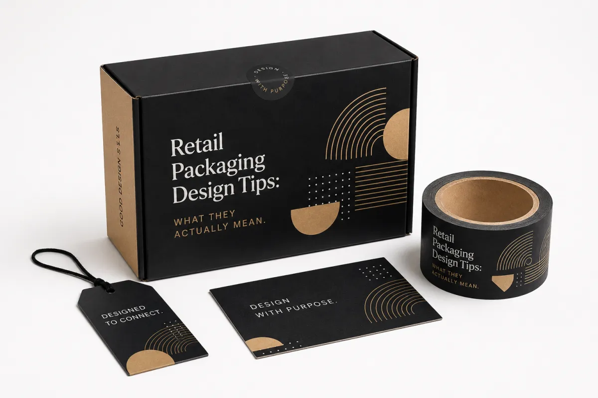
Retail Packaging Design Tips: What They Actually Mean
Retail packaging design tips get repeated as if they are mostly aesthetic choices, a mood board dressed up in marketing language. That misses what matters on the floor: a package has to sell the promise, protect the product, and survive enough handoffs that it still looks intentional after it has been stacked, lifted, and returned a dozen times. A glossy draft with no practical backbone can look perfect in a meeting room and still fail once the first customer touches it.
In plain terms, retail packaging design is a blend of structure, graphics, materials, and shelf behavior. A pack that stands upright, scans fast, and still reads well under real lighting usually performs better than a flashy execution that folds wrong or hides the product name. At the moment of purchase, shoppers are doing rapid triage, not literary analysis, and a clear package saves them cognitive time.
When teams review retail packaging design tips without the retail context, they usually overvalue novelty. A new shape can help, but only if it still fits the planogram, survives transit, and supports the category price point. The right package is not the loudest object in the room; it is the one that is easiest to understand in the fewest eye movements.
Materials matter too. A lighter paperboard may keep cost down, but a heavier board can hold structure better under repeated handling. Finishes change the signal as well. Matte can calm the design and reduce glare. Gloss can sharpen color and increase perceived energy. Foil, embossing, and spot UV can create a premium cue, but every added layer changes press time, spoilage risk, and budget. Retail packaging design tips are practical because they translate taste into tradeoffs.
From a branding point of view, retail packaging design is also a memory device. The shopper may not remember the full copy, but they will remember a shape, a color block, a texture, or a specific contrast pattern. That is why many brands use a stable visual system across SKUs while adjusting only one or two variables. The package becomes easier to recognize, and recognition is often the quiet advantage that wins in retail display packaging.
From an execution point of view, packaging also has to behave in the factory. Color targets need to hold across press runs, dielines have to close accurately, and barcode quiet zones cannot be sacrificed for decoration. A beautiful face panel that ignores production limits is kinda decorative failure. Good retail packaging design tips keep the visual idea and the manufacturing reality in the same room.
The same idea applies to category architecture. A family of products should look related without becoming visually identical. One strong color, one consistent grid, one repeatable type hierarchy, and one distinctive material move can do more than six competing effects. That kind of discipline is not boring; it is what makes a line look intentional instead of assembled.
How Retail Packaging Design Tips Become a Real Process
A stack of good ideas has no value if the team cannot execute them in sequence. Early-stage packaging teams often begin with words like “make it premium” or “make it stand out,” then wonder why timelines explode and everyone argues over the same file at the end. Structured process prevents that loop, because each checkpoint has a reason and a deliverable attached.
The standard path is predictable on paper: brief, concepting, mockups, prototyping, revisions, and production approval. Reality adds friction. Shelf dimensions change, buyers request hang-ready variants, operations flags impossible barcode placement, and legal inserts mandatory language at the last minute. That is why retail packaging design tips are practical: they force each iteration to map back to an actual retail constraint rather than a pretty preference.
A standard-size refresh can move from brief to sample approval in roughly 2-4 weeks when artwork arrives complete and decisions are timely. Custom structures and die-line revisions stretch to 6-10+ weeks at a minimum, and unusual compliance edits can push launch windows further. What looks like a design schedule problem is usually a requirement clarity problem wearing a different face.
Common drag points appear in the same places again and again: thin briefs, delayed stakeholder feedback, late dieline changes, and last-minute compliance edits. The chaotic version is everyone giving contradictory approvals and expecting production to resolve the contradictions. A clean workflow uses clear ownership: one person approves brand direction, one person owns operations, one person owns compliance, and one person has final authority. Anything less is theater with expensive consequences.
For a family of products, the process should stay coordinated across SKUs. A hanging carton in one line and a shelf-ready tray in another can still share standards, reducing tooling changes and lowering print waste. If you are comparing formats, the Custom Packaging Products catalog gives a useful way to sort structural options before committing to a shape that looks clever on paper but collapses under a fixture.
Practical rule: custom structure multiplies proofing time. Retail packaging design tips become meaningful there, because they reduce the chance of approving a beautiful mistake that no one can build cleanly.
“If the front panel cannot be understood in two seconds, the shelf has already voted.”
Key Factors That Make or Break Retail Packaging
The conversation about retail packaging design tips often stops at graphics, but structure carries a larger part of the risk. A package that crushes in transit, refuses to stack, or wastes depth in a basket quickly turns into margin leakage. Panel size, opening method, insert design, hang tabs, stackability, and handling tolerance decide whether the box behaves like a tool or a prop.
Visual hierarchy is the other half of survival. The shopper should instantly identify brand, product, and the top one benefit. Claim overload creates visual static: too many icons, seals, guarantees, and legal bits compete for the same glance window. A sharper design hierarchy does not remove details; it postpones most of them until after the first decision. Good retail packaging design tips usually start here because shelf clarity beats decoration.
Materials and finishes change the psychological and physical feel of a pack at once. A lighter SBS board can feel economical but may show defects sooner than heavier C1S artboard stock. Matte lamination cuts glare and can improve readability in harsh store lighting. Gloss lifts color impact and can push premium perception, but scuffs and finger marks show up faster. Foil, emboss, and spot treatments can create instant differentiation, yet each extra layer adds setup cost, longer press time, or higher rejection rates.
Retail fit has a hard edge. A mockup may look balanced on screen and still fail inside a tray or PDQ because proportions drift by millimeters. A few millimeters too far forward can bury the brand panel; a few millimeters too high can misalign with fixture hardware. If a pack will be tray-mounted, the front face must remain visible when neighbors crowd it. If it hangs, the hole geometry has to survive repeated load without tearing.
Sustainability and compliance no longer live in separate departments for many brands. Recyclability language must match the actual materials and finish stack, or it collapses into greenwashing risk. Mixed films and certain laminates can complicate claims even when the print is flawless. Barcode placement is equally unforgiving; a scan failure is not a branding issue alone, it is a sales hold-up. For baseline recycling guidance, the EPA recycling resources help, and FSC-certified paperboard remains a common anchor when sourcing credibility matters.
Color management deserves its own warning. A brand that builds its identity around a particular red or blue has to proof against press variation, not just against a monitor. Under cooler LED store lighting, some hues darken; under warm bulbs, others go muddy. If the package depends on a precise shade to carry recognition, ask for physical proofs and check them beside the actual shelf lighting conditions. That small step prevents a lot of drama later.
In practical terms, the strongest outcomes happen when structure, hierarchy, materials, shelf fit, and compliance are treated as one system. Miss one input and the package may look fine until someone else pays the cost: returns, reprints, delays, or damaged shelf execution. Rework costs are rarely dramatic line items in a plan, yet they are among the fastest ways to erode margin.
Step-by-Step Retail Packaging Design Guide
Teams make better packages when they repeat a process with real checks, not a brainstorming marathon that restarts each week. A sequence gives everyone a shared grammar: what “good” means at concept stage, what “good enough” means at sample stage, and what triggers a change or a stop.
-
Define the shopper, retailer, and price point.
Start by identifying who buys, where it is sold, and what price band defines perceived value. A $12 impulse SKU needs instant scanning and clear utility; a $45 premium item can tolerate slower decoding if it delivers depth and refinement. Retail packaging design tips become reliable when they are anchored to this buyer context instead of a generic “beautiful” objective.
-
Write a serious packaging brief.
Include exact dimensions, item weight, fragility, shelf placement, print budget, brand standards, compliance text, and retailer requirements. Clarify physical demands: hang hole, tamper feature, window, travel-safe insert, opening style, and handling expectations. Vague briefs push teams into assumption design, and assumptions are expensive in review rounds. Good retail packaging design tips start with precision, not inspiration alone.
-
Build two or three concept directions.
Compare the options inside a shelf simulation, not alone in design mode. One route can be loud, another premium in texture, and a third optimized for durability and production speed. Retail packaging design tips become meaningful when selection criteria stay fixed: visibility from typical browse distance, text legibility at hand level, and fixture fit.
-
Prototype the winning direction.
Skip this step only when structure is truly standard and low risk. Prototypes expose defects that never appear on a mockup: glare bands, weak folds, awkward opening sequences, and surface effects that flatter in a studio yet fail under fluorescent lighting. Handling a real sample also gives sales teams concrete language instead of speculative language.
-
Collect feedback from the right people.
Sales catches buyer objections. Operations flags pack fragility, waste rates, and transport risk. Production knows where print tolerances can slip. Marketing protects brand consistency and story readability. The key is not collecting unlimited comments, it is knowing which comments can change artwork and which should go into launch planning notes.
-
Lock the final artwork and dieline.
Once approved, freeze the approved structure and graphics. Last-minute edits feel minor, then snowball into label shifts, barcode moves, and alignment breaks. Locking files is not about control for its own sake; it is risk management. Late edits usually land with a cost attached, and the production team is gonna feel it first.
-
Approve samples and prep launch logistics.
Finalize carton counts, packing method, case efficiency, and delivery dates before launch comms lock. A compelling package can still fail to launch if logistics are not aligned. Retail packaging design tips only fulfill their purpose when the final step includes fulfillment readiness.
An operating sequence that works well in practice is simple: concept, prototype, proof, lock, print. Teams that use it reduce duplicate work and protect themselves from paying twice for avoidable design errors.
One more useful habit: test the pack in motion, not just in still life. Put it on a pallet, inside a tray, on a peg, and under the lighting the customer will actually see. A package that looks balanced in a deck can look clumsy once it is surrounded by competing facings. That kind of reality check is cheap compared with a reprint.
Retail Packaging Costs, Pricing, and Tradeoffs
Retail packaging design tips become useful only when they sit inside real cost decisions. Cost is not a side note in retail packaging; it is the operating system. Structure, print method, finishing, tooling, MOQ, and freight all sit in one equation, and the lowest unit cost is often not the lowest project cost.
This is a practical baseline comparison used across many moderate-volume programs:
| Packaging Option | Typical Unit Cost | Best For | Main Tradeoff |
|---|---|---|---|
| Stock packaging with light label customization | $0.08-$0.22 per unit | Early launches, test runs, simple products | Fast and cheap, but less distinctive shelf impact |
| Lightly customized retail packaging | $0.18-$0.45 per unit at 5,000+ units | Most DTC-to-retail transitions, mid-market products | Better branding, moderate tooling, and manageable lead time |
| Fully custom printed boxes with premium finishes | $0.45-$1.40+ per unit depending on quantity | Premium lines, crowded shelves, high-margin items | Stronger shelf presence, but higher setup, MOQ, and spoilage risk |
Unit economics can mislead when MOQ ties up inventory and extends cycle time. A lower per-unit quote may freeze cash in stock before real demand appears. A slightly higher price with a shorter run can produce better capital use during category testing. Retail packaging design tips should guide where spending creates return: structural clarity, print quality, or premium finishing.
Structural changes often pay back more than decorative upgrades. A cleaner die line can reduce board waste and handling labor. Spot effects can lift shelf perception, yet each added process raises scrap, setup, and quality rejection risk. One strong finish used well often outperforms multiple effects used without restraint. That is a familiar pattern in retail packaging design tips: focus on the highest-yield change first.
Higher spend is reasonable when competition is intense, product risk is high, and the category relies on visual cues to claim premium value. Cautious spend is smart when launch volume is exploratory, seasonality is high, or demand is still uncertain. That is where retail packaging design tips become financial judgment: they align packaging investment with commercial risk.
Freight costs deserve equal attention. Lightweight but bulky packaging can still damage a budget if it ships inefficiently or requires oversized case configurations. Insert design and flat-pack efficiency influence delivered cost as much as print and material. The quiet budget killer is extra air, plus unplanned handling complexity.
When evaluating suppliers, many teams gain clarity by asking three bids: a standard build, a moderately upgraded option, and a premium alternative. Those three points often reveal exactly where the budget should bend for this launch and where it should stay fixed. It is a simple comparison, but it stops the usual slide into vague opinions about what “feels affordable.”
Common Retail Packaging Design Mistakes to Avoid
Too much information on the front panel is a recurring failure. Dense claims, too many icons, and repeated certification marks create cognitive overload, and the shopper abandons the scan before understanding the value. The brand name gets buried, and the pack loses its priority message.
Designing for the monitor while ignoring actual shelf conditions is the second familiar trap. Rendered assets show perfect backgrounds and ideal illumination. In a real aisle, neighboring packs, imperfect lighting, shelf wobble, and handling marks change perception instantly. A strong retail packaging design tips process includes shelf testing before final lock.
Production limits should never be treated as an afterthought. Ink density, bleed tolerance, color control, and die accuracy all define what can be repeated across thousands of units. Soft-touch films and heavy matte surfaces can feel premium but can also mark or scuff faster under real handling. Any design reliant on tight register for foil and edge-to-edge treatment needs clear manufacturing margins, or quality suffers at scale.
Material choices can quietly undermine performance. A board that feels elegant in a showroom sample can buckle when humidity rises or transit handling is aggressive. Window films can conflict with recycling narratives. Matte black finishes may read premium but also reveal prints and fingerprints in high-traffic stores. Practical durability is not optional; it is part of the value proposition.
Barcode scanning issues create avoidable friction. Placement matters as much as size and quiet contrast. If the code is awkwardly nested in a decorative zone, the retailer pays with time, repacks, and exceptions. Scan failures are not a technical inconvenience; they become a launch bottleneck with real cost.
Waiting to evaluate warehouse and shelf behavior before artwork approval is a recurring source of wasted effort. A pack that hangs, folds, stacks, or enters automated handling must be designed for those actions first. Surface design should follow function, not replace it. Retail packaging design tips work when priorities are ordered the same way.
There is also a less obvious mistake: designing for internal consensus instead of shopper clarity. A committee can approve a pack because every department gets a little of what it wants, but the shelf does not reward compromise very often. It rewards readability, distinctiveness, and fit. If those three are weak, the rest is just paperwork.
Retail Packaging Design Tips for Better Briefs and Next Steps
One-page briefs often beat sixty-page slide decks when they are specific. Define shopper, shelf context, price bracket, dimensions, finish goals, and non-negotiable constraints. Specificity shortens debates. Vagueness gives every stakeholder permission to reinterpret your objective during review rounds. Retail packaging design tips become much easier to apply once the brief stops drifting.
Physical samples should appear in meetings, not just on screens. A box reveals scale, hand feel, opening tension, and finish behavior far earlier than any digital mock. A physical sample quickly exposes excessive gloss, weak contrast, or structural awkwardness. Teams can argue less abstractly and decide faster when they are all handling the same object.
Demand at least one structural prototype before final artwork freeze whenever shape or opening method impacts performance. Display cartons and custom printed boxes that must sit in fixtures or survive repeated opening behavior carry hidden risk, and prototypes catch failure modes sooner. Extra days spent in proto usually save weeks of factory corrections later. That is one of the clearest retail packaging design tips for teams with tight launch windows.
Use a review checklist that explicitly covers brand, compliance, production, and logistics. Questions need to be direct: Does the product name dominate? Is the barcode clear and scannable? Is legal copy complete and visible? Does board weight match payload? Can case packing maintain efficiency? Will transit handling preserve appearance? Those checks seem procedural, yet they protect launch quality more effectively than opinion-heavy discussions.
Check the pack under the same lighting the retailer uses. Warm lighting can soften colors; cooler LEDs can sharpen them. If possible, review both a shelf mock and a hand-held mock. What looks premium in one context can become unreadable in the other, and that mismatch is easy to miss when everyone is staring at a laptop.
Next, convert those notes into a supplier-ready execution plan with one clear set of quotes, sample rounds, and a realistic launch calendar. If the brief requires anything beyond a standard carton, compare options through Custom Packaging Products and select based on fit, not deck aesthetics.
Ranking goals early keeps momentum. Shelf impact often belongs first. Protection follows, then cost, then sustainability, then visual refinement. Teams that skip that ranking end up delivering whichever department spoke loudest in the final meeting rather than the strategy that best serves the business.
Style still belongs in packaging. Neutral palettes and restrained layouts can be as persuasive as loud graphics when aligned to category and price point. Good retail packaging design tips create intentional design language, not random decoration. That discipline matters whether the pack is a simple carton, shelf-ready packaging, or a premium rigid box built to anchor a category.
What are the best retail packaging design tips for small brands?
Prioritize one core product promise, high contrast, and readable type so the shopper understands the pack in a glance. Keep structure simple during first launches to avoid tooling complexity and unexpected production delays. Validate the design in an actual shelf setup before a large order lands. Smaller teams win by reducing ambiguity, not by adding effects.
How do I keep retail packaging costs under control?
Start with common stock sizes and familiar board grades unless differentiation demands custom builds. Select one or two high-value finishes and avoid stacking multiple premium features on a single build. Compare tooling cost, MOQ, and freight together before committing, because a low unit figure can still create a heavier all-in spend.
How long does retail packaging design usually take?
A straightforward refresh often moves from brief to sample approval in roughly 2-4 weeks. Custom structures, mixed approval cycles, and retailer constraints commonly extend timelines to 6-10+ weeks. Add time for shipping, corrections, and compliance checks so launch dates hold under real-world review pressure. Speed without control usually creates expensive reruns.
Which materials work best for retail packaging design?
Material decisions should follow weight, fragility, handling distance, and shelf positioning. Durable coatings help print protection but can affect recyclability claims and overall visual behavior. Demand samples under real lighting and touch conditions, then evaluate durability alongside brand fit. Material decisions separate memorable brands from decorative misfires.
What should I send a supplier before requesting a quote?
Send dimensions, quantity forecast, retailer constraints, budget expectations, print specs, and launch timing in one package. Include mandatory compliance copy, brand standards, and any fixed structural requirements, then attach 1-2 competitor references to anchor visual and performance expectations. Better input reduces revision loops, improves price clarity, and keeps the quote useful.
Retail packaging design tips perform best when treated as a commercial instrument, not a styling exercise. A package that communicates quickly, fits the shelf, and tolerates production without drama earns long-term trust from shoppers, buyers, and factories. The most useful next step is not more inspiration; it is to rank the pack’s job in this order: shelf clarity, structural fit, production reality, then visual refinement. If the design cannot survive that sequence, it is not ready for retail yet.