The small label that can quietly weaken a premium garment
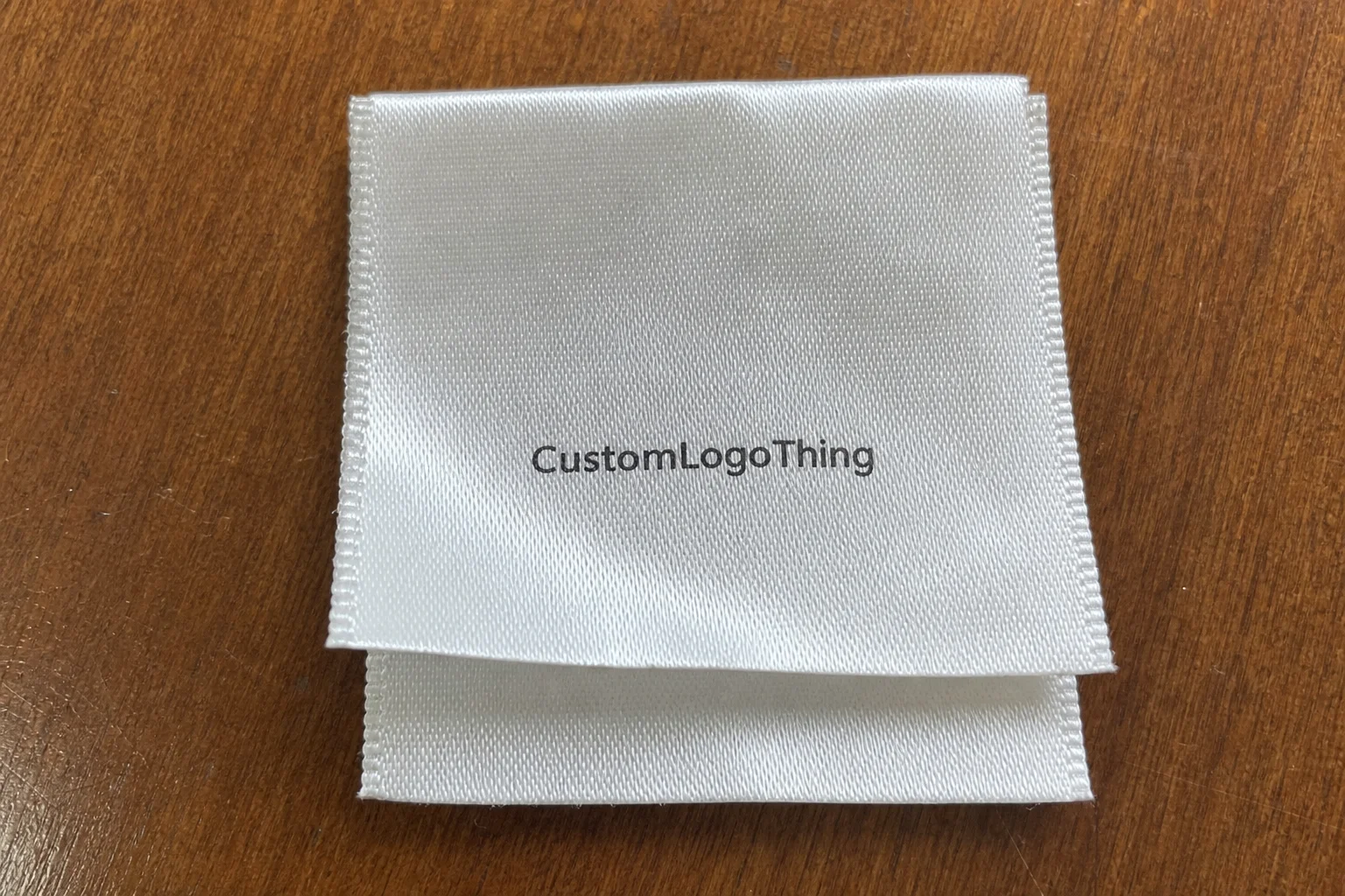
The label is often the first thing a buyer feels and the last thing they forget. If it scratches, wrinkles, or prints badly, the garment loses polish immediately. That is why choosing the right Satin Care Labels Manufacturer custom logo buyers can trust is not a minor sourcing decision. It affects comfort, compliance, and the way the brand is perceived after the box is opened.
Satin is popular because it gives a smooth hand feel and a cleaner surface for printed care information. It works well on necklines, waistbands, lingerie, kidswear, and many private-label apparel programs where the label touches skin. In practice, the label has two jobs: it has to be comfortable enough not to annoy the wearer, and durable enough not to fail after repeated washing.
That combination is harder to achieve than people expect. A woven label may look sharper in thread detail, but it can feel more structured. Cotton labels can suit a natural or heritage look, though they rarely match satin for softness. Heat-transfer labels remove the physical tag entirely, which is useful for some garments, but they are not always the best option when the text is dense or compliance requirements are strict.
Custom logo placement adds another layer. It is branding, but it is also part of the product’s visual system. A well-placed logo on satin can make a garment feel finished. A cramped one, or one with poor contrast, makes the whole item look rushed. That is especially true if the label sits near hang tags, tissue, or Custom Packaging Products; those pieces need to feel like they belong to the same product line.
“A label should be soft in wear, clear in the wash, and quiet in the garment. If it does the opposite, the branding is working against the product.”
For buyers, the target is straightforward: legible care text, a clean logo, soft touch, and print that survives normal laundering. Good satin care labels do not call attention to themselves for the wrong reasons. They just do their job and stay out of the way.
How satin care labels are made and why the print method matters
A satin care label usually starts with polyester-based satin tape or sheet material. Polyester is used so often because it handles print well, resists distortion better than many softer substrates, and stands up to routine washing. The label is then printed, cut, folded if needed, and finished into its final format: center fold, end fold, loop fold, or flat cut.
The print method changes the finished result more than most buyers realize. Thermal transfer printing is common for care information because it can keep small text and symbols readable. Screen printing works well for bold logos and limited color layouts, especially on larger label formats. Digital printing can handle more complex artwork, but it is not always the most economical option for simple care text. A satin care labels Manufacturer Custom Logo buyer should ask how the print is fixed or cured, because that affects wash resistance and edge sharpness.
The material finish matters just as much as the print method. Softer satin usually feels better against the skin, but lower-grade stock can fray at the edge, curl after cutting, or let the ink lose clarity after laundering. Better satin tends to have tighter weave consistency, cleaner cut edges, and less fiber lifting. That matters on neck labels, kidswear, and activewear, where repeated friction is unavoidable.
Logo complexity is another trap. Fine lines, tiny type, and detailed care symbols may look perfect on a PDF and still fail once reduced to label size. A symbol that reads clearly at 100% on a screen may become too tight on a 15 mm label. Good manufacturers usually push back on overpacked artwork. That is not resistance for its own sake. It is a practical warning that the label will be hard to read or harder to produce.
Finish choices also affect readability. A matte satin reduces glare and can make small text easier to scan. A more lustrous satin can look richer, but strong reflection may interfere with fine print. End folds suit side seams. Center folds are common for neck placement. Cut-edge labels can create a minimal look, but the edges need careful finishing to avoid irritation or curling.
If your brand also orders Custom Labels & Tags, it helps to keep the spec language aligned across styles. That keeps the product line consistent and reduces the chance of a label family that feels pieced together from different suppliers.
Pricing, MOQ, and quote math for custom logo labels
Pricing for a satin care labels manufacturer custom logo order depends on more than just size. Quantity, label dimensions, print method, number of colors, fold style, finishing, and rush timing all affect the final number. Quantity usually carries the most weight. Smaller runs cost more per piece because setup work is spread across fewer labels. Manufacturing still obeys math, even when buyers hope it will not.
For budgeting, a basic custom satin care label can fall around $0.05-$0.18 per unit at higher volumes, depending on the spec. Lower quantities often move into the $0.18-$0.45 per unit range, especially if the order uses a special fold, variable text, or slower custom setup. High-detail or multi-pass printing can cost more. The cheapest quote often leaves something out: durability, finish quality, or a fee that appears later on the invoice.
| Order type | Typical MOQ | Common unit price range | Best for |
|---|---|---|---|
| Standard satin care labels | 1,000-3,000 pcs | $0.08-$0.22 | Established apparel lines, repeat styles |
| Small-batch custom logo labels | 300-1,000 pcs | $0.18-$0.45 | Launches, boutiques, limited runs |
| High-detail or multi-color labels | 1,000+ pcs | $0.12-$0.35 | Complex branding, mixed content, premium finish |
MOQ is not arbitrary. It reflects setup time, material usage, and machine changeover. A lower MOQ helps when a brand is testing a style or launching a capsule line, but the unit cost rises quickly. For a core retail program, larger quantities usually make more sense once the design is stable.
Hidden costs deserve attention. Artwork cleanup can add fees if the logo is a low-resolution JPG instead of a vector file. Extra revision rounds may be billed if the first proof keeps changing. Shipping is easy to overlook on lower-value orders. If you split sizes, colors, or styles across multiple SKUs, the quote can change because each variation adds setup or handling time.
Comparing quotes only works if the specs are identical. Same material. Same size. Same fold. Same print method. Same quantity. Otherwise the comparison is meaningless. A lower quote on a thinner satin with a looser print process is not the same product. It only looks cheaper on paper.
Production steps and turnaround: from artwork to boxed shipment
A solid production process should be simple to follow. The buyer sends artwork and specifications. The manufacturer sends a proof. The buyer approves it. Production begins, labels are printed and finished, then they are counted, packed, and shipped. The process becomes messy only when the artwork is unclear or the approval chain drags on.
The usual sequence is predictable:
- Artwork submission — logo file, care text, dimensions, fold style, and color target.
- Proofing — the manufacturer prepares a digital mockup or production proof.
- Revision — font size, spacing, and symbol placement are adjusted if needed.
- Sampling — optional, but useful for first orders or fine-detail branding.
- Production — printing, cutting, folding, and finishing.
- Packing and shipment — usually boxed in counted bundles for easy receiving.
Delays usually happen before production, not during it. The most common causes are low-resolution logos, missing fiber content or origin text, unclear care symbols, and slow proof approval. If the manufacturer has to guess at the text, the timeline stops. That is not a factory problem. It is a specification problem.
Typical turnaround fits a few ranges. Standard runs often take 12-15 business days after proof approval. Rush orders can land in 5-8 business days, but only when the artwork is simple and the line has room. More customized jobs, especially those with multiple folds or special finishing, can take 2-4 weeks. Faster schedules leave less room for complexity, revision, and rework.
To keep the order moving, send a complete spec sheet from the start:
- Vector logo file, ideally AI, EPS, or PDF
- Exact label dimensions
- Fold preference
- Care text and compliance text
- Quantity by style and size
- Color target or Pantone reference if needed
A serious manufacturer should also flag font size, symbol legibility, and wash durability before production begins. That is part of quality control. It should not be treated like a premium add-on. If your packaging system includes other branded pieces, it is better to keep the label spec in step with the rest of the presentation instead of letting it drift from season to season.
For shipping and storage, plain carton packing is usually enough for labels, but moisture and crush protection still matter. These products are not freight-tested like pallets of finished goods, yet a damp carton or badly packed box can still ruin a label run. For broader transport testing references, ISTA is a useful standard-setting resource.
Choosing the right satin finish, size, and fold for the garment
Label size should match the garment, not the mood board. Tees usually work with compact labels around 40 x 15 mm to 60 x 20 mm. Lingerie and kidswear often need a softer hand feel and less visual clutter. Outerwear and workwear can handle larger labels because they often carry more compliance text and can tolerate a slightly firmer build. Too large looks bulky. Too small becomes unreadable.
Fold style affects comfort and visibility. Center folds are common for neck placement because they sit neatly and keep the logo visible. End folds work well in side seams and hems. Loop folds are useful on garments that need a hanging or attached tag format. Flat cut labels are flexible and simple, but the edges need careful finishing so they do not irritate the wearer.
Contrast should be treated as a functional choice, not just a design one. White-on-black reads clearly and can look strong. Black-on-white is often the safest route for care text. Custom color branding can work, but pale ink on pale satin creates a readability problem for no practical gain. The label may look refined in a sample photo and fail in the hand.
Soft-hand priority matters most on skin-contact apparel. If the label goes on a tee collar, underwear, babywear, or activewear, comfort needs to come first. If it goes on workwear or a garment that gets heavy laundering, durability may matter more. Many buyers get the order wrong and regret it later. A useful ranking is comfort first, legibility second, styling third. That sequence prevents most obvious mistakes.
A simple sizing rule helps: if the garment is small, keep the label compact. If the care content is long, use a larger format or split the information into multiple panels. Trying to fit too much into one tiny label usually produces microscopic type, weak hierarchy, and an unhappy customer squinting at the seam.
Common mistakes that make custom logo care labels look cheap
The fastest way to make a satin label look low-end is to overload it. Too much text. Too many symbols. Too little spacing. The eye has nowhere to rest, so the label feels cluttered even if the print itself is clean. If a brand needs a lot of compliance information, it should format it properly instead of trying to cram six functions into one small strip.
Bad file prep creates another layer of trouble. Raster logos, thin strokes, tiny type, and fuzzy edges can survive a phone screen and still fail in production. Vector files are the safer choice. So are stronger font weights and cleaner line work. If the logo depends on hairline details, the label needs enough size and print precision to support them. Otherwise the mark will break up or disappear.
Compliance is where many brands cut corners and pay for it later. Care instructions, fiber content, country of origin, and size markings may all matter depending on the market and product category. Ignoring those details can create relabeling costs, shipping delays, or a batch that cannot move forward. That is paperwork, yes, but paperwork with consequences.
Material grade matters more than buyers usually admit. A cheap satin can scratch, curl, or show wear after laundering. Better-grade satin holds shape and print clarity more reliably, especially when the label is folded and stitched into garments that get packed, unfolded, washed, and worn repeatedly. If your outer packaging is premium, the internal label should not be the weak point.
Another common mistake is approving a proof that looks fine on screen but fails at actual size. Screens hide spacing problems and make tiny type look more legible than it really is. Always review the proof at the real dimensions. If the label is 50 mm wide, view it at 50 mm wide. That sounds obvious. It still gets missed.
For brands that want visual consistency across labels, hang tags, and mailers, a stable style system helps. It keeps package branding coherent from one season to the next and reduces the odds of a product line that looks assembled from unrelated parts.
Expert tips for placing, testing, and scaling your label order
Test one sample or production-quality proof on the actual garment before placing a full run. Not on paper. Not on a render. On the same fabric, sewn or applied the way it will be used in production. That tells you how the label sits, whether the print holds, and whether the edges feel right against skin.
Keep a small buffer. Ordering 5% to 10% extra is often sensible if the labels will be used across multiple SKUs or size runs. A few pieces will always be lost, damaged, or miscut. A buffer also helps when a reorder is needed sooner than planned, which tends to happen right when inventory is already tight.
Standardize the spec whenever possible. Same size. Same fold. Same satin grade. Same print method. That reduces confusion and makes reordering easier. Changing the spec every season to “see options” can be expensive in hidden ways: more proofing, more risk of mismatch, and more chances for a label to drift away from the rest of the line.
Match the label to the rest of the presentation. Neck print, hang tag, folding method, tissue, and outer carton all influence the perceived value of the garment. If the product line uses clean branded packaging and well-designed custom printed boxes, the satin label should support that same level of finish. If the internal label feels flimsy or noisy, the whole system feels less controlled.
A clean spec sheet is still the best tool you can use:
- Label size and fold
- Satin finish preference
- Logo file format
- Approved care text
- Quantity and reorder expectation
- Color targets and placement notes
For sustainability-minded brands, it can help to review the broader packaging chain even if the satin label itself is synthetic. The FSC remains a useful reference for paper-based packaging sources when outer cartons, inserts, or hang tags are part of the same order. The label may be a small part of the garment, but the buyer experiences it as part of one system.
FAQ
What should I send to a satin care labels manufacturer for a custom logo order?
Send a vector logo file, label size, fold style, quantity, color preference, and the exact care text. If compliance details apply, include them from the start so the proof is usable the first time. A clear spec sheet usually cuts revisions and shortens turnaround.
Are satin care labels better than woven labels for custom logo branding?
Satin is usually softer and smoother against the skin, which makes it a strong option for neck and waistband placement. Woven labels can feel more structured and sometimes more premium in a visual sense, but satin often wins when comfort and readable print matter most. The right choice depends on the garment, wash frequency, and the branding style you want.
How much do custom satin care labels usually cost?
Price depends on quantity, label size, print method, fold style, and color count. Lower quantities cost more per label because setup fees are spread across fewer pieces. The cheapest quote is not always the best one if it hides poor print quality, weak durability, or extra charges later.
What is the usual turnaround time for satin care labels with a custom logo?
Turnaround depends on proof approval speed, quantity, and whether the order is standard or rush production. Delays usually come from artwork fixes and late approvals, not the print run itself. A manufacturer with a clean process should give a realistic date after the proof is approved.
How do I avoid a logo or care label proof that looks good online but fails in production?
Check the proof at actual size, not only zoomed in on a screen. Make sure small text, care symbols, and fine lines still read clearly on satin. Ask for a sample or production-quality mockup when the label includes tiny details or strict branding requirements.