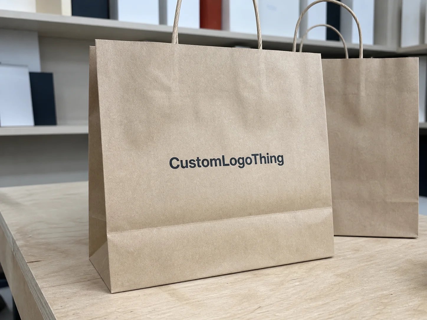
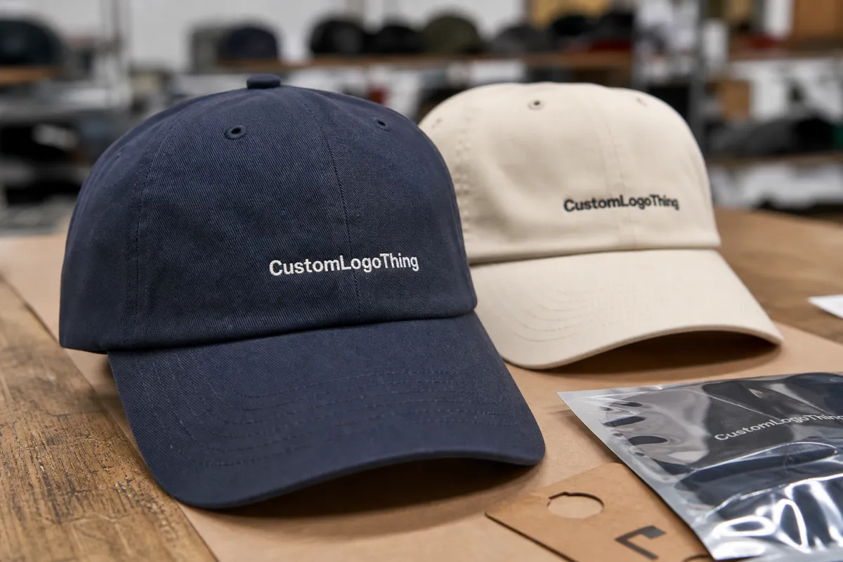
Screen Printing for Ecommerce Hats: What to Order First
Screen printing for ecommerce hats looks simple on paper, then the first proof comes back and the practical limits show up fast. A cap front is small, curved, interrupted by seams, and often less forgiving than the art board suggested. A logo that feels balanced on a monitor can feel crowded on a crown, and a placement that looked centered in a mockup can shift once the blank is seated in the press.
That is why hat programs need a different mindset than tee programs. The print has to hold its shape through packing, shipping, returns, and real wear, while still looking clean enough to carry a product page. In ecommerce, the hat is already being judged before it leaves the warehouse, so the print needs to survive a close inspection under bright light and a photo taken from arm's length.
The best results usually come from simple artwork, a stable blank, and a production plan that respects the shape of the cap instead of fighting it. A bold one-color logo on a structured front panel can look excellent. A crowded, multi-layer design can turn into a fight over legibility, opacity, and placement, and that fight is usually expensive.
Why Screen Printing for Ecommerce Hats Feels Different Than Tees
A tee gives you room to breathe. A hat does not. On a shirt, a logo can sit across a broad chest area with enough margin around it to hide a minor shift or soften a slightly imperfect edge. On a cap, the print zone is smaller, the curve is stronger, and the human eye notices errors faster because the decoration sits high and front-facing.
That is the first reason screen printing for ecommerce hats is its own discipline. The second is how customers actually encounter the product. A hat shows up in product photography, then again in unboxing, then again every time it is worn. If the print is off-center by even a small amount, or if the ink lays a little too heavy, the flaw stays visible. The same design on a shirt might pass. On a hat, it feels deliberate.
For simple branding, screen printing can be the right method more often than buyers expect. A clean spot-color logo on a structured cap can read clearly, cost less than textured decoration, and repeat well across replenishment orders. That repeatability matters in ecommerce, where hero SKUs need to look the same in the second production run as they did in the first.
The mistake many buyers make is treating the cap like a tiny billboard. It is not. The strongest hat graphics usually work with the crown shape rather than pretending the front panel is flat cardboard. Bold shapes, thicker strokes, and fewer tiny elements usually print better and photograph better. Small detail can survive on a screen and disappear on fabric.
There is also a practical production reason to keep the design simple. Hats are often printed with separate cap platens, magnetic or clamp-style fixtures, and slower handling than tees, which means every extra color, every extra screen, and every extra point of registration adds labor. A one- or two-color design keeps the job cleaner, and cleaner jobs tend to hold up better in a fulfillment environment where speed matters.
How the Hat Printing Process Works From Screen to Cure
The process starts with art, not ink. A hat logo needs to be scaled for a small front panel, cleaned up for bold edges, and separated in a way that respects the number of colors the blank can carry. For most ecommerce cap orders, a spot-color build is the practical choice. Full CMYK imaging can work in some decoration contexts, but on a curved hat front it often loses the crispness buyers want.
In a typical shop workflow, the first step is a digital mockup for placement and scale, followed by a physical strike-off on the actual blank or a close fabric match. Many programs use a one-piece pre-production sample before bulk approval, and that sample should be checked under the same lighting used for final QC. If the artwork includes small letters, thin outlines, or fine halftones, the printer may recommend thicker line weights, a reduced color count, or a simplified fill to keep the result readable on a 5- to 6-inch decoration zone.
Once the art is approved, the shop burns screens and sets the job on cap-specific equipment. That fixture matters. A cap front needs support so the panel does not flex or drift while the squeegee passes. If the hat is not seated correctly, the print can float off center, stretch on one side, or lose the clean shoulder that separates a professional run from a rushed one.
Most shops will use mesh counts in the 156-230 range for spot-color cap work, with finer detail sometimes moving to 230-305 mesh depending on ink viscosity and target opacity. A cap platen, index press, or manual rotary press with a molded hat fixture helps keep the crown stable. For the ink system, plastisol is common because it builds opacity well and can hold a bold edge, especially on darker caps. Low-cure formulas are useful on polyester blends and some performance styles, since they reduce the risk of heat distortion and dye migration. Foam-front truckers can print well, too, but the surface needs enough control to avoid a thick, bulky result that sits on top of the fabric rather than into it.
Curing is the final checkpoint, and it is not a step to rush. A print that looks fine coming off the press can still fail if the ink is undercured. On hats, that failure often shows up during folding, bagging, or shipping, when the front panel gets flexed and the ink starts to crack or scuff. Good shops test cure with a wash or rub check, not just a quick visual pass. For plastisol, many programs target a cured film temperature in the 320-330 F range, while low-cure systems may be formulated to fuse at lower temperatures depending on the garment and ink spec.
Quality control should include alignment, opacity, edge sharpness, and how the print behaves against the fabric grain. Practical checkpoints usually include a first-article approval at press start, an in-process check every 50-100 pieces, and a final carton check before packout. If the order uses organic cotton blanks, certifications such as GOTS and OEKO-TEX Standard 100 are relevant for the blank material; for recycled polyester, GRS can matter; and if the factory or assembly site is audited, WRAP or BSCI status can support social compliance expectations. Those certifications do not guarantee print quality, but they do help buyers match the blank and production chain to their sourcing requirements. If you want a broader reference for packout and transit stability, the standards and resources at ISTA are useful for understanding why durability testing matters once a product leaves the press.
The cleanest hat jobs usually start with the simplest art and the most disciplined proof.
A strong mockup saves more money than a fast press run. It gives the buyer and the production team a chance to catch weak line weights, awkward placement, and color combinations that looked better on a screen than on a crown. A good sampling plan usually goes like this: digital proof in 24-48 hours, physical sample in 5-10 business days, then bulk approval after the actual blank, threadline, and print position are confirmed. Once the first hundred hats are printed, those mistakes get expensive.
Hat Style, Fabric, and Placement Choices That Change Results
Structured caps usually print cleaner because the front panel holds its shape under the press. The added body gives the ink a more stable surface and helps the logo stay centered. Unstructured hats can still work, but the softer crown moves more, which makes the decoration feel less precise unless the design is deliberately sized for that style.
Panel count changes the visual field, too. A six-panel cap often gives the printer more predictable front-panel real estate, while a five-panel style can offer a flatter presentation but may bring the center seam into a more sensitive spot. The wrong artwork on the wrong cap style can look cramped even if the print itself is technically perfect.
Fabric choice affects ink behavior. Cotton twill is a familiar, forgiving surface with a classic hand feel. Brushed cotton and garment-washed cotton can soften the look but may need tighter registration because the nap is less uniform. Polyester blends can be more demanding because they react differently under heat, and darker synthetics may need a bleed-resistant underbase or low-cure chemistry to avoid dye migration. Foam fronts are excellent for bold graphics, but they do not reward overbuilt artwork. A heavy ink film can make them look stiff instead of premium.
Placement is where ecommerce hat programs either look clean or drift into average territory. A logo too close to the seam feels crowded. A logo too low can disappear under the brim in photos. A logo too large can flatten the front panel visually and make the cap feel like a promo item instead of a retail product. Most front-panel marks land well in the 2.25-3.25 inch tall range for standard retail caps, with wider marks adjusting to the panel width rather than forcing a fixed size across every style. The design has to be made for the hat first, not resized from a shirt graphic and hoped into place.
Color contrast matters just as much. Light ink on a dark cap can photograph beautifully if the ink is opaque enough to hold its edge. Dark ink on a light cap often feels sharper at a glance, though it still needs enough scale to read on a phone screen. For screen printing for ecommerce hats, the design has to work in person, in photos, and in motion. That combination is what makes the choice feel harder than it looks.
Crown height also changes the way the final product sells. Lower-profile hats sit closer to the head and often show less printed area in a lifestyle photo, while mid- and high-profile caps provide more front-panel visibility but can exaggerate any placement error. If you are ordering blanks that need a sustainability story, it is worth matching the fabric to the claim: organic cotton with GOTS support, recycled polyester with GRS documentation, or a finished blank with OEKO-TEX Standard 100 confidence for restricted substances. The better the match, the fewer surprises at receiving.
Cost, Pricing, and Unit Economics for Small and Large Runs
Hat screen printing pricing usually moves in layers: blank cost, print setup, decoration labor, sampling, and freight. For small runs, the economics can look high because the same setup time gets spread over fewer units. For a 50-100 piece run, a common retail-ready range is $6.50-10.00 per unit depending on blank quality and print complexity. At 250 MOQ, many one-color cap programs land around $3.50-5.50 per unit. At 500 MOQ, a practical target is often $2.50-4.00 per unit. At 1,000+ units, especially on a standard cotton twill blank with a one-color front print, some programs can drop into the $1.80-3.25 range before freight and duties.
Setup and sample charges are worth planning separately. Screen setup can run $25-75 per color on simple jobs and more if the artwork requires special screens or extra proofing. Physical samples often cost $25-50 plus shipping, and rush samples can be higher. If the decoration includes a second placement, a puff ink effect, metallic ink, or a specialty underbase, the price usually moves up because the press cycle is slower and the reject risk is higher.
Blank choice has a large effect on margin. A standard 100% cotton cap is usually the easiest starting point. Branded retail-grade caps, garment-washed fabrics, and specialty recycled or organic blanks tend to cost more but can support a higher selling price. If the blanks are certified, buyers should request the actual scope documents rather than relying on a logo on the product page. GOTS, OEKO-TEX Standard 100, GRS, WRAP, and BSCI each answer different sourcing questions, and a factory may hold one but not the others.
For ecommerce sellers, the real metric is not just piece price. It is landed cost plus defect rate plus replenishment speed. If a supplier quotes a very low unit price but misses color consistency or needs a high reorder minimum, the hidden cost can erase the savings. A slightly higher unit cost with a stable 18-22 business day production window, predictable inspection checkpoints, and clean reorders often performs better over the life of the SKU.
If you are buying at scale, ask for a full cost breakdown: blank, print, packaging, carton count, label application, sample fee, and freight estimate. That lets you compare suppliers on the same basis instead of comparing a low headline price to a fully loaded offer. For high-volume drops, unit economics often improve when the factory can consolidate screens, keep the same ink system across runs, and avoid moving the artwork between multiple production lines.
Production Steps, Lead Time, and Turnaround Expectations
A realistic hat order moves through a few predictable stages. First is quoting and artwork review, usually 1-2 business days if the spec is clear. Next is sample approval, which can take 5-10 business days if a physical cap sample is needed. After approval and deposit, bulk production commonly takes 18-22 business days for a standard one-color run, longer if the order includes multiple colors, specialty inks, or mixed blank styles. Shipping then adds 3-7 business days domestically or longer if the inventory is moving internationally.
The first production step is blank receiving and inspection. The factory should check panel count, fabric weight, crown height, brim shape, seam symmetry, and color consistency before the print line starts. A simple cap spec sheet helps here: panel style, material composition, target decoration size, thread color if embroidery is involved elsewhere in the line, and packaging requirements. If the caps are sourced from a certified program, documentation should be matched to the PO so the right lot is used.
Next comes pre-press. The shop confirms artwork size, confirms screen mesh, and locks down the ink formula. For polyester or blend caps, that may include a dye-migration-resistant underbase and a lower cure profile. The press operator should approve a strike-off before the run goes live, because a 1-2 mm shift on a cap can be visible in retail photography.
During the run, inspection is usually a mix of visual review and handling tests. Good checkpoints include print registration, underbase opacity, edge definition, ink pickup on the crown, and cure performance after cooling. Many shops also check every carton for count accuracy, polybag condition, barcode placement if used, and any crushed crowns or deformed brims before shipment.
Final packout should protect the hat shape. That usually means stacking with inserts or using nesting logic that prevents the front panel from flattening. If the order is retail-ready, the last checkpoint is label accuracy, carton count, and outer case marking. For ecommerce, the last mile is part of the product, so a clean packout matters as much as the print itself.
Step-by-Step Ordering Guide for Online Hat Sellers
Start by choosing the hat style before you finalize the graphic. A six-panel structured cotton twill cap, a five-panel foam trucker, and a low-profile washed cotton dad cap all behave differently in print. If the artwork was built for a wide flat front, the right blank can save the design; if the artwork is already small and dense, you may need to simplify it before quoting.
Second, request a mockup that shows actual decoration size in inches, not just a centered logo on a stock photo. A useful mockup includes front-view placement, panel seam reference, and at least one colorway on a dark cap and one on a light cap. This is where the buyer should ask for line-weight changes, knockouts, or an ink-opacity adjustment if the artwork is thin or detailed.
Third, confirm MOQ, sample policy, and lead time in writing. For many programs, MOQ starts around 50-100 pieces for a test run, 250 pieces for more price-efficient buying, and 500+ pieces for the best unit economics. Ask whether the first sample is a digital proof only, a physical strike-off, or a production-equivalent preproduction sample. Those are not the same thing.
Fourth, lock the quality standard before bulk starts. Define acceptable alignment tolerance, color tolerance, and surface finish. For example, a simple cap program might allow no more than 1-2 mm placement drift, no visible ink cracking after a bend test, and no smudging, pinholes, or exposed underbase on the front panel. If the cap is meant for retail shelves, the bar should be higher than if it is meant for a promo campaign.
Finally, plan reorder logic. Ecommerce winners usually keep the same blank, same print size, and same ink spec across replenishment runs so the product page and the inventory stay consistent. If you change the blank, update the product photo and the packaging spec at the same time. That avoids the mismatch that happens when a returning customer receives a slightly different cap than the one they saw online.
Common Mistakes That Cause Weak Prints or Rejected Goods
The most common mistake is overdesigning the front panel. Small text, thin outlines, and busy gradients can look sharp in digital art and muddy on a curved cap. If the logo needs more than two colors to read, ask whether the design can be simplified without losing identity.
The second mistake is skipping a physical sample. A proof on screen does not show how the ink sits on a crown, how the seam interrupts the shape, or whether the cap fabric drinks up too much detail. A sample catches those issues before the full order is locked.
The third mistake is using the wrong ink system for the blank. Standard plastisol can work beautifully on cotton twill, but some polyester caps need low-cure chemistry, an anti-migration underbase, or a different mesh and flash schedule. If the shop ignores fabric composition, the result can be ghosting, dull color, or poor adhesion.
The fourth mistake is weak inspection. If the shop only checks the first and last hats, small shifts can pass through the middle of the run. A better process includes start-up approval, mid-run sampling, and post-cure testing for abrasion and flex. That matters because hats are handled by the brim, crushed in shipping, and worn in ways that expose weak ink film quickly.
The fifth mistake is treating lead time as a guess. Good orders include sample time, bulk production, carton sealing, and freight in one plan. If you need the hats for a launch date, place the order early enough to absorb a reprint, a sample correction, or a shipping delay without missing the drop.
Expert Checks and Next Steps Before You Place the Order
Before you place the order, confirm three things: the blank specification, the print specification, and the quality standard. If the hat is organic cotton, request the certification trail. If it is recycled polyester, ask for the GRS paperwork. If the factory promotes WRAP or BSCI compliance, make sure you understand whether that applies to the production site, the sewing line, or the broader supply chain. The documents should match the actual order.
Ask for a sample workflow that matches your risk level. A low-risk reorder might need only a digital proof and one color swatch. A new launch should usually include a physical sample, a cure test, and a final preproduction approval on the exact blank. If the cap has a special print effect, such as puff, metallic, or high-opacity white on a dark crown, insist on a real strike-off rather than a mockup alone.
Request the inspection checkpoints in writing: blank inspection before print, first-article approval, in-process checks every 50-100 pieces, cure verification, final count, and carton audit. If the supplier cannot describe those steps clearly, that is a signal to slow down.
From there, compare offers on landed cost, lead time, and repeatability. A slightly higher quote can be the better business choice if it comes with fewer defects, better documentation, and a more predictable 18-22 business day production window. For ecommerce, consistency usually beats chasing the cheapest unit price.
If you want the fastest path to a clean order, start with a one-color logo on a structured cotton twill cap, request a physical sample, and lock the spec before bulk production. That sequence gives you the best chance of hitting retail quality without paying for avoidable rework.
FAQ
What is the most practical MOQ for screen printed hats?
A useful starting point is 100-250 pieces for a first order, with 500 pieces often giving better unit economics. At 500 MOQ, many one-color programs land around $2.50-4.00 per unit before freight.
How long does production usually take?
For a standard run, expect 18-22 business days after sample approval and deposit. Add time for sampling, shipping, and any artwork revisions.
Which blanks are easiest to print?
Structured cotton twill caps are usually the easiest. Foam-front truckers and polyester blends can print well, but they often need more attention to ink choice and cure settings.
Which certifications should I ask for?
Use GOTS for organic cotton claims, OEKO-TEX Standard 100 for restricted-substance testing, GRS for recycled content, and WRAP or BSCI when you want social compliance documentation from the factory or sewing site.
What should a sample include?
At minimum, a physical strike-off on the actual blank, ink color confirmation, placement confirmation, and a cure check. If the order is new or technical, ask for an additional wash or rub test.