Buyer Fit Snapshot
| Best fit | Shipping Supplies Design That Cut Costs Fast projects where brand print, material claims, artwork control, MOQ, and repeat-order consistency need to be specified before quoting. |
|---|---|
| Quote inputs | Share finished size, material target, print colors, finish, packing count, annual reorder estimate, ship-to region, and any compliance wording. |
| Proofing check | Approve dieline scale, logo placement, barcode or warning zones, color tolerance, closure strength, and carton packing before bulk production. |
| Main risk | Vague material claims, crowded artwork, missing packing details, or unclear freight terms can make a low unit price expensive after revisions. |
Fast answer: Shipping Supplies Design That Cut Costs Fast: Material, Print, Proofing, and Reorder Risk should be specified like a repeatable production item. The safest quote records material, print method, finish, artwork proof, packing count, and reorder notes in one written spec.
Production checks before approval
Compare the actual filled-product size with the drawing, then confirm tolerance on folds, seals, hang holes, label areas, and retail display edges. Reserve space for logos, QR codes, warning copy, and material claims before decorative graphics fill the panel.
Quote comparison points
Review material grade, print process, finish, sampling route, tooling charges, carton quantity, and freight assumptions side by side. A quote is only useful when the supplier can repeat the same color, closure quality, and packing count on the next order.
Shipping supplies design tips are not about making a box “look nice.” They’re about stopping crushed corners, cutting dimensional weight by 12% to 18%, and keeping your order fulfillment team from cursing your name at 6:45 p.m. because the insert is 6 mm too short and the product rattles like a maraca. I’ve stood on factory floors in Shenzhen and Dongguan and watched a premium-looking carton fail an 18-inch drop test because the structure was designed for the mockup, not the product. Pretty on a screen. Useless in a truck. Classic. Also expensive, which is my least favorite kind of classic.
Honestly, a lot of brands treat packaging like a styling exercise when it’s really an engineering problem wearing a branded jacket. Shipping supplies design tips sit at the intersection of package protection, shipping materials, and speed. If your box, mailer, tape, insert, and label placement don’t work as one system, you’ll pay for it twice: once in production, once in returns. I’ve seen brands spend $0.42 more per unit on a stronger structure and save $1.80 in damage claims and replacement shipments. That math is not glamorous, but it is profitable. And yes, it makes the finance team weirdly cheerful for about eight minutes.
At Custom Logo Things, I’ve watched small ecommerce shipping brands, subscription boxes, and mid-market retailers burn money because nobody asked the boring questions early enough: What are the exact dimensions? How much crush resistance do we need? Which side gets the barcode? Those questions are the difference between a clean launch and a warehouse headache. Good shipping supplies design tips fix that before the first pallet shows up. I’m a big fan of boring when boring saves money, especially when a line item can swing $0.15 per unit across 5,000 pieces.
Shipping supplies design tips: why packaging fails so often
I remember a client who brought me a beautiful setup: matte black carton, silver foil logo, die-cut foam insert, the whole “premium” fantasy. On the desk, it looked like a $90 gift set. On the drop table in a plant outside Shenzhen, it failed hard. The insert was 6 mm too short, so the product shifted, hit the corner, and the first impact cracked the lid. That one mistake turned a polished prototype into a refund machine. This is exactly why shipping supplies design tips start with structure, not decoration. The customer never sees your render. They see the dented corner and the “why is this broken?” email.
Shipping supplies design is the system behind cartons, mailers, tape, inserts, labels, void fill, and dunnage. Not just “making it look nice.” If you’re only thinking about print, you’re ignoring half the job. A shipment can have perfect artwork and still arrive damaged because the board grade was weak, the insert flexed too much, or the tape seam popped in transit. I’ve seen that happen with everything from skincare in Los Angeles to hardware kits assembled in Ningbo. One factory manager in Guangdong literally tapped the seam and said, “This is decoration, not closure.” Brutal. Accurate.
The usual pain points are predictable. Crushed corners show up when the box is oversized and the product can move more than 10 mm inside the cavity. Returns spike when the packaging does not survive carrier handling from hubs like Dallas, Louisville, or Chicago. Wasted void fill appears when someone orders a carton 20 mm too big and then spends money stuffing kraft paper into the gap. Slow pack-out happens when assembly takes 90 seconds instead of 25. Higher freight charges hit when the package is bulky enough to trigger dimensional weight pricing. Shipping supplies design tips are basically a way to stop paying for bad decisions. The bill gets ugly fast when you multiply that by 3,000 orders a week.
The customer experience starts before the unboxing photo. It starts with protection. If the product arrives dented, your brand story is dead on arrival. A clean carton with proper package protection feels premium because it performs. A pretty box that arrives smashed feels cheap, even if you spent $1.20 on the print treatment. That’s the truth. Customers do not forgive transit damage because the logo was embossed. They just don’t. They take a photo, ask for a refund, and suddenly your “luxury” line is customer service’s problem. I’ve watched that happen on a Wednesday afternoon, and nobody looked happy.
Client line I still remember: “Our box looked expensive, but it shipped like a cheap one.” That was a $38,000 annual mistake disguised as branding.
The big idea behind shipping supplies design tips is simple: balance protection, speed, cost, and brand consistency. If one of those four is ignored, the whole system gets expensive. I’ve audited programs where a brand saved $0.06 on corrugate and spent $0.19 more on labor because the insert needed three extra folds and a prayer. That is not efficiency. That is self-sabotage with a logo on it. Cute? No. Profitable? Also no. In one case, the team spent an extra 14 seconds per unit just because the closure sequence was awkward.
How shipping supplies design works from box to doorstep
Good shipping supplies design tips follow a chain, not a vibe. First you measure the product. Then you choose the structural style. Then you select board or mailer material, print layout, insert design, assembly method, and shipping test protocol. If you skip a step, the whole thing gets shaky. I’ve visited plants in Shenzhen, Guangzhou, and Xiamen where the design team and the warehouse team had never spoken. The result was a carton that looked clean on a rendering and took 14 extra seconds to pack because the flaps fought the operator. If packaging had a grudge, that was it.
The workflow usually starts with exact product dimensions, including the ugly parts. Not “roughly 8 inches.” I mean 203 mm by 127 mm by 56 mm, with the cord tucked on the right side and a 12 mm label clearance zone on the top panel. That level of detail matters because one wrong assumption can throw off the whole fit. Shipping supplies design tips only work when the real object is measured, not the marketing sample. The sample always behaves. The actual product? Far less cooperative. The product on the production line is the one that matters, not the one photographed under softbox lighting.
Then comes structural choice. Corrugated board grades, mailer styles, tape strength, and cushioning types all play different roles in transit packaging. A lightweight apparel brand might be fine with a custom poly mailer. A candle company probably needs a rigid mailer or small corrugated shipper with an insert. A subscription kit with three bottles and a booklet needs a layout that keeps the bottles from kissing each other in the back of a truck for 900 miles from Pennsylvania to Arizona. Different products. Different physics. Same painful lesson if you ignore it.
Here’s where line speed enters the conversation. A design that protects beautifully but takes forever to assemble can cost more than a slightly heavier material. I had a warehouse manager in Ohio tell me, “I don’t care if it saves two cents if my team needs scissors, tape, and a second pair of hands.” Fair point. Shipping supplies design tips must respect order fulfillment reality. If a package adds 18 seconds per unit on a 2,000-unit day, that’s 9 extra labor hours. Try explaining that to payroll without watching someone stare into the middle distance. Or the ceiling. Same energy.
A practical process timeline looks like this:
- Brief and specs — product dimensions, weight, fragility, channel, and budget.
- Prototype — structural sample or mockup with real measurements.
- Sample review — check fit, protection, print placement, and pack-out flow.
- Artwork approval — confirm dielines, barcode zones, and tape areas.
- Production — finalize quantities, board grade, and finishing.
- Inbound receiving — inspect cartons and test a few before launch.
And yes, there are standards. If you’re shipping fragile goods, you should know about ISTA transit testing, ASTM performance methods, and FSC-certified board options when sustainability claims matter. The rules do not replace practical testing, but they give you a baseline. I’ve linked brands to the ISTA testing resources when they needed to stop guessing and start proving. That usually saves money, even if it bruises a few egos. Which, frankly, can be healthy. A little bruised ego is cheaper than a truckload of broken product.
Key shipping supplies design tips for cost and performance
The first shipping supplies design tips I give any brand are boring and effective: right-size the packaging, then strip out waste. A box that is 15 mm too wide on each side can increase board usage, void fill, and dimensional weight charges in one shot. If you ship 10,000 orders a month, that little mistake becomes real money. I’ve watched a simple carton redesign cut freight by $0.34 per order because the new size dropped the shipment into a better rate band on routes through Memphis and Louisville. That’s not sexy. It’s just profit. The kind finance notices and marketing pretends they planned.
Material tradeoffs matter too. Stronger board may seem more expensive, but it can reduce crush damage and replacement shipments. I once negotiated a shift from a thin single-wall board to a better-grade E-flute structure at $0.08 more per unit for a run of 8,000 pieces. The client panicked for exactly 11 minutes. Then we looked at the returns data and saw a 4.2% damage rate falling to under 1%. The math cleared itself up fast. Shipping supplies design tips are not about cheapest materials; they’re about lowest total cost. I’ll take a slightly pricier carton over a pile of damage claims any day, especially when the carton survives a 24-inch drop.
Print design has a cost footprint as well. One-color print is usually cheaper than full-color coverage. Flooded solids can drive up ink usage and raise the chance of scuffing in transit. Large black panels look sleek in a mockup, then show every rub mark after they slide across a pallet. I’ve had suppliers in Dongguan tell me straight up that a full flood coat added $0.11 to $0.16 per unit because of extra ink, slower drying, and tighter QC. That’s the sort of detail brands should ask for before approving artwork. Not after the first angry photo from the warehouse. A corrected proof is cheaper than a reprint, every single time.
Supplier negotiation is part of the job. If you’re buying cartons or mailers, get tiered pricing and ask about tool fees, print plate fees, and freight. I’ve had quotes from Uline, Packlane, Staples Business, and regional corrugators come back with wildly different structures. One vendor quoted $0.28/unit but buried a $650 tool charge. Another came in at $0.33/unit with no tooling and a two-week shorter lead time. The “cheaper” option was not actually cheaper. Shipping supplies design tips save you from fake discounts. The sticker price is usually the bait. The extra fees are the hook. I’ve seen freight from a factory in Foshan wipe out a lower unit price in one pallet move.
| Option | Typical unit price | Setup / tool fee | Best use | Notes |
|---|---|---|---|---|
| Standard stock mailer | $0.22–$0.48 | $0–$0 | Fast-moving ecommerce shipping | Good for common sizes, limited branding |
| Custom printed corrugated box | $0.55–$1.40 | $250–$900 | Brand-forward shipments | Better for package protection and presentation |
| Custom poly mailer | $0.14–$0.38 | $0–$450 | Apparel and soft goods | Lightweight, lower freight, less crush protection |
| Rigid insert kit | $0.30–$1.10 | $200–$800 | Fragile sets and subscription kits | Improves fit, adds material cost, saves damage claims |
Sustainability is also a cost factor, not just a marketing sentence. Recycled content, right-sized cartons, and fewer components often lower total spend. If you reduce the number of pieces in a kit from five to three, you may cut assembly time, carton size, and carton count in one shot. The EPA has useful information on waste reduction and packaging impacts at epa.gov. That’s worth reading before someone tells you every green choice costs more. Sometimes it does. Sometimes it doesn’t. Depends on the structure, the volume, and whether your warehouse crew hates the current design. In a lot of cases, the warehouse crew knows the truth before anyone else does.
Step-by-step shipping supplies design tips process
My favorite shipping supplies design tips always start with a boring audit. Count how many sizes you ship now. Measure damage rates. Track pack time per order. Look at average shipping cost per order, not just the sticker price of the carton. I once sat with a subscription brand that had nine carton sizes for 14 SKUs. Nine. Their warehouse looked like a geometry exam. We cut that to four sizes and reduced operator confusion, storage headaches, and shrink-wrap waste. Small change. Big relief. Also, fewer people muttering at the pallet racks, which is a nice side benefit.
Step 1: Audit your current system. Pull the last 90 days of order data. Track product dimensions, breakage, returns, carrier claims, and labor time. If you can’t measure it, you can’t improve it. That sounds obvious, but I’ve met more than one team that “felt” their packaging was fine while damage claims told a different story. Feelings are not a shipping metric. Sadly. A spreadsheet with real numbers from March through May will tell you more than a room full of opinions.
Step 2: Build a real spec sheet. Add exact measurements, weight, fragility level, brand expectations, and channel requirements. If you’re selling direct-to-consumer and wholesale, your shipping supplies design tips will differ because retail presentation matters more in one channel and pallet density matters more in the other. Include label zones, tape zones, and any warehouse constraints. If your team uses thermal printers, say so. If your pack station can’t handle odd-shaped inserts, say that too. Every missing detail becomes somebody else’s headache later. Usually mine.
Step 3: Choose the architecture. Carton, mailer, sleeve, insert, pouch, or multi-part kit. Each one changes cost and pack-out speed. For apparel, a branded poly mailer may be enough. For glass bottles, I’d look at a corrugated shipper with a scored insert and at least one cushioning layer. For electronics, the anti-static requirement might change the whole build. These are not cosmetic choices. They’re transit packaging decisions. Treat them like that and you’ll avoid a lot of post-launch regret. One bad choice can add $0.23 per shipment and a week of headaches.
Step 4: Prototype and test. Use real product weight. Real corner compression. Real shake tests. Real drop tests. I’m not interested in a sample that survives because the product was substituted with foam. Test the actual item, packaged the actual way. ISTA protocols are useful here, and so are honest shop-floor tests. If you can’t do a full lab sequence, do a practical simulation with 18-inch drops, edge drops, and a quick vibration check. I know it sounds a little unromantic. Packaging rarely cares about romance. Packaging cares whether the seam pops open in transit from Shenzhen to Los Angeles.
Step 5: Review artwork and assembly with operations. This is where a lot of shiny plans fall apart. The artwork looks clean, then someone notices the barcode is under the seam tape or the folding sequence forces the operator to flip the carton twice. I’ve watched a well-meaning designer add a full-bleed print on the exact tape area. Pretty. Expensive. Completely annoying in production. Shipping supplies Design Tips That ignore operations are decoration, not design. And decoration does not get your orders out the door. It just gets you a prettier problem.
Here’s a simple rule I use: if the packer needs to think, you’ve already lost time. Pack stations should be obvious. Fold lines should be readable. Inserts should orient one way, not four. Tape should land where hands naturally go. If you can reduce one decision per order, you’ll feel it in labor. That’s how order fulfillment gets faster without hiring three more people. Or without bribing the team with more coffee than is medically advisable. A 2-second savings per unit becomes serious money at 4,000 orders a day.
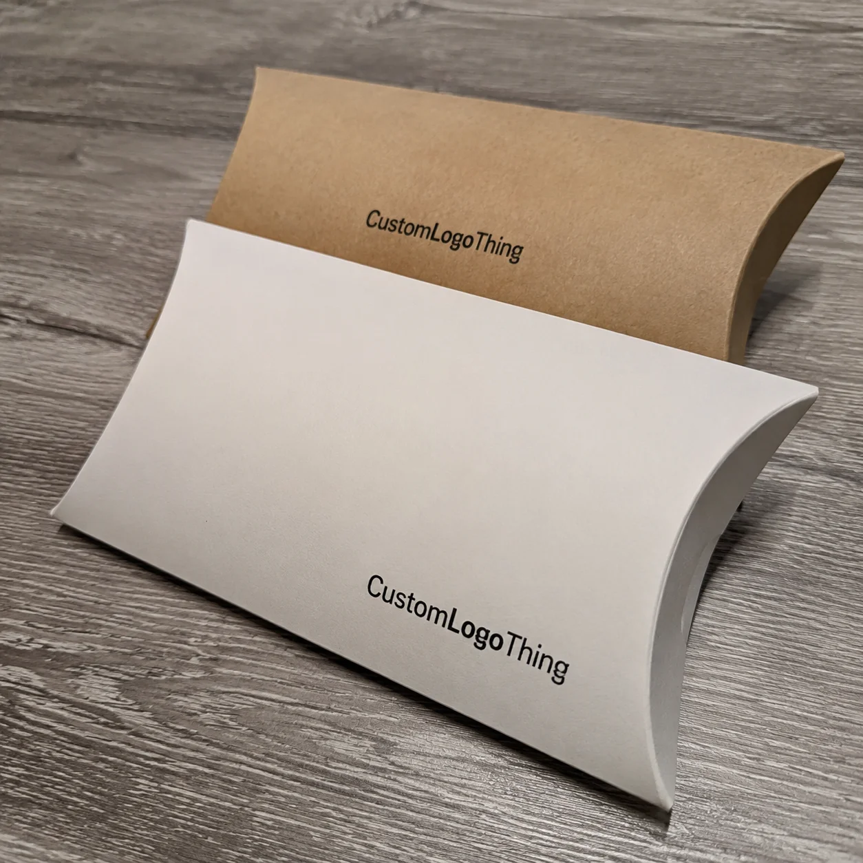
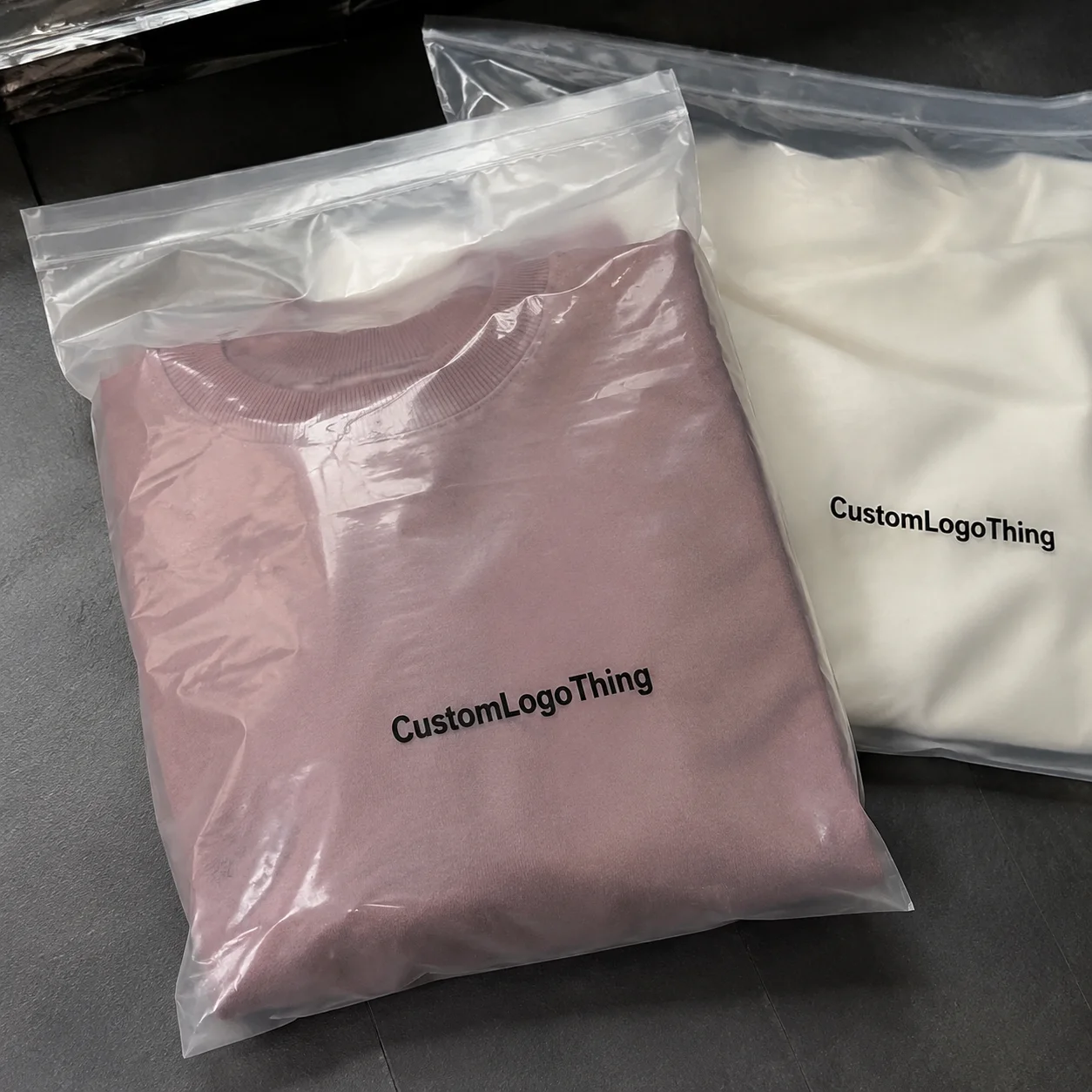
For brands that need a place to start, I usually recommend reviewing a broader mix of Custom Packaging Products so the shipping format matches the product, not the other way around. If the item is soft and lightweight, a Custom Poly Mailers setup might be enough. If the product needs crush resistance or retail-style presentation, Custom Shipping Boxes are usually the better move. That decision alone can save a week of back-and-forth with the supplier.
Common mistakes in shipping supplies design
The most expensive mistake is the oversized box. People choose it because they don’t want to remeasure the product, then they throw in bubble wrap, kraft paper, or air pillows to compensate. That is how shipping materials costs creep up. You pay for board you don’t need, filler you don’t want, and freight you didn’t budget for. I’ve seen a brand burn through $12,000 a quarter in void fill because someone wanted “a little extra room.” Little room, huge bill. I wanted to scream into a carton. Preferably a 32 ECT one, because if I’m going to be dramatic, I want the box to hold.
Another mistake is designing for the graphic mockup instead of the packing line. The render looks beautiful. The warehouse hates it. A lid that flips the wrong way, an insert that needs perfect alignment, or a tuck flap that catches on the product will create slow assembly and mistakes. One client had a fancy custom insert that required the operator to rotate the package three times before sealing it. Their line speed dropped from 42 units per hour to 27. That’s not branding. That’s a labor tax. And a very annoying one. At $18 per hour, the waste adds up fast.
Skipping test shipments is a classic. I don’t care how solid the sample looked on your desk. Ship it to Zone 5, Zone 7, and wherever your worst carrier handling tends to happen. Temperature changes, humidity, stacked pallets, and rough transfers all matter. I’ve seen cartons that looked perfect in the warehouse come back with scuffed corners and split seams after a cross-country trip in summer heat. Shipping supplies design tips only become real after transit. Before that, they’re just educated guesses in a nicer font. Testing to Denver, Miami, and Seattle will tell you more than a polished render ever will.
Premium finishes can also backfire. Soft-touch coatings, deep matte inks, and foil can look rich, but they can rub, scuff, or add cost without improving protection. If you’re selling a luxury item, that finish may be worth it. If you’re shipping consumables in bulk, maybe not. I’ve had to talk clients out of using a velvet-feel coating on outer shippers because the finish was adding $0.24 and showing abrasion after one pallet wrap cycle. Gorgeous. Fragile. Not worth the headache. I’m not against nice things. I’m against paying for nice things that arrive looking tired. That’s a bad combo in any warehouse in North America or Asia.
Label placement and barcode visibility are the sneaky problems. If the label sits across a seam, scanners miss it. If the tape crosses the barcode, fulfillment slows down. If the branding panel occupies the only flat space, the warehouse rep will curse your layout by Friday. I learned that the hard way during a supplier negotiation in Guangdong when the factory manager pointed at my own artwork and said, “Your label zone is decorative, not usable.” He was right. Annoying, but right. I still think about that when someone suggests “just move the barcode a little.” A little move can become a lot of scanning grief, especially when the receiving dock is moving 600 cartons an hour.
Finally, a lot of teams ignore tape zones. Tape needs a flat, predictable surface. If the substrate flexes or the print texture resists adhesion, your cartons open during transit. That’s a bad day. A box that fails at the seam makes the customer think the whole brand is careless. Good shipping supplies design tips always reserve clean closure areas, even if that means giving up a little visual space. A tiny blank strip is cheaper than a fully open box. And yes, the tape roll still needs a proper seal width, usually 48 mm to 72 mm depending on the carton size.
Expert shipping supplies design tips for faster pack-out
If you want faster pack-out, standardize more than you think you need to. I know, the branding team loves unique sizes. The warehouse does not. Standard carton sizes across your product line simplify inventory, reduce training time, and make it easier to forecast replenishment. I worked with a beauty brand in Los Angeles that went from 11 carton SKUs to 5. Their pack-out errors dropped, and their receiving team stopped playing Tetris with pallets. Shipping supplies design tips get more effective when your team can recognize a package at a glance. Familiar shapes move faster. Novelty slows everybody down.
Keep inserts symmetrical and easy to orient. If staff have to think about left side versus right side, you’ve added friction. I prefer designs that “self-align” with a natural fold or cut shape. The best inserts almost assemble themselves. A good operator should be able to look at a part and know where it goes without reading a manual. That might sound picky, but during peak season, those seconds matter. And the wrong insert orientation turns into a comedy sketch nobody asked for. I’ve seen one person flip a divider three times because the tabs were not obvious.
Visual cues help too. Arrows. “This side up.” Fold lines. Small glue tabs that make sense. I once toured a facility in Dongguan where the cartons had bold direction marks printed in the wrong panel because the designer assumed the box would only ever be handled one way. That lasted about two shipments. The carrier flipped the pallet, the box landed on its side, and the “up” arrow became a joke. Shipping supplies design tips need to survive reality, not ideal conditions. Carriers do not care about your mood board. They care about moving freight from A to B without thinking about your brand story.
Production timing belongs in the design brief from day one. If you approve artwork late, you’ll pay rush charges. If you forget plate lead time, you’ll beg for a faster slot. If you miss the inbound receiving window, the whole launch slips. I’ve seen a brand pay $780 in air freight just to rescue a launch because the cartons were approved four business days too late. That money could have funded a better insert or two sample rounds. Instead, it funded panic (which, shockingly, doesn’t improve packaging). In one case, the factory in Foshan needed 12-15 business days from proof approval just to finish and ship the first run.
Small operational upgrades make a bigger difference than glossy extras. Pre-taped options shave off a motion. Tear strips save time on opening. Right-placed glue tabs reduce assembly errors. A die-cut handhold on a larger box can make handling easier and reduce drops. None of these ideas are thrilling in a boardroom. All of them matter on a Tuesday when 1,400 orders need to leave the building. That’s when packaging either earns its keep or becomes a team sport nobody wanted. If the box saves even 3 seconds per unit, the warehouse feels it by lunch.
Here’s my blunt version of shipping supplies design tips for speed: remove choices from the packer. Remove unnecessary folds. Remove ambiguous orientation. Remove extra filler. Remove a second piece of tape if one good seal will do. The more obvious the package is, the faster your team moves. And yes, that also lowers the chance of a mistake under pressure. Less thinking. Fewer errors. More boxes out the door. Amazing concept, right? You’d be shocked how often this gets treated like radical thinking.
Shipping supplies design tips: next steps and rollout checklist
Here’s the rollout plan I use when a brand wants shipping supplies design Tips That Actually cut costs fast. Pick your top three shipping formats first. Not ten. Three. Maybe a mailer, a small carton, and a kit box. Build one prototype per format and compare damage, labor, and shipping cost. Then decide whether the savings come from sizing, material, insert design, or all three. If you try to fix everything at once, you’ll never know what worked. You’ll just end up with a long meeting and a bigger spreadsheet. I’ve sat through both, and only one produces something useful.
Use a vendor comparison sheet so decisions are comparable. I want material spec, MOQ, lead time, print cost, tool fee, freight, and payment terms on one page. If Vendor A is $0.29/unit with a 15,000 MOQ and Vendor B is $0.34/unit with a 5,000 MOQ, that is not a simple price comparison. It’s a cash-flow decision. That matters. Especially for smaller ecommerce shipping brands that do not want to sit on eight pallets of the wrong box. Storage space is not free, despite what people pretend in meetings. In Dongguan, I’ve seen one extra pallet rack become an argument for three weeks.
Set your timeline before launch. Sample approval, revisions, production, and receiving should all have dates attached. A lot of brands assume custom packaging behaves like stock inventory. It doesn’t. If you want current shipping supplies design tips to pay off, you need sample time. A basic carton can move quickly if specs are clean, but custom structures and printed prototypes can drag if approvals bounce back and forth. Delays happen because someone says “can we just make the logo 10% bigger?” and suddenly the dieline needs a second review. That request has probably caused more schedule damage than weather. I’ve seen a two-word change add five business days.
Measure success with boring metrics. Damage rate. Pack time per order. Shipping spend. Customer complaint rate. Reorder frequency. If the design is “better” but those numbers worsen, the project failed. Pretty packaging that costs more and performs worse is just expensive clutter. I say that with affection and a little sarcasm, because I’ve seen too many brands fall in love with their own mockups. The mockup is not the product. The pallet is. The warehouse data is the truth, not the presentation deck.
My personal rule is to test three things before full production: fit, survival, and speed. Fit means the product doesn’t rattle. Survival means it passes a real transit test. Speed means your team can pack it without improvising. If all three pass, you’re in good shape. If one fails, fix it before spending on volume. Shipping supplies design tips are only useful when they change your actual costs and your actual damage rate. Otherwise, they’re just nice talk. And nobody needs more nice talk. Not in a shipping lane, not in a supplier call, nowhere.
For brands ready to move, start with the packaging format that supports your product best, then refine the artwork and material around it. Review your Custom Packaging Products, compare Custom Poly Mailers and Custom Shipping Boxes, and build a short test plan with your warehouse lead. If you do that now, the next shipment will probably cost less, ship faster, and arrive looking like somebody actually planned it. Which, honestly, is the whole point.
Shipping supplies design tips are not about perfection. They’re about making smart, measurable choices that protect product, cut freight, and keep order fulfillment moving. I’ve seen brands waste thousands chasing fancy details while ignoring fit and board strength. Don’t be that brand. Start with the measurements, test the transit packaging, and approve only what saves money in the real world. That’s how shipping supplies design tips turn into actual savings. No drama, no mystery, just fewer broken boxes and fewer apologies. If you’re fixing one thing first, make it the fit. Fit drives protection, cost, and speed all at once, and that’s where the money usually hides.
FAQs
What are the best shipping supplies design tips for fragile products?
Prioritize snug sizing, corner protection, and inserts that stop movement inside the box. Then test drops from multiple angles, not just one flat fall, because the first impact often tells you whether the product shifts. If the item can move after the first hit, the design still needs work. Fragile products do not reward optimism. I’d rather see a carton fail in a test room in Shenzhen than on a porch in Phoenix.
How do shipping supplies design tips help reduce costs?
Right-sizing lowers Dimensional Weight Charges and reduces filler usage. Simple structures and standard sizes usually cost less to produce and pack. I’ve seen a carton redesign cut total shipping spend by more than $0.30 per order because the package fit better and needed less void fill. That’s the kind of boring math that keeps margins alive. Over 5,000 orders, that’s $1,500 back in the business.
What should I include in a shipping supplies design brief?
Add product dimensions, weight, fragility level, brand goals, pack-out method, and shipping environment. Include budget, required lead time, and any carrier or warehouse constraints. If your team uses thermal labels, specify that too, because label placement can make or break fulfillment speed. The more exact the brief, the fewer “surprise” revisions later. A good brief saves at least one round of sample changes, usually more.
How long does the shipping supplies design process usually take?
Basic mailers or cartons can move quickly if specs are clear and artwork is ready. Custom structures, printed prototypes, and approval rounds can add several weeks, especially if revisions are needed. Tooling, sample shipping, and supplier lead times can stretch the schedule if nobody manages the calendar closely. I’ve watched a one-line change turn into a two-week delay. Painful, but common. For a custom run out of Guangdong, 12-15 business days from proof approval is a realistic starting point.
Which shipping supplies design tips matter most for ecommerce brands?
Right-size the package, keep assembly simple, and test for real-world transit damage. Make sure branding does not interfere with labels, seals, or warehouse speed. For ecommerce shipping, the best designs protect the item, keep labor low, and avoid annoying your fulfillment team. If your box makes the packer sigh, fix the box. The best shipping supplies design tips for ecommerce are usually the least flashy ones.