Buyer Fit Snapshot
| Best fit | Sustainable Kraft Box Branding Ideas Better projects where brand print, material claims, artwork control, MOQ, and repeat-order consistency need to be specified before quoting. |
|---|---|
| Quote inputs | Share finished size, material target, print colors, finish, packing count, annual reorder estimate, ship-to region, and any compliance wording. |
| Proofing check | Approve dieline scale, logo placement, barcode or warning zones, color tolerance, closure strength, and carton packing before bulk production. |
| Main risk | Vague material claims, crowded artwork, missing packing details, or unclear freight terms can make a low unit price expensive after revisions. |
Fast answer: Sustainable Kraft Box Branding Ideas Better: Board, Finish, Dieline, and Unit Cost should be specified like a repeatable production item. The safest quote records material, print method, finish, artwork proof, packing count, and reorder notes in one written spec.
Production checks before approval
Compare the actual filled-product size with the drawing, then confirm tolerance on folds, seals, hang holes, label areas, and retail display edges. Reserve space for logos, QR codes, warning copy, and material claims before decorative graphics fill the panel.
Quote comparison points
Review material grade, print process, finish, sampling route, tooling charges, carton quantity, and freight assumptions side by side. A quote is only useful when the supplier can repeat the same color, closure quality, and packing count on the next order.
Sustainable Kraft Box Branding Ideas That Sell Better
A plain kraft box can stop a shopper faster than a shelf full of glossy cartons, especially in a category aisle where a 120 ml serum, a 90 g bar soap, and a 250 g snack pouch are all competing for the same three seconds of attention. I remember standing in a Chicago skincare review with two serum boxes on the table: one built from 350gsm C1S artboard with a soft-touch film, the other made from 300gsm recycled kraft with a restrained one-color mark and a 2 mm deboss. Same formula, same $28 retail price, same 30 ml fill on the label. The kraft sample won the room because it felt more honest, more grounded, and less desperate to impress. That is the real promise behind sustainable kraft box branding ideas. They are not just about putting a logo on brown board; they shape structure, typography, finish, and the feeling a customer gets before the lid even lifts.
I still meet brands that treat packaging as the last decorative layer to be added after product and pricing are already locked. Frankly, that sequence causes headaches in nearly every launch I have seen from Brooklyn to Bristol. Good sustainable kraft box branding ideas carry three jobs at once: they help the product look credible, they keep waste in check where the system allows it, and they protect margin by avoiding unnecessary build complexity. A carton that looks elegant but costs $1.40 a unit at 3,000 pieces can torch a launch budget in a hurry, while a cleaner option at $0.34 per unit for 12,000 pieces may leave enough room for paid search, sampling, and a second production run. A cheap carton that scuffs during transit creates returns, reprints, and that slow erosion of trust nobody wants to talk about in the meeting. The strongest solutions usually sit in the middle, where the board spec is sensible, the design is disciplined, and the unboxing feels deliberate rather than overworked.
Kraft is especially useful because it gives the brand a head start in the mind of the buyer. Many shoppers read the surface as responsible, handmade, and transparent before they ever scan the copy, whether the box is sitting in a Toronto apothecary, a Portland refill shop, or a DTC parcel landing at a flat in Manchester. That shortcut helps in categories like supplements, skincare, pantry goods, and subscription kits, where buyers often decide in a few seconds whether the brand feels believable. The trick is using that shortcut with specificity instead of leaning on tired green language or fake simplicity. The best sustainable kraft box branding ideas usually rely on one clear message, a narrow color system, a tactile cue that feels intentional, and a layout that respects the board instead of crowding it like a packed subway platform at 5:30 p.m. If the box feels kind of apologetic, it is missing the point.
What Are Sustainable Kraft Box Branding Ideas?
At their core, sustainable kraft box branding ideas are packaging decisions that make the material, the message, and the manufacturing process work together instead of fighting each other. That means Choosing the Right board, keeping the print system simple, and making sure the carton still feels premium enough to support the product price. A 280gsm recycled kraft carton for a lightweight skin cream, a 350gsm kraft-lined fold for a pantry item, or a 1.8 mm E-flute mailer for ecommerce all send slightly different signals, but they can all belong to the same brand if the visual system stays disciplined.
The most useful version of the idea is not decorative at all. It is practical. If the carton can reduce filler material, simplify the insert, and keep the surface honest, it usually improves both the customer experience and the production schedule. That is why brands often turn to sustainable kraft box branding ideas when they want Packaging That Feels warm, credible, and less wasteful without drifting into generic eco messaging. The design should look like it belongs to the product, the factory, and the price point all at once. If it does that, the rest tends to follow.
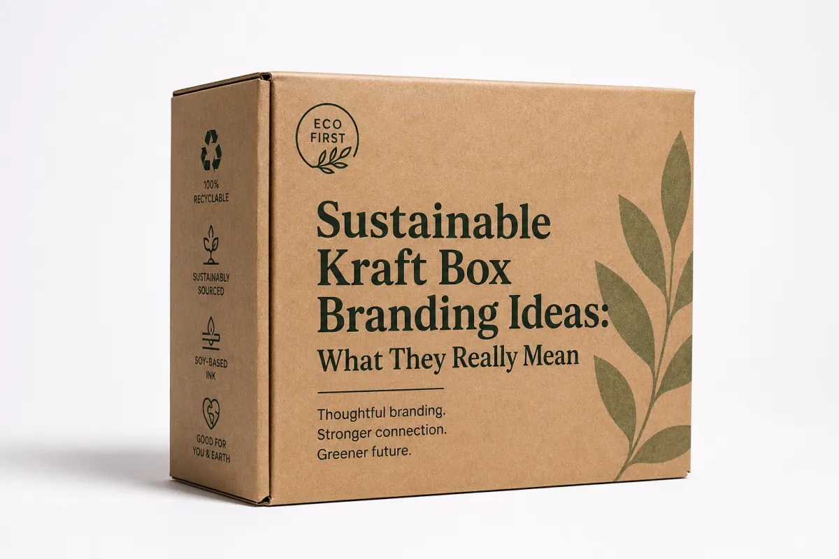
Sustainable Kraft Box Branding Ideas: What They Really Mean
When I talk about sustainable kraft box branding ideas, I mean the whole system, not a logo stamp and a recycled stock claim. Structure matters, and so does the exact board spec, whether the carton is built on 280gsm FSC-certified recycled kraft, a 350gsm kraft-lined fold, or a 1.8 mm E-flute mailer for ecommerce. Ink system matters too, especially if the printer in Dongguan is running vegetable-based inks or a low-migration set for food contact. Folding order matters, because a clever box that needs extra glue, an extra sleeve, or a pile of inserts is not really clean from a production standpoint. In plain terms, this is branding built around material honesty. Instead of hiding the substrate, the design lets kraft do part of the speaking.
That distinction matters because kraft and coated white stock send very different signals. White cartons can feel crisp, polished, and clinical, which suits a peptide serum or a medical device kit made in Suzhou. Kraft feels warmer and less processed, which is why it often fits oat milk powder, refillable hand wash, or a candle line assembled in New Jersey with an FSC-certified board sourced from Canada. Many buyers also read kraft as less wasteful, even when the real environmental outcome depends on sourcing, barrier coatings, freight weight, and the number of added components. I have sat in meetings where a client asked for something that "looked eco," then showed me a board spec with a matte laminate and a nested thermoformed tray. That is why sustainable kraft box branding ideas should be judged by what they actually remove from the package, not just by what they resemble on a mood board.
One personal care client learned that lesson the hard way in a pilot run of 8,000 cartons produced in Guangzhou. Their first box used 300gsm kraft with six spot colors and a matte film wrap. The sample looked polished under showroom lights, but the film complicated recycling in practical terms and dulled the natural feel they had asked for in the first place. We stripped the design back to two inks, moved the logo into a 1.5 mm deboss, and tucked the usage copy inside the flap in 6 pt type. The box still felt premium in hand, but the material story became much easier to explain to retail buyers and sustainability-minded customers. I still remember the relieved face on their brand manager, which honestly looked like someone had just taken a 15 kg backpack off her shoulders.
The stronger versions of sustainable kraft box branding ideas often scale well across multiple SKUs, and that matters more than many brands expect once a line reaches 6 or 8 variants. A 250 ml cleanser, a 100 ml refill, and a travel-size carton can all share the same layout logic, then change only the product name, the accent tone, and the claim line. Once the shopper recognizes that rhythm, brand memory builds faster than it does with a completely different graphic treatment on every pack. I have seen this work especially well in DTC and subscription categories, where shelf time is short and mobile photos do a surprising amount of selling, especially on a 6.1-inch phone screen shot in daylight at a front door in Austin or Leeds.
There is also a financial definition behind the phrase. If the design reduces white ink coverage, trims finishing steps, or removes custom inserts, it can save real money. If it raises perceived value enough to support margin, the box pays back in a different way. That is why I always push clients to treat sustainable kraft box branding ideas as both a visual decision and a unit-economics decision. A carton made at $0.21 per unit in a 15,000-piece run can strengthen the brand or quietly drain it, depending on how the details are handled and whether the final damage rate stays under 1.5% in transit. That sounds small on a spreadsheet, but it is gonna feel big when the reorder lands.
My rule stays simple: if the packaging cannot explain itself in under three seconds from about 60 cm away, it is too busy for kraft. Brown board already introduces texture and visual activity, especially on a 320gsm sheet with visible fiber. Use that surface as part of the design language. Do not fight it with cluttered graphics or overwritten copy, because a calm front panel with one logo, one product name, and one clear claim line usually performs better in a camera roll or on a retail shelf.
How Sustainable Kraft Box Branding Ideas Work in Production
The production path starts with the dieline and ends with cartons packed for freight. Between those two points sit five decisions that shape the final outcome: structure, board, ink system, finishing, and folding. That order matters more than most first-time packaging teams realize. I have watched brands spend two weeks debating foil color while nobody checked whether the product actually fit the insert for a 74 mm jar or a 158 mm bottle. That is how launch delays begin. Good sustainable kraft box branding ideas start with the physical object, then move into the visual layer once the structure has been proven on a real sample from the factory, not just a PDF on a laptop.
Kraft stock behaves differently from coated art paper. Ink absorbs faster, contrast softens at the edges, and small details can lose clarity before they ever reach the press sheet. A 5 pt serif that looks elegant on a proof on 350gsm C1S stock can disappear on recycled brown board. I learned that on a factory floor in Shenzhen, where an operator placed two runs side by side under inspection lights: one with solid black text, one with a dark green mixed from two inks. The green looked rich on the screen, but on kraft it turned dull and muddy. We moved to a single deep black and the copy became readable at a glance. That discipline is one of the quiet advantages of sustainable kraft box branding ideas.
Structure before graphics is the clearest rule I use in production. If the carton is for a 180 g soap bar, a 2.5 oz candle, or a set of small apparel accessories, the opening style should support the product first. Mailer boxes, tuck-end cartons, sleeve-and-tray sets, and rigid boxes each create a different sequence of touch, reveal, and protection. A mailer with a one-color logo may cost $0.29 per unit at 10,000 pieces, while a rigid box can land closer to $1.20 per unit for the same quantity, yet the rigid box still makes sense for a high-margin gift set that depends on presentation. The job is to match the structure to the margin and the use case, not to default to the fanciest option on the table.
Inside-panel branding remains one of my favorite moves because it adds storytelling room without another outer layer. A short origin note, a batch code area, a care instruction, or a simple thank-you line inside the flap can lift perceived value quickly. It also keeps the exterior calmer. I often recommend this for sustainable kraft box branding ideas because it balances restraint with surprise, and surprise matters more than brands admit when people are forming a first impression in a store or at the front door, especially if the box is opened within 20 seconds of delivery.
If you want technical guardrails, ask for print proofs and shipping tests early, before artwork gets locked. Many suppliers test transit performance to ISTA shipping test standards, and for heavier or more fragile products they may also refer to ASTM D4169-style distribution testing. Those standards do not make a box sustainable by themselves, but they do keep a carton from becoming waste after one rough delivery. For a 1.2 kg candle set or a glass bottle trio, those tests are the difference between a good mockup and a box that actually survives the UPS route from California to Ohio.
The production lesson is blunt: sustainable kraft box branding ideas perform best when the print system respects the board. If the design needs eight colors to survive, it probably does not belong on kraft. If it can be read with one color, strong spacing, and a clear logo mark, it usually feels more confident anyway. That is why many of the most durable cartons I have seen coming out of Dongguan, Delhi, and Barcelona use one ink, one solid form, and a single clean finish.
Key Factors That Shape Sustainable Kraft Box Branding Ideas
The first factor is the board itself. Virgin kraft, recycled kraft, and kraft-lined corrugated all behave differently in press and in transit. A 300gsm recycled kraft carton may cost less in raw material than a premium artboard, but it can also show ink spread more quickly and make fine copy harder to read. A 1.8 mm E-flute mailer feels much stronger in shipping than a thin folding carton, yet it adds bulk and freight weight on a 22 kg carton case headed from Shanghai to Los Angeles. That tradeoff sits at the center of many sustainable kraft box branding ideas: lighter is not always better, and cheaper is not always the smartest path.
The second factor is color strategy. Brown stock naturally lowers contrast, so the palette has to work harder. One-color printing is usually the most efficient route, and it often looks the sharpest. Two colors can work well if the brand wants a small accent band, a refined logo mark, or a seasonal variation that still feels like the same family. Full coverage on kraft is possible, though it often raises ink load and increases the risk of inconsistency from one run to the next, especially on a 6,000-piece order split across two press shifts. When brands ask me for a minimal but premium feel, I usually steer them toward one strong neutral and one accent tone. That is the cleanest path to recognizable sustainable kraft box branding ideas.
Finish choice changes the whole tone of the package. Embossing and debossing add tactile value without hiding the board. An uncoated varnish can protect the surface while preserving the natural look, which is useful on a box that will be handled in a shop in Berlin or mailed in humid weather in Miami. Foil alternatives can work if the brand wants a more refined signal without the glare of a metallic layer. Heavy lamination, by contrast, usually works against the earthy feel people expect from kraft, and it can complicate recycling depending on substrate and adhesive. That is why the finish spec deserves scrutiny instead of automatic approval.
Legibility is non-negotiable. Kraft surfaces soften fine typography more than white cartons do. I tell clients to size type at least 1 to 2 points larger than they originally planned, especially for ingredients, QR codes, and legal copy. Strong contrast, generous spacing, and a clear hierarchy matter more on kraft than they do on a coated box. If the carton needs a magnifying glass at arm's length, the design has already failed. Several of the best sustainable kraft box branding ideas I have seen used a large product name, a medium-sized claim line, and almost nothing else on the front panel, with a 4 mm quiet margin around the logo.
Brand fit has to be real. Kraft feels natural for organic snacks, handmade cosmetics, apparel basics, and small-batch stationery produced in places like Cornwall, Ontario, or Osaka. It can also feel confused if the product promise sits in luxury tech or ultra-high-gloss fashion. The packaging needs to match the category language. A cosmetic serum can use restrained kraft and still feel upscale if the typography is crisp and the copy is exact. A candle gift box can carry a softer and warmer layout. The same visual language does not work equally well across every market.
One more factor deserves a hard look: sustainability claims. If a box uses FSC-certified board, say so clearly and accurately. If it is recyclable in common curbside systems, confirm the local rules before making the claim, because municipal guidance in Vancouver can differ from rules in Dallas or Rotterdam. For sourcing language, FSC is the reference many buyers already know, but the claim has to match the paperwork. That is the difference between credible sustainable kraft box branding ideas and packaging that only looks green from a distance.
Cost and Pricing for Sustainable Kraft Box Branding Ideas
Cost starts with the board grade, but it almost never ends there. For sustainable kraft box branding ideas, the real pricing drivers are box size, print colors, inserts, die-cut complexity, and order quantity. A 5,000-piece run prices very differently from a 20,000-piece run because setup costs spread more efficiently at volume. In supplier quotes I have reviewed from factories in Guangzhou, Ningbo, and Ho Chi Minh City, the gap between a simple one-color carton and a custom structure with specialty finishing was rarely small; it often landed in the 2x to 3x range.
I saw that pattern during a supplier negotiation for a meal supplement brand in Austin. They wanted a recycled kraft folding carton with an embossed logo, a two-panel inner print, and a custom insert for a 60-capsule bottle. The first quote came back at $0.93 per unit at 8,000 pieces. After we removed the insert, simplified the inner copy, and reduced the embossing footprint, the cost dropped to $0.58 per unit. That kind of change sounds modest in a conference room, but on a 20,000-unit forecast it becomes meaningful money, especially if freight is quoted at $1,850 for a domestic pallet move.
Here is a practical comparison I often use when brands are evaluating sustainable kraft box branding ideas:
| Option | Typical Unit Cost at 5,000 pcs | Setup / Tooling | Best For | Notes |
|---|---|---|---|---|
| One-color logo on recycled kraft carton | $0.18-$0.32 | $120-$250 | Starter brands, simple retail packs | Lowest-risk route for clean branding and fast approval |
| Two-color print with inside-panel copy | $0.28-$0.46 | $180-$400 | DTC boxes, subscription kits | Balances brand recognition and modest storytelling |
| Embossed logo with one-color print | $0.42-$0.78 | $250-$700 | Premium skincare, gift sets | Adds tactile value without a heavy ink load |
| Custom die-cut structure with insert | $0.55-$1.10 | $450-$1,200 | Fragile goods, high-margin launches | Best when protection and presentation both matter |
That table is a guide, not a quote. I always tell clients to compare unit cost, setup cost, freight weight, and damage rate together. A carton that saves $0.09 at the factory but raises breakage by 2% is not cheaper. Sustainability choices can push cost in either direction as well. Recycled board sometimes costs a little more than a buyer expects if the mill grade is tight, yet it can save money later by reducing coatings, avoiding overprinting, and trimming extra marketing inserts. That is why sustainable kraft box branding ideas need a total-cost view instead of a narrow unit-price view.
The places where brands overspend are usually obvious after the fact. They print every panel, including the ones nobody sees. They add a full-coverage liner because they do not trust the kraft surface. They revise artwork three times between proof and press, burning time and prepress labor that could have been spent on a stronger launch page or a better insert card. They choose a rigid box for a $14 item when a mailer would protect the product just as well. Good sustainable kraft box branding ideas do the opposite: they remove waste from the design itself.
If you want to compare your own assumptions against broader industry practice, the Institute of Packaging Professionals is a useful source for terminology and packaging basics. It does not replace supplier quotes, yet it helps teams stay aligned when they are talking about substrates, finishing, and performance. For a brand manager, that shared language is worth real money, especially when one factory in Qingdao is quoting in USD and another in Ho Chi Minh City is quoting in RMB and VND.
Step-by-Step Process and Timeline for Sustainable Kraft Box Branding Ideas
The fastest projects usually have the clearest brief. For sustainable kraft box branding ideas, I want five pieces of information before anyone starts artwork: box dimensions, product weight, target quantity, print budget, and sustainability goals. When those inputs are vague, the project tends to wander through email threads and half-answered questions. When they are tight, the supplier can move directly into dieline recommendations and material choices. A sharp brief saves more time than any rush fee, especially if the carton needs to fit a 72 mm diameter tin or a 210 ml bottle without wobble.
A realistic timeline depends on the structure. A stock mailer with one-color print can move from concept to production in about 12 to 15 business days after proof approval, if the artwork is already prepared and the supplier is working from a standard dieline. A custom structure with inserts, embossing, and multiple proof rounds can take 20 to 30 business days before shipping. Freight adds more time, usually 3 to 7 days for domestic transit and 10 to 18 days by ocean freight for cross-border movement. I have watched brands miss launch windows by a week because nobody built in sample approval or carton packing time.
Step 1: Strategy and fit comes before design. The team decides whether the carton is for shelf retail, ecommerce, gifting, or a hybrid role. That choice shapes the rest of the build. A retail box needs stronger shelf graphics. A shipping box needs better compression resistance, usually measured with a target like 200 to 275 lb burst strength depending on product weight. A gift box may need a more satisfying opening sequence. Sustainable packaging only works once the use case is clear.
Step 2: Structural selection follows. Dielines should be checked against product dimensions with at least 2 to 3 mm of internal tolerance, depending on how the item is inserted. This is where a 45 mm candle or a 92 mm skincare bottle can change the whole layout. On one project, a 1 mm error in insert height created enough wobble to ruin a beautiful carton after transit testing. That is why sustainable kraft box branding ideas are as technical as they are visual. A clean box on screen means little if the sample rattles in a van for 45 minutes.
Step 3: Artwork setup and proofing should include one print proof, one folding sample, and one shipping sample if the product is fragile. I ask teams to review color, readability, fold accuracy, and scuff resistance. If the front panel needs to be read on a phone screen, we also test the packaging in a quick product photo shot at f/2.8 under daylight or 5000K shop light. That matters for ecommerce, where the carton often appears in the first image or in the unboxing clip. Brand consistency across screen, shelf, and carton is the real target.
Step 4: Production and packing should end with a clear quality check. I like to see a 20-box spot inspection every few hundred units, especially on orders above 10,000. That catches mis-registration, weak glue, and print drift before pallets leave the facility. One hidden strength of sustainable kraft box branding ideas is that they often reduce failure points: fewer inks, fewer coatings, fewer layers that can go wrong, and fewer reasons for a carton to be scrapped after a brief inspection in the warehouse.
I also recommend coordinating packaging, operations, and marketing at the same time. If ecommerce photos are scheduled before final cartons arrive, the launch feels disconnected. If warehouse inventory lands before the marketing assets are ready, the box carries too much of the load alone. The best launches use packaging, web assets, and fulfillment timing as one system, whether the goods are shipping out of a Los Angeles 3PL or a fulfillment center in Milton, Ontario. That is what keeps customer perception aligned with the promise on the carton.
Common Mistakes in Sustainable Kraft Box Branding Ideas
The biggest mistake is assuming kraft automatically means sustainability. It does not. A brown box can still be overprinted, laminated, overpacked, and shipped in a way that creates unnecessary waste. I have seen brands spend heavily on an "eco look" while choosing a structure that used more material than the white carton they replaced. That contradiction becomes obvious to customers faster than many teams expect, especially once a retailer asks for the board spec or the glue type. True sustainable kraft box branding ideas start with material reality, not color psychology.
Weak contrast causes trouble too. Fine lines, pale inks, and tiny legal text can vanish on natural board. When that happens, the carton may look artisanal in a mockup and messy in the hand. I once watched a food client lose an entire proof round because the ingredient list became unreadable under warm lighting in a 70 lux warehouse. The fix was straightforward: darken the ink, enlarge the type by 15%, and clear more space on the face panel. The box immediately looked more deliberate.
Overdesign is just as damaging. Too many icons, slogans, recycling badges, and claims can erase the calm, grounded feeling that makes kraft work in the first place. The carton starts to feel crowded, and the quiet authority that buyers often read as quality disappears. I tell clients to choose one hero message, one support line, and one tactile detail. Anything beyond that usually turns into noise. The strongest sustainable kraft box branding ideas often feel almost under-designed, though that restraint is doing a lot of heavy lifting across a 350gsm sheet and a 500-unit sample run.
Protection failures are another expensive mistake. A carton that photographs beautifully but collapses in transit is not sustainable in practice, because every damaged unit turns into a replacement. For shipping-sensitive products, the box has to pass compression and drop expectations, not just a style review. Depending on the product, that means testing against a relevant ISTA profile or an ASTM transport method before scale-up. Pretty packaging has value. Durable packaging has value. Pretty and durable is the target, whether the shipment is traveling 18 miles across London or 1,800 miles across the United States.
Vague claims can damage trust as well. Phrases like "earth-friendly" and "green packaging" do not carry much weight unless they are supported by sourcing, recycling guidance, or a verifiable material spec. Buyers are more skeptical now, and retailers ask sharper questions. If you cannot explain the board grade, the print system, and the end-of-life path in one sentence, the message is not ready. That is why sustainable kraft box branding ideas need honest language as much as they need good graphics.
One clear example came from a supplier negotiation where the brand wanted to print "100% sustainable" on the front panel of a box being made in Penang. We pushed back, asked for FSC paperwork, and narrowed the claim to what could actually be documented. The final carton looked less flashy, yet the sales team trusted it more. That kind of trade-off keeps a brand out of trouble and keeps the packaging story believable when a buyer or retailer asks for proof.
Expert Tips and Next Steps for Sustainable Kraft Packaging
If I had to reduce sustainable kraft box branding ideas to one rule, it would be this: choose one hero message, one primary color, and one tactile detail. That combination gives the box a point of view without crowding the surface. For one cosmetics client, a debossed logo, a charcoal ink, and a small inside-panel origin note were enough to make the carton feel like a deliberate part of the brand system. The box did not shout. It simply looked certain of itself, even when stacked beside six competitor cartons on a shelf in Singapore.
There are also upgrades that add value without adding much waste. A strong typographic system costs nothing extra if the artwork is already being prepared. A repeating pattern built from one ink can create recognition across multiple SKUs. Inside-flap messaging can turn a simple carton into a better unboxing experience without adding another outer layer. These are the kinds of sustainable kraft box branding ideas I recommend when the budget is tight but the brand standards are not, especially if the carton is produced at 10,000 pieces or more.
I also like to test packaging in the real world rather than only in a presentation deck. Place the carton on a shelf next to a white box and photograph it from six feet away. Drop it into a shipping sample with the actual product inside. Record a 20-second unboxing clip on a phone in daylight. Then ask three people who do not work in packaging what they notice first. That is where customer perception becomes visible. Sometimes the box that looks simpler on screen performs better because the hierarchy is cleaner, and sometimes the $0.24 unit carton outperforms the $0.61 one because it reads faster.
For brands ready to move, the next steps stay straightforward. Pick one box size, request two material samples, quote three print options, and build one prototype with the actual product weight inside. Then compare the options against three numbers: damage rate, perceived value, and reorder confidence. Those metrics tell you more than vague praise about how nice the carton looks. I have seen too many teams celebrate the mockup and forget the warehouse. Sustainable packaging has to survive both places, whether the run is 4,000 units or 40,000 units.
If you want to compare your own options, our Case Studies page shows how different packaging choices affected shelf presence, shipping strength, and customer response across real projects. If your project needs a label or hangtag alongside the box, our Custom Labels & Tags can keep the visual system consistent without adding unnecessary bulk. That kind of coordination is often what separates average packaging from packaging people remember when they open the parcel at home or in a studio.
My honest view after years of watching cartons move from concept to pallet: sustainable kraft box branding ideas work best when they are specific, disciplined, and measured. Not flashy. Not vague. Specific. When the spec is right, the box can support the product, reduce waste, and make the brand look smarter than it spent. Start with the board spec, keep the front panel simple, and test the carton in transit before you fall in love with the finish. That is the part that actually holds up in production.
What are the best sustainable kraft box branding ideas for small brands?
Start with a one-color logo, a strong type hierarchy, and recycled kraft board that fits your product weight, such as 300gsm for light cartons or 1.8 mm E-flute for mailers. Add one inside-panel message or a single repeat pattern if you want more distinction without pushing cost too high. For small brands, sustainable kraft box branding ideas work best when the box stays legible, ships safely, and avoids decorative extras that do not move sales, especially on runs of 1,000 to 5,000 pieces.
How much do sustainable kraft box branding ideas usually cost?
Costs depend on board grade, box size, print colors, custom tooling, and order volume. In quotes I have reviewed, a minimal one-color recycled kraft carton can sit around $0.18-$0.32 per unit at 5,000 pieces, while embossing, inserts, and custom structures can push the price much higher. Ask for unit cost, setup cost, and freight together so you can compare sustainable kraft box branding ideas on equal footing, especially if the line is moving from 5,000 to 15,000 units.
How long does the sustainable kraft box branding process take?
Simple stock-box projects can move faster than fully custom structures, especially if artwork is ready and the dieline is standard. A basic one-color run may take about 12 to 15 business days after proof approval, while a custom box with inserts and specialty finishes can take 20 to 30 business days before shipping. Build in extra time for sampling, because kraft often prints and folds differently than coated packaging, and a factory in Ningbo or Shenzhen may need one extra revision before locking the press.
Can sustainable kraft box branding ideas still look premium?
Yes. Premium usually comes from restraint: cleaner typography, better spacing, and a focused color palette. Tactile details like embossing, debossing, or an uncoated finish can feel upscale without heavy decoration. The strongest sustainable kraft box branding ideas look intentional, not unfinished, and they often rely on one or two careful details rather than a crowded surface, even when the box is printed at 10,000 pieces in a single production run.
What should I test before ordering sustainable kraft box branding ideas at scale?
Check shelf visibility, shipping strength, and scuff resistance using a real product inside the box. Review photos under natural light and on mobile screens so you can confirm the branding still reads clearly. Test customer reactions to the unboxing experience too, because the inside of the box can matter just as much as the outside when brand perception is on the line, especially if the carton will travel 2,000 miles through standard parcel networks.

