Buyer Fit Snapshot
| Best fit | Branding Seasonal Poly Mailers projects where brand print, material claims, artwork control, MOQ, and repeat-order consistency need to be specified before quoting. |
|---|---|
| Quote inputs | Share finished size, material target, print colors, finish, packing count, annual reorder estimate, ship-to region, and any compliance wording. |
| Proofing check | Approve dieline scale, logo placement, barcode or warning zones, color tolerance, closure strength, and carton packing before bulk production. |
| Main risk | Vague material claims, crowded artwork, missing packing details, or unclear freight terms can make a low unit price expensive after revisions. |
Fast answer: Branding Seasonal Poly Mailers: Material Claims, Seal Quality, and Freight Cost should be specified like a repeatable production item. The safest quote records material, print method, finish, artwork proof, packing count, and reorder notes in one written spec.
Production checks before approval
Compare the actual filled-product size with the drawing, then confirm tolerance on folds, seals, hang holes, label areas, and retail display edges. Reserve space for logos, QR codes, warning copy, and material claims before decorative graphics fill the panel.
Quote comparison points
Review material grade, print process, finish, sampling route, tooling charges, carton quantity, and freight assumptions side by side. A quote is only useful when the supplier can repeat the same color, closure quality, and packing count on the next order.
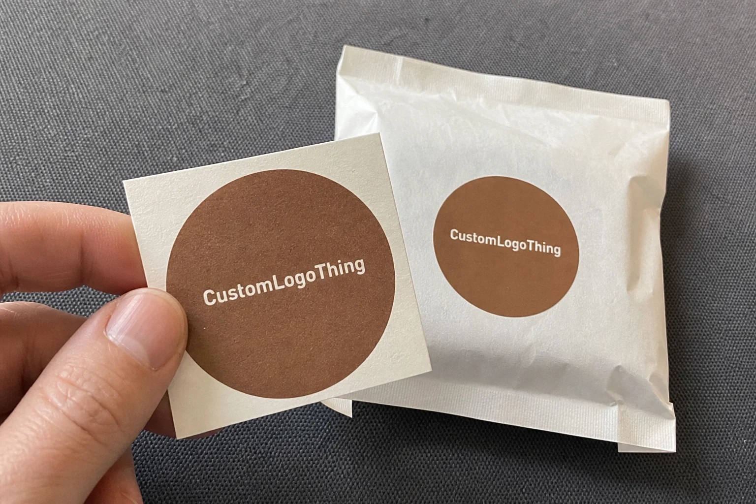
The first thing many customers touch is not the product. It is the mailer. That detail matters more than most brands admit, and it is exactly why tips for branding Seasonal Poly Mailers can shape how people feel before they even open the order. I remember standing on a factory floor in Shenzhen, watching a press operator wipe down a freshly printed run of winter mailers made from 3.0 mil co-extruded polyethylene film, and thinking, “That’s a lot of influence for a glorified envelope.” Then I saw the same thing happen later in a cramped merchandising room in Chicago, where a buyer picked up a sample bag, smiled at the print, and said, “This feels more expensive already.” Same product. Different package. Very different customer perception.
Seasonal packaging has a short window to do its job, which is why Tips for Branding seasonal poly mailers need to be practical, not decorative fluff. A holiday mailer, event mailer, or campaign-specific poly envelope is a lightweight shipping envelope printed with a limited-time visual identity: winter graphics, Valentine’s artwork, summer promotions, year-end messaging, or a brand’s anniversary theme. Done well, it creates immediacy, increases brand recognition, and makes an ordinary shipment feel gift-ready. Done poorly, it looks like leftover inventory with stickers slapped on top, and I have seen a room full of those stickers peel off in humid weather in Miami when the warehouse HVAC failed for a day.
Honestly, I think most people underestimate how much the outer package influences the unboxing experience. A clean, well-branded mailer can trigger social posts, referrals, and repeat orders because it gives the customer a visual cue that the brand cares about detail. That is not fluff. In packaging, detail sells trust. And trust sells the next order, whether it shipped from a 12,000-square-foot fulfillment center in Dallas or a boutique packing room in Brooklyn.
What Seasonal Poly Mailers Are and Why Branding Them Matters
Seasonal Poly Mailers are shipping envelopes made from polyethylene film, usually 2.5 mil to 4.0 mil thick, printed with artwork tied to a specific season, campaign, or event. They are used by apparel brands, beauty companies, subscription boxes, and gift-oriented retailers that want the package itself to carry part of the message. A mailer can be plain white, matte black, or fully printed with snowflakes, confetti, or a repeat logo pattern. The point is not just decoration. The point is creating a fast visual handshake with the customer, often in under three seconds as the package moves from porch to hands.
I visited a fulfillment center near Dallas where the operations manager showed me two pallets side by side: standard gray mailers on one side, and branded holiday mailers on the other. Both contained the same socks packed in 10" x 13" envelopes. The branded run had 18% more customer photo tags on social media, according to their internal tracking from a six-week December campaign. That was not because the socks changed. It was because the outer layer made the package feel intentional. That is the kind of lift that tips for branding seasonal poly mailers are meant to capture.
Seasonal branding works because it hits three things at once. First, it signals relevance: the package feels current. Second, it creates emotion: a winter motif, spring color palette, or back-to-school graphic can trigger familiarity. Third, it adds repetition: every shipment becomes another brand impression. Compared with a plain mailer, a seasonal version can make a modest order feel like a curated drop, and that shift in customer perception can matter more than a 10% discount code or a free shipping promo that costs $4.95 to absorb.
There is also a practical side. Seasonal packaging is a short-term marketing asset. It supports launches, lifts gifting behavior, and can encourage sharing without requiring a separate insert card or expensive exterior sleeve. I have seen small brands use one printed mailer design to cover an entire quarter of promotions, especially when the run was 5,000 pieces at roughly $0.18 per unit from a converter in Shenzhen. That is leaner than custom boxes, and often easier to stock, especially if you use Custom Poly Mailers alongside standard fulfillment materials.
Branding is not just what the customer sees. It is how fast they recognize you in a stack of shipments, how confidently they identify the package as yours, and how likely they are to remember it after opening. That is why tips for branding seasonal poly mailers should always be tied to brand identity, not trend-chasing for its own sake. A seasonal mailer that looks right in October and still feels coherent in November is doing real brand work.
Tips for Branding Seasonal Poly Mailers in the Real World
In practical terms, branding a seasonal mailer means making a set of design choices that still survive production, shipping, and warehouse handling. Color is the first one. Red and gold read as holiday; pastel pink may read as spring or Valentine’s; black and silver can feel premium year-round with a seasonal accent. Artwork is the second. A pattern of stars, candy canes, leaves, or snowdrifts can reinforce the seasonal theme. Logo placement is the third. If the logo is buried under heavy graphics, you lose brand consistency. If it dominates every inch, you may lose the festive effect.
Print method matters too. For large runs, flexographic printing is common because it keeps unit cost lower when artwork is simple and repeatable. Digital printing is better when the design has multiple elements, variable artwork, or smaller quantities, such as a 1,000-piece test run for a Valentine’s launch. Surface treatments, like matte lamination or a soft-touch coating on a hybrid mailer structure, can also change how the package feels in hand. For a poly mailer, the finish is less about luxury texture than about how light reflects on camera. That matters because your customer is very likely to photograph the package under warm indoor lighting or on a porch at 3 p.m.
I once sat in on a supplier negotiation where a DTC cosmetics brand in Los Angeles wanted full-coverage floral artwork with metallic ink on a 100,000-piece seasonal run. The supplier pushed back, not because it was impossible, but because the artwork had fine lines that would blur at production speed on the wide-web press. The brand ended up simplifying the border, keeping the logo clean, and saving roughly $0.06 per unit. That sounds tiny until you multiply it by 100,000. Then it is $6,000 back in the budget. Tips for branding seasonal poly mailers often come down to exactly that sort of compromise.
One-sided branding is usually enough for many campaigns. It places the artwork on the front panel, leaving the reverse side plain or lightly marked with shipping requirements. All-over branding can work for higher-end campaigns, influencer launches, or gift-heavy promotions where the package is as important as the contents. The tradeoff is cost, ink coverage, and the chance that too much decoration interferes with labels, barcodes, or scanner readability. If a carrier cannot process it cleanly, your beautiful design becomes an operational headache, especially in hubs like Memphis or Louisville where parcels move through tight sortation windows.
The unboxing sequence matters more than people think. The exterior creates anticipation. The inside can confirm the seasonal story. I have seen brands print a simple “Warm wishes from our team” message on the inner flap of a 14" x 19" mailer, and that single line lifted perceived care far more than adding another exterior icon. If you want the package to feel memorable, start with the outside and finish with one clear reinforcing detail on the inside.
For brands also considering broader packaging support, a quick review of Custom Packaging Products can help align mailers, labels, inserts, and seasonal cards so the whole kit feels coordinated rather than improvised, especially when the mailers are produced in Guangdong and the inserts are printed separately in the United States.
Key Factors to Consider Before You Design Seasonal Poly Mailers
Before you sketch a single snowflake or decide on a color palette, you need to run the numbers. Pricing is driven by quantity, print complexity, number of colors, material thickness, and lead time. A simple two-color seasonal mailer in a run of 5,000 pieces might land around $0.18/unit, while a more complex full-coverage design in a smaller quantity can jump much higher. Rush production can add 10% to 25%, depending on factory schedule and proof approval timing. That is why tips for branding seasonal poly mailers should begin with budget discipline, not art direction.
Inventory planning is the second pressure point. If you over-order, you can end up with dated packaging sitting in a warehouse after the season ends. If you under-order, you may have to fall back on generic stock mailers halfway through the campaign. I saw one apparel client in Los Angeles burn through their winter run two weeks early because their influencer campaign outperformed projections, and the replacement shipment from a supplier in Ningbo arrived 9 business days later than planned. The result was a messy mix of seasonal and plain shipments. Customers noticed. They always do. That inconsistency weakens brand recognition.
Material and durability are non-negotiable. A mailer still has to survive drops, belt friction, compression, and light moisture exposure. Typical considerations include tear resistance, seal strength, and whether the adhesive strip will hold in cold storage or humid warehouse conditions. A 3.0 mil mailer might be enough for lightweight apparel, but heavier items may need 4.0 mil or a co-extruded structure. I always tell clients that if the package fails in transit, the best artwork in the world is irrelevant, whether the route runs through Phoenix heat or a damp December line in Atlanta.
| Mailer option | Typical unit cost | Best for | Notes |
|---|---|---|---|
| Plain stock mailer with seasonal label | $0.10-$0.16 | Small runs, test campaigns | Lowest commitment, quick to deploy, less visual impact |
| Two-color printed seasonal mailer | $0.16-$0.24 | Mid-sized DTC orders | Balances cost and brand identity well |
| Full-coverage custom seasonal mailer | $0.24-$0.40 | Premium launches, gifting | Stronger visual branding, higher setup and ink costs |
| Stock mailer + custom insert + label | $0.13-$0.22 | Flexible seasonal campaigns | Good backup option when lead times are tight |
Audience and channel fit matter just as much as cost. A luxury boutique does not need cartoon icons and a candy-cane border to feel seasonal. A subscription box may benefit from a fun, repeatable pattern that photographs well. A direct-to-consumer wellness brand may prefer restrained typography, one accent color, and a small seasonal line of copy. The right look depends on customer expectation, not just the holiday calendar. That is one of the most common places where tips for branding seasonal poly mailers get ignored, especially by teams working from a template built for spring 2023 and never refreshed.
Compliance and logistics basics cannot be an afterthought. Barcodes should remain scannable. Return labels need clear placement. Carrier handling marks should not disappear into busy artwork. If you ship internationally, you may also need to confirm customs label space and adhesive behavior in different temperature zones. For sustainability questions and mailer disposal context, the EPA’s packaging and waste reduction resources are worth reviewing at epa.gov. Not every packaging decision is a marketing decision; some are simply about whether the material can be managed responsibly after use.
Step-by-Step Process for Branding Seasonal Poly Mailers
Start with a campaign goal. Do you want to drive gifting, generate social sharing, mark a limited-edition drop, or keep repeat buyers engaged? One objective usually beats three. When I worked with a beauty brand that shipped 40,000 holiday orders from a fulfillment center outside Nashville, we defined the goal as “increase shareable unboxing moments by 15%.” That single metric shaped everything from palette choice to the placement of the logo. If you skip that step, your seasonal artwork may look nice but fail to do any actual work.
Next, audit your brand assets. Gather high-resolution logo files, approved color values, typography guidelines, and any seasonal illustration rules. If your files are still sitting in a designer’s old Dropbox folder with three versions of the same logo, stop and clean that up first. I have seen a production delay of six days come from a missing vector file, and I have also seen a printer in Dongguan hold a job for three extra business days because the artwork was delivered as a flattened PNG instead of a press-ready AI file. Six days sounds minor until you are already inside a holiday shipping window.
Create a design brief with exact details: mailer size, printable area, seal flap dimensions, shipping weight, target quantity, target ship date, and whether the mailer will be used for one SKU or multiple SKU sizes. Include the placement of shipping labels and any return instructions. If you want an internal review, share the brief with your operations lead, your designer, and the person who actually packs orders. That last person usually spots the issues nobody else sees, like a return address that sits too close to a heat-seal edge or a logo that lands where tape will cover it.
Then prototype the design in context. Do not evaluate it only on a bright monitor. Print it. Hold it. Stack it with other shipments. Take photos under warehouse lights and on a doorstep. I once watched a brand approve a deep navy mailer with silver text, only to discover that the text disappeared in low indoor lighting in a Detroit apartment lobby. The fix was easy: increase the font size by 20% and shift the silver to white. The lesson was not subtle. Real-world visibility beats pretty mockups.
Here is a straightforward workflow that has saved me time in multiple client meetings:
- Set the campaign objective and budget ceiling.
- Pick one seasonal theme and one backup theme.
- Lock the mailer size and material thickness.
- Place the logo and shipping zones first, decoration second.
- Request a digital proof and, if possible, a physical sample.
- Approve only after checking color contrast, barcode space, and seal function.
- Build a delivery timeline that ends at your first ship date, not your approval date.
That timeline point matters more than people think. A lot of brands build backwards from artwork approval, then act surprised when printing, freight, and inbound receiving consume another 10 to 20 business days. For standard runs, I like to see at least 12-15 business days from proof approval to factory completion, then additional time for shipping. If the campaign is tied to a hard retail event, add a buffer. Always. A factory in Xiamen may promise 8 business days, but port congestion and inland trucking can turn that into 14 fast.
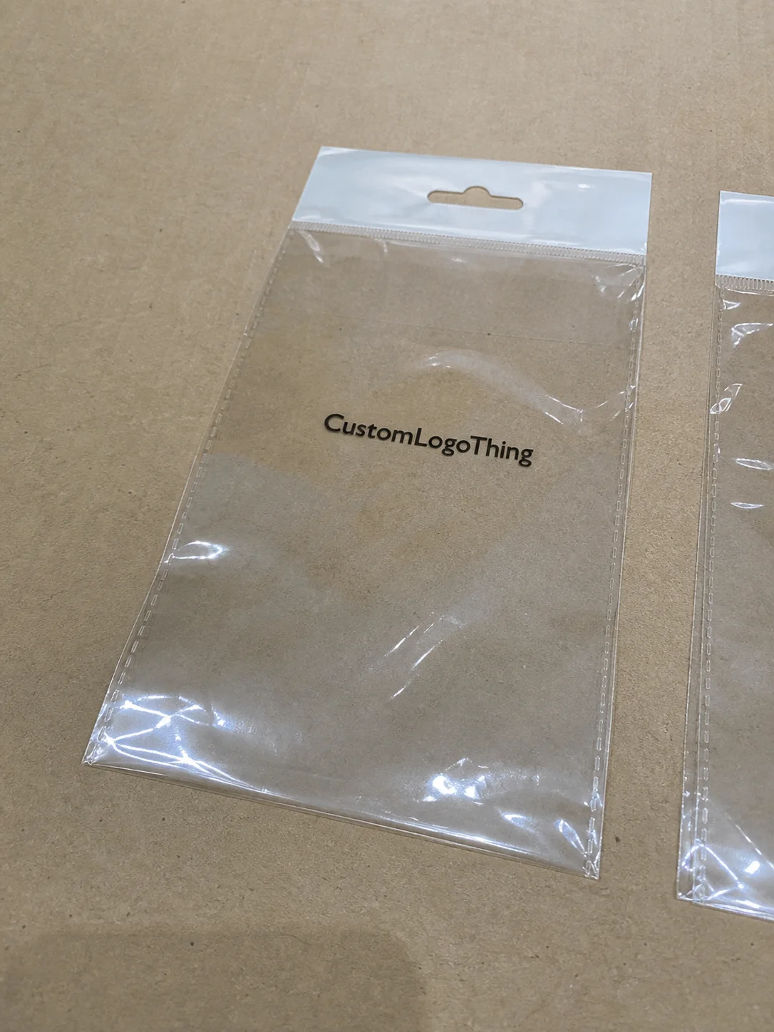
For brands using a mix of print assets, it can help to coordinate mailers with Custom Labels & Tags. A seasonal label on a plain mailer is not the same as a fully printed envelope, but in the right campaign it can still carry the seasonal story without pushing the budget too far, especially when label rolls cost $0.03 to $0.06 per piece in a 10,000-unit order.
“The best seasonal mailer we ever shipped was almost boring in the mockup,” one ecommerce director told me. “It had one clean logo, one red border, and a single line of copy. Customers loved it because it looked intentional, not noisy.”
That is the kind of feedback I trust. It reflects brand consistency, production reality, and the unglamorous truth that clean execution usually beats visual clutter. Good tips for branding seasonal poly mailers should protect all three, from the proofing stage in artboard form to the final packed parcel on a conveyor in Kansas City.
Common Mistakes That Undercut Seasonal Mailer Branding
The first mistake is stuffing too many graphics onto the mailer. A festive package does not need eight icons, three taglines, a border, a snowflake field, and a giant logo all at once. That creates visual noise, not excitement. In the warehouse, busy designs also tend to show abrasion more visibly because scratches and scuffs interrupt multiple elements at once, especially on glossy film with a 15% surface sheen.
The second mistake is choosing seasonal colors that fight the brand. A neon green Christmas mailer may be memorable, but if your brand identity is calm, premium, and neutral, the result can feel off. I saw a wellness company test a hot pink Valentine’s design against its usual sage-green visual language in a 2024 sample review. Their loyal customers called it “cute but not us.” That is a warning worth listening to. Brand recognition comes from continuity, not random reinvention.
The third mistake is ignoring shipping conditions. Poly mailers are tough, but they are not invincible. Abrasion from conveyors, moisture at loading docks, and adhesive strip failure can ruin the customer experience before the order arrives. If your mailer includes a matte finish or specialty coating, check how it handles friction. Also confirm that the tear line and seal flap still work after temperature cycling. For seasonal mailers traveling across colder routes from Minneapolis to Boston, that detail can save complaints and returns.
The fourth mistake is treating the mailer like a billboard. I know that sounds strange coming from someone who writes about branding, but packaging is not a roadside sign. It has to move through picking, packing, shipping, and receiving. If artwork blocks the necessary labels or makes it hard for staff to orient the parcel quickly, you are creating labor friction. That extra 2 to 3 seconds per parcel can add up over 8,000 units in a week, which means a real labor cost even before the carriers touch the order.
The fifth mistake is skipping proofing. I cannot say this enough. A proof catches low-contrast text, logo distortion, unexpected color shifts, and off-center artwork. It also gives you a chance to verify that the seasonal message still reads clearly once the mailer is folded, sealed, and stacked. According to industry practices encouraged by groups like the International Safe Transit Association, packaging should be validated in conditions that resemble actual shipment handling. You can find more at ista.org. If your artwork is meant to survive a 2-foot drop and a rubber-belt conveyor, test it like that.
Another error I see often: brands rely too heavily on trends. A design that feels clever this season may age badly by the time inventory arrives. If your delivery timeline is 8 weeks and your campaign is only active for 4 weeks, you need artwork that remains useful even if the season shifts by a few days. That is one reason I encourage clients to think in motifs, not memes. A simple pine branch pattern or geometric star can age better than a joke tied to a single viral moment.
Expert Tips for Branding Seasonal Poly Mailers on a Budget
If you want to keep costs under control, start with a modular system. Keep one base mailer structure and change only a small seasonal element, such as a border, icon, phrase, or accent color. That approach preserves brand consistency while reducing redesign time and artwork risk. I have seen it save brands both setup fees and internal approvals because the core layout never changes, and the printer in Qingdao can keep the same plate structure for multiple seasons.
Limit print colors strategically. Two well-placed colors can outperform six messy ones. A white mailer with one red logo and one thin gold border can feel more polished than a fully printed surface with weak contrast. In packaging, restraint often reads as premium. That is especially true if the customer already knows the brand. If the logo is recognized instantly, the seasonal cue only needs to do a supporting job, not carry the whole visual load.
Patterns and icons are your friend when full coverage is too expensive. Repeated stars, leaves, hearts, or holiday marks can create a festive look without forcing every square inch into artwork-heavy territory. One beverage client I worked with used a diagonal pattern of small evergreen trees on the lower third of the mailer and left the upper panel mostly clean. The result looked modern, packed well, and cost less than their previous all-over print by about $0.05 per unit on a 20,000-piece run. Small changes. Big difference.
Here is a quick comparison that often helps brands decide where to spend:
| Budget tactic | Visual impact | Cost impact | Best use case |
|---|---|---|---|
| One strong seasonal motif | High | Low | Most DTC campaigns |
| Full seasonal coverage | Very high | High | Gift-heavy launches and premium drops |
| Seasonal label on stock mailer | Moderate | Very low | Test runs and fast turnarounds |
| Minimal print with premium finish | High | Moderate | Clean, upscale brands |
Plan for reusability whenever possible. Some seasonal themes can stretch across multiple campaigns if they are broad enough. Winter silver works for holiday, New Year, and post-holiday clearance. Floral elements can bridge spring launches and Mother’s Day. That approach keeps your inventory from becoming useless too quickly, which is one of the smartest tips for branding seasonal poly mailers I can give, especially if your MOQ is 3,000 pieces and your storage space is only two pallet positions wide.
One more money-saving move: put the most attention on the part customers actually photograph. That is usually the face of the mailer with the logo and primary graphic. The reverse panel often only needs shipping information and a simple continuation of the design. You do not need to print drama on every side, and you certainly do not need to pay for it at $0.08 extra per unit if no one will see it.
For brands wanting a larger seasonal toolkit, reviewing Case Studies can help you see how other companies balanced budget, turnaround, and visual branding without overcomplicating the package, whether their runs came out of a facility in Shenzhen or a domestic plant in Ohio.
My opinion? A clean mailer with one memorable idea beats an expensive-looking mess every time. The customer notices confidence, not chaos, and that confidence is easier to produce in a 350gsm C1S artboard insert than in a cluttered outer shell.
How to Launch Seasonal Poly Mailers and Measure Results
Launch day should have a checklist. Not a vague one. A real one. Confirm inventory counts, verify artwork versions, check packing instructions, and make sure labels are loaded in the correct printer tray. I once saw a seasonal run delayed because the warehouse loaded the wrong mailer size into the packing lane. The artwork was perfect. The operation was not. That is why tips for branding seasonal poly mailers must include execution, not just design, especially when the first outbound wave is scheduled for 7:00 a.m. on a Monday.
Track your milestones from the start: artwork approval date, proof turnaround, production lead time, arrival date, and the first ship date. If the freight lands two days late, note it. If the first 500 units go through without a complaint, note that too. You are building a record, not guessing. The next seasonal cycle should be based on data, not memory, and a real timeline often looks like 3 business days for proofing, 12-15 business days from proof approval to completion, and 4-7 additional business days for domestic freight.
Measurement does not need to be complicated. Compare branded seasonal mailer shipments with standard mailer shipments using a few practical metrics: repeat purchase rate, social mentions, customer photos, email replies, packaging complaints, and return damage claims. If a branded run increases user-generated content by 12% but also adds 3% to fulfillment time, that is useful information. It tells you whether the visual lift is worth the operational cost, and whether your team can maintain pace at 600 parcels per hour.
Another useful metric is support contact volume. If customers mention packaging more often, that can be good or bad. Good if they are complimenting the design. Bad if they are complaining about tears, scuffs, or print quality. I would rather have a boring metric than a flattering one that hides a problem, especially if the complaint rate rises from 1.2% to 2.8% after a new seasonal run.
You should also compare seasonal runs against baseline packaging by season. A holiday mailer may generate a strong response in December and a mediocre one in February. That does not mean the design failed. It may mean the timing, theme, or audience fit was off. Context matters. A seasonal package is not a universal truth; it is a timed tool, and a January clearance design in silver and navy may perform very differently than the same design shipped in early November.
Here is a simple launch checklist I recommend to clients:
- Verify final artwork and Pantone or CMYK targets.
- Confirm seal strength and tear-line placement.
- Check barcode and return address visibility.
- Review at least one physical sample in natural light.
- Train the fulfillment team on packing order and storage orientation.
- Set a measurement window for customer feedback and repeat orders.
And yes, document the results. If the mailer increased social photos, note the exact count. If it shortened assembly time by using a simpler layout, quantify the minutes saved. That record makes the next approval easier and strengthens your argument for continued investment in brand identity and packaging strategy. A $1,200 seasonal print run can be easier to defend when you can show a 9% lift in customer-tagged posts and a 4% reduction in damage claims.
If you want to tie seasonal mailers back to your broader product strategy, it also helps to keep your packaging architecture consistent across the line. A mailer, a label, and an insert should feel like they came from the same brand system, not three different suppliers fighting for attention. That is where smart seasonal planning pays off, particularly if your outer mailer is a 3.5 mil co-extruded structure and your insert uses a matte 350gsm C1S artboard card.
In my experience, the brands that win with seasonal mailers are the ones that treat the package as a business asset. They do not just ask, “Does it look festive?” They ask, “Will it ship well, photograph well, and still make sense when the campaign ends?” Those are the questions that separate decoration from strategy. And that is the real heart of tips for branding seasonal poly mailers.
If you are ready to build your next campaign, start with one clear theme, one realistic budget, and one proof you can hold in your hand. Then measure what happens. That is how you turn tips for branding seasonal poly mailers into actual sales, stronger brand consistency, and a better unboxing experience.
What are the best tips for branding seasonal poly mailers for small businesses?
Start with one strong seasonal visual element instead of a full redesign. Keep your logo and shipping details easy to read, and order a small test run before committing to a larger quantity. For a business shipping 1,000 to 3,000 units, that usually reduces risk while still creating a noticeable seasonal effect. If your budget is tight, a $0.03 seasonal label on a stock mailer can still carry the idea clearly.
How much does it usually cost to brand seasonal poly mailers?
Pricing depends on quantity, print method, color count, material thickness, and turnaround time. Smaller runs and rush orders usually cost more per unit. A simple two-color design can often stay in a much lower price band than full-coverage artwork, which is why simple designs are often the most budget-friendly way to create a seasonal look. For example, 5,000 pieces at about $0.18 per unit is often more manageable than a 1,000-piece all-over print that jumps to $0.32 or more.
How far in advance should I plan branded seasonal poly mailers?
Start planning several weeks before the seasonal launch date. Leave time for design revisions, proofing, and production delays. I recommend building the schedule backward from the date orders need to ship, not the day the artwork gets approved, because freight and receiving often take longer than teams expect. A good working target is 12-15 business days from proof approval to factory completion, plus shipping time.
Can seasonal poly mailers still look premium on a budget?
Yes, if you focus on clean typography, a limited color palette, and one standout seasonal motif. A matte finish or minimal pattern can feel more elevated than a busy design. In packaging, premium impact often comes from restraint, not complexity, and even a 2-color print on 3.0 mil film can feel polished if the artwork is well spaced.
What should I avoid when designing seasonal poly mailers?
Avoid cluttered graphics, low-contrast text, and oversized artwork that hides branding. Do not ignore shipping durability or barcode placement. Always request a proof so the final print matches your expectations, especially if the run is tied to a limited campaign window. If possible, test the sample under warehouse lighting and on a porch in daylight before approving a 10,000-piece order.