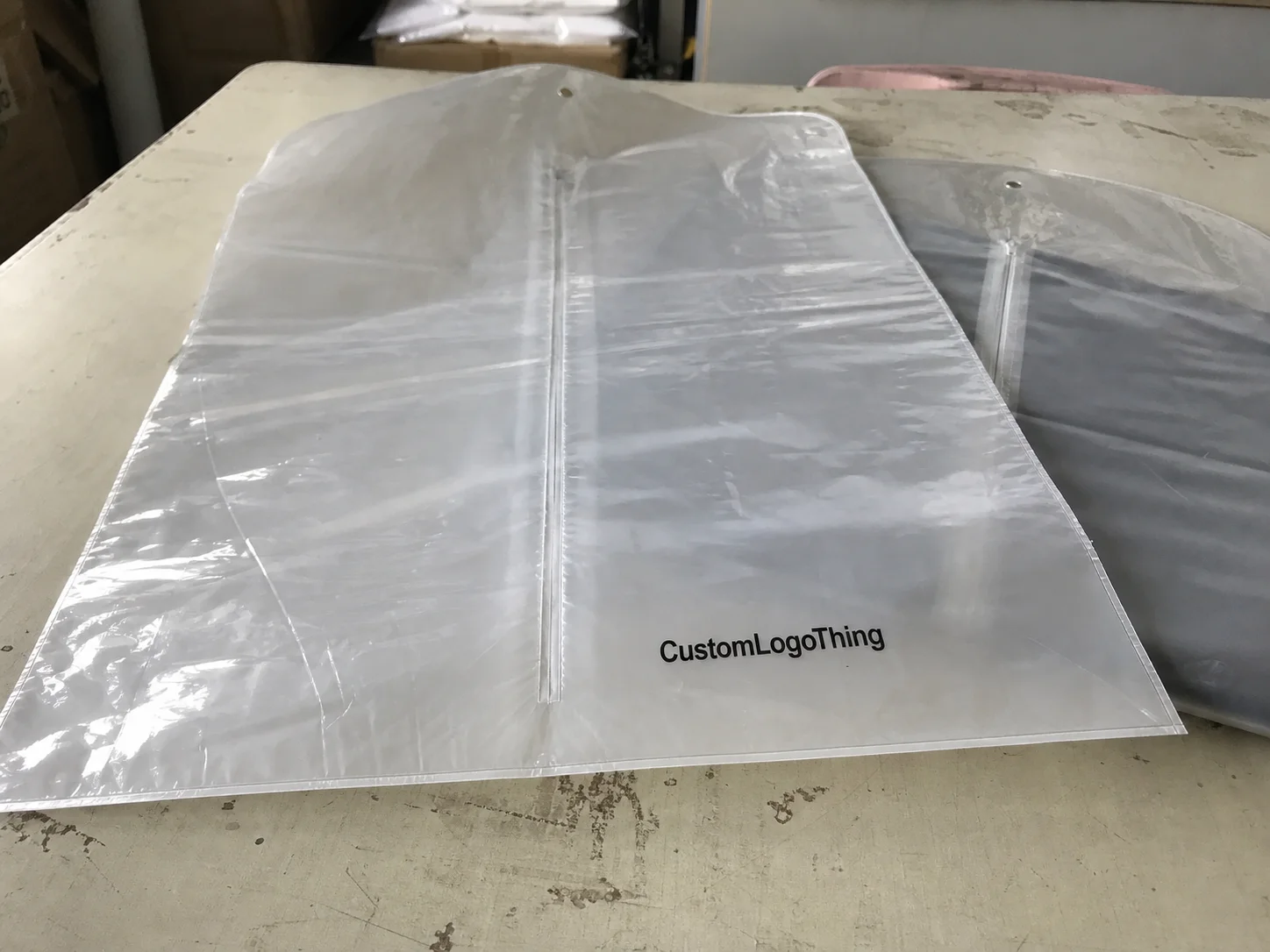
Buyer Fit Snapshot
| Best fit | Cohesive Brand Typography Packaging projects where brand print, material claims, artwork control, MOQ, and repeat-order consistency need to be specified before quoting. |
|---|---|
| Quote inputs | Share finished size, material target, print colors, finish, packing count, annual reorder estimate, ship-to region, and any compliance wording. |
| Proofing check | Approve dieline scale, logo placement, barcode or warning zones, color tolerance, closure strength, and carton packing before bulk production. |
| Main risk | Vague material claims, crowded artwork, missing packing details, or unclear freight terms can make a low unit price expensive after revisions. |
Fast answer: Cohesive Brand Typography Packaging: Material, Print, Proofing, and Reorder Risk should be specified like a repeatable production item. The safest quote records material, print method, finish, artwork proof, packing count, and reorder notes in one written spec.
Production checks before approval
Compare the actual filled-product size with the drawing, then confirm tolerance on folds, seals, hang holes, label areas, and retail display edges. Reserve space for logos, QR codes, warning copy, and material claims before decorative graphics fill the panel.
Quote comparison points
Review material grade, print process, finish, sampling route, tooling charges, carton quantity, and freight assumptions side by side. A quote is only useful when the supplier can repeat the same color, closure quality, and packing count on the next order.
If you spend enough time on a packaging line in Chicago, Elgin, or even a small converter outside Milwaukee, you start to notice something funny: before a shopper reads the logo or notices a photo, the typography has already told them whether the pack feels trustworthy, premium, or cramped. That is why Tips for Cohesive brand typography packaging matter so much. The right type system can make a corrugated mailer, a folding carton, and a pressure-sensitive label all feel like they belong to the same brand family. And when they don’t? Well, the shelf notices. Loudly.
I’ve watched a production manager at a folding carton plant in Illinois stop a 40,000-piece run because the body copy looked “technically correct” but felt visually off by just enough to hurt shelf presence. He was right. The carton had a beautiful soft-touch coating and a sharp foil logo, but the typography sat there like three different designers had touched it. That kind of mismatch is exactly what Tips for Cohesive brand typography packaging are meant to prevent. I still remember the silence on the floor after he called it out. Brutal, but fair.
For Custom Logo Things, this topic ties directly to Custom Packaging Products, because typography is never just a design decision. It affects print setup, die-line layout, ink behavior, proofing time, and even the customer’s unboxing experience. I see brands obsess over imagery before they settle the typography rules, and that creates avoidable rework once the files hit prepress. Honestly, I think typography gets treated like the boring cousin at the family reunion, and then everyone acts surprised when the package looks messy.
Why Cohesive Typography Changes Packaging Fast
One of the strongest tips for cohesive brand typography packaging I can give is simple: typography is usually the first thing that communicates order. On a busy corrugated run in Grand Rapids, especially with a kraft liner and a one-color print, type spacing and hierarchy often decide whether the pack feels controlled or rushed. I’ve stood next to a flexographic press where the artwork was minimal, the logo was tiny, and the type did almost all the work. The customer didn’t care that the illustration was absent; they cared that the product name, variant, and usage claims were instantly readable at arm’s length.
In plain language, cohesive brand typography packaging means a controlled system where fonts, weights, sizes, spacing, case treatment, and placement work together across every SKU, size, and material. It is not about using the same font everywhere like a stamp. It is about having rules that let the brand expand from a 2 oz label to a 12-pack carton without losing its identity. That distinction matters a lot in branded packaging and product packaging, because real programs usually include more than one substrate, more than one printer, and more than one launch date. A clean system can save a team from revising six dielines in one week, which is the kind of headache nobody puts on a mood board.
Why does it matter so much? Because shoppers see packages in motion. A box slides past on a shelf in Minneapolis. A mailer is stacked in a fulfillment center in Dallas. A pouch sits under warm lighting with glare on the film in a store near Atlanta. Good typography holds up in those conditions. Weak typography disappears. Strong package branding creates recognition, and that recognition builds trust before anyone ever tastes, sprays, pours, or opens the item.
I remember a cosmetic client meeting where the founder brought in three sample cartons from three vendors. Same logo, same color palette, same photography style, but each carton used a different numeral style and different header spacing. The result was a Brand Identity That felt borrowed instead of owned. We fixed it by creating a two-font system with rigid rules for product name, shade, and ingredient block. That kind of cleanup is one of the most practical tips for cohesive brand typography packaging I know, because it improves consistency faster than almost any visual tweak.
Cohesion also helps retail packaging travel across channels. A box on a shelf in Denver, a subscription mailer in transit from Phoenix, and a shipping-ready ecommerce carton packed in New Jersey should feel related even if they do not look identical. The typography can provide that common thread. That is why smart packaging design treats type like infrastructure, not decoration.
“The best packaging type system I’ve seen was almost invisible until you compared five SKUs side by side. Then the discipline jumped out immediately.” — a brand manager I worked with during a beverage carton program in Columbus
There is also a production reason behind all of this. A typographic system reduces correction rounds, which reduces time, and time is money on press. On a 5,000-piece specialty carton run, even one extra proof cycle can add several hundred dollars in art handling and scheduling friction. That is why tips for cohesive brand typography packaging are not just aesthetic advice; they are operational advice too.
How cohesive brand typography packaging works
A solid typographic system usually begins with three roles: a primary brand font, a secondary support font, and a clear hierarchy for everything else. The primary font handles the hero product name, the secondary font handles descriptors or flavor variants, and the support rules cover body copy, claims, instructions, and regulatory text. In practice, the cleanest tips for cohesive brand typography packaging are the ones that keep each job separate instead of forcing one style to do everything. A 7 pt ingredient block should not be asked to behave like a 42 pt display headline. That’s how packages get weird.
Different packaging materials change how type behaves. On coated paperboard, a 5 pt line might hold up if the plate is sharp and the varnish is controlled. On uncoated kraft, that same line can soften and darken, especially if the board absorbs more ink than expected. On label stock, the adhesive and topcoat influence contrast. On shrink sleeves, the film stretch can alter letterforms. On flexible pouches, registration and seal area placement matter just as much as the font choice. Ignore these variables and even the best tips for cohesive brand typography packaging fall apart on press. I’ve seen a 350gsm C1S artboard behave beautifully in one plant in Ohio and then print like a different animal once the same file hit a recycled board in North Carolina.
The workflow matters too. A designer sets the type rules, but prepress checks the file structure, embedded fonts, overprints, traps, and line thickness. Then the press operator evaluates how the type prints under real production conditions. After that, finishing teams verify whether foil stamping, embossing, varnish, or lamination changed the text enough to affect legibility. I’ve seen a gorgeous hot-stamped logo swallow a nearby subtitle because the die pressure was a little too aggressive. That kind of thing is why physical proofing still matters, even for experienced brands. The machine does not care about your mood board. Never has, never will.
Technical file setup also plays a major role in cohesive brand typography packaging. Fonts should be outlined or embedded correctly. Minimum type size should be specified. Safe margins must be respected, especially near die-cuts and folds. Color contrast standards should be defined in the artwork guide. If your type is reversed out of a dark block, the positive space needs enough strength to survive print gain. In many folding carton plants, I’ve seen reversed text become fuzzy because the design looked fine on screen but failed at final press speed. That is exactly the kind of miss these tips for cohesive brand typography packaging are meant to catch early.
Typography also carries brand voice. A luxury skincare carton may use a high-contrast serif for the product name and a restrained sans serif for supporting copy, while a subscription mailer uses the same family in lighter weights with more relaxed tracking. The font family can stay consistent, but the treatment changes based on audience, material, and format. That balance is where package branding gets real. It is not about rigidity; it is about control.
For brands that want a broader view of how the physical format affects presentation, I often point them to Case Studies, because real examples show how typography, substrate, and finishing all interact on actual runs rather than in a mockup deck.
Key factors behind cohesive brand typography packaging
Readability comes first in tips for cohesive brand typography packaging. That means watching minimum point size, x-height, stroke weight, line spacing, and contrast. A 6 pt legal note might be acceptable on a coated carton, but the same size can blur on textured paper or recycled board. If the package has a busy illustration, the type needs either stronger contrast or a quieter zone to live in. I’ve seen a 14 pt product name fail because it sat over a patterned background that looked tasteful in design review and messy on press.
Hierarchy is the second major factor. A shopper should know the product name first, the variant second, and the supporting claim third. If everything screams equally loud, nothing leads. That is a common mistake on custom printed boxes, where marketing teams keep adding benefits until the front panel becomes a billboard. Strong hierarchy lets the most important line win from three feet away, while less urgent information can live in smaller areas without ruining the overall look. Among tips for cohesive brand typography packaging, this is one of the easiest to measure and one of the most often ignored.
Brand consistency covers capitalization, numerals, punctuation, and unit formatting. Do you write “oz.” or “oz”? Are ingredient callouts sentence case or all caps? Do flavor variants use title case or lowercase? These small choices seem cosmetic, but across a line of retail packaging they create a visual rhythm that shoppers start to recognize. When those details drift from SKU to SKU, the brand identity feels less deliberate. I’ve seen one line use “2 Pack,” another use “2-pack,” and a third use “2pk,” all on the same shelf. That is not a system. That is a typing accident.
Material and finish choices matter more than many creative teams expect. Soft-touch lamination absorbs glare and can make thin letters feel cleaner. Matte varnish reduces shine but may soften contrast. Foil stamping adds luxury, yet it can crowd nearby type if the layout is too tight. Embossing can make a logo feel premium, but if the text is too small, the edges can collapse. Spot UV can add sharpness on a coated surface, but it can also create reflections that interfere with legibility under retail lighting. In my experience, one of the best tips for cohesive brand typography packaging is to judge the type after finish selection, not before. Otherwise you’re polishing the wrong version of reality. A design that looked fine in Adobe can get ugly fast on a press in Louisville.
Compliance is another real-world constraint. Ingredient statements, barcodes, warnings, directions, and lot codes have to remain functional. That often means the creative team must reserve one region of the pack for information density instead of trying to make every panel look identical. On food, personal care, and supplement packaging, legibility and legal clarity usually outrank decorative ambition. The typography system has to make room for both.
Cost is part of the conversation, whether brands like it or not. Custom fonts, extra press passes, foil dies, specialty varnishes, and multiple SKUs can all affect pricing. A clean system with fewer type exceptions can shorten proofing time and reduce the need for artwork corrections. A messy system does the opposite. On one beverage carton project out of St. Louis, a client was quoted $0.18 per unit for 5,000 pieces with a standard four-color run, but the revised version with foil detail, two extra proof rounds, and a tighter type lockup pushed the cost noticeably higher. That is why tips for cohesive brand typography packaging should always be tied to production economics.
| Typography approach | Typical production impact | Cost effect | Best use case |
|---|---|---|---|
| Simple two-font system | Fewer approvals, cleaner prepress, faster file prep | Usually lower setup cost | Most branded packaging programs |
| Multiple display fonts | More proofing, more hierarchy conflicts, more correction risk | Can raise design and prepress cost | Limited promo runs or seasonal packaging |
| Type plus foil, emboss, spot UV | Extra plates, extra alignment checks, tighter registration control | Higher tooling and setup cost | Premium retail packaging and luxury lines |
For reference on packaging tests and transport standards, I often look to the ISTA guidelines, and for sustainability-oriented material decisions, the EPA and the FSC resources are useful when the project needs both typographic consistency and responsible material choices.
Step-by-step process for cohesive brand typography packaging
The most reliable tips for cohesive brand typography packaging begin with an audit. Pull every current box, mailer, insert card, sleeve, and label into one review, then compare the fonts, weights, and spacing against each other. I once sat in a client conference room in Indianapolis with 18 actual packages spread across a table, and the issue became obvious in five minutes: four different body fonts, two different numeral sets, and three different interpretations of the brand name spacing. You cannot fix what you have not cataloged. You also cannot pretend the problem is “minor” when every package is introducing a different personality.
Step 1 is the audit. Gather current SKUs, old dielines, e-commerce mailers, and promotional packs. Note where the product name changes position, where the variant shifts case, and where legal copy drifts into different sizes. This gives you a map of what is working and what is not. If a brand has launches in Portland, Austin, and Charlotte, I usually ask for samples from all three regions because the inconsistencies love to hide in the local versions.
Step 2 is defining typographic roles. Write down the hierarchy in plain language: hero headline, product descriptor, variant, callout, body copy, instruction block, compliance block. Keep those labels consistent across all packaging design files. The cleaner the roles, the easier it is to maintain package branding as the line expands. I like seeing this written into the job bag, not just in someone’s head.
Step 3 is testing on the real substrate. Screen mockups are helpful, but they cannot show ink gain, board tooth, film stretch, or the shine of a varnished panel under lights. I’ve watched a recycled board sample turn a delicate sans serif into a near-miss because the fibers broke up the edges slightly. That’s why physical proofs on the actual stock matter so much in product packaging. If anyone tells you a screen is enough, they’ve either never stood on a production floor or they’re trying to save themselves a headache. A proof on 350gsm C1S artboard in Atlanta will behave differently than the same art on a 24 pt SBS carton in Toronto. Different plant, different press, different reality.
Step 4 is building a spec sheet. This is one of the most practical tips for cohesive brand typography packaging because it keeps future teams from improvising. Include approved fonts, minimum sizes, allowed weights, line spacing, letter spacing, capitalization rules, and “do not use” examples. A good spec sheet may feel unglamorous, but it saves hours when new SKUs launch. If the sheet also notes approved cities or plants for production, such as Dongguan for labels or Monterrey for corrugated, it becomes even easier for vendors to align on expectations.
Step 5 is preflighting artwork with the printer or packaging manufacturer. Confirm font embedding, outline conversion, overprint settings, minimum line thickness, trapping, and final trim safety. If your layout includes a die-cut window or fold line, check that no text falls into a stressed area. On custom printed boxes, I usually want to see the live file against the dieline before anyone approves a hard proof. That extra check catches the annoying little errors that never show up in a slide deck. It also catches the “we assumed the copy would fit” problem, which is how you end up paying for emergency revisions at 6:40 p.m.
Step 6 is proof approval. Compare the proof to the brand standard with the same lighting conditions you expect in the field if possible. If the package will sit on a retail shelf, look at it from three feet away. If it will be shipped in ecommerce, check how the typography reads once the box is wrapped, stacked, and taped. A final proof should confirm that the hierarchy feels intentional, not accidental. Ask for one last check on the exact finish too. A satin aqueous varnish on the proof can reveal problems that a digital rendering will hide every time.
Here is a simple workflow summary:
- Audit every current package and label.
- Define type roles and rules.
- Test on real materials and finishes.
- Build a written spec sheet.
- Preflight with the printer or converter.
- Approve a physical proof before production.
These are not flashy tips for cohesive brand typography packaging, but they are the ones that keep a launch from spiraling into revision loops. If I had to pick the biggest production saver, it would be the spec sheet, because it gives every vendor the same target instead of a vague “make it look better” instruction.
Common mistakes that break brand typography cohesion
The first mistake is using too many font families. I’ve seen brands with one script for the logo, another serif for the headlines, a condensed sans for the variants, and a fourth face for the legal text. That might look energetic in a mood board, but on the shelf it often reads as visual noise. One of the clearest tips for cohesive brand typography packaging is to keep the family count low and use weight, scale, and spacing to do the work. Two families can handle most jobs. Four usually means someone lost the plot in week two.
The second mistake is ignoring substrate differences. A font that looks elegant on coated carton may become muddy on kraft corrugate or too faint on recycled paperboard. I remember a coffee client in Seattle whose white-on-brown carton looked beautiful on the monitor but lost detail in the final press run because the reversed type was too small and the board was absorbent. That is not a rare issue. It is a normal production risk. The annoying part is that it was visible in proof if anyone had bothered to look with a printer’s eye instead of a Pinterest eye.
The third mistake is overusing trendy display fonts. Decorative type can work, but only in controlled doses. If every line is a statement, the package ends up fighting itself. Better to let one high-character element carry the personality while the supporting text stays clean and functional. That balance is one of the most underrated tips for cohesive brand typography packaging, especially for brands trying to look premium without becoming hard to read.
The fourth mistake is flattening hierarchy. If the product name, scent, size, and benefit all have equal visual weight, the shopper has to work too hard. In packaging, effort kills clarity. The eye should know where to land first. This is true for luxury cosmetics, dry foods, supplements, and almost any other retail category where the front panel carries the sales burden. If the shopper has to decode the panel at arm’s length, you’ve already made them do homework. Nobody wants homework in aisle seven.
The fifth mistake is forgetting production limits. Tiny reversed-out type, thin hairlines, and cramped stacked copy often look elegant in design review and fragile on press. If the line is going through flexographic printing, you need a little more strength in the letters than you might on an offset carton. If embossing is involved, you need enough space around the text so the impression does not distort the letters. I have seen a 4.5 pt legal note on a folding carton go from “technically acceptable” to “absolutely cursed” after the first pass through finishing.
The sixth mistake is leaving the system undocumented. Without a shared spec, designers make one-off decisions, marketing tweaks a headline in a rush, and the next print run drifts from the original look. That is how package branding slowly loses shape. Strong tips for cohesive brand typography packaging always end with documentation, because a good system only stays good if future teams can follow it.
There is also a commercial mistake I see often: brands approve typography based on one hero SKU and assume it will scale. Then the small label, the tall mailer, and the wide carton all force different compromises. A system has to be tested across formats, not just in one “perfect” layout. Otherwise, the brand ends up rebuilding the type rules every time a new container appears.
Expert tips for cohesive brand typography packaging
If you want my honest opinion, the best tips for cohesive brand typography packaging are usually the least dramatic. Keep the system simple. One primary serif or sans serif family and one support family will solve more problems than a shelf full of style experiments. If your brand absolutely needs a display face, reserve it for the logo or one seasonal accent so the core packaging stays steady. That approach is easier to manage in production, easier to proof, and much less likely to explode when the line expands to a second factory in Mexico or Vietnam.
Use scale with intention. A strong headline paired with restrained body copy often looks more premium than everything set in bold. In a lot of premium skincare and candle packaging, the restraint is what creates the sense of quality. The package seems confident because it doesn’t shout. That’s a useful lesson for any brand trying to elevate its product packaging without increasing visual clutter. Quiet can be expensive-looking. Who knew?
Design for the material, not just the mockup. I cannot say that enough. Ask for a physical proof on the actual stock, with the actual finish, before you approve final files. If the project uses a 350gsm C1S artboard with soft-touch lamination, test the type there; if it uses uncoated kraft, test there too. One of the strongest tips for cohesive brand typography packaging is to assume the substrate will change the personality of the font, because it almost always does. A nice serif on screen can look crisp on coated board in Suzhou and a little sleepy on recycled stock in Leeds.
Build variant rules early. Flavor names, scent names, product tiers, and size indicators tend to create the most inconsistency as a line grows. Set the rules once: how long can the variant line be, what weight should it use, where should it sit, and how much tracking does it need? Then enforce those rules across all future SKUs. That kind of discipline is one reason some branded packaging programs stay clean for years while others become patchworks in six months.
Collaborate with production teams on the finishing details. Foil dies, varnish plates, embossing locations, and die-cut windows can all interfere with typography if they’re not coordinated early. On one luxury carton job, we moved a foil border by 2.5 mm so the brand name could breathe better, and that tiny change improved readability immediately. Production teams see problems early because they know where the press will struggle. That practical input belongs in any serious list of tips for cohesive brand typography packaging.
Document the whole system in a style guide that covers both design and manufacturing. Include approved typefaces, hierarchy examples, minimum type sizes, contrast rules, color usage, alignment rules, and a short section on what to avoid. A good guide should also show how the typography behaves on folding cartons, labels, pouches, and mailers so future launches don’t need to start from scratch. If the guide doesn’t mention press-ready file prep, someone will end up asking a prepress tech in New Jersey to interpret “make it feel premium.” That’s not a process. That’s a cry for help.
A quick reference matrix can help teams stay aligned:
| Packaging element | Recommended typographic focus | Production watch-out |
|---|---|---|
| Front panel headline | Brand name and product name clarity | Keep clear of folds, varnish edges, and foil crowding |
| Side panel copy | Instructions, claims, and details | Maintain legibility after die-cut and fold lines |
| Bottom panel or back panel | Compliance and regulatory text | Avoid tiny reversed type and weak contrast |
For me, the most effective tips for cohesive brand typography packaging always combine design restraint with production realism. That combination is what separates a pretty rendering from Packaging That Actually prints well, ships well, and sells well.
Process, timeline, and next steps for cohesive brand typography packaging
A realistic workflow starts with discovery and a typographic audit, then moves into concept development, proofing on substrate, prepress corrections, production approval, and final run. For a simple update to existing artwork, the schedule may be short if the font system is already locked. For a full packaging redesign with new dielines, multiple finishes, and several SKUs, plan for more review cycles. That is one of the practical tips for cohesive brand typography packaging I give every brand: the earlier you settle the type rules, the less the calendar gets squeezed later. A brand that starts late in February and needs shelves by mid-April is already flirting with trouble.
Timeline depends on complexity. A single carton refresh can typically move from proof approval to production in 12-15 business days if the copy is final and no specialty finishing is involved. A multi-format launch with folding cartons, labels, and mailers usually needs 20-30 business days because each format introduces different typography constraints. If someone promises a dramatic turnaround without asking about substrate, finish, quantity, and shipping region, I would be cautious. Good print production rarely rewards rushing. Especially not when a plant in Dongguan is waiting on a revised foil layout and your team still hasn’t locked the headline.
Pricing tracks closely with those decisions. Rush approvals, extra revisions, specialty finishes, and multiple packaging formats can increase the total cost. A clean spec sheet and well-defined hierarchy can save money because the printer is not guessing, and the design team is not reworking the same text in three different layouts. I’ve seen brands spend more on avoidable corrections than they would have spent on the original planning meeting. That is not a fun lesson, but it is a common one. For example, a 5,000-piece folding carton run with 350gsm C1S artboard and a standard aqueous coating might land around $0.15 per unit from proof approval to release, while the same job with a second proof, a foil stamp, and a revised type hierarchy can climb much higher.
Here is a straightforward next-step list:
- Gather all current packages, labels, and mailers.
- Identify the top three typography issues hurting consistency.
- Choose one reference package that best represents the brand.
- Create a do-not-change list for the core type rules.
- Request a proof on the actual stock before final approval.
If you are building or refreshing a packaging line, start with the packages that get seen most often: hero SKUs, best sellers, and ecommerce cartons. That is where cohesive typography makes the fastest visible difference. It is also where customers form the strongest memory of the brand identity. A launch in Toronto, for example, may need the main SKU and the subscription mailer standardized first, then the back-panel compliance text cleaned up in phase two. That kind of sequencing keeps the team sane.
I’ve had more than one client tell me that once the typography was standardized, the whole brand suddenly looked more expensive, even before changing materials. That tracks with what I’ve seen on the floor. When the type hierarchy is disciplined, the unboxing experience feels more intentional, and the packaging design stops fighting itself. One beverage client in Nashville changed nothing but line spacing, weight, and variant placement, and the shelf presentation looked like it had gained a full level of polish.
So if your team is reviewing a launch, use these tips for cohesive brand typography packaging as a checklist: fewer type families, stronger hierarchy, real substrate testing, clear documentation, and early production input. That combination will carry across custom printed boxes, retail packaging, and branded packaging systems far better than a style trend ever will.
At Custom Logo Things, that is the standard I would aim for before the next print run: clean hierarchy, controlled variation, and typography that behaves the same way on screen, in proof, and on the finished package. When those pieces line up, tips for cohesive brand typography packaging stop being theory and become a practical way to protect the brand, reduce rework, and improve the final shelf presence.
What are tips for cohesive brand typography packaging in a multi-SKU line?
Use the same font family system across all SKUs, then vary weight, size, and spacing for hierarchy. Set strict rules for product name, flavor, and regulatory text placement so every box feels related. Test the system on the smallest and largest package formats before rolling it out across the line. If your smallest label is 2.5 inches wide and your largest shipper is 16 inches wide, check both before production, not after.
What are the best tips for cohesive brand typography packaging across multiple SKUs?
Use the same font family system across all SKUs, then vary weight, size, and spacing for hierarchy. Set strict rules for product name, flavor, and regulatory text placement so every box feels related. Test the system on the smallest and largest package formats before rolling it out across the line. If your smallest label is 2.5 inches wide and your largest shipper is 16 inches wide, check both before production, not after.
How do I choose fonts for cohesive brand typography packaging?
Start with readability and brand personality, then check whether the type performs well on your actual packaging materials. Choose fonts with enough weights for hierarchy and enough character support for ingredients, units, and multilingual text if needed. Avoid fonts that are too thin, too condensed, or too decorative for small package copy. If the font collapses at 6 pt on a coated board in a physical proof, it is not your font. It is a problem.
How much does cohesive brand typography packaging affect cost?
It can reduce costs when a strong system lowers revisions and speeds up approvals across future runs. It can increase cost if typography requires specialty finishes, custom fonts, extra plates, or more proofing rounds. Planning typography early usually saves money because it avoids late-stage artwork changes and press delays. On a 10,000-piece carton run, even one avoided proof round can save a few hundred dollars in prepress time and a full day of scheduling friction.
What is the typical timeline for cohesive brand typography packaging development?
A simple refresh may take only a few review cycles if the font system is already established. A full packaging redesign usually needs time for audit, design, proofing, prepress, and production approval. Physical proofs are worth the time because they reveal legibility and finish issues that screen mockups miss. In many plants, the full process runs 12-15 business days after proof approval for a straightforward carton and 20-30 business days for multi-format packaging.
What mistakes should I avoid when building cohesive brand typography packaging?
Do not mix too many fonts or change hierarchy from one product to the next. Do not approve tiny type or thin reversed-out text without testing it on the actual substrate. Do not leave typography decisions undocumented, or future packaging runs may drift away from the brand standard. And do not assume the same layout will work on kraft, coated board, and label stock without checking each one on press.