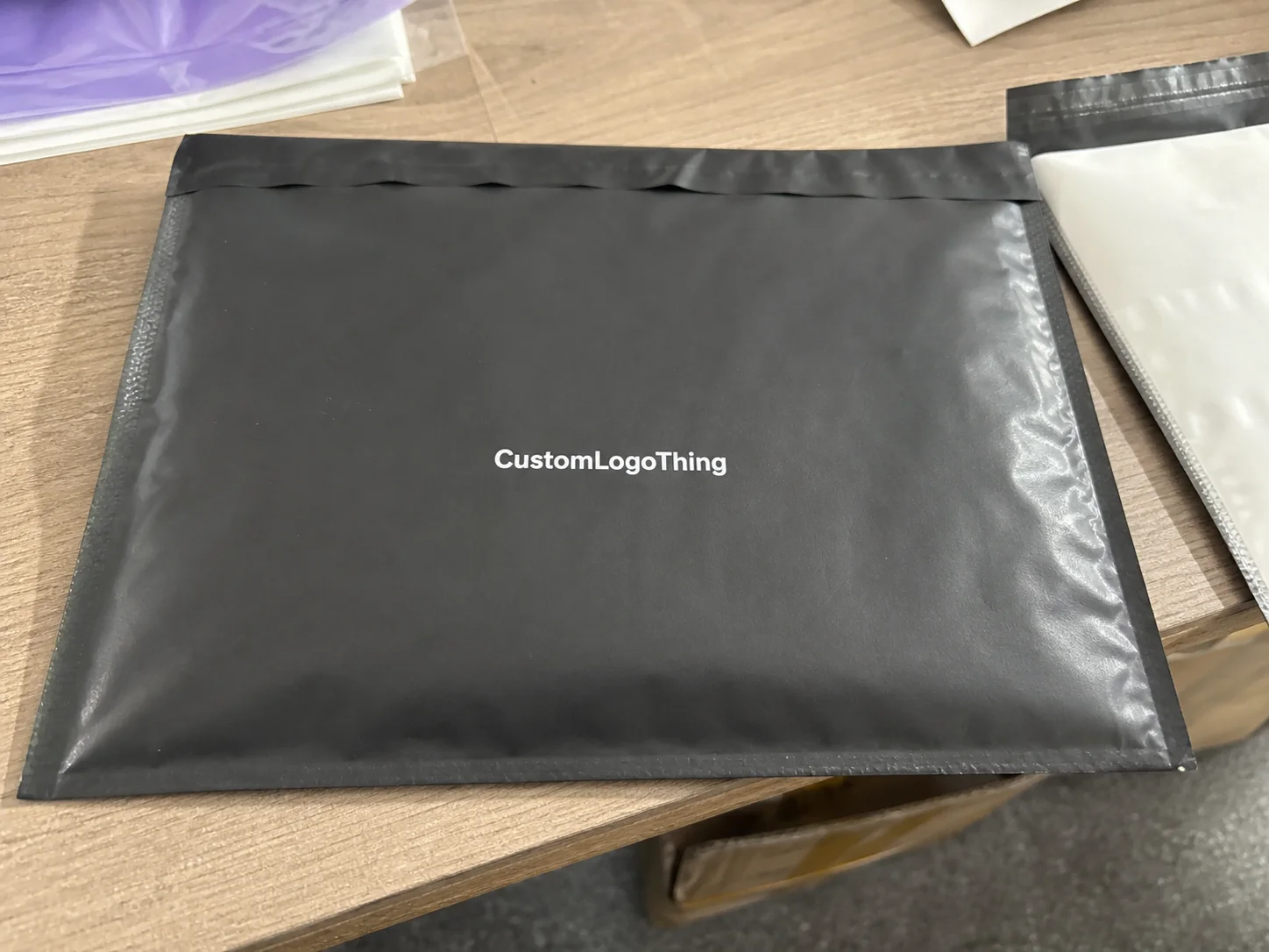
Buyer Fit Snapshot
| Best fit | Custom Hang Tag Branding projects where brand print, material claims, artwork control, MOQ, and repeat-order consistency need to be specified before quoting. |
|---|---|
| Quote inputs | Share finished size, material target, print colors, finish, packing count, annual reorder estimate, ship-to region, and any compliance wording. |
| Proofing check | Approve dieline scale, logo placement, barcode or warning zones, color tolerance, closure strength, and carton packing before bulk production. |
| Main risk | Vague material claims, crowded artwork, missing packing details, or unclear freight terms can make a low unit price expensive after revisions. |
Fast answer: Custom Hang Tag Branding: Material, Adhesive, Artwork, and MOQ should be specified like a repeatable production item. The safest quote records material, print method, finish, artwork proof, packing count, and reorder notes in one written spec.
Production checks before approval
Compare the actual filled-product size with the drawing, then confirm tolerance on folds, seals, hang holes, label areas, and retail display edges. Reserve space for logos, QR codes, warning copy, and material claims before decorative graphics fill the panel.
Quote comparison points
Review material grade, print process, finish, sampling route, tooling charges, carton quantity, and freight assumptions side by side. A quote is only useful when the supplier can repeat the same color, closure quality, and packing count on the next order.
The strongest Tips for Custom hang tag branding usually begin with a simple truth I learned on a finishing line in Dongguan, where a tag can sell the product before anyone touches the fabric. I remember watching buyers pick up a shirt, thumb the hang tag once, and decide within three seconds whether the brand felt worth the shelf space, which is exactly why tips for custom hang tag branding matter far more than most teams expect. On that run, the tags were printed on 350gsm C1S artboard with a matte aqueous coating, and the difference in perceived value was immediate, which is equal parts fascinating and mildly infuriating when you realize how much revenue can hinge on a piece of board that costs only pennies.
Too many brands treat hang tags like an afterthought, then wonder why their package branding feels uneven. The tag is often the first tactile brand experience, whether the product is hanging in retail packaging, sitting inside a mailer as part of the unboxing experience, or presented at a showroom table beside custom printed boxes and tissue paper. That little card has a job: make the product feel intentional, credible, and worth the price. I’ve stood in factories in Guangzhou and Xiamen where a tag was the only thing separating a “nice item” from something buyers called “retail-ready,” and that distinction is not subtle once you’ve watched it happen enough times.
A hang tag is not just a place for a logo and a barcode. In practice, it is a compact piece of branding design that carries message hierarchy, material feel, color control, and structural durability. If you are looking for tips for custom hang tag branding That Actually Help sales, you need to think about more than ink on paper. You need to think like a buyer, a customer, and the prepress technician in Shenzhen who has to fix a file at 11 p.m. because someone placed the trim too close to the copy (yes, that happens more than anyone admits), often after a rushed proof round that could have been avoided with a 0.125-inch bleed.
What Custom Hang Tag Branding Really Means
On the factory floor, I’ve seen a plain tag turn a mid-range garment into something that looked retail-ready simply because the stock, fold, and finish were chosen with care. That is the heart of Tips for Custom hang tag branding: using shape, paper stock, typography, color, print finish, and attachment style to communicate value at a glance. A good tag does not shout; it signals. It has that quiet confidence that makes a shopper think, “Okay, these people know what they’re doing,” especially when the card is printed on a clean 400gsm coated board with crisp die-cut edges and a 3 mm rounded corner.
Custom hang tag branding is the deliberate use of visual and physical details to support brand identity. It includes the paper board, the dieline, the print method, the way the hole is punched, and even how the string or fastener sits against the product. In a showroom in Shanghai, those details affect how buyers read the brand. In e-commerce, they show up in product photos and in the first seconds of the unboxing experience. In wholesale, they help a line look organized instead of improvised. A tag that looks like it was assembled in a hurry tends to whisper “we rushed everything,” and nobody wants that whisper following their product around.
I’ve seen small brands win shelf credibility with a 350gsm C1S tag and a clean matte finish, while larger accounts stumbled with flimsy stock and crowded copy. That’s why Tips for Custom hang tag branding should always include durability and consistency, not just aesthetics. A tag that curls, scratches, or tears at the hole tells a customer more than the logo ever can. I still remember one sample run in Dongguan where the hole punched too close to the edge and started fraying after one pass through the warehouse test rack. The tag looked fine on the table, then behaved like a grumpy paper napkin in the real world. Not ideal, especially after the client had already approved the proof and booked 10,000 pieces.
A basic tag lists information. A branded tag supports price perception, product positioning, and trust. That distinction matters whether you are selling handmade candles in Portland, denim jackets in Los Angeles, gourmet snacks in Melbourne, or giftable accessories in London. I’ve stood beside a buyer in a Shenzhen facility who kept one sample and rejected another, and the difference was not the product itself; it was the tag’s structure and visual discipline. That kind of moment sticks with you because it proves the point in a way no slide deck ever could, particularly when one sample used a clean uncoated 300gsm stock and the other used a glossy board that reflected every overhead light in the room.
If you want more context on label and tag presentation across product categories, our Custom Labels & Tags page is a useful reference, and our Case Studies show how small print decisions change customer perception. Those are the kinds of tips for custom hang tag branding that come from real production, not theory. I’d take a real sample over a polished mockup any day, especially when the sample is delivered by a printer in Dongguan with the exact board, foil, and hole placement the line will actually use.
“A hang tag is a tiny billboard with a tactile edge. If the board feels cheap, the brand feels cheap.”
That line came from a buyer during a sampling review I attended in Guangzhou, and it stuck with me because it was brutally honest. It also explains why tips for custom hang tag branding should always account for feel, not just visuals. Good branding is half sight, half touch, and the touch part is the one people underestimate until they pick up a sample printed on 350gsm C1S artboard with a soft-touch laminate and immediately go, “Oh. That’s better.”
How the Hang Tag Branding Process Works
The production flow is more technical than many teams realize. One of the most practical tips for custom hang tag branding I can give is to understand the whole chain before you approve artwork. It usually starts with a concept sketch or a rough layout, then moves into a dieline, proof, print setup, finishing, cutting, punching, and final packing. If that sounds like a lot of steps for “just a tag,” well, welcome to print production in Shenzhen and Dongguan, where the tiny things are somehow always the most complicated and the average turnaround can still be 12 to 15 business days from proof approval if the file is clean.
In a typical factory run, the artwork is first checked against the dieline to make sure the safe zone is respected and the bleed is correct. Then the job moves to offset printing or digital printing, depending on quantity, color complexity, and turnaround. For high-volume orders, offset often gives better consistency and lower unit costs; for smaller runs or frequent revisions, digital can be the smarter choice. That decision alone is one of the most overlooked tips for custom hang tag branding. I’ve seen teams fight over finish choices while ignoring the printing method, which is a little like arguing over the rims while the engine is still missing, especially when a 5,000-piece offset run in Dongguan can come in at roughly $0.15 per unit for a single-color job on standard stock while a 500-piece digital run might be several times higher.
From there, finishing choices begin to matter. I’ve seen jobs run through foil stamping for a logo, then embossing on the mark, followed by spot UV on a small graphic detail to create contrast. When that combination is done well, the result feels premium without looking busy. When it is done poorly, the tag becomes a shiny distraction. The same goes for lamination: gloss can heighten color saturation, while matte or soft-touch can give a calmer, more refined read. I’m personally a fan of matte on most fashion tags, though I’ll admit a sharp foil hit on 400gsm board from a factory in Guangzhou can make a room go quiet for the right reasons.
Paper choice changes everything. A coated stock will hold crisp type and bold color differently than uncoated kraft or a recycled board with visible fiber. Ink coverage also plays a part. Heavy coverage on a porous sheet can soften edges and shift the perceived color, while a lighter ink load on a smoother sheet often looks sharper. These are practical tips for custom hang tag branding that save money because they reduce rework. They also spare everyone from that awkward moment when a “warm natural brown” turns into “why is this tag muddy?” once the press sheets come off the machine in Dongguan after a 1,000-sheet test run.
Timeline is another place where brands get surprised. A clean job with ready artwork, one proof round, and standard finishing might move from approval to shipment in 12 to 15 business days. Add Custom Die Cutting, foil, multiple proof rounds, or special paper sourcing, and the schedule stretches. Rush jobs are possible, yes, but I’ve seen schedules collapse simply because the final logo file was not press-ready. One of the most honest tips for custom hang tag branding is to treat final art as a production asset, not a design draft. The printer cannot magically “make it work” if the file is a mess, no matter how much everyone wishes otherwise, and a second proof round can add three to five business days before the press even starts.
For packaging professionals, it helps to compare tag production with other branded pieces like Custom Packaging Products, because the same print logic applies across boxes, inserts, and labels. When a brand keeps its branding design aligned across those pieces, the customer sees a coherent system instead of random parts. And honestly, once you’ve seen how much cleaner a line looks when the print specs match across the board in Shenzhen, it’s hard to go back.
If your team needs technical reassurance, standards and testing guidance from organizations like ISTA and materials insight from the FSC can be helpful, especially when your hang tags need to support shipping durability or sustainability claims. Those references do not replace production experience, but they do strengthen the decision-making behind tips for custom hang tag branding. I like having that extra layer of sanity check before anyone signs off on a run that’s going to live in the wild, particularly when the supplier is quoting recycled board from a paper mill in Zhejiang and the delivery window is already tight.
Key Branding Factors That Make a Tag Work
The most effective tips for custom hang tag branding start with material selection. A kraft tag can feel handmade, earthy, and honest. A coated artboard tag can feel polished and commercial. A textured specialty paper can signal craft, luxury, or limited-edition status. I’ve seen a tea brand switch from plain white board to lightly flecked recycled stock from a mill in Zhejiang, and the product suddenly felt more connected to its story without changing the logo at all. That’s the kind of shift people feel before they can explain it, especially when the stock is 320gsm and paired with a subtle blind emboss.
Typography is the next major factor. Font weight, line spacing, and hierarchy affect whether a tag feels calm or crowded. Decorative scripts may look lovely on a screen, but on a 2.5-inch-wide tag they can blur into noise. A clean sans serif at 6.5 pt with enough leading is often more readable than a beautiful but fragile display font. That is one of those tips for custom hang tag branding that sounds basic, yet it prevents a lot of expensive disappointment. I’ve lost count of how many times a brand has fallen in love with a font that looked gorgeous in layout and then turned into a tiny decorative disaster once printed at actual size on a 45 mm-wide hang tag.
Color matters, too. Warm neutrals, deep blacks, and muted metallic accents tend to support premium fashion and giftable products. Bright saturated colors can work beautifully for youth, sports, or playful consumer goods if the rest of the layout can handle the energy. The key is contrast. If your tag has dark copy on a dark background, the customer will struggle. I’ve had clients insist on a deep navy logo on charcoal board because it looked elegant in a render, then had to rework the job after seeing the press proof under factory lighting in Guangzhou. The render lied, as renders sometimes do (rudely), and the corrected version used a higher-contrast white ink on 350gsm black card.
Structural details make a bigger difference than many marketers expect. Rounded corners can soften a luxury tag. A Custom Die Cut can create a memorable silhouette. Hole placement affects how the tag hangs, rotates, and interacts with the garment or package. A top-center hole gives a balanced swing, while an offset hole can add personality but also create unwanted twist. That may sound minor, but in a busy retail rack, a tag that twists into the wrong position is not doing its job. It’s basically out there freelancing, especially when the string is 120 mm long and the carton is packed tightly for shipment from Dongguan.
Consistency ties everything together. If the tag looks premium but the mailer, tissue, and label system feel unrelated, the customer senses a disconnect. Strong brand identity depends on repeatable cues: the same type family, the same color range, the same material language, and the same tone of voice. I’ve seen brands improve trust simply by making their hang tag, insert card, and exterior packaging feel like they came from the same desk. That is one of the most practical tips for custom hang tag branding I know. It turns a pile of separate pieces into a system.
For brands building a full system of branded packaging, the tag should not sit alone. It should echo the box, insert, label, and product copy so the entire experience feels intentional. In my experience, that consistency is what moves a product from “nice item” to “brand people remember.” It’s the difference between someone tossing the item in a drawer and someone keeping the tag because the whole thing felt worth holding onto, from the 350gsm card stock to the matching ink tone on the sleeve printed in Shenzhen.
Step-by-Step: Building a Strong Hang Tag Strategy
The first step is to decide the message the tag must deliver in five seconds or less. Luxury, sustainability, craftsmanship, playful personality, technical performance, heritage, or giftability: pick one primary idea. Brands often want all six. That is where the layout starts to collapse. The strongest tips for custom hang tag branding always begin with focus. If the tag tries to do everything, it ends up saying almost nothing, even if the cardstock costs $0.20 per unit and the foil stamp looks impressive at first glance.
Next, map the information hierarchy. The front of the tag should carry the brand signal: logo, name, and perhaps one short line that reinforces positioning. The back can handle product details, origin notes, care instructions, or a QR code. If something is not essential, move it off the tag and into an insert, website, or product page. I’ve watched buyers react better to a tag with only three clear messages than to one overloaded with nine bullets and two icons. They do not want a scavenger hunt; they want clarity, and that is especially true when the tag size is only 70 x 140 mm.
Then choose size and shape based on the product and the display environment. A small jewelry tag needs a different footprint than a denim hang tag or a gourmet food card tied to ribbon. If the product hangs on a crowded rack, oversized tags can get bent. If the product is sold in a gift box, a compact but heavier stock may feel better. One of the best tips for custom hang tag branding is to mock the tag on the actual product, not just on a screen. Screens are liars too, honestly, and a 3D sample taped to the item in a warehouse in Dongguan tells the truth faster than any render.
Artwork preparation comes next. Use correct bleed, usually 0.125 inch or the printer’s specified margin, and keep critical text inside safe zones. Images should be at press-quality resolution, typically 300 dpi for printed art. If you are working with a foil stamp or emboss, supply separate vector layers. That helps the prepress team separate the print steps cleanly and reduces costly confusion at proofing. I cannot stress this enough: a tidy file saves friendships, and in practical terms it often saves two to four days on the schedule.
I learned this lesson in a packaging meeting where a fashion client sent a beautiful PDF that looked fine on a laptop but placed the barcode too close to the trim edge. On press, that barcode risked clipping once the die cut was applied. We caught it at proof stage, but it added two days and a second revision round. Since then, I tell clients that a clean file is one of the most underrated tips for custom hang tag branding. A pretty file that fails production is just expensive decoration, especially when the reprint is coming from a factory in Shenzhen and the ship date has already been promised to the retailer.
Before full production, approve a prototype or press proof. Check the color, the paper feel, the hole strength, and the balance of the layout. Hold the sample against the actual product under real lighting. Retail LED lights will show color and texture differently than office lighting, and that difference matters. If the tag is for a premium line, ask whether the finish feels consistent with the rest of the product packaging system. That is where polished packaging design shows its value. I’ve had tags go from “great” to “nope” just by moving them from a desk lamp to store lighting in a Shanghai showroom.
Brands that want to dig deeper into category examples can also compare their concept against our Case Studies, since seeing real outcomes often clarifies which tips for custom hang tag branding are worth adopting first. Real examples beat theoretical advice every time, especially when those examples show how a 350gsm C1S tag with a clean matte finish outperformed a glossy alternative in a real retail environment.
Cost and Pricing Tips for Custom Hang Tag Branding
Price is usually driven by quantity, stock, color count, finishing, and attachment accessories. If you want practical tips for custom hang tag branding, start by understanding where each dollar goes. A simple rectangular tag on 400gsm coated board with one-color print is dramatically more economical than a custom shape with foil, embossing, and soft-touch lamination. That sounds obvious, but I’ve watched plenty of teams discover it only after the quote arrives and everybody suddenly gets very quiet, especially when the factory in Dongguan breaks the estimate into plate cost, die cost, and finishing cost line by line.
For a rough planning example, a basic 5,000-piece run might land around $0.15 per unit for a single-sided print on standard 350gsm C1S board with a simple hole punch, while a more decorative version with foil and specialty board could jump significantly higher depending on tooling and setup. Shorter runs cost more per piece because the press setup, die creation, and finishing time get spread over fewer units. That is why one of the smartest tips for custom hang tag branding is to balance order size with inventory needs. Ordering too few can be just as annoying as ordering too many, especially when the exact tag stock gets discontinued six months later and everyone has to pretend that was part of the plan.
I’ve sat in supplier negotiations where a brand wanted five finish effects on a small run of 2,000 tags. The unit price climbed fast, and the client was shocked. The better move was to choose one premium feature, not all of them. A single foil logo or a soft-touch coating can create a premium feel without pushing the project into luxury-only pricing. More effects do not automatically mean more value; sometimes they just mean a louder tag with a fatter invoice, particularly when the job has to be produced in Guangzhou with a custom steel rule die and a second proof round.
Proofing and sampling should also be part of the budget. A press proof, especially for color-critical work, may add cost, but it can save a much larger loss if the final run misses the mark. If the brand uses seasonal colors or strict Pantone matching, sample rounds become even more important. That is one of those tips for custom hang tag branding that protects both quality and margin. Paying for one good proof is cheaper than explaining to a customer why the brand red now looks suspiciously like brick dust, and in many factories that proof fee is still a modest line item compared with a full reprint.
If you are trying to control spend, choose the finish strategically. For example, a matte board with an embossed logo can feel expensive without requiring foil or multiple varnish layers. Or a clean uncoated sheet with strong typography might support a natural brand better than a glossy, heavily decorated option. The goal is not to spend the most; it is to spend where the customer can feel it. That’s a judgment call, and in my experience, the best call is usually the simplest one with the sharpest execution, particularly on a 350gsm stock from a paper mill in Zhejiang.
These pricing decisions sit alongside broader branding design choices and often affect the rest of the packaging line. A tag that pushes cost too high may force compromises elsewhere, whether on custom printed boxes, inserts, or shipping materials. In the best systems, the tag, box, and label budgets are planned together. That way the whole package feels deliberate instead of one piece carrying the weight while the others limp behind, and the launch can still hit a 12 to 15 business day production window from proof approval if the scope stays disciplined.
Common Mistakes to Avoid in Hang Tag Branding
The biggest mistake I see is clutter. Too many words, too many icons, too many weights, too many colors. A hang tag is small, and the eye can only process so much in one glance. One of the most valuable tips for custom hang tag branding is to subtract before you add. If the layout feels crowded in a PDF, it will feel worse in hand. And once it feels crowded in hand, it starts looking cheap, which is a painful thing to watch after all that effort, especially on a 60 x 90 mm tag where every millimeter matters.
Low contrast is another problem. Tiny gray text on off-white stock can look tasteful in a design file and nearly invisible on press. Decorative typefaces can also create trouble, especially if the letters need to be read in a retail setting from arm’s length. I’ve seen store staff misread care instructions because the font was more artistic than functional. That is not branding; that is friction. The customer should not need a magnifying glass to figure out how to wash a sweater, and the issue becomes worse if the tag is printed on a textured recycled board in a dim showroom.
Inconsistent brand color is a subtle but serious issue. If the tag is one shade of red and the packaging insert is another, the customer may not know why, but they feel the inconsistency. It makes the line seem less intentional. Strong package branding depends on repeatability, and that means matching print standards as closely as possible across pieces. I’ve had brands swear the colors were “close enough,” and then the samples sat side by side under daylight in Guangzhou and suddenly looked like they were arguing with each other.
Another common mistake is choosing a finish that clashes with the brand story. Ultra-gloss on a brand built around organic materials can feel off. Heavy foil on a rustic hand-poured candle can undermine authenticity. The finish should support the message, not fight it. I remember a meeting with a natural skincare startup that fell in love with silver foil. On the sample, the effect looked too cold for a brand centered on botanical ingredients, and we moved them to blind emboss on recycled board instead. The finished tag fit them far better. The team was disappointed for about ten minutes, then relieved for the next ten years, especially once the line was photographed in a studio in Shanghai and the understated finish read as premium rather than flashy.
Production mistakes can be expensive too. Forgetting bleed, placing text too close to the trim, or leaving the hole punch area too crowded can cause immediate rework. If the hole cuts into a logo or clashes with a focal element, the tag loses balance. These are technical details, but they are exactly the kind of tips for custom hang tag branding that separate polished work from costly do-overs. A clean mechanical layout is not glamorous, but neither is paying for a reprint because somebody ignored the trim area on a 10,000-piece order.
For brands that want to see how well-executed packaging avoids these pitfalls, our Custom Packaging Products page shows how tags, boxes, and inserts can be coordinated without visual noise. That kind of system thinking is what makes tips for custom hang tag branding more than a design checklist. It turns the packaging into a conversation instead of a jumble, especially when the box, insert card, and hang tag are all produced to the same print tolerance in Dongguan.
Expert Tips to Make Your Hang Tags More Effective
Design the front of the tag like a storefront sign. That means one primary message, one visual anchor, and a clear hierarchy. If the logo is the hero, give it room. If the product name is the hero, let it breathe. This is one of the most reliable tips for custom hang tag branding I’ve used across apparel, gift products, and accessory lines. A tag with breathing room feels more confident, and confidence sells better than noise, especially on a 75 x 125 mm tag printed in Guangzhou with a matte finish and clean edge cut.
Use tactile cues to strengthen memory. Soft-touch lamination can make a premium brand feel calm and controlled. Uncoated stock can support sustainability messaging. Embossing gives the hand something to remember, and the memory of touch often lasts longer than color alone. I’ve seen buyers keep a sample tag in their notebook simply because the board felt right. That kind of response matters. People may forget the exact Pantone, but they remember the feel of a piece that made them pause, whether it was 350gsm C1S from Dongguan or a textured specialty sheet from a paper house in Zhejiang.
QR codes can be helpful, but only when they earn their place. Use them for care instructions, product registration, origin stories, or sourcing details. Don’t add one just because it feels modern. If a QR code is tiny, poorly printed, or placed where it will be damaged by handling, it frustrates customers more than it helps them. One of the most practical tips for custom hang tag branding is to test the scan in store-like lighting before approving the run. I’ve had codes fail because of finish glare, and watching a perfectly good tag become a useless square of regret is deeply annoying, especially when the print run was already scheduled for shipment from Shenzhen.
Match the tag to the product environment. Heavy coated board may be ideal for folded apparel on a retail rack, while lighter kraft tags can suit artisan soap, handmade stationery, or small gift items. If the product ships inside a box, the tag should feel compatible with the inner packaging materials and the brand promise. Good branding design does not stop at the tag; it carries through the entire package journey. That means thinking about the mailer, the insert, the tissue, and the moment the customer first touches the product, all the way from the carton in Dongguan to the shelf in the store.
Test the tag in real conditions. Hang it on the actual product, let it swing, see whether it curls, and check readability under store lighting. I’ve done this on a production line while standing beside a carton of finished goods, and the difference between a desk sample and a real sample can be dramatic. A layout that looks perfectly balanced flat may feel awkward once it hangs, especially if the hole placement is slightly off. Even a few millimeters can Matter More Than anyone wants to admit, particularly when the tag is tied with 120 mm cotton string and the product is moving on a crowded rack.
Brands focused on sustainability should also ask about paper sourcing and recycling compatibility. The EPA recycling guidance can be useful when deciding which coatings or adhesives may affect end-of-life handling, and the Forest Stewardship Council provides a reference point for responsibly sourced paper options. Those details can support claims, provided they are accurate and documented. That honesty is part of trustworthy tips for custom hang tag branding. Green claims without proof are a fast way to lose credibility, and nobody wants that smoke, especially if the paper is sourced from FSC-certified mills in Zhejiang or Fujian.
Finally, remember that the tag is one piece of a larger customer experience. If your tag is elegant but your insert card is generic, the system feels incomplete. The best brands align the tag with the rest of the branded packaging so every touchpoint reinforces the same message. That’s where the customer starts to believe the price. Not because the tag alone was magical, but because the whole package behaved like it knew what it was, from the 350gsm artboard to the custom printed box sitting beside it.
Next Steps: Put Your Hang Tag Plan Into Production
The clearest path forward is simple: define the message, choose the material, build the layout, and confirm the production specs before you place the order. Those four steps sound basic, but they are the backbone of all effective tips for custom hang tag branding. Skipping them is how projects drift, budgets wobble, and everyone ends up in a meeting saying, “Wait, why does this look different from the mockup?” That kind of surprise is avoidable when the quote, dieline, and finish schedule are locked in before the first proof is sent from Guangzhou.
I recommend creating a short internal checklist with size, shape, stock, finish, hole placement, quantity, and timeline. Keep it to one page. If a team needs a long meeting to approve a tag, the design is usually not clear enough yet. A clean approval process saves time, especially when several departments touch the file, from marketing to operations to procurement. Fewer cooks, better soup, and fewer delays when the factory in Dongguan is waiting on a signed proof to start a 10,000-piece run.
Gather reference samples from brands that match your tone. Lay them out side by side with your current product packaging and ask what feels right: the texture, the type weight, the edge treatment, the hole position, or the finish. This side-by-side method is one of my favorite tips for custom hang tag branding because it removes guesswork and replaces it with physical comparison. When people can hold three options at once, opinions get sharper fast, especially when one sample uses a matte 400gsm board and another uses a gloss-coated card from Shenzhen.
Build a backup version of the artwork, too. Keep one premium option and one simplified option ready in case budget or timing changes. I’ve seen projects saved by having a no-foil alternate layout ready before the supplier even quoted the job. That kind of preparedness is especially helpful when you are coordinating with custom printed boxes, labels, and inserts under the same launch deadline. It also saves you from the kind of last-minute panic that makes coffee taste like regret, and it can shave a few days off the approval cycle if the premium finish becomes too expensive.
Before production starts, review the tag against the product, the box, and the customer experience as a whole. Ask whether the piece feels like it belongs. Ask whether it improves shelf appeal, unboxing, and trust. Then approve the proof and move forward with confidence. If you want to see how packaging pieces can work together across categories, our Case Studies are a good place to compare approaches. Real projects make the decision easier than any abstract checklist can, especially when one of those projects shipped from a plant in Guangzhou with a 12-business-day turnaround after proof approval.
One last practical point: the best tips for custom hang tag branding do not chase decoration for its own sake. They use material, print, and structure to tell the truth about the product in a way customers can feel in their hands. That is the real job of a hang tag, and when it is done well, the whole line feels more intentional, more credible, and more worth keeping, whether the tag was printed on 350gsm C1S artboard in Dongguan or specialty kraft stock in Zhejiang.
Tips for Custom Hang Tag Branding That Sell: decision table
| Decision area | Best fit | What to verify | Risk if skipped |
|---|---|---|---|
| Substrate | Labels, stickers, ribbons, inserts, tags, and tissue paper | Paper/film type, adhesive, GSM, roll direction, and finish | The print looks right but fails during application or handling |
| Artwork control | Brand color, barcode, QR code, and small text clarity | Vector file, Pantone target, safe area, and proof route | Small details blur or shift across a full production run |
| Use environment | Retail display, shipping, food-safe handling, or gift presentation | Moisture, rubbing, heat, and surface compatibility | A pretty sample fails in the real use case |
FAQ
What are the best tips for custom hang tag branding on a tight budget?
Start with a standard rectangular or square die so you avoid custom cutting charges, which can add noticeable setup cost on small and medium runs. Limit the design to one or two print colors and a single finish, then choose a strong stock with good contrast so the tag still feels polished. Those are the most practical tips for custom hang tag branding when budget is tight, because they protect the look without inflating the bill. I’ve had better results making one smart choice than trying to squeeze five “premium” ideas into one tiny card, especially on runs under 3,000 pieces where every extra effect adds cost quickly.
How do I choose the right material for custom hang tag branding?
Match the stock to the brand personality first, then check durability second. Kraft works well for natural, artisanal, or eco-minded brands, while coated board is often better for polished retail presentation. If the tag will be handled often or hung on heavier products, ask for a sturdier board, such as 350gsm or above. Physical samples matter because paper feel and print finish can look very different once they are printed and die cut, especially if one sample comes from a mill in Zhejiang and another uses a coated artboard from Dongguan. That is one of the most useful tips for custom hang tag branding I can offer, and it saves a lot of second-guessing.
How long does the custom hang tag branding process usually take?
Simple jobs can move quickly if the artwork is ready and approvals are fast, typically 12 to 15 business days from proof approval to shipment. The timeline depends on proofing, finish complexity, and quantity, so a foil-stamped or custom-shaped tag will take longer than a standard print-and-cut run. Sampling and revisions are the most common reasons production takes longer than expected, which is why early file readiness is one of the best tips for custom hang tag branding. If the final art is still a moving target, the schedule will feel like it’s on roller skates, especially when the factory is waiting on corrected vector files from marketing.
What information should be on a branded hang tag?
At minimum, include the brand name, product name, and logo, and then add product details only if they help the customer understand the item faster. Care instructions, origin notes, or a QR code can work well if they support the experience, but the layout should stay clean and readable. The goal is to make the tag easy to scan in two seconds, not to cram every available fact onto one card. That balance is one of the core tips for custom hang tag branding, and it makes the tag feel confident instead of overloaded, whether the tag is 60 x 90 mm or 75 x 125 mm.
How can I make my hang tag look more premium without raising costs too much?
Focus on strong typography, balanced spacing, and a cleaner layout before adding expensive finishes. Then choose one elevated element, such as a soft-touch coating, embossing, or foil on the logo only, instead of stacking multiple effects. A heavier stock and precise print alignment can also create a polished feel at a relatively modest cost. In practice, that is one of the smartest tips for custom hang tag branding because it spends money where the customer can feel it most. The trick is restraint, not excess, and a 350gsm C1S board with a matte finish often does more for perceived value than a pile of decorative effects.