Buyer Fit Snapshot
| Best fit | Ecommerce Mailer Artwork That Boosts Sales projects where brand print, material claims, artwork control, MOQ, and repeat-order consistency need to be specified before quoting. |
|---|---|
| Quote inputs | Share finished size, material target, print colors, finish, packing count, annual reorder estimate, ship-to region, and any compliance wording. |
| Proofing check | Approve dieline scale, logo placement, barcode or warning zones, color tolerance, closure strength, and carton packing before bulk production. |
| Main risk | Vague material claims, crowded artwork, missing packing details, or unclear freight terms can make a low unit price expensive after revisions. |
Fast answer: Ecommerce Mailer Artwork That Boosts Sales: Film, Print, MOQ, and Carton Packing should be specified like a repeatable production item. The safest quote records material, print method, finish, artwork proof, packing count, and reorder notes in one written spec.
Production checks before approval
Compare the actual filled-product size with the drawing, then confirm tolerance on folds, seals, hang holes, label areas, and retail display edges. Reserve space for logos, QR codes, warning copy, and material claims before decorative graphics fill the panel.
Quote comparison points
Review material grade, print process, finish, sampling route, tooling charges, carton quantity, and freight assumptions side by side. A quote is only useful when the supplier can repeat the same color, closure quality, and packing count on the next order.
Tips for ecommerce mailer artwork that actually hold up in production usually start with one hard-earned lesson from a supplier floor in Dongguan, where a mailer that looked rich on a calibrated monitor came off press flatter, darker, and a bit less confident than the mockup had promised. I remember one cosmetics run where the team approved a deep navy on a 45-micron poly mailer, then opened the first sample and found the ink had shifted almost a full tone under production lighting, while the film finish quietly swallowed some of the depth that made the artwork sing on screen. Three proofs, one spot-color adjustment, and a late-night call with the converter later, the brand finally had a version that kept its character in hand. That was the moment I stopped treating tips for ecommerce mailer artwork like a design sidebar and started treating them like risk control, which is a much better use of everybody's time.
Shoppers rarely say, "The safe zone was off by 4 mm." They say, "This feels expensive," or "This feels rushed." That judgment happens fast, often within 2 to 4 seconds of the package landing on a desk, counter, or kitchen table, and it is shaped by details as small as a 6 mm logo margin or a 0.5 pt type stroke. Strong tips for ecommerce mailer artwork protect that first impression without slowing packing or complicating fulfillment. Weak artwork can trigger reprints, push back a launch, and turn a tidy rollout into dead stock nobody wants to own. The upside is that the rules are practical, not mysterious. Once the dieline, print method, and brand message line up, the rest comes down to discipline, proofing, and a little patience when the first draft is not quite behaving.
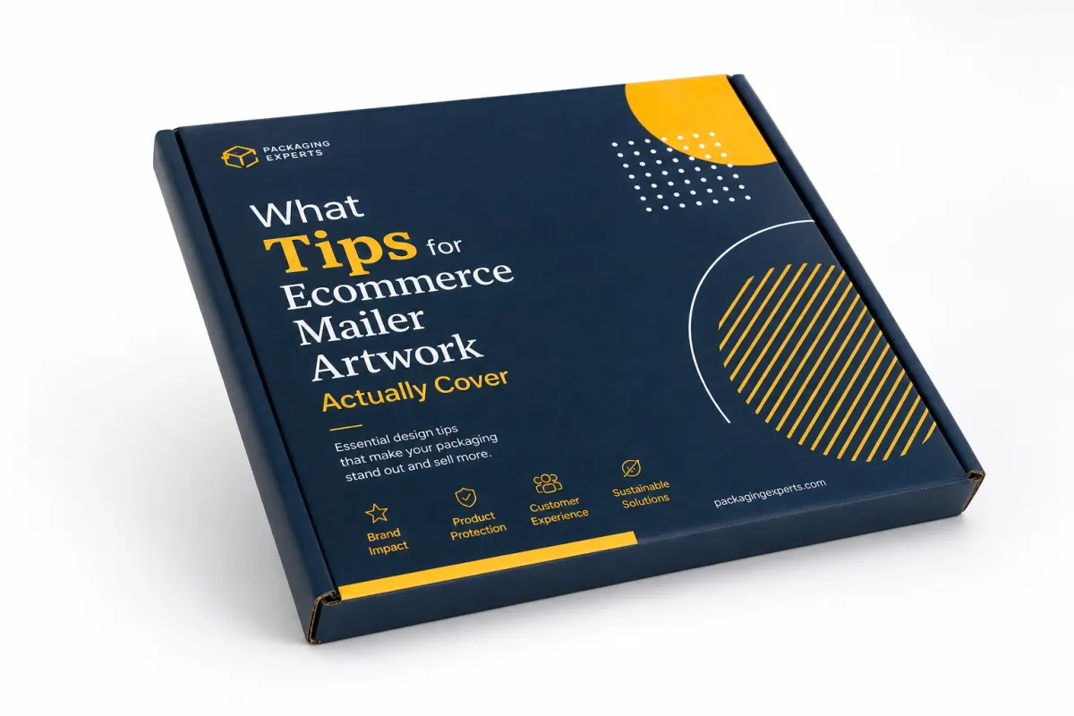
What Do Tips for Ecommerce Mailer Artwork Actually Cover?
When I talk about tips for ecommerce mailer artwork, I am not only talking about logo placement or whether the background is cream instead of white. I mean the full visual system that appears on the outer mailer, the inner panel, the seal flap, and any print-safe messaging that supports the unboxing moment. On a folded carton made from 350gsm C1S artboard, that may include front, back, side panels, tuck flaps, and glue zones. On a printed poly bag, the printable area may be smaller, but the same principle holds: the artwork has to respect the structure, the ink behavior, and the way a real customer will read it in motion, whether the job is running in Leicester on folding carton or in Ho Chi Minh City on coextruded film.
Plenty of brands get this wrong. They approach tips for ecommerce mailer artwork like a branding exercise and forget that packaging is a physical object with tolerances, seams, and production limits. A logo that looks perfect at 1200 pixels wide can shift visually when it crosses a fold or sits too near a label zone. A headline that reads cleanly on a laptop can disappear once the package is stacked under five other parcels in a fulfillment lane or parked under harsh warehouse LEDs. The strongest mailer artwork is not the loudest one; it is the one that survives production, shipping, handling, and the trip back from the customer's front door, which is exactly why a 3 mm type margin matters more than a mood board full of gradients.
"The artwork was not the problem until it became the problem," a plant manager told me during a corrugated line check in Shenzhen after a brand insisted on a full-bleed pattern that clipped at the lock tab by 2 mm. He was right. A 2 mm shift can matter more than a 20-second pitch deck, especially when the line is moving 8,000 units an hour.
There is a commercial side to this, too. Thoughtful tips for ecommerce mailer artwork can lift perceived quality, and perceived quality has a real effect on repeat purchase intent. I have seen brands get more customer-shot content simply because the outer mailer looked intentional enough to film, while other products with strong formulas and healthy margins felt discount-heavy because the artwork used tiny type, weak contrast, and three different blues that never quite agreed with each other. In a customer's hands, that inconsistency becomes a judgment about the brand itself, which is a bit unfair but also very real, especially if the package is arriving in a $6.99 parcel shipment rather than a boutique counter bag.
The promise here is straightforward. By the time you work through these tips for ecommerce mailer artwork, you should be able to plan the brief, price the work, proof the files, and release the run without slowing fulfillment. That matters whether the order is 2,000 mailers for a seasonal drop or 50,000 for a core SKU, and whether the package is being printed in Ontario, California, or in a converter cluster outside Guadalajara. The scale changes the risk, but not the logic, and the logic is what keeps the whole thing from turning into a frantic scramble at 4:47 p.m. on a Thursday.
How Tips for Ecommerce Mailer Artwork Move from Brief to Press
The workflow starts before design begins. The best tips for ecommerce mailer artwork start with a brief that names the box style, exact dimensions, print method, order quantity, and shipping environment. If the team does not know whether the job will run flexo, digital, or litho-lam, the artwork group ends up guessing on ink density, image detail, and finish. Guessing is how a clean concept turns into a production headache, and I have yet to meet a printer in Clarksville, Tennessee, or Dongguan who enjoys rescuing a guessed-at color build.
Once the brief is clear, the dieline comes next. That file is not a suggestion. It defines bleed, safe zones, folds, glue areas, and any places that should stay open for barcodes, recycled-content claims, or carrier labels. I have watched teams build a beautiful layout on an unapproved dieline only to learn that 18 mm of the hero graphic vanished into a flap. The fix meant a re-layout, a revised proof, and an extra 4 business days. That delay cost more than the original artwork fee, which is always a fun lesson in the least fun way.
Supplier feedback belongs before final approval, not after. Good suppliers will flag art that is too rich for the substrate, a white underbase that needs adjusting, or a fine font that will blur at press speed. On a packaging line outside Shenzhen, a converter once showed me how moving a QR code 6 mm to the left saved an entire batch of reprints because the original position sat too close to the fold. That sort of detail rarely makes it into a brand deck, yet it shows up on the shop floor every day, usually right where the headaches begin.
Here is the sequence I recommend for tips for ecommerce mailer artwork:
- Creative brief: confirm size, print method, quantity, and whether the mailer supports retail display or only parcel shipping.
- Dieline review: map the design to the exact flat layout, including bleed at 0.125 inch and a safe zone of at least 0.25 inch where possible.
- File prep: check image resolution at 300 dpi, outline fonts if the printer asks for it, and convert colors only when the press profile requires it.
- Internal review: have marketing, operations, and customer service review the proof for claims, scan codes, and pack-out reality.
- Supplier proof: compare the annotated proof line by line before signing off for production.
The schedule matters, too. A simple run can move from concept to proof approval in 5 to 7 business days if the brand assets are organized and the dieline is already confirmed. Add a structural change, a special finish, or three stakeholder groups, and the timeline can stretch to 2 or 3 weeks. Teams that stay calm usually build in one extra proof round. The teams that scramble are the ones who assumed a perfect first proof would arrive on its own, which is charming in theory and terrible in practice.
Tips for Ecommerce Mailer Artwork: Key Brand and Print Factors
Brand consistency is the first filter. Tips for ecommerce mailer artwork should begin with logo scale, type hierarchy, color palette, and tone of voice. A premium skincare brand and a warehouse-supply brand should not share the same visual grammar, even if their mailer sizes are similar. I have seen an elegant serif typeface work beautifully on a matte board mailer with soft-touch lamination, while the same face looked fragile on a glossy poly bag because the contrast dropped too low and the stroke weight thinned out under print. That is not a moral failing; it is just what happens when a beautiful idea meets a real press in a plant running 12 hours a shift.
Print behavior is the second filter. A saturated color block that looks crisp on screen may band or shift slightly on a short-run digital press. A white logo printed on a tinted substrate may need a stronger underbase than the mockup suggested. If you are comparing materials, ask for a printed sample on the actual stock, not a generic proof. A paper mailer and a poly mailer behave differently, and even two poly formulations can finish differently depending on the ink system and surface treatment. I still think sample rounds are the cheapest sanity check in packaging, especially when the sample comes back from a pressroom in Taipei or Suzhou with the exact stock, exact ink, and exact finish in hand.
That is why I keep pushing brands to rank content by priority. The outside panel needs the fastest read: logo, a clear brand cue, and maybe one short line of copy. The inside panel can carry a fuller message, a thank-you note, a QR code, or a short product story. On a 12-inch by 15-inch mailer, too much text turns into visual noise. Good tips for ecommerce mailer artwork are about restraint as much as expression, which sounds boring until you see how much cleaner the package feels after one line gets cut and the hierarchy is tightened by 20%.
Accessibility matters as well. Use contrast ratios that hold up under warehouse lighting and front-door daylight. Keep body copy large enough to read at arm's length, which usually means at least 7 to 8 pt equivalent on small packaging text and larger for any legal copy. If the design relies on icons, make sure they remain clear at 1 inch tall, because many customers glance at the package while carrying it from the porch to the kitchen table. That is a very different viewing condition from a polished mockup in a pitch meeting, where everyone is squinting politely and pretending the room is brighter than it is.
There is also a sustainability layer. If the mailer uses paper-based stock, check whether the board or paper content is FSC-certified, and make sure any sustainability claim on the artwork is precise enough to survive scrutiny. I have seen brands weaken their credibility by using broad phrases like "eco-friendly" when a tighter claim such as "made with 80% recycled fiber" would have been cleaner and safer. Honest copy is easier to approve, easier to defend, and usually easier to print. It also saves you from the awkward meeting where someone asks, "Eco-friendly how, exactly?" and the room gets very quiet, especially if the supplier sheet is still open and the auditor is on the line.
- Color: keep the palette to 2 to 4 core colors when possible so the artwork stays consistent across paper and film substrates.
- Type: use one headline face and one support face; more than two families can make the mailer feel noisy at small scale.
- Messaging: place the strongest line on the outer face and save longer copy for the inside panel or insert card.
- Compliance: reserve a clean area for barcodes, legal marks, and shipping labels so operations do not need to cover the design later.
If you want a practical reference point, study Custom Poly Mailers as a starting format, then adapt the artwork to the exact dieline and shipping method. That approach keeps the visual idea intact while reducing the odds of a costly redesign. For brands with multiple size tiers, I often build the system around one master look and then apply it to three or four mailer sizes instead of inventing a new creative direction for each SKU. Less reinvention, fewer headaches, better Monday mornings, especially when the first production sample is landing from a plant in Jiangsu or Monterrey.
Cost and Pricing Considerations for Ecommerce Mailer Artwork
Cost is where a lot of teams get surprised. Tips for ecommerce mailer artwork are not only about the design fee; they also touch revisions, proof rounds, plate or setup charges, and any special finishes that affect the press run. In the quotes I review, a simple one-color design might sit in the $250 to $500 range for artwork labor if the dieline is already approved, while a more complex multi-panel concept can climb to $1,200 or more before production setup even starts. If a supplier needs new plates or cylinders, that can add another $80 to $250 per color depending on the process, with flexo setups in cities like Shenzhen and Dongguan often landing on the lower end for volume runs.
The cheapest-looking artwork is not always the cheapest project. I have seen a brand save $300 on design and lose $4,800 on a rejected print run because the logo sat too close to a fold and the color bar was not built for the press profile. That kind of mistake is expensive in two directions: reprint cost and delayed fulfillment. Once customers are waiting, every extra day matters, especially if the mailing window is tied to a launch or a holiday sale. Nobody enjoys telling a founder that their budget win just became a warehouse problem, particularly when the replacement order has a 12 to 15 business day turnaround from proof approval.
It helps to think in two buckets. One bucket is the one-time artwork cost: concepting, layout, proofs, and internal approvals. The other is the recurring production cost: print method, substrate, ink coverage, finish, and any variable elements. A team that tracks only the first bucket usually underestimates the actual packaging spend by 10% to 25%. A team that tracks both sees where visual ambition is worth the money and where it is just decoration wearing a fancy hat. I have watched the same artwork add only $0.015 per unit on a 25,000-piece run and add $0.07 per unit on a 3,000-piece pilot because the press setup and finish amortization change so much between quantities.
Here is a comparison I use when I explain tips for ecommerce mailer artwork to buying teams and founders:
| Artwork Approach | Typical Design Spend | Setup Impact | Best Fit | Risk Level |
|---|---|---|---|---|
| One-color logo and copy | $250 to $500 | Low; usually 1 color and 1 proof cycle | Utility-first brands, high-volume replenishment, tight margins | Low |
| Two- to three-color brand layout | $600 to $1,200 | Moderate; often 2 proof rounds and closer color matching | Premium essentials, subscription boxes, seasonal refreshes | Medium |
| Full-coverage or multi-panel artwork | $1,200 to $2,500+ | Higher; more file checks, more proofing, more color control | Launch campaigns, influencer mailers, strong unboxing programs | Higher |
That table is not a universal quote. It is a pattern I see often enough to make budgeting easier. If your brand ships 20,000 units a month, the extra $0.03 to $0.06 per piece caused by heavier ink coverage or a special finish may matter less than the reduction in reprints and the lift in customer perception. For a 2,000-piece test, the same premium can feel unnecessary. Context decides the right spend, and context is usually the part people forget while they are staring at a spreadsheet in a room with fluorescent lights and one very tired procurement manager.
There is a strategic angle here, too. Spending more on tips for ecommerce mailer artwork can save money later if it prevents one rejected proof, one canceled pallet, or one expensive inventory write-off. I would rather see a brand spend an extra $400 on careful prepress than lose $2,000 because 1,000 units came back with a cropped logo. That is not theory; I have watched it happen during a Friday afternoon sign-off while everyone was trying to wrap up early and go home, which made the whole room feel even more expensive.
If you need a broader packaging reference for material and durability thinking, the ISTA test standards are a useful benchmark for transit performance, especially when the mailer has to survive parcel sorting, stacking, and abrasion. Artwork cannot fix weak structure, but it can either make a sturdy package look premium or make a sturdy package look careless. I always tell teams that a good visual system should be doing at least two jobs, and one of them should not be "hide the fact that the box is fighting for its life."
Step-by-Step Workflow for Approving Ecommerce Mailer Artwork
When teams ask for a practical process, I usually give them a five-step approval flow. The strongest tips for ecommerce mailer artwork work best when everyone knows who signs off, in what order, and on which file version. If version control is loose, someone will approve a PDF v3 while the designer is already editing v4. That mistake happens more often than people admit, and it is usually preventable with one shared file log, usually a spreadsheet with eight columns and one boring little tab that saves everyone a headache.
Step one is the pre-design checklist. Confirm the exact mailer size, the print method, the minimum order quantity, the shipping requirement, the outer carton count, and the message hierarchy. I ask clients to decide whether the package needs to sell the product, reinforce the brand, or simply protect the contents. A package cannot do all three equally well if the surface area is only 80 square inches, which is why I get skeptical when someone wants the mailer to act like a billboard, a brochure, and a legal document all at once.
Step two is file preparation. Export in the format your printer wants, usually a press-ready vector file or a packaged design file with linked images. Keep raster images at 300 dpi at final size. Convert fonts to outlines only if the printer requests it; otherwise, keep editable type for late-stage corrections. Place the art on the dieline and verify that no key element sits inside a fold, glue zone, or trim edge. That is the point where the workflow starts to feel technical, because it is technical, and pretending otherwise only creates expensive surprises later.
Step three is proofing. I recommend at least one digital proof and one annotated supplier proof. For larger runs, I prefer a third check from the operations team, because they catch issues marketing often misses, such as barcodes too close to a seal or a pack-out message that conflicts with the actual warehouse flow. If you are running a special finish, ask for a material sample or a press proof rather than trusting a monitor preview. The difference between a bright screen and a printed surface can be significant, and sometimes the printer has opinions, very strong ones, about what the mockup forgot.
Step four is final approval. This is where tips for ecommerce mailer artwork save money or cost money. Once the proof is signed, the file should be locked, the version should be stored, and the supplier should confirm whether any last-minute change is a true revision or a new order. I have watched a 15-minute "small tweak" turn into a full day of rework because someone wanted to move a logo by 3 mm after approval. In production terms, that is rarely a small change; in human terms, it is the part where everyone sighs into their coffee.
- Confirm structure: lock the exact box or bag style before layout work begins.
- Check art scale: verify logo size, copy size, and panel balance on the actual dieline.
- Review technicals: confirm bleed, safe zones, file format, color mode, and image resolution.
- Proof in sequence: marketing first, operations second, supplier third, then final sign-off.
- Archive versions: save the approved PDF, the final editable file, and the supplier email chain in one folder.
The timeline usually looks like this: 1 to 2 days for a clean brief, 1 to 3 days for design, 1 to 2 days for internal review, 2 to 4 days for supplier proofing, and 5 to 15 business days for production depending on quantity and finish. If a team has never done the format before, add 2 extra days. That buffer is cheap insurance, and it beats explaining a missed launch date to a room full of people pretending they are not worried, especially if the cartons are already booked on a truck to the port.
For brands that want to keep the system scalable, I often map the workflow against the same print family used across poly mailer options and carton mailers. A modular system is easier to approve because the logo rules, color values, and copy rules stay fixed even when the substrate changes. That consistency becomes more valuable as the product line grows from 3 SKUs to 30, which is roughly the point where everyone starts asking who changed the art file and nobody wants to answer.
Common Mistakes That Hurt Ecommerce Mailer Artwork
The biggest mistake is designing for the screen instead of for the fold. Tips for ecommerce mailer artwork have to account for the fact that a flat mockup on a laptop does not behave like a folded box or a sealed mailer. I have seen beautiful artwork ruined by a 5 mm shift in the center seam, and I have seen plain artwork look excellent because it respected the physical object. The package is not a poster. It is a working surface that gets folded, stacked, handled, and shipped, sometimes in ways that would make a designer wince.
Copy overload is another common failure. Teams want the package to say thank you, sell the brand story, promote a QR code, announce a discount, and explain sustainability all at once. The result is usually a busy layout with weak hierarchy. On a mailer, less text often performs better because it reads faster at 3 feet and still makes sense in poor lighting. If the customer needs a second pass to understand the package, the first pass has already been wasted, and the package has already missed its easiest job.
Production specs are where expensive mistakes hide. A missing bleed, the wrong color profile, or low-resolution imagery can trigger cropped edges, washed-out tones, or fuzzy detail. One apparel client I advised had to scrap 8,000 units because the black background was built for RGB display, not the press profile the supplier used. The replacement run took 9 business days and pushed a launch date the marketing team had already announced. That sort of error makes people nervous about packaging budgets for months, which is a long shadow for one bad file.
"Our mistake was treating the mailer like a banner ad," a brand director told me after a reprint. "Once we built it like a production tool first and a creative asset second, approvals got faster by half."
There is a cleaner path. Audit each SKU by box style, message goal, and fulfillment route. If one SKU ships in a standard poly bag and another ships in a rigid mailer with an insert, they should not share the same artwork system without adjustment. Good tips for ecommerce mailer artwork do not force one layout across every size. They let one visual identity flex across multiple structures without losing clarity, which sounds simple until you try to force a square logo onto a long, narrow bag and wonder why everything starts to feel pinched.
- Wrong format: starting from a social graphic instead of a press-ready dieline.
- Weak hierarchy: giving equal visual weight to logo, promo code, and legal text.
- Uncontrolled color: using unapproved blues, blacks, or metallics that shift on press.
- Ignored logistics: placing print where labels, seams, or folds will cover it later.
Expert Tips and Next Steps for Ecommerce Mailer Artwork
If I had to pick one move that pays off again and again, it would be testing one high-volume SKU first. Tips for ecommerce mailer artwork improve fastest when the brand prints a controlled run, watches pack-out speed, and listens to customer reaction before scaling. A 3,000-piece test tells you more than a 20-slide presentation ever will. You learn whether the matte finish scuffs too easily, whether the color reads correctly in warehouse light, and whether the artwork still feels clean after a courier belt has handled it twice. That is the sort of learning you cannot fake with a nice render.
The second move is building a reusable packaging kit. That kit should include the approved dieline, logo clear space, color values in CMYK and Pantone where relevant, copy rules, photo rules, and a list of approved claims. I have seen teams save 2 to 4 approval cycles a quarter once they stopped rebuilding the same rules from scratch. A shared system also helps new designers, outside agencies, and vendors stay aligned without relearning the brand every time, which is very useful when the creative team changes and nobody wants to decode old decisions like an archaeological dig.
The third move is a post-launch review. Pull feedback from operations, customer support, and marketing after the first 30 to 60 days. Operations can tell you whether the mailer packed efficiently, customer support can tell you whether people understood the message, and marketing can tell you whether the unboxing assets generated usable social content. That trio of feedback is worth more than a single opinion from a creative review meeting, especially the kind where everyone agrees the design is "nice" and then quietly means "I have no idea if this will work."
Honestly, that is where most brands leave money on the table. They approve a design, print it once, and never check whether the artwork helped or hurt the business. Strong tips for ecommerce mailer artwork should feel like a process, not a one-off design choice. If you are ready to start, pick one mailer style, one proof cycle, and one launch deadline, then build from there. For many brands, the easiest way to begin is with a durable, production-friendly structure and a clear artwork system around it, especially if the mailer will be used across several promotional drops with different order volumes and finish requirements.
Keep the next run simple: one visual direction, one approved substrate, one print method, and one main message. I have seen more packaging projects rescued by restraint than by ambition. Use tips for ecommerce mailer artwork to sharpen what already works, not to cram five ideas into a 14-inch panel. That mindset protects margins, keeps the brand credible, and makes the next approval cycle easier than the last. Plus, it saves everyone from the "can we just add one more thing?" conversation, which is how perfectly good packaging projects wander off a cliff.
The strongest tips for ecommerce mailer artwork are practical ones. Protect the dieline, respect the press, keep the hierarchy sharp, and review the proof like a production document instead of a mood board. Do that, and the artwork stops feeling like an expense line and starts becoming one of the simplest ways to make the package work harder for the brand. If you need a single next step, make it this: lock the dieline first, then print one real sample on the actual substrate before you approve the full run. That one move catches more problems than any polished render ever will.
What are the best tips for ecommerce mailer artwork before I send files to print?
Start by confirming the dieline, bleed, and safe zones before any layout work begins, because a 0.125 inch bleed error can force a new proof. Use print-friendly colors, readable typography, and a clear hierarchy so the package still works at arm's length. Then ask your supplier for the exact proof requirements, including whether they want a PDF, AI file, or packaged folder, so you do not miss a correction round, especially if the job is being printed on 350gsm C1S artboard or 45-micron poly film.
How long does ecommerce mailer artwork approval usually take?
Simple artwork can move in 5 to 7 business days if the dieline is approved and the brand assets are already organized. The timeline gets longer when structural changes, multiple stakeholders, or special finishes are involved, and I have seen that stretch to 2 or 3 weeks before production starts. Build extra time for proofing so a small error does not delay a launch tied to a campaign date or inventory arrival, and expect production to run 12 to 15 business days after proof approval for standard quantities.
How much should I budget for ecommerce mailer artwork?
Budget separately for design labor, revisions, proofing, and production setup fees so the real spend does not get buried inside one line item. A simple one-color file may land in the $250 to $500 range for artwork labor, while a more complex multi-panel design can exceed $1,200 before setup. More colors, more panels, and premium finishes usually increase the total cost, but one avoided reprint can save far more than a cheaper layout would, and a 5,000-piece run may land near $0.15 per unit for artwork and print setup once the dieline and plates are locked.
What file format is best for ecommerce mailer artwork?
Use the format your printer requests, which is usually a press-ready vector file or a packaged design file with all linked images included. Keep images at 300 dpi at final size, and convert type to outlines only if the supplier asks for it, because editable text makes late corrections easier. Always export a proof copy for stakeholders so they can review layout, claims, and copy before final approval, and ask whether the plant in Dongguan, Monterrey, or Leeds wants PDF/X-1a, AI, or layered EPS files.
How do I keep ecommerce mailer artwork on-brand across different mailer sizes?
Build a modular packaging system with fixed logo rules, approved color values, and two or three type styles that can travel across sizes. Adapt the layout to each dieline instead of stretching one design across every box or bag, because each structure has different folds, seams, and safe zones. Review each size in context so the artwork feels consistent, not forced, and the brand stays recognizable whether the shipper is 9 by 12 inches or 14 by 18 inches, or whether the run is built on a 300gsm kraft mailer or a laminated folding carton.


