Buyer Fit Snapshot
| Best fit | Rigid Box Artwork projects where brand print, material claims, artwork control, MOQ, and repeat-order consistency need to be specified before quoting. |
|---|---|
| Quote inputs | Share finished size, material target, print colors, finish, packing count, annual reorder estimate, ship-to region, and any compliance wording. |
| Proofing check | Approve dieline scale, logo placement, barcode or warning zones, color tolerance, closure strength, and carton packing before bulk production. |
| Main risk | Vague material claims, crowded artwork, missing packing details, or unclear freight terms can make a low unit price expensive after revisions. |
Fast answer: Rigid Box Artwork: Board, Finish, Dieline, and Unit Cost should be specified like a repeatable production item. The safest quote records material, print method, finish, artwork proof, packing count, and reorder notes in one written spec.
Production checks before approval
Compare the actual filled-product size with the drawing, then confirm tolerance on folds, seals, hang holes, label areas, and retail display edges. Reserve space for logos, QR codes, warning copy, and material claims before decorative graphics fill the panel.
Quote comparison points
Review material grade, print process, finish, sampling route, tooling charges, carton quantity, and freight assumptions side by side. A quote is only useful when the supplier can repeat the same color, closure quality, and packing count on the next order.
Tips for rigid box artwork matter because a premium box can look flawless in a mockup and still fall apart once it meets real board, wrap stock, glue, and finishing pressure. A logo that feels perfectly centered in a PDF can drift too close to a seam. A thin rule can disappear into textured paper. A dark background that looked rich on a monitor can print flat and dull. Packaging is rude like that. It does not care what the render looked like.
The gap between concept and production causes most packaging headaches. The best tips for rigid box artwork are not just about making something attractive. They are about building artwork that survives scaling, wrapping, trimming, folding, and finishing without losing the brand story or getting mangled by the structure.
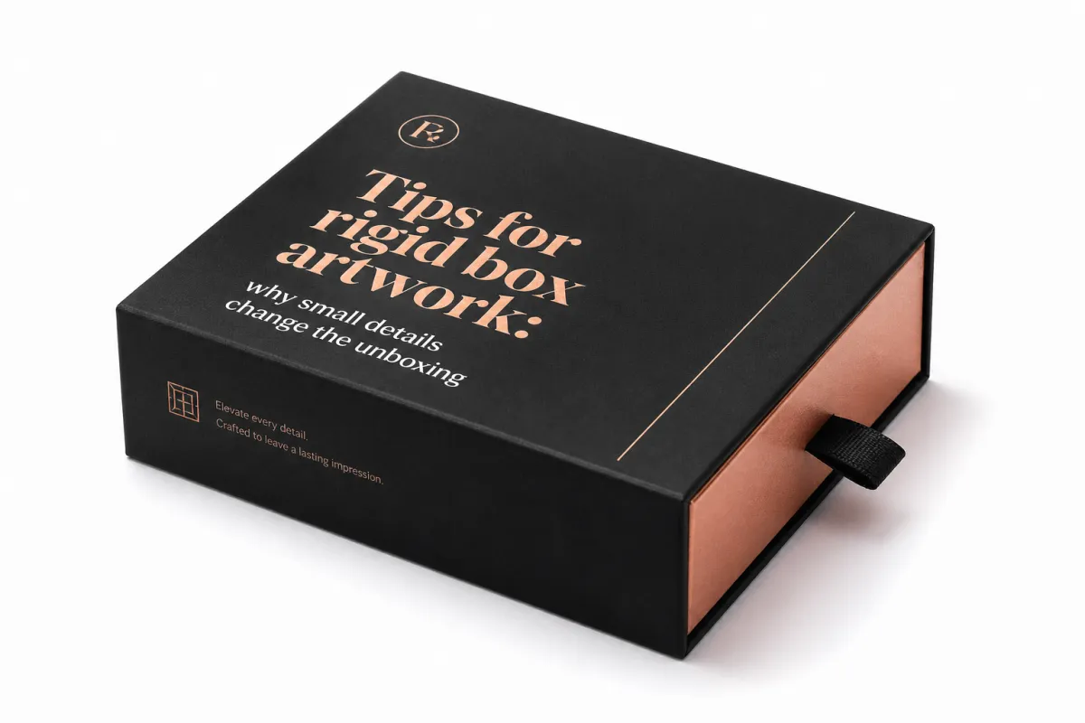
Rigid box artwork is the print-ready visual system for the outer wrap, inside panels, logo treatment, legal text, finish callouts, and special effects like foil, embossing, debossing, or spot UV. It has to work on the actual structure, not just on a flat artboard. That is why tips for rigid box artwork need to shape both design choices and production choices from the first draft, not the night before print.
For a brand ordering luxury packaging, the stakes are simple: the box is often the first physical touchpoint a customer sees, and the surface quality tells people a lot about the product before they ever open it. Good tips for rigid box artwork keep that first impression sharp, consistent, and printable. No drama. Just a box that does its job.
What are the best tips for rigid box artwork?
One of the most useful tips for rigid box artwork is also the least glamorous: assume the flat file will change once it becomes a wrapped box. A rigid setup usually uses mounted greyboard, often around 1.5 mm to 3 mm thick, with a printed wrap paper or specialty stock laminated around it. The artwork has to travel across corners, turn-ins, and seams, and every one of those transitions can change how type, color, and imagery read at hand level.
A premium-looking mockup can hide problems that production will expose immediately. A face panel might be centered in the render, but once the wrap is glued and trimmed, the eye may catch a logo sitting too close to the top edge or a pattern drifting off balance on the side panel. Good tips for rigid box artwork keep that in view early, before anyone gets attached to a layout that only works in a perfect digital scene.
Material choice matters too. Coated paper, matte laminated wrap, textured specialty stock, and soft-touch finishes all change ink appearance and contrast. A thin serif font that feels refined on smooth paper may lose crispness on a rougher surface, while a bold sans-serif might hold better but need more breathing room around it. The same tips for rigid box artwork do not fit every substrate, which is why mockups should never replace a real production review.
I have watched otherwise strong packaging jobs stumble because the team treated the render as the finish line. It is not. The render is just a hint. The real box is built from paper, adhesive, pressure, and a whole lot of tolerance for things going slightly sideways.
The real value of disciplined tips for rigid box artwork is simple: they keep beauty and manufacturability in the same conversation. Instead of treating artwork as the last decoration step, smart teams treat it like a production tool that has to survive the full box-making process. That shift usually saves time, money, and a stack of revision notes nobody wanted.
If a line or logo is going to sit near a seam, move it farther away than your first instinct says. That one habit prevents a surprising amount of rigid box artwork trouble.
One more practical point: the unboxing experience is not just the top panel. Customers rotate the box, feel the texture, check the side walls, and glance at the inside print before they reach the product. Strong tips for rigid box artwork account for that sequence, so the whole package reads as intentional instead of stitched together from disconnected graphics.
How rigid box artwork moves from concept to production files
The cleanest projects usually follow a disciplined path. A brand brief defines the goal, the supplier supplies a dieline, the designer builds the layout, prepress checks the file, the team proofreads and revises, and the approved artwork goes into production. Strong tips for rigid box artwork work best when each step has a clear owner, because packaging files get messy fast if structure, copy, and finish decisions happen in random order.
The dieline is the map. It shows the panels, flaps, glue areas, wrap-around zones, and places where artwork may disappear once the box is assembled. Many first-time packaging teams underestimate how much the dieline controls the final result. If a brand logo sits too close to a fold line, or if a pattern is built without checking the wrap direction, the box can end up looking slightly off even when the art file is technically correct. That is why tips for rigid box artwork always begin with the structure, not the graphic alone.
Designers should place logos, product names, barcode areas, ingredients, safety text, and finish callouts with the built box in mind. A barcode that looks fine on a mockup may need more quiet space around it to scan reliably. A legal block that sits beautifully on a flat artboard may become hard to read if it lands on a wrapped edge. The more complex the rigid box artwork, the more important it becomes to think in visible panels rather than abstract canvas space.
Prepress then checks the technical side. That usually includes image resolution, linked asset integrity, color mode, overprint settings, trapping, font handling, and whether the file has been saved on the correct dieline version. Packaging-safe font handling matters a lot here: if the type is not outlined or embedded properly, a font substitution can change spacing enough to ruin a careful layout. Among all tips for rigid box artwork, this is one of the most expensive mistakes to ignore because the problem may not show up until late in the approval chain.
Production teams then translate the approved art into print plates, finishing layers, and assembly instructions. That translation step is where the file moves from looks right to can be built. Foil areas need clean separation, emboss or deboss marks must be understood clearly, and the wrapper has to be aligned with the board dimensions. If there is custom interior printing, the inside art needs its own careful placement so it lands square when the box opens. These are the details that separate casual artwork from real packaging-ready artwork.
One helpful habit is to build the artwork package as if another person will need to rebuild the file from scratch in a year. Clear layer names, locked dieline versions, and separated finish callouts make that possible. The best tips for rigid box artwork are often the ones that reduce interpretation, because fewer guesses mean fewer production errors.
For brands that want to check broader packaging norms, organizations like the Institute of Packaging Professionals and FSC are useful references for packaging language and responsible material claims. If transit performance matters too, ISTA publishes test methods that help teams think about how the package will behave once it leaves the plant.
Key factors that affect rigid box artwork quality and readability
Typography is usually the first place where rigid box artwork quality rises or falls. Fine serif fonts, script faces, and ultra-light weights can look elegant on screen, then break down on textured wrap stock or get swallowed by a deep matte finish. A practical rule is to keep important copy readable at real viewing distance, not only zoomed in at 300 percent. In many packaging jobs, 6 pt text can be the practical floor for simple sans-serif copy on smooth stock, while textured papers or intricate type often need more room to stay crisp.
Contrast matters just as much as font choice. Dark copy on a dark background, metallic type on a busy pattern, or low-contrast text sitting over a photographic panel can look stylish in a mockup but become tiring to read in real life. Good tips for rigid box artwork push brands toward stronger separation between message and background, especially on side panels where people only glance for a second or two.
Color behavior is another place where expectations need to stay grounded. Monitor color is bright, backlit, and forgiving; printed color sits on paper, influenced by ink load, coating, absorbency, and the finish on top. A soft-touch laminate will mute shine, while a high-gloss laminate can deepen saturation and increase the sense of contrast. If the job uses uncoated or textured wrap, color shifts become even more noticeable. That is why realistic proofs matter so much in rigid box artwork, and why any advice that starts with print it and hope is too casual for premium packaging.
Special finishes deserve their own planning, not a last-minute add-on. Foil stamping often needs clean vector shapes and enough mass to transfer cleanly. Embossing and debossing need thoughtful spacing so the image does not look crowded once the paper is pushed or pressed. Spot UV works best when the artwork includes crisp boundaries and enough separation from small type. If a design wants to use several finishes at once, tips for rigid box artwork should include a finish map from the beginning so every layer is intentional.
Image quality is another key factor. Vector art is best for logos, linework, icons, and many pattern elements because it scales cleanly. Raster images can work for photography or painted textures, but they need enough resolution for the final size and viewing distance. A 72 dpi file that looks acceptable in a deck usually will not hold up on a large top panel. For most rigid box artwork, 300 dpi at final size is the safer target for photography, though complex layouts and fine details sometimes need even more careful handling.
Structure can interfere with visibility too. Seams, corners, turn-ins, and glue zones are not decorative; they are practical limitations that must be respected. A beautiful band pattern can look broken if it crosses a seam in the wrong place. A centered emblem can appear off-center if it lands too close to the corner radius or wrap return. Reliable tips for rigid box artwork always include a seam check, because the best graphic in the world can still look awkward if the structure was ignored.
There is a simple mental test I use: if a customer opened the box with one hand in a dim room, would the main message still read quickly? If the answer is no, the artwork probably needs stronger contrast, simpler hierarchy, or a better panel assignment. That kind of practical thinking keeps rigid box artwork focused on real use, not just design awards.
Rigid box artwork pricing: what drives cost, proofs, and revisions
Artwork cost is rarely a single number tied only to drawing time. In rigid box artwork, the price usually reflects how many parts of the file need coordination. More colors, more finish layers, more copy blocks, more panels, and more versions for different languages all add labor. The simplest wrap-around job may stay fairly lean, while a premium presentation box with foil, spot UV, and a printed interior can require several coordinated files and more prepress attention.
Late changes are expensive because they ripple. If a logo moves after the proof is built, the plate layout may need updating, the finish mask may need revision, and the final approval cycle may restart. If copy changes after the dieline is locked, the team may have to confirm whether the new text still fits the same space or whether a layout adjustment is needed. Among all tips for rigid box artwork, this is one of the most practical: lock structural decisions early, because every late change multiplies work.
Special finishes add setup and coordination cost. A foil area needs a dedicated layer or clear callout. Embossing may need a separate die note. Soft-touch coating can change how the artwork color should be judged. Custom interior print adds another side of the box to manage, which means more inspection and more chances for alignment issues. None of these finishes are bad ideas; they just need to be budgeted properly.
Proofing method also changes the bill. A basic digital PDF proof is usually the lowest-cost checkpoint, but it only shows layout and color on a screen. A more accurate print proof, mockup, or finished prototype gives a better sense of scale, texture, and assembly, yet it usually costs more because it requires materials and setup. For many brands, that extra spend is worth it if the packaging is meant to support a premium launch or a high-value gift item.
| Proof type | Typical use | Typical cost impact | Best for |
|---|---|---|---|
| Digital PDF proof | Layout, copy, dieline, and layer check | Often included or very low cost | Early review and fast approval |
| Soft proof / color mockup | Color and finish direction check | About $25-$100 depending on setup | Moderate-risk print jobs |
| Structural sample | Size, fit, fold, and wrap review | About $50-$250 depending on complexity | New box sizes or complex wraps |
| Fully finished prototype | Near-final look with premium effects | About $150-$500+ depending on finishes | Launches, luxury lines, and buyer sign-off |
The smartest way to control cost is not to strip the design down until it loses personality. It is to make decisions in the right order. Confirm the dieline, confirm the board size, confirm the finish plan, and then start refining the art. That sequence usually avoids duplicate revisions and keeps tips for rigid box artwork practical instead of theoretical.
Brands can also save money by reducing the number of artwork versions. If every market needs a slightly different file, ask whether some of the differences can be moved into a variable text area or a single controlled panel. Consolidating revision rounds helps too. Instead of sending one comment for color, another for copy, and another for finish placement, gather the team and approve the file in one clear pass. Fewer handoffs often mean lower artwork cost and faster release.
One honest caution: a cheap artwork setup can become expensive if it causes reproofs, press delays, or rejected samples. In rigid box artwork, the lowest quote is not always the lowest total cost.
Rigid box artwork process and timeline from brief to press approval
The fastest rigid box projects usually start with a complete brief. That means the dimensions are known, the brand assets are ready, the copy is final, the finish direction is agreed, and the decision-makers know who will sign off. When those pieces are missing, the timeline stretches because the artwork team ends up waiting for answers that should have arrived before layout began.
A realistic workflow often looks like this: the supplier delivers the dieline, the designer creates the first layout, the internal team reviews the art, the supplier adds prepress notes, revisions are made, the proof is checked again, and then production approval is given. Simple jobs can move quickly, but more complex rigid box artwork can take multiple rounds if the box includes foiling, interior print, multiple languages, or a special opening structure.
- Dieline delivery: verify the box size, board thickness, and wrap style before any design work begins.
- First layout: place the brand hierarchy, finish layers, and legal content with the structure in mind.
- Internal review: check copy, barcode placement, color direction, and panel flow.
- Supplier notes: confirm bleed, safe zones, seam positions, and any production constraints.
- Proof approval: sign off on artwork, finishes, and text in one coordinated decision.
- Production release: lock the file so the plant can move forward without more drift.
Timeline risk grows when too many elements are still open. A box with three finish effects and two language versions is not the place for casual approval habits. Someone needs to own color approval, someone needs to own copy approval, and someone needs to own brand compliance. If those responsibilities overlap too loosely, rigid box artwork tends to bounce around until the schedule starts feeling squeezed.
Compression is usually where mistakes creep in. Rushed files miss bleed, forget finish boundaries, or carry last-minute copy edits that were never fully checked against the dieline. A team that has to approve artwork in a hurry often focuses on the front panel and forgets the side walls, the interior lid, or the turn-ins. Good tips for rigid box artwork make time for those checks up front, because the cost of an extra day in review is usually lower than the cost of a production correction.
Another scheduling detail that matters is proof turnaround. If the proof is a simple PDF, the response can be quick. If the team wants a physical sample, a mounted prototype, or a finished mockup, the timeline expands because someone has to build, dry, inspect, and ship it. That is normal. The mistake is treating every proof type as if it should move at the same speed.
Clear communication keeps the schedule sane. If the artwork team knows the launch date, the print partner can help decide whether the box should be simplified, whether a finish should be removed, or whether the interior print should be moved to a later phase. Good tips for rigid box artwork do not promise magic speed; they create enough clarity that the schedule stops fighting the design.
Common rigid box artwork mistakes that slow production
Missing bleed is one of the most common problems, and it sounds basic because it is basic. Yet it still happens, especially when a file is built from a sales mockup rather than a real dieline. If the wrap edge is trimmed exactly where the artwork ends, the slightest shift can create a white sliver or a crooked border. In rigid box artwork, a standard bleed of around 3 mm, or about 0.125 inch, is often a safer starting point unless the supplier specifies otherwise.
Another frequent issue is artwork built on the wrong dieline version. A size change, seam shift, or insert adjustment can make the older file unusable even if it looks close. Designers sometimes update only the visible front panel and miss the side panel shift hidden inside the structure. That is why tips for rigid box artwork should always include version control. If the dieline changes, the artwork file needs to change with it.
Fonts are another trouble spot. Unoutlined text, missing font files, or auto-substituted typefaces can alter spacing and weight. That may sound minor, but on a luxury package, tiny spacing shifts are obvious. A brand name that was carefully tracked on screen can feel cramped or uneven once the font changes during output. Good packaging workflows either outline text after final approval or confirm that the package will preserve the font properly.
Placement mistakes are just as common. A logo too close to a fold can distort. Fine lines near a corner can lose integrity. A pattern that spans a seam may look broken once the box is wrapped. Even a barcode placed too close to a curved edge can become harder to scan or read. That is why tips for rigid box artwork repeatedly stress safe zones, not because the term sounds technical, but because the structure is unforgiving.
Finish instructions get forgotten more often than people expect. A file may include foil art in one layer and spot UV in another, but if the prepress notes do not clearly label them, the team can spend extra time confirming what each layer is supposed to do. A clean layer name like FOIL_GOLD_LOGO is far better than a vague layer called special. Simple naming saves back-and-forth.
Workflow mistakes can be just as damaging as design errors. Too many reviewers can create conflicting comments. Inconsistent file naming can lead to the wrong version being approved. Last-minute copy changes can trigger rechecks across every panel. A project that looked on schedule can suddenly stall because the file management was loose. Honest tips for rigid box artwork treat workflow discipline as part of the design job, not an administrative afterthought.
There is also a psychological trap: a beautiful mockup can make people overlook technical flaws. The art looks expensive, so the team assumes it is ready. But printed packaging does not care how nice the render was. It only cares whether the file was built for the real structure. That is why production checks matter even on the most attractive rigid box artwork.
Tips for rigid box artwork: next steps that protect print quality
The cleanest final pass is usually the simplest one. Confirm the dieline version, check the bleed, verify the safe areas, inspect the finish layers, and read the copy one last time in a calm environment. Good tips for rigid box artwork are rarely about adding more complexity; they are about removing guesswork before the file moves forward.
A strong handoff bundle should include the final art file, source files, outlined type notes if needed, linked or embedded images, finish instructions, and a clear contact person for approval questions. If the box has a foil panel, include a labeled foil layer. If the interior is printed, call out the interior orientation. If there are multiple SKUs, keep the filenames distinct enough that nobody has to guess which version is which. Small details like this save time later.
One of the best habits a brand can build is reviewing all decision points together. Color, structure, branding, regulatory text, and finish behavior should be approved in the same session whenever possible. Fragmented approvals often lead to contradictions: one person likes the color, another likes the layout, and a third wants the copy changed after the file has already been prepared for print. Unified sign-off keeps the project moving and makes tips for rigid box artwork easier to apply consistently.
It also helps to ask the supplier practical questions before the artwork is finalized. Where will the seam sit? How far does the wrap turn in? How are corner returns handled? Is there any risk that a finish will break at a fold or disappear near a glue zone? Those are not fussy questions. They are the questions that protect the finished look. A supplier who answers them clearly is helping the brand avoid hidden problems before production starts.
If the project is likely to carry recycled content claims, sustainability marks, or chain-of-custody language, check the rules carefully before locking the layout. FSC guidance helps brands use certification marks properly, and that matters because misused logos can create compliance issues. If the package also needs shipping durability, ISTA test references can inform how much protection the box may need beyond the printed wrap. These are different issues, but both influence smart packaging decisions.
For teams building their next brief, the safest mindset is straightforward: treat tips for rigid box artwork as part of the manufacturing plan, not just the visual concept. That approach keeps the design sharper, the proofing cleaner, and the final box closer to what the brand intended. If the artwork is built with the structure, finish, and process in mind, the result usually feels more expensive because it is more disciplined.
So on the next project, use tips for rigid box artwork to check the dieline first, think through the wrap and finish behavior second, and only then polish the visual details. That order gives the design team and the production team the same target, which is exactly what premium packaging needs.
Actionable takeaway: before you approve any rigid box file, inspect the latest dieline, seam placement, bleed, finish layers, and copy in one sitting. If those five things are clean, the artwork is probably ready. If one of them is fuzzy, fix it before the file goes anywhere near print.
What should I check first in rigid box artwork files?
Confirm the latest dieline version before any layout work begins, because every panel and turn-in depends on it. After that, check bleed, safe zones, and panel placement so the design fits the structure, then verify image resolution, font handling, and finish layers before sending files out.
How long does rigid box artwork approval usually take?
Simple projects can move quickly if brand assets and copy are already final, while projects with multiple finishes, languages, or structural changes usually take longer. Fast approval depends on having one clear decision-maker and a single revision path, especially when the box includes foil, embossing, or printed interiors.
How do special finishes change rigid box artwork?
Foil, embossing, debossing, and spot UV often need separate layers or clear callouts so prepress can separate them cleanly. Fine type and thin lines may need to be adjusted so the finish reproduces cleanly, and the artwork should be built with the finish behavior in mind instead of added at the end.
What drives rigid box artwork cost the most?
Complex dielines, multiple artwork versions, and specialty finishes all add labor, and late revisions can increase cost because they create new proofs and extra checks. Custom interiors or multi-panel printing usually require more coordination than a simple wrap, so the final price often reflects coordination as much as drawing time.
Can I use the same artwork for different rigid box sizes?
Not safely without reviewing the dieline for each size or structure change. Scaling can affect type readability, finish placement, and panel alignment, so a new size should always be checked by prepress before production approval.
Related packaging resources
Use these related guides to compare specs, costs, quality checks, and buyer decisions before making the final call.