Buyer Fit Snapshot
| Best fit | Sustainable Mailer Pouch Branding Work projects where brand print, material claims, artwork control, MOQ, and repeat-order consistency need to be specified before quoting. |
|---|---|
| Quote inputs | Share finished size, material target, print colors, finish, packing count, annual reorder estimate, ship-to region, and any compliance wording. |
| Proofing check | Approve dieline scale, logo placement, barcode or warning zones, color tolerance, closure strength, and carton packing before bulk production. |
| Main risk | Vague material claims, crowded artwork, missing packing details, or unclear freight terms can make a low unit price expensive after revisions. |
Fast answer: Sustainable Mailer Pouch Branding Work: Film, Print, MOQ, and Carton Packing should be specified like a repeatable production item. The safest quote records material, print method, finish, artwork proof, packing count, and reorder notes in one written spec.
Production checks before approval
Compare the actual filled-product size with the drawing, then confirm tolerance on folds, seals, hang holes, label areas, and retail display edges. Reserve space for logos, QR codes, warning copy, and material claims before decorative graphics fill the panel.
Quote comparison points
Review material grade, print process, finish, sampling route, tooling charges, carton quantity, and freight assumptions side by side. A quote is only useful when the supplier can repeat the same color, closure quality, and packing count on the next order.
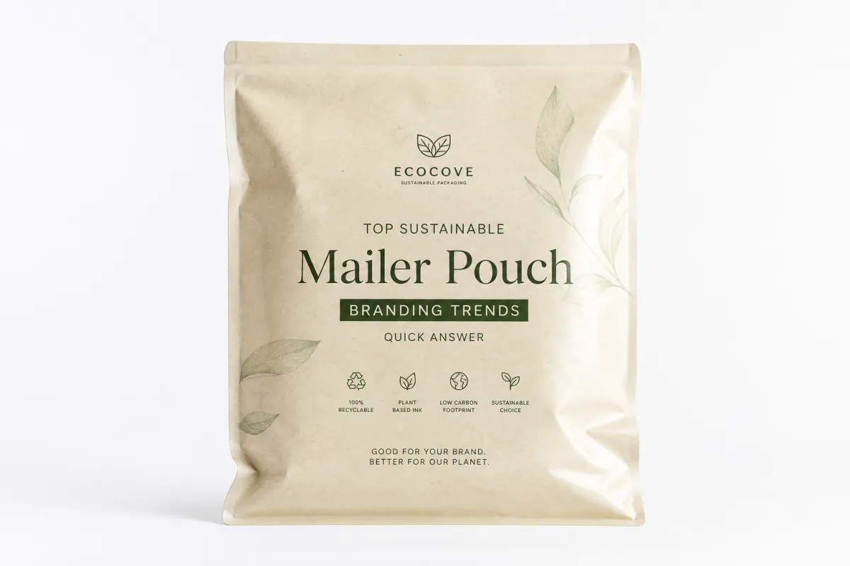
Top Sustainable Mailer Pouch Branding Trends That Work
top sustainable mailer pouch branding trends are no longer a niche design conversation. They sit at the intersection of shipping performance, customer trust, and proof. A pouch gets stacked, pressed, tossed, photographed, and sometimes judged before the buyer even opens it. That puts pressure on the branding to do more than look polished on a screen. It has to survive transit and still read clearly in a messy kitchen, a studio apartment, or the back seat of a car.
Among the top sustainable mailer pouch branding trends, restraint is winning. Brands are cutting ink coverage, choosing recycled-content materials, leaning into kraft-toned surfaces, and building systems that feel deliberate instead of overdesigned. The shift is easy to miss if you only look at mockups. On the actual package, less decoration often feels more confident. It says the brand knows what it is and does not need to shout.
That matters most in fashion, beauty, supplements, and small-batch goods, where the shipping pouch becomes part of the brand presentation. Buyers want credibility without a sermon. They want brand recognition fast. They also spot the gap between a sustainability claim and the real material story almost immediately, which is why the strongest top sustainable mailer pouch branding trends rely on proof as much as polish.
The prettiest eco-looking pouch is not always the most believable one. The cheapest option is not always the smartest one either. Most packaging mistakes live in the space between appearance and proof.
This review takes a buyer’s view, not a polished pitch deck view. It compares materials, print methods, and cost structures, then weighs visual branding against shipping durability and production reality. That matters because the first run is not a mood board. It is inventory. It is also the point where sustainable packaging either earns trust or starts to feel like a concept with no backbone.
What Are the Top Sustainable Mailer Pouch Branding Trends?
The strongest top sustainable mailer pouch branding trends right now are low-ink systems, recycled-content structures, kraft-forward visuals, and modular branding that scales across product lines without turning every pouch into a special project. Those approaches earn their place because they match the way customers actually judge packaging: quickly, often on a phone, then again in the hand.
Clarity tends to beat complexity. A clean logo lockup, one or two ink colors, disciplined typography, and a substrate with a believable material story usually outperform crowded illustrations and decorative noise. Brands that want a handmade or artisan feel can still get there with kraft textures, uncoated finishes, and label-led branding. The package feels human without pretending to be handmade if it is not. That is one reason top sustainable mailer pouch branding trends are drifting toward systems that read as honest first and styled second.
The most effective top sustainable mailer pouch branding trends are not always the ones that look the greenest at first glance. Heavy leaf graphics can feel less honest than a plain panel, a recycled-content claim, and a certification that can be verified. Buyers have become better readers of packaging. They know the difference between a visual cue and an actual material decision.
For a packaging team, the cleanest rule is simple: choose the trend that fits product weight, shipping conditions, and order volume first, then shape the visuals around that structure. A beauty brand shipping fragile kits does not need the same treatment as a supplement brand with repeat orders or a fashion label trying to keep brand consistency across multiple SKUs. That is where the best top sustainable mailer pouch branding trends start to look less like trends and more like operating systems.
One more reality check. A pouch that looks beautiful in natural light can still scuff badly in transit. I have seen that happen more than once in sample reviews. A finish that looked elegant in a studio setting turned patchy after a short courier test. That is why the current leaders are usually systems rather than isolated styles. The strongest top sustainable mailer pouch branding trends combine material honesty, legible design, and enough toughness to survive the parcel network without arriving tired. They also make mailer pouch printing decisions that support the structure instead of fighting it.
Top Sustainable Mailer Pouch Branding Trends Compared
The comparison that matters is not trend versus trend. It is trend versus use case. Sustainability gets discussed in broad language, but the result depends on what the pouch is made from, how it is printed, and how much punishment it takes before it reaches the customer.
Below is a practical comparison of the main directions showing up in top sustainable mailer pouch branding trends right now.
| Branding approach | What it signals | Strengths | Common failure point | Best fit |
|---|---|---|---|---|
| Recycled-content film with low-ink print | Modern, credible, disciplined | Clean graphics, strong logo clarity, easy to scale | Can look plain if the hierarchy is weak | DTC fashion, supplements, repeat-use brands |
| Kraft-based or kraft-inspired pouch visuals | Earthy, handmade, tactile | Warm tone, natural cue, friendly unboxing experience | Dark colors can print muddy; fine detail can disappear | Artisan food, wellness, small-batch beauty |
| Mono-material recyclable film with monochrome branding | Technical, organized, premium restraint | Good for brand recognition, simpler recycling story | Needs strong typography to avoid feeling generic | Minimalist brands, premium essentials |
| Label-led branding on neutral stock | Flexible, practical, small-run friendly | Fast to launch, easy to revise, lower setup cost | Can look temporary if the label system is inconsistent | Launches, seasonal drops, test runs |
| Full-panel storytelling with restrained color | Confident, branded, editorial | Strong visual branding, room for messaging | Higher print complexity and more inventory risk | Established brands with steady volume |
What stands out across these top sustainable mailer pouch branding trends is that the best option is rarely the busiest one. Recycled-content films handle one-color marks and bold sans-serif typography well. Kraft-inspired visuals work when the brand wants warmth, but heavy ink coverage can flatten the texture. Mono-material structures can deliver a crisp, current look, yet they depend on precise spacing and line weight. Label-led systems are the safest starting point, though they need discipline or they begin to feel patched together.
That tradeoff shapes customer perception. A pouch that feels neat and intentional can raise perceived value before the product is even opened. A pouch that looks overworked can do the opposite, even if the material story is technically stronger. That is why top sustainable mailer pouch branding trends are moving toward restraint rather than decoration for decoration’s sake. In practice, restraint often behaves like a stronger sustainability signal than decoration.
For brands deciding between earthy and modern, the difference usually shows up in print behavior. Earthy looks lean on texture, softer contrast, and a paper-like feel. Modern looks depend on sharper logo placement, more geometry, and strong white space. Neither wins by default. The better choice is the one that matches the product promise and the broader brand identity, especially if the business wants its eco-friendly shipping pouches to feel credible rather than performative.
A useful comparison is between Custom Poly Mailers and pouch formats positioned as more sustainable. Poly mailers can still belong in a smarter packaging system if the branding is restrained and the material use is efficient. A lot depends on the supplier’s structure, not just the graphics on the front. If a supplier claims a greener story, ask what can be documented and what is only visual language. That small habit saves a lot of regret later.
For brands that need texture-driven cues, the strongest middle ground is often a plain pouch paired with a disciplined label system. That is where Custom Labels & Tags can pull real weight. A good label can carry a secondary message, a QR code, batch data, or a seasonal note without forcing the pouch itself to do every job. It is one of the quietest but most useful moves inside the top sustainable mailer pouch branding trends.
Detailed Reviews of the Best Branding Approaches
Evaluating top sustainable mailer pouch branding trends like a buyer means asking blunt questions. What does the pouch look like after it has been opened and handled? How does it hold up after transit? Does the logo still read from arm’s length? Does the package feel more expensive, less expensive, or exactly as priced once it is in hand?
That is also where a lot of sustainable packaging claims get exposed. A design can look clean in a render and still fail the moment it meets tape, abrasion, and stacked cartons. The strongest top sustainable mailer pouch branding trends respect that difference.
Kraft-inspired branding
Kraft-inspired branding wins on warmth. It suggests natural materials, local production, and a less polished identity that feels approachable instead of corporate. In the hand, it often reads as honest. That is a strong fit for food, wellness, and artisan beauty brands, where visual branding should feel familiar before it feels clever.
The weakness shows up in print behavior. Dark greens, browns, and dense illustrations can muddy quickly on kraft-toned surfaces. Fine linework is risky, especially if the pouch will travel through a rough delivery stream. Crisp results usually come from a simplified logo, a smaller color palette, and a clear message hierarchy.
Kraft works best when it is not trying too hard. A restrained logo, some breathing room, and one useful message can outperform a crowded composition that shouts sustainability without proving it. That pattern keeps showing up across the strongest top sustainable mailer pouch branding trends.
Recycled-film print
Recycled-content film tends to look more modern and controlled. It is often the Best Choice for Brands that want brand consistency across multiple products. The surface can support cleaner typography, stronger contrast, and a more premium finish than many teams expect, especially when ink coverage stays modest.
The downside is perception. If the design is too sparse, the pouch can look generic. That is where brand identity carries the load. The logo, spacing, and typography need enough intention to hold the system together even when the color palette stays narrow. For many brands, that is not a flaw. It is discipline.
In practice, recycled-film branding performs well for DTC clothing, supplements, and subscription products because it signals operational maturity. It also scales better than many craft-heavy looks. Once the design language is established, it can move across categories without losing recognition. Among top sustainable mailer pouch branding trends, it is one of the easiest to extend into a larger sustainable packaging system.
Monochrome systems
Monochrome is the quiet overachiever. A single-color or near-single-color system usually looks sharper than brands expect, provided the type is strong and the spacing is not careless. Black on natural, charcoal on gray, or deep green on off-white can all read as premium without expensive decoration.
The reason monochrome keeps appearing in top sustainable mailer pouch branding trends is practical. It lowers prepress complexity, supports faster approvals, and often keeps unit costs manageable. It also leaves room for the product story instead of making packaging compete with it.
The risk is sameness. Plenty of brands learn that a minimal mark is not enough on its own. If the package system does not have a distinctive typographic voice or a memorable layout, the pouch can blend into the background. Minimal does not mean anonymous.
Stamp-style graphics
Stamp-style graphics bring a slight irregularity that can work well. They suggest small-batch handling and a less manufactured tone. That effect can be persuasive for niche food, handmade personal care, and limited-run product drops. It also gives brands a fast visual cue for a sustainability-minded identity.
There is a thin line between charming and sloppy. A faux-stamp look can feel dated if every pouch uses the same trick. Execution matters even more. If the print is too faint, too gritty, or too irregular, the pouch can lose clarity in shipping photos. That hurts brand recognition more than many teams expect.
Label-led branding
Label-led branding is not glamorous, and that is exactly why it works. It gives brands room to test names, claims, seasonal copy, or certification details without committing to a fully printed format. For early-stage businesses, this is one of the safest ways to participate in top sustainable mailer pouch branding trends without locking money into inventory too early.
The upside is flexibility. The downside is that the package can look assembled from parts if the label size, placement, or stock changes from one run to the next. A strong label system needs rules. The logo should sit in the same place every time, the copy should follow a fixed order, and the finish should feel intentional rather than temporary.
For many smaller brands, the smartest route is a neutral pouch paired with a dependable label and a clear shipping insert. That gives the unboxing experience structure without demanding a full packaging commitment before demand is proven. It also keeps mailer pouch printing decisions simpler, which is often the difference between moving fast and losing a launch window.
If the packaging looks eco-friendly but cannot be explained in one sentence, customers usually trust it less, not more.
There is also a materials issue that gets ignored. Certain sustainable substrates limit metallic inks, dense solids, and tiny text more than teams expect. That does not mean the design has to be bland. It means the art direction needs to respect the substrate instead of fighting it. Brands that accept that constraint usually get better results and fewer production surprises.
For examples, browse a few project references in our Case Studies. The strongest projects tend to be the ones where package design and shipping reality were solved together rather than treated as separate problems. That pattern appears again and again in the most durable top sustainable mailer pouch branding trends.
Pricing and Value: What Sustainable Branding Costs
Pricing is where the conversation gets real. Many brands like the look of top sustainable mailer pouch branding trends until they see how unit cost, setup, freight, and minimum order quantity interact. The price is not just the pouch. It is the system wrapped around the pouch.
A useful budget model splits spend into five buckets: pouch material, print setup or plates, prepress and proofing, freight, and repeat-run savings. The biggest mistake is looking only at the per-unit price. On smaller runs, setup and shipping can matter almost as much as the pouch itself.
| Option | Typical unit impact at 5,000 pcs | Setup complexity | MOQ pressure | Value note |
|---|---|---|---|---|
| One-color print on stock pouch | $0.08-$0.18 | Low | Lower | Best starting point for controlled budgets |
| Label-led branding | $0.03-$0.12 | Very low | Very low | Flexible for launches and revisions |
| Recycled-content custom print | $0.14-$0.28 | Medium | Medium | Good balance of appearance and credibility |
| Full-panel custom graphics | $0.18-$0.35 | Medium-high | Higher | Better for strong visual storytelling |
| Specialty finish or tactile effect | $0.25-$0.45+ | High | Higher | Premium look, but not always the best sustainability story |
These ranges are indicative, not universal quotes. Material thickness, print coverage, certification needs, and shipping lane all shift the number. A small run with a short lead time can cost more per unit than a larger run planned with patience. That is normal, even if it is frustrating.
The value question is larger than cost alone. A well-chosen pouch can improve perceived quality, reduce design clutter, and support brand recognition on social media and in repeat orders. Sometimes a small increase in packaging spend is justified because the package lowers confusion, strengthens trust, and helps a product look coherent from the first delivery onward. In that sense, the most effective top sustainable mailer pouch branding trends often save money indirectly by reducing redesign churn and inventory mistakes.
Where buyers overspend is often less obvious. Certification claims can add verification work. Supplier switching can add sample rounds. Specialized print methods can create tolerance issues. A small batch ordered too late can trigger freight premiums that wipe out the savings from a cheaper substrate. None of that is theoretical. It happens constantly.
Inventory matters too. Simpler sustainable branding often reduces SKU sprawl because the same pouch format can serve more products. That helps forecast demand and lowers the chance of sitting on obsolete packaging. In a packaging budget, that matters as much as the print quote.
For companies comparing pouch formats with related shipping options, the pouch should not be the only thing under the microscope. A package that looks cleaner, ships efficiently, and avoids unnecessary layers often delivers better value than a more elaborate system that wins on mockups but loses on logistics.
For standards and material credibility, the paperwork matters. If a supplier claims recyclable or certified content, ask what can be documented and by whom. The FSC explains chain-of-custody basics clearly, which helps when a brand needs a claim that can stand up to internal review. For shipping durability, parcel testing methods from the ISTA library offer a practical reference point when the pouch will move through rough distribution channels.
Branding Process and Timeline for Sustainable Mailer Pouches
The production path for top sustainable mailer pouch branding trends is usually slower than the mockup suggests. A clean design on screen can still take several rounds of proofing once it meets a real substrate, a real printer, and a real transit profile.
The sequence usually runs like this: concept direction, substrate selection, artwork prep, proofing, sample approval, production, and delivery. The order sounds obvious. The delays happen because teams reverse it. They start with the look before they know what the material can actually support.
Stock or lightly customized formats move fastest. A label-based rollout might be ready in about 7-10 business days once copy and artwork are finalized. Semi-custom print often lands in the 12-15 business day range after proof approval. Fully custom production can run longer, especially if the supplier needs revised dielines, new plates, or extra verification on recycled content or certification language.
The biggest slowdowns are usually not mechanical. They are organizational. Sustainability claim verification takes time. Color matching takes time. Logo cleanup takes time. Internal approval loops take time. If a brand is launching a new line, the smartest move is to finalize messaging early and keep the artwork as simple as the brand can tolerate. That is one of the most practical ways to keep top sustainable mailer pouch branding trends from becoming a production bottleneck.
That is one reason so many strong top sustainable mailer pouch branding trends rely on a simple hierarchy: logo, product name, one supporting claim, and maybe one secondary message. Simplicity is not a downgrade. It is a production advantage.
Brands planning a larger rollout should request a sample pack, then test the pouch under the same conditions the customer will see. Drop it in a shipping carton. Rub the surface lightly. Check readability under indoor light and phone flash. If the material marks too easily or the ink fades in a way that looks accidental, that defect will show up in the market faster than the supplier expects.
One practical rule helps a lot: lock the copy before the color decision. Color can distract teams from what matters, which is whether the package communicates the right promise in two seconds. If the wording is vague, even beautiful packaging can feel empty. If the wording is sharp, modest design can still feel premium.
Brands with a fast launch window should use the shortest route that still protects accuracy. That usually means a stock pouch, a controlled label system, and a strict approval timeline. Brands with a slower runway can invest in custom print, but they should still pilot the design on a smaller quantity before committing to a full rollout. For practical examples of how this plays out, our Case Studies page is a useful place to compare formats and outcomes.
How to Choose the Right Sustainable Mailer Pouch Branding Trend
Choosing among top sustainable mailer pouch branding trends is less about taste than fit. The right answer depends on product weight, shipping conditions, order volume, and whether the pouch is used for direct-to-consumer delivery or retail support. The same look can perform brilliantly in one channel and poorly in another.
Start with the product. Heavy items need structures that resist puncture and flexing. Light items can tolerate more decorative freedom. Then look at the shipping route. If the pouch will sit inside another carton, the branding can be more delicate. If it will serve as the outer mailer, the surface and ink system need to survive scuffs, dust, and handling.
Next, match the visual personality. Clean and modern usually means restrained graphics, sharp typography, and fewer colors. Earthy and handmade usually means softer contrast, tactile finishes, and more organic layout choices. Premium and restrained means excellent spacing, minimal clutter, and strong material feel. Bold and promotional means higher contrast and more decisive messaging, but that can work against a sustainability story if the execution gets too loud.
One of the most overlooked points is that a pouch can look sustainable without being the best material choice. Visual sustainability is not the same as actual sustainability. A kraft look can be authentic, or it can be a costume. A recycled-content structure can be practical, or it can be a weak claim if the chain of evidence is thin. Buyers should ask what is documented, what is inferred, and what is only decorative.
That is where top sustainable mailer pouch branding trends meet compliance. Green claims should match the substrate, the certification, and the language on the pouch. If a brand says recycled, the recycled content should be explained. If a brand says compostable, there should be a standard behind the claim. If the supplier cannot explain the claim clearly, that is a warning sign, not a minor detail.
A simple shortlist rule works well in practice:
- If the brand needs trust fast, choose clarity.
- If the brand needs differentiation, choose texture or structure.
- If the brand needs scale, choose repeatable low-ink systems.
- If the brand needs launch flexibility, choose labels first.
- If the brand needs premium restraint, choose monochrome with disciplined spacing.
Internal consistency matters too. A pouch should not fight the website, the product page, or the insert card. The strongest packaging systems reinforce the same promise across channels, so the customer does not need to decode the brand twice. That is especially true for eco-friendly shipping pouches, where the packaging story and the product story need to sound like they belong to the same company.
For teams still shaping that system, it helps to think in terms of a packaging family rather than a single pouch. The pouch, label, shipper, and insert should speak the same language. Otherwise the unboxing experience feels assembled instead of designed.
Our Recommendation: Best Sustainable Mailer Pouch Branding Moves
After testing the main options across print behavior, perceived value, and shipping durability, here is the ranking I would give most brands exploring top sustainable mailer pouch branding trends.
- One-color branding on a recycled-content or neutral stock pouch for the best mix of clarity, cost control, and credibility.
- Label-led branding for launches, seasonal ranges, and brands that need flexibility before demand settles.
- Monochrome minimalist print for premium essentials that depend on brand consistency and a cleaner visual identity.
- Kraft-inspired visuals for artisan and handmade categories that want warmth and texture.
- Full-panel custom storytelling for established brands with enough volume to support a more specific packaging system.
If I were advising a new brand, I would test one pouch structure, one print approach, one message hierarchy, and one shipping scenario before scaling anything. That sounds cautious because it is. Packaging is one of those places where a small mistake gets multiplied by every order, which is exactly why the best top sustainable mailer pouch branding trends reward discipline more than novelty.
Test it the way customers will see it. Put it in a box. Send it through a normal delivery cycle. Open it under indoor light and on a phone camera. Then ask three questions: Is the logo legible? Does the material story make sense? Does the package still feel strong after transit?
From a practical standpoint, the best rollout sequence is straightforward: audit current packaging, collect supplier samples, compare proof support, and run a customer-side unboxing test. That is the fastest way to separate a nice concept from a package that actually performs.
Use this rule before you commit: if the pouch needs to prove trust, keep the design clear; if it needs to prove differentiation, add texture or structure; if it needs to scale, keep the system repeatable. That is the logic behind the strongest top sustainable mailer pouch branding trends, and it is why they continue to work across categories that are otherwise very different.
For brands that want a next step, start with a side-by-side sample review and compare the result against your current packaging. Then check whether the design still holds up when photographed, stacked, and opened by a customer who has never seen the brand before. That is the real test. If it passes there, it will probably work in the market. If it fails there, no amount of messaging will rescue it.
The most practical takeaway is simple: choose the packaging system that can be documented, printed cleanly, and repeated without drama. That is usually the winning move for top sustainable mailer pouch branding trends. Everything else is decoration around that decision.
FAQ
What are the best top sustainable mailer pouch branding trends for small brands?
Start with one-color printing, recycled-content materials, or a strong label system to keep costs under control. Small brands usually benefit from packaging that reads clearly in photos and on delivery because first impressions do a lot of work. Avoid complicated finishes that raise minimums before demand is proven. The most practical top sustainable mailer pouch branding trends for small teams are the ones that let them launch, learn, and revise without wasting inventory. A clean label-led system can be the easiest path into sustainable packaging without overcommitting. It is kinda the least risky way to get moving.
Which top sustainable mailer pouch branding trends look most premium?
Minimal typography, restrained color, and tactile materials usually look more premium than busy graphics. Matte finishes, kraft-inspired layouts, and clean logo placement often outperform flashy effects in perceived quality. Premium does not have to mean ornate; consistency and restraint usually win. The premium feel comes from spacing, print discipline, and material honesty more than decoration. Among the top sustainable mailer pouch branding trends, monochrome systems tend to feel the most editorial.
How much do sustainable mailer pouch branding trends add to packaging costs?
The biggest cost drivers are print complexity, minimum order quantity, and any specialty substrate or finish. Simple branding can stay relatively modest, while fully custom structures and specialty inks push prices higher. Freight and proofing often matter more than buyers expect, especially for smaller runs. The right way to judge the spend is to compare cost against perceived value, not against material price alone. Many brands find that the most cost-effective top sustainable mailer pouch branding trends are the ones that reduce revisions later.
How long does it take to launch branded sustainable mailer pouches?
Stock or lightly customized options move fastest, while custom printed runs take longer because of artwork and approvals. Lead time can stretch if sustainability claims, colors, or supplier specs need extra verification. Build in sample review time so the first production run does not miss your launch window. For brands moving quickly, the safest route is often a stock pouch plus a controlled label system. That approach keeps the rollout aligned with the quickest of the top sustainable mailer pouch branding trends.
How do I know if a sustainable mailer pouch branding claim is credible?
Ask for material specifications, certification details, and a clear explanation of what can be verified. Match the claim to the actual substrate and avoid vague language that sounds green but cannot be documented. If the supplier cannot explain the claim simply, treat that as a warning sign. A credible sustainability story should be easy to explain, easy to support, and consistent with the pouch structure. The best top sustainable mailer pouch branding trends make that story visible without overexplaining it.
For brands choosing among top sustainable mailer pouch branding trends, the best path is usually the one that balances proof, cost, and visual discipline. That means choosing a structure that can be documented, a print method that survives shipping, and a brand language that still feels sharp in a customer’s hand. Get those three things right, and the pouch does more than carry a product. It carries trust.


