Buyer Fit Snapshot
| Best fit | Unboxing Experience Comparison projects where brand print, material claims, artwork control, MOQ, and repeat-order consistency need to be specified before quoting. |
|---|---|
| Quote inputs | Share finished size, material target, print colors, finish, packing count, annual reorder estimate, ship-to region, and any compliance wording. |
| Proofing check | Approve dieline scale, logo placement, barcode or warning zones, color tolerance, closure strength, and carton packing before bulk production. |
| Main risk | Vague material claims, crowded artwork, missing packing details, or unclear freight terms can make a low unit price expensive after revisions. |
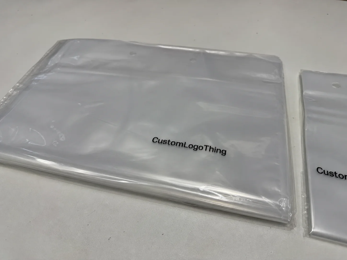
Fast answer: Unboxing Experience Comparison: Board, Finish, Dieline, and Unit Cost should be specified like a repeatable production item. The safest quote records material, print method, finish, artwork proof, packing count, and reorder notes in one written spec.
Production checks before approval
Compare the actual filled-product size with the drawing, then confirm tolerance on folds, seals, hang holes, label areas, and retail display edges. Reserve space for logos, QR codes, warning copy, and material claims before decorative graphics fill the panel.
Quote comparison points
Review material grade, print process, finish, sampling route, tooling charges, carton quantity, and freight assumptions side by side. A quote is only useful when the supplier can repeat the same color, closure quality, and packing count on the next order.
What an Unboxing Experience Comparison Really Measures
The first time I saw an Unboxing Experience Comparison done properly, it was on a line in a corrugated mailer plant outside Charlotte, North Carolina, where two boxes held the exact same ceramic mug, same foam insert, same shipper weight, and yet one made the customer panel smile before the lid even cleared the tray. The other one felt ordinary, almost forgettable, and the difference came down to a 16pt SBS folding carton with matte aqueous coating versus a plain kraft shipper with a noisy roll of tape across the top. Same mug. Very different emotion. I still remember standing there with a coffee in one hand and a clipboard in the other, thinking, “Well, that’s annoying in the best possible way,” because the data was staring us in the face.
That is the part a lot of teams miss. An unboxing experience comparison is not just a design exercise or a pretty mockup review. It is a side-by-side look at how packaging formats, materials, and finishing choices perform in real hands, under real shipping conditions, with a real product inside. In plain language, you are asking which package creates stronger customer perception, which one protects better, and which one better supports your brand identity without creating headaches in fulfillment. A packaging team in suburban Atlanta might focus on visual polish, while a fulfillment group in Reno may care more about crush resistance and pack speed, and both views matter in equal measure.
Branding teams care because the box is usually the first physical brand touchpoint. Before the product is held, before the instructions are read, before the scent or texture of the item itself can influence opinion, the package is speaking. In my experience, the package often sets the tone for brand recognition faster than the logo on a website header does, because the customer is touching it, hearing it, and opening it. A rigid box with a magnetic closure says something different than a tuck-top carton. A printed mailer says something different than a white polybag inside a kraft shipper. A 350gsm C1S artboard mailer with a matte aqueous finish creates a calmer, more controlled first impression than a 24pt chipboard set-up with a glossy wrap, and the customer absolutely notices even if they never write a dramatic review about it.
So what are we actually comparing? Usually, I look at outer box construction, closure style, print quality, inserts, tissue, seals, ease of opening, and how each element signals value before the product is even visible. On a factory floor, I also watch for things that marketing decks rarely mention: whether the tuck flap fights the operator’s thumb, whether the insert rattles when the parcel is shaken, whether the gloss finish scuffs on the conveyor, and whether the package can survive a corner drop from 30 inches, which is the kind of abuse that shows up fast in carrier networks. At a plant in Dongguan, I once watched a supposedly “premium” carton get humbled by a conveyor belt like it had personally offended the machine, and the scuff marks were visible after only 40 passes through the wrap station. Not pretty.
Honestly, I think the best unboxing experience comparison is never just about beauty. It has to balance brand storytelling, usability, production feasibility, and cost per unit. If one option looks like luxury but drives pack-out time up by 18 seconds per carton, that may be a problem at 10,000 units. If another option feels modest but survives ISTA-style handling and cuts damage claims by 4%, that may be the smarter play. The comparison earns its keep by replacing opinion with evidence, which is refreshing because packaging meetings can otherwise turn into a polite version of people arguing over coffee cups. In a project I reviewed in Louisville, Kentucky, the cleanest-looking sample was also the slowest to assemble, and the operations team caught it before the first 2,500 cartons were printed.
How the Unboxing Experience Comparison Process Works
A practical unboxing experience comparison starts with prototypes, not assumptions. I usually recommend creating two to four packaging versions using different materials or constructions, then evaluating them with the same product, the same fill method, the same shipping method, and the same opening sequence. If one package gets wrapped tissue and the other does not, or one ships with a paperboard insert while the other uses molded pulp, that is fine. The point is to isolate the variables so you can tell what actually changed the experience. Otherwise, you are comparing packaging luck, which is a terrible strategy and somehow still common. At a sample shop in Shenzhen, I saw a team test three structures in the same afternoon using a single die-cut sample cutter and a handheld scale, and that kind of discipline saves a remarkable amount of guesswork.
In the shops I’ve visited, this process often moves through familiar factory stages: folding carton mockups on a digital cutter, rigid box prototypes built by hand, offset print samples pulled from press, hot foil stamping trials, soft-touch lamination tests, and insert die-cutting on a sample rule. Those details sound dry until you see them in motion. A foil hit that looks elegant on screen can wrinkle on a production board with heavier caliper. A soft-touch finish that feels expensive can also show fingerprints if the coating chemistry is off. A 1,000-sheet run on a Komori press in Osaka may tell you more in one afternoon than three weeks of slide decks, and the sample table tells the truth with very little patience for wishful thinking.
The best comparison method includes timed opening, damage checks, photographability, tactile impressions, and short customer surveys that capture first reaction, perceived quality, and whether the package feels worth keeping. I have sat in client meetings where the winning package was not the fanciest one, but the one that made the test group say, “This feels like the brand actually thought about me.” That kind of response is gold, because it speaks to emotional connection and not just visual branding. I still remember one buyer who literally stroked the side of a soft-touch carton like it was a rescue dog, and the board spec was 18pt SBS with a 1.2 mil matte film, which made the reaction both specific and slightly unsettling.
Cross-functional review is essential. Branding, operations, ecommerce, and fulfillment should all have a seat at the table. I once worked with a cosmetics client in Los Angeles that loved a tall rigid set-up box with a magnetic flap and a velvet tray insert. Gorgeous package. Strong shelf presence. But the pack-out team was spending an extra 22 seconds per unit because the inner tray had to be aligned by hand, and the returns team warned that the magnet kept attracting paper clips and small steel tools on the bench. The box won the aesthetics contest and lost the operations contest. That happens more often than people admit, and it is usually the operations team quietly saving everyone from a future headache during a 9,000-unit launch.
Shipping conditions matter too. A serious unboxing experience comparison should include vibration, drop, and corner-crush risk, because a mockup on a studio table is not the same thing as a carton rattling in a parcel trailer for 600 miles. The International Safe Transit Association has useful material on testing methods, and I often point teams to ISTA when they want to understand why a box that looks perfect can still fail in transit. If you’ve ever opened a crushed outer carton that looked like it had been sat on by a forklift with a grudge, you already understand why this matters. In practice, even a simple 24-inch corner drop test can reveal more than a week of hallway speculation.
Key Factors That Change the Unboxing Experience
Texture, weight, sound, scent, and visual layering all shape the way a package feels in the hand. A 350gsm C1S artboard carton with a matte aqueous finish sends a very different signal than a 24pt rigid board wrapped in printed paper. The first has a lighter, more efficient feel. The second says premium, deliberate, and usually more expensive. In a solid unboxing experience comparison, those sensory details become measurable because they influence how the customer judges the product before touching the product itself. I’ve watched people decide a box was “high-end” just because the lid made a clean, quiet sound instead of a cheap crackle, and that detail can be traced all the way back to board caliper, wrap tension, and closure tolerances in the factory.
Material choice is usually where the story starts. Corrugated mailers are strong and practical, especially for ecommerce. SBS folding cartons work well when print detail and crisp edges matter. Rigid set-up boxes bring weight and presence. Molded Pulp Inserts tell a sustainability story and can cradle fragile items with impressive reliability. PET windows show the product early, which can help with retail visibility but can also make the package feel less mysterious. Tissue paper, if used well, can add a small moment of anticipation; if used carelessly, it just becomes litter on the table. A mailer made in Monterrey, Mexico with E-flute corrugate and water-based ink will behave very differently from a laminated rigid box produced in Ningbo, China, even before the product is added, and that difference shows up in the hand almost immediately.
Finishing details often decide the winner in an unboxing experience comparison. Matte versus gloss changes the light reflectance and the perceived softness of the print. Embossing and debossing add tactile depth. Foil stamping can make a brand mark pop, especially in gold, silver, or a custom pigment foil. Spot UV can create sharp contrast if the ink density is controlled properly. Edge painting is common in luxury stationery and higher-end rigid packaging, and it can dramatically improve brand consistency when it matches the palette on the website and retail assets. Color accuracy matters, too, especially on coated versus uncoated boards, because a navy on uncoated paper often reads flatter than the same ink on a coated sheet. I’ve lost count of the times someone said, “That blue looks off,” and the pressroom reply was basically, “Yes, because paper is not a screen.”
Structure affects pacing. Magnetic closures create a deliberate reveal. Tuck tops open quickly and efficiently. Sleeves add a second layer that can feel elegant if the fit is tight and the motion is smooth. Custom inserts, pull tabs, tear strips, and lift trays each change how the product is discovered. That reveal matters. I’ve watched people literally slow down when a package has a well-designed pull tab because the motion feels guided and respectful, almost like the brand is handing over the product instead of dumping it out. And, yes, I’ve also watched someone fight a stubborn tuck flap like it had insulted their family. That was not a premium moment, especially when the flap stock was 18pt board with a heavy flood coat.
Brand consistency should never be an afterthought. A luxury candle line, a subscription snack box, and a premium tech accessory all need different packaging languages. If the price point is $18, the package should not act like it belongs to a $180 item. If the brand voice is playful, a severe black rigid box may feel off. If the product is built around eco-conscious positioning, heavy lamination and excess plastic film can work against the story. A useful unboxing experience comparison asks whether the packaging supports the product’s actual promise, not just whether it looks expensive. A 4 oz candle in Portland, Oregon and a $120 wireless charger in San Jose need completely different visual cues, even when they share the same ecommerce checkout flow.
Sustainability is part of the equation now, and customers notice. Recyclability, material usage, and whether the package can be flattened, reused, or curbside recycled often affect trust as much as aesthetics do. I’ve had brand managers ask for FSC-certified paperboard because they wanted a cleaner sourcing story, and that instinct was sound. If you want a refresher on responsible sourcing and paper standards, FSC is a good place to start. I also tell teams to review EPA guidance on waste reduction and materials management at epa.gov, especially if they are rethinking inserts and secondary packaging. A cleaner build can save material, simplify disposal, and frankly spare everyone from that awkward moment when a customer posts a pile of excess packaging next to the product they bought. In one Chicago subscription box program, switching from plastic void fill to molded pulp reduced secondary material use by 27% across a 25,000-unit season.
Cost and Pricing: What Changes Between Box Options
Pricing surprises are common in an unboxing experience comparison, and they usually happen because people judge only the box itself instead of the whole system. The most expensive-looking option is not always the smartest purchase. A rigid box with specialty wrap, foil, magnet closure, and custom insert can create a beautiful presentation, but it can also push unit cost up fast. A simpler folding carton with excellent graphics and smart internal staging may deliver most of the brand benefit at a fraction of the cost. I’ve had clients fall in love with a sample so fast they basically tried to adopt it, and then the quote arrived and everyone suddenly discovered math again. A 5,000-piece rigid box run in Suzhou with foil and a magnetic closure can look lovely and still be the wrong economic choice for a 12,000-order subscription launch.
What drives cost? Paperboard grade, box construction complexity, print method, minimum order quantity, custom inserts, tooling, finishing steps, and labor time on the packing line. If you specify a 24pt rigid board with wrapped panels, a custom EVA foam insert, and a spot UV on the logo, you are stacking multiple cost centers into one design. If you choose a 18pt SBS carton with a single-color exterior and a paperboard insert, your economics change quickly. I’ve seen projects where a shift from a three-piece rigid setup to a one-piece folding carton cut the packaging spend by 38% on a 15,000-unit order. That kind of difference gets everyone’s attention, including the finance team, who usually appear five minutes late and somehow still have the sharpest questions. In practical quote terms, a folding carton might land around $0.15 per unit for 5,000 pieces, while a rigid box with a wrapped chipboard shell and custom insert can jump to $1.10 or more per unit at the same quantity.
Scale changes the math. Small runs of premium boxes often cost far more per unit than larger runs of folding cartons, especially if foil stamping or custom dielines are involved. A plant in Dongguan once quoted a beauty client two different structures: a 5,000-unit rigid box program at a much higher per-unit price, and a 50,000-unit folding carton run that came in far lower because the press sheet utilization was better and the die-cutting waste was lower. Same brand, same product, totally different cost outcome. That is why a proper unboxing experience comparison always includes volume assumptions. Leaving volume out is how people end up comparing apples to entire orchards. I’ve also seen a supplier in Gujarat price the same structure 14% lower once the order moved from 8,000 to 20,000 units because the tooling and setup charges were spread more efficiently.
Hidden operational costs can surprise people, too. Heavier packaging raises freight expense. More inserts slow assembly. Complex closures can require extra labor during packing and returns processing. Even the way a box stacks on a pallet can affect total landed cost. If a package adds 0.12 lb per unit and you are shipping 20,000 units, freight can move enough to matter. That does not mean you should avoid premium packaging. It means you should compare the whole system, not just the decorated carton in isolation. One box might save you pennies on materials and then quietly eat dollars in labor. Sneaky little monster, that one. A 9 x 6 x 3 inch mailer that nests efficiently on a 40 x 48 inch pallet can save more in outbound freight than a decorative sleeve ever will.
Here’s the lens I prefer: compare packaging cost against perceived value, conversion lift, social sharing potential, and damage reduction. A box that costs $0.18 more per unit may be worth it if it reduces breakage, lowers refund rates, and improves repeat orders. A package that looks cheaper but creates a poor customer perception can quietly cost far more through lost loyalty. In client meetings, I often ask, “What is the cost of the wrong impression?” That question tends to sharpen the conversation because nobody wants to admit they are paying for a bad first date with the customer. If a premium finish lifts repeat purchase rate by even 2% on a 30,000-order line, the added spend can be justified faster than most people expect.
Manufacturers should quote structure, print, finishing, and assembly separately. That makes it easier to see whether the price spike came from the board, the foil, the die line, or hand labor. It also helps the team make informed trade-offs. If the foil hot stamp adds $0.06 per unit and the magnet adds $0.11, maybe the visual impact of the foil is enough. If the custom insert adds 2 minutes of hand assembly per 50 units, maybe a simpler insert should be tested in the next unboxing experience comparison. Clear pricing layers make better decisions, and better decisions keep the project from turning into a slow-motion surprise party. A quote from a plant in Ho Chi Minh City that lists tooling, printed board, assembly, and freight as separate line items is much easier to evaluate than a single bundled number that hides everything.
Process and Timeline: From Concept to Production
A packaging program usually follows a clear workflow: discovery, structural design, artwork setup, proofing, prototyping, revisions, production approval, manufacturing, finishing, and final assembly. That may sound tidy on paper. On a live floor, it is more like a series of handoffs between design, prepress, purchasing, pressroom, die-cutting, and pack-out. Each step can move smoothly, but only if the team makes decisions early. A good unboxing experience comparison benefits from that discipline because late changes tend to be expensive and disruptive. I’ve seen a tiny logo move trigger a chain reaction that felt less like a revision and more like an industrial accident in slow motion. In one case in Grand Rapids, a 2 mm shift in the logo required updated foil tooling, revised dies, and a fresh proof cycle.
Delays usually show up in the same places. Artwork changes after dielines are approved. Material substitutions happen because a board grade goes on allocation. Color matching drifts on coated stock. Insert fit problems appear only after samples are assembled by hand. Finishing add-ons get requested after sampling begins, which is often the most annoying one because it means the job has already been planned around a different spec. I’ve watched a simple logo placement change add eight business days to a program because the foil tooling had already been approved and had to be reworked. Nobody enjoys that phone call. Nobody. A mill in Wisconsin can still be on time with board delivery and a downstream press in New Jersey can still lose a week if the approval email lands on a Friday afternoon.
How long does each stage take? Simple folding carton samples can move quickly, sometimes within 5 to 7 business days if the artwork is clean and the structure is standard. Rigid box programs with custom inserts, soft-touch lamination, and multiple finishing trials take longer because every detail has to be verified. In practical terms, a straightforward sample might be in hand faster than a multi-component gift box that needs die-line adjustments, wrap material approval, and assembly review. That is why no honest supplier should promise magic. Good work takes coordination, and coordination takes time whether anyone likes it or not. For production, a typical schedule is often 12 to 15 business days from proof approval for a standard folding carton run, while a more complex rigid box program in Shenzhen can require 20 to 25 business days after all artwork and materials are locked.
Early prototyping saves time. Physical samples reveal fit, flap behavior, print contrast, and insert alignment far better than a screen mockup. I remember a beverage accessory client who was sure the insert slot was fine based on the render. The real sample proved the bottle cap scraped the side wall during insertion because the tolerances were too tight by just 1.5 mm. That tiny adjustment saved an entire production run from customer complaints. A strong unboxing experience comparison is valuable precisely because it exposes these details before you commit. The mockup may look calm and confident; the actual sample usually tells the truth with a lot less charm. In that project, a simple 2.0 mm slot change in the insert board prevented an estimated 600 defective pack-outs.
Factory scheduling matters more than outsiders think. Press availability, die-cutting queues, lamination windows, and hand-assembly capacity all affect lead time. During busy seasons, a plant may have three or four packaging programs competing for the same finishing window. If your project needs hot foil, soft-touch lamination, and hand-glued inserts, it may move slower than a standard printed carton. Good planners build in buffer time for revisions, shipping, and receiving tests, which lets the team compare options without feeling rushed. Rushed packaging decisions are how you end up paying overtime just to discover the closure tab was upside down. I wish I were exaggerating. A plant in Ho Chi Minh City can run beautifully on a calm schedule and still get pinched by a late paper shipment or a public holiday that adds 3 to 4 lost days.
Step-by-Step Guide to Running a Better Comparison
Step 1: define the goal. Are you chasing premium perception, lower damage rates, better social-media shareability, faster pack-out, or a sustainability story that customers can understand in three seconds? If you do not define the goal first, the unboxing experience comparison becomes a taste contest. I have sat in rooms where everyone liked a different sample for a different reason, and nothing gets approved when the objectives are fuzzy. A clear goal is boring in the best possible way, and it keeps a 7-person review team from turning a 15-minute meeting into a 90-minute debate about foil color.
Step 2: choose two to four concepts that are different enough to matter. A rigid box versus a folding carton is a meaningful comparison. A plain insert versus molded pulp is a meaningful comparison. Two nearly identical white cartons with different shades of white are not always worth the time unless color accuracy is the exact issue. Make the variables useful, not decorative. No one needs to spend three weeks comparing “slightly less matte” to “slightly more matte” unless that nuance actually changes buyer perception. If your structure changes the material from 350gsm C1S artboard to 24pt chipboard, the difference is worth testing; if it only changes the corner radius from 3 mm to 3.5 mm, maybe spend that energy elsewhere.
Step 3: create identical test conditions. Same product weight. Same fill method. Same shipping setup. Same opening instructions. If one sample includes tissue and another does not, that is fine, but do not let the shipping conditions change at the same time. Fairness is the whole point of the unboxing experience comparison. Otherwise, you are comparing luck, which is a terrible strategy and somehow still common. I’ve seen a comparison fall apart because one prototype had been sitting in a warm office and another had been hauled across town in the back of a van. Predictably, the results were “inconsistent.” Shocking. A 72-hour conditioning period at 72°F and 50% RH makes those tests much easier to trust.
Step 4: score each version with the same rubric. I like a simple scorecard with six categories: first impression, brand fit, protection, ease of opening, ease of repacking, and cost impact. If the company wants to get more technical, add damage performance, assembly time, and recyclability. Keep the rating consistent, and use the same scale across every sample. Even a 1-to-5 scoring sheet helps. Honestly, the scorecard is less glamorous than a fancy presentation deck, but it saves everyone from confusing vibes with evidence. A 1-to-5 rubric works especially well when one sample takes 14 seconds to open and another takes 31 seconds.
Step 5: collect feedback from both internal teams and target customers. Packaging experts often notice structural issues that shoppers will never mention, like a weak lock tab or a flap that catches on the insert. Customers, on the other hand, may react strongly to feel and presentation, even if they cannot explain why. That combination of operational truth and emotional reaction is where the best insights live. I like hearing both because one tells me whether the thing will work, and the other tells me whether anybody will care. A survey of 25 target buyers in Denver can tell you a lot more than a polished room full of assumptions.
Step 6: choose the winner based on balance. The best package is rarely the flashiest one. It is the one that creates the strongest customer perception, protects the product, fits the budget, and can be produced without drama. If your strongest design only works at 100,000 units, but your current order is 8,000 units, it may not be the right answer right now. A disciplined unboxing experience comparison should lead to a decision the business can actually sustain. Fancy is nice. Reliable pays the bills. A box that can be made in 12 to 15 business days from proof approval is often more valuable than a gorgeous option that needs six more weeks of waiting.
“The prettiest box is not always the best box. The best box is the one that survives the truck, makes the customer feel seen, and still lets the line keep moving.”
Common Mistakes and Expert Tips for Better Results
The biggest mistake I see is over-designing the box. Too many layers, inserts, coatings, and reveal moments can make the package feel expensive in a bad way. Instead of delighting the customer, the opening sequence starts to feel like a chore. I once helped a personal care brand remove two layers of tissue, a card sleeve, and a stitched ribbon from a package that looked beautiful in photos but frustrated real buyers. The revised version was cleaner, faster, and better received. That is a common outcome in a good unboxing experience comparison. The moment the customer needs a map and a snack just to open the package, we’ve probably gone too far. In that case, the simplified version cut assembly time by 11 seconds per carton and reduced labor cost by about $0.04 per unit on a 20,000-unit run.
Shipping reality gets ignored more often than it should. A delicate reveal means little if the package arrives dented, scuffed, or with loose contents. Cardboard crush, edge rub, corner whitening, and interior movement can all undo the brand story before the customer even begins opening the box. I always push clients to test actual transit conditions, especially if the product ships through parcel networks, because the box has to look good after abuse, not just before it. Packaging that cannot survive the trip is basically a stage prop, and the carrier network is not known for gently escorting stage props. A 1,200-mile route from Dallas to Philadelphia can do more damage in one trip than a showroom table will reveal in a week.
Another mistake is comparing visuals only. A render cannot tell you how the tuck flap behaves, whether the insert rattles, or whether the finish scratches when stacked. I’ve watched teams approve a beautiful simulated package and then discover that the matte coating scuffed on the first pallet wrap. The fix was simple: test the actual board stock, compare ink on different substrates, and check closure tolerances before approving a large run. A reliable unboxing experience comparison always includes hands-on testing. Screens are useful, sure, but they do not hiss, scrape, or buckle when a real operator gets involved. A 10-point rub test on the wrap paper can save a 10,000-unit disaster.
One of my favorite floor-floor tips is to watch how an operator handles the sample after the third or fourth repetition. That is where friction shows up. If the lid requires too much force, if the insert is too tight, or if the flap sticks because of finish build-up, the issue will become obvious very quickly. A package should not fight the person packing it. The less resistance in production, the more consistent the customer experience. I’ve stood beside enough packing tables in Kentucky and New Jersey to know that a design can look elegant and still be a pain in the wrist, and the wrist always has the final opinion. If the same motion takes 6 seconds on the first unit and 14 seconds on the tenth, the line will feel it.
Think like the end user. The best package is usually the one that feels intuitive, protects the product, photographs beautifully, and can be opened without a knife or a mess. That does not always mean simple. Sometimes a carefully designed sleeve and tray system makes the reveal feel deliberate without becoming fussy. Sometimes a compact folding carton with a crisp insert beats a heavy rigid box because it gives the customer exactly the right amount of ceremony. In a strong unboxing experience comparison, intuition matters as much as style. If the package makes someone smile and not swear under their breath, that’s already a win. I’ve seen that happen with a $0.22 paperboard tray and a single pull ribbon made in Taicang, China, which is a reminder that elegance does not always require a giant budget.
What to Do Next After Your Comparison
Once the testing is done, document the result. Write down the top-performing option, the cost tradeoffs, the operational requirements, and the reasons the team chose it. That sounds basic, but I have seen companies forget the details six months later and end up re-litigating the same packaging choice because nobody saved the comparison notes. A simple internal record protects the decision and helps future launches move faster. I know, documentation is not glamorous, but neither is redoing the same sample round because everyone “remembered it differently.” If the final board spec was 18pt SBS with aqueous coating and a 3 mm thumb notch, write that down before the details drift.
Then create a short action list. Request a final prototype. Confirm dielines. Approve finishing samples. Verify carton dimensions against shipping and fulfillment needs. If the chosen package uses a custom insert, make sure the insert drawing is locked before the production schedule starts. If the option depends on foil stamping or spot UV, confirm the color target with a printed drawdown, not a screen file. Small steps, big difference. These are the dull little moves that keep the big launch from wobbling. A supplier in Jalisco can often turn a revised drawdown in 2 to 3 business days, which is a lot easier to manage than guessing from a PDF.
The next smart move is a pilot run. Do a small batch with a real packing team and a small customer segment before you commit to full production. That pilot can reveal assembly issues, label placement problems, and customer response that the sample stage missed. It is not wasted effort. It is insurance. A thoughtful unboxing experience comparison should lead to a controlled rollout, not a blind leap. I’d rather catch a problem in a pilot of 200 units than in a headline-grabbing shipment of 20,000. A pilot run in a fulfillment center in Columbus, Ohio can also expose carton stacking issues that never show up in the sample room.
Departments should stay aligned on the launch plan. Branding should finalize visuals and tone. Operations should confirm line efficiency and freight implications. Customer experience should prepare messaging that reflects the chosen packaging story, whether that story is premium, efficient, sustainable, or all three. When those teams are in sync, the package does more than hold the product. It reinforces brand consistency every time someone opens it. That kind of consistency is the quiet stuff that builds trust over time, which is a lot harder to buy than foil and far more valuable. A consistent unboxing flow across Dallas, Toronto, and Chicago can make a national launch feel like one coherent brand instead of three different operations.
That is the practical lesson I keep coming back to after two decades on the floor: a strong unboxing experience comparison helps brands choose packaging that is beautiful, durable, scalable, and profitable enough to support growth. The best box is not a trophy sample in a conference room drawer. It is the one that works in production, survives transit, and earns the customer’s confidence the first time the tape is cut. If that box can ship 15,000 units from a plant in Shenzhen and still arrive looking crisp in Minneapolis, you have not just chosen packaging; you have built a better first impression.
Unboxing Experience Comparison: decision table
| Decision area | Best fit | What to verify | Risk if skipped |
|---|---|---|---|
| Board or flute choice | Product protection, stacking strength, and shipping distance | Caliper/flute, crush resistance, and sample fit | Weak structure or oversized cartons increase damage and freight cost |
| Print and finish | Retail presentation, unboxing, and shelf recognition | Color proof, coating, scuff resistance, and logo placement | A good dieline can still look cheap if finish and color drift |
| Packing method | Hand packing, ecommerce fulfillment, or retail-ready cartons | Inner count, master carton, label position, and warehouse handling | Good packaging slows operations if pack-out is ignored |
FAQs
How do you compare unboxing experience options fairly?
Use the same product, same shipping method, and same opening conditions for every sample. Score each version on brand fit, protection, ease of opening, and cost impact. Collect feedback from both customers and internal operations teams so the unboxing experience comparison reflects real-world use, not just design preference. If one sample gets extra tissue or a gentler ship method, the comparison stops being fair pretty quickly. A controlled test with 10 to 20 participants is often enough to reveal the strongest option.
What packaging features matter most in an unboxing experience comparison?
Material quality, structure, closure style, inserts, and finishing details usually have the biggest effect. Texture, weight, and print accuracy shape perceived value, while protection and ease of opening matter just as much as appearance. In most unboxing experience comparison projects, those are the details that decide the winner. Honestly, the customer notices the feel before they notice your brand deck. A 24pt rigid board with foil can feel dramatically different from a 16pt folding carton, even before the product appears.
How much does a better unboxing experience usually cost?
Costs rise with premium board, rigid construction, special finishes, and custom inserts. Labor, freight, and assembly time can increase total project cost even if unit price looks manageable. The smartest unboxing experience comparison weighs cost against brand impact and damage reduction instead of looking at the carton price alone. A box that costs a little more but saves refunds can be cheaper in practice, which is a fun little reminder that packaging math has a personality. For example, a folding carton may run around $0.15 per unit for 5,000 pieces, while a rigid option with custom wrap and insert can sit above $1.00 per unit.
How long does it take to develop and compare packaging samples?
Simple folding carton samples can move quickly, while rigid Boxes with Custom inserts take longer. Artwork approvals, die-cutting, and finishing trials are common timeline variables. Buffer time matters because revisions often happen after the first prototype arrives, especially in a detailed unboxing experience comparison. If someone says a complex box will be ready “next week” with no caveats, I’d treat that the way I treat a very cheap suitcase: suspiciously. In many cases, the full process takes 12 to 15 business days from proof approval for standard production, and 20 business days or more for more complex builds.
What is the biggest mistake brands make in unboxing experience comparison?
They focus on appearance alone and ignore fulfillment, shipping durability, and customer usability. A package that looks impressive in a mockup can fail in transit or slow down pack-out. The strongest option in an unboxing experience comparison balances beauty, function, and production reality. The pretty version has to survive the real world, not just the photo shoot. If the sample cannot make it through a 30-inch drop test and still look presentable, it is not ready for launch.