Dad hats Print Method Comparison sounds straightforward until the first sample comes back wrong. Most bad dad hats do not fail because the artwork is weak. They fail because the decoration method fights the cap: a soft, low-profile crown, a curved front panel, and seams that refuse to behave like a flat substrate. The same logo can look sharp, flat, or strangely expensive depending on the process. That is the real issue.
A dad hat is not a structured five-panel cap with a stiff front that forgives sloppy decisions. It is relaxed by design. The crown flexes, the front panel sits lower, and the fabric often has enough give to distort fine detail. So the question is not which method is “best” in the abstract. The better question is which method makes the hat look intentional, durable, and worth the spend.
The logic is familiar if you buy packaging, labels, or print jobs. The cheapest process on paper is rarely the best match for the artwork. A one-color mark can look premium in embroidery and oddly flat in a transfer. A full-color graphic can reverse that outcome. Process matters more than the mockup suggests.
This is a buyer guide, not a theory exercise. The comparison below focuses on durability, detail, hand-feel, pricing, lead time, and what the finished hat actually looks like outside a perfect studio render.
Dad hats print method comparison: what really changes the result
The biggest mistake buyers make is treating every decoration method as interchangeable. It is not. On a dad hat, the crown is softer, the surface is smaller, and the front panel usually sits at a slight angle. Thread, ink, film, and patch construction all react differently to that shape.
Embroidery adds texture and permanence because the design becomes part of the fabric structure. Screen print places ink on the surface. Heat transfer and DTF place a printed layer on top of the cap through heat and pressure. Patches introduce a separate material, which is why they can feel more premium or more badge-like depending on how they are built. None of those outcomes depend on the artwork alone. They depend on how the art meets the cap body.
That is the same basic tradeoff seen in finishing-heavy print work. Great art can still land badly if the process is wrong. I have seen very simple logos look expensive because the stitch density, placement, and thread choice were all calibrated to the cap. I have also seen well-drawn graphics turn muddy after a vendor forced them into a method that could not hold the detail.
“The hat does not care that the file looked clean on screen. The curve decides what survives.”
For any serious dad hats Print Method Comparison, the buyer questions stay consistent: Does it last? Does it hold detail? How does it feel in hand? What does it cost at the quantity you actually need? How fast can it ship? And does it still look good in daylight, not just under flattering lights?
How each decoration method works on a dad hat
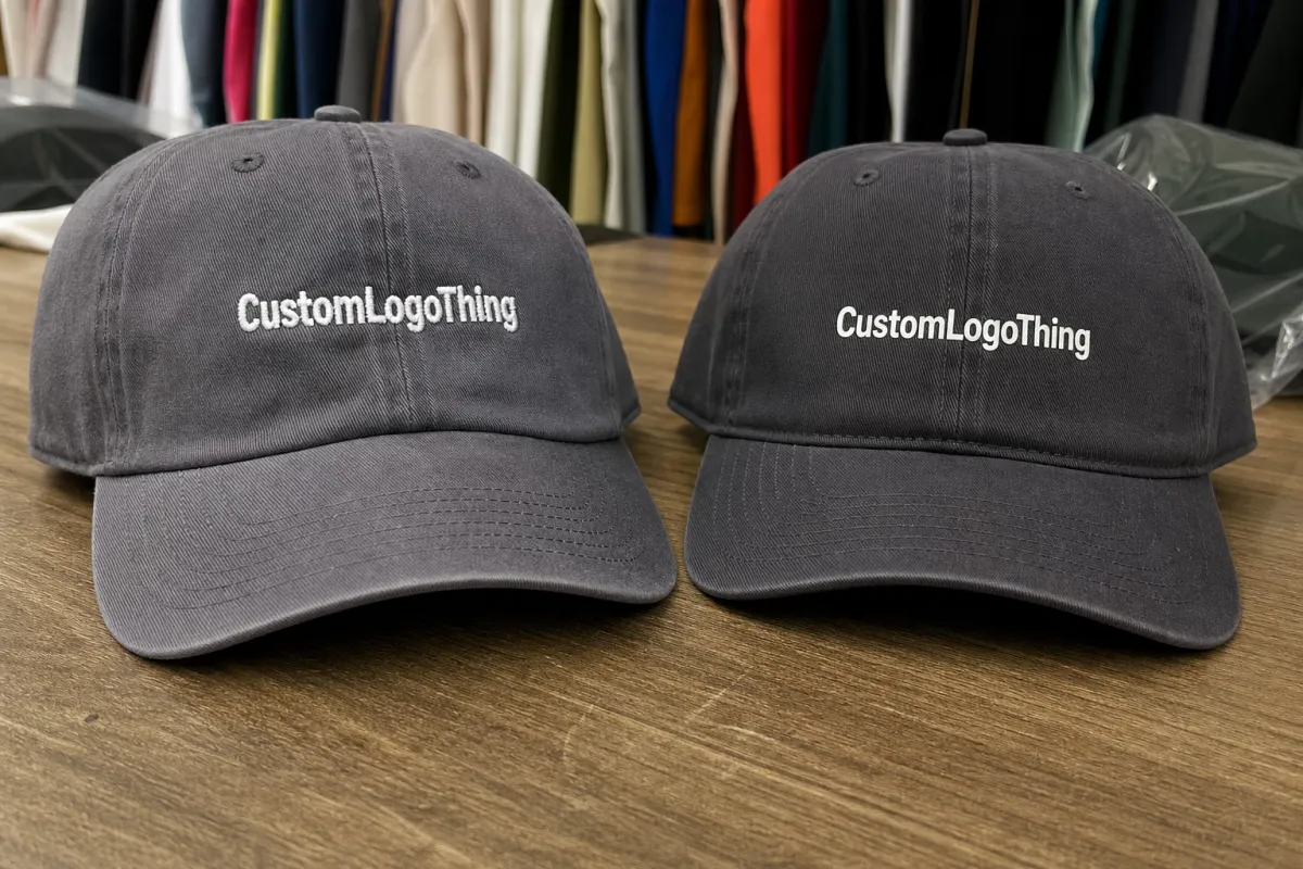
Embroidery uses thread stitched through the cap. The result is tactile, durable, and easy to read from a distance. The limits show up fast, though. Very thin strokes, tiny letters, and tight counters can fill in or collapse. Small embroidery is the first thing to fail when buyers try to preserve too much detail. If a logo needs to read cleanly from six feet away, embroidery is usually a strong candidate. If it depends on gradients or delicate linework, it is probably the wrong tool.
Screen printing uses ink pushed through a mesh screen. On flat apparel, the method is predictable. On a dad hat, the curve and seams complicate the setup. Bold spot-color graphics can work well, especially on larger front panels, but fine detail is more fragile. Screen print usually rewards simple, high-contrast artwork. The more the design depends on precision edges and tiny type, the more likely it is to look compromised.
Heat transfer and DTF preserve color-heavy artwork more effectively than most other options in small runs. The graphic is printed first, often in CMYK, then pressed onto the cap. That makes the method useful for gradients, complex logos, and designs that would be expensive to stitch. The tradeoff is feel. Even a good transfer still sits on the surface more than embroidery does, so close inspection can read as less substantial.
Patches and applique solve a different problem. They create a separate front piece, which can make the hat feel more branded and more deliberate. Woven labels, embroidered patches, merrowed-edge patches, and stitched applique each change the final look. The construction quality has to be clean. Loose edges, bad trim, weak backing, or sloppy stitching are obvious immediately, and no amount of good artwork hides that.
Short version: embroidery for simple logos, screen print for bold graphics, transfer for color and detail, patch for a more constructed or collectible look. That is the honest shorthand.
Which artwork styles fit each method best
Artwork style is where many orders go sideways. Buyers send the same file to every vendor and expect each method to deliver the same result. It will not. A design can be excellent and still be wrong for the process.
Minimal logos, monograms, short words, and simple emblems usually favor embroidery. Clean sans-serif marks often hold up well if the lettering is large enough for the thread path. Tiny letterforms are the danger zone. Once the stitch line gets crowded, the letters lose their shape and begin to blur together. Fine outlines and small taglines are the first elements to disappear.
Gradients, photos, and multi-color illustrations lean toward DTF or another transfer process. If the art relies on shading, tiny color changes, or CMYK blending, embroidery is the wrong tool unless the design is simplified first. Screen printing can handle strong spot-color art, but full photographic detail on a curved dad hat is usually an awkward compromise.
Premium lifestyle brands often choose embroidery or a stitched patch because texture reads as quality in person. That is not just fashion language. Texture catches light, creates shadow, and feels less disposable. For event merch, field staff, or giveaway programs, speed and visual impact may matter more than tactile depth, so a solid transfer can still be the better business choice.
Streetwear drops tend to prioritize identity over strict technical purity. Patch construction, applique, and crisp print finishes can make the hat feel more deliberate. Sports teams often prefer embroidered initials or mascots because they read as durable and familiar. Retail merch sits between those poles, where buyers usually want the best mix of cost, feel, and repeatability.
One blunt check saves a lot of disappointment: can someone read the design from three feet away on a curved front panel? If not, simplify it or change the process.
Cost, pricing, MOQ, and unit cost tradeoffs
Hat pricing is driven by the boring details: setup fees, digitizing, color count, decoration size, extra sewing, and how much manual handling the cap requires. Fancy artwork does not merely “cost more.” It creates more labor and more opportunities for rework.
For a dad hats Print Method Comparison, the number that matters is landed unit cost, not just the decoration line. If you only compare the front-logo price, you can miss setup, packaging, freight, revisions, and sample charges. That is how a cheap-looking quote becomes an expensive order after the fact.
| Method | Typical setup | Typical unit price at 50-100 pcs | Best fit | Main watch-out |
|---|---|---|---|---|
| Embroidery | $25-$75 digitizing | $2.25-$5.50 | Simple logos, text, monograms | Small detail can fill in |
| Screen print | $20-$60 per color | $1.50-$3.50 | Bold spot-color art | Curve distortion and seam issues |
| Heat transfer / DTF | $0-$35 | $2.00-$4.50 | Full-color, small runs | Can feel less premium in hand |
| Patches / applique | $40-$120 | $3.50-$7.50 | Badge-like, branded look | Construction quality matters a lot |
Those ranges move with quantity, coverage, and complexity. Dense embroidery costs more because stitch count rises. Multi-part patches cost more because they add sewing and assembly. Detailed full-color transfers can still be efficient at lower quantities, which is why they often win on small custom runs. Once orders move into higher volume, some methods spread setup costs better than others, often somewhere around the 50 to 100 piece range.
MOQ should be treated as a production model, not a vendor mood. A lower unit price may hide a higher setup fee, a higher minimum, or fewer revision rounds. Ask for quotes using the same artwork, same placement, same quantity, and same shipping method. Otherwise the comparison is not useful.
Use case matters too. Promo giveaways usually need low cost and quick repeatability. Retail merch can justify a higher decoration cost if the hat feels worth keeping. Staff caps sit in the middle, where durability and consistency usually matter more than visual tricks.
Process, timeline, and turnaround from art to delivery
Production follows a predictable chain: art review, digitizing or layout prep, proof approval, sample check if needed, production, finishing, and shipment. Each decoration method introduces its own bottleneck. Embroidery needs clean digitizing. Patches need construction and stitching. Transfer work needs print prep and pressing. Screen print needs setup that may not love a curved cap.
Simple orders can move quickly if the art file is ready and the method is straightforward. More complex orders add days, sometimes several, especially if color matching, logo cleanup, or patch construction are involved. If a vendor says the job will be fast, ask what “fast” means at each step. Sales language is not a production schedule.
Most delays are preventable. Missing vector files slow embroidery and patch work. Unclear placement instructions create proof revisions. Last-minute color changes reset the clock. A clean file, a reference image, and exact placement notes can save real time.
A useful buyer habit is to ask for a production calendar before approving the order. That reveals where the time actually goes and whether the rush fee is justified. Sometimes a rush charge buys useful speed. Sometimes it is just panic with a line item.
Packaging teams already understand this from transit and compliance work. If you want to sanity-check a vendor’s process discipline, see whether they can explain their standards without hand-waving. A cap is not a shipping carton, obviously, but the same operational habit applies: know the steps, know the risks, and know what can be verified before production starts.
Fit, fabric, and placement details that change the outcome
Fabric choice matters more than buyers expect. Washed cotton, brushed twill, pigment-dyed fabric, and heavier chino twill all take decoration differently. Some surfaces soften the look of the design. Others make it pop harder. A logo can feel understated on one body and aggressive on another even when the artwork is identical.
Fabric weight and finish also matter. Midweight chino twill around the 8 oz range usually behaves differently from a washed, softer cotton body because the surface tension is not the same. A smoother fabric often gives embroidery cleaner edges. A more textured or washed cap may mute a transfer slightly or make printed edges read more tactile. That can be good or bad depending on the brand.
The crown shape matters too. A dad hat has a low-profile, unstructured front, so artwork that looks fine on a baseball cap can look split or cramped here. Seam placement is a bigger issue than many buyers expect. If the logo crosses a seam, the design can warp. If it sits too low, it can land in the bend where the front panel no longer behaves like a flat surface. That is a common reason samples look awkward.
Placement is a technical decision, not just a design decision. Keep logos away from seams, avoid oversized art that wraps into odd territory, and do not rely on a centered mockup alone. A design that is perfect on a rectangle can feel crowded on a curved cap, especially if the front panel is soft.
Thread sheen, ink finish, patch backing, and edge treatment all influence perceived value. Matte thread reads quieter and often more refined. Glossy transfer work reads brighter but can feel more obvious. A patch with tight merrowed edges can look sharp if the stitching is clean. Loose backing, crooked trim, or fuzzy stitching lower the value immediately.
The simplest rule is still the best one: if the artwork cannot survive at small physical size, it is too detailed for the front of a dad hat. Simplify it, reduce it, or move it to a patch. More detail usually means more failure points.
Common mistakes that make dad hats look cheap
The mockup fooled you. That is usually the first problem. A polished digital render hides curve distortion, stitch texture, film edges, and panel flex. Buyers approve what looks good on a flat screen and then act surprised when the real hat looks different. Production is not the villain here; the mockup was incomplete.
Over-detail is the most common mistake. Tiny letters, thin outlines, crowded icons, and too many colors create fragile artwork. A design that works in digital printing or offset printing terms may still fail on a cap because hats are not brochures. The surface is smaller, curved, and often soft. Tiny work disappears faster than people expect.
Ignoring the blank body is another problem. A low-cost cap with weak structure makes even good decoration feel cheaper. The front panel can wrinkle. The crown can sit too loose. The hat may look fine in hand but odd on a head. If the decoration budget is meaningful, the blank should not be the weak link.
Chasing the lowest unit price without checking setup, revisions, and wear is a false economy. A transfer that saves a dollar up front can age badly. Dense embroidery costs more, but if it holds shape after repeated wear, the value is better. Cheap is only cheap if the result survives normal use.
Weak contrast also ruins hats. A low-contrast logo on a washed cap can disappear in daylight and on camera. Bad placement makes the design look accidental. Inconsistent notes produce uneven output. Put those three together and the hat reads amateur even if the factory followed the file exactly.
That is why a serious dad hats Print Method Comparison always includes the cap body itself. The hat and the decoration method are a single decision. Pretending otherwise is how people end up placing the same order twice.
How to choose the right method before you request quotes
Start with two methods, not five. If vendors are pricing the same art at the same quantity, the comparison becomes useful quickly. If each quote uses a different file, different placement, or different hat body, you are not comparing options. You are collecting noise.
Send clean vector files if you have them. Include placement notes. Add a reference image if the visual direction matters. Ask for sample photos of similar hats, not generic factory shots. A supplier who can show the same crown shape, the same decoration type, and similar artwork is giving you something you can actually evaluate.
Ask for five items in writing: setup fees, unit price, lead time, minimum order quantity, and revision charges. Those five numbers expose most weak quotes. If a vendor is vague about two of them, proceed carefully. Vague pricing usually goes with vague production control.
If the design matters a lot, start with a small pilot run. A 24-piece test is annoying. A 500-piece mistake is expensive and annoying. Pick the kind of annoying that causes less damage.
Final filter: think about the end use. Retail merch can justify patch work or dense embroidery if the margin supports it. Staff caps may need durability and repeatability. Promo giveaways may need speed and lower cost. A strong dad hats Print Method Comparison is not about finding the fanciest answer. It is about matching the method to the art, the budget, and the deadline.
When those three stay aligned, the hat usually lands where it should: readable, durable, and worth wearing more than once.
Which method lasts longest in a dad hats print method comparison?
Embroidery usually holds up best because the design is stitched into the cap instead of sitting on top of it. Patches can also last very well if the stitching and backing are strong and the hat is worn normally. Transfers can work, but their lifespan depends more on film quality, heat application, and care.
Is embroidery better than DTF for dad hats with small logos?
Embroidery is better when the logo is simple, bold, and large enough for thread to read cleanly. DTF is better when the logo has tiny details, gradients, or multiple colors that would get crowded in stitches. If the logo is too small for either method, simplify the art before placing the order.
What affects pricing most when comparing dad hat print methods?
Setup fees, design complexity, and the number of colors usually move the price fastest. Run size matters too because higher quantities spread setup cost across more hats. Patches, dense embroidery, and detailed full-color work usually cost more than a simple one-color logo.
How long does production usually take for custom dad hats?
Simple orders can move quickly if the art is ready and the method is straightforward. More complex orders take longer because of digitizing, proofing, sample approval, and finishing steps. Rush timelines are possible, but they usually cost more and leave less room for changes.
Can I mix print methods on the same dad hat order?
Yes, if the factory supports it and the design justifies the extra handling. Mixing methods can improve the result, such as embroidery on the front and a patch or woven label on the side. It usually adds cost and lead time, so it works best when the branding payoff is clear.
Pick the method that fits the art, not the one that only looks cheapest on a quote sheet. That is the cleanest way to use a dad hats print method comparison without ending up with a hat that looks fine in the inbox and disappointing on the head.


