A snapback caps Print Method Comparison sounds straightforward until a logo meets a real crown. A design that looks clean on a flat screen can shift, stretch, or lose edge clarity once it crosses a seam or sits on a stiff front panel. That gap between mockup and finished cap is where most of the expensive mistakes happen.
Buyers usually start with the artwork and only later discover that the cap itself is the limiting factor. The front panel can be too curved, the seam can cut through a letter, or the chosen finish can feel heavier than expected. Those details matter because cap decoration is not just about what prints well. It is about what survives the structure of the product, the price target, and the timeline.
The cap is the constraint. The artwork is only part of the decision, and a flat proof rarely shows where the risk really sits.
Snapback Caps Print Method Comparison: What Really Drives the Result
Most buyers ask the same set of questions: Will it stay sharp? Does it feel premium? How long will it last? How many pieces do we need? How fast can it ship? Those are useful questions. The wrong question is which method is universally best, because that answer does not exist. A one-color staff cap, a detailed retail graphic, and a short-run event order all reward different decoration choices.
The main variables are physical, not abstract. Crown height, panel count, seam position, and front-panel stiffness determine how much artwork the cap can realistically carry. A logo that looks centered on a digital layout may drift once it is forced onto a structured six-panel cap. Fine lines can close up. Tiny type can disappear. A wide graphic may look strong in theory and crowded in production.
That is why a useful comparison begins with the cap spec sheet. The cap style should come before the decoration method, not after it. Once the crown shape is confirmed, the supplier can judge whether the artwork should be printed directly, transferred, simplified, or rebuilt for the surface. The wrong method can still be forced onto the cap, but it usually shows.
In practical terms, screen print is often strongest for bold spot colors and simple logos. DTF-style transfer work handles detail and color variation better on small runs. Specialty transfer methods can add sheen, texture, or a premium edge that suits retail merchandise. Each option solves a different problem, and each one carries a different set of tradeoffs.
How the Main Methods Behave on a Structured Crown
A snapback front panel is not a flat garment panel. It is stiff, curved, and interrupted by seams. That changes adhesion, registration, and the final feel in hand. A method that performs cleanly on a T-shirt can behave differently once it is pressed onto a cap with more structure and less forgiving geometry.
Screen print places ink directly onto the surface through a mesh stencil. On the right artwork, that gives a clean, low-profile result with strong color blocks and minimal extra texture. It can be a smart choice for logos that need to look crisp and durable without much visual noise. It is less forgiving with gradients, small lettering, and complex multi-color work.
DTF-style digital transfer work takes a different path. The image is printed to a carrier, then bonded to the cap with heat and pressure. That route is useful for detailed graphics, short runs, and artwork with more color variation than a screen print can handle efficiently. The finish can feel slightly more pronounced, which is not always a problem, but it does matter on a crown that will be worn every day.
Specialty transfer systems sit somewhere between decoration and finishing. Some give a softer hand feel, some create a raised or reflective effect, and some are designed for a more fashion-forward look. They can lift a cap from functional to retail-ready, but they usually bring stricter approval steps and more chance for production variation. A premium effect is only premium if it still holds up in hand and under inspection.
There is also a hybrid path. A cap does not always need a fully printed front panel. Sometimes the better answer is a simplified mark, a print plus patch combination, or a smaller decoration area that respects the seam layout. That approach is less dramatic, but it often produces a better cap. Restraint is not a compromise when the crown is doing half the work.
- Screen print: best for bold logos, clean text, and larger production runs with controlled color counts.
- DTF-style transfer: useful for detailed art, small quantities, and faster setup.
- Specialty transfer: suited to premium effects, fashion drops, and finishes that need more texture or sheen.
- Hybrid decoration: worth considering when one method cannot solve both the visual and structural constraints.
Not every supplier uses the same naming system. One shop may say digital transfer while another says DTF, and a third may separate standard transfers from specialty films. That is normal. The important part is not the label. It is the actual build, the bond method, and the expected finish on the specific cap style.
Spec Factors That Change the Outcome
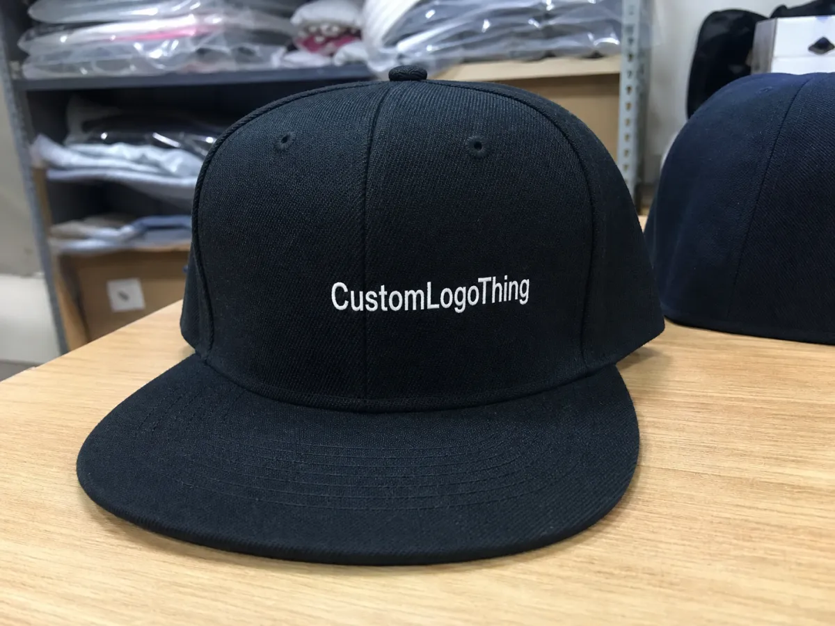
Logo size is the first filter. On many structured snapbacks, front-panel decoration often lives in a rough 2.25 to 2.75 inch width range, though the usable area depends on the crown height and the shape of the artwork. A wide logo can feel forceful in a good way, but it can also crowd the seams and lose breathing room. A logo that is too small may look timid, especially on a high-profile cap.
Panel construction comes next. A six-panel structured snapback behaves differently from a five-panel style or a lower-profile unstructured cap. The front panel stiffness can help the decoration sit cleanly, but the curve still matters. Thin lines and small details are vulnerable. If the artwork crosses a seam, the risk goes up immediately, and a production team may need to shrink the design or redraw it for the cap instead of importing it as-is from the brand guide.
Fabric changes the result too. Cotton twill, polyester blends, and coated surfaces do not respond the same way to heat, pressure, or adhesive films. Some fabrics accept direct ink cleanly. Others are better served by transfer work. Finish matters just as much. A matte cap with a heavy glossy decoration can feel mismatched, while a soft-touch finish may read too plain if the brand wants a more retail-looking piece.
The use case should shape the spec. A tradeshow giveaway that will be worn a few times does not need the same durability profile as a merch cap that will live on shelves, in bags, and on heads for months. Sweat, flexing, storage, and shipping all add stress. That is why quality checks matter before production starts and again when the caps come off the press.
Transit is part of the product, not an afterthought. Finished caps are vulnerable to crushing and edge wear in cartons, especially when the decoration sits high on the front panel. It is reasonable to ask how a supplier packs bulk orders, whether cartons are reinforced, and what inspection happens before dispatch. Packaging standards discussed by ISTA are a useful reminder that the last mile can affect the first impression.
Cost, MOQ, and Unit Economics
Cap decoration pricing usually breaks into setup cost, per-unit decoration cost, and any premium for extra colors, specialty film, difficult placement, or repeat proofing. That sounds simple until the quote arrives with line items the buyer did not expect. A low unit price can turn into a much higher landed cost once revisions, sample approval, and freight are added.
These are common market-style ranges, not fixed rates. Equipment, labor, artwork complexity, and order size all shift the final number.
| Method | Typical setup | Good for | Typical decorated cost per unit at 24-100 pcs | Notes |
|---|---|---|---|---|
| Screen print | $25-$75 | Bold spot colors, simple text, repeat orders | $1.25-$2.75 | Strong value on clean art; less useful for fine gradients or tiny type |
| DTF / digital transfer | $0-$25 | Full-color art, short runs, detailed graphics | $1.75-$3.75 | Handles CMYK detail well; the finish can feel a little more present on the crown |
| Specialty transfer | $0-$50 | Premium looks, metallic, puff, reflective, soft-touch | $2.25-$4.50 | Can improve visual impact, but approval and curing steps may take longer |
| Hybrid print + embellishment | Varies | Retail caps, fashion drops, mixed-detail artwork | $3.00-$6.00+ | Useful when one method cannot satisfy both the design and the feel target |
MOQ changes the economics quickly. A shop may be comfortable with 24 pieces for transfer-based work but prefer 48, 72, or more for screen print, especially if multiple colors are involved. At 250 or 500 units, screen print often becomes the most efficient route for simple art because the setup cost is spread across more pieces. At 24 pieces, a detailed graphic may be cheaper overall with transfer work, even if the per-unit price looks higher at first glance.
Hidden cost is where the real comparison lives. Multi-location decoration, rush production, color matching, proof corrections, and the risk of rework can erode savings fast. A quote that looks cheap on paper may not be the least expensive order once shipping and delay risk are included. That is especially true for event dates, retail launches, and seasonal drops where timing has its own value.
Lead Time and Production Flow
Most production runs follow a familiar sequence: file intake, artwork cleanup, proofing, method selection, test placement, production, inspection, and packing. The schedule usually slips at the front, not the back. If the artwork is unclear, the cap style is not confirmed, or the placement needs revision, the clock starts moving before any production line is active.
Some methods are fast to start but slower to finish. A transfer-based job may avoid screen setup, which helps, but it still needs print preparation, heat application, and inspection. Screen print carries setup work, yet once the press is dialed in it can move efficiently on larger runs. Specialty effects often add curing or extra review. The order is not delayed because someone is being careful for no reason; the method itself needs that time.
Ask whether the quoted lead time is in business days or calendar days. That sounds like a small detail until a Friday ship date turns into a next-week ship date. Also ask for the schedule in stages. Good vendors can usually separate proof approval, sample approval, production start, and dispatch. A single promised date with no checkpoints is harder to trust than a staged timeline with realistic buffers.
Once art is approved, simple transfer orders often land in the 5-8 business day range. Screen print jobs can sit closer to 8-15 business days, depending on setup, quantity, and color count. Specialty work can run longer. Those are not problems by themselves. They are signals about what the decoration process needs in order to stay consistent.
How to Pick the Right Method Step by Step
Start with the artwork. Is the design a one-color wordmark, a sharp icon, or a full-color image with gradients and small type? That single question removes a lot of noise. Bold and simple usually points toward screen print. Detailed and colorful often points toward a transfer route. If the logo includes tiny text, ask for a real size check, because details that read clearly on a laptop may vanish at cap scale.
Then match the art to the cap. Confirm the crown height, seam location, front-panel stiffness, and actual printable area. A standard six-panel snapback gives less usable space than many buyers expect. If the logo must sit high or stay far from the seam, the decoration method may narrow quickly. That is especially true for premium looks, where the finish has to stay clean rather than merely visible.
Next, compare quantity and budget together. A 24-piece order behaves differently from a 500-piece reorder. For a short run with full color and a tight deadline, DTF or another transfer method can make sense. For a larger order with a one- or two-color mark, screen print usually becomes attractive because the setup cost is diluted across volume. The useful question is not which method is cheapest in isolation. It is which one gives the best unit economics for that exact run.
A simple scoring system keeps the decision grounded. Rate each method from one to five for visual impact, hand feel, durability, turnaround, and landed cost. That kind of comparison is plain, even dull, and that is the point. It is much harder for a flashy mockup to win once the options are forced onto the same scorecard.
- Confirm the final artwork size, color count, and minimum text size.
- Verify cap style, panel count, seam position, and fabric.
- Request quotes for at least two decoration methods using the same spec.
- Ask for a proof that shows exact placement on the cap front.
- Score each option on durability, detail, lead time, and total cost.
Errors That Lead to Reprints or Weak Branding
Seam placement causes more problems than most buyers expect. If the logo crosses a seam, the image can distort, crack, or lose legibility once the cap is pressed and worn. Oversizing the artwork is the next common mistake. It can force the decorator to crowd the edges, compress details, or crop the design in a way the brand team never intended.
Skipping a physical sample or a precise digital proof is another expensive habit. Cap color changes contrast, sometimes dramatically. A white logo on navy twill reads differently than the same logo on a washed gray cap. Gloss level matters too. A shiny film can look louder than expected, while a matte finish can disappear on some colors. On a small run, one failed proof can wipe out a noticeable share of margin.
Price-only buying creates its own damage. A lower-cost method may peel early, feel bulky, or miss the brand standard by a wide margin. That becomes obvious when the cap sits beside other merchandise and looks like it came from a different line entirely. If the decoration looks cheap, the entire product does too, even if the cap body itself is well made.
File quality is not a side issue. Vector art is usually the safest choice because it preserves clean edges and scales well. If raster art is the only option, send the highest-resolution file available and confirm the final print size, colors, and text minimums. Low-resolution artwork does more than slow production. It increases proof rounds and raises the odds of a reprint.
Practical Checklist for Buyers
Use one spec sheet for every supplier. Include the cap style, artwork dimensions, quantity, Pantone targets if needed, required ship date, and whether the design must avoid the seam. That one habit makes bids comparable instead of messy. It also forces the supplier to answer the same question in the same format, which is where comparison starts to become useful.
Ask for samples that reflect the actual method under discussion. A generic photo gallery is not enough. A physical sample, or at least a close analog with the same decoration type, tells you far more about edge quality, texture, and color accuracy. If the supplier cannot show the finish on a similar cap, the quote is less useful than it looks.
For brands that care about packaging as much as decoration, the conversation should include cartons and inserts too. Education resources from packaging.org help teams think about materials, structure, and transit risk with more discipline. FSC-certified cartons or inserts may also matter if the order is moving through a retail or sustainability review. The cap is the centerpiece, but the box still frames the experience.
The cleanest decision is usually the least theatrical one. Match the method to the artwork, the crown, the quantity, and the deadline. Then compare the total result, not just the headline quote. That is the real value of a snapback caps Print Method Comparison: it turns a vague vendor conversation into a practical choice about finish, cost, and time.
Which method is usually better for small snapback orders?
Transfer-based options often work well on small runs because they avoid the higher screen setup burden. DTF-style work is especially useful for detailed art and short quantities. If the design is simple, compare a one-color screen print against a transfer quote before deciding.
Which snapback decoration method lasts longest?
Durability depends on how the decoration bonds to the cap surface, not only on the method name. A thin, properly applied finish usually handles wear better than a thick layer that can edge up or crack. Ask how the decoration performs under sweat, flexing, and storage in bags or cartons.
Can full-color artwork be printed on snapback caps?
Yes, but the cap shape and method have to support the detail. Gradients, tiny text, and photographic elements usually need a method built for high-detail transfer work. If the logo crosses a seam or the front panel is very curved, simplifying the artwork can improve the result.
How does decoration choice affect turnaround?
Some methods need screen prep, heat application, or extra approval steps, which adds time. A method that seems faster on paper can slow down if the proof fails or the artwork needs another round of cleanup. Ask for the full production sequence so the lead time is visible.
What file type is best for cap decoration?
Vector files are usually the safest option because they scale cleanly and keep edges sharp. If only raster art is available, send the highest-resolution file you have and confirm the final print size. Include placement notes, color references, and any text-size limits so the production team is not guessing.


