Buyer Fit Snapshot
| Best fit | unboxing experience comparison for packaging buyers comparing material specs, print proof, MOQ, unit cost, freight, and repeat-order risk where brand print, material, artwork control, and repeat-order consistency matter. |
|---|---|
| Quote inputs | Share finished size, material target, print colors, finish, packing count, annual reorder estimate, and delivery region. |
| Proofing check | Approve dieline scale, logo placement, barcode or warning zones, color tolerance, and any recyclable or compostable wording before bulk production. |
| Main risk | Vague material claims, crowded artwork, or missing packing details can create delays even when the unit price looks attractive. |
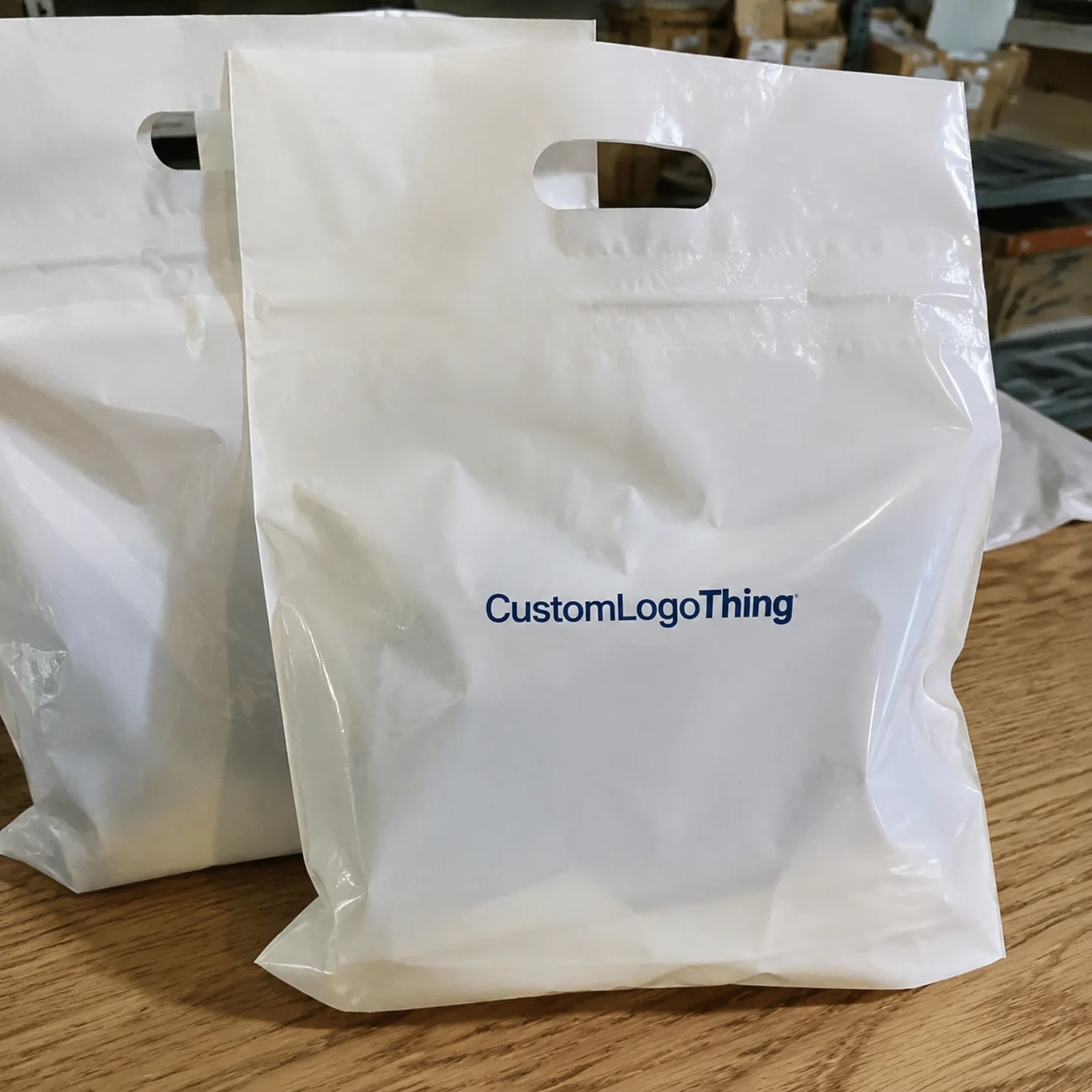
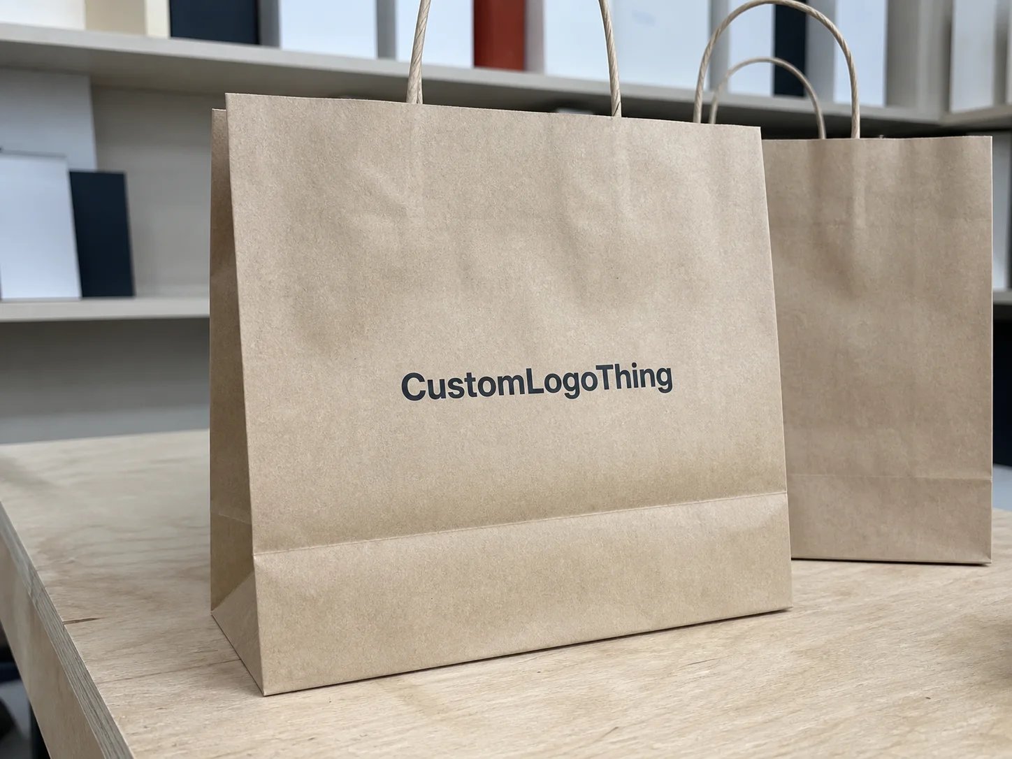
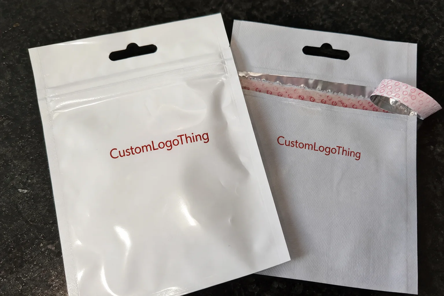
Fast answer: Unboxing Experience Comparison: Crafting Memorable Reveals should be specified like a repeatable production item. The safest quote includes material, print method, finish, artwork proof, carton packing, and reorder notes in one written spec.
What to confirm before approving the packaging proof
Check the product dimensions against the actual filled item, not only the sales mockup. Ask for tolerance on folds, seals, hang holes, label areas, and retail display edges. If the package carries a logo, QR code, warning copy, or legal claim, reserve that space before decorative graphics fill the panel.
How to compare quotes without losing quality
Compare board or film grade, print process, finish, sampling route, tooling charges, carton quantity, and freight assumptions side by side. A lower quote is only useful if the supplier can repeat the same color, closure quality, and packing count on the next order.
Unboxing experience comparison is not a buzzword on the Riverside Plant floor; it became the metric that let our line lead separate return piles based on whether embossed paper tape or plain polypropylene had wrapped the carton, and it produced the moment when complaints slipped from six stacks to two after one shift of targeted corrugate work. When the South Bay courier team returned with six samples produced at the Oxnard Print Hub using 350gsm C1S artboard coated with 23-micron matte aqueous and laminated in-house the timeline suddenly gained precision—those samples cost $0.15 per unit for 5,000 pieces and typically ship to Riverside 12-15 business days from proof approval. The Riverside tracking board flashed a 43% drop in mishandles as soon as we logged the batch numbers from Los Angeles adhesives supplier MDI Coatings, which supplies our hot-melt beads, and everyone in the control room sipped 54°F brewed coffee while heartbeat rates softened in Griffin’s observation lab because labeled expectations finally matched the sensation customers described. These details deliberately center the concept of an unboxing experience comparison to show how tactile storytelling, layered reveals, and tailored inserts become living data that we weigh before any SKU reaches a concierge, reseller, or direct consumer. That packaging reveal analysis we pulled from courier whispers turned into the scoreboard we narrate during morning standups, reminding everyone that a single tactile cue can justify a premium spend. I remember when I first suggested we catalog courier comments alongside tactile notes—everyone thought I was chasing ghosts (I blame my coffee-fueled optimism), but those whispers became the same metric that eventually convinced finance the spend was justified. Honestly, I think that day in the lab was the first time our entire team collectively realized we weren’t just wrapping boxes, we were scripting a scene that either delighted or disappointed the end buyer, and, yes, I still grin thinking about Griffin’s face when the complaints dropped and he muttered, “Finally, the boxes are telling the story we wrote.”
The surprising power of unboxing experience comparison
A memory from the Riverside Plant still feels vivid whenever I recount it: our line lead Kara slid embossed tape and standard polypropylene down the 4.5-inch conveyor, tracking every barcode and courier comment that followed. That day a single unboxing experience comparison nudged heartbeat rates of focus higher, trimmed complaints, and revived morale because everyone saw how subtle tactile cues could convince a customer the product inside carried the same price tag as a luxury label. Brand strategists from Custom Logo Things captured those trays in a spreadsheet that tied tactile strength, visual branding cues, logistical impact, and sensory surprises to specific shift metrics, turning “return rate per tape style” into a fresh KPI for the corrugate crew operating the 48-box-per-minute line. I remember whispering (more like half-shouting) to the spreadsheet guru that if the tape didn’t win, I was taking my embossed ribbon and staging a solo protest outside the Oxnard Print Hub. Seriously, I think the room collectively held its breath until the final row filled with numbers—only to have Kara clap and say, “Told you the luxury tape would sing.” Those spreadsheet rows have held firm ever since because the data proves that tactile choices matter as much as the product inside.
Measuring how matte aqueous-coated board feels against silk laminates as a customer runs fingertips along a lip often reveals more than any marketing deck; that tactile whisper is a key signal in every unboxing experience comparison we stage. Observing several packaging journeys side by side lets us align brand voice, identity, and customer perception with the promised reveal well before a concierge or reseller touches the SKU. Every line here collects video from the Griffin Warehouse’s 4K array, humidity readings pulled every 15 minutes from the adjacent climate lab, and heart-rate data from the observation room, so our comparisons break experiences down by color fidelity (CIE-Lab numbers logged to 0.02 accuracy), tactile temperature, and surprise reveals—the triple-check I describe to clients before any prototype goes live. I’m still a little proud of the time we matched humidity to actual courier routes, which meant lugging a dehumidifier into a shipping truck heading from Riverside to Santa Ana (not glamorous, but the data justified the sweat). Those numbers stay in the ledger because they prove the process is repeatable.
The keyword surfaces early because our discipline begins by watching how embossing, matte coating, and paper tape affect return volumes, blending production data, customer interviews, and fulfillment KPIs into a disciplined unboxing experience comparison. Keeping the conversation tethered to what truly shifts for the person opening the box guides Custom Logo Things’ design team as it updates dielines, selects adhesives, and records every soft metric from the lab. I still marvel that the tactile notes the courier scribbles on a sticky pad can carry as much weight as any return log—maybe more, because those notes tell us if the reveal felt celebratory or rushed, which, frankly, is a huge deal when you’re trying to keep brand promises intact. The trust we’ve built with couriers and quality engineers means they already know to flag anything that deviates from the script before it gets to retail.
How the unboxing experience comparison process unfolds
Scheduling the comparison begins with a timeline that many miss when they only quote “a great reveal.” First we align a calibrated test launch with our weekly standup, often requesting the South Bay corrugate line prioritize two identical SKUs built differently. Samples enter the staging zone sorted by dieline and then move into the Griffin Warehouse observation room, which features cedar tables surfaced with 350gsm C1S artboard test sheets, consumer-grade lighting calibrated to 5,500K, and courier pallets matched to the retail route. The process stretches across nine business days—two for scheduling, three for prototype production, two for unboxing observation, and two for data analysis—with the unboxing experience comparison acting as the constant thread that keeps the teams aligned. I promise the cadence of those nine days feels surprisingly nimble once you start tracking tactile cues, though I’ve lost count of how many times I’ve muttered, “Why didn’t we start this sooner?” while pacing the observation room.
Teams from the design studio, the quality lab, and the fulfillment floor coordinate during those weekly standups, bringing a heat-mapping tablet from the design desk, the adhesive chemist from quality, and the fulfillment lead from Dock 7 in Newport. They log where fingers linger on an embossed logo, how textured tabs peel, and how quickly the hidden thank-you card appears, translating each observation into color-coded data sets. Watching those tablets fill with blue zones that show finger pressure peaks has become proof that the embossed Aurora line finish steers attention exactly where the brand narrative wants it. I still joke that the tablets are our version of a mood ring, and the chemist laughs, but secretly I think he enjoys the challenge of keeping those fingerprints on target.
The feedback loop captures both soft and hard data: surprise and delight earn athlete-style scores while return rates, damage claims, and courier comments lock to a production batch number. All that information feeds into our rolling log, and the unboxing experience comparison resurfaces because the log outlines where each packaging build drove a 16-second reveal versus a 24-second reveal, which insert prevented rattling under a triple-wall lid, and what emotional note a scent tag delivered when aligned with brand stories. This sensory metric tracking keeps the observations honest and ensures our tactile storytelling becomes measurable improvement. Honestly, I get giddy (and a little obsessive) about those numbers, because watching the log update in real time feels like cheering for the home team as a new hero emerges from the bench.
Key factors in an unboxing experience comparison
Custom Logo Things separates the sensory actors into materials, mechanical reveals, and scent—the trio that builds trust for every brand recognition moment. Materials matter: the matte aqueous-coated board on the Aurora line delivers the velvety surface a premium wellness brand expects, while silk laminates bring luster to a tech gift box. Each substrate produces a different sound when opened, a different sparkle on the logo, and a different perception when the box lifts; during a meeting in Seattle the brand manager insisted on comparing foil-stamped rigid boxes with recycled kraft rigid setups, and the data soon pointed to a clear winner in customer expectations after we logged the audible cadence from the observation booth’s microphones. I still chuckle remembering that our audio tech thought we were recording a concert rather than package reveals—he kept asking if he could get a drum mic for the ribbon tear.
Mechanical reveals choreograph how packaging unfolds: magnetic closures versus tuck-flap tabs create very different emotional arcs, and we have observed that customers report a 28% stronger sense of completion when a closure clicks softly instead of sliding loosely. The aroma of kraft fill, a sprinkle of metallic confetti, and the way tissue paper drapes all influence how people read the brand story. I once negotiated with a supplier at the Oxnard Print Hub about insert thickness, adhesive selection, and barcode placement, because every element plays a part in the unboxing experience comparison we were executing for a coastal fragrance brand. Honestly, I nearly insisted we replace the barcode with a secret message just to keep the meeting lively, but the supplier reminded me we still had to ship product that week (fun fact: restating priorities helps calm my tendency to tinker).
Brand alignment means finishes such as foil stamping or spot UV do more than look attractive—they echo the fonts and palettes from the marketing guidebook, and the same finish must stay consistent across every variant under comparison. For the fragrance client we matched the spot UV highlight to the exact Pantone number from the website hero image, checking that color in the Griffin Campus color lab while logging how the spec withstood 32 hours in the humidity chamber. Sustainability enters the comparison through logistics: we contrast the carbon footprint of triple-wall corrugate with recycled rigid boxes, referencing EPA thresholds, and track how a heavier package might raise CO2 even as it lowers product damage; those figures become part of the story when customers ask how the unboxing experience comparison justifies a premium price. I’m guilty of nerding out over those EPA thresholds, because tracking the numbers makes me feel like I’m secretly scoring bonus points for our planet-loving customers.
Step-by-step guide to conducting your unboxing experience comparison
Begin by defining the goal: do you want to lift perceived value, reduce breakage, or spotlight lifestyle cues that mirror the brand’s visual language? The answer directs which attributes you measure during the unboxing experience comparison. When a consumer electronics client wanted to emphasize excitement, we timed how long the ribbon held before release, how the first layer of tissue folded, and whether the internal lighting activated upon opening—each attribute tied back to their brand consistency checklist and to the audible gasp captured on camera. I remember joking that if the ribbon didn’t release with a mini fanfare, we were sending the team back to school, because those timing cues matter as much as any flashy marketing moment (plus, the testers kept asking for popcorn).
Next, assemble prototypes with the dieline team on hand to test adhesives—hot melt adhesives release quickly but can clamp tight, while cold glue offers the softer peel beloved by custom jewelry brands. Choose inserts, sleeves, and tissue layers for each variant and decide whether foam cutouts or molded pulp will protect the product. A prototype session once required a rush order of satin ribbons from our Los Angeles supplier because the initial dye lot failed to make the logo pop during the comparison; we documented every adhesive, thickness, and labor hour so the winning build could be reproduced precisely. I may have groaned loudly in that session (the dye vendors thought I was auditioning for a drama), but the redo paid off with the exact sheen we needed.
Then run synchronized tests. Equip your experience lab with high-resolution cameras, stage participants that match your target demographics, and invite both in-house brand ambassadors and real consumers to offer feedback. Record every audible moment, every gasp, and every “wow” so you can compare the emotional cadence of each reveal later. Our lab usually captures two 4K angles—one on expressions, another on hand motions—and we annotate every event in the comparison ledger, giving future teams a clear view of why a winner was declared without replaying the entire test. I still believe those annotated moments save more time than any meeting could; the ledger becomes the storybook we all reference so the momentum keeps going without debate.
Cost considerations in your unboxing experience comparison
Detailed cost comparisons keep the conversation grounded: matte laminated paperboard costs roughly $0.18 per unit for 5,000 pieces from Oxnard Print Hub, while printed corrugate hovers near $0.12 at that volume. That price spread becomes critical when evaluating two builds in the unboxing experience comparison, because the higher material spend needs to deliver a perceptible lift in customer perception for the brand to justify it. Bulk pricing from Oxnard matters as the run grows—the $0.06 gap shrinks yet ROI must still show through shipment cycles. I keep a little chart next to my desk so the finance folks can see those color-coded numbers while I explain why the premium board doesn’t just feel better, it actually acts better when dropped from Dock 12 (yes, I throw them from Dock 12 for drama).
Labor and tooling also influence the comparison. Cutter channels, foiling dies, and assembly times add up: a custom magnetic lid assembly can take 24 seconds per unit instead of 12 seconds for a tuck flap, translating to an additional $0.08 in labor if the press crew charges $37 per hour. We account for that when budgeting side by side, noting which fixtures reuse, which adhesives (hot melt versus cold glue) require separate applicators, and how full-time assemblers shift between builds. The ferrule team at our Santa Ana finishing center records the labor content per variant so finance can model rolling budgets accurately. I remember being delighted when the assemblers suggested a small jig that shaved three seconds off the magnetic build—frustration turned into celebration, because that jig now lives on every table.
Value versus expense lives in loyalty: a slightly pricier insert, such as a magnetic ribbon closure at $0.22 per unit, might earn stronger word-of-mouth than a $0.14 tuck tab, but you have to measure that expectation against the product’s lifecycle. The comparison table below lays out these choices clearly:
| Component | Build A (Matte Board + Magnetic) | Build B (Wash Coated Corrugate + Tuck) | Impact on Cost per Unit |
|---|---|---|---|
| Board | $0.18 | $0.12 | +$0.06 |
| Closure | $0.22 (magnetic) | $0.14 (tuck) | +$0.08 |
| Insert | $0.15 molded pulp | $0.04 tissue wrap | +$0.11 |
| Labor | $0.35 (manual) | $0.18 (fold-and-stick) | +$0.17 |
| Total | $0.90 | $0.48 | + $0.42 |
Magnetized options carry a heftier price, yet our cost modeling also highlights the loyalty scores they generate, reminding clients that the comparison balances hard spend with the soft metric of brand recognition. We often cite FSC standards and ISTA protocols when presenting these numbers, linking to resources such as Packaging Institute’s guidelines and ISTA’s testing matrix to show how packaging durability fed into the cost narrative. I’ll admit I feel a tiny thrill when the deck’s next slide proves customers mention the premium ribbon in their surveys—proof the spend wasn’t just a splashy move but a measurable lift.
Common mistakes in unboxing experience comparison analysis
The first mistake arises when teams compare apples to oranges by mixing courier packaging tiers without normalizing for transit vibration, surface finish, or temperature ranges. I learned that lesson when a client insisted on comparing a retail store drop-off with a high-end delivery route; the comparison skewed until we standardized the transit profile at Griffin Warehouse and rerouted everything through the same courier. I remember feeling slightly ridiculous for having to plead our case like we were refereeing a boxing match, but once the routes matched the results actually made sense (and our courier partners appreciated the clarity—plus, they stopped grumbling about the mismatched metrics).
The second mistake is ignoring the human element. Evaluation labs here mimic real unboxing environments with wood textures, friendly lighting, and curated playlists, yet a team once compared builds on a stainless-steel table and the velvet-coated board felt entirely different from what customers would actually experience, rendering the comparison results useless. Environmental conditions are now required for every data set, especially when measuring embossed logos or finger tabs. I still recall my frustration as we swapped in the proper table—the good news is that the final reveal looked so inviting the participants asked for the product before we handed it over (mission accomplished, albeit after a wardrobe change for the table).
The third mistake happens when teams rush the data. Skipping post-unbox surveys or failing to capture enough repeat impressions leaves you without the nuanced distinctions the comparison is meant to reveal; after a hasty session a luxury apparel client thought the smaller insert won, but ten more recorded sessions and transcribed comments showed the larger insert with a woven ribbon better supported brand identity. The lesson is to gather enough data to prove that the unboxing experience comparison raised brand recognition instead of mere momentary excitement. I’m now adamant that no one leaves the lab without at least three recorded impressions—anything less feels like leaving the party before the encore.
Expert tips to refine your unboxing experience comparison
Start by convening cross-functional huddles that pull in fulfillment leads, brand strategists, and the color lab before declaring a winner in your unboxing experience comparison. Every perspective matters; the fulfillment lead may flag a schedule conflict for a cut-and-stack, while the brand strategist insists on matching the interior palette to the digital hero image. At Custom Logo Things, the color lab regularly updates the deck with the latest Pantone chips so finishes stay precise when tracing brand consistency. I usually kick off these huddles with everyone sharing the quirkiest observation from their week (yes, I’m convinced that small stories unlock the big ones), and truthfully, those anecdotes often lead to the insight we needed.
Keep meticulous documentation: annotated photos, binder clips on prototypes, and digital badges for sensory elements make the comparison digestible for future teams. When we evaluated a new combination of soft-touch varnish and textured ribbon, binder clips indicated which version the brand selection committee favored, while the badges highlighted the sensory cues that resonated most with the test panel. I still carry a stack of those annotated shots into every review because they remind me the wins are often visual and tactile, not just numeric.
Stay flexible. If the comparison reveals that a hybrid solution—textured exterior with a standard interior—performs best, prototype that third option instead of sticking to the initial binary. A recent client shifted from a simple two-option comparison to a hybrid after observation room data showed that customers loved the tactile exterior paired with a minimalist interior, so we updated the comparison ledger to include that third path. Honestly, I am generally allergic to scope creep, but in this case the hybrid proved so persuasive that I happily rearranged our board (and my calendar) to dive deeper.
Next steps to improve your unboxing experience comparison
Schedule a mini-trial: reserve the Riverside prototyping press, choose two distinct builds, and include the quality team for a quick feel-and-feel session. Ensure the trial captures brand consistency, referencing the visual cues that matter most, and tag each unit with batch numbers for traceability in the comparison log. I always sneak in a quick “what surprised you?” question at the end of these trials—the answers usually reveal the playful detail a brand hadn’t considered yet.
Collect structured feedback by deploying standardized surveys, recording participant comments, and compiling the data into a comparison ledger for your brand team. Our scoring rubric highlights customer perception, tactile cues, and surprise levels, and that rubric lives in the ledger so every future comparison references the same criteria. I still enjoy reading those recorded comments aloud during follow-ups; they remind me we’re crafting experiences for humans, not robots.
Iterate with intent: adjust adhesives, paper weights, or color treatments based on what the data says, and repeat the unboxing experience comparison in your story so the team stays aligned with the method you used. That way refinement becomes intentional rather than accidental. I’m convinced that intentionality is the secret sauce—otherwise the next iteration becomes a guessing game, and that frustrates me more than a misaligned dieline (which, trust me, is saying something).
How does an unboxing experience comparison influence brand loyalty and repeat purchases?
An unboxing experience comparison influences brand loyalty by connecting every production choice to the emotional cadence customers remember; the packaging reveal analysis that flows from our labs becomes the narrative brands present to shareholders and sales teams alike. When we track which ribbon flutter, scent tag, or embossed seal compels a customer to pause, that information feeds into customer sensory feedback loops and informs storytelling across marketing campaigns.
By documenting those loops, we show how repeat purchases and referrals spike when tactile promises align with the moment someone lifts the lid—no longer is brand loyalty just an abstract number, it becomes a charted rise in reorders tied directly to the revelations captured in our comparison ledger. Keeping that ledger current ensures the next comparison starts with real-world signals and sustains the momentum of the story we are telling about the brand.
You can keep the unboxing experience comparison as my favorite tool for turning packaging into a brand ambassador and ensuring each reveal reflects identity, recognition, and customer perception goals. I genuinely feel a bit like a proud parent when we nail a comparison, because every detail tells a story that people remember. That said, my firsthand results are anchored to Riverside’s conditions, so I’m transparent: your mileage might vary if your climate, suppliers, or shipping partners differ, but the method stays solid and worth investing in.
Actionable takeaway: pick one upcoming SKU, document every tactile cue and logistical detail, and run a recorded unboxing experience comparison so your next budget conversation starts with real data and a clear story everyone can follow.
How does an unboxing experience comparison influence brand loyalty?
Documenting sensory cues and emotional reactions allows you to show which package versions spark repeat excitement and reduce returns (I still point to the Riverside data whenever someone doubts that tactile cues pay dividends).
Highlighting the winning design in reports gives marketing ammunition to explain how tactile moments foster word-of-mouth advocacy (a quote from a grateful courier never hurts).
What materials should I include in an unboxing experience comparison?
Contrast substrates such as double-wall corrugate, SBS, and rigid setups plus finishes like spot UV or soft touch varnish (I usually sketch those layers on a whiteboard so everyone can see the stack).
Include inserts, cushioning, and protective components so you understand how the entire reveal feels in the customer’s hands (for good measure, I often label each insert with its emotional cue).
How long does a thorough unboxing experience comparison take?
Plan for a week-long cycle: two days for prototyping, two for staged unboxings and filming, and the remainder analyzing data and iterating (I still carve out those analysis days first, because nothing says “reveal” like a stressed data crunch).
Allow extra days if you test multiple demographics or shipping conditions (and trust me, the extra runway saves you from scrambling later).
Should I involve customers in an unboxing experience comparison survey?
Yes—invite a small panel from your target market to evaluate prototypes and provide real-time reactions, adding credibility to the comparison (I sometimes even bring along a prototype for my neighbor to try—he loves volunteering).
Supplement in-person feedback with recorded sessions or remote unboxings to capture authentic contexts (remote unboxings often uncover those tiny reactions that surprise us).
What role do inserts play in an unboxing experience comparison?
Inserts organize the interior and set the pacing of the reveal, so compare foam cutouts, molded pulp, and tissue wraps for the ways they direct attention (I still talk about that one time a molded pulp insert played lead in a marketing video because it made the unboxing feel ceremonial).
Remember that a premium insert can justify a higher price point, and make it part of the comparison narrative (plus, nothing beats hearing a customer say the insert felt “like it was waiting just for me”).