Buyer Fit Snapshot
| Best fit | packaging buyers who need clearer specs, stronger internal paths, and repeatable quote decisions where brand print, material, artwork control, and repeat-order consistency matter. |
|---|---|
| Quote inputs | Share finished size, material target, print colors, finish, packing count, annual reorder estimate, and delivery region. |
| Proofing check | Approve dieline scale, logo placement, barcode or warning zones, color tolerance, and any recyclable or compostable wording before bulk production. |
| Main risk | Vague material claims, crowded artwork, or missing packing details can create delays even when the unit price looks attractive. |
Fast answer: Art Supplies Packaging Boxes: Design, Cost, and Process should be specified like a repeatable production item. The safest quote includes material, print method, finish, artwork proof, carton packing, and reorder notes in one written spec.
What to confirm before approving the packaging proof
Check the product dimensions against the actual filled item, not only the sales mockup. Ask for tolerance on folds, seals, hang holes, label areas, and retail display edges. If the package carries a logo, QR code, warning copy, or legal claim, reserve that space before decorative graphics fill the panel.
How to compare quotes without losing quality
Compare board or film grade, print process, finish, sampling route, tooling charges, carton quantity, and freight assumptions side by side. A lower quote is only useful if the supplier can repeat the same color, closure quality, and packing count on the next order.
I still remember a pallet of watercolor sets collapsing after a distributor used flimsy art supplies packaging boxes with a thin 300gsm folding carton and no internal support. One corner got crushed in transit, the retail chain rejected the shipment, and that “cheap” packaging ended up costing the brand more than $4,800 in replacement product, freight, and rework. I was standing there thinking, honestly, this is how people end up learning the expensive way. Art supplies packaging boxes are not just containers. They are protection, presentation, and sales support sitting in the same job.
When I walk a factory floor in Shenzhen, Dongguan, or Suzhou, or sit in a supplier meeting over a stack of dielines, I ask the same question every time: is this box doing enough work for the product inside it? With art supplies packaging boxes, the answer has to be yes. The box needs to hold brushes, paints, markers, sketchbooks, or mixed craft kits without damage, but it also has to sell the idea of creativity the second someone sees it on a shelf or in ecommerce photos. I’ve seen buyers underestimate that part, and then act surprised when the pretty product with the bad box loses shelf space. Humans are weird like that.
For Custom Logo Things, that matters because product packaging is often the first physical brand interaction a buyer has. If the packaging looks generic, people assume the product is generic. Fair or not, that’s how retail works. I’ve seen a $2.40 box help a $28 art set feel premium while a $0.22 box made a perfectly decent product look like a bargain-bin afterthought. (And yes, the bargain-bin look usually comes with bargain-bin expectations.)
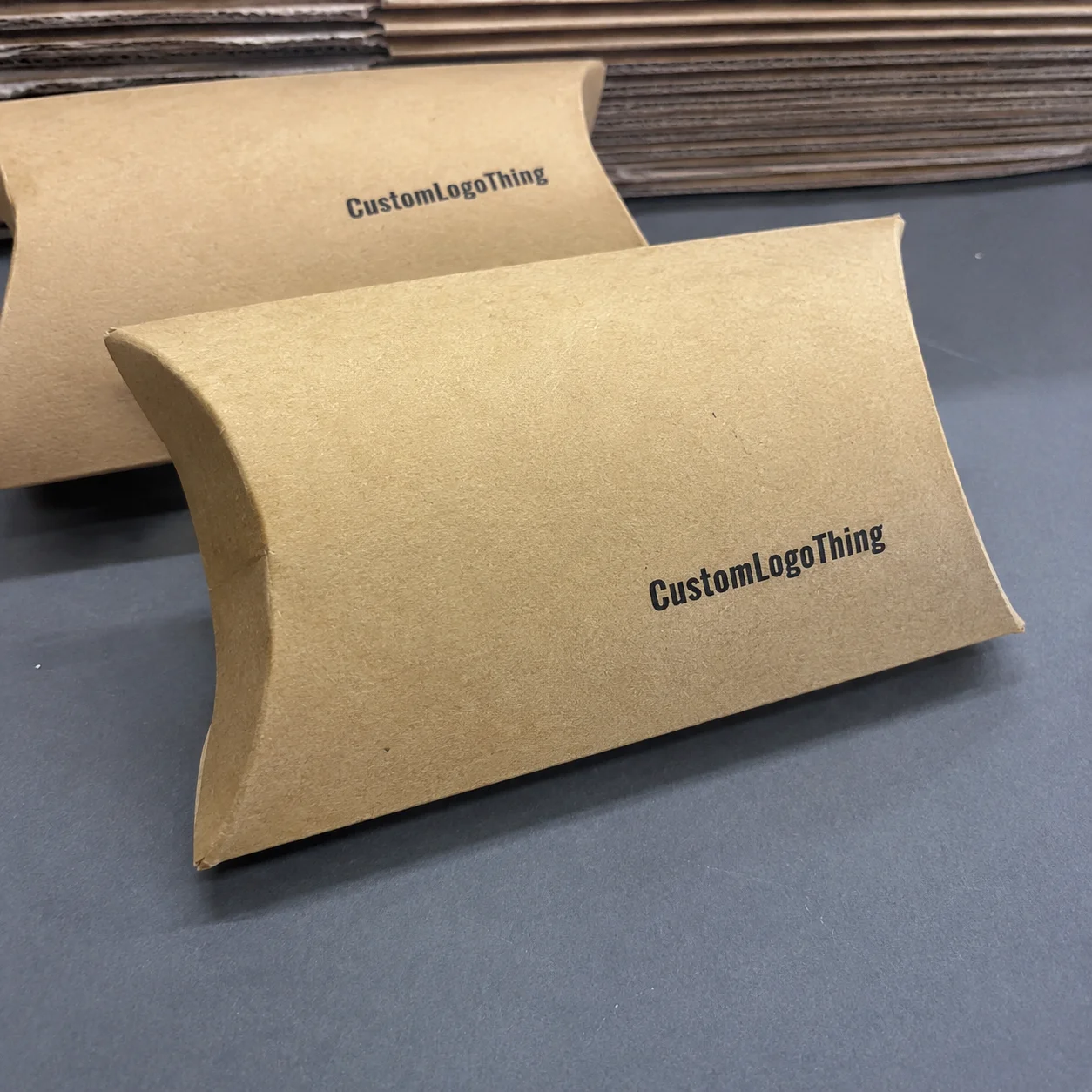
Art Supplies Packaging Boxes: What They Are and Why They Matter
Art supplies packaging boxes are custom cartons built for products like markers, pencils, paints, brushes, erasers, sketchbooks, craft kits, and mixed media sets. They’re not one-size-fits-all. A 24-piece marker set needs a very different structure from a glass ink bottle kit, and a children’s watercolor box has different safety and display needs than a premium adult brush set. Good packaging design starts with the product, not the printer’s favorite template. I learned that early, after approving a box that looked great on screen and then swore at it in person because the product inside had absolutely no intention of fitting the “creative vision.”
I’ve seen brands treat art supplies packaging boxes like a last-minute wrapping exercise. That’s how you end up with crushed corners, labels peeling off, and a box that fights the product instead of supporting it. Better brands treat the box as part of package branding. They think about weight, shelf height, shipping stack pressure, and how the box looks next to five competing SKUs in a retail aisle. That last one matters more than people admit. In a crowded store, the box is basically your salesperson, except it doesn’t take lunch breaks.
There are three common formats. Plain shipping cartons are built for transport first and presentation second. Retail packaging is designed to stand on a shelf, show a barcode, and communicate the brand in a few seconds. Gift-style packaging is the premium version, often with rigid board, specialty finishes, or inserts that make the product feel like something worth keeping. The right format depends on how the product is sold, how fragile it is, and what margin the brand can actually support. That part is not glamorous, but it decides whether the packaging makes money or quietly drains it. I wish that were an exaggeration. It really isn’t.
Art supplies packaging boxes also do a job that people undervalue: they reduce returns. If a customer opens a set of gouache paints and finds loose tubes rolling around because the box was too large by 18 mm, that brand just bought itself a complaint. If the box has custom inserts or dividers that hold everything in place, the customer gets a better unboxing and the warehouse gets fewer breakage claims. That’s not magic. That’s basic packaging engineering. And basic packaging engineering, frankly, saves a lot of headaches.
“The box is part of the product experience. If it fails, the product gets blamed even when the item inside was fine.”
In my experience, the smartest art supplies packaging boxes solve four problems at once: protection, shelf visibility, ecommerce performance, and brand memory. That’s a lot for a folded carton to carry, which is why material choice and structure matter so much. I remember a client once telling me the box “just needed to look nice.” Five minutes later we were discussing vibration resistance, barcode placement, and why a shiny finish can make scuff marks more obvious. Nice is good. Functional is better.
How Art Supplies Packaging Boxes Work in Production
The production flow for art supplies packaging boxes usually starts with dieline design. That’s the structural blueprint. It tells the factory where the folds, cuts, lock tabs, and glue points go. If the dieline is off by even 2 mm, you can create a box that bulges, won’t close, or scrapes the print during folding. I’ve sat in meetings where a buyer waved off dieline review because “it’s just a box.” That buyer later paid for 12,000 reprints. Great use of budget. Truly inspiring. I was not calm about it, if you’re wondering.
After the structure is approved, the team selects the board. Paperboard is common for lighter retail packaging. Corrugated board is stronger and used when the box has to survive shipping abuse. Rigid board is the premium end of the market, often used for high-value sets or presentation kits. A common spec for retail cartons is 350gsm C1S artboard with a 1.5 mm E-flute insert, while heavier sets may use 400gsm SBS or 1.5 mm grayboard wrapped in printed paper. Then comes printing. Offset printing handles high-volume jobs with fine detail and consistent color. Digital printing is usually better for short runs or faster turnaround. Spot UV, foil stamping, embossing, and soft-touch lamination are added when the brand wants the packaging to feel more expensive than it is.
Then the box gets die-cut, folded, glued, and inspected. With art supplies packaging boxes, this part matters more than most people think because many art products have unusual shapes. Brushes have handles. Paints have caps. Sketchbooks have thickness. Mixed craft kits have 17 components and six loose accessories that love to wander around in transit like they pay rent. Inserts, dividers, and custom cutouts keep those items where they belong.
For example, I once visited a supplier producing marker kit packaging for a wholesale client in Dongguan. The first sample looked beautiful, but the markers rattled inside like dice in a shoebox. We added a 350gsm paperboard insert with 24 die-cut channels, and the product suddenly felt stable, premium, and retail-ready. That small insert cost about $0.08 more per unit at 10,000 pieces. Worth every cent. Honestly, the difference was so obvious it almost felt rude to the original sample.
Here’s a simple view of how different box styles usually perform for Art Supplies Packaging Boxes:
| Box Style | Best For | Typical Strength | Common Price Range | Notes |
|---|---|---|---|---|
| Tuck-end paperboard box | Markers, pencils, light kits | Medium | $0.18 to $0.55/unit | Fast to produce, good retail display |
| Sleeve box | Brush sets, sketchbooks, premium kits | Medium | $0.35 to $0.90/unit | Looks polished, easy for branding |
| Corrugated mailer | Ecommerce shipping, heavier kits | High | $0.65 to $1.80/unit | Stronger transit protection |
| Rigid box | Gift sets, premium collections | Very high | $1.80 to $6.50/unit | Best for luxury feel and retention |
I also always push clients to test print files, because artwork issues can ruin a production run faster than structural issues. CMYK blues shift. Small text disappears. Black backgrounds can show scuff marks if the finish is wrong. A supplier I worked with in Dongguan once saved a client from a $7,000 mistake by catching that the logo was too close to the fold line. That kind of thing happens all the time if nobody checks the real production file. I’ve had buyers say, “But it looked fine in Canva,” and then stare at me like the software owed them money.
For standards and testing, I like referencing real industry sources, not just supplier promises. The ISTA testing guidelines are useful for transit performance, and the FSC system helps brands identify responsibly sourced paperboard. If you’re shipping art supplies packaging boxes into ecommerce channels, testing against drop and vibration expectations is not optional. It’s insurance you can actually measure. The boring stuff usually saves the day.
Key Factors That Affect Art Supplies Packaging Boxes
The first factor is material. For lightweight retail packaging, paperboard often works well because it prints cleanly and keeps costs controlled. For shipping-heavy applications, corrugated board adds crush resistance. For premium gifting or high-ticket art sets, rigid board adds stiffness and a higher perceived value. I’ve seen brands try to save $0.12 by stepping down board grade, only to lose more than that in damaged product and ugly shelf presentation. Smart penny-pinching is a skill. Dumb penny-pinching is a hobby. I say that with affection, but also with a little trauma.
Size matters just as much. Oversized art supplies packaging boxes waste board, increase freight costs, and let the product move around. Undersized boxes crush corners, bend brush handles, and create returns. A box fit that’s off by even 3-5 mm can be enough to create a bad experience once inserts and coatings are added. That’s why I always recommend measuring the product with packaging space included, not just measuring the item itself. The box has to fit the product after reality gets involved, not just in a spreadsheet.
Branding choices also have a major effect. Color accuracy is a big one. If a client wants a deep navy background with a warm gold logo, You Need to Know how the ink behaves on the chosen board. Window cutouts can help customers see actual brush tips, paint tubes, or marker colors. Finish choices like matte, gloss, and soft-touch lamination change both the look and the feel. Soft-touch costs more, sure, but it can make a premium art kit feel like a $40 product instead of a $24 one. That tactile cue matters more than people expect.
Sustainability is not just a marketing checkbox. Recyclable board, soy-based inks, and reduced plastic inserts can make a real difference, especially for brands selling to eco-aware customers. That said, not every plastic-free idea is practical. Some art products need molded pulp trays or polypropylene inserts because the product shape demands it. The goal is to balance material impact with product safety, not chase purity points and ignore damage rates. I’ve had people pitch me “zero plastic” as if the universe itself would applaud. The shipping department, predictably, was less impressed.
Sales channel changes the whole job. A subscription kit sold direct-to-consumer might need a branded mailer with strong unboxing appeal. A boutique retailer might want shelf-facing art supplies packaging boxes with a hang tab and bold side panel graphics. Amazon-style ecommerce usually needs stronger outer protection, tighter transit testing, and simpler exterior graphics. Craft fairs might prioritize low minimum order quantities and easy restocking. Same product category. Very different packaging design rules. The channel decides whether the box is a salesperson, a bodyguard, or both.
Here are the main factors I’d compare before approving Art Supplies Packaging Boxes:
- Material grade: 300gsm, 350gsm, 400gsm paperboard or E-flute corrugated
- Product weight: under 250g, 250g-1kg, or heavier mixed kits
- Print coverage: full color, spot color, or one-color branding
- Finish: matte, gloss, soft-touch, foil, embossing, or no finish
- Channel: retail packaging, ecommerce shipping, gift box, or subscription kit
One more practical note: if the SKU mix is wide, standardize the structure where possible. I helped a brand reduce packaging complexity across six art supplies packaging boxes by keeping the same height and changing only the insert and outer print. They cut storage headaches and trimmed setup charges by almost 18%. That’s the kind of result clients actually remember. And warehouse teams remember it too, usually because they stop tripping over all the extra cartons.
For buyers researching custom printed boxes, packaging.org has useful general industry references. Their site is here: packaging.org. I’d use it as a starting point, not the final word, but it helps ground conversations in real packaging terms instead of sales fluff.
Art Supplies Packaging Boxes: Cost and Pricing Breakdown
Let’s talk money, because packaging quotes love to look simple until they’re not. The cost of art supplies packaging boxes usually depends on quantity, board grade, box style, print coverage, finishing, inserts, and shipping method. A simple paperboard tuck box at 5,000 pieces might land around $0.22 to $0.38 per unit. At 10,000 pieces, a 350gsm C1S artboard box with four-color printing can sometimes land at $0.15 per unit for a very basic spec, while a custom insert and matte lamination can move that closer to $0.42 to $0.68. Move to rigid packaging with foil stamping, and you can be looking at $1.95 to $6.50 per unit. It all depends on the spec, and yes, the spec is where quote sheets go to become mysterious.
Setup costs matter more than most first-time buyers expect. A die cut tool might cost $180 to $450 depending on complexity. Plates for offset printing can add another few hundred dollars. Sample making can run $40 to $150 per prototype. So if you only want 300 boxes, your unit price gets ugly fast. Not because the factory is greedy, but because fixed costs have to go somewhere. That’s just arithmetic wearing work boots. I’ve seen people look at a small run quote like it insulted them personally. The math was not trying to be rude; it was just being honest.
One buyer I worked with wanted 800 custom boxes for a watercolor palette launch. The factory quote looked high at first: $1.35/unit. Then we compared it to the real alternative, which was buying generic stock boxes and manually assembling foam inserts in-house. Once labor, labor errors, and wasted time were counted, the custom run was actually cheaper by about $0.19 per finished kit. Packaging quotes without process context are half the story. The other half is the part nobody wants to calculate after lunch.
It helps to break pricing into clear buckets. Ask your supplier for separate pricing on structure, printing, finishes, and extras. If they give you one vague total and refuse to explain it, that’s not transparency. That’s a smoke machine.
Here’s a simple pricing logic table I often use with art supplies packaging boxes:
| Cost Driver | Lower Cost Choice | Higher Cost Choice | Typical Impact |
|---|---|---|---|
| Quantity | 5,000+ pieces | 300-1,000 pieces | Lower volume raises per-unit cost sharply |
| Board | Standard paperboard | Rigid board or thick corrugated | Thicker boards improve protection and cost more |
| Printing | 1-2 colors | Full-color CMYK with detailed art | More coverage usually means more press time |
| Finishing | Uncoated or matte | Foil, embossing, soft-touch | Premium effects raise cost and visual value |
| Insert | No insert | Die-cut board, foam, or molded pulp | Better protection, more setup and material cost |
My rule of thumb is simple: if art supplies packaging boxes protect a high-margin product, support retail placement, or improve conversion, spending a little more usually pays back. If the product is a low-margin refill pack, then the packaging needs to be efficient and boring in the best possible way. Not every box needs foil. Some boxes just need to show up, do the job, and not embarrass anyone. I respect that kind of quiet competence.
Shipping cost matters too. A heavier rigid box might look great, but if it increases dimensional weight enough to bump freight by $0.60 per unit, that can wipe out the branding benefit unless the retail margin supports it. That’s why I like discussing total landed cost, not just factory price. The best suppliers—whether you work with BoxUp-style teams, Uline, or a custom production house in Guangdong, Vietnam, or Jiangsu—will help you compare the whole picture instead of selling the prettiest quote. Pretty quotes are nice; delivered profit is nicer.
For brands that need a wider packaging mix, check Custom Packaging Products to compare formats and see what’s possible across product lines.
Step-by-Step Process for Creating Art Supplies Packaging Boxes
The first step is product mapping. Measure every item in the kit. Not just the widest point, but the tallest, deepest, and most fragile parts. If you have brushes, account for handle length. If you have bottles, account for cap height. If you have loose accessories, count them and group them by function. A box that fits the product on paper but fails in real assembly is just expensive cardboard theater. I’ve seen beautiful theater. This is not that.
Second, build a proper brief. I want to know the audience, brand style, budget, target quantity, shipping channel, and any compliance needs. If the box needs a barcode panel, warning text, or multilingual instructions, that has to be in the brief from the start. Art supplies packaging boxes often look simple, but the back panel can get crowded fast once legal text and product details are added. My opinion? Give the legal copy a plan before it starts freelancing all over the carton.
Third, request a dieline and structural mockup. Review fit before you obsess over artwork. I’ve seen teams spend two weeks choosing the perfect shade of teal for a box that didn’t actually close. That’s backwards. Structure first. Pretty second. Otherwise you’re decorating a problem. And problems, annoyingly, have a habit of staying problems no matter how nice the font is.
Fourth, order a sample or prototype. And test it with real products. Not just a photo. Not just a ruler. Put the actual paint tubes, brushes, or sketchbooks inside the sample and shake it. Drop it from waist height if the product is going to ecommerce. Stack it under a few cartons. If the box opens, bulges, or lets items slide around, fix it now while the cost is small.
Fifth, approve final production only after checking print quality, closure strength, and carton stacking performance. I usually tell clients to look for five things: color consistency, glue integrity, fold accuracy, insert fit, and outer surface scuff resistance. If all five check out, production can move. If two fail, stop and correct them. Reprints cost more than patience. I know patience sounds like a boring superpower, but in packaging it saves actual money.
Here’s the typical workflow I’ve used for art supplies packaging boxes:
- Measure product and define packaging purpose
- Choose structure and board specification
- Create dieline and design artwork
- Review mockup and correct sizing
- Produce sample or prototype
- Run transit or handling test
- Approve final file for mass production
- Inspect first batch and confirm consistency
Timelines vary, but a straightforward paperboard project can often move in 12 to 15 business days after proof approval, while custom inserts, foil, or rigid structures can push things into 20 to 35 business days. Sampling adds time. Always. I know clients hate hearing that, but a day spent sampling is cheaper than a week spent explaining why 8,000 boxes are wrong. Trust me, nobody enjoys that conversation, especially the one that starts with, “So, funny story...”
If your team is new to custom printed boxes, ask the supplier how they handle artwork review, file format, and color management. Good vendors will want editable vector files, linked images at print resolution, and clear notes on finish areas. Poor communication at this stage creates problems later. Good packaging production is basically a chain of tiny decisions, and each one is trying to save the next one from being stupid. I say that lovingly, but only because I’ve had to fix enough mistakes to earn it.
Common Mistakes People Make With Art Supplies Packaging Boxes
The first mistake is using one box style for everything. A marker set, a brush roll, and a paint bottle kit do not deserve the same structure just because it’s convenient. That usually leads to poor fit, wasted material, and packaging that looks lazy on shelf. Brands do this when they want uniformity without actually doing the work to make the system intelligent. Uniformity is good. Laziness is not. I’ve been in that meeting where someone says, “Can’t we just make them all the same?” Sure. If you also want all the products to fit badly.
The second mistake is skipping transit testing. This is especially dangerous for paint jars, glass bottles, sharpeners, and mixed craft kits. A box can look beautiful and still fail a drop test from 76 cm. I’ve seen customers approve art supplies packaging boxes based on a render, then act shocked when the first shipment arrives with broken corners and leaking ink. The carton did not betray them. The lack of testing did.
The third mistake is choosing the cheapest board without checking crush resistance. A 300gsm box might be fine for a light sketchbook. It is not fine for a heavy watercolor set with glass vials. That’s the difference between cost control and false economy. I’d rather see a client spend an extra $0.09 on better board than lose $4.00 in product damage. Simple math. Annoying math, but simple. The numbers are rarely subtle, even when people wish they were.
The fourth mistake is over-designing the package. Too many colors, too much text, too many icons, too many claims. The box becomes visually noisy, and the product stops being readable from 1.5 meters away. Shelf packaging has to communicate fast. If the front panel tries to say everything, it says nothing. I’ve literally held a carton at arm’s length and still felt like it was yelling at me.
The fifth mistake is skipping sample approval. I know, I know. “We trust the factory.” Great. The factory still prints what you sent. If the colors are off, the dimensions are wrong, or the insert misses the product by 4 mm, that trust won’t pay for the reprint. A sample is not a formality. It is the cheapest insurance policy you’ll buy all week.
Another mistake I see often: forgetting to design for storage and assembly. If the box arrives flat but the insert needs extra handwork, your labor cost can quietly climb. If the artwork uses a dark solid background that scuffs in warehouse handling, the packaging may look tired before the product ever sells. A good packaging design thinks about the whole life of the box, not just the nice render in the presentation deck. The presentation deck, for the record, is usually the least stressful part of the process.
Expert Tips for Better Art Supplies Packaging Boxes
Design for shipping and unboxing at the same time. Ecommerce brands especially need this because the box is often the first thing a customer touches. If the outer carton arrives dented, the product feels less valuable before it’s even opened. I like art supplies packaging boxes that can survive transit, then still feel thoughtful when the customer opens them. That means a sturdy structure, clean internal layout, and a controlled reveal. Basically: the box should do its job and still manage to look like it tried.
Keep one brand system across multiple SKUs. Don’t redesign the entire visual language for every item unless you enjoy making your own life harder. Use the same typeface family, same logo placement logic, and same panel hierarchy, then vary the color or product illustration by SKU. That creates a recognizable shelf block and keeps the line connected without making every box identical. Good branding should look related, not cloned. Like siblings, not photocopies.
Test the packaging under real warehouse conditions. Paperboard behaves differently in dry rooms, humid storage, and cold transport. If you’re shipping through climate swings, check whether the surface coating holds up and whether the edges stay crisp. I’ve seen boxes look perfect in the studio and then curl slightly after 48 hours in a warm loading area. Paper does not care about your mood board. It has no interest in your aesthetic vision, which is rude but consistent.
Ask for the supplier’s recommended board spec before you start guessing. A good manufacturer will know what actually works for the weight, the print coverage, and the shipping method. Teams that produce a lot of custom printed boxes often have a practical sweet spot in mind because they’ve already seen what fails. That’s especially useful if you’re comparing options from BoxUp, Uline, or a custom packaging shop with strong manufacturing relationships in Shenzhen, Ningbo, or Ho Chi Minh City. Experience is helpful here. Guessing is not.
Add functional details that help the end user. Thumb notches make opening easier. Tear strips improve ecommerce unboxing. QR codes can link to brush care, refill ordering, or a short tutorial. These small touches turn art supplies packaging boxes into part of the product experience instead of a passive shell. They’re cheap details, but they make people remember the brand. And if you’ve ever tried to open a beautiful box with sticky fingers and no tear strip, you know exactly why that matters.
Here’s a quick buyer checklist I use before final approval:
- Does the box fit the product with at least 2-4 mm of practical clearance?
- Does it hold the product securely without rattling?
- Can it survive stacking and transit handling?
- Does the front panel communicate the product in under 3 seconds?
- Does the finish match the brand’s price point?
One last thing: don’t ignore the role of eco claims. If you use FSC board or recyclable paperboard, make sure the claim is accurate and supported. Customers care, but they also notice when a brand pretends a plastic insert is “fully sustainable” because the marketing team got enthusiastic. Use truthful language. It lasts longer. So does trust, which is nice when you’re trying to build a brand instead of a one-time sale.
For teams building out a larger line of art supplies packaging boxes, I also recommend reviewing broader retail packaging and mailer options so the structure matches the sales channel instead of forcing the channel to adapt to the box.
What are art supplies packaging boxes and which styles work best?
What are the best art supplies packaging boxes for fragile items?
For fragile items like glass paint bottles, ink jars, ceramic tools, or delicate mixed kits, corrugated boxes or rigid boxes with custom inserts are usually the safest choice. The insert matters as much as the outer carton. If the product moves even a few millimeters inside the box, add a divider, a tighter cutout, or a different board spec. For ecommerce, make sure the outer structure can survive drops, not just sit pretty on a shelf. In practice, many brands use a 350gsm printed sleeve over a 1.5 mm grayboard tray for premium kits made in Dongguan or Xiamen.
How much do custom art supplies packaging boxes usually cost?
Cost depends on quantity, material, print coverage, finishing, and inserts. A simple paperboard carton might be around $0.15 to $0.38 per unit at 5,000 to 10,000 pieces, while premium rigid packaging can move into several dollars per box. The smartest way to compare quotes is to separate structure, print, and extras so you can see exactly where the money goes. That stops suppliers from hiding a $0.40 insert inside a vague “package price.”
How long does it take to produce art supplies packaging boxes?
Timeline usually depends on design approval, sample making, and order size. Simple projects can move in 12 to 15 business days after proof approval, while custom structures, special finishes, and complex inserts need more time, often 20 to 35 business days. I always tell clients to build in room for sampling. Skipping that step is how brands end up paying for reprints, and nobody wants to explain that to finance.
What materials work best for art supplies packaging boxes?
Paperboard is a strong choice for lightweight retail packaging, especially when shelf appeal matters. Corrugated board is better for shipping protection and heavier kits. Rigid board is best for premium gift sets or higher-value art collections. Common specs include 300gsm, 350gsm C1S artboard, and 1.5 mm grayboard, depending on weight, sales channel, and how much damage risk the box needs to absorb.
How do I choose the right size for art supplies packaging boxes?
Measure every product carefully and include space for inserts, closures, and protective clearance. Avoid oversized boxes because they waste material and raise shipping costs. Avoid tight boxes because they crush corners, bend brush handles, or damage labels. If you’re unsure, ask the supplier for a dieline mockup before committing to production. A 2 to 4 mm clearance is often enough for many retail kits, but the exact fit should be tested with the real product.
Art supplies packaging boxes do a lot of heavy lifting. They protect the product, support branding, improve retail performance, and shape the customer’s first physical impression. Get the material wrong, and you pay for it in damage and complaints. Get the structure right, and art supplies packaging boxes can make a modest product feel organized, premium, and worth the price. The practical takeaway is simple: start with the product dimensions, choose the box structure around the sales channel, and test a real sample before signing off. That’s the job. And honestly, it’s a job worth doing properly.