Buyer Fit Snapshot
| Best fit | Brand Packaging Premium Quality projects where brand print, material claims, artwork control, MOQ, and repeat-order consistency need to be specified before quoting. |
|---|---|
| Quote inputs | Share finished size, material target, print colors, finish, packing count, annual reorder estimate, ship-to region, and any compliance wording. |
| Proofing check | Approve dieline scale, logo placement, barcode or warning zones, color tolerance, closure strength, and carton packing before bulk production. |
| Main risk | Vague material claims, crowded artwork, missing packing details, or unclear freight terms can make a low unit price expensive after revisions. |
Fast answer: Brand Packaging Premium Quality: What Actually Matters should be specified like a repeatable production item. The safest quote records material, print method, finish, artwork proof, packing count, and reorder notes in one written spec.
Production checks before approval
Compare the actual filled-product size with the drawing, then confirm tolerance on folds, seals, hang holes, label areas, and retail display edges. Reserve space for logos, QR codes, warning copy, and material claims before decorative graphics fill the panel.
Quote comparison points
Review material grade, print process, finish, sampling route, tooling charges, carton quantity, and freight assumptions side by side. A quote is only useful when the supplier can repeat the same color, closure quality, and packing count on the next order.
A buyer can judge a product in three seconds flat, and brand packaging premium quality is often what they are judging before they read a single line of copy. I have watched that happen on production lines in Shenzhen, in buyer meetings in Los Angeles, and in retail aisles where one tighter box beat a louder design by a mile. Premium does not always mean expensive. A 5,000-piece run of 350gsm C1S folding cartons can land around $0.15 to $0.22 per unit before special finishes, which is a very different story from a $3.50 rigid box. It means deliberate, consistent, and convincing in the hand. Honestly, that last part is the one people miss most often, and it is usually the part that decides whether the packaging feels credible or kinda ordinary.
Too many teams still treat packaging as a decorative layer at the end of the process. They pick a color, add a foil stamp, and hope the result will feel high-end. That order is backwards. Brand packaging premium quality starts with the product, the shipping path, and the story the pack has to tell from first touch to final unboxing. A good package can lift perceived value, protect the product, and sharpen brand identity at the same time. A weak one can make a well-made product feel ordinary, which is a brutal little twist after all that work. I have seen a $24 serum lose shelf presence to a $12 competitor simply because the competitor used a 1.2 mm rigid set-up box with a magnetic closure and a matte soft-touch wrap.
If you sell Custom Printed Boxes, run retail packaging, or build a full package branding system, the details matter more than the adjectives. I have seen a 350gsm carton with precise folds and controlled color outperform a heavier 400gsm board that was printed badly in Dongguan. That still surprises people, even though it should not. That is why I always push teams to judge brand packaging premium quality by what customers touch, what they notice from arm's length, and what survives shipping without turning into a sad little dented mess. A 1 mm tolerance error can be more visible than a $2 finish upgrade, which is a weird little lesson the industry keeps teaching.
What Does Brand Packaging Premium Quality Really Mean?
Buyers often decide how trustworthy a product feels before they decode a single line of messaging. I have seen shoppers lift a box, feel a stiff edge, and immediately assume the product inside is better made. That is brand packaging premium quality in action. It is not a gloss effect. It is the total impression created by structure, print fidelity, material feel, and brand consistency. I remember one buyer tapping a carton twice with his knuckle like he was testing a door in a hotel corridor. He was not joking. He was deciding whether the pack felt worth the $48 retail price.
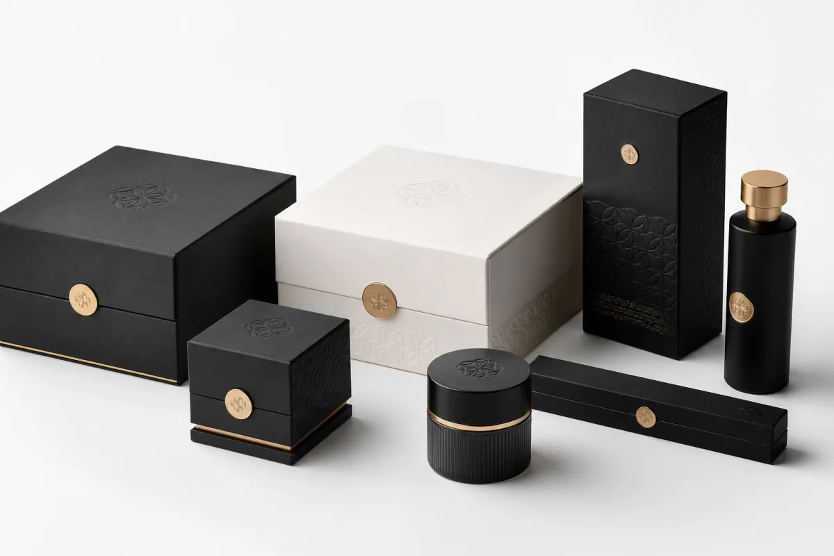
People usually mean one of three things when they say premium. The first cue is visual: the pack looks refined and controlled. The second is tactile: it feels substantial in the hand. The third is functional: it survives the trip from warehouse to customer without dents, loose corners, or crushed inserts. Strong brand packaging premium quality blends all three. Luxury cues may use rigid board, foil, and dramatic opening moments. Sustainable cues may use FSC-certified board, minimal ink coverage, and water-based coatings. Durability may come from corrugated protection, smart inserts, and closures that hold their shape after repeated use. Premium is not one look. It is a system of signals working together, from the outer shipper down to the 0.5 mm reveal gap.
I learned that the hard way during a client meeting for a skincare launch in Singapore. The mockup looked elegant on screen, but when we assembled the sample, the lid had a 2 mm gap that caught the eye instantly. Nobody mentioned the copy or the claims. Every comment focused on that gap. We fixed the tolerances, tightened the fold, and the same design suddenly felt much more expensive. Brand packaging premium quality is often built in fractions of a millimeter, not inches. That part drives me a little crazy, because it means tiny errors can hijack weeks of good work.
Another mistake is assuming premium means ornate. It does not. I have seen a two-color carton with a sharp die-cut window feel more premium than a crowded box covered in five finishes and three taglines. The cleaner pack usually wins because the brand has the confidence to leave space. That empty space is not wasted. It is part of the value signal. Strong brand packaging premium quality gives the product room to breathe, which in turn makes the brand feel more credible. Personally, I trust the brand that knows when to stop decorating, especially when the print run is 10,000 units and every extra effect adds cost.
The smartest packaging teams also think about repeat purchase. A pack can look great in the unboxing moment and still fail if it tears, scuffs, or creates frustration the second time the customer uses it. Premium should be durable enough to live on a desk, in a drawer, or back in a tote bag. If the closure weakens, the hinge splits, or the insert rattles, the customer stops thinking about premium and starts thinking about inconvenience. That is the fastest way to lose brand packaging premium quality in the real world, where nobody gives extra points for good intentions. A cosmetic mailer that survives three deliveries looks far more premium than a glossy box that caves in after the first courier scan.
If you want to compare formats, our Custom Packaging Products page is a good place to map structure against product type before you lock the concept. I also point teams to our Case Studies archive when they want to see how different finishes and substrates change the final impression. Those side-by-side comparisons usually make the idea of brand packaging premium quality much less abstract. They also save a few awkward meetings, which I consider a public service. One comparison between a 350gsm folding carton and a 1200gsm rigid box can settle a debate faster than 40 minutes of opinions.
How Brand Packaging Premium Quality Is Built
Brand packaging premium quality is built layer by layer, and each layer has its own failure points. It begins with the brief, then moves into concept, dieline, substrate, printing, finishing, conversion, and assembly. If one layer drifts, the whole piece starts to feel off. I have seen beautiful artwork ruined by a poor dieline, and I have also seen a plain layout elevated by exact folds and a clean finish. The stack matters. It matters more than most creative decks admit, especially when the line has to perform at 8,000 units per day in a factory near Foshan.
The first serious decision is structure. A good structure does more than hold a product. It shapes the opening sequence, controls how the customer finds the product, and sets the tone before the graphics even register. A carton that opens with a crisp front panel and a neat reveal feels intentional. A lid that bends, bows, or catches halfway through the opening feels like a compromise. Structure is one of the most reliable signals of brand packaging premium quality. I always tell teams: if the box behaves badly, the brand will get blamed, fair or not. A straight tuck flap and a 1.5 mm crush allowance can change the whole impression.
At our Shenzhen facility, I once watched a pressman stop a run because the score line was drifting by less than 0.3 mm. Most people would have shrugged. He did not. He knew that small drift would cause a fold to flare, which would make the final carton look rushed. That level of discipline is not glamorous, but it is the difference between a pack That Feels Premium and one that feels merely printed. The final customer never sees the correction. They only feel the result, which is exactly how brand packaging premium quality should work. In a neighboring Dongguan plant, the same standard would be checked against a 0.2 mm registration target, and that is the kind of detail that separates a decent box from a memorable one.
Printing is the next test. Sharp typography, consistent solids, and correct registration tell the eye that the brand respects detail. If the logo is soft at the edges, the black is muddy, or the color blocks shift from panel to panel, the package begins to feel cheap even if the design is strong. I have seen this happen with a deep navy on a cosmetics box; the brand color leaned purple in one batch and flat gray in another. The product itself was fine. The packaging was not. That inconsistency undermined brand packaging premium quality more than the team expected, and yes, the marketing team was not thrilled. A Delta E variation above 3.0 can be visible to the naked eye on a large solid panel.
Finishing comes after that, and it can help or it can clutter. Soft-touch lamination adds a velvety hand feel. Foil creates hierarchy and catches light on a logo or seal. Embossing gives physical depth. Debossing feels restrained and expensive. Spot varnish can sharpen a focal point. Finishing is not a rescue plan for weak design, though. Too many effects can make a box feel busy rather than premium. One hero finish and one supporting detail usually work better. That keeps brand packaging premium quality focused instead of crowded. A 20 percent foil coverage on a logo can feel elegant; a 70 percent foil flood often feels like overcompensation.
Assembly is the last test, and it is the one many teams forget. If a box needs awkward manual correction, if the insert floats, or if the lid has to be forced into position, the customer notices. The person on the line notices too. I have negotiated with suppliers who wanted to dismiss a 1.5 mm misalignment as "within tolerance," but that logic only holds on paper. In the hand, premium packaging either clicks into place or it does not. There is very little middle ground in brand packaging premium quality. I wish that were less true, but packaging does not care about our wishful thinking. In a Guangzhou assembly room, I once watched 3,000 units get reworked because the insert pocket sat 2 mm too high.
One quote from a client still stays with me: "The box was fine online, but in hand it felt like a promo mailer." That was not a design failure. It was a production failure. The board was too light, the coating was too shiny, and the fold was not crisp enough to support the product category. We revised the material and the edge definition, and the entire unboxing experience changed. That is how brand packaging premium quality actually gets built, not by promise, but by process. The box has to earn the feeling, usually with a 1200gsm shell, a wrapped 157gsm art paper exterior, and a matte finish that does not glare under store lighting.
Key Factors That Signal Premium Quality
The clearest signal is material choice. Board weight, fiber quality, and stiffness all influence how the package feels before it is even opened. A 350gsm C1S artboard can work beautifully for a small cosmetic item, while a rigid setup box with 1200gsm board and wrapped art paper makes more sense for a gift set or a PR kit. The wrong material sends mixed signals. Too light, and the pack feels fragile. Too heavy, and it can feel wasteful or awkward. Either way, brand packaging premium quality takes a hit. In practical terms, a 30-gram product and a 300-gram product should not share the same structure.
Print quality comes next. Crisp typography matters because the eye reads sharp type as care and soft type as sloppiness. Controlled solids matter because uneven coverage looks like a production issue, even if the design is elegant. Color management matters because a brand color that drifts by a few points can make the whole range look inconsistent. In a multi-SKU line, I have seen a simple brand blue become three different shades across two print runs. That is not just a color issue. It is a trust issue, and trust is part of brand packaging premium quality. On a shelf in Seoul or Chicago, a 5 percent color shift can be enough to make one SKU look off-family.
Finishing choices help create hierarchy. A selective varnish can guide the eye to the logo. Embossing can add depth without shouting. Debossing can feel restrained and expensive. Foil can work well on seals, borders, and small marks of authenticity. The real skill is restraint. The best packaging teams know where to stop. They use finishes to support brand identity, not to hide a weak concept. That judgment is one of the clearest markers of brand packaging premium quality. A single copper foil mark on a matte black lid can feel more intentional than a full-page gloss pattern.
Function matters just as much as appearance. Premium packaging must protect the product, survive handling, and support the unboxing sequence without creating friction. Inserts should hold the item firmly but not crush it. Closures should feel precise. Inner trays should slide with intention, not scrape. If the product arrives damaged, no amount of foil or embossing can save the impression. Functional performance is not separate from brand packaging premium quality; it is part of it. A box that survives a 1.2-meter drop test and arrives without crushed corners has already done more for the brand than any slogan can.
Brand consistency is the final signal, and it reaches beyond the main box. The outer carton, shipper, insert card, tissue, and mailer should look like they belong to the same brand system. If the retail box feels luxurious but the shipper looks generic, the experience breaks. If the thank-you card uses a different tone or paper stock, the narrative weakens. Customers do not always articulate this, but they feel it. Consistency across packaging touchpoints is one of the easiest ways to strengthen brand packaging premium quality. A 120gsm insert card on the inside and a 150gsm outer sleeve can work together if the tone and print language stay aligned.
Sustainability often gets discussed as if it sits outside premium. It does not. A smart package can use FSC-certified board, a water-based coating, and fewer components without feeling cheap. The EPA has clear recycling guidance at EPA, and FSC standards help brands source responsibly at FSC. I also pay attention to distribution tests from ISTA because a box that looks refined but fails in transit does not deserve the word premium. Sustainable choices and testing discipline can increase brand packaging premium quality when they are handled with care. Frankly, it is nice when being responsible also makes the pack better, especially when a water-based matte coating reduces glare by roughly 30 percent.
- Material: choose board stiffness and fiber quality that match product weight and brand positioning.
- Print: keep registration, solid coverage, and color targets tight across every SKU.
- Finish: use one or two effects with purpose, not as decoration for its own sake.
- Protection: make sure the product arrives intact after shipping, stacking, and shelf handling.
- Consistency: carry the same visual language across box, insert, shipper, and accessory pieces.
What Brand Packaging Premium Quality Costs
Cost is where most teams start to get nervous, and for good reason. Brand packaging premium quality can be surprisingly affordable in one format and expensive in another. The biggest cost drivers are material grade, print method, finishing complexity, order volume, and the number of setup steps needed before production starts. A simple change in board, coating, or insert can move the price more than a logo redraw. I have watched that single fact rescue a few budget meetings from becoming a small disaster. A 4-color folding carton in Qingdao might start at $0.16 a unit at 5,000 pieces, while the same box with soft-touch lamination and foil could jump to $0.29 or more.
Setup costs behave differently from unit costs. If you change artwork after plates are made or revise a tool after sampling, you pay for that change immediately. If you spread the same tooling over 20,000 units, the cost per box falls. If you print only 500 units, the opposite happens. That is why brand packaging premium quality looks expensive in small runs but can become efficient once a brand standardizes a format. I have watched teams save real money simply by keeping one dieline and varying only the printed sleeve or insert. A single steel rule die can be amortized over 8,000 to 12,000 units and suddenly stop looking scary in the spreadsheet.
To make this concrete, here is the kind of pricing logic I use in early conversations. These are typical planning ranges, not universal quotes, because quantity, region, and finish can move things quickly. A carton built in Guangzhou will not always price the same as one produced in Ningbo, and a factory in Ho Chi Minh City may have different labor economics than a plant in Shenzhen.
| Packaging option | Typical build | Typical unit cost at 5,000 units | Best use |
|---|---|---|---|
| Folding carton | 350gsm C1S board, 4-color print, aqueous coating | $0.18-$0.34 | Cosmetics, supplements, smaller consumer goods |
| Rigid setup box | 1200gsm board, wrapped art paper, soft-touch lamination | $2.40-$4.80 | Gift sets, luxury retail, influencer kits |
| Corrugated mailer | E-flute, 2-color print, water-based coating | $0.42-$0.90 | DTC shipping, subscription boxes, e-commerce |
| Custom insert | Paperboard, pulp, or foam insert tailored to product | $0.08-$1.10 | Protection, presentation, and product fit |
Those numbers shift fast once foil, embossing, magnetic closures, or custom windows enter the spec. I once negotiated a rigid box where the foil die change alone added $320 to the project, but switching the insert from foam to paperboard saved more than $500 over the run. That is the real game: knowing where a visual upgrade strengthens brand packaging premium quality and where it only creates margin pain. Nothing glamorous about that conversation, but it saved the project. The client kept the embossed logo, dropped the window, and still hit the target of $3.10 per unit.
I usually tell brands to spend first on the parts customers touch and see most often. Structure, board quality, print accuracy, and closures deserve priority. Decorative overload does not. A box can look expensive in a render and still fail on the shelf if the board is weak or the logo is off-center. Better to have one clean, premium signal than three noisy ones. That approach protects both perception and budget, which is the sweet spot for brand packaging premium quality. A 0.5 mm tighter closure is usually more valuable than a second foil color.
There is also a volume effect that people underestimate. A low-volume launch may need a simpler finish stack to stay viable, while a larger run can justify tooling and better unit economics. If you are moving from 1,000 to 10,000 units, the pricing curve can change dramatically. That is one reason I encourage teams to build a packaging roadmap rather than treating every SKU like a one-off. A roadmap gives brand packaging premium quality room to mature without crushing margins. A brand that ships 25,000 units per quarter can absorb a better board spec far more easily than a brand shipping 800 units per month.
For teams trying to protect cash flow, the smartest move is often to simplify the number of components rather than downgrade the core box. Remove an unnecessary insert card, standardize the mailer, and keep the main presentation piece strong. That keeps the customer-facing moment intact. In practice, this is usually better than shaving a few cents off the wrong component and weakening the entire experience. Good packaging strategy makes brand packaging premium quality feel intentional, not indulgent. A $0.07 savings on the shipper is not worth losing a $2.00 perceived-value lift on the box.
Process and Timeline for Premium Packaging
A premium pack rarely fails because of one dramatic mistake. It usually fails because one step was rushed. The workflow starts with strategy, moves into structure, then sampling, proofing, production, finishing, and packing. I have seen launch dates slip because a team approved artwork before the dieline was final, or because the prototype was never tested with the actual product dimensions. That sort of rework eats time fast, and it puts brand packaging premium quality at risk before production even starts. A 1 mm dimensional mismatch can cascade into a five-day correction cycle if it is caught late.
The cleanest projects move through a few clear milestones: brief, concept, dieline approval, sample review, color proofing, production, finishing, and final packing. If any of those are skipped, the team ends up solving problems in the worst possible place, usually during the press run or assembly stage. A simple folding carton with standard print might be finished in 12-15 business days from proof approval. Add rigid construction, foil, custom inserts, or specialty coatings, and the timeline can stretch to 25-40 business days. That is not slow. That is normal for brand packaging premium quality done properly. In a busy quarter, a factory in Dongguan might book out two additional weeks before you even approve the sample.
Sampling is where the truth shows up. A CAD mockup can tell you dimensions, but it cannot tell you how the edge feels, how the lid closes, or whether the print finish supports the product category. I always want at least one physical sample in hand before sign-off. Better still, I want the sample under the same conditions the customer will experience: shelf viewing, shipping vibration, warehouse stacking, and opening with one hand while someone is holding a phone in the other. That is the reality of brand packaging premium quality. The phone-in-one-hand test is not official, but it should be. A sample that survives a 90-second courier shake test is usually worth keeping.
Clear feedback shortens the process. Vague comments like "make it feel more premium" cause delays because nobody knows what to revise. Specific comments like "reduce the lid gap to under 1 mm," "increase board stiffness," or "bring the logo contrast up by one step" can be acted on immediately. I have seen teams cut a full week from a project simply by consolidating approvals into one decision-maker. Fewer loops mean fewer errors, and fewer errors mean stronger brand packaging premium quality. One client in Melbourne moved from four reviewers to one approver and saved six working days on a single launch.
There is one planning rule I repeat often: schedule premium packaging earlier than you think you need to. Brands usually budget time for design and product manufacturing, then forget sampling, freight, and revisions. That is how good launches get squeezed by packaging. If the product launch depends on a custom box, treat the box as part of the critical path, not as a side task. The brands that understand this protect both launch dates and brand packaging premium quality. A project that starts six weeks before ship date is already asking for trouble if the pack includes foil and a custom insert.
"We thought the box was the last task. It turned out to be the task that changed the launch date." I have heard that sentence more than once, and it usually arrives after someone has already paid for rush freight from Shenzhen to Chicago.
If you need a simple planning benchmark, I would start here: one week for concept and structural direction, one to two weeks for samples and revisions, one to two weeks for production on straightforward cartons, and longer for specialty finishes or assembled rigid formats. Exact timing depends on quantity, factory load, and approval speed. That uncertainty is normal. What is not normal is pretending the project will be fast just because the design is clean. A clean design still needs disciplined execution to deliver brand packaging premium quality. A 7-day promise is realistic only for very simple labels or stock boxes, not for a custom rigid presentation piece.
Common Mistakes That Undercut Premium Packaging
The biggest mistake is overdesigning the pack. Too many messages, too many icons, too many finishes, and the customer stops reading and starts scanning for noise. I have seen brands with excellent products bury the logo beneath claims, badges, and decorative lines. The package becomes busy instead of premium. A confident layout usually does more for brand packaging premium quality than a crowded one with expensive effects. If a carton has 14 callouts and 3 foil areas, the odds are good that none of them will feel special.
Another mistake is choosing materials that look premium in a render but fail in the hand. A paper stock can appear rich on a screen and still feel flimsy once folded. A coating can look elegant and then scratch during packing. A rigid box can photograph well and then bow in transit. That is why I keep returning to sample reviews. Physical samples reveal whether the design supports brand packaging premium quality or just imitates it. A screen can lie. Cardboard, annoyingly, cannot. I would rather catch the problem on a bench in Ningbo than in front of a retailer in New York.
Print tolerances cause more damage than many teams expect. A slight color drift, a blurry small typeface, or a misregistered pattern can make a carefully designed pack look rushed. I once saw a haircare line with beautiful metallic accents, but the brand name sat just enough off-center that the whole box felt careless. The customer did not know why it looked wrong. They only knew it looked wrong. That is enough to weaken brand packaging premium quality. A 0.8 mm shift on a centered logo can be enough to trigger that reaction, especially on a black substrate.
Some teams still treat sustainability and premium as competing goals. That is outdated thinking. A package can use recyclable materials, restrained decoration, and a thoughtful structure without losing presence. In fact, the best sustainable packs often feel more considered because there is less clutter. I usually find that customers respond well to clarity: fewer materials, better board, cleaner print, and clear disposal guidance. Those choices can strengthen both trust and brand packaging premium quality. A mono-material mailer in kraft E-flute with soy-based ink can feel more intentional than a glossy composite build.
The last mistake is skipping sign-off steps. A proof is not a formality. A sample is not a souvenir. Both are checkpoints meant to catch issues before full production. I have watched brands approve a file too quickly because a launch date was looming, then spend the next week fixing a problem they could have caught with one more review. That kind of rush rarely saves time. More often, it damages brand packaging premium quality and adds cost later. A 15-minute proof review can save a $1,500 reprint.
Here is the comparison I give clients who are trying to decide whether to push a design further or simplify it. If the visual effect does not improve clarity, tactile value, or protection, it probably does not belong. That rule sounds plain, but it saves money and keeps the package honest. Honest packaging has a better chance of delivering brand packaging premium quality that customers actually believe. If a finish only looks good in a presentation deck, it is probably not worth the added setup cost.
Expert Tips and Next Steps for Stronger Brand Packaging Premium Quality
If I were auditing a packaging line tomorrow, I would start with a scorecard. Rate structure, print, finish, durability, and unboxing flow on a 1-to-5 scale. Then compare the scores across samples. That simple exercise makes gaps obvious. It also turns a vague conversation into a practical one. Teams can argue about taste all day, but a scorecard gives brand packaging premium quality a measurable framework. A carton scoring 2 on closure precision and 5 on print quality tells you exactly where to spend the next hour.
I also recommend testing samples in the real world, not just under studio lights. Put them on a shelf. Stack them in a warehouse. Drop ship them through a normal carrier. Open them with gloves if the product will be handled in cold storage. The packaging that looks strongest in a presentation is not always the one that performs best in use. Real testing reveals whether the pack supports brand packaging premium quality or only performs it. I have had more than one sample look gorgeous in photos and then fail the moment it met a delivery van. A 1.5-meter courier drop is a humbling teacher.
Customer feedback is another underrated source of truth. Watch return reasons, reviews, and customer service notes. If people mention damaged corners, hard-to-open closures, or insert issues, those are not random complaints. They are data points. I have seen one small tweak to a tuck flap cut product complaints by a noticeable amount because the box simply opened better. Small changes can produce outsized effects on brand packaging premium quality. When 2 percent of orders mention a packaging irritation, that is already enough to warrant a redesign.
Vendor alignment matters too. Every supplier should understand the standard you are trying to hit. I like to give them a short checklist: target board weight, print tolerance, finish priority, fold quality, closure fit, and packaging sequence. That way the printer, converter, and assembler are all solving the same problem. Misalignment between suppliers is one of the fastest ways to lose brand packaging premium quality before the box is even built. A factory in Guangzhou might assume the insert can float by 1 mm; your brand should never assume that.
Here is a practical rule I use with brands that need to improve fast: audit one current package, identify the weakest link, and fix that first. If the board is weak, upgrade the board. If the print is muddy, tighten color control. If the opening sequence feels awkward, revise the structure. Do not try to improve everything at once. Focused change gives cleaner results and a clearer return on investment. That is how brand packaging premium quality becomes a repeatable standard rather than a one-off win. One upgraded touchpoint usually does more than five tiny cosmetic tweaks.
My final tip is to treat packaging as part of the brand promise, not a wrapper around it. A strong pack can support premium pricing, improve shelf impact, and make the product feel worth keeping. A weak one can erode trust faster than a bad ad because the customer touches it. That is why the brands that win long-term pay attention to structure, material, print, and finish in equal measure. They do not chase decoration for its own sake. They build brand packaging premium quality piece by piece, and the customer feels that discipline immediately. A box built with a 1200gsm core, a 157gsm wrap, and a 0.3 mm score adjustment tells a different story from one built by guesswork.
If you want to move from theory to action, start by reviewing one existing carton or mailer against the scorecard above. Then compare it to your competitor set, your product margin, and your shipping realities. The smartest upgrades usually appear after that comparison, not before it. In my experience, the best packaging teams are not the ones with the loudest designs. They are the ones that understand how brand packaging premium quality is actually produced, priced, and experienced. A carton that costs $0.21, ships from Dongguan, and survives a 1.2-meter drop is often more persuasive than a glamorous concept nobody can manufacture on time.
So the practical move is simple: choose one current package, score it honestly, fix the weakest point first, and test the revised version under real handling conditions. That is the fastest path to brand packaging premium quality that feels real in the hand, looks right on the shelf, and holds up after the first unboxing. The strongest packages are rarely loud. They are precise, measured, and hard to dismiss.
How do you improve brand packaging premium quality without overspending?
Focus on the elements customers touch first: structure, material stiffness, and print accuracy. Use one or two high-impact finishes instead of stacking several decorative effects. Standardize box sizes and inserts where possible so setup costs stay under control while brand packaging premium quality still feels deliberate. I usually tell teams to spend where the customer will notice, not where the spreadsheet looks fancy. A 350gsm C1S folding carton with a matte aqueous coat can look far better than a 250gsm stock with three gimmicky finishes.
What materials usually make brand packaging feel more premium?
Heavier paperboard, rigid board, and well-finished corrugated can all feel premium when chosen for the right product. Texture matters as much as thickness because touch often shapes value perception faster than visuals. The best material is the one that fits the product weight, shipping needs, and brand position while supporting brand packaging premium quality. A beautiful stock that collapses in transit is just expensive disappointment. For a 180-gram candle, a 1200gsm rigid box with a 157gsm wrap usually feels much more substantial than a thin folding carton.
How long does a premium packaging project usually take?
Simple projects can move quickly, but custom structure, sampling, and finishing add time. Expect extra time for proofing color, reviewing samples, and approving dielines before production begins. Planning early is the best way to protect launch dates and avoid rush fees while preserving brand packaging premium quality. If someone promises a complex box overnight, I raise an eyebrow immediately. A straightforward carton may take 12-15 business days from proof approval, while a rigid box with foil and a custom insert can take 25-40 business days.
What is the difference between luxury packaging and premium packaging?
Luxury packaging leans on exclusivity, rarity, and dramatic presentation. Premium packaging focuses on quality signals, durability, consistency, and a polished brand experience. A product can feel premium without looking ornate or expensive, which is why brand packaging premium quality is broader than luxury styling alone. Luxury shouts. Premium often speaks in a calmer, more confident voice. A $95 fragrance in a matte black folding carton can feel premium, while a $250 collector's item in an overdecorated box can still feel cheap if the print and structure are weak.
How do I know if my packaging looks premium to customers?
Ask whether the pack looks consistent at arm's length and still feels refined up close. Check for sharp print, aligned folds, clean closures, and a smooth unboxing sequence. If possible, compare your package side by side with competitors at the same price point to see whether brand packaging premium quality is actually landing. Customers are brutally honest in the first five seconds, which is annoying but useful. If your box survives a shelf test, a courier test, and a repeat-open test, you are probably close.

