Buyer Fit Snapshot
| Best fit | Branded Fragile Stickers for Parcels projects where brand print, material claims, artwork control, MOQ, and repeat-order consistency need to be specified before quoting. |
|---|---|
| Quote inputs | Share finished size, material target, print colors, finish, packing count, annual reorder estimate, ship-to region, and any compliance wording. |
| Proofing check | Approve dieline scale, logo placement, barcode or warning zones, color tolerance, closure strength, and carton packing before bulk production. |
| Main risk | Vague material claims, crowded artwork, missing packing details, or unclear freight terms can make a low unit price expensive after revisions. |
Fast answer: Branded Fragile Stickers for Parcels: Material, Adhesive, Artwork, and MOQ should be specified like a repeatable production item. The safest quote records material, print method, finish, artwork proof, packing count, and reorder notes in one written spec.
Production checks before approval
Compare the actual filled-product size with the drawing, then confirm tolerance on folds, seals, hang holes, label areas, and retail display edges. Reserve space for logos, QR codes, warning copy, and material claims before decorative graphics fill the panel.
Quote comparison points
Review material grade, print process, finish, sampling route, tooling charges, carton quantity, and freight assumptions side by side. A quote is only useful when the supplier can repeat the same color, closure quality, and packing count on the next order.
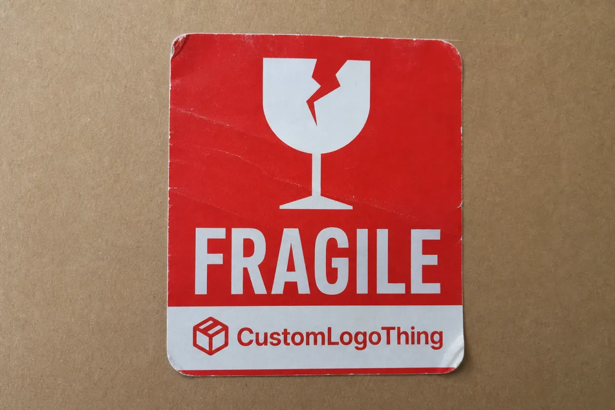
Branded Fragile Stickers for Parcels: What to Know starts with a simple reality: parcels do not get handled with the kind of care people like to imagine. They get stacked, shifted, scanned, scraped, and moved through systems built for speed. That is exactly why branded fragile stickers for parcels matter. They are not just a warning with a logo. Used properly, they combine handling instruction, brand recognition, and fast visual clarity on the box.
From a packaging buyer's point of view, the real question is not whether a fragile sticker looks neat. It is whether it changes what happens in the warehouse, during carrier handoff, and at the doorstep. A good label supports the pack-out, helps protect fragile items, and makes the shipment look deliberate instead of improvised.
Packaging has two jobs, and neither one is optional. It has to survive the trip. It also has to communicate. A generic fragile sticker often does both poorly. A branded version, built with the right size, color, adhesive, and message, can support handling and still match the rest of the packaging system.
A label is not insurance. It is a cue. If it is too small, low contrast, or buried under tape, most of its value is gone before the parcel leaves the bench.
Why Branded Fragile Stickers for Parcels Matter
Picture a busy shipping lane. Boxes move from the packing table to a staging cart, then into a carrier cage, then onto a truck with dozens of other parcels that all look about the same. Nobody is reading a paragraph. The eye catches color, symbol size, shape, and contrast first. A fragile sticker has to win that fight in less than a second.
Branded fragile stickers for parcels do more than warn handlers. They also build memory. A logo, a consistent color system, or a repeated message style tells the buyer something useful: this brand pays attention to the whole order, not only the product inside. That matters more than teams expect. Packaging is often the only physical brand touchpoint that survives the full order cycle.
There is a practical side too. Fragile shipments are the parcels people remember when something goes wrong. A small reduction in preventable damage can matter a lot if the product has thin margins, a high replacement cost, or a returns process that already burns time and money. A $3 breakage avoided on a $25 item is not a rounding error when it happens week after week.
Generic fragile stickers still have a place. They are fast to buy, easy to stock, and they cover the basic warning job. What they do not do is reinforce brand recognition. They also tend to look inconsistent when they come from different suppliers across the year. A buyer who wants the outside of the parcel to match the rest of the packaging usually gets more value from a custom version.
So the better question is this: when does a warning label become a packaging asset? Usually when it does three things at once. It grabs attention, supports handling discipline, and presents the brand with the same care that went into the product inside.
If you want to see how that thinking fits into a broader packaging mix, the related examples in our Case Studies archive show how brands use labels, inserts, and carton presentation together instead of treating them like random separate purchases.
How the Stickers Work in the Shipping Chain
A parcel does not travel in a neat straight line. It passes through different hands and different environments, and each step changes what the sticker has to do. At the packing station, it has to apply cleanly. In the carrier network, it has to stay visible. During last-mile delivery, it has to survive scuffing, vibration, and weather without peeling off like an afterthought.
That is why visibility and adhesion matter so much. A bold red label with a simple icon usually beats a sentence-heavy design in a crowded sortation environment. The message needs to be understood from a few feet away. Large type, high contrast, and a clear warning symbol do more work than decorative detail ever will.
The substrate matters too. Corrugated board gives pressure-sensitive adhesives a friendly surface, but recycled cartons can be less predictable. Poly mailers may need a different adhesive tack than kraft boxes. Textured surfaces, heavy dusting, and low surface energy films can all weaken the bond. If a label starts curling at the edges, the warning looks less credible and gets ignored faster.
There is a useful distinction here. A fragile sticker is a handling cue, not a guarantee. It works best when it sits alongside internal cushioning, carton selection, corner protection, and sensible pack-out. If the item is glass, ceramic, or a delicate electronics component, the outer warning should support the protection system, not pretend to replace it.
Branding can actually improve the warning if it is handled well. That sounds backwards until you see it on a real packing line. When the outer-pack visual language is consistent, workers recognize it faster. A label that clearly belongs to the company packaging system stands out more than a random generic sticker that looks like it came from a drawer full of office leftovers.
For teams that want a broader view of label formats, materials, and application styles, our Custom Labels & Tags page shows related options that can be matched to the same parcel workflow.
Handling-critical parcels are usually qualified with test methods instead of guesswork. ASTM peel and adhesion testing is common in material qualification, and parcel-performance programs often reference ISTA procedures when they want a better picture of how labels, cartons, and contents behave under transport stress. You can review transport-testing basics at ISTA.
Cost, Pricing, MOQ, and Unit Cost
Sticker pricing looks simple until a buyer compares two quotes line by line. The headline number is only part of the story. Size, shape, print complexity, finish, adhesive type, and packaging format all affect the final cost. A 2 x 3 inch one-color label on a roll is a different job from a custom die-cut, full-color label with a matte laminate. They are not even close.
As a broad planning range, many custom fragile labels land somewhere around $0.03-$0.12 per label depending on quantity, stock, and print specification. At 1,000 pieces, the unit cost may look high because setup gets spread over fewer labels. At 5,000 or 10,000 pieces, the price per label usually drops. That is normal. The better question is whether the cheaper sticker also lowers the landed cost.
MOQ can matter more than new buyers expect. A small brand shipping 200 fragile orders per month may not want to commit to a huge run while the artwork or packaging is still shifting. A seasonal seller, though, may benefit from ordering enough stock to cover the full peak period plus a buffer. Running out mid-campaign is almost always more expensive than buying a little extra.
Below is a practical comparison that buyers can use before requesting quotes:
| Option | Typical Use | Approx. Unit Cost | Strengths | Tradeoffs |
|---|---|---|---|---|
| Paper label on roll | Standard corrugated parcels | $0.03-$0.06 at mid volume | Economical, fast application, clean print | Less moisture resistance; can scuff more easily |
| BOPP / film label | Higher abrasion or light moisture exposure | $0.05-$0.12 | Durable, better for handling wear, strong visual finish | Usually higher cost; may be overkill for dry warehouse routes |
| Custom die-cut label | Premium branding or distinctive shapes | $0.06-$0.15+ | Memorable appearance, brand distinction | Setup and tooling can raise cost and lead time |
| Sheeted labels | Low-volume hand packing | $0.04-$0.10 | Easy for small teams, simple storage | Slower application on busy lines |
Hidden costs deserve attention too. Artwork setup, proofing, plate charges for conventional print, special die cutting, split shipments, and rush fees can move the final bill more than the label price itself. Freight matters as well, especially if the labels are being shipped to multiple packing locations. A quote that looks 10% cheaper can end up costing more once freight and reorders are included.
That is why landed cost is the better comparison. It asks one practical question: what does each finished label cost once it reaches the packing station and is ready to use? If you are comparing suppliers, use the same assumptions for quantity, size, finish, and shipping destination so the numbers are actually comparable.
For teams that need packaging materials with different price bands, the label category on our Custom Labels & Tags page can help frame the tradeoff between a basic warning label and a more branded parcel-facing piece.
Brands that care about recycled content or certified paper stock should also ask about FSC chain-of-custody options. If sustainability claims matter on the box or in procurement paperwork, a supplier that can document paper sourcing through FSC can save a lot of back-and-forth later.
Production Steps, Lead Time, and Timeline
A clean production run follows a predictable path. First comes the brief: size, shape, quantity, target surface, shipping environment, and the exact wording. Then the designer prepares artwork. After that, the supplier issues a proof, material is chosen, printing begins, and the order passes through quality check before shipment.
That sounds straightforward, but timing usually slips at the approval stage. Missing logo files, vague color references, low-resolution artwork, and late wording changes all slow the process. A label that says “fragile” one day and “handle with care” the next may look like a tiny tweak. In production terms, it can reset proofing and add days to the schedule. Small change, annoying delay.
Lead time depends on print method. Digital printing is usually better for shorter runs and faster turnaround because setup is lighter. Conventional printing can be more efficient at scale, especially for large repeated orders, but it often takes longer to prepare. Custom shapes, special coatings, and complex die cuts can stretch the schedule even further.
For planning purposes, many buyers should assume something like 7-14 business days after proof approval for standard jobs, with longer windows for custom finishing or larger volumes. If the order is urgent, ask whether rush production changes the proof process or skips sample validation. Sometimes it does. That tradeoff should be understood before the PO goes out.
There is another timeline issue that buyers miss: reorder timing. A fragile sticker is not a one-time display item. It sits in recurring use, so the reorder point should be set before the shelf runs empty. For a busy shipping operation, it is smarter to reorder when stock reaches roughly four weeks of usage, not when the last roll is already hanging by a thread.
Testing should be built into the timeline too. A sample run on actual parcels can reveal issues that no proof file will show. Does the label lift on recycled board? Does the adhesive still grab in the colder pack area? Does the print stay readable under warehouse lighting? That test is cheap compared with discovering a failure after 2,000 units have already shipped.
One practical way to shorten future cycles is to standardize the file package. Keep a locked logo file, approved wording, Pantone references if needed, and a preferred label size on record. The next reorder then becomes a production task instead of a design project, which is how it should be.
Key Factors That Affect Performance and Visibility
If a fragile sticker fails in the field, the cause is usually not mysterious. The problem is often one of five things: poor contrast, weak adhesion, bad placement, abrasion, or the wrong material for the environment. Those are the variables that matter most.
Contrast comes first. Red on white is common because it reads quickly, but high contrast can work in other combinations too. What matters is legibility at distance. A small, decorative label with thin lettering may look polished on a mockup and disappear entirely on a moving carton line.
Message clarity matters just as much. One strong instruction is better than three weak ones. “Fragile” is fast. “Handle with care” is also clear. Long sentences slow the eye. If there is room for both branding and caution, the caution should stay immediately readable.
Adhesive strength depends on the surface. Smooth cartons are easier. Recycled corrugate and textured kraft can be trickier. Poly mailers may need a different tack profile. Cold storage makes the job harder because many pressure-sensitive adhesives bond best when applied above roughly 50-60F (10-15C) and then allowed to dwell. If the application temperature is low, the adhesive may never fully wet out.
Abrasion resistance should be matched to route intensity. A label on a parcel that rides local delivery for a few hours has a different wear profile than a carton that goes through multiple hub transfers. Film-based labels often stand up better to rubbing and moisture, while paper labels can be more economical for dry, low-wear use.
Placement can make or break the result. A label hidden under tape, draped across a seam, or folded over an edge loses authority. The best spot is usually on the most visible face, away from major seams and straps, where scanning, stacking, and human handling are least likely to damage it. A label that can be seen from arm's length is already doing more work than one hiding near a flap fold.
Surface condition matters too. Glossy cartons may give a crisp look, but some adhesives need a clean, dry surface to achieve consistent hold. Recycled material can be more fibrous and less predictable. Chill-sensitive shipments may face condensation. Each of those conditions changes how a sticker behaves over the life of the parcel.
There is also a brand layer to this. Packaging that looks coherent across the carton, inserts, tape, and warning label tends to feel more intentional. That sense of order matters to buyers, and it often matters to customer service teams too, because a consistent pack system is easier to train and easier to audit.
If you need a reference point for packaging qualification, the most useful standards come from transport testing and adhesive performance methods rather than broad general guidance. ASTM peel testing helps with bond evaluation, and ISTA procedures help simulate the shocks and handling that parcels actually see in transit. Those standards do not design the label for you, but they do define what good enough should mean.
Step-by-Step Guide to Choosing and Applying Them
Buying a custom label becomes much easier once the process is broken into steps. Rushing straight to artwork usually leads to a label that looks fine in a proof and underperforms in shipping. That is an annoying way to learn a lesson.
- Audit the parcel mix. List the product types, carton sizes, mailer formats, and damage patterns. If the fragile orders are mostly glass, ceramic, or detailed gift sets, the label strategy should reflect that. If the risk is mostly bending rather than crushing, the wording may need to shift.
- Define the message hierarchy. Decide whether the label should say “fragile,” “handle with care,” “do not bend,” or a branded version of one of those. Keep the instruction short enough to read instantly. The warning should never fight with the brand name for attention.
- Select material and adhesive. Match the stock to the carton finish and shipping route. Smooth corrugated in a dry warehouse can often use standard paper or film. Recycled board, cold storage, or variable surfaces may need a stronger adhesive or a different face stock.
- Request samples. If the parcel surface is unusual, ask for physical samples before the full run. Test them on real boxes, not just on a flat desk sheet. A five-minute trial can save a lot of rework.
- Run a small test batch. Put the labels through realistic handling. Stack the cartons. Move them through a packing lane. Check whether the corners lift after temperature changes or after a few hours in storage.
- Standardize application. Write a simple SOP so every pack station uses the same placement. A label on the top right corner one day and the side seam the next looks inconsistent and can weaken the visual signal.
There is a useful rule of thumb for placement: visible, flat, and repeatable. If the label is competing with tape, straps, or a busy print area, the pack station should change the layout rather than forcing the sticker to do too much.
Teams that want a broader benchmark can compare packaging visuals across different product lines by reviewing our Case Studies. Even if the products differ, the lesson is usually the same: the most effective outer-pack labels are the ones that are easy to read, hard to miss, and consistent from shipment to shipment.
A final practical tip: document the approved label size, Pantone or CMYK targets, adhesive type, and application position in one place. That simple record prevents version drift when staff changes or reorder cycles get busy.
Common Mistakes, Expert Tips, and Next Steps
The most common mistakes are easy to spot once you know what to look for. The first is going too small. A tiny label may fit the box design, but it fails the real test: can someone at the end of a fast-moving conveyor read it without leaning in?
The second mistake is low contrast. Grey text on a pale background may look stylish on screen and disappear in a warehouse. The third is vague wording. If the message is trying to be polite, premium, and urgent all at once, it often becomes weaker than a plain instruction.
Another problem is overuse. If every parcel gets a fragile sticker, handlers quickly stop treating the warning as special. That is not a design issue. It is a behavior issue. A label has more authority when it appears on parcels that actually need the signal.
Skipping real-world testing is the fourth mistake. A proof can tell you whether the logo sits in the right place. It cannot tell you whether the adhesive survives a recycled carton with a rough texture or whether condensation affects the edge bond after cold storage.
Here are a few expert-level habits that improve results:
- Use one clear warning instead of a cluster of smaller instructions.
- Match the label size to the distance it must be read from, not just the box dimensions.
- Choose film or laminated stock if abrasion and moisture are realistic risks.
- Keep label application in the same spot on every parcel to train both staff and carrier partners.
- Track damage claims before and after rollout so the team can measure whether the label is helping.
It also helps to plan inventory around shipping spikes. Seasonal demand can empty label stock faster than expected, especially if the business launches a promotion or adds a fragile product category. A reorder calendar tied to usage is more reliable than one tied to memory.
One more thing buyers should ask for: sample packs. Even if the final order is large, a sample on the exact carton material is worth the extra step. If the supplier is helping with a custom warning format or a branded version of a standard fragile label, sample approval reduces the chance of a costly mismatch.
For many brands, the right next move is to compare two or three quotes on the same spec, request a sample, and test the result on live parcels. That approach is slower than buying the first low-cost option, but it usually produces a sturdier packaging decision.
If you are also reviewing related shipping labels or tags, the custom label range at Custom Labels & Tags can be used to align fragile warnings with the rest of the parcel system so the look and the handling logic stay aligned.
Final thought: the best branded fragile stickers for parcels are the ones that earn attention quickly, stay in place, and fit the way your parcels actually move. The practical move is simple: lock the spec, test it on the real carton, check lead time and landed cost, and only then place the order. That is how packaging teams avoid expensive surprises.
FAQ
Are branded fragile stickers for parcels better than plain fragile labels?
They do the same warning job, but branded versions also strengthen recognition and make shipments look more consistent. They are especially useful for repeat orders, DTC brands, and packaging that needs to feel premium without adding much cost.
What size works best for branded fragile stickers for parcels?
Choose a size that stays readable from a few feet away on a crowded packing line or in a carrier cage. Larger labels help on bigger cartons; smaller labels can work on mailers if the message is short and the contrast is strong. Common formats include 2 x 3 inches, 3 x 4 inches, and 4 x 6 inches.
How long does it take to get branded fragile stickers for parcels made?
Timing depends on proof approval, print method, quantity, and whether the design needs a Custom Die Cut. A standard run often lands in the 7-14 business day range after approval, but artwork revisions and sample testing can add time before production starts.
What affects the price of branded fragile stickers for parcels?
Price changes with quantity, material, adhesive, print colors, finish, and whether the labels are produced on rolls or sheets. Shipping, setup fees, and rush charges can move the real cost more than the label price itself, so landed cost is the better number to compare.
Should every parcel get branded fragile stickers for parcels?
No, use them where the handling risk is real, such as glass, ceramics, cosmetics, electronics, or gift packs with delicate inserts. Overusing fragile labels can train handlers to ignore them, so match the label to the product and the damage risk.

