Buyer Fit Snapshot
| Best fit | Branded Kraft Boxes for Soap projects where brand print, material claims, artwork control, MOQ, and repeat-order consistency need to be specified before quoting. |
|---|---|
| Quote inputs | Share finished size, material target, print colors, finish, packing count, annual reorder estimate, ship-to region, and any compliance wording. |
| Proofing check | Approve dieline scale, logo placement, barcode or warning zones, color tolerance, closure strength, and carton packing before bulk production. |
| Main risk | Vague material claims, crowded artwork, missing packing details, or unclear freight terms can make a low unit price expensive after revisions. |
Fast answer: Branded Kraft Boxes for Soap: Board, Finish, Dieline, and Unit Cost should be specified like a repeatable production item. The safest quote records material, print method, finish, artwork proof, packing count, and reorder notes in one written spec.
Production checks before approval
Compare the actual filled-product size with the drawing, then confirm tolerance on folds, seals, hang holes, label areas, and retail display edges. Reserve space for logos, QR codes, warning copy, and material claims before decorative graphics fill the panel.
Quote comparison points
Review material grade, print process, finish, sampling route, tooling charges, carton quantity, and freight assumptions side by side. A quote is only useful when the supplier can repeat the same color, closure quality, and packing count on the next order.
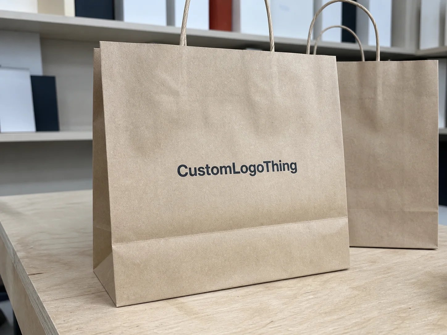
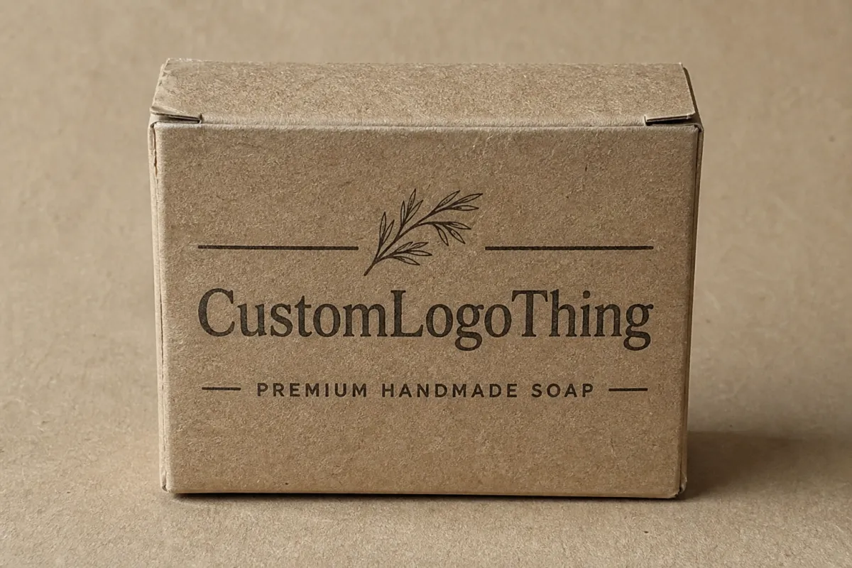
Branded kraft boxes for soap can make a $6 bar look deliberate, clean, and worth the shelf space. That is the whole trick. Kraft already carries a natural, practical signal, so the design does not need to fight the material. It needs control. Enough restraint to look planned, not like someone finished the file between orders.
Soap packaging has a funny job. It has to look handmade without looking flimsy, premium without turning precious, and eco-minded without drifting into sad cardboard territory. Get the structure, Print, and Fit right, and the box starts selling before the customer opens it. Get them wrong, and even a solid formula can read like an afterthought. Brands selling through boutiques, farmers markets, gift sets, and subscription boxes tend to feel that difference fast.
There is also a practical buyer reality that gets overlooked. Retail buyers handle the box differently from direct-to-consumer shoppers. A store owner wants clean shelf presence. A fulfillment team wants cartons that do not crush in transit. A customer wants a box that opens cleanly and does not shed ink onto the bar. Branded kraft boxes for soap have to serve all three, which is why the details matter more than the mood board.
If you want to compare how different formats perform in real packaging programs, the Case Studies page is a useful place to look at actual decisions across product types.
Why Branded Kraft Boxes for Soap Can Outsell Glossy Packaging
Kraft has a trust advantage. Buyers often read the brown, fibrous surface as cleaner, more natural, and less overproduced before they even touch the soap. That matters in categories where the product story carries part of the value. A botanical bar, charcoal bar, oatmeal bar, or cold-process soap does not need a plastic-heavy presentation to feel premium. It needs restraint.
Glossy packaging can work, but it asks for more design discipline. Clutter, weak color balance, or awkward typography gets louder under shine. Kraft hides a few sins. Minor scuffs do not scream. Small handling marks from retail or fulfillment look less like damage and more like the normal life of a product. That helps if your bars move through independent stores, craft fairs, or subscription kits where the packaging gets handled by more than one pair of hands.
Price perception matters too. A plain brown box can feel expensive if the layout is intentional. A centered logo, one strong type family, and one or two accent colors usually look more refined than a crowded full-bleed design. Too many brands try to dress up kraft stock until it stops looking like kraft at all. That is usually the moment the concept loses its charm.
Handmade soap usually sits in a narrow lane between artisanal and retail-ready. The box should suggest craft, but it still needs enough structure to sit on a shelf beside premium bath and body products. That means readable information, a clean silhouette, and a finish choice that supports the brand mood instead of burying it. When the design feels built with intention, customers notice.
Good kraft packaging does not shout. It frames the product, lets texture do some of the work, and leaves enough breathing room for the soap to feel deliberate instead of improvised.
That is why branded kraft boxes for soap often beat fancier-looking cartons in small and mid-size brands. The material already handles part of the branding. The rest of the design should stay out of the way.
How Branded Kraft Boxes for Soap Work: Structure, Print, and Finish
The box structure does quiet work that people ignore until it fails. A tuck-end carton is the usual starting point because it is simple, economical, and easy to assemble. Sleeve-style packaging adds presentation and fits gift sets or wrapped bars well. Window boxes expose the soap and help sell color and texture. Simple wraps and belly bands work for minimal presentation or for bars that already have a strong wrapper label.
Think of the package as a chain of jobs. It has to fit the soap. It has to protect the bar. It has to show the brand. It has to survive production, shipping, retail handling, and the occasional impatient customer. Dielines handle that part. A proper dieline sets panel size, glue area, fold behavior, and whether the box closes cleanly without forcing the carton or leaving too much slack. If the fit is loose, the bar rattles. If it is too tight, corners crush or the board bows. Neither looks good.
Printing on kraft is where many brands either get it right or make a mess. Digital printing is common for short runs because setup is lower and artwork changes are easier. Offset printing makes more sense at higher volumes and usually gives cleaner color consistency across larger orders. The key detail is how ink behaves on kraft stock. Kraft absorbs color differently than white board, so dark shades can flatten and pale tones can disappear unless you use white ink or build the design around the natural brown base.
Finish choices that actually help
Finish should serve the box, not hijack it. A matte aqueous coating is a practical default because it helps with scuff resistance and keeps the surface from feeling too raw. Soft-touch coating creates a smoother feel, though it can slightly mute the natural paper character. Spot UV can highlight a logo or scent name, but only if the layout has enough contrast to earn it. Embossing works well on minimalist kraft layouts because texture can replace some of the visual noise. And yes, sometimes no coating at all is the right call, especially for a small-batch brand that wants an obviously natural look.
Window cut-outs deserve a second look. They can help the soap sell itself, especially if the bar has marbling, botanicals, or an unusual shape. They also reduce protection and can let dust or scent escape more quickly. That is fine for some formulas and a bad choice for others. If the soap has a strong fragrance or the surface picks up marks easily, a window may create more trouble than it solves.
For brands comparing options, here is the short version:
| Format | Best Use | Typical Strength | Tradeoff |
|---|---|---|---|
| Tuck-end carton | Single bars, retail shelves | Low cost, easy to assemble | Less premium than sleeve-style presentation |
| Window box | Bars with strong color or texture | High visual sell-through | Less protection and more dust exposure |
| Sleeve + inner wrap | Gift sets, premium soap lines | Strong unboxing feel | Higher labor and material cost |
| Simple wrap or belly band | Minimalist, low-cost presentations | Very lean material use | Less shelf protection than a full carton |
If you want a practical reference point for packaging durability, the ISTA standards are useful for thinking about vibration, drop risk, and transport abuse. Soap boxes do not need to survive like heavy electronics, but they still need to stay square, closed, and readable after shipping.
Materials and Design Factors That Make or Break the Box
Board choice does far more than most people expect. Kraft cartons for soap are often made from paperboard in the 14 pt to 24 pt range, depending on product weight and the stiffness you want in hand. Lighter bars can work fine in thinner board. Heavier bars, soap with inserts, or multipacks usually need a sturdier stock so the box does not feel flimsy. Recycled content can help sell the story, but it should not weaken print clarity or structure.
The inside of the box matters too. Soap can carry oils, fragrance compounds, or moisture from curing and storage. That means the packaging may need a liner, coating, or barrier treatment to reduce staining or scent loss. This is not always required, but it matters more for high-fragrance bars, luxury ingredients, or products meant to sit on shelf longer. If a formula is especially oily, test for transfer. Kraft shows stains fast, and once that happens, the box can look old before it reaches a customer.
Sizing should start with the finished product, not the soap alone. A wrapped bar is larger than the raw bar. A label adds thickness. A belly band adds friction. A soap tray or insert can change internal clearance by more than expected. If you size only to the mold dimension, the final carton may be too tight, and then every packed unit becomes a small fight with gravity and paperboard. I have seen good packaging fail over three millimeters. That is not dramatic. It is just annoying, and expensive.
Design hierarchy for soap boxes
Front panel space is limited, so hierarchy matters. The customer needs the brand name, the scent or product name, and a fast cue about the formula. After that, you can add ingredients, weight, usage notes, bar type, and required copy. If everything competes for attention, nothing feels premium. The front should answer one simple question: what is this, and why should I care?
In practice, the strongest kraft soap packaging usually uses a compact system:
- Logo near the top or center, not buried in a corner
- Scent name large enough to read from shelf distance
- One accent color to distinguish variants
- Ingredient or benefit copy kept on the secondary panels
- Compliance details placed where they do not fight the layout
Color strategy matters a lot on kraft stock. Muted earth tones, black, cream, sage, deep green, terracotta, and one clean accent shade usually outperform muddy multicolor graphics. Full-bleed dark coverage can work, but it often pushes the brand away from the natural story kraft suggests. White ink is a strong tool here. It creates contrast without forcing the whole design onto a heavy painted layer.
Typography should be chosen for clarity first and personality second. Serif fonts can make soap feel botanical or heritage-driven. Sans serif fonts often read as cleaner and more modern. Either can work. What does not work is trying to use three typefaces, six weights, and a decorative script because the software made it available. Kraft already has texture. It does not need a typography circus.
For brands that want recycled or responsibly sourced material, look for FSC-certified board and ask for proof of chain of custody where relevant. The FSC system helps buyers compare sourcing claims more credibly than vague green language ever will. That matters if your customer base cares about packaging waste and material origin.
Cost, Pricing, and MOQ: What Affects the Quote
Quotes for branded kraft boxes for soap vary because the box is a bundle of decisions, not a single item. Size, board grade, print coverage, number of colors, coating, window cut-outs, and finishing all change the final price. Ask for a box with a custom dieline, two-sided printing, matte coating, white ink, and a die-cut window, and you have a very different order from a plain one-color tuck carton.
MOQ, or minimum order quantity, tends to annoy buyers. Small runs usually cost more per unit because setup costs get spread across fewer boxes. That is not a trick. It is math. Plate setup, die cutting, proofing, and color matching do not get cheaper because the order is small. They just get divided across fewer pieces.
Here is a realistic pricing pattern for basic custom soap cartons. These are broad ranges, not promises, because supplier location, material choice, and shipping can swing the numbers:
| Order Size | Simple Kraft Tuck Box | Window or Finish-Heavy Box | Notes |
|---|---|---|---|
| 500 units | $0.55-$1.20 each | $0.85-$1.60 each | Setup costs weigh heavily on small runs |
| 1,000 units | $0.28-$0.75 each | $0.45-$1.05 each | Often the first volume where costs feel reasonable |
| 3,000 units | $0.18-$0.48 each | $0.32-$0.88 each | Better unit economics, but storage becomes more important |
Those numbers can move fast if you add embossing, foil, thicker board, specialty coatings, or more complex die cutting. They can also improve if the supplier already has the right material in stock and the order stays simple. Shipping is another piece people underrate. A low unit cost can stop looking clever once freight, duties, and warehouse space are added back in.
There is a trap in chasing the lowest unit price. A cheap quote can hide weak board, rough cutting accuracy, inconsistent printing, or a longer timeline that misses your launch date. Saving five cents on a carton means nothing if the packaging makes the soap look generic or arrives late enough to delay retail placement. Buy the box that supports margin and brand perception together. Not the one that only looks good in a spreadsheet.
A useful quoting strategy is to compare the same exact spec at 500, 1,000, and 3,000 units. Keep the size, stock, print count, and finish identical. That shows you where the breakpoints sit. If the jump from 1,000 to 3,000 units barely changes the unit price, then extra inventory may not be worth the cash tied up. If the drop is meaningful, you can decide whether storage space and cash flow justify the larger run.
Production Steps and Timeline for Branded Kraft Soap Boxes
The production path is straightforward enough, provided the buyer gives clean information. It starts with a brief, then a quote, then a dieline, then artwork prep, proofing, sampling, production, finishing, and shipping. Each step can move quickly or stall completely. The usual delay is not the machine. It is the file.
Artwork issues cause more trouble than most brands expect. Text sits too close to the fold. A barcode lands on a curved or glued edge. Bleed is missing. The design uses colors that do not translate well on kraft board. If the supplier has to keep sending revised proofs, lead time stretches. If a physical sample is needed, add even more time because the sample has to be made, shipped, reviewed, and approved before the full run starts.
Simple digital-print cartons can often turn around in about 12 to 18 business days after proof approval, assuming the supplier has the board and finishing requirements ready. More complex runs with windows, embossing, foil, or heavier print coordination can move into the 18 to 30 business day range, and that is before shipping. Seasonal demand, queue length, and freight method can change everything. A supplier may quote a fast production window and still miss your launch if you forgot to leave time for sample approval.
Where lead time gets lost
Lead time usually slips in one of five places:
- Spec changes after the quote, which force a new dieline or new setup
- Artwork corrections, especially with small text, barcodes, or ingredient panels
- Sample revisions, which add a full round trip before approval
- Material sourcing, if the exact board or coating is not in stock
- Shipping delays, especially when the order passes through multiple handoffs
For Brands That Ship regularly, planning matters more than decoration. Soap launches tend to move on tight windows. A delay of a week or two can mean a missed retail reset, a delayed subscription send, or a gap in production inventory. Packaging is not the only thing that can hurt a launch, but it is one of the easiest variables to control if you respect the timeline early.
One more practical point: if your soap uses seasonal artwork or scent-specific panels, lock the core structure first and change only the variable elements. That keeps the dieline stable, reduces reproofing, and makes reorder planning less chaotic. Flexible systems age better than one-off packaging miracles.
Common Mistakes When Ordering Soap Packaging
The first mistake is sizing by mockup alone. A box can look great on screen and still fail in the hand. The bar slides inside. The lid buckles. The carton crushes because the board is too light for the actual weight. Soap buyers notice that right away. They do not need packaging jargon to tell that something feels off.
The second mistake is using too much ink on kraft. Heavy dark coverage can make the box feel muddy, especially if the artwork is busy or the colors were picked for white stock and never adjusted for brown paperboard. Kraft is not the right surface for every concept. If a design depends on bright neon gradients or photo-heavy art, the material can work against the goal.
Another common problem is ignoring oil transfer, fragrance bleed, and humidity. Soap is not inert like a sealed plastic trinket. Some bars keep curing, some hold more moisture than expected, and some scents can migrate into the board over time. That means stain testing matters. A box that looks fine on day one can look tired after a few weeks on shelf. If your packaging has to survive hot transport, humid storage, or long retail dwell time, test for it instead of assuming the board will behave.
Compliance mistakes are especially irritating because they are easy to avoid. Brands sometimes leave too little room for ingredients, net weight, caution statements, distributor information, or barcode placement. Others use claims that are visually attractive but legally fuzzy. If the box is meant for regulated retail channels, the layout should leave space for the copy that the channel actually requires. Design that ignores compliance often gets redesigned at the last minute, which is the expensive way to learn the lesson.
The biggest process mistake is approving packaging from a screen alone. Digital mockups help, but they do not tell you how the board feels, how the print reads on kraft, or whether the closure behaves properly. A physical sample is cheap insurance. If the sample looks wrong, the full run will usually look wrong faster and at greater scale. Skipping that step to save a few days is the sort of decision that creates a pile of unusable boxes and a lot of regret.
Order one real sample before you commit. Screens flatter everything. Paperboard does not.
Expert Tips and Next Steps for Branded Kraft Boxes for Soap
The cleanest soap packaging systems are rarely the busiest ones. One hero color, one type family, and one tactile detail do more work than a front panel stuffed with icons and copy. If the brand is botanical, lean into natural textures and restrained print. If the brand is modern, keep the layout sharp and use contrast to create structure. Either way, resist the urge to decorate every inch of cardboard. The box is not trying to win an art contest. It is trying to sell a bar.
A smart buying habit is to request unprinted and printed samples side by side. That comparison makes the effect of ink, coating, and stock choice obvious. On kraft, small differences matter. A matte coating can deepen the tone a bit. White ink can save a pale logo from disappearing. A richer brown stock can look more premium than a lighter, rougher one. The only honest way to judge those differences is to see them in person.
Before asking for quotes, build a simple spec sheet. It Should Include:
- Finished box size
- Soap dimensions with wrapper or label included
- Board type and thickness
- Print count and color list
- Finish or coating choice
- Quantity target
- Budget range
- Timeline needed for launch
That little list saves a lot of back-and-forth. It also makes it easier to compare suppliers on equal terms instead of comparing one quote for a plain box against another for a more finished version. Buyers get misled by low starting prices all the time because the specs were never matched. Same product. Same paper. Same finish. That is the only fair comparison.
Test the box with real soap bars, not paper dummies. Actual bars vary in weight, surface texture, scent, and coating. A soap that looks identical in a sample cutout can feel heavier in the box and shift differently once wrapped. If your formula has a fragrance-heavy profile, watch for odor transfer. If the packaging sits in a warm retail space, look for curl, staining, or softened corners. Real conditions beat assumptions every time.
For brands building a larger packaging system, it helps to think beyond one SKU. The same design logic can carry into gift sets, sleeve packs, subscription bundles, and retail shipper cartons. That is where the Custom Packaging Products page becomes useful, because the best packaging programs usually share a material and visual language across formats rather than reinventing each box from scratch.
Here is the practical next move: compare two or three quotes for branded kraft boxes for soap, make sure the spec is identical, request a physical sample, and choose the version that fits the product, timeline, and margin. Not the prettiest mockup. Not the cheapest line item. The version that will still look good after shipping, shelf time, and a few hands touching it.
If you want one final filter, use this: does the box protect the soap, present the brand clearly, and survive the way your customers actually buy and store it? If the answer is no on any one of those, keep refining the spec before you place the order. Packaging is supposed to make the product easier to sell, not create a new problem.
What size should branded kraft boxes for soap be?
Start with the wrapped soap dimensions, then add just enough clearance for inserts, labels, or belly bands. Ask for a dieline based on the finished product, not a generic stock size, so the bar does not shift or crush.
Are branded kraft boxes for soap good for oily or scented bars?
Yes, but the board and finish need to match the formula. For oily or high-fragrance bars, ask about barrier options, liners, or coatings that reduce staining and scent loss.
What finish works best on kraft soap boxes?
Simple finishes usually win: matte coating, selective spot UV, embossing, or white ink where needed. Avoid overloading kraft with heavy dark coverage unless the brand wants a deliberately bold, less natural look.
How much do branded kraft boxes for soap cost?
Cost depends on size, board thickness, print coverage, finish, and quantity. The unit price usually drops as volume rises, but tooling, samples, and shipping still affect the total.
How long does production take for kraft soap packaging?
Simple runs can move quickly once artwork is approved, while special finishes and windows take longer. Build in time for proofing, sample approval, and shipping so the packaging does not hold up the launch.