Buyer Fit Snapshot
| Best fit | Branded Kraft Inserts with Logo projects where brand print, material claims, artwork control, MOQ, and repeat-order consistency need to be specified before quoting. |
|---|---|
| Quote inputs | Share finished size, material target, print colors, finish, packing count, annual reorder estimate, ship-to region, and any compliance wording. |
| Proofing check | Approve dieline scale, logo placement, barcode or warning zones, color tolerance, closure strength, and carton packing before bulk production. |
| Main risk | Vague material claims, crowded artwork, missing packing details, or unclear freight terms can make a low unit price expensive after revisions. |
Fast answer: Branded Kraft Inserts with Logo: Cost, Process, Design should be specified like a repeatable production item. The safest quote records material, print method, finish, artwork proof, packing count, and reorder notes in one written spec.
Production checks before approval
Compare the actual filled-product size with the drawing, then confirm tolerance on folds, seals, hang holes, label areas, and retail display edges. Reserve space for logos, QR codes, warning copy, and material claims before decorative graphics fill the panel.
Quote comparison points
Review material grade, print process, finish, sampling route, tooling charges, carton quantity, and freight assumptions side by side. A quote is only useful when the supplier can repeat the same color, closure quality, and packing count on the next order.
Custom Logo Things
Branded Kraft Inserts with Logo: Cost, Process, Design
Branded kraft inserts with logo do more than keep a product from sliding around in transit. A well-cut insert gives the box structure, places the logo at the first visual touch point, and makes even a simple mailer feel considered the moment the customer lifts the lid.
Why branded kraft inserts with logo punch above their weight
A plain mailer opens, the product sits still, and the first thing the customer notices is a tidy kraft insert holding everything in place with the logo landing exactly where the eye naturally goes. That small moment carries more weight than its material cost suggests, which is why branded kraft inserts with logo often feel more premium than a buyer expects from a sheet of brown board.
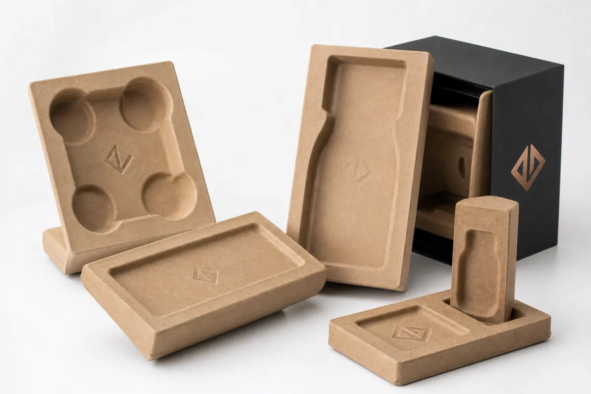
An insert is a shaped kraft component that cradles, separates, or positions a product inside a box, sleeve, or mailer. It can be die-cut, scored, folded, slotted, or built from layered boards, and the structural job usually comes before the branding job. Movement control matters first. The logo follows that structure, and branded kraft inserts with logo work so well because they are built from that order.
Kraft has a natural, direct look that does not need much decoration. A one-color print often reads crisply on brown stock, and the material supports a restrained visual language that many buyers now associate with lower-waste packaging and thoughtful production. That does not force every kraft insert to look rustic or unfinished. It means branded kraft inserts with logo can suggest care, order, and restraint without turning loud.
These inserts appear in ecommerce kits, cosmetics, candles, apparel accessories, subscription boxes, gift sets, and small electronics. The assignment stays similar from category to category: stabilize the product, present it cleanly, and give the brand a strong visual moment before the customer touches the item. Branded kraft inserts with logo are useful because they carry both jobs at once. They are part of the product experience, not empty space that got dressed up later.
What most people get wrong is treating the insert like decoration after the fact. The strongest branded kraft inserts with logo balance protection, presentation, and production reality. If one of those falls apart, the package starts to feel careless even when the outer carton looks polished in a mockup.
The best teams begin with the product, then build the insert around it. The logo matters, but it matters most when the insert already fits, holds, and guides the unboxing sequence in a way that feels calm and deliberate.
I have seen a two-millimeter label buildup turn a supposedly perfect insert into a lid that needed extra pressure to close, and that kind of miss is exactly why fit should be checked on the actual item, not just the drawing. On paper, a layout can look tidy; on the bench, it has to work.
How branded kraft inserts with logo work inside the package
The mechanics are straightforward. A kraft insert creates friction, shape support, and separation so the product does not shift, rub, or collide during shipping. That might look like a snug cradle for a bottle, a pocket for a candle jar, a set of slots for accessories, or a partition that keeps multiple pieces from touching. Branded kraft inserts with logo earn their keep by making the package behave better in transit.
Several common structures solve different problems. A tray works well when a product needs a flat base and some side restraint. A sleeve can guide a long, narrow item. Folding cradles suit bottles and jars, while partitions help when two or more items need to stay apart. Layered boards can add stiffness without making the package bulky, and small tabs or locks can keep the insert from springing open during packing. The strongest branded kraft inserts with logo come from the product geometry, not from how the render looks on a screen.
Logo placement can stay restrained. One-color flexographic print, digital print, a stamped mark, or a small inside-panel print often does more than heavy coverage. Some brands want the logo to appear only after the outer wrap comes off. Others want the mark right on the top face so the insert becomes part of the reveal. Either route can work, and branded kraft inserts with logo should feel integrated rather than pasted on at the end.
The insert also needs to work with the outer package. A tight mailer, a folding carton, and a rigid gift box create different packing behaviors. If the insert is too thick, the carton can bow. If the insert is too loose, the product shifts and the unboxing feels weak. Branded kraft inserts with logo need to respect the full system: product orientation, box depth, closure style, and the way the packing team loads items on the line.
Material choice changes the result more than many buyers expect. Kraft paperboard is usually lighter and cleaner for presentation work. Corrugated kraft brings more crush resistance and suits heavier items or longer shipping routes. Recycled boards in a heavier caliper can sit between those two options, giving a sturdier feel without the bulk of full corrugation. Each material folds differently, holds creases differently, and responds differently to humidity and compression.
A useful way to think about branded kraft inserts with logo is simple: the branding only convinces when the structure is already doing its job. Once the product locks into place, the customer sees less damage, less void fill, and a smoother opening sequence. The logo lands because the insert did the hard work first.
That is also why the layout should be checked from the packer's point of view, not just from the art director's. If a fold has to be finessed every time, or a tab catches on gloved hands, the design is asking too much. The smartest insert designs feel almost boring in production, and that is a compliment.
Branded kraft inserts with logo: cost, pricing, and MOQ
The cost picture usually starts with a useful correction: the cheapest-looking insert is not always the cheapest package once tooling, waste, assembly time, and replacement damage are counted. Branded kraft inserts with logo can look simple from the outside, yet the price changes fast when the structure shifts from a basic one-piece fold to a multi-part fit-up with tighter tolerances.
The main cost drivers are easy to name and easy to underestimate. Board thickness changes material usage and cutting pressure. Print coverage affects ink and press time. Die complexity affects tooling and setup. A layout with many cutouts, tabs, or nested layers takes longer to make and may waste more of the sheet. Finish matters too. A plain printed kraft insert usually costs less than one with special coatings, embossing, or extra glued parts. Manual assembly adds labor, and labor belongs in the real price, not just the unit quote.
MOQ changes by production method. Short digital runs can suit samples, pilots, or seasonal runs, while custom tooling and setup fees usually make larger quantities more efficient. In many programs, the price curve starts making more sense around 1,000 pieces, then improves again at 3,000 to 5,000, especially when the layout nests well on the sheet and trims waste. Branded kraft inserts with logo can stay cost-aware, but only if the structure is planned with volume in mind.
A clean way to compare options is to look at both unit cost and total program cost. Design time, prototype samples, freight, assembly labor, and storage all belong in the conversation. A low unit price that needs a lot of hand assembly can end up costing more than a slightly higher-cost insert that loads quickly and packs cleanly. That is one reason branded kraft inserts with logo should be quoted with the actual packing workflow included.
For real purchasing decisions, ask for an estimate that shows whether the price includes tooling, a proof sample, and production-ready folding or gluing. If a quote leaves those items vague, the number can be a little misleading. That is not a moral failing of the supplier; it just means the scope is incomplete and needs to be pinned down before anyone compares figures.
| Insert Type | Typical Unit Cost | Setup / Tooling | Best Fit | Notes |
|---|---|---|---|---|
| Simple one-piece kraft insert, one-color print | $0.18-$0.35 at 5,000 pcs | $250-$600 | Light products, mailers, accessory kits | Best when the product shape is consistent and the logo is restrained |
| Die-cut folding kraft insert, two-color print | $0.28-$0.55 at 5,000 pcs | $400-$900 | Cosmetics, candles, gift sets | Good balance of structure and branding for branded kraft inserts with logo |
| Corrugated kraft tray or cradle | $0.45-$0.90 at 5,000 pcs | $600-$1,200 | Heavier items, better crush resistance | More material, but often better damage control in transit |
| Multi-part insert with layered board and special finishing | $0.60-$1.20+ at 5,000 pcs | $900-$2,000+ | Premium sets, presentation packaging | Higher cost, but strong visual impact for branded kraft inserts with logo |
Those numbers are illustrative, not a universal rate card. Board grade, print area, and packing labor can move them in either direction. Even so, they give buyers a practical frame. If a supplier quotes branded kraft inserts with logo at a price that feels unusually low, ask what is not included. Tooling, samples, freight, and assembly are common blind spots. Waste from a poor nesting layout is another one.
Quantity breaks help too. Ask for pricing at 1,000, 3,000, 5,000, and 10,000 units. That shows where the cost drops and whether the savings justify carrying more inventory. In some programs, simplifying the structure saves more than chasing a lower print price. A tighter fold, one fewer cutout, or a better nesting pattern can trim enough material to make branded kraft inserts with logo more economical without changing the visual identity.
There is also a hidden cost in over-specifying the insert. If the product only needs a modest cradle, do not ask the board to behave like molded pulp or foam. Kraft does not have to do everything; it just has to do the right things cleanly. Keeping the structure honest usually saves money and avoids that slightly overworked look that nobody really wants.
Branded kraft inserts with logo: process, timeline, and lead time
The process should start with a real brief, not a rough guess. Gather product dimensions, weight, quantity per set, fragile areas, accessory count, and the inside dimensions of the box or mailer. If the insert needs to show a logo at a specific moment, say that directly. Branded kraft inserts with logo are much easier to engineer well when the team knows whether the insert needs to hold, reveal, or separate each component.
After the brief comes structural work. A dieline is created or refined, then checked for folds, tabs, tolerances, and product clearance. That is the stage where the packaging team decides whether the insert should be a single folded piece, a multi-part construction, or a heavier board with slots and partitions. If the structure is wrong there, printing will not fix it later. That lesson comes up often on production jobs involving branded kraft inserts with logo.
The prototype step makes the details real. A sample, short run, or mock-up should be tested with the actual product, the actual carton, and ideally the actual packing team. A design can look perfect on paper and still pinch a bottle shoulder, leave a headphone accessory loose, or make the lid close with too much pressure. A solid sample review catches those problems before the full run. See a few practical packaging approaches in our Case Studies library if you want to compare how different structures behave once they are packed.
Production usually follows a clear sequence: printing, die-cutting, creasing, folding, and sometimes gluing. Some inserts ship flat for final assembly on site; others are built and packed ready to use. The exact flow depends on volume, labor, and how much handling the pack-out team can absorb. With branded kraft inserts with logo, the goal is not just a clean visual result. It is a smooth line process that does not slow fulfillment.
Lead time depends on revision count, approval speed, material availability, print method, and shipping distance. Simple digital jobs can move in roughly 8-15 business days after proof approval, while more complex multi-piece structures often need 15-25 business days or longer if samples need another round. Seasonal demand can stretch those timelines. If the insert has to launch with a product release, build in enough time for testing.
One practical habit helps a lot: treat the insert schedule as part of the product launch schedule, not a separate packaging task. That keeps approvals from getting rushed and lowers the chance of accepting a close-enough fit. Branded kraft inserts with logo usually improve when there is room for one round of correction before the final run.
And if you are working with multiple SKU sizes, keep the timing grouped by structural family rather than by artwork alone. That keeps the team from approving three visually similar inserts that behave differently in production, which is a pain nobody needs right before launch.
Key factors that decide fit, performance, and sustainability
The product itself drives the structure. Weight, fragility, surface finish, and accessory count all change the shape of the insert. A matte glass bottle behaves differently from a printed cosmetic jar. A candle in a metal tin behaves differently from a ceramic vessel. If the item has cables, cards, or literature, the insert needs pockets or separation points so those extras do not wander around in the box. Branded kraft inserts with logo only work well when the insert geometry follows product reality.
Tolerance matters more than many buyers expect. A nominal product size is useful, but the actual packed size can shift once labels, sleeves, adhesive thickness, or shrink wrap are added. Carton variation also shows up from one production run to the next. That means the insert cannot be designed around a single perfect measurement. It needs a small but deliberate allowance. The strongest branded kraft inserts with logo feel snug without forcing the product into a stressed position.
Sustainability claims should be grounded in the materials, not just the story. Recycled content, FSC options, water-based inks, and the avoidance of plastic lamination can support a cleaner packaging profile. If the board is plain kraft and the print is simple, recycling is usually easier than with mixed-material constructions. For a useful reference point on forestry certification, see the standards information at FSC. For shipping and transit testing practices that help confirm performance, ISTA is a solid authority to review. Those references do not replace testing, but they help anchor the discussion in real standards.
Branding choices can either support the sustainable brief or complicate it. Oversized logos, too many colors, dark flood coverage, or heavy coatings can make an insert feel less natural and sometimes harder to recover. A restrained mark on the top face or an inside panel often looks better and ages better in the box. In practice, branded kraft inserts with logo usually read more premium when they are disciplined rather than loud.
Shipping conditions matter as well. Humidity can soften fibers. Vibration can loosen weak folds. Stacking pressure can crush low-caliper board. Temperature swings can change how adhesives behave. These are ordinary realities of shipping, not edge cases. If the product travels far or sits in storage, the insert needs enough stiffness and crease quality to hold up under that stress.
Production compatibility is the last piece that gets missed more often than it should. A clever insert is not very useful if the fulfillment team has to wrestle with it for 20 seconds per pack. The design should be simple enough to load by hand or by light automation without slowing the line. That is another reason branded kraft inserts with logo should be checked against the actual packing workflow, not only against the render.
Common mistakes when ordering branded kraft inserts with logo
The first mistake is measuring one sample and assuming every future unit will match it perfectly. Real products vary. So do cartons. So does wrapping, especially if tissue, foam, or an inner sleeve enters the equation. A fit that looks perfect on one sample can turn loose or tight once production tolerance shows up. Branded kraft inserts with logo need a sensible allowance, not a zero-margin guess.
The second mistake is designing for appearance before structure. That usually leads to inserts that look polished in a mockup and fail in transit. A product can sit beautifully in a rendering and still shift when the box gets shaken, tipped, or stacked. If the insert does not hold the product at three practical points of contact, the visual polish will not last long. Good branded kraft inserts with logo start with retention, then move to presentation.
The third mistake is choosing the lowest quote without comparing the full package. Some prices leave out tooling, sample revisions, freight, or assembly labor. Others assume a simpler print method than the buyer actually needs. The result is a quote that looks attractive right up until the hidden costs appear. Ask for the full picture and compare apples to apples. That matters especially for branded kraft inserts with logo, where setup and fit work can matter as much as the board itself.
Another common issue is overprinting. A kraft insert can take branding well, but it does not need to carry every message the brand has ever written. Too many colors, too much ink coverage, or an overly glossy finish can make the piece feel heavier and less recyclable. The package can lose the calm, natural feeling that made kraft a smart choice in the first place. A clean logo, a small line of copy, and one deliberate placement often do more for branded kraft inserts with logo than a crowded design ever will.
A good insert should do three jobs at once: hold the product, guide the hand, and make the brand feel intentional without getting in the way.
The final mistake is skipping a sample test with the real product, the real carton, and the real packing team. Drawings help. Dielines help. Neither one shows exactly how the insert behaves under pressure on the line. Small problems reveal themselves there, such as a tab that slows assembly, a pocket that is too shallow for an accessory, or a logo position that disappears once the product is loaded. Branded kraft inserts with logo should always be validated in the conditions they will actually face.
Once those mistakes are avoided, the insert starts to feel like part of the package instead of an added expense. That shift matters. The customer does not see manufacturing shortcuts or quote comparisons. They notice whether the product arrives neat, secure, and easy to open.
And honestly, that is the real test. If the insert saves time on the packing table, keeps the product stable in transit, and still looks good when the lid comes off, the design is doing its job without making a fuss about it.
Expert tips and next steps for branded kraft inserts with logo
Start with the product journey. Ask how the box opens, what the customer sees first, and where the insert should create the strongest impression. If the top face of the insert is visible the moment the lid lifts, branded kraft inserts with logo can do a quiet but real amount of work there. If the insert sits deeper in the package, the logo may be better placed on an inside flap or a reveal panel instead.
Send a complete brief. Include product dimensions, weight, fragile areas, quantity per set, accessory count, and whether anything should be visible or hidden at unpacking. If you have a target cost per unit, share it early so the design stays practical. If the insert needs to work in a fulfillment environment with short pack times, say that too. Branded kraft inserts with logo are easier to get right when production reality is part of the brief from day one.
Ask for a dieline and a physical sample before committing to volume, especially if the insert uses precision folds, tabs, or a specific logo placement. A sample makes tolerances visible in a way a drawing never can. It also lets the pack team check how quickly the insert loads and whether the product settles in the right place. If the insert sits inside a broader packaging refresh, compare the sample against other structures in the Case Studies section to see how different design choices perform in practice.
Keep the brand rules simple. One strong logo position is often enough. A restrained ink palette usually looks more considered than a busy one. A surface finish that matches the recycled look often reads better than a finish that tries to fight it. Branded kraft inserts with logo work best when they feel like an extension of the product story, not a separate graphic exercise.
Run a pilot with the people who will actually pack the order. That is where you find out whether the insert nests efficiently, whether the folds are obvious, and whether the presentation still looks sharp after a few dozen hand-packed units. If the pilot works, scale-up feels much less stressful. If it does not, there is still time to correct the issue before larger production starts.
From a practical packaging buyer’s point of view, the smartest path stays simple: gather specs, request a quote, approve a sample, and launch only after fit and finish are proven. If you need a concrete checklist, start with internal box dimensions, actual product samples, expected annual quantity, and the exact logo placement you want. That short list usually prevents a revision cycle, which saves time and keeps branded kraft inserts with logo from turning into a guessing game. Treat branded kraft inserts with logo as both a structural component and a brand touch point, and the result usually feels worth the effort.
FAQ
What materials work best for branded kraft inserts with logo?
Recycled kraft paperboard works well for lighter products and for clean presentation inside mailers and cartons. Heavier corrugated kraft is a better choice when the insert needs more crush resistance or has to support a heavier item in transit. If sustainability matters, ask whether the board includes recycled content or FSC options before you approve the build.
How much do branded kraft inserts with logo usually cost?
Price depends on board thickness, print coverage, die complexity, assembly time, and order quantity. A simple one-piece insert can land in a very different range than a multi-part tray with several folds and a tighter fit. Prototype and tooling costs may sit outside the unit quote, so always ask for a full breakdown and compare pricing at multiple volume breaks.
What is the typical lead time for branded kraft inserts with logo?
Lead time usually includes dieline development, sampling, approval, production, and shipping. Straightforward digital jobs can move faster than complex multi-piece inserts that need custom tooling or a second sample round. If the insert must launch with a product release or holiday pack, build in extra time so the sample stage does not become the bottleneck.
Can branded kraft inserts with logo be recycled?
Often yes, if the insert is made from plain kraft board and printed with compatible inks. Plastic lamination, heavy coatings, or mixed-material construction can make recycling harder or less consistent across regions. Always check local recycling rules, because acceptance varies by municipality and by how the paper stream is sorted.
How do I make sure branded kraft inserts with logo fit my product correctly?
Provide exact product dimensions, weight, and any fragile areas or accessories. Ask for a sample or prototype and test it with the actual box and the actual packing team, not just a drawing. Real-world tolerance matters, so build around the variation you will see on the line instead of relying on nominal measurements alone.


