Buyer Fit Snapshot
| Best fit | Branded Kraft Shipping Labels projects where brand print, material claims, artwork control, MOQ, and repeat-order consistency need to be specified before quoting. |
|---|---|
| Quote inputs | Share finished size, material target, print colors, finish, packing count, annual reorder estimate, ship-to region, and any compliance wording. |
| Proofing check | Approve dieline scale, logo placement, barcode or warning zones, color tolerance, closure strength, and carton packing before bulk production. |
| Main risk | Vague material claims, crowded artwork, missing packing details, or unclear freight terms can make a low unit price expensive after revisions. |
Fast answer: Branded Kraft Shipping Labels: Design, Cost, and Use should be specified like a repeatable production item. The safest quote records material, print method, finish, artwork proof, packing count, and reorder notes in one written spec.
Production checks before approval
Compare the actual filled-product size with the drawing, then confirm tolerance on folds, seals, hang holes, label areas, and retail display edges. Reserve space for logos, QR codes, warning copy, and material claims before decorative graphics fill the panel.
Quote comparison points
Review material grade, print process, finish, sampling route, tooling charges, carton quantity, and freight assumptions side by side. A quote is only useful when the supplier can repeat the same color, closure quality, and packing count on the next order.
Branded Kraft Shipping Labels: Design, Cost, and Real-World Use
Branded kraft shipping labels do something a plain white label rarely manages: they make a shipment feel intentional the moment it reaches a dock, a packing bench, or a front porch. That first touch matters more than a lot of teams admit, because the label is often the first branded surface a customer handles after the box itself.
For packaging buyers, the real question is not whether branded kraft shipping labels look attractive in a mockup. The real question is whether they stay readable, hold up through order fulfillment, and keep unit costs under control once they meet actual carton surfaces, dusty board, and the kind of handling that happens when a shipping floor is moving fast and nobody has time for second guesses.
"If the label looks premium but fails after the box leaves the pack station, the branding never really shipped."
That is why the strongest branded kraft shipping labels live at the point where design meets operations. They need the right face stock, the right adhesive, and enough print contrast to survive warehouse light. They also need to work with ecommerce shipping realities such as recycled corrugated, stacked pallets, barcode scans, and the pressure that comes with oversized cartons, freight rules, and the occasional rushed packout that nobody wants to talk about later.
What Branded Kraft Shipping Labels Are and Why They Stand Out
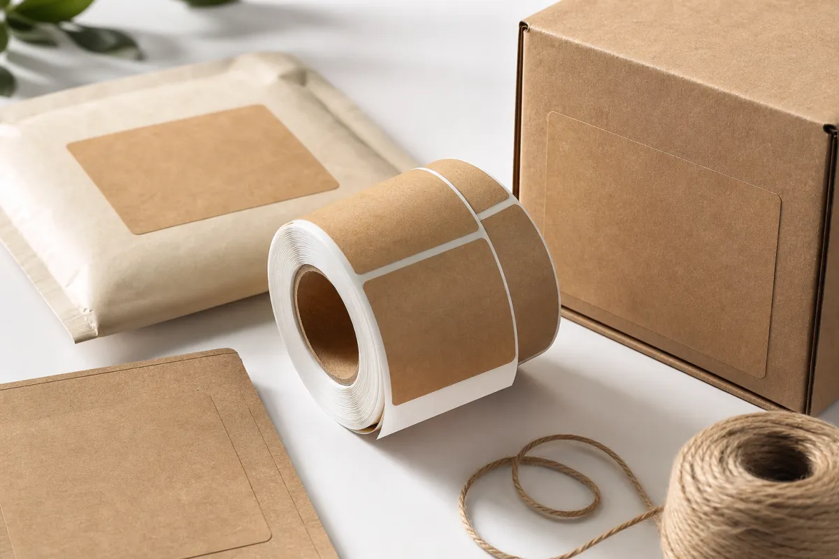
Branded kraft shipping labels are custom-printed labels designed to pair with kraft-colored packaging while carrying shipping data and brand details. That can include a logo, a wordmark, a tracking barcode, handling icons, return instructions, or a short line of copy that reinforces the brand without crowding the label.
The appeal is visual, but it is not only visual. Kraft packaging already signals restraint, reuse, and a less glossy presentation than a retail carton with a coated finish. When the label speaks the same language, the whole shipment feels coordinated. A bright white label on a brown box may work just fine in a logistics sense, yet it can still look like it was added at the last minute.
There is a practical side too. Minor scuffs and handling marks are less obvious on kraft-toned surfaces than on bright white or high-gloss substrates. That does not make the carton tougher, but it does help the package look cleaner as it moves through the last mile, which matters because customers judge the package long before they judge the product.
From a packaging buyer's point of view, the strongest case for branded kraft shipping labels is simple: they do two jobs at once. They guide the parcel through the warehouse and carrier network, and they shape the first impression at delivery. A square inch of label space can carry more value than a long brand presentation if the hierarchy is clean.
Many teams try to make the label do too much. They pack every brand asset into a small surface and end up with clutter that is hard to scan and hard to read. A cleaner layout, a stronger logo, and a few high-contrast fields usually perform better than a crowded design, especially on compact shipping labels used in fulfillment. I have seen more than one rollout stall because the team loved the artwork and hated the scan results.
Another point worth keeping in mind: branded kraft shipping labels are not limited to direct-to-consumer cartons. They also show up on poly mailers, inner cartons, subscription shipments, sample kits, and return-ready packaging. If the package belongs to the customer journey, the label belongs to the story. Teams that invest in Custom Labels & Tags often find that consistency shows up across every shipping touchpoint.
For brands that make sourcing claims, kraft can fit naturally with responsibly sourced fiber narratives, but those claims should be documented rather than guessed at. If a supplier references FSC chain-of-custody or another verified sourcing framework, great; if not, do not write a sustainability story the paperwork cannot support. That kind of honesty builds trust faster than a polished line that sounds good and proves nothing.
How Branded Kraft Shipping Labels Work in Real Shipping Flows
Every one of the branded kraft shipping labels on a carton reflects a chain of decisions, not just a print file. The face stock affects how the surface looks and how ink sits on it. The adhesive determines whether the label stays attached to uncoated kraft board, recycled corrugated, or a lightly textured mailer. The liner affects application speed. The print method affects color consistency, barcode contrast, and reorder behavior.
In practice, the label has to survive a path that starts on the packing line and ends with a carrier scan or a customer unboxing moment. That means the same branded kraft shipping labels need to perform on fulfillment tables, automatic applicators, carton-sealing stations, outbound pallets, and sometimes on returns that arrive with old adhesive residue still clinging to the surface.
When a brand ships on uncoated kraft board, adhesion is rarely a theoretical issue. Paper fibers, recycled content, and surface dust can all weaken bond strength. If the label goes on before the carton flap is fully closed or before the surface is flattened, even a decent adhesive can lift at the corners. Testing on the actual package matters more than trusting a spec sheet alone.
Appearance and function do not always travel together. branded kraft shipping labels often carry the shipping address, carrier barcode, and handling marks, but they also work as visual cues. A logo in the upper left, a single accent color, or a clear type hierarchy can make the parcel easier to sort in-house and easier to remember after delivery. That serves logistics and brand recall at the same time.
For packaging teams, the most useful way to think about these labels is as transit packaging components, not decorative extras. A failed label can lead to missed scans, relabeling labor, delayed order fulfillment, or returned cartons. The print itself may be inexpensive, yet the operational failure cost is not.
Branded kraft shipping labels also need to respect the physical limits of the package. A larger label may look bolder, but if it pushes the layout toward a larger carton or adds clutter around the shipping panel, the box may tip into a higher dimensional weight tier. A design choice can reach all the way into freight cost, which is why packaging and logistics should review the label early together.
For transit validation, many teams borrow from ISTA testing logic. The label should be checked under vibration, compression, and abrasion conditions that mirror real distribution rather than studio conditions. The test library at ISTA is a useful reference point if you want to evaluate the label the same way you evaluate the carton and closure system.
What Drives Branded Kraft Shipping Labels Cost and Value
Pricing for branded kraft shipping labels usually comes down to five variables: size, face stock, adhesive, print complexity, and order quantity. A small one-color label on roll stock will price very differently from a larger label with multiple brand colors, a specialty adhesive, and kiss-cut finishing. That sounds obvious, yet teams still compare quotes that are not truly equivalent, then act surprised when the numbers do not line up.
A practical range helps. For runs around 5,000 pieces, simple branded kraft shipping labels can often land around $0.08-$0.14 each, while more complex versions with richer print coverage or stronger adhesives may sit closer to $0.18-$0.28 each. Those numbers move with supplier, region, and spec, but they give buyers a better starting point than the word "affordable."
Volume matters because setup costs spread across more units. Plates, setup, proofing, and tooling can make up a meaningful part of the quote on shorter runs. Once quantities rise, the unit cost usually falls, sometimes sharply. That is why the same branded kraft shipping labels specification can look expensive at 1,000 pieces and very reasonable at 10,000.
The hidden expense many buyers miss is the cost of failure. A cheaper label that lifts in cold storage, weakens in humidity, or jams on a high-speed applicator often costs more later. Relabeling labor is expensive. So is a missed scan. So is a returned carton because the shipping label peeled off during distribution. The lowest quote is not always the lowest-cost outcome.
There is another layer of value that sits beyond the invoice. Better branded kraft shipping labels can reduce hesitation at the pack station because workers trust the label to apply cleanly. They can cut down on exceptions on the shipping floor. They can lower the chance of barcode rework. They can make the package feel more premium without adding a second packaging component.
That premium effect matters more than many finance teams expect. A clean label can shape how a shipment is perceived before the box is even opened. If that impression lowers complaints, returns, or support tickets, the label quietly earns its place. Packaging does not need to be loud to matter.
The table below gives a practical shorthand when buyers compare common options for branded kraft shipping labels. The ranges are directional rather than universal, but they are close to what many packaging teams see when they move from generic stock to custom-printed transit labels.
| Label option | Typical unit cost at 5,000 | Best use case | Main tradeoff |
|---|---|---|---|
| Uncoated paper kraft label | $0.08-$0.14 | Standard cartons, light brand treatment, low-gloss look | Less water resistance and lower scuff tolerance |
| Premium kraft-look paper with stronger adhesive | $0.12-$0.20 | Higher handling, branded ecommerce parcels, mixed surfaces | Higher print and adhesive cost |
| Synthetic kraft-look label | $0.18-$0.28 | Humidity, abrasion, longer shipping cycles | Less paper-like feel and a higher per-unit price |
| Roll-fed operational label with brand accent | $0.10-$0.18 | Fast application lines and repeated label runs | Design space is tighter, so branding must stay disciplined |
There is also a sustainability lens. If your packaging story leans on fiber-based transit packaging, use verified sourcing language and keep it narrow. The FSC system is a stronger reference point than generic green wording, and the same discipline should apply to label claims. A label that says too much and proves too little creates more risk than value. If the brief calls for a leaner overall pack, the EPA's guidance on waste reduction and source reduction is a useful reference for thinking about overpack and material restraint.
Branded kraft shipping labels also intersect with dimensional weight in a very real way. A larger label may not change the parcel's physical weight, but a larger carton built to fit a design-heavy label panel can push a shipment into a higher billing bracket. The label design should be reviewed alongside the box format, not after it. A packaging line that treats those decisions separately is usually paying for it somewhere later.
If you already ship other branded formats, compare the label spend against your broader packaging mix. A brand that uses a coordinated carton system, custom insert cards, and Custom Poly Mailers often finds that the label cost is modest relative to the total presentation. The key is keeping each piece purposeful instead of redundant.
Step-by-Step Process and Timeline for Ordering Branded Kraft Shipping Labels
The ordering process for branded kraft shipping labels runs more smoothly when the team treats it like a packaging project rather than a print purchase. Start with the actual use case. Which box sizes need labels? Are they going on flat cartons, poly mailers, or textured recycled board? Do they need to seal the package, carry a barcode, or act as a tamper cue? Those answers shape everything that follows, and skipping them is how orders get delayed for no good reason.
- Define the application - document the carton or mailer surface, shipping environment, scan requirements, and any handling instructions that must appear on the label.
- Lock the dimensions - choose a size that fits the shipping panel without crowding the address field or barcode quiet zone.
- Select the construction - confirm face stock, adhesive type, liner format, and whether the labels will be sheeted, rolled, or fanfolded.
- Prepare the artwork - build a press-ready file with the right bleed, contrast, and type sizes so the first proof is useful rather than vague.
- Approve samples - test the label on actual packaging before release, not only on a screen or a digital proof.
Most delays start with vague inputs. If the team cannot agree on the box surface or the print field layout, proofing slows down. If the barcode sits too close to the edge, corrections take another round. If the label needs to behave as both a brand piece and a shipping surface, the proof has to be judged from both angles, not just one.
For timeline planning, a simple digital run can sometimes move from proof approval to shipment in about 5-7 business days. More complex branded kraft shipping labels often need 12-15 business days after approval, especially when specialty adhesives, custom sizes, or exact color matching are involved. Add transit time on top of that. If the project is tied to a product launch or a carrier switch, the label order should not wait until the last minute.
Sample testing saves time later. Ask for a small run, apply it to the actual carton or mailer, and let it sit for a day before flexing, stacking, and moving it through the normal flow. Then inspect the corners, scan the barcode, and look for residue or lift. That simple test can reveal a label that looked perfect on a proof but fails under real handling.
Here is the kind of checklist I would want on a buyer's desk before signing off on branded kraft shipping labels:
- Carton or mailer substrate confirmed
- Label size matched to shipping panel
- Barcode and text spacing verified
- Adhesive tested on the actual surface
- Artwork approved in press-ready format
- Reorder point set before stock gets tight
Teams that already buy broader packaging lines usually move faster here because they have a structure for specs. If you are still building that structure, start with the full range of Custom Packaging Products so the label sits inside a bigger system rather than becoming a one-off purchase every cycle.
Common Mistakes With Branded Kraft Shipping Labels
The easiest mistake to spot with branded kraft shipping labels is also one of the most damaging: low contrast. Tan text on brown stock. Olive on kraft. Thin script that looks graceful in a mockup and disappears the moment the carton moves under warehouse lighting. Good packaging design starts with readability, not decoration.
Adhesive mismatch causes its own headaches. A label that sticks to a glossy carton may fail on recycled corrugated or dusty transit packaging. The failure does not always show up immediately. Sometimes the edge lift appears after the box sits in a cold dock or a humid trailer for a few hours. Adhesive selection should follow the real substrate, not a generic product description.
Overbranding creates a different kind of damage. When a logo grows too large, shipping data starts to feel squeezed. Barcodes lose breathing room. Handling marks compete with the address. In ecommerce shipping, clutter is not just unattractive; it can slow sorting and increase errors. A beautiful label that causes a scan failure is not a successful label, even if everybody in the design review liked it.
Branded kraft shipping labels also fall short when teams skip physical testing. Mockups help, but they do not reproduce compression under stacked cartons, scuffing on a conveyor, or the friction of repeated handling. A label that looks strong on screen can still fail on the line if the adhesive, print contrast, or face stock is wrong for the work.
Another quiet mistake is forgetting that package protection works as a system. The label, carton, tape, and insert all interact. If the box surface is uneven, if the label crosses a seam, or if the mailer flexes heavily during transit, the label may curl, tear, or lose adhesion. Once that happens, the brand impression drops and the logistics risk rises with it.
Here is a practical rule: test branded kraft shipping labels in the same posture they will live in. Flat on cartons. Curved on mailers. Cold if the product ships through refrigeration. Warm if it sits near warehouse heat. Stack them. Rub them. Scan them. A label is not a studio object. It is a workhorse.
For buyer teams, the most expensive mistake is often not the design issue. It is the hidden labor issue. Every relabel, every exception, every manual correction adds time. That time compounds across shifts. On a busy pack floor, one unreliable label can create a pattern of friction that no one notices until the order fulfillment team is already behind.
Expert Tips to Make Branded Kraft Shipping Labels Work Harder
If you want branded kraft shipping labels to earn their place, keep the design focused. One strong brand cue usually beats five weak ones. A clean logo. A disciplined type hierarchy. One accent color that is actually legible on kraft. That approach looks more premium than clutter, and it prints more reliably across repeat runs.
Think in zones. The shipping area needs quiet space. The barcode needs a clean contrast field. The brand mark needs enough room to read without overpowering the logistics data. That matters even more on compact labels, where every millimeter counts. A few extra millimeters of blank space can save a scan and reduce handling errors.
My strongest recommendation is to test branded kraft shipping labels under real stress. Put them through cold, heat, vibration, and friction. If the package ships in humid conditions, leave a few samples in that environment before applying them. If cartons are stacked tightly, simulate compression. If the label will live on a mailer, bend the mailer before and after application. Packaging should be proven, not assumed.
"A label that survives the dock is more valuable than a label that wins a mockup."
Another useful tactic is to separate roles. A brand-forward outer label can handle the customer-facing moment, while a separate operational label can serve warehouse and carrier needs. That does not mean making the packout complicated. It means matching each label to its job so the most visible label stays clean and the most functional label stays easy to scan.
That split helps especially when a brand ships multiple box styles. A subscription box may justify one design language. A replacement shipment may need a more straightforward label. A return-ready package may need a different information hierarchy. If you study patterns across Case Studies, the best-performing packages usually do not try to make one format do every job equally well.
Branded kraft shipping labels can also support package protection when they double as a seal or tamper indicator. In that role, adhesive coverage matters more than decorative detail. A label that bridges the closure seam can signal whether a box has been opened, but only if the adhesive bond is strong enough for the carton grade and transport cycle.
One last operational tip: reorder before the reorder point feels urgent. Label shortages create expensive workarounds. Teams substitute the wrong stock. They switch face stock mid-run. They improvise with generic labels and lose the visual consistency they paid for. Build a safety margin into your inventory plan, especially if you use multiple carton sizes or seasonal branding. That is the kind of boring discipline that saves a lot of grief later.
For brands expanding their shipping program, the label is only one part of the transit packaging system. If you are also reviewing cartons, mailers, and inserts, Custom Shipping Boxes can give the package a stronger foundation, which makes branded kraft shipping labels look even better in use.
Next Steps for Choosing the Right Branded Kraft Shipping Labels
The fastest way to choose branded kraft shipping labels well is to audit what is already happening. Look at the labels that smudge, peel, or scan poorly. Look at the cartons that get relabeled in the warehouse. Look at the packages that arrive looking tired even before the customer opens them. Patterns show up quickly once the label stops being treated as an isolated item.
Then narrow your priorities. Do you need appearance first, speed first, or durability first? Sometimes the answer is all three, but not always in equal measure. A seasonal DTC kit may prioritize presentation. A refill shipment may prioritize fast application. A cold-chain parcel may prioritize adhesion and scuff resistance. The right branded kraft shipping labels should match the shipment, not just the brand deck.
It helps to request two or three sample specs rather than one. Compare them on real cartons. Compare scan quality. Compare corner lift after 24 hours. Compare the way the ink sits on the surface. A five-minute side-by-side test often reveals more than a week of internal debate. Honestly, that little test can save you from ordering the wrong thing and then having to explain the miss to operations later.
Build one internal spec sheet and keep it simple. Record the size, face stock, adhesive, print method, finish, and reorder quantity. Add the carton surface and shipping environment too. That one page becomes the reference point for future orders, which means fewer mistakes, fewer delays, and fewer mismatched branded kraft shipping labels across different fulfillment batches.
If your team is still sorting out the broader packaging mix, start with the shipping experience as a whole. The strongest packages are usually coordinated systems: carton, insert, closure, label, and brand cues all working together. That coordination turns shipping into a repeatable brand moment instead of a cost center with a logo on it.
So the practical takeaway is this: choose branded kraft shipping labels only after you have tested them on the real carton, in the real environment, with the real application speed your team uses every day. If the label is readable, sticks cleanly, scans first time, and still looks sharp after handling, you have something worth ordering. If it does not, adjust the stock, adhesive, or layout before you lock the run. That one habit will do more for the finished package than a fancier mockup ever will.
How are branded kraft shipping labels different from plain shipping labels?
They combine logistics information with custom brand design instead of using a generic stock label. That means branded kraft shipping labels can carry a logo, a cleaner type hierarchy, and a kraft-friendly visual style while still doing the job of a standard shipping label.
Are branded kraft shipping labels more expensive than standard labels?
Usually yes on a per-unit basis, but the gap depends on quantity, print coverage, size, and adhesive selection. Larger orders often reduce unit cost, and reliable branded kraft shipping labels can save money by cutting relabeling, damage, and fulfillment delays.
What should I put on branded kraft shipping labels?
At minimum, include the shipping address, barcode or tracking field, and any required carrier information. Add brand elements like a logo or accent color only if they do not hurt readability. For branded kraft shipping labels, clarity always comes before decoration.
How long does it take to produce branded kraft shipping labels?
Timing depends on proof approval, print method, quantity, and whether the artwork is ready to go. Simple runs can move quickly, while specialty adhesives or color matching can add time. Build in sample testing so branded kraft shipping labels are validated on real packaging, not just on screen.
Do branded kraft shipping labels hold up in cold or humid conditions?
They can, but only if the adhesive and face stock are chosen for the actual shipping environment. Cold-chain and high-humidity use cases often need stronger performance and real-world testing. Before scaling up, test branded kraft shipping labels on the exact package surface you use in production.


