Buyer Fit Snapshot
| Best fit | Branded Shipping Tubes with Cmyk Print projects where brand print, material claims, artwork control, MOQ, and repeat-order consistency need to be specified before quoting. |
|---|---|
| Quote inputs | Share finished size, material target, print colors, finish, packing count, annual reorder estimate, ship-to region, and any compliance wording. |
| Proofing check | Approve dieline scale, logo placement, barcode or warning zones, color tolerance, closure strength, and carton packing before bulk production. |
| Main risk | Vague material claims, crowded artwork, missing packing details, or unclear freight terms can make a low unit price expensive after revisions. |
Fast answer: Branded Shipping Tubes with Cmyk Print: Board, Finish, Dieline, and Unit Cost should be specified like a repeatable production item. The safest quote records material, print method, finish, artwork proof, packing count, and reorder notes in one written spec.
Production checks before approval
Compare the actual filled-product size with the drawing, then confirm tolerance on folds, seals, hang holes, label areas, and retail display edges. Reserve space for logos, QR codes, warning copy, and material claims before decorative graphics fill the panel.
Quote comparison points
Review material grade, print process, finish, sampling route, tooling charges, carton quantity, and freight assumptions side by side. A quote is only useful when the supplier can repeat the same color, closure quality, and packing count on the next order.
Branded Shipping Tubes with cmyk print do something subtle and surprisingly powerful: they turn a transit item into part of the brand story. The product inside still matters most, but the tube is the first surface people see, handle, stack, or set aside. That makes it more than packaging. It becomes proof that the shipment was planned with care rather than assembled as an afterthought.
That matters for poster sellers, art print studios, apparel brands shipping rolled garments, and event teams mailing graphics. A plain brown tube says “functional.” A printed tube says the brand expected to be seen. The difference can shape customer perception before the contents are even opened, and it can influence how a warehouse team sorts, stores, and identifies repeat orders.
Round packaging exposes weak design decisions faster than flat cartons do. Artwork that looks balanced on a screen can become crowded once it wraps around a cylinder. A thin headline can disappear. A centered logo can shift off rhythm. A seam can split a pattern in half. None of that makes printed tubes a bad idea. It just means the artwork has to be built for the shape, not adapted to it after the fact.
A well-made printed tube has to protect the contents in transit and still look intentional enough that the customer recognizes the brand before the package is opened.
Branded shipping tubes with cmyk print: why the tube gets noticed first
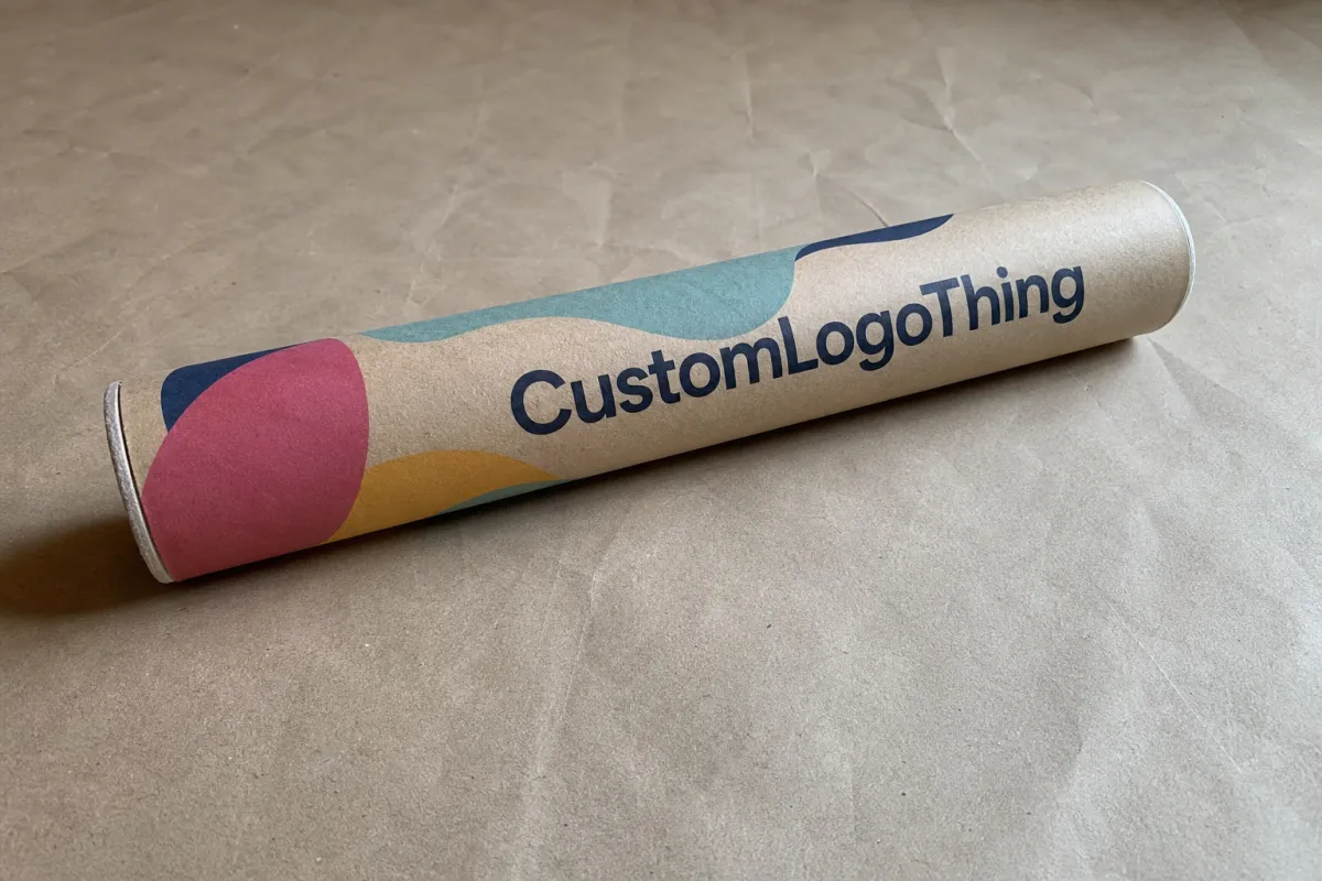
Most teams think about the product first and the tube second. That order is understandable, but it can hide the fact that the tube is often the first branded item a customer handles. On a loading dock, inside a fulfillment center, or at a front door, a printed tube stands out against the usual run of blank mailers and battered cartons. It looks deliberate. That alone changes the impression.
For companies shipping posters, gallery work, promotional graphics, or rolled apparel, the tube can carry part of the product experience. A clean exterior suggests the shipment was handled with the same care as the item inside. It also avoids the generic look that makes a premium order feel temporary. Buyers compare packages, even if they do it in the background of their minds. Presentation becomes part of the value equation.
Branded shipping tubes with cmyk print are usually produced in one of two ways. Some are printed directly on the tube body. Others use a full-color wrap or sleeve that carries the artwork around the cylinder. The aim is the same in both cases: full-color branding on a curved surface without crooked graphics, muddy color, or awkward seam breaks.
CMYK opens the door to photographs, gradients, layered graphics, and logos that need more than one or two inks. That flexibility is useful, but it has limits. Fine lines, small text, and tightly packed details can break down on a rounded tube, especially on textured board or stock that absorbs ink unevenly. A cleaner design almost always reads better than a crowded one. Packaging tends to reward restraint, and tubes are no exception.
There is also a practical business reason to invest in printed tubes. They can improve the perceived value of direct-to-consumer shipments, support retail display, and make fulfillment easier to identify at scale. For brands that want one visual system across shipping boxes, mailers, and inserts, tubes fit neatly into that structure. If you already use Custom Packaging Products, tubes can be part of the same program instead of a disconnected one-off order.
How CMYK print works on shipping tubes
CMYK stands for cyan, magenta, yellow, and black, the four-color process used for most full-color print. Those inks mix to produce a wide range of colors, including photographs, gradients, and complex logos. For packaging, that matters because it lets a brand print a rich visual system without limiting itself to a small set of spot colors. Companies with photo-heavy art or detailed illustration often start here for good reason.
On shipping tubes, the print method affects the final result more than many buyers expect. Direct print places the artwork onto the tube body itself. A printed label wrap gives a strong full-color look and can be practical for shorter runs or versioned designs. A printed outer sleeve keeps the tube structure standard while the decoration changes. Each method solves a different problem. None is best in every case.
Curved surfaces create distortions that flat mockups hide. A logo centered neatly on screen may shift slightly once it wraps around the tube. Bleed zones matter more than first-time buyers assume. Seam placement matters too. If a seam cuts through a headline or a patterned area, the design can look broken even when the file is technically correct. A good supplier builds the dieline with those realities in mind rather than pretending a cylinder behaves like a flat sheet.
Proofing is not a box to tick. A digital proof checks placement, copy, and layout. A physical proof checks how the color behaves on the actual board. That difference saves money. A neutral gray can pick up a green cast on one stock. A deep red can come back flatter than expected if the substrate or coating changes. CMYK gives a broad range, but brand color matching still needs testing when consistency matters, especially for repeat campaigns and corporate programs.
If the tubes will move through warehousing, ecommerce shipping, and parcel networks, ask about transit testing. The ISTA test series gives buyers a more useful language for durability than vague claims. For any shipment that spends time in forklifts, trucks, and delivery vans, that question belongs near the start of the conversation, not at the end.
Cost, pricing, MOQ, and what changes the quote
Tube pricing usually comes down to a small set of variables, and each one moves the final number. Size is the obvious one. A 2-inch diameter tube uses less board than a 4-inch or 5-inch version, so the base material cost stays lower. Board thickness matters too. Heavier stock improves crush resistance and package protection, but it also adds cost. Print coverage affects pricing as well: a small logo panel costs less than a full-wrap CMYK design that covers every visible side.
Minimum order quantity is where buyers often get surprised. A short run can feel expensive because setup, prepress, and finishing costs are spread across fewer units. If a supplier has to create a custom production path for 250 tubes, the unit price will usually be higher than a 2,000-piece run with the same spec. That is not a trick. It is how packaging manufacturing works.
Here is a practical comparison of common decoration approaches:
| Decoration approach | Best for | Typical setup cost pressure | Indicative unit range |
|---|---|---|---|
| Direct CMYK print | Mid to larger runs with consistent artwork | Moderate to high, depending on coverage | $0.85-$2.40 |
| Printed wrap or sleeve | Flexible branding, faster art changes | Moderate | $0.70-$2.10 |
| Simple label application | Short runs, promotions, limited editions | Lower upfront, but labor can rise | $0.45-$1.60 |
| Limited-area branding | Budget-conscious orders with basic logos | Lowest | $0.35-$1.25 |
Those figures are directional, not a quote. Tube diameter, board grade, finish, order quantity, and shipping destination all change the final price. Dimensional weight can also push freight and parcel charges higher than a lightweight tube suggests. A long tube that looks inexpensive on paper may cost more once shipping materials, transit, and damage risk are included.
Other factors can move the quote too: custom end caps, inserts, soft-touch lamination, aqueous coating, metallic effects, and brand-color approvals. Offset printing often suits longer runs with fixed artwork. Digital printing can fit shorter runs or campaigns that change version by version. The right choice depends less on trend and more on run length, color demands, and production window.
When requesting quotes, make sure every vendor is pricing the same spec. Same diameter. Same length. Same board thickness. Same finish. Same print coverage. If one supplier is quoting a wrap and another is pricing a logo panel, the numbers are not comparable. They may look tidy, but they are not competing on the same terms.
For brands with sustainability requirements, ask whether the board is FSC-certified and verify how that claim is documented. The FSC site explains chain-of-custody basics and proper label use: FSC. If customers care about recycled content or responsible sourcing, that detail belongs in the buying discussion early.
Process, timeline, and production steps from proof to delivery
The cleanest tube projects follow a predictable sequence. Artwork prep comes first. The dieline check comes next. Proofing follows. Approval, production, finishing, packing, and shipment close the loop. On paper, the process looks neat. In real life, the schedule gets stretched by file fixes, color revisions, and the familiar discovery that a logo was exported from the wrong version of the design software.
A disciplined handoff saves time. Send vector art when possible. Convert fonts to outlines. Keep image resolution high enough for print at final size. If the design includes photos, they should be sharp at the actual dimensions, not merely acceptable on a phone. A file that looks polished on screen can still fail if safe zones are ignored or if a seam cuts through the wrong part of the artwork. Small checks now prevent long email chains later.
Turnaround depends on the method and the complexity. A straightforward tube order with approved art may move in roughly 10-15 business days after proof approval. More complex jobs, custom structures, or repeated color changes can push that closer to 15-25 business days. Stock availability can shorten the schedule. A custom structural part can lengthen it. That is not a delay so much as the actual shape of manufacturing.
These are the places where time disappears:
- Artwork arrives without a proper dieline, so the packaging team has to rebuild the layout.
- Brand colors are still being debated after the proof is sent.
- The quantity changes late, which usually triggers a new quote or a new press setup.
- The order is placed too close to a launch, event, or seasonal shipping window.
For launches, I would not wait until the deadline is near. Tubes that carry posters, promotional graphics, or premium inserts need more than casual lead time. Build in a buffer if the shipment supports a trade show, a limited drop, or a heavy ecommerce shipping push. If the ship date is fixed, tell the supplier early. That gives them room to sequence materials, labor, and packing without improvising under pressure.
One useful guideline: if the tube is part of a larger packaging system, the structure should match the other formats. If you already buy Custom Shipping Boxes for boxed products and Custom Poly Mailers for lighter orders, keep the same brand logic across all three. Otherwise the tube can look like it belongs to a different company.
Key factors that affect quality, color, and durability
The board stock does most of the physical work. Recycled paperboard, premium board, and reinforced stock behave differently, and those differences show up in both print quality and shipping performance. Smoother stock usually gives sharper graphics. Heavier stock improves protection and crush resistance. Rough recycled board can still look strong, though it may soften fine detail a bit. That tradeoff often makes sense for brands that want a natural or eco-forward appearance.
Finish changes the visual result too. Matte reduces glare and can make the design feel quieter, more editorial, less loud. Gloss increases color intensity, though it can show fingerprints and scuffs more easily. Soft-touch adds a noticeable tactile quality, but it also raises cost and does not suit every shipping environment. An aqueous coating usually sits in the middle: practical, protective, and less expensive than more decorative options.
The artwork itself has a direct effect on quality. Thin lines, tiny text, and low-contrast copy are the first elements to fall apart on a curved tube. If a logo needs to be read from a few feet away, make it larger than your first instinct suggests. If the design relies on layered detail, view it at actual size. What looks crisp on a monitor can become visual noise once it wraps around a cylinder.
Handling conditions matter more than many buyers expect. A tube that looks pristine in the warehouse can still come back scuffed if it rubs against other cartons, sits in humid transit, or waits too long on a damp dock. That is why surface durability is not decorative. It is part of transit packaging performance. A tube can look premium and still fail if it cannot survive the supply chain that carries it.
The real buying question is not “Which supplier is cheapest?” It is “Which print method fits the artwork and the shipping route?” That is the decision that protects both budget and presentation. A lower-cost tube that loses color, shifts graphics, or dents too easily will cost more later through replacements and customer complaints. A stronger board, a better coating, or a more careful proofing step often prevents those costs before they start.
Buyers who care about production discipline usually ask for a spec sheet and a sample before approval. That is the right habit. A sample reveals the stiffness of the board, the feel of the coating, and whether the printed art still looks balanced on a real cylinder instead of a polished mockup. Packaging sales language can sound polished. Samples tell the truth faster.
Common mistakes that waste money or hurt presentation
The most expensive packaging mistakes are usually the dull ones. Not dramatic. Just avoidable. Sending artwork without a dieline is the first example. If the layout ignores seams, glue zones, or end clearance, the result often looks amateur even when the artwork itself is strong. The fix is mechanical rather than creative. Someone has to move elements until the packaging behaves like packaging.
Overdesigning the tube is another trap. A monitor can make a busy layout feel energetic. A real tube can make it feel crowded and noisy. Too many gradients, tiny icons, thin outlines, and weak contrast produce a muddy result. The issue appears quickly with full-color digital printing, and it can show up just as hard with offset printing if the artwork is not simplified before production.
Color approval causes problems too. A proof on one substrate does not guarantee the same result on another board or coating. Buyers sometimes approve a color on a coated sample and then move it to an uncoated recycled tube, which shifts the tone. If color fidelity matters, test on the actual stock. A brochure sheet is not a tube, and it will not behave like one.
Low MOQ choices can backfire as well. Small runs are useful, but quantities that are too small for an active campaign can push unit cost up and leave no cushion for damaged inventory or a sudden spike in orders. If the tubes support a launch or holiday shipping cycle, order enough to cover expected demand plus a reserve. Reordering packaging under deadline is a familiar way to pay more and wait longer.
Presentation gets damaged by small type, weak contrast, and finishes that scratch too easily. A matte black tube with silver copy can look excellent, but only if the print and coating are matched correctly. A surface that scuffs in the first carrier network is not premium. It is expensive regret with a tracking number attached.
Do not ignore the actual use case. If the tube is only for occasional poster mailings, the decoration can stay restrained. If it is part of a higher-touch customer experience, the print should do more work. Trying to make every package look luxurious whether it needs to or not is how budgets get burned without adding much value.
Expert tips and next steps for ordering the right tube
Start with the product, not the artwork. Length, diameter, weight, and shipping method should come first. A tube for a lightweight poster set is not the same job as a tube carrying dense rolled materials or premium collateral. Once the physical spec is fixed, the branding decisions get easier because the structure stops shifting under you.
Ask for three things before you place the order: a sample, a structural spec sheet, and a print proof. The sample tells you how the tube feels. The spec sheet tells you how it performs. The proof tells you whether the design survives the curve, the seam, and the coating. A supplier that cannot provide those basics gives you useful information too.
Keep the artwork as strong as possible and as complicated as necessary. That sounds simple, but it matters. The best tube graphics usually have one dominant idea: a bold logo, a strong band of color, a clean pattern, or a photo treatment that still reads from across a room. If the design tries to do everything, it usually does nothing well. Simplifying the artwork often improves impact and can reduce prepress cleanup, which helps both cost and turnaround.
For a quote request, send the following in one message if you want a clean response:
- Tube dimensions and end style
- Quantity
- Artwork format and print coverage
- Finish preference
- Target deadline
- Shipping destination
- Any certification needs, such as FSC
That kind of brief makes apples-to-apples comparisons possible. It also cuts down the email loop where every vendor asks for one missing detail and the project loses another day. If you are still deciding between formats, compare tubes against other options in Case Studies and browse the wider range of Custom Packaging Products to see where the tube fits in the larger brand system.
The practical sequence is straightforward: lock the structure, approve the artwork, confirm the timeline, and add a buffer before launch. That order keeps the project calm. It also keeps branded shipping tubes with cmyk print from becoming a last-minute scramble, which is exactly what good packaging should prevent.
Are branded shipping tubes with CMYK print strong enough for mailing?
Yes, if the tube stock is thick enough for the product weight and transit conditions. The print method affects appearance, not basic structural strength; the board spec does the real work. For long-distance shipping, ask about crush resistance, end closure strength, and moisture protection so the tube holds up through normal ecommerce shipping.
What artwork works best for branded shipping tubes with CMYK print?
Bold logos, large type, flat color blocks, and high-contrast graphics usually print most cleanly. Photos and gradients can work well too, but they need careful proofing and enough resolution. Tiny text and thin lines are the first things to fail on a curved tube, so keep them simple unless you want to pay for avoidable revisions.
How much do branded shipping tubes with CMYK print usually cost?
Price depends on size, quantity, print coverage, finish, and the tube stock you choose. Small runs usually carry a higher unit cost because setup gets spread over fewer pieces, while larger runs bring the price down more quickly. Ask for quotes using the same dimensions and print specs, or the numbers will not mean much.
What is the usual turnaround for branded shipping tubes with CMYK print?
It depends on artwork readiness, proof approval, quantity, and whether the supplier has the stock in hand. Simple jobs move faster; custom structural changes and repeated proof edits slow things down. A common range is about 10-15 business days after approval for straightforward work, with more complex jobs taking longer.
Can I use full-wrap graphics on branded shipping tubes with CMYK print?
Usually yes, but you need to account for seams, bleed, and the curved surface. A full-wrap design should be built from the supplier's dieline, not from a generic flat template. If the artwork is detailed, request a proof so you can check alignment before production. Done right, branded shipping tubes with cmyk print can carry a full-wrap graphic without looking forced or flimsy.


