Buy Custom Kraft Window Pouches With Less Guesswork
Buying custom kraft window pouches should feel like a spec decision, not a guessing game. The window builds trust, the kraft outer layer tells the brand story, and the inner liner decides whether the product stays fresh or turns into a shelf-life problem. If you are ordering through Custom Logo Things, the smartest move is still the practical one: define the structure before you obsess over the mockup.
That matters because good packaging has to do more than look natural on screen. It has to hold shape, protect the contents, and present the product clearly on shelf without overstating what is inside.
What custom kraft window pouches do on shelf
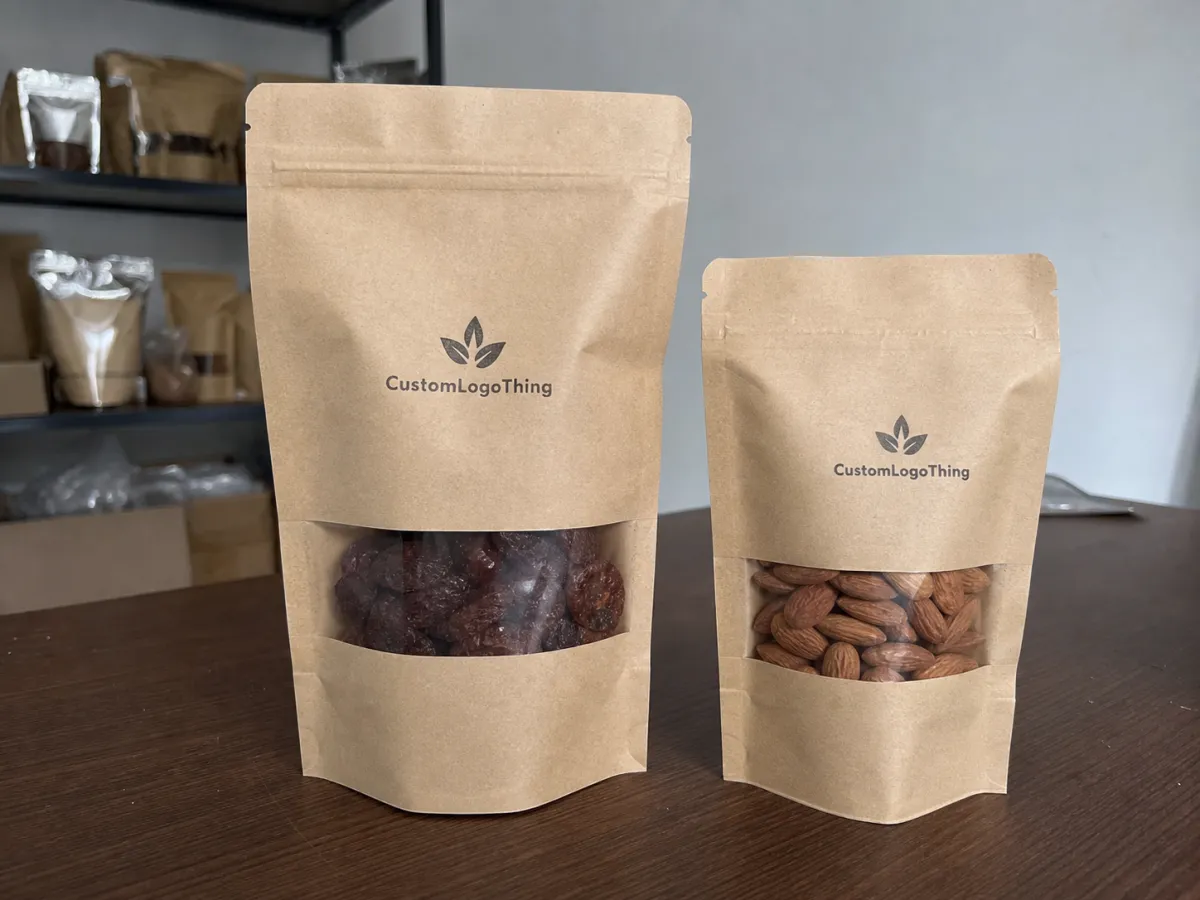
The window is a trust signal, not just decoration. A shopper can see coffee beans, tea leaves, granola, nuts, bath salts, or snack mix before reading the copy, and that matters because most purchase decisions happen fast. Custom kraft window pouches work because they combine two signals that usually pull in opposite directions: kraft says natural, handmade, and grounded; the clear window says the product is visible and real.
That balance is especially useful for products with texture, color variation, or fill-level sensitivity. Coffee, dried fruit, cookies, trail mix, protein snacks, herbal tea, and cosmetic salts all benefit from a quick preview. A fully opaque kraft bag can feel vague. A fully clear pouch can feel clinical. The window gives you a middle ground.
From a packaging buyer’s point of view, this format also supports package branding. You can keep the outer surface restrained, then use the window to frame the product as part of the design. That is often more effective than crowding the surface with extra graphics.
A window is not decoration. It is a shortcut to trust, especially when product texture or fill level helps close the sale.
If you are comparing this format to other branded packaging options, think of it as a visual compromise with a purpose. It gives you the natural look buyers expect from kraft without forcing them to imagine what is inside. That is why these pouches often work well for launch products and small retail runs.
How the window, barrier, and seal work together
The outer kraft layer handles the look and most of the print. The clear window shows the fill. The inner layer, liner, or laminate is the part that quietly decides whether the product survives shipping and shelf life. If one piece is off, the pouch becomes attractive but not useful.
Barrier is where many buyers get tripped up. A pouch can look strong and still have poor resistance to moisture, oxygen, aroma transfer, or grease. Coffee usually needs stronger oxygen control than granola. Oily snacks need better grease resistance than bath salts. A pouch for dry herbal tea is a different build from one holding roasted nuts, even if the outside looks similar.
Window size matters more than people expect. Too small, and shoppers cannot see enough to build confidence. Too large, and the pouch starts to look like a generic bag with a cutout. Large windows also expose inconsistent fills, dust, or uneven product shape. The right size frames the product. The wrong size advertises production problems.
Seal choice changes the user experience too:
- Heat seal for a tight freshness seal and a clean retail finish.
- Zipper for repeat use, especially in DTC and grocery.
- Tin tie for fast reseal on coffee and bakery items.
- Tear notch for easy first opening without damaging the top edge.
There is a tradeoff here that gets ignored often. Better barrier materials can extend shelf life, but they can also complicate compostability claims, raise cost, and affect recycling guidance. If you plan to make sustainability claims, check the material structure before you print them. The EPA recycling guidance is a decent baseline, and FSC sourcing claims only matter if the paper chain is actually documented.
Sizing, materials, and closure choices that change performance
Size should follow the product, not the other way around. Dense items like coffee beans or candy fill a pouch differently than airy products like granola or puffed snacks. Two bags can share the same dimensions and still behave differently on shelf because fill weight, product shape, and headspace all change the final look.
Material choice affects both appearance and legibility. Natural kraft gives you a warm, earthy tone that suits artisanal or clean-label products. Bleached kraft gives a brighter print surface and usually makes color pop more. If your artwork depends on tiny type, hairline rules, or detailed gradients, rough kraft can make those details muddy. Bold graphics usually survive better than delicate ones.
The hidden specs are often the ones that drive the final result:
- Gusset depth determines how well the pouch stands up.
- Bottom style affects shelf presence and packing efficiency.
- Window shape controls how much product gets exposed.
- Zipper style changes convenience and repeat-use value.
- Hang hole matters for peg display and some retail sets.
- Tear notch affects first-use feel and customer complaints.
If your brand already uses custom printed boxes, keep the visual rules aligned. Same type scale. Same color logic. Same tone. Good package branding feels coordinated even when the formats are different. That is where a pouch can either reinforce the brand or look disconnected from the rest of the line.
For product launches, the safest choice is usually the simplest structure that still protects the product. Fancy construction sounds good in a meeting. In production, simple usually wins unless shelf life, aroma control, or retail abuse demand more.
Custom kraft window pouches pricing and MOQ basics
Price is mostly a function of five things: size, material stack, window shape, print coverage, and finish. A stock-style pouch with minimal print costs less than a fully custom build with a larger window, zipper, matte finish, and higher-barrier lining. That is not mystery pricing. It is setup plus material cost.
MOQ matters because setup costs do not disappear on a small order. Once the press, tooling, and proofing are done, the cost gets spread across more units as volume goes up. That is why unit pricing usually drops at 2,500, 5,000, and 10,000 pieces. Bigger runs can lower the unit price enough to matter, but they also raise inventory risk if your flavor, size, or branding changes later.
Here is a useful rough guide for custom kraft window pouches:
| Option | Typical MOQ | Rough unit price | Best for | Main tradeoff |
|---|---|---|---|---|
| Stock-style kraft pouch with window | 500-1,000 | $0.32-$0.60 | Launch tests, small retail runs | Less customization |
| Custom size with zipper and print | 1,000-3,000 | $0.55-$1.05 | Core retail packaging | Higher setup and lead time |
| High-barrier pouch for coffee or oily goods | 2,000-5,000 | $0.78-$1.45 | Shelf life and aroma control | Less flexible sustainability claims |
| Premium finish with custom window shape | 5,000+ | $0.95-$1.85 | Brand-forward retail packaging | More inventory exposure |
Quote hygiene matters. A useful quote should split out unit price, tooling, sample cost, freight, and any special packing for shipment. If those pieces are bundled into one mystery number, comparing vendors gets messy fast. Ask for pricing at two or three volume breaks so you can see where the real savings start.
For smaller brands, a lower MOQ is often worth the higher per-unit cost because it buys flexibility. For a stable SKU with known velocity, a larger run can make sense if you can handle the cash tied up in inventory. There is no prize for ordering more than you can sell.
Production steps and turnaround from proof to ship
The production path is usually straightforward: inquiry, spec confirmation, quote, artwork check, proof approval, sample or preproduction review, production, packing, and shipment. The slow part is rarely the machine time. It is the back-and-forth before anyone signs off on dimensions, colors, and window placement.
Most delays come from a few predictable places: missing measurements, artwork sent in the wrong format, a window size that changes after proofing, or a sample that sits unreviewed for days. If you want a cleaner timeline, lock the structure before the design gets too far along.
Simple builds move faster. A stock-format pouch with basic print can be much quicker than a fully custom size with a special finish or more complex liner. High-volume runs also need more planning because press time, material ordering, and packing all add up. If the order has a hard launch date, build in breathing room. Freight timing is separate from production timing.
If the pouches ship inside a larger kit, a quick drop and vibration check helps catch zipper failure, corner scuffing, or weak seals before a full run. Good retail packaging should survive the trip, not just the render.
For brands building a broader line, it helps to keep the pouch workflow aligned with your other Custom Packaging Products. That keeps artwork approvals, dimensions, and finish choices from drifting across separate projects.
Step-by-step ordering checklist for a clean first run
Start with the product itself: weight per unit, fill behavior, shelf life needs, and whether the pack will be heat sealed, reclosed, or both. If the product is oily, fragile, crumbly, or moisture-sensitive, say so early. That detail changes the whole material conversation.
Next, lock the dimensions. Width, height, gusset depth, and window placement all affect how the final pack sits on shelf. A pouch that looks elegant flat can bulge awkwardly once filled. That is why I want to see the product size and target fill weight before approving artwork.
Then build the artwork around the structure, not the other way around. Leave safe margins. Keep text away from seals and folds. Use contrast that works on kraft instead of pretending kraft is white paper. Rough stock tends to soften fine lines, so bold type and clean shapes usually print better than tiny decorative details.
Before production, ask for a real sample or sample flat and check these points:
- Does the fill level look balanced in the window?
- Is the pouch easy to open and reseal?
- Do the printed colors still read clearly on kraft?
- Does the pouch stand well enough for shelf display?
- Is the closure strong enough for the intended use?
One more thing buyers often skip: confirm any claims before printing. If you want FSC language, verify the paper chain. If you want recyclability language, make sure the structure and local guidance support it. Packaging claims are not decoration. They are supposed to survive questions.
Common mistakes that make window pouches look cheap
The first mistake is a window that is too large. A giant cutout can expose messy fills, dust, or low-grade product, and then the pouch stops doing its job. The second mistake is choosing a barrier that is too weak for the contents. A pretty pouch that fails on freshness is expensive packaging with a logo on it.
Another common problem is cramped artwork. Thin type, tiny barcodes, low-contrast colors, and delicate line art all struggle on rough kraft stock. If the design depends on hairline details, ask for a proof or print sample before committing. A lot of packaging design problems only show up once the ink hits the material.
Closure testing gets ignored more often than it should. That matters a lot for products that are opened and reclosed multiple times in retail or direct-to-consumer use. Zippers that feel fine on a flat sample can be frustrating once the pouch is full. Tin ties can look charming and still be clumsy if the pouch is overfilled.
There is also a brand mistake that is easy to spot from ten feet away: trying to force a rustic material into a loud, glossy look. Kraft naturally reads more grounded and artisanal. If the graphics fight that, the pouch looks confused. Better to work with the stock than to wrestle it into something it is not.
Expert tweaks that improve sell-through and your next move
Use the window to frame the best part of the product: bean color, snack texture, fruit mix, salt crystals, or tea blend variety. A well-placed opening makes the pouch feel more premium because it turns the product itself into part of the visual hierarchy.
If your brand is natural, artisanal, or price-sensitive, a matte finish and restrained print often sell better than a loud layout. Loud can work for some categories, but it has to fit the product and the shelf. For most kraft-based packs, a quieter design reads more credible.
If you are building a set with other formats, keep the rules consistent across your product packaging. Matching the pouch to your box line, labels, and inserts helps the whole brand feel organized instead of stitched together.
For your next step, write a one-page spec sheet with product weight, fill dimensions, closure choice, artwork notes, target quantity, and any claim requirements. Then ask for sample photos, lead time, shipping terms, and a revised quote based on that exact spec. One page saves a lot of email back-and-forth.
If you want the shortest version of the buying advice, here it is: choose the barrier for the product, choose the window for the fill, choose the closure for the customer, and choose the print style that fits the kraft instead of fighting it. Do that well, and custom kraft window pouches become a practical piece of branded packaging instead of a gamble.
Frequently Asked Questions
What products work best in kraft window pouches?
Dry goods with visual appeal work best: coffee, tea, granola, nuts, dried fruit, candy, and bath salts. Products with consistent fill levels look better because the window exposes what is inside. Very oily, very humid, or fragile items need the right inner barrier before the pouch is a fit.
How do I choose the right barrier for window kraft pouches?
Match the barrier to the product: moisture resistance for snacks, oxygen protection for coffee, and grease resistance for oily goods. If shelf life matters, ask for the actual material structure instead of guessing from the outside look. Check whether the barrier affects recycling or compostability claims before you print the packaging.
What MOQ is normal for custom kraft window pouches?
MOQs vary by size, print method, and material stack, but custom runs usually start higher than stock pouch orders. Lower MOQ options cost more per unit, so the tradeoff is usually flexibility versus price. Ask for pricing at two or three volume breaks so you can see where the real savings begin.
Can I print full-color artwork on the kraft surface?
Yes, but the kraft color changes how colors read, so bright tones often look more muted than they do on white stock. Dark graphics and bold type usually hold up better than thin lines or pale shades. Request a proof or sample if color accuracy matters more than a rustic look.
How long does production usually take for custom kraft window pouches?
Simple builds are faster; custom sizes, special finishes, and high-volume runs take longer. Artwork approval and sample sign-off are the most common reasons schedules slip. Freight time is separate from production time, so plan both before you commit to a launch date.

