Buyer’s Guide: Woven Labels Material guide for stationery brands
A premium notebook sleeve can lose its charm in one fingertip if the label feels scratchy, stiff, or oddly cheap against the paper. That is why a Woven Labels Material guide for stationery brands is more useful than it may sound at first: the label often creates the first tactile signal before the buyer opens the journal, folio, planner, boxed pen set, or desk gift.
Stationery is a quiet category. Paper grain, board thickness, cloth wrap, foil stamping, kraft paper bands, and even the sound of a drawer-style box opening all matter. A woven label has to sit inside that experience without shouting over it. Done well, it makes the product feel kept, gifted, and considered.
Woven labels material guide for stationery brands: what changes the feel
People often say “material” and mean only the fiber. With woven labels, that is too narrow. The material experience comes from four things working together: the yarn, the weave density, the edge finish, and the backing. A 50 denier polyester yarn woven at a high density will feel very different from a broader, looser weave with a heavier border, even if both are technically polyester.
On stationery packaging, texture usually matters more than bulk. A notebook wrapped in 350gsm C1S artboard with soft-touch lamination does not need a thick badge fighting for attention. A clothbound journal may need something warmer and softer. A rigid gift box covered in uncoated paper might call for a flat, clean label that feels precise rather than plush.
Here is what most people get wrong: they judge the woven label like a garment trim. Stationery labels are handled differently. They may be rubbed by a thumb, pressed under a belly band, stacked in cartons, or viewed beside paper stocks with subtle color shifts. The label is small, but it has to behave like part of the packaging system.
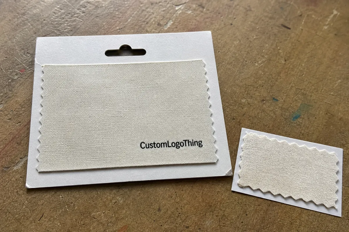
A good woven label can lift a simple carton, binder, or gift set by adding a durable textile cue. On a custom planner set, for example, a 35 mm x 18 mm end-fold damask label may be enough to make the piece feel more permanent than a printed sticker. That does not mean woven is always better. It means the spec has to be chosen for the surface, the artwork, and the way the customer will touch it.
Practical callout: If the label will sit against paper, request a hand-feel sample before approving bulk production. A label that looks sharp in a photo can feel too rigid on uncoated board or too shiny beside natural kraft paper.
How the weave structure creates detail, softness, and durability
Woven labels are made by interlacing threads, not by laying ink on top. That single difference explains nearly every strength and limitation. The logo, border, lettering, and background are built into the fabric itself, so the design resists surface scuffing better than many printed trims. The tradeoff is that tiny artwork details must be translated into thread paths.
Damask is the usual choice for fine stationery branding because it supports sharper type, thinner lines, and cleaner curves. It often uses finer polyester yarns and tighter weave settings, which can work well for small logos around 25 mm to 60 mm wide. If your mark includes thin serifs, small icons, or a short tagline, damask usually gives the best chance of keeping it legible.
Satin has more sheen and a smoother face. It can look elegant on gift sets and presentation folders, especially where the packaging already uses metallic foil, coated board, or a ribbon closure. Satin is less forgiving with tiny type, though, and a bright thread can reflect light in ways that make small letters harder to read under retail lighting.
Taffeta is flatter and often more economical. It can be useful for simple one-color marks, hidden brand tabs, or labels where soft flexibility matters more than detail. On a paper wrap or thin pouch, taffeta may feel less assertive than a dense damask label. The limitation is clarity: small typography can break up quickly.
Tighter weave densities usually support better detail, but they can also feel firmer. Looser weaves can feel more relaxed, yet they may swallow thin strokes or soften a geometric logo. Border treatment matters too. A heat-cut edge may be clean but slightly firm; an end fold can hide the cut edge; a woven border can add body. Thread direction, fold pressure, and backing adhesive also affect how the label survives handling, shipping vibration, and final assembly.
For packaging teams reviewing samples, I like a simple test: place the label beside the real notebook cover, rub it lightly 20 times with a clean thumb, then view it from 12 inches and 24 inches. That tells you more than a polished render ever will.
Material and construction factors that matter on stationery packaging
A Woven Labels Material guide for stationery brands should always translate design language into practical construction choices. The main decision points are yarn type, weave density, label size, color count, fold style, and backing. Change one, and the finished label can shift in cost, feel, and application behavior.
Polyester is the common base material because it is stable, colorfast, durable, and suitable for high-volume weaving. It handles fine detail well and tends to stay consistent across production runs. Recycled polyester or other recycled materials may be worth considering if the brand needs a responsible sourcing story, especially when the rest of the package uses FSC certified paper, post-consumer waste board, or biodegradable packaging components. Just be honest with the spec: recycled yarn can have different availability, shade consistency, and minimum order requirements.
Backing changes the job the label can do. A sew-in label is often best for cloth pouches, fabric notebook covers, or elastic bands. Adhesive backing can work on paperboard, wrapped rigid boxes, and some coated stocks, but the adhesive must be tested against the actual surface. Iron-on backing is common in apparel, yet it is rarely the first choice for paper goods because heat and pressure can warp board or affect coatings. Soft backing can help if the label touches the user’s hand often.
The substrate should drive the build. A rigid paper wrap may need a low-profile straight-cut label with pressure-sensitive adhesive. A cloth notebook cover may suit an end-fold sew-in label. A padded presentation pouch may need a center fold or loop style that can be captured in a seam. A corrugated cardboard mailer, meanwhile, usually does not need an expensive woven trim unless the label is part of an unboxing layer rather than the shipping surface.
- For paper bands: test adhesive hold after 24 hours, especially on textured or uncoated stock.
- For cloth covers: check stitch allowance, usually 2 mm to 4 mm from the folded edge.
- For gift boxes: compare sheen under warm and cool light so the label does not clash with foil or lamination.
- For pouches: test flexibility after bending, folding, and light compression.
If the label supports a broader packaging system, it can help to review material claims against guidance from groups such as the Forest Stewardship Council for paper sourcing or the EPA’s recycling resources for recovery language. Textile trims and paper packs do not always share the same recycling path, so avoid overclaiming.
Woven labels pricing, MOQ, and unit cost drivers
Pricing is not mysterious, but it is easy to compare badly. Size, weave density, number of thread colors, fold style, backing, sampling, and freight all move the number. A simple 30 mm x 15 mm two-color damask label may price very differently from a 70 mm x 25 mm satin label with metallic thread and adhesive backing.
For a typical stationery brand order, small runs often carry higher unit costs because setup, proofing, and loom preparation are spread over fewer pieces. Larger runs usually bring the per-label price down. As a broad planning range, a simple woven label may land around $0.06 to $0.14 per unit at higher quantities, while a more detailed label with special backing, premium weave density, or multiple colors may sit around $0.15 to $0.35 per unit. For very small quantities, unit pricing can climb higher.
MOQ varies by supplier and specification. Some custom woven label programs may start around 500 to 1,000 pieces, while more efficient pricing often appears at 3,000, 5,000, or 10,000 pieces. Sampling may be quoted separately, commonly $35 to $120 depending on complexity and whether a physical loom sample is required. Freight can surprise buyers too, especially if labels are needed quickly for final kitting.
| Spec choice | Typical use | Cost impact | Buyer note |
|---|---|---|---|
| Damask polyester, 2-3 colors | Notebook covers, gift boxes, planner sleeves | Low to medium | Best balance of detail, durability, and hand-feel for many stationery lines. |
| Satin-style woven label | Premium folders, boxed sets, decorative wraps | Medium | Great for sheen, but check small type carefully before approval. |
| Adhesive backing | Paperboard, rigid boxes, wrap bands | Medium | Test on the exact stock, coating, and lamination before bulk production. |
| Recycled yarn option | Eco-positioned stationery kits | Medium to high | Ask about color limits, MOQ, and documentation for recycled content claims. |
| Metallic or specialty thread | Limited gift sets, luxury stationery | High | Use sparingly; shine can reduce legibility in small logo elements. |
Compare quotes line by line. One vendor may look cheaper until finishing, sampling, or freight is added. Another may quote a higher unit price but include proofing and packing in a cleaner way. From a packaging buyer’s point of view, the real question is not “Which label is cheapest?” It is “Which spec reaches approval with the least rework?”
Production steps and timeline: from artwork to finished labels
A woven labels Material Guide for Stationery brands is most useful when it connects the creative decision to the production path. The process normally starts with artwork review. The supplier checks line weight, type size, color count, label dimensions, fold allowance, and whether the design can be woven cleanly. Vector artwork is strongly preferred, usually AI, EPS, or PDF with outlined fonts.
Next comes a technical proof. This is not just a beauty mockup. It should show label size, fold style, thread colors, border, backing, and any limitations in fine detail. If the logo has tiny lettering below 5 pt or hairline strokes under roughly 0.3 mm, the proof may recommend simplification. That is not a failure. It is normal woven-label engineering.
Physical sampling may follow, especially for premium notebooks, subscription gift sets, and packaging that will be photographed heavily. A sample gives the team a real read on softness, edge feel, color balance, and how the label sits on paper or cloth. After approval, production moves to weaving, cutting or folding, backing application if needed, inspection, counting, and packing.
Typical timing depends on the order and supplier capacity, but a practical planning window is often 12 to 20 business days after proof approval for production, with sampling adding another 5 to 10 business days. Rush timelines can be possible, but they are not free. Artwork revisions, color matching, or a failed adhesive test can add several days.
- Submit artwork, size target, placement photo, and packaging material details.
- Review the technical proof for scale, color count, fold, and backing.
- Approve a physical sample if the label affects the main product experience.
- Confirm production quantity, packing method, ship date, and delivery address.
- Inspect the received labels before final assembly or kitting begins.
Build a buffer into the schedule. Packaging teams often need two or three internal reviewers to look at the label against real materials, and that alone can take 48 to 72 hours. If the product is tied to a launch, holiday drop, or retail delivery window, place woven labels on the same timeline as cartons, inserts, and printed wraps rather than treating them as a late add-on.
Step-by-step: how to choose the right woven label spec
Start with the application. Will the label sit on a notebook cover, a kraft paper wrap band, a cloth pouch, a folder, or a rigid presentation box? The answer controls almost everything after that. A label that works beautifully on a fabric pouch may lift at the corners on coated board, while an adhesive label made for a flat box may feel too stiff on a soft planner sleeve.
Measure the usable space before adjusting the logo. For small stationery goods, a label around 25 mm to 45 mm wide often looks refined without crowding the design. For a larger folio, binder, or boxed set, 50 mm to 75 mm may be appropriate. Leave visual breathing room. A woven label jammed against an edge can look like a repair patch instead of a brand detail.
Then choose the weave density and fold. If the mark has fine lettering, start with damask and simplify the artwork where needed. If the goal is softness and a quiet textile feel, compare damask against taffeta or a satin-style option. For flat application, straight cut or end fold may work best. For sewn-in fabric applications, center fold or loop fold can be cleaner.
Prepare artwork with clean shapes. Woven construction rewards bold geometry, open counters in letters, and restrained color counts. Two to four thread colors are often enough for stationery branding. If your logo depends on gradients, tiny texture, or photographic detail, consider a woven label for the mark and a printed insert for the finer story.
Finally, review a proof or sample against real packaging materials. Do not approve from a screen alone if the label is central to the product feel. Color can shift against warm ivory paper, cool white board, dyed cloth, or recycled chipboard. Texture changes perception too. A black woven label on black cloth can look elegant in a render and nearly invisible in hand unless the thread sheen is chosen carefully.
Teams already developing related trims can review Custom Labels & Tags options together, so woven labels, hang tags, belly bands, and package seals feel like one system rather than separate purchases.
Common mistakes stationery teams make when ordering labels
The first mistake is designing more detail than the weave can hold. Tiny taglines, delicate botanical line art, and thin script marks may look graceful in Illustrator but blur on a 30 mm label. If the supplier recommends thickening lines or removing micro-copy, listen carefully. They are usually trying to protect the final result.
The second mistake is choosing by photo only. A label photographed under soft light can look premium, yet feel too crisp against uncoated paper or too slick beside cloth. Ask for swatches. Hold the sample where the customer will hold it. If it sits on a sleeve, slide the sleeve in and out of the carton several times and check whether the edge catches.
Another common issue is ordering before final packaging dimensions are locked. Even a 3 mm change in wrap band width can affect label placement. A different board caliper can change how adhesive grabs. If the notebook cover material changes from coated paper to cloth, the same label spec may no longer be right.
Skipping sample approval can save a few days early and cost two weeks later. That is especially true for gift sets, retail launches, and products with multiple components. The lowest quote is not always the best value if it creates rework, rush shipping, or an extra approval round after the labels arrive.
- Too much detail: simplify line art before proofing, not after bulk weaving.
- Wrong backing: test adhesive, sewing, or fold style on the actual substrate.
- No schedule buffer: allow review time before final kitting or pack-out.
- Unclear quote comparison: confirm sampling, finishing, packing, and freight are included or separated.
Honestly, I think the best woven label specs are usually quieter than the first concept. Cleaner mark, better proportion, fewer colors, and a finish that respects the paper. That combination tends to age well.
Expert tips and next steps for a cleaner quote and faster approval
A woven labels material guide for stationery brands should leave you with a cleaner buying process, not just more vocabulary. Start by requesting physical swatches or finished samples in the closest weave styles you are considering. Ask for damask, satin, and taffeta if you are unsure. Compare them under normal office light, retail-like warm light, and near the actual paper stock.
Compare specs, not just prices. Two quotes can both say “woven label,” while one uses a tighter damask weave, cleaner folded edges, and adhesive suited for coated board, and the other uses a looser construction with a generic backing. Put the details in a simple grid: size, weave, colors, fold, backing, MOQ, sample cost, production lead time, freight, and revision policy.
Create an approval checklist before placing the order. It does not need to be complicated. Confirm label size, logo scale, fold style, backing, thread colors, placement, substrate compatibility, packing method, and the date labels must arrive for assembly. If sustainability claims are part of the brand story, confirm whether the paper packaging is FSC certified, whether board includes post-consumer waste, and whether the textile label claim is documented separately.
For brands planning a full packaging refresh, it may help to study how different components support the same brand feel. The Case Studies section can be useful for seeing how material choices, finishes, and presentation details work together across a product line.
One more practical tip: send the supplier a photo of the label placement with a ruler in frame. A written size is helpful, but a scale photo catches issues early. If the label will sit near a fold, spine, elastic closure, magnet, or ribbon, say so. Those small details can affect backing choice and edge finish.
Use this woven labels material guide for stationery brands as a shortlisting tool: narrow the weave, confirm the substrate, request quotes with the same spec, and approve a sample before bulk production. The right label will not fix weak packaging, but it can make good stationery feel more tactile, more durable, and more worthy of keeping.
FAQs
What woven label material works best for stationery brands?
Damask-style polyester is usually the best balance of fine detail, clean edges, and everyday durability. Choose a softer or satin-style build only when the label needs a smoother, more decorative finish rather than ultra-sharp detail. Match the material to the product surface so the label feels intentional on paper, cloth, or wrapped packaging.
Are woven labels worth it for premium notebook packaging?
Yes, especially when the woven texture supports the product experience. A label on a notebook sleeve or gift set can make the piece feel more finished and collectible. Woven labels hold detail well when the design is clean, the weave density is chosen correctly, and the label is sized for the artwork.
How do I choose the right fold for stationery label applications?
Pick the fold based on where the label will be sewn, tucked, or attached. A straight cut or end fold can work well for flat placements on paperboard or wrap bands. A center fold or loop style may suit fabric wraps, pouches, and sewn applications. Always check how the fold sits on the real substrate so it does not wrinkle, lift, or distort the brand mark.
What is a realistic MOQ for custom woven labels?
MOQ varies by size, weave complexity, and finishing, so ask for a quote based on your actual spec. Smaller orders usually carry a higher unit cost because setup and weaving time are spread across fewer pieces. If budget is tight, simplify the design, reduce color count, and compare quantity breaks around 1,000, 3,000, and 5,000 pieces.
How long does woven label production usually take?
Lead time depends on proof approval, sample needs, and production capacity. A practical planning range is often 12 to 20 business days after proof approval, with sampling adding extra review time. Artwork changes and color matching can add days, so build in a buffer before a launch, seasonal shipment, or final assembly date.


