A patch that looks premium on paper can flop on a tote
The Logo Patches Material guide for stationery brands exists because a patch can look excellent on a mockup and still fail in the hand. Stationery brands tend to judge product systems through paper stock, printed finishes, and box structure. That works until the patch enters the picture. Then the question changes: does the branding element fit the substrate, survive handling, and still read clearly after shipping?
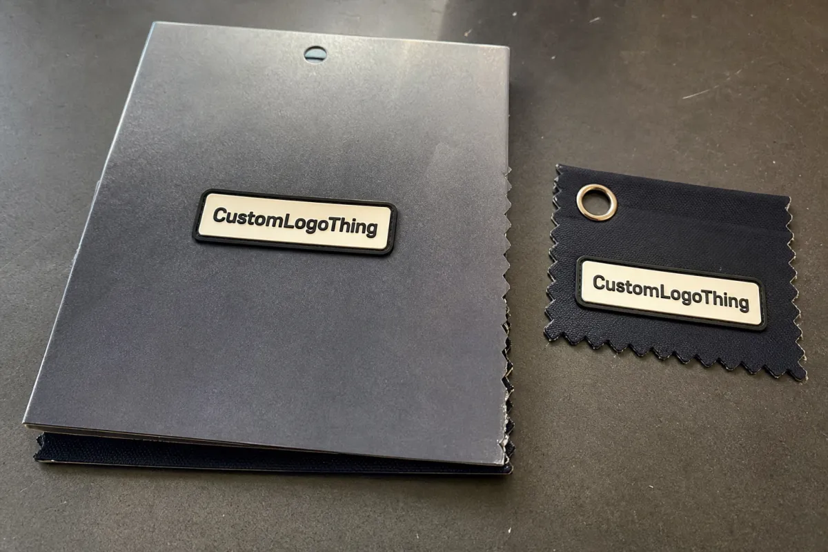
A logo patch is a branded applique used on packaging, pouches, display kits, uniforms, and occasional merch. It may be woven, embroidered, printed, molded, or made from faux leather. Each construction carries a different visual weight. Some read crisp and editorial. Others feel tactile and premium. A few are better at surviving abuse than they are at winning a design award.
The common mistake is choosing based on appearance alone. A glossy sample board favors shiny detail and rich texture, but real products do not sit still on a board. They bend, stack, rub, fold, and get packed against paperboard corners. That is where weak construction shows up. If a patch curls on a slim folder, overwhelms a kraft sleeve, or makes an insert feel awkwardly bulky, the problem is usually not the artwork. It is the material decision.
A patch is not decoration first. It is a branding surface with a job to do.
For stationery brands, that job is usually subtle. The patch should feel like it belongs in the system, not like an afterthought added because texture looked nice in a meeting.
How logo patch materials work across stationery applications
Every patch is built from four core decisions: face material, logo detail method, edge style, and backing. Change any one of them and the entire buying picture changes. Two patches with the same logo can behave very differently once they are attached to a pouch, carton, or staff uniform.
For stationery brands, the substrate matters as much as the patch itself. A woven patch can sit neatly on a canvas zipper pouch, while the same design may look too technical on a slim paper insert. A thick PVC piece can work on a merch tote but feel heavy on a lightweight mailer. Paper packaging is not a sweatshirt. It tolerates less force, less weight, and less depth.
The main material families behave like this:
- Woven patches — crisp, flat, and detail-friendly.
- Embroidered patches — tactile, traditional, and more dimensional.
- PVC or silicone patches — durable, modern, and easy to wipe clean.
- Faux leather or leather-like patches — premium-looking with a warmer, crafted feel.
- Printed fabric patches — lightweight and useful for multicolor art or gradients.
The visual language matters. Woven feels controlled and editorial. Embroidery feels heritage-driven and hand-finished. PVC signals practicality and durability. Faux leather says giftable and premium. Printed fabric reads lighter and more flexible. None of these is universally better. A stationery brand built around recycled paper, soft neutrals, and restrained typography may need a very different patch language than a luxury desk-accessory brand using coated boards and bold presentation packaging.
Think about the attachment surface as well. A patch on corrugated cardboard display packaging faces different constraints from one on kraft paper sleeves or textile pouches. Heavy constructions can create pressure points, distort folds, or leave visible tension marks on paper-based packaging. If the patch is part of a subscription box reveal, the way it sits matters almost as much as the logo itself.
For brands working with responsible-sourcing claims, FSC standards are useful context, and the EPA has practical guidance on waste reduction and recycling. Those frameworks do not choose the patch for you, but they help keep the broader packaging story consistent.
Key material factors: feel, durability, and brand fit
Feel is the first thing most customers notice. A soft-touch patch can feel refined, but softness often comes with less sharp definition. A structured patch gives cleaner edges and a more deliberate finish. For premium notebooks, gift sets, or stationery accessories, that hand-feel can shift perceived value more than teams expect. The difference is small on a spec sheet and obvious in the hand.
Detail level is where many buyers get caught. Tiny type, thin rules, and fine icons do not suit every construction. Embroidery builds with thread, and thread has thickness. Very small lettering can fill in, blur, or lose separation. Woven construction usually handles compact logos better because it can capture detail with a flatter surface. If the mark is bold and simple, embroidery can look excellent. If the logo relies on precision, woven is usually safer.
Durability is not just about whether the patch survives a few weeks. It includes abrasion, moisture, fold lines, adhesive performance, and repeated handling. Staff uniforms, reusable tote bags, and event kits get touched constantly. In those settings, edge finish and backing matter more than ornamental detail. For a packaging insert handled once, appearance may outweigh long-term wear. That does not mean durability is irrelevant; it means the target lifespan is shorter.
Attachment method changes the entire production plan. Common options include sew-on, iron-on, peel-and-stick, Velcro, and heat-seal backings. Sew-on is the safest choice for textiles. Iron-on is convenient but not equally reliable on every substrate. Peel-and-stick can work for some light packaging applications, though it is not a cure-all. Velcro is useful for removable brand systems. Heat seal can be efficient if the target material can tolerate the temperature and pressure.
Color fidelity is another place where expectations drift. Yarn, thread, PVC, and printed surfaces all render brand colors differently. A deep forest green in thread will not behave the same way as forest green in print. If the color matters, ask for Pantone references and a physical proof. Otherwise, you may end up with “close enough,” which sounds harmless and usually isn’t.
Sustainability perception matters too, especially for brands already using kraft paper, recycled boards, or post-consumer content elsewhere in the packaging stack. Recycled yarn, lower-plastic constructions, and FSC certified packaging can support the message. But avoid overstating what the patch itself proves. A recycled face with a plastic-heavy backing is not a clean environmental win. Buyers can tell when the story and the structure do not match.
| Material | Best for | Typical look | Relative cost | Watch-outs |
|---|---|---|---|---|
| Woven | Small logos, fine text, flat applications | Crisp, clean, editorial | Low to medium | Less texture than embroidery |
| Embroidered | Bold marks, heritage branding, merch | Tactile, raised, classic | Medium | Detail can blur at small sizes |
| PVC/Silicone | Durable use, modern merch, wipe-clean needs | Bold, dimensional, contemporary | Medium to high | Heavier feel, tooling required |
| Faux leather | Premium kits, gift sets, desk accessories | Warm, upscale, crafted | Medium to high | Can be too stiff for thin paper packaging |
| Printed fabric | Gradients, colorful campaigns, soft branding | Light, flexible, image-friendly | Low to medium | Less dimensional presence |
Logo patches material guide for stationery brands: best options by use case
If you want the practical answer, start with use case rather than taste. The right patch for a retail packaging insert may be wrong for a staff apron. The right patch for a limited-edition notebook sleeve may be too delicate for an event tote. Match the material to the job, then check whether the brand identity still reads correctly.
Woven is usually the safest choice for sharp logos, fine text, or cleaner packaging systems. It suits retail packaging inserts, stationery subscription kits, and paper-based presentation pieces where clarity matters more than dimension. If the visual identity leans modern, organized, or editorial, woven usually earns its place.
Embroidery fits better when the brand wants texture and a more traditional or handcrafted feel. It works well on canvas zip pouches, apron-style uniforms, and merch where tactile depth supports the brand story. Just do not ask embroidery to carry a logo that already struggles at small size. That is a design limitation, not a manufacturing flaw.
PVC or silicone makes sense when the patch needs to survive rough handling, wiping, or repeated use. It is a good fit for staff uniforms, reusable tote bags, and some event giveaway items. For stationery brands, it can also work on accessory kits that sit closer to lifestyle merch than pure paper packaging. It is less subtle than woven, but it is hard to beat for wear resistance.
Faux leather is the premium answer when you want a richer, more giftable finish. It works well for boxed stationery sets, desk accessories, and presentation kits where the patch is part of a reveal. But judgment matters. On a thin paper folder or soft mailing sleeve, it can look overspecified very quickly. Premium is not the same as heavy.
Printed fabric is useful when the artwork is colorful, gradient-heavy, or photographic and you want a lighter patch with softer visual impact. It is a practical option for campaign-based stationery drops, promotional kits, and limited runs where the logo treatment is more artistic than corporate. It will not deliver much relief, so choose it for image fidelity, not tactile drama.
There is a simple rule that saves time: if the patch has to do visual heavy lifting, prioritize clarity. If it has to feel collectible, prioritize texture. Those are not the same thing. Trying to force both equally usually produces a patch that does neither well.
For paper packaging, especially thin folders, sleeves, and envelope systems, avoid overspecifying heavy materials. A patch that looks polished on a sample board may buckle the structure once it is applied. If the base is lightweight kraft paper or a slim carton, choose flatter constructions or lighter backings. Packaging should not need to fight the patch.
For comparison work, finished samples beat swatches every time. A material swatch tells you what the surface feels like. A finished sample tells you whether the logo still reads, whether the backing behaves, and whether the patch looks proportionate on the actual piece. Specs matter. Reality matters more.
Cost and pricing: what changes unit cost fast
Patch pricing is usually straightforward. A few variables move the number quickly: size, stitch count, color count, backing type, shape complexity, and finish. More custom construction means higher cost. That is not a secret; it is the basic math of small-run manufacturing.
As a working range, simple woven patches in moderate quantities usually come in lower than highly detailed embroidered versions of similar size, while PVC often sits higher because molds and tooling increase setup time. Faux leather can be reasonably priced at standard finishes, but embossing, specialty coatings, or unusual cut shapes can push it up. The invoice rarely tells the whole story unless you compare like for like.
MOQ matters a lot. Lower minimums usually raise unit cost because the setup is spread over fewer pieces. Higher runs reduce the per-unit price, but they also increase inventory risk. If the patch is tied to a one-off launch or seasonal packaging, do not be seduced by a low unit price on an oversized order. Dead stock is a very efficient way to convert savings into waste.
Setup costs are another line item buyers sometimes forget. Digitizing artwork, making molds, sampling, and developing custom edge finishes all add upfront cost. If the logo has unusual contours or needs a special backing, expect extra prep work. Rushing this stage tends to cost more later, usually after the first proof comes back wrong and someone has to restart the approval cycle.
There are also indirect costs, and they are almost never invisible. Rush fees. Freight. Re-sampling. Color corrections. Placement changes. The classic one is approving a digital proof too quickly and then paying for another sample because the physical texture reads differently. A “cheap” patch can become expensive after three rounds of correction.
Here is a practical way to compare quotes:
- Lowest unit cost usually means simpler construction, fewer colors, and a higher quantity.
- Mid-range cost often buys better texture, stronger backing options, or a more refined finish.
- Highest cost shows up with special tooling, complex shapes, and small orders.
If you are benchmarking suppliers, make sure the quotes match exactly: same size, same backing, same edge, same quantity. Otherwise you are comparing one spec against a completely different one. That is how purchase decisions go sideways without anyone noticing until production starts.
Process and timeline: from artwork to approved sample
The cleanest production path usually runs like this: artwork review, material selection, digital proof, sampling, approval, mass production, quality check, and shipping. Skip steps and you invite problems. Packaging teams often underestimate how much of production time is spent clarifying details that should have been settled before sampling began.
Simple woven or printed patches often move faster than molded PVC or premium faux leather runs because the setup is less involved. The more complex the shape, edge, or backing, the more time the factory needs to prepare. Clean vector artwork helps. Jagged files, low-resolution logos, or missing color references slow everything down.
What delays timelines most? Too many revisions. Unclear artwork. Late color changes. Last-minute backing changes. And the biggest one of all: trying to decide the application method after sampling has already started. That sequence is backwards. Choose the use case first, then the construction.
A practical lead-time framework looks like this:
- Simple woven or printed patch: often the fastest once artwork is approved.
- Embroidered patch: moderate timeline, depending on stitch detail and border style.
- PVC or molded construction: longer, because tooling and molding add steps.
- Faux leather with special finish: timing depends on embossing, coating, and sample rounds.
For planning, think in business days from proof approval rather than vague promises like “soon.” A straightforward job can move in a relatively short window. More complex builds take longer, especially if the patch has to coordinate with box production or fulfillment timing. If a stationery launch or event date is fixed, align the patch schedule early. Beautiful patches arriving after the boxes are not especially useful.
Approving one reference file, one Pantone plan, and one final application method before sampling starts reduces confusion. It also keeps everyone from interpreting the artwork differently. Guessing is expensive.
For shipped kits with multiple components, ISTA resources are worth reviewing. A patch that survives a desk sample is not automatically safe once it is packed, stacked, and transported with other items.
Common material mistakes stationery buyers keep making
The first mistake is choosing embroidery for tiny text and then being surprised when the logo turns into decorative fuzz. Embroidery has strengths. Small typography is usually not one of them.
The second mistake is picking a heavy patch for thin packaging or soft goods. That can cause curling, sagging, adhesive failure, or a raised area that disrupts the clean look of the piece. If the base is delicate, the patch should be too.
Third, buyers ignore backing type. Then they discover the patch cannot be applied in-house, or the adhesive does not work on the real material, or the vendor needs a different application method than the one assumed in the quote. Backing is not a footnote. It is part of the spec.
Fourth, they overlook color contrast. A muted stationery palette can make a logo disappear if the patch tone is too close to the substrate. The patch may be technically correct and visually ineffective. That is a frustrating way to spend money.
Fifth, they judge the patch from a single product photo. Photos do not show edge thickness, hand-feel, or how the piece reacts when bent, folded, or packed for shipping. Physical samples matter because production reality is not a flat image.
Sixth, they order too few units to test real handling. Then the first shipping batch scuffs, peels, or looks tired after a week in transit. If the patch is headed into subscription boxes, mailers, or retail packaging, test a small run under actual conditions before committing to a full order.
Short version: do not choose the patch that photographs best. Choose the one that survives the job.
Expert tips for choosing a patch that actually matches the brand
Start with the packaging texture. Matte recycled stock, coated cartons, kraft paper, corrugated cardboard, and fabric pouches all signal different things. The patch should feel consistent with that system. A clean, minimal stationery brand usually looks better with a flat woven patch than with a chunky, highly dimensional build.
Ask for a scale test using the actual product, not just a ruler on a table. Put the sample on the pouch, box, folder, or uniform. The size may be technically correct and visually wrong. That happens constantly, especially with small logos that look better in isolation than in context.
If the logo is sensitive to tonal shifts, request one warm-tone and one cool-tone proof. Thread, yarn, and printed surfaces can read differently under store lighting and office lighting. A little extra checking here prevents awkward conversations later.
For premium stationery brands, controlled texture usually ages better than loud relief. A subtle woven label, a restrained embossed patch, or a neat faux leather mark can feel more expensive over time than something flashy that competes with the rest of the packaging. Loud effects date faster than most teams expect.
If the patch will be handled often, put edge stability and backing strength ahead of novelty. A clever backing that fails during use is not a feature. It is a complaint waiting to happen.
Keep a master spec sheet. Size. Material. Backing. Color references. Placement. Approved sample date. Reorder notes. The document is boring, and it saves teams from inconsistency when staffing changes or sourcing shifts. That is especially useful for stationery brands that reorder seasonal packaging or run repeat product drops.
For brands that care about sustainability, keep the wider packaging story aligned. If the outer box uses biodegradable packaging or recycled materials, do not introduce a patch that clashes with the message unless there is a clear reason. Buyers notice mismatches even when they do not talk about them in those terms.
If you need a final filter, use this: the best patch is the one that fits the brand visually, fits the packaging physically, and fits the budget without creating a future headache. That is the actual win.
What is the best patch material for stationery brand packaging?
Woven patches are often the best starting point when you need sharp logo detail and a clean, editorial look. Embroidery works when the brand wants a tactile, heritage feel and the logo is bold enough to read clearly. PVC or faux leather make sense when durability or a more premium modern look matters more than flat detail.
How do I choose between woven and embroidered logo patches?
Choose woven if your logo has fine text, thin lines, or small graphic details. Choose embroidered if you want texture and a richer feel, and the design is strong enough to hold up at size. For delicate stationery packaging, woven is usually the safer, flatter option.
What affects logo patch pricing the most?
Size, stitch count, color count, backing type, and shape complexity drive pricing fastest. Custom tooling, sampling, and rush production add cost beyond the unit price. Higher quantities usually lower the unit cost, but only if you can actually use the inventory.
How long does custom patch production usually take?
Simple woven or printed patches can move faster than molded PVC or premium leather-look builds. Artwork approval, sampling, and revision rounds have the biggest effect on timing. If you need a launch date, lock the artwork and backing method early so the schedule stays controlled.
Can logo patches work on paper packaging?
Yes, but only if the backing and weight suit the paper structure. Heavy or stiff patches can buckle thin cartons, sleeves, or envelopes. For paper packaging, lighter constructions or adhesive-backed options are usually the smarter choice.
Use the Logo Patches Material guide for stationery brands as a buying filter, not just a reference chart. Match the material to the substrate, the handling, and the brand message, and you avoid the usual cycle of reorders, awkward bulk, and packaging that only looks good in the sample photo. That is the difference between a patch that decorates a product and one that belongs there.


