A proof can look polished on a laptop and still turn into a weak logo once it lands on a ribbed beanie. This checklist closes that gap by forcing the review back to scale, placement, contrast, and build limits before production starts.
If you buy or sell custom winter merch, the costly mistake is approving a mockup and assuming the factory will read your mind. They will make what was approved, including the bad proportions, weak contrast, and patch size that only seemed right because the screen was flattering it.
Brown beanies need extra attention because chocolate is forgiving only in theory. Dark body color, knit texture, and small decorated areas can swallow detail fast. A clean digital proof does not guarantee a perfect finished piece, but it does catch predictable problems before they cost real money.
The cheapest fix is the one that happens before production. Changing a PDF costs almost nothing. Changing a finished run does not.
That is the real value here: control. A good proof process keeps the order moving, protects the budget, and cuts down on the "we thought it meant something else" conversation that shows up after the fact.
For teams handling hang tags, inserts, or shelf-ready packaging, transit and handling still matter. The ISTA testing framework is a practical reference if the order ships in retail or ecommerce packaging and needs to survive distribution, not just a photo shoot.
Why a chocolate logo patch beanies proof checklist saves money
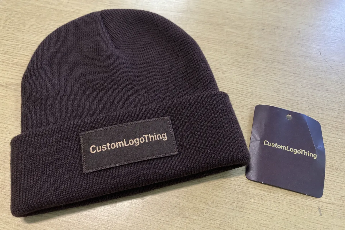
The classic failure looks like this: the mockup shows a crisp patch centered on a chocolate beanie, but the finished version arrives too small for the knit texture and the type reads like a blur from a normal viewing distance. On screen, the artwork was fine. In production, the limitations show up immediately.
The checklist catches the issues that screen approval hides. Scale matters because a 45 mm patch can feel balanced in a render and still disappear on a thick cuff. Placement matters because a patch too close to a seam can warp once it is stitched. Contrast matters because dark thread on a dark body flattens detail. And construction matters because woven patch, embroidery, leather, and knit stretch all behave differently.
There is also a hard difference between a digital proof and a physical sample. A digital proof can confirm layout, dimensions, copy, and color targets. It cannot confirm hand feel, stitch tension, yarn variation, or how the patch sits after it is sewn to the beanie. A sample answers those questions, but it takes more time and money. For many orders, a detailed proof is enough if the buyer knows what to check.
That is why this process pays off. It keeps the order grounded in the actual build, not in assumptions. If the proof is vague, the production run usually reflects that vagueness exactly.
Proof process and timeline from artwork upload to sign-off
A good proof workflow stays simple on paper: artwork intake, mockup setup, buyer review, revision notes, final approval, production queue. The cleaner the handoff, the fewer places an error can hide.
With clean vector art and clear placement instructions, same-day proofing is realistic. If the logo needs cleanup, tracing, font correction, or line-weight adjustments, 24 to 48 hours is more normal. When the order needs color matching, stitch-density discussion, or a debate over how close a patch can sit to a seam, the timeline stretches because the details are not settled yet.
The usual bottlenecks are predictable:
- Only a screenshot is available instead of a proper logo file.
- The patch size is described loosely, like "about 2 inches," with no hard measurement.
- Font issues show up late, especially if the type is unlicensed or not outlined.
- Feedback is vague, which creates a second proof round nobody planned for.
If you need a revision, ask early. If the patch sits near a fold, seam, or rib line, request a close-up callout before approval. That extra view matters when the artwork uses thin borders, tiny counters, or multiple colors that can merge into one muddy shape.
Suppliers that manage several decorating methods need one more layer of discipline. A woven patch, an embroidered patch, and a leather patch may all support the same logo, but they do not support it equally well. The proof has to show the actual method being used, not an interchangeable idea of a patch. If the decoration path might change, lock that down before the run starts.
Cost, MOQ, and quote variables that change unit price
Pricing on patch beanies is rarely random, even if the quote reads like it was assembled quickly. The main drivers are patch material, patch size, stitch density, logo color count, body color, and decorating method. After that, the unit price reacts to quantity, lead time, and how many proof revisions the project needs.
Small runs cost more per unit because setup is spread across fewer pieces. At 100 to 300 units, a custom beanie order often carries a noticeable premium. Once quantities move into the 500 to 1,000 range, the unit price usually drops, sometimes by 15% to 35%, depending on construction and decoration. Very low quantities are possible, but they are convenience buys, not bargain buys.
Here is a practical view of patch adders on a beanie order:
| Patch option | Typical unit adder | Best for | Tradeoff |
|---|---|---|---|
| Simple woven patch | $0.45-$0.95 | Small text, clean logos | Best detail, less texture |
| Embroidered patch | $0.65-$1.40 | Bold marks, sports-style branding | Thicker look, weaker tiny type |
| Leather patch with deboss | $0.75-$1.60 | Premium retail feel | Limited fine detail, fewer color options |
| Multi-color custom patch | $1.20-$2.50 | Detailed logos, layered branding | Higher setup and tighter proof control |
Those figures are adders, not total beanie prices. A basic knit body can cost far less or far more depending on fiber content, gauge, and sourcing location. The useful move is to ask for line-item pricing so you can separate the body, the patch, setup, labels, and packaging.
Quote surprises usually come from four places: rush charges, extra proof rounds, custom labels, and specialty packaging. Freight can also move the total if the goods ship from a different facility or need split delivery. If you want a fair comparison, ask for an apples-to-apples quote that shows the body, patch construction, proof fees, shipping, and tooling.
If the order includes retail carton work or shipping tests, the ISTA standards are worth a look because soft goods still need to survive handling. If paper hang tags or inserts are part of the package, FSC-certified paper is a sensible filter rather than a decorative flourish; see FSC for the basics.
Artwork specs that make patch details read cleanly
Good proofing starts before the mockup. If the source file is weak, the proof team has to guess, and guessing is how a sharp logo turns into a patch that looks generic from arm's length.
The file checklist is straightforward: vector artwork whenever possible, outlined fonts, clean clear space, minimum line thickness that suits the patch method, and Pantone references if color matters. A JPG or PNG can work for a simple emblem, but fine text and tight corners usually need vector cleanup.
Knit texture changes the game. A logo that looks crisp on a screen can lose definition once it is scaled down to fit a cuff or hem. Thin lines, tiny counters, and delicate serifs are the first details to disappear, so the proof should reflect the actual minimum size the patch can hold without collapsing.
Contrast needs equal attention. Dark-on-dark combinations often look refined in a mockup and muddy in real life. If the beanie is chocolate, the artwork needs enough separation to survive low light, distance, and the visual noise of the knit itself.
Method also shapes the file. Woven patches reward cleaner edges and fine detail. Embroidery handles bold shapes better than tiny lettering. Leather debossing works best when the design leans into strong forms instead of dense fills. Matching the artwork to the decoration method keeps the proof honest.
Step-by-step digital proof checklist before you approve
Use the proof like a production document, not a marketing image. The goal is to catch anything that will look off after the garment is made.
- Check the patch size against the actual beanie body and confirm the measurement in millimeters or inches.
- Confirm the placement on the cuff or front panel and make sure the patch does not crowd a seam, fold, or rib change.
- Review the artwork at true scale, since a logo that reads well when zoomed in may fail at the final size.
- Match the colors against the approved references and flag any substitutions before the run begins.
- Inspect the edges, corners, and small text for detail loss, especially on woven or embroidered patches.
- Look for any missing callouts on backing type, stitch style, label placement, or packaging.
- Save the approved proof version so future reorders use the same reference.
If anything feels vague, ask for a revision before signing off. A proof should answer questions, not create them.
Common mistakes that slow down beanie production
The biggest delays usually come from preventable gaps in the first round of review. A file sent as a screenshot forces the team to rebuild artwork that should already be clean. Missing measurements create back-and-forth that could have been avoided with one clear note. Unoutlined fonts are another repeat offender because they can break when the file moves between systems.
Loose approvals cause their own damage. Comments like "looks good" or "make it pop" do not tell the factory what to change. Specific feedback keeps the project moving and makes the next proof better than the last one.
Seam placement also trips people up. A patch can look centered in a flat mockup and still sit awkwardly once the beanie is folded and worn. If the decoration zone is tight, ask for a placement drawing that shows the garment in context.
Changes after approval are the slowest and most expensive part of the process. At that point, the team is no longer editing a file; they are dealing with materials, labor, and schedule. That is where a small oversight becomes a real cost.
What to send your supplier before final sign-off
A complete handoff gives the supplier fewer ways to miss the mark. Send the final logo file, the exact patch size, the desired placement, the color reference, and any notes about backing, label, or packaging requirements. If the project has a reference sample or previous order, include that too.
Measurement is the anchor. A patch described only as "medium" or "around two inches" invites interpretation, and interpretation is where production errors begin. Clear dimensions make the approval useful later if the same style gets reordered.
Packaging notes help as well. If the order needs tissue, swing tags, barcode labels, or retail-ready packing, say so before sign-off. The same goes for shipping requirements, since a good product can still arrive damaged if the transport plan is weak.
Once the proof is approved, keep the record. The approved file becomes the baseline for the next run, the next reorder, and any dispute about what was agreed to in the first place.
FAQs
How large should a patch be on a chocolate beanie?
The right size depends on the body shape, cuff height, and logo detail. A patch that looks balanced on a mockup may still be too small once it meets knit texture, so the final measurement should be checked at full size before approval.
Can a digital proof replace a sample?
Not completely. A proof can confirm layout, size, copy, and color targets, but it cannot show how the patch feels, bends, or sits once sewn to the beanie. For many orders, though, a careful proof is enough to move forward.
Why do dark beanies need extra review?
Dark fabric absorbs detail fast. Chocolate, black, and deep navy all make small logos work harder, especially when the decoration itself is also dark or tightly stitched.
What file type works best?
Vector files are the safest option because they hold clean edges at any scale. If the art starts as a JPG or PNG, expect cleanup before the proof is ready.
Why does the quote change after the first proof?
Revisions, setup, custom labels, and packaging changes all affect cost. A quote based only on the base beanie and patch often misses the extra items that appear once the order is finalized.


