Clear poly retail bags logo placement guide: start here
A press proof can look perfect, then the finished bag looks weak. That is the first lesson in any useful Clear Poly Retail Bags logo placement guide: transparent film does not forgive glare, fold lines, product color, or lazy artwork placement.
Logo placement is not “put the logo in the middle.” Cute idea. Usually wrong.
Placement means choosing the real print zone: front face panel, back panel, header area, bottom zone, gusset, flap, or repeat pattern. Each option changes how the brand reads when the bag is hanging on a peg, stacked in a bin, photographed for ecommerce, or handled under bright store lighting.
Clear bags are harsh judges. On opaque packaging, a slightly off-center logo may slide by unnoticed. On clear film, every registration shift, weak white ink layer, poor crop, and awkward product overlap shows faster. The contents become part of the design whether anyone planned for that or not.
The goal is simple: make the brand legible in the real buying situation. Not just on a PDF. Not just on a flat mockup. A bag hanging empty may show the logo beautifully, while the same bag filled with a bulky textile item may push the mark into a wrinkle, seam, or glare line.
Practical rule: judge clear bag artwork with the product inside the bag. A floating logo on a blank dieline tells you almost nothing about shelf impact.
Before paying for plates, screens, or a production slot, answer four questions: where should the logo sit, how large should it print, does it need white ink, and what will the product behind it do to visibility?
How print placement works on transparent retail bags
Printed clear poly bags are commonly made from LDPE, PP, BOPP, or similar transparent films. Typical retail gauges run from about 1.5 mil to 4 mil, depending on product weight, handling, and the level of structure the bag needs. A light stationery sleeve does not need the same film as a resealable apparel bag. Obvious, yes. Still missed all the time.
The printer registers artwork onto film before or during bag conversion, depending on the equipment and bag style. That means placement is tied to the film roll width, seal position, closure type, cut length, and finishing method. A logo cannot simply float wherever the mockup designer thinks it looks nice.
Flexographic printing is common for higher-volume runs because it handles repeat production efficiently. Screen printing can work for shorter runs or heavier ink deposits. Digital printing may be available for certain bag styles, though film type, ink adhesion, size, and color matching can limit options.
Each process has different tolerances. A 1/16 inch movement may be normal on one setup and unacceptable on another. Build safe margins into the artwork instead of pretending flexible film behaves like a rigid carton.
Most placement choices fall into three useful groups. A centered front logo gives strong shelf impact if the product does not block it. A lower-panel logo lets the product lead visually, which works well for colorful merchandise or items shoppers need to inspect. A repeat pattern creates branded coverage across the bag, useful for boutiques, apparel, stationery, and small giftable products.
Clear space changes everything. A 2.5 inch logo with half an inch of breathing room can read cleaner than a 4 inch logo jammed into the panel. Buyers often ask for the logo to be bigger. Printers see the aftermath: crowding near seals, distortion on flexible areas, and a bag that feels cheaper even when the film and ink are fine.
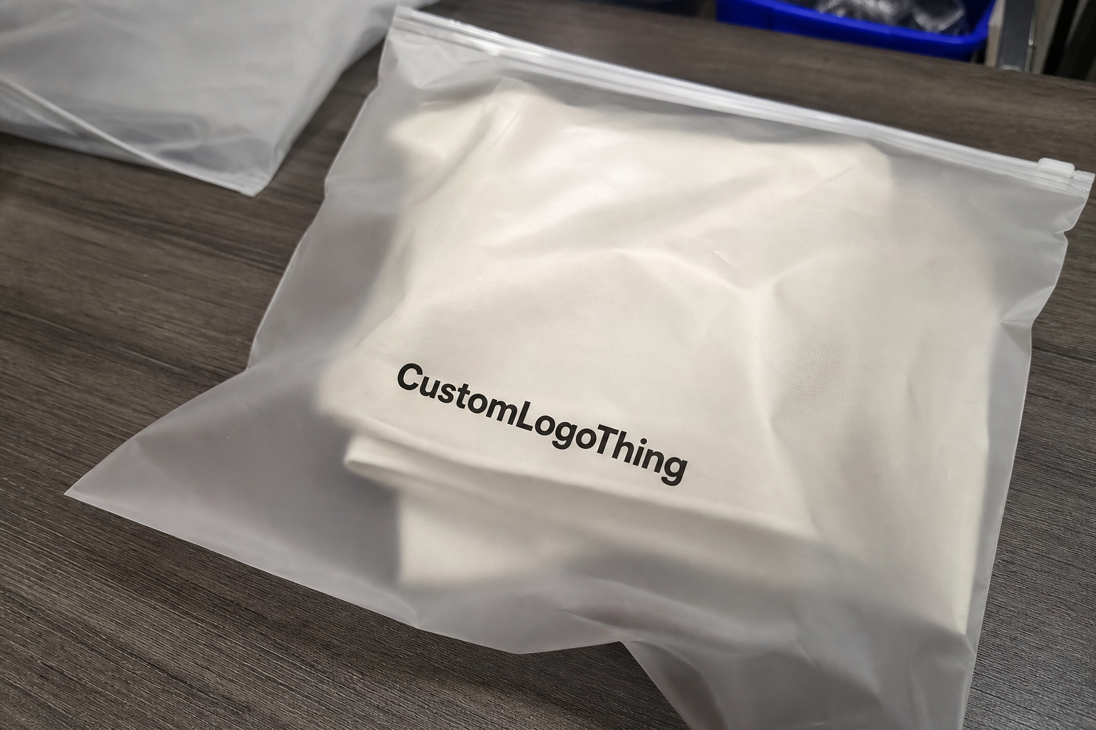
White ink underprint is the standard fix for contrast. If your logo is pale blue, yellow, metallic-look gray, or thin-lined, it may vanish against the product inside the bag. A white layer under the logo helps color stay true. The tradeoff is cost and appearance. White backing makes the print more solid and retail-ready, but it also reduces the transparent, airy look some brands want.
Use the same logic for black ink. Black looks reliable until it sits over navy fabric, dark chocolate packaging, charcoal accessories, or a busy printed product. Clear film makes background color part of the artwork. Ignore that and the customer sees a smudge, not a brand.
What changes visibility, durability, and shelf impact
Film thickness affects feel, clarity, and how the print behaves after packing. A 1.5 mil bag feels light and economical, often fine for small flat items. A 2 mil to 3 mil film feels more retail-ready for apparel, accessories, craft supplies, or kits. A 4 mil bag can feel more protective, but the extra stiffness may create stronger fold memory. Put the logo too close to that crease and it bends with the bag.
Film clarity matters too. High-clarity PP or BOPP can make print look sharper. Softer LDPE may have a hazier look, which can be perfectly acceptable for some apparel and utility packaging but less sharp for premium retail display.
Glossy film catches light. That can make dark logos pop, but it also creates glare across large solid print areas. Matte or frosted clear film reduces glare and fingerprints, though it softens contrast. No free lunch. Packaging rarely gives you one.
The product inside can rescue or wreck the design. A black logo over a white cotton item usually reads well. The same black logo over a dark navy product may disappear. White ink over a light beige product can look muddy unless the underprint is dense enough. Fine lines under 0.5 pt can break up on flexible film, especially after packing, folding, and shipping.
Handling changes the final look. Poly bags rub against cartons, shelves, bins, and other units during transit. If the ink sits on the outside surface, ask about rub resistance and cure time. For some applications, reverse printing or a protective varnish may help, though not every bag format supports it.
Technical specs help keep supplier conversations grounded. ASTM testing methods for film properties can give useful language when comparing materials, tensile strength, tear resistance, or film thickness. The standards library at ASTM International is a practical reference for terminology, even if final testing requirements depend on the product and retailer.
Functional print needs real space. Barcodes need quiet zones. Suffocation warnings may be required depending on bag size, opening, and market. Hanging holes, zipper tracks, flap seals, and header cards all compete with the logo. If the logo fights a barcode or warning label, the bag looks cluttered. Worse, the retailer may reject it.
- Best for shelf clarity: logo on the front panel, at least 0.375 inch to 0.5 inch away from seals.
- Best for hanging retail: logo in the upper third, below the hang hole and clear of the header seal.
- Best for product-first display: small logo in the lower corner or lower center, often 1.5 to 3 inches wide.
- Best for brand pattern: repeat mark at 30% to 60% coverage, depending on ink color and product visibility.
Production process and timeline
A clean production run starts with artwork review. Send vector art whenever possible: AI, EPS, or print-ready PDF with outlined fonts. Raster files can work only if resolution is high enough at final print size, usually 300 dpi or better. A tiny PNG pulled from a website is not a logo file. It is a cry for help.
After artwork review, the supplier confirms finished bag dimensions, film gauge, material, print area, ink colors, closure, and placement. Then comes the proof. For simple jobs, that may be a digital proof showing scale and position. For higher-risk jobs, especially clear film with white ink or tight retail requirements, a physical preproduction sample is worth considering.
Proofs should show the logo at actual size, not just centered on a generic bag outline. If there is a zipper, hang hole, header seal, adhesive flap, gusset, or barcode, it should appear on the proof. The proof should also identify whether the print is surface printed or reverse printed, and whether white ink sits only under the logo or extends beyond it.
Plate or screen setup follows approval. Flexographic plates add setup cost but can reduce unit cost at higher quantities. Screen setup can be simpler for one-color work, depending on the supplier. Digital setups may avoid plates but usually have their own limits on film compatibility, order size, and ink durability.
Sampling adds time. It also catches issues a screen proof can miss: glare, product overlap, opacity, curl, fold memory, and how the bag behaves once filled. If the order is large, the packaging is going to retail, or the product color varies across SKUs, sampling is not overkill. It is cheaper than explaining why 10,000 bags look wrong.
Typical custom printed poly bag production often lands around 12 to 20 business days from proof approval for standard specs. More complex jobs can run 25 to 35 business days, especially with custom sizing, multi-color print, dense white ink, specialty closures, or imported material. Rush work may be possible, but expect higher cost and fewer options. One print location, fewer colors, or a stock bag size may be the compromise.
| Production Choice | Typical Use | Cost Impact | Placement Flexibility |
|---|---|---|---|
| One-color front logo | Simple retail branding | Lowest setup and unit cost | Good, if kept away from seals |
| Logo with white underprint | Light or colored logos on clear film | Moderate increase from extra ink pass | Good, but contrast must be proofed |
| Two to four color print | Brand marks with multiple colors | Higher setup and registration cost | Moderate, due to tighter tolerances |
| Repeat pattern | Boutique or gift-style presentation | Higher ink coverage cost | Strong, but must avoid seals and folds |
Delays usually come from avoidable messes: unclear logo files, missing dimensions, late color changes, no dieline, or five people approving one proof with five different opinions. Decide who has final approval before the proof arrives. Your timeline will thank you.
Cost, pricing, and MOQ
The biggest cost levers are bag size, film gauge, print colors, white ink coverage, order quantity, and closure style. A 6 x 9 inch 2 mil clear bag with a one-color front logo is a very different job from a 12 x 15 inch 3 mil resealable bag with a two-color logo and white backing. Same category. Different invoice.
For rough planning, small custom printed clear bag runs may land around $0.18 to $0.45 per unit at quantities near 5,000 pieces, depending on size and print coverage. Higher-volume runs of simpler bags can drop below that range. Specialty films, heavy gauges, dense ink coverage, custom features, or low MOQs can push well above it. These are planning ranges, not a quote. Anyone promising exact pricing without specs is guessing with confidence.
MOQ matters because setup costs do not care whether the run is 1,000 bags or 20,000 bags. Plates, screens, artwork prep, machine setup, and proofing still happen. Smaller orders spread that cost over fewer units, so the per-bag price climbs. A one-color logo at 10,000 pieces may feel reasonable; the same setup at 1,000 pieces may feel rude.
A simple one-color placement is usually the cheapest path. Black, white, or one brand color on the front panel keeps setup controlled and reduces registration risk. Extra contrast is worth the spend when the product behind the bag is busy, dark, patterned, or inconsistent from unit to unit.
If the assortment changes colors every season, white underprint may save the logo from disappearing half the year. It costs more, but so does packaging that only works on one product color.
Ask for quotes with the same specs across suppliers. Otherwise you are comparing fog. Give the exact bag size, film type, gauge, closure, print area, number of ink colors, white underprint requirements, quantity breaks, packing format, and lead time target. If you are sourcing related packaging too, reviewing broader Custom Packaging Products can help align bag specs with boxes, labels, tissue, or mailers.
Step-by-step logo placement setup
Start with the product, not the logo. Measure the actual item going into the bag: width, height, depth, and how it sits after packing. A flat 7 x 10 inch bag may become visually shorter once a folded shirt, accessory kit, or bulky product fills the bottom. That changes the usable print zone.
- Choose the product view. Decide whether the customer needs to inspect the contents first or recognize the brand first. Food-safe items, apparel, stationery, accessories, and kits may need different answers.
- Select the print zone. Use the face panel for display, the upper third for hanging retail, the lower corner for product-led merchandising, or a repeat pattern when the bag may fold over.
- Build at real size. Place the logo at actual print dimensions, not as a random percentage on a mockup. Keep critical text at least 0.375 inch from seams, seals, zipper tracks, and flap edges.
- Check contrast. Test the logo over dark, light, and patterned product photos. If it fails on two of three, add white ink, simplify the mark, or move the placement.
- Review from three feet away. A retail bag is not judged at 400% zoom. Print the proof at size and step back.
Good proof logic includes scale, safe margins, barcode location, warning placement, hang hole clearance, closure clearance, and white ink behavior. Misaligned white underprint creates a pale halo. Sometimes subtle. Often ugly.
Also check orientation. Bags with hang holes may sit differently on pegs than they do in a flat layout. Resealable bags may show the zipper first. Flap bags may shift the visible front depending on how the flap folds after packing. The print position should match how the customer actually sees the package.
For products shipped directly to customers, think about how the bag works with outer packaging. If clear retail bags are paired with branded shipping materials, Custom Poly Mailers may need a different design role. The retail bag can stay product-forward while the mailer carries the stronger brand hit.
Common mistakes that make clear bags look cheap
The most common mistake is centering the logo without checking where the product will sit. Dead center sounds safe. It can land directly over a fold, a bulky seam in the product, or the darkest part of the contents. A logo placed slightly higher or lower often looks more intentional.
Overcomplicated artwork is another classic problem. Tiny taglines, fine decorative lines, gradients, and thin serif details can break down on flexible clear film. If the logo includes small type under 6 pt, expect trouble unless the print method and film are tested. Retail packaging should read quickly. It is not a museum plaque.
Skipping a preproduction proof can be expensive. Clear materials reveal spacing problems fast, especially if the logo sits near a zipper closure, bottom seal, or gusset. A digital proof may show the mark floating beautifully. The packed bag may split it across a fold. That is the sort of surprise nobody enjoys after paying for a production run.
Gussets deserve special suspicion. Side gussets and bottom gussets add volume, but they also bend and hide print. If the logo crosses into that area, part of it may disappear when the bag opens. For gusseted bags, keep the main logo on the flattest visible panel unless the artwork is intentionally designed as a wraparound effect.
Compliance print gets ignored until late, then everyone scrambles. Suffocation warnings, recycling marks, country-of-origin text, and barcodes all need space. The U.S. Environmental Protection Agency has useful guidance on materials and recycling language at EPA recycling resources, though local requirements and retailer rules can vary. For transit testing and packed-product performance, ISTA is another practical reference.
- Bad idea: light gray logo over mixed-color products with no white underprint.
- Bad idea: full-front print on thin glossy film without testing rub resistance.
- Bad idea: barcode placed over a wrinkle-prone bottom zone.
- Bad idea: logo crossing a side gusset because the flat proof looked “balanced.”
- Bad idea: approving color from a monitor without checking ink opacity on clear film.
What to check before requesting a quote
Before contacting a supplier, gather three basics: finished bag dimensions, the best available logo file, and the target print location. Add product photos if you have them. Even rough photos help because clear bag placement depends on the item inside, not just the bag outline.
Ask for a mockup with the actual product inside the bag or at least a photo-based placement proof. Judge the design in context. A centered 3 inch logo may look clean on a flat proof and clumsy over a patterned product. A smaller logo in the upper third may give better shelf recognition and leave the product visible.
Compare two versions before approving: one optimized for lower cost and one optimized for stronger shelf visibility. The budget version might use one ink color on the front panel. The visibility version might add white underprint, move the logo higher, or adjust scale. Seeing both makes the tradeoff real.
Confirm the print zone, film gauge, ink count, white underprint, safe margins, barcode space, warning copy, and production timeline before approving a proof. Clear bags can look sharp, modern, and retail-ready. They can also look cheap fast. The difference is usually decided before production starts.
FAQ
Where should a logo go on clear poly retail bags for the best visibility?
For most retail products, the front face panel works best because shoppers see it first on a shelf, peg hook, or product photo. If the product fills most of the bag, move the logo higher, lower, or slightly offset so the item does not block the brand mark. Always check the logo against the packed product, not just an empty bag.
Does white ink improve logo placement on clear poly retail bags?
Yes. White ink creates contrast on transparent film and keeps brand colors from disappearing into the product behind the bag. It also raises cost and changes the look, so use it where readability matters: pale logos, thin marks, dark products, busy patterns, or retail lighting with glare.
What affects pricing for printed clear poly retail bags the most?
Quantity, print colors, bag size, film gauge, closure style, and white ink coverage usually drive the biggest unit cost changes. MOQ matters too. Smaller orders spread setup costs across fewer bags, so the unit price almost always climbs.
How long does production usually take for custom printed poly bags?
Standard production often takes about 12 to 20 business days after proof approval for common specs, while more complex jobs can take 25 to 35 business days. Delays usually come from file changes, missing dimensions, unclear artwork, late approvals, or custom material requirements. Rush turnaround may be possible, but it can narrow print options and increase pricing.
What file should I send for clear poly retail bags logo placement?
Send a vector logo file if possible, such as AI, EPS, or a print-ready PDF with fonts outlined. Include the exact bag size, preferred print area, product photos, and any barcode or warning copy. Those details help the supplier judge whether the logo should sit centered, high, low, or offset for the cleanest result.