Buyer Fit Snapshot
| Best fit | Cmyk Printed Kraft Boxes projects where brand print, material claims, artwork control, MOQ, and repeat-order consistency need to be specified before quoting. |
|---|---|
| Quote inputs | Share finished size, material target, print colors, finish, packing count, annual reorder estimate, ship-to region, and any compliance wording. |
| Proofing check | Approve dieline scale, logo placement, barcode or warning zones, color tolerance, closure strength, and carton packing before bulk production. |
| Main risk | Vague material claims, crowded artwork, missing packing details, or unclear freight terms can make a low unit price expensive after revisions. |
Fast answer: Cmyk Printed Kraft Boxes: Board, Finish, Dieline, and Unit Cost should be specified like a repeatable production item. The safest quote records material, print method, finish, artwork proof, packing count, and reorder notes in one written spec.
Production checks before approval
Compare the actual filled-product size with the drawing, then confirm tolerance on folds, seals, hang holes, label areas, and retail display edges. Reserve space for logos, QR codes, warning copy, and material claims before decorative graphics fill the panel.
Quote comparison points
Review material grade, print process, finish, sampling route, tooling charges, carton quantity, and freight assumptions side by side. A quote is only useful when the supplier can repeat the same color, closure quality, and packing count on the next order.
CMYK Printed Kraft Boxes: A Practical Packaging Guide
A coral logo can look sharp on a monitor and kind of dull on kraft board. That is not a failure. It is the first clue that cmyk Printed Kraft Boxes are shaped as much by the paper as by the artwork. The substrate changes the result, and it does not wait for anyone to catch up.
For packaging buyers, that is both the headache and the appeal. cmyk Printed Kraft Boxes give you structure, color, and a natural finish without forcing the brand into a shiny, overworked look. They feel grounded. They also punish lazy files. If the artwork is sloppy or the spec is vague, the box will say so pretty fast.
The real question is not whether kraft can be printed. Of course it can. The real question is whether the design was built for kraft from the start. That difference decides whether the final box looks intentional or just printed.
What CMYK Printed Kraft Boxes Are and Why They Stand Out
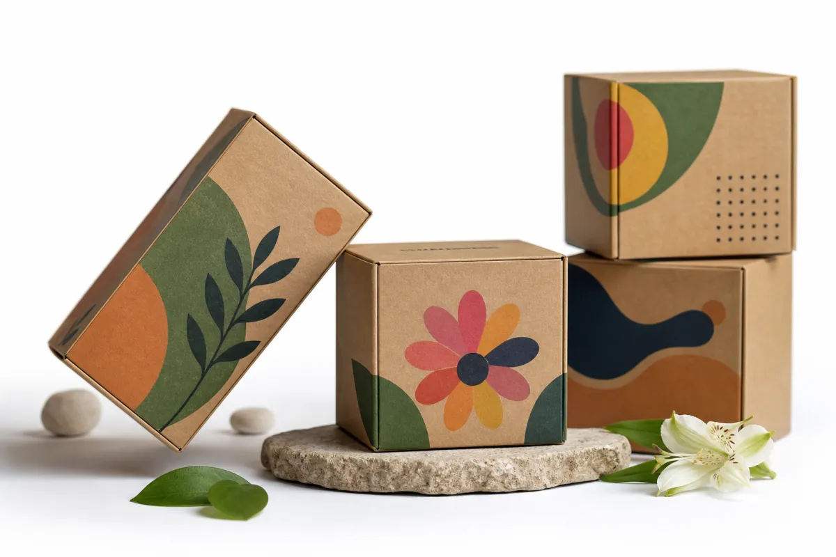
cmyk printed kraft boxes are packaging boxes printed with the four-color process: cyan, magenta, yellow, and black. Those inks build color with layered dots instead of one premixed shade. That means logos, gradients, product artwork, small type, patterns, and even photography can all be reproduced. That flexibility is a big reason brands choose cmyk printed kraft boxes instead of limiting themselves to one or two flat inks.
The print method is only half of the story. The board matters just as much. Kraft is not a blank white sheet pretending to be neutral. Brown kraft, white-top kraft, and bleached kraft each bring different absorbency, texture, and tone. The same CMYK values can drift across all three. A soft blue can go dusty. A red can lean brick. Black can lose some depth. On cmyk printed kraft boxes, ink and paper are always in the same conversation, whether the file is ready for that or not.
That is also why these boxes keep getting attention. Kraft suggests restraint. It hints at recycled content, less visual noise, and a product story that does not need a spotlight. For food, wellness, beauty, apparel, and subscription brands, that can read as more premium than glossy stock because it feels honest rather than staged. When the artwork is handled well, cmyk printed kraft boxes can say clean, modern, and responsible without yelling about it.
There is another reason they stand out. They force better design discipline. Once a brand commits to cmyk printed kraft boxes, contrast matters more. Typography matters more. Ink coverage matters more. That is not a downside. It usually improves the packaging. The kraft texture becomes part of the brand language instead of something the design tries to hide behind.
CMYK vs. spot color matters here. Spot color is the better move when a brand needs one exact signature shade every time. CMYK is stronger for gradients, multiple hues, and image detail. On kraft, some teams use both: CMYK for the artwork and a spot color for a logo or key accent. That can work well, but every extra color adds cost, setup time, or production complexity. Packaging budgets have a funny way of getting happier when the color count stays sane.
Buyers sometimes ask whether kraft can be printed cleanly at all. Yes, it can. The better question is whether the artwork was built for the stock. cmyk printed kraft boxes reward brands that understand that distinction before they place the order.
How CMYK Printed Kraft Boxes Work in Production
The CMYK process uses four ink layers to recreate color. On coated board, those layers sit closer to the surface and keep more punch. On kraft, absorbency changes the result. Ink sinks in more readily, which lowers contrast and can flatten the artwork a bit. That does not mean the print is poor. It means cmyk printed kraft boxes need artwork prepared for an uncoated or lightly coated surface, not a file borrowed from a glossy brochure and shoved into a new layout.
Three production paths usually come up. Offset printing is common for consistent, higher-volume runs and can deliver crisp detail when the file is built properly. Digital printing makes sense for short runs, versioning, and quick sampling, especially when a brand wants to test the design before a larger order. Flexographic printing is often chosen for corrugated packaging or efficient long runs, though linework and tonal range behave differently from offset. Each one can produce cmyk printed kraft boxes, but the choice changes cost, color consistency, and setup time.
Paper type is the other big variable. Natural brown kraft gives the most rustic look and the least color fidelity. White-top kraft adds a brighter printable face while keeping a kraft side or interior, which helps the artwork read more accurately. Bleached kraft pushes closer to standard white packaging, though it can soften the earthy story many brands want. If a supplier does not tell you which face is being printed, ask. That one detail changes the outcome of cmyk printed kraft boxes more than most buyers expect.
Prepress work decides whether the job lands cleanly or turns into a mess. File resolution needs to be high enough for the box size. Bleed has to extend past the trim. Safe zones need to protect text and logos from folds and die-cut edges. Ink limits matter because kraft can only take so much saturation before heavy areas start to look muddy. For cmyk printed kraft boxes, the best proof is not a screen mockup. It is a proof built for the actual stock and process.
That is why suppliers ask for dielines before the artwork is final. The dieline shows the folds, glue flaps, and display panels. It also shows where the design should stop, restart, or change direction. Good dielines save time. Bad dielines create reprints and angry emails. Nobody enjoys the second version of that conversation.
There is a structural reality hiding under the print discussion. A box that looks fine in a render may scuff, crush, or flex too much once it is built. If the package is shipping through parcel networks, it is worth checking transit performance with ISTA methods and comparing board assumptions against ASTM-style testing logic. That is not overkill. It is basic risk control. A nice-looking design is fine. A box that arrives intact is better.
In practice, the most dependable cmyk printed kraft boxes combine the right print method, the right kraft face, and proofing that matches the real use case. Simple formula. Not always simple execution.
CMYK Printed Kraft Boxes: Key Factors That Shape Color and Cost
Color and cost are tied together more tightly than buyers like to admit. With cmyk printed kraft boxes, the first driver is print coverage. A restrained layout with one logo, a few lines of text, and open space usually costs less than a full-bleed design with dense artwork on every panel. Heavy coverage means more ink, more press attention, and more chance of visible variation. That effect is stronger on darker kraft, where the substrate already shifts the tone.
Order quantity is the second major variable. Short runs usually carry a higher unit cost because setup, plate work, file checks, and machine calibration get spread across fewer pieces. Larger runs lower the per-box price, but they also tie up cash and storage. For cmyk printed kraft boxes, a brand ordering 500 units may pay a very different rate from one ordering 5,000, even if the box style is identical.
Finishing choices can move the price more than the print itself. Aqueous coatings, matte lamination, embossing, foil, spot UV, soft-touch finishes, and special varnishes all add labor or extra process steps. Some of those finishes also fight the raw kraft look. A soft-touch box can feel expensive, but it can mute the honest, recycled impression that pulled the brand toward kraft in the first place. With cmyk printed kraft boxes, the smartest finish is not always the flashiest one. It is the one that supports the brand story and the handling needs.
Material choice matters too. Natural kraft is often the most straightforward option. White-top kraft may cost a bit more because of the printable face. Bleached kraft can add another step or two depending on the construction. If the structure needs inserts, partitions, or Custom Die Cuts, the spend rises again. The box is never just the box. It is the board, the cut, the print, the finish, and the assembly.
Here is a practical comparison to make the tradeoffs easier to read:
| Stock Type | Visual Result | Color Behavior | Typical Unit Cost at 5,000 | Best Fit |
|---|---|---|---|---|
| Natural brown kraft | Earthy, warm, visibly recycled | Softens bright CMYK tones and deepens neutrals | $0.18-$0.30 | Minimal branding, organic products, rustic presentation |
| White-top kraft | Cleaner print face with kraft character | Improves contrast and keeps whites brighter | $0.21-$0.34 | Retail boxes, beauty, apparel, higher color accuracy |
| Bleached kraft | Closest to a bright white carton | Best for image detail and lighter tones | $0.24-$0.39 | Premium presentation, photography, sharper branding |
Those numbers are directional, not universal. Box size, board caliper, ink coverage, shipping lane, and finishing all move the final price. The pattern is still pretty clear. cmyk printed kraft boxes get more expensive as the design asks more of the press and more of the structure.
Sustainability can reduce cost in smaller ways that add up. A box that fits the product properly uses less board. A layout that avoids unnecessary full-coverage backgrounds often prints faster and wastes less material. A design approved on the first physical sample avoids reprints. A packaging spec that is clear enough for suppliers to quote correctly saves time on the front end. The cheapest cmyk printed kraft boxes are usually the ones that are simplest to execute.
If your supplier offers FSC-certified stock, verify the chain-of-custody claim directly through FSC. It is a small step, but it matters if the packaging story is part of the sale. Buyers notice those details, and retailers do too.
CMYK Printed Kraft Boxes: Step-by-Step Process and Timeline
Good packaging projects start with a short, precise brief. For cmyk printed kraft boxes, the brief should include product dimensions, weight, whether the item ships individually or in sets, the required look, and any retail or e-commerce constraints. A candle box, a cosmetic carton, and a mailer each need different structural thinking. If the supplier has to guess, the quote gets fuzzy and the timeline stretches.
The next step is the dieline. This is where many projects either save time or lose it. The dieline defines the shape, folds, panels, and glue areas. It also shows where type should stay away from edges and where artwork can cross a fold safely. Once the artwork is built on a proper dieline, the box starts acting like a package instead of a flat poster. That matters for cmyk printed kraft boxes, because fold lines can break up gradients and small text if they are not planned early.
After layout comes proofing. A digital proof catches spelling, positioning, barcode placement, and die-line fit. A physical sample shows whether the kraft face behaves the way you expected. That second step is the one that saves money. A screen can suggest a bright mustard tone; the actual kraft may deliver something deeper and more muted. Better to learn that early than after a thousand units are already in motion.
A realistic timeline usually moves in stages:
- Brief and quote review: 1-3 business days if the specs are complete.
- Dieline and artwork setup: 2-5 business days depending on revisions.
- Sampling or proof approval: 3-7 business days, sometimes longer if the stock needs testing.
- Production: often 8-15 business days for straightforward runs, more for complex finishing.
- Shipping and receiving: add transit time based on destination and freight method.
That timeline is not a promise. It shifts with quantity, press schedule, material availability, and revision requests. Still, it is a realistic frame. cmyk printed kraft boxes are rarely delayed by one giant problem. They are delayed by five small ones: a missing dieline, a late logo change, an unclear finish choice, a proof skimmed too quickly, and a bad assumption that "close enough" will pass.
A better-looking kraft box usually comes from respecting the substrate, not from forcing coated-paper color onto it.
It also helps to test the box with the real product and the real ship method. A box can look excellent on a table and fail once an insert is added, a tissue wrap shifts, or a courier stacks it badly. The packaging buyer has to think like a shipper here. The best cmyk printed kraft boxes are attractive, yes, but they also stack, close, and protect without drama.
If you need to compare structures before you request a quote, browse Custom Packaging Products and narrow the box type first. That simple move often shortens the approval cycle because the supplier knows whether to quote a folding carton, mailer, rigid-style presentation box, or something else entirely.
Common Mistakes Brands Make With CMYK Printed Kraft Boxes
The biggest mistake is expecting coated-stock color accuracy from kraft. It does not work that way. A color that looks crisp on a bright white mockup can go darker, warmer, or softer once it lands on kraft. With cmyk printed kraft boxes, that shift is not a defect. It is the material doing what it naturally does. The trouble starts when the artwork is built as if the material will disappear.
Light text is another common trap. Pale gray type, thin lines, and soft gradients can vanish against a brown or textured background. That does not mean the design cannot be subtle. It means subtlety needs contrast and scale. For cmyk printed kraft boxes, bolder typography usually reads better, especially at retail distance or in low warehouse lighting.
Brands also skip proof reviews because they assume the packaging is "just a box." That assumption gets expensive fast. If the box is part of the unboxing, part of the shipping protection, and part of the shelf presence, it deserves the same review discipline as the product label. One missed barcode, one cut-off panel, or one bad fold can turn a decent run into waste. The smarter habit is to proof cmyk printed kraft boxes as both a brand asset and a mechanical object.
Overdesign creates a different kind of waste. Heavy ink coverage, oversized board dimensions, unnecessary inserts, and decorative features that do not improve the customer experience all push the price up. Worse, they can make the box harder to recycle or more difficult to ship efficiently. The industry loves to talk about sustainability, but the cleaner route is usually restraint. Simple does not mean cheap-looking. Simple means deliberate.
Vague specs are the last big mistake. If the supplier does not know the board grade, the finish, the exact dimensions, or the expected color behavior, the quote may look attractive while the final result becomes harder to control. That is where packaging projects drift. Clear specs keep cmyk printed kraft boxes on schedule and protect the budget from avoidable revisions.
There is a process lesson here worth keeping. Strong packaging projects are rarely rescued by heroics. They are protected by details gathered early, checked carefully, and approved at the right stage. That matters even more for cmyk printed kraft boxes, where the substrate itself becomes part of the color system.
Expert Tips for Better CMYK Printed Kraft Boxes
Start with contrast. If the design has to work on kraft, the typography should probably be stronger than your first instinct says. Heavier type weights, larger logos, and cleaner spacing usually print better than delicate letterforms. That does not mean every box should shout. It means cmyk printed kraft boxes tend to reward clarity over fragility.
Match the artwork to the material. Earth tones, deep greens, charcoal, muted blues, and warm neutrals often behave more gracefully on kraft than neon shades or ultra-pale pastels. That is not a creative downgrade. It is a strategic choice. A design that accepts the substrate usually looks more expensive than one that fights it. If the brand story is natural, premium, or artisanal, cmyk printed kraft boxes can carry that message without extra decoration.
Ask for material samples before final approval. A touch sample tells you more than a screenshot ever will. Texture changes perception. So does lighting. So does the difference between a matte kraft face and a smoother white-top face. A good sample run helps you see how the ink sits, how the folds behave, and whether the box still feels right in hand. That matters a lot for cmyk printed kraft boxes used in cosmetics, candles, supplements, and giftable retail items.
Think through the full handling chain. A box can look beautiful on a studio table and fall apart in a distribution center. It should open cleanly, close with proper friction, and survive stacking. If the product ships, test for compression, vibration, and drop risk. If it sits on a shelf, test for glare and legibility from a short distance. The best cmyk printed kraft boxes are designed for how people actually touch them, not just how they photograph.
One more practical point: decide early whether the brand needs CMYK alone or a blend of CMYK and spot color. If a logo has to match a strict brand standard, a spot color may still be useful even on kraft. If the design is image-heavy or needs gradients, CMYK is usually the better base. Many good packaging programs use both. The choice should reflect the product, the budget, and the repeat-order plan.
From a buyer's point of view, the best result is a package that feels aligned across every step. The print looks right. The board feels right. The shipping performance holds up. That is the real benchmark for cmyk printed kraft boxes, not whether the first screen mockup looked impressive.
Next Steps for Ordering CMYK Printed Kraft Boxes
Before you ask for a quote, build a one-page spec sheet. Include dimensions, quantity, product weight, artwork goals, finish preferences, whether you want natural brown kraft or a brighter face stock, and any shipping requirements. That one page gives suppliers a real target and makes pricing far more accurate. It also reduces the chance that cmyk printed kraft boxes get quoted like a generic carton instead of a custom package.
Then ask for the right proof stage. A PDF proof is good for layout. A physical sample is better for color and feel. If the product is fragile, request a transit-style test or at least a simulated pack-out. A sample without the actual product inside gives you half the picture and half the confidence. The closer the approval stage is to real use, the fewer surprises you will face later with cmyk printed kraft boxes.
When the quotes arrive, compare more than the unit price. Look at setup cost, proof cost, finishing charges, freight, and the likely waste from rework or delayed approval. A lower quote can cost more overall if it leads to a bad sample or a material substitution. Packaging buyers see this pattern all the time: the cheapest line item is not always the least expensive finished job. That is especially true for cmyk printed kraft boxes, where material selection and print accuracy affect the total landing cost.
- Check the stock: confirm whether the sample is natural brown, white-top, or bleached kraft.
- Check the ink plan: decide whether CMYK alone is enough or whether a spot color should anchor the logo.
- Check the finish: confirm whether you need matte, aqueous, varnish, or no coating at all.
- Check the timeline: separate proof approval, production, and shipping so no one treats them as the same step.
- Check the use case: retail display, e-commerce shipping, or gift packaging each changes the structure.
If you want the cleanest path forward, start here: define the box clearly, ask for a sample on the exact stock, and judge the result in real lighting with the actual product inside. That is the point where cmyk printed kraft boxes stop being an idea and become packaging that can actually do its job. If the design still feels strong at that stage, you have a package worth running. If it does not, you just saved yourself from a costly mistake before production begins.
Are cmyk printed kraft boxes a good choice for small businesses?
Yes, especially if you want a natural look without locking yourself into a rigid spot-color program. cmyk printed kraft boxes work well for smaller brands that need flexible branding, moderate quantities, and packaging that feels more considered than plain shipping cartons. The tradeoff is color control, so a proof is smart before you place the full order.
How do cmyk printed kraft boxes compare with Pantone printing?
CMYK is stronger for full-color art, gradients, photography, and detailed illustrations. Pantone is better when a brand needs one highly specific signature color to match as closely as possible across packaging. On kraft, both methods can shift visually, but cmyk printed kraft boxes usually give more design flexibility.
Why do colors look different on cmyk printed kraft boxes?
Kraft absorbs ink differently from coated board, so colors often appear softer, darker, or warmer. The brown or off-white tone of the substrate also changes the apparent color by mixing with the printed ink. White-top kraft or a white underlay can improve the result when more accurate color reproduction matters.
What affects the price of cmyk printed kraft boxes the most?
Quantity, board type, print coverage, and finishing choices usually drive price the most. Custom dimensions, inserts, and specialty structures can add setup and tooling costs. Simple artwork on standard sizes is often the most budget-friendly route for cmyk printed kraft boxes.
How long does it take to produce cmyk printed kraft boxes?
Timeline depends on artwork approval, proofing, material availability, and order volume. A fast quote is not the same as a fast production schedule, so it helps to confirm each stage separately. Planning ahead for samples and revisions usually shortens the total process for cmyk printed kraft boxes.


