Buyer Fit Snapshot
| Best fit | Compare Matte vs Gloss Packaging projects where brand print, material claims, artwork control, MOQ, and repeat-order consistency need to be specified before quoting. |
|---|---|
| Quote inputs | Share finished size, material target, print colors, finish, packing count, annual reorder estimate, ship-to region, and any compliance wording. |
| Proofing check | Approve dieline scale, logo placement, barcode or warning zones, color tolerance, closure strength, and carton packing before bulk production. |
| Main risk | Vague material claims, crowded artwork, missing packing details, or unclear freight terms can make a low unit price expensive after revisions. |
Fast answer: Compare Matte vs Gloss Packaging: Production Spec, Color Control, and Delivery Risk should be specified like a repeatable production item. The safest quote records material, print method, finish, artwork proof, packing count, and reorder notes in one written spec.
Production checks before approval
Compare the actual filled-product size with the drawing, then confirm tolerance on folds, seals, hang holes, label areas, and retail display edges. Reserve space for logos, QR codes, warning copy, and material claims before decorative graphics fill the panel.
Quote comparison points
Review material grade, print process, finish, sampling route, tooling charges, carton quantity, and freight assumptions side by side. A quote is only useful when the supplier can repeat the same color, closure quality, and packing count on the next order.
On a press floor in Shenzhen's Bao'an district, gloss usually wins the first three seconds and matte tends to win the last one. I still remember two carton samples under 6500K inspection lights, one on 350gsm C1S artboard and the other on 24pt SBS, and the contrast was almost rude in its clarity. Brands miss that split second and then build the wrong argument around finish. Compare Matte vs gloss packaging and you are not just comparing shine against a softer surface. You are weighing attention against restraint, speed against patience, spectacle against confidence. I have watched a plain white carton with a gloss logo get picked up faster than a louder design with a flat coating. I have also watched a skincare brand in Dongguan abandon gloss after the sample looked oddly cheap under showroom LEDs. A box is never only a box. It carries package branding, product packaging, and the first proof of whether a brand feels expensive or merely decorated. To compare matte vs gloss packaging properly, you have to see how the finish behaves on the actual board, in the actual light, with the actual artwork.
The short answer is straightforward, and the numbers usually back it up. Gloss is louder, brighter, and harder to ignore. Matte is calmer, quieter, and usually reads as more premium in hand. That does not make matte the universal winner, and anyone who says otherwise is selling a finish like it is a miracle. A snack launch fighting for attention in a crowded aisle in Chicago needs a different finish than a rigid gift box sitting on a boutique shelf in Los Angeles for six weeks. I have quoted both finishes on Custom Packaging Products ranging from 18pt SBS cartons to 350gsm C1S sleeves, and the better choice always comes back to lighting, handling, and how much visual drama the brand can actually use. If you want to compare matte vs gloss packaging without wasting hours, start with how customers will touch, see, and carry the box. The finish decision gets expensive only when it ignores the real use case. To compare matte vs gloss packaging with any rigor, use the same substrate, same print file, and same room light before you judge the result.
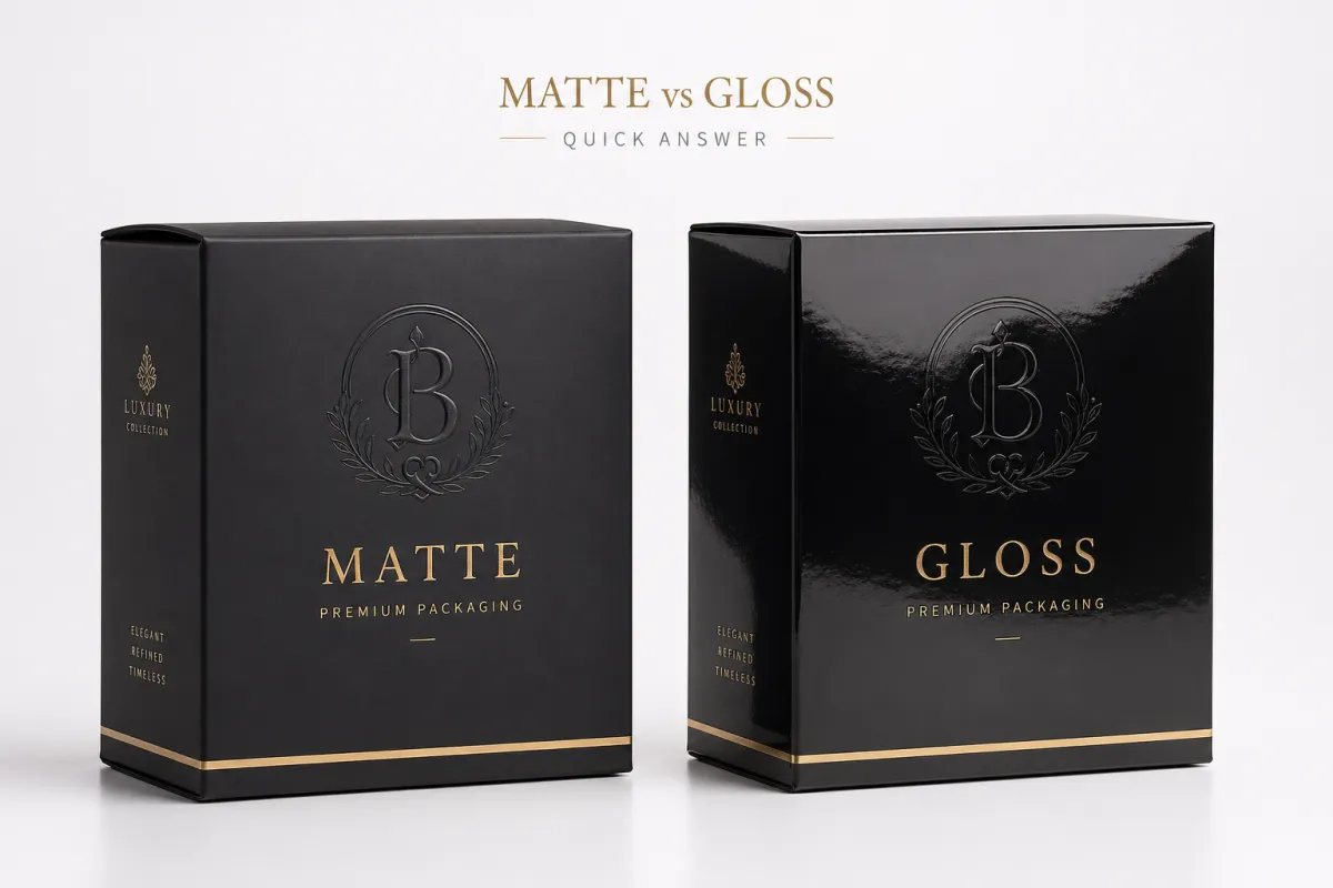
Compare Matte vs Gloss Packaging: Which Is Better?
On a press check in Guangzhou, gloss can look crisp and almost electric under 5000K inspection lights, then turn theatrical once it lands on a retail shelf with warm overhead fixtures and window spill. Matte does the opposite. It pulls glare out of the equation, softens the color a shade or two, and often makes a carton feel more expensive before anyone has read a word. That is why compare matte vs gloss packaging matters for brands that care about shelf presence and hand-feel in equal measure. The same printed sheet can feel like two different products depending on whether it is under a warehouse fluorescent tube or a boutique pendant lamp. To compare matte vs gloss packaging in a way that predicts the shelf, you need to see the sample under both conditions.
If you need the blunt version, choose gloss for bold color, tight contrast, photo-driven layouts, and packaging that has to pop from six feet away. Choose matte for a quieter luxury signal, fewer fingerprint complaints, and a finish that makes minimal layouts look deliberate instead of unfinished. I saw a cosmetics founder in Miami reject gloss after thirty seconds because every thumbprint showed up on the black panel. She pointed at it, counted the smudges, and said, "I am not paying to print fingerprints." Fair enough. The same box in matte felt calm and expensive. That single decision saved her from a reprint and from a stack of unflattering unboxing clips filmed on an iPhone 15 Pro. A finish choice can protect both margin and reputation. If you compare matte vs gloss packaging on dark stock, the fingerprint test usually settles the argument fast.
- Gloss wins for bright retail packaging, promo launches, and color-rich custom printed boxes with photos or gradients.
- Matte wins for artisan food, skincare, fragrance, and branded packaging that leans on restraint and tactile quality.
- Gloss struggles more with glare, fingerprints, and obvious scuffs on dark solids.
- Matte struggles more when artwork depends on ultra-bright color or razor-sharp reflective contrast.
Commercially, the finish needs to match the product, the channel, and the abuse the carton will take before anyone opens it. A mailer box for a subscription kit in Austin has to survive trucks, stacking, and storage for 30 to 45 days. A rigid gift box for jewelry in New York has to feel luxurious the moment it is touched. A bulk retail sleeve in Dallas has to shout, not whisper. I tell clients to compare matte vs gloss packaging against those realities, not against a mood board alone. If the box lives under harsh store lights, gets handled by a lot of people, or ships through rough distribution, the finish decision changes quickly. A good sample on a bad channel can still fail, and that failure is always more expensive than the coating line item. To compare matte vs gloss packaging honestly, you have to ask where the box will actually live.
Finish never acts alone. It sits on top of substrate, ink density, coating chemistry, and die-cut quality. A weak file on a beautiful matte sheet still looks weak. A smart layout on gloss can look polished even on a modest budget. That is why I ask for the stock first, then the finish, then the print method. On a 350gsm C1S artboard, a simple black logo can look crisp with a UV gloss varnish; on a 24pt SBS carton, the same logo can read more refined with matte lamination. Good packaging design starts with a practical stack of choices, not a fantasy render. That stack matters more than most people admit, and I have watched more than one budget unravel because someone approved the finish before they understood the board. If you compare matte vs gloss packaging too early, you end up debating style before you know the substrate.
Top Options Compared: Compare Matte vs Gloss Packaging Finishes
Five places make this decision show up fast: cosmetic cartons, food boxes, mailer boxes, retail sleeves, and rigid gift packaging. I have seen matte work beautifully on a 24pt SBS skincare carton because the brand wanted a soft, clinical feel and a tidy unboxing in a 12-unit subscription set. I have also seen gloss rescue a snack box with photo-heavy artwork because the fruit image needed saturation and contrast to compete with nearby competitors in a Target aisle in Phoenix. Compare matte vs gloss packaging by category and the guessing stops. The finish starts to follow the sale, and the shelf stops acting like a coin toss. Brands that compare matte vs gloss packaging by product line usually spot the pattern much faster than brands that compare by preference.
On coated paperboard, gloss usually sharpens color and lifts contrast. On corrugated, gloss can make the surface feel cleaner and more promotional, especially on mailer boxes with a large logo panel and a 1-color interior print. Matte pushes in the other direction. It cuts glare, softens edges, and makes broad color fields feel more composed. I once sat through a sample review with a beverage client in Portland where the exact same 1-color logo looked flat on gloss but expensive on matte because the paper texture carried more presence. Same art file. Different story. Different outcome, too, which is the part people forget when they chase finish trends like they are trading cards. The substrate matters as much as the coating. To compare matte vs gloss packaging properly here, the paperboard and print density have to stay constant.
| Finish | Best For | Visual Effect | Handling | Typical Cost Impact |
|---|---|---|---|---|
| Matte | Luxury skincare, fragrance, artisan food, premium gift boxes | Soft reflection, muted color, restrained look | Hides fingerprints better, shows some scuffs on dark solids | Standard matte can be low to moderate; soft-touch adds cost |
| Gloss | Retail packaging, promo launches, bold graphics, bright photography | High shine, stronger contrast, louder shelf presence | Shows fingerprints and glare more easily, but color pops | Often similar to matte; premium UV or extra varnish can raise price |
| Spot UV on Matte | Brands wanting both elegance and a highlight effect | Low-glare base with selective shine | More premium looking, but more finishing steps | Usually higher than plain matte or plain gloss |
That table covers the basics, yet the real answer still depends on the environment. A box seen under boutique track lighting in Seattle behaves differently from a shipper opened at a kitchen counter in Atlanta. A matte mailer that looks rich in a flat lay can feel too quiet on a discount shelf in Las Vegas. A gloss sleeve can look powerful in a retail endcap in Atlanta, then feel a little cheap if the brand promise is subdued and natural. The smartest way to compare matte vs gloss packaging is to judge it in context: substrate, photography, lighting, and the buyer's expectations all matter. One finish can be elegant in one channel and awkward in another, and that channel difference can move sell-through by 10 to 20 percent in the first month. To compare matte vs gloss packaging across channels, you need at least one retail mockup and one shipping test.
I also watch fingerprints, scuff visibility, and readability. On dark panels, matte usually beats gloss for hiding handling marks. On detailed artwork, gloss often makes type and fine linework look sharper from a distance. On minimalist package branding, matte often feels more intentional because there is less visual noise. On bold color systems, gloss can push the whole box into a more energetic place. That is why I do not ask which finish is "better." I ask which finish supports the sale and which one undercuts it. That distinction has saved more launches than any design trend ever did, especially on runs of 5,000 to 10,000 units where a bad finish choice gets multiplied fast. When you compare matte vs gloss packaging at that scale, small mistakes stop being small.
Detailed Reviews: Matte Packaging Finish
Matte packaging carries a quiet confidence. Reflection stays soft, color tone usually deepens a little, and the box feels less like a billboard and more like something chosen with care. I have handled matte cartons made on 18pt SBS, 350gsm artboard, and kraft-lined rigid stock, and the finish consistently gives branded packaging a calmer, more premium mood. If your art direction leans minimalist, botanical, clinical, or boutique-luxury, compare matte vs gloss packaging and matte often comes out ahead. It is especially useful on jobs where the logo carries the weight and the visuals need room to breathe. When teams compare matte vs gloss packaging on premium stock, matte is the finish that usually makes the copy feel considered instead of loud.
One of my clearest memories is a factory visit in Dongguan's Houjie district where we were checking a skincare carton with black panels and tiny silver type. The gloss sample looked slick on the table, but the moment I tilted it under the work lights, every reflection cut through the copy. I remember muttering something I should not repeat in polite company because the sample looked so promising online and so irritating in person. The matte sample was not flashy, though it read cleaner and caused fewer problems. The founder wanted people to trust the jar before they opened it, not feel like they were buying a nightclub flyer. That is a packaging decision, not a decorative preference. It also saved her from a reprint that would have added roughly $800 to a 4,000-piece order. To compare matte vs gloss packaging in that situation, matte won the trust test before anyone even handled the lid.
Matte has some plain advantages. It hides fingerprints better than gloss. It reduces glare in photos and video. It tends to make minimalist layouts feel more expensive, especially when paired with blind embossing, foil stamping, or a restrained one- or two-color print plan. It also works well on mailer boxes because the finish helps the outer surface survive handling without announcing every touch. If your retail packaging spends time under uneven store lighting, matte is often the safer choice for readability and calm presentation. I have seen matte sleeves hold up better on pharmacy shelves in Denver and on beauty counters in Toronto where customers handle the box before they decide to buy. To compare matte vs gloss packaging for a shelf-heavy category, matte usually earns the cleaner first impression.
"The matte sample looked calmer, but the gloss carton yelled for attention. We chose matte because the product needed trust first, shine second."
Matte does have weaknesses. Dark solid areas can show abrasion sooner, especially on boxes that rub against each other in transit from Shenzhen to Los Angeles or sit in a fulfillment center for three weeks. Ultra-bright artwork can lose some energy, which matters if your brand identity depends on saturated reds, electric blues, or highly polished photography. I have seen a music accessory brand choose matte and then wonder why the neon accent felt subdued on the shelf. The answer was not mysterious. The finish was working against the art direction. Compare matte vs gloss packaging with your actual color palette, not a generic sample card, or the surprise will show up after the order ships. And when it does, it never arrives politely. It arrives in the form of a customer photo and a complaint about dull color. To compare matte vs gloss packaging well, the art file has to be printed, not imagined.
Testing matters here. I like to stack 20 sample cartons, rub the front panel with a clean cloth 10 times, and photograph them under daylight and 5000K store lighting. Then I watch the packaging in motion. Does the matte finish smear under handling? Does it flatten the logo too much? Does the unboxing video still look rich after a few days in transit? Those questions matter more than any showroom pitch. If you are sourcing custom packaging products for a premium launch, ask for real samples, not render files. A physical proof usually arrives in 2-4 business days from a factory in Ningbo or Foshan, and the sample table tells the truth faster than a sales deck. Sales decks are very brave right up until the light changes. I have seen a brand compare matte vs gloss packaging on paper and then reverse its choice after holding the sample for 30 seconds.
For luxury cues, matte pairs well with spot UV, soft-touch lamination, embossed logos, and foil details in copper, gold, or silver. I have watched a rigid box go from "nice" to "seriously expensive" with nothing more than matte lamination and a blind deboss on the lid. Material cost did not rise by much. Perception did. That is why matte wins so often in beauty, fragrance, and artisan food: it gives room for controlled detail without letting the box feel noisy. The result can be elegant without trying too hard, which is probably why I keep recommending it to clients who are tempted to shout before they have earned the right. On a 1,000-unit test run, that difference can be the gap between a $1.10 box and a $1.28 box, yet the perceived value can move by far more than $0.18. To compare matte vs gloss packaging in luxury categories, matte usually makes the brand story feel more restrained and credible.
Detailed Reviews: Gloss Packaging Finish
Gloss packaging is the one that announces itself first. It reflects more light, raises contrast, and makes color look richer on most coated stocks. If you compare matte vs gloss Packaging for Retail visibility, gloss usually grabs the first glance faster. I have seen it rescue a slow launch because the carton finally looked like it belonged next to the louder brands on shelf in a Minneapolis pharmacy. When the job is instant attention, gloss pays for itself. It can make a box look newly printed even when the stock is ordinary. To compare matte vs gloss packaging for a crowded shelf, gloss is the finish that plays offense.
My strongest gloss memory comes from a press check on a six-color job for a snack brand in Qingdao. The box had deep orange photography and a big, simple logo, and the gloss varnish made the layout feel more alive. Under the press lights, it looked almost too much. In the store mockup, it looked right. That is the trick with gloss. It can feel aggressive in production and correct in the real world. People often judge the sample under one light source while the shopper sees it under another. That difference matters more than most approval meetings allow. I have sat through meetings where everyone stared at a board for ten minutes and then made the wrong call because no one bothered to walk it over to the window. A five-step walk can save a five-figure mistake. To compare matte vs gloss packaging honestly, you have to move the sample around, not just stare at it.
Gloss works especially well for Custom Printed Boxes that depend on vibrant color, product shots, or promotional messages. It makes branded packaging feel energetic and clean. It also helps retail sleeves and cartons stand out from a row of similar items. If your box carries a lot of copy, gloss can make smaller text look crisper. If your category is crowded, the finish can help the design read from a distance without forcing the team into a more expensive stock choice. For certain launches, that extra clarity is the difference between "seen" and "skipped." On a shelf 8 feet wide, gloss can make one SKU read before the shopper even stops walking. Compare matte vs gloss packaging here and gloss often wins the distance test.
The weaknesses are real. Gloss shows fingerprints quickly, especially on dark panels. It can reflect overhead lights in a way that hurts readability. Scratches are easier to spot on some jobs because the shine breaks when the surface gets marred. I had a client in a cosmetics showroom in New Jersey point out three fingerprint trails on a black gloss carton within 90 seconds. She was not being dramatic. She was being practical. The box had to live in customer hands, and gloss was making every touch visible. I have also had to wipe down gloss samples with my sleeve more times than I care to admit, which is not exactly the glamorous side of packaging work. On dark gloss, the first smudge often arrives before the sales pitch is finished. To compare matte vs gloss packaging for a hands-on category, gloss needs to survive the fingerprint test.
Gloss also asks more from the design. If the artwork already has a lot of shine, heavy gradients, or multiple competing colors, the finish can push it into visual overload. A simple and strong design, though, can benefit from the extra lift. I usually tell teams to compare matte vs gloss packaging using the actual typeface, actual color values, and actual artwork scale. A finish cannot rescue weak packaging design, but it can sharpen a strong one. That difference becomes obvious once the sample is printed, not before. A glossy Pantone 186 red on a carton from Yiwu can look dramatically different from the same red on a flat file preview at 72 dpi. Compare matte vs gloss packaging against the final color values, not the comp on a laptop screen.
On the production side, gloss can be built with aqueous coatings, UV varnish, or gloss lamination, depending on durability target and budget. I have asked suppliers in Shenzhen and Xiamen for cleaner coated board, then requested small test sheets before the full production lot. That extra step matters because a gloss finish on a good sheet looks premium; a gloss finish on a weak sheet looks shiny in the wrong way. If the goal is retail packaging that shouts without falling apart, gloss often delivers what the design promised. The fun part is that everyone notices. The frustrating part is that everyone notices. A 2,000-unit run with glossy UV on a strong board can look like a million dollars even if the unit cost stays under $0.20 for the finish pass. To compare matte vs gloss packaging for promo launches, gloss often gives the fastest visual return.
Compare Matte vs Gloss Packaging Costs and Timelines
Cost is where people often overcomplicate the decision. The finish itself is only one line in the quote, yet it changes the full production flow. I have seen a client in Atlanta obsess over a $0.01 difference per unit and ignore the fact that a slow approval round added four extra days to the schedule. That always makes me a little twitchy, because the schedule is usually the real budget leak. If you compare matte vs gloss packaging honestly, you need the whole stack in view: print, coating, die-cutting, inspection, packing, and freight. A single coating line never tells the whole story, especially on jobs running from Dongguan to West Coast warehouses. To compare matte vs gloss packaging by price alone is to miss the larger cost of delay.
For a 5,000-piece run of custom printed boxes, a standard aqueous matte coating on 18pt SBS might add roughly $0.03 to $0.06 per unit, depending on size and supplier setup. A UV gloss varnish can land in a similar range, sometimes a touch lower on simple jobs. Soft-touch matte is different. That can climb to $0.08 to $0.14 per unit because the coating is thicker, handling gets fussier, and the finish often needs more care during packing. I once negotiated a soft-touch upgrade down by $0.02 a unit only because the client accepted a longer lead time and a simpler die line. Supplier math never flatters anyone, but it does follow the same rules every time. On a 10,000-piece order, that difference is real money, not theory. If you compare matte vs gloss packaging on the quote sheet, keep the same size, stock, and finish pass count.
Gloss can become more expensive if the job needs extra protection. A heavy UV coat, a premium varnish, or additional passes on dark solids can raise the cost fast. Matte can become the pricier option when the client wants anti-scratch treatment, soft-touch lamination, or a special coating that keeps fingerprints down. So the real comparison is not "matte costs more" or "gloss costs more." It is "which finish needs more process to hit the brand target?" That answer shifts with the artwork, the stock, and the way the box will be used. I have had quotes swing both ways, and the surprise usually comes from the finishing steps, not the base print. A simple shelf carton can stay near $0.18 to $0.32 per unit, while a rigid setup with specialty matte can jump well above $1.00 per unit. To compare matte vs gloss packaging accurately, ask for both finish options on the same production spec.
- Sampling: 2-4 business days for simple digital proofs, 5-7 business days for a physical sample from Shenzhen, Dongguan, or Ningbo.
- Production: 7-12 business days for standard cartons, typically 12-15 business days from proof approval if matte lamination or special varnish adds a pass.
- Inspection: 1-2 days for rub checks, color checks, and carton fit verification.
- Shipping: 3-7 days by air for urgent launches, 18-24 days by sea for larger volumes from South China to the U.S. West Coast.
I also tell buyers to think about failure cost. If the gloss carton shows fingerprints and forces a reprint, the "cheaper" finish becomes the expensive mistake. If matte hides a premium skincare label too well and the product misses shelf attention, the brand pays in slower sell-through. I have watched both problems happen. One client chose a too-flat matte on a haircare line and later added spot UV just to recover shelf visibility. Another chose a mirror-like gloss on dark food cartons and spent more time cleaning samples than selling them. That is why finish pricing should never be judged in isolation. A $0.05 finish difference can matter less than a 7-day delay or a 2 percent increase in damaged units. If you compare matte vs gloss packaging only on unit cost, you may miss the more expensive outcome.
If you want a cleaner quote comparison, start with the same stock, size, print count, and delivery window. Then ask for matte, gloss, and one mixed-finish option. That gives you a real read on how much finish changes the price. If you need a starting point, our custom packaging product lineup is the easiest way to match board and finish before you request pricing. It saves time and avoids the classic problem of a beautiful finish on the wrong stock. A good quote starts with good inputs, not wishful thinking and a half-finished mockup. I have seen a 500-piece order in a rigid box price out at nearly four times a folding carton once the finish changed from simple matte to soft-touch plus foil. To compare matte vs gloss packaging fairly, the quote must keep every other variable constant.
For brands that track compliance and shipping performance, I also recommend checking durability guidance from ISTA testing standards and broader industry references from the Packaging School and industry resources. Not every box needs full lab testing, but if your product ships through rough distribution, a quick drop and rub test is cheaper than a wave of damaged returns. I have seen one $0.05 coating choice protect a $40 product line from ugly complaints. That trade is easy to justify once the math lands in the right column, especially if your fulfillment center is in New Jersey and your customer base is on the opposite coast. If you compare matte vs gloss packaging with shipping in mind, the durability test matters as much as the finish cost.
How to Choose Between Matte and Gloss Packaging
I use a simple decision framework. First, ask what the box is selling. Then ask where the customer sees it. Then ask how hard the box will be handled. A fragrance box sitting in a boutique in SoHo has different needs than a promotional snack carton sitting in a supermarket checkout lane in Houston. If you compare matte vs gloss packaging without those three questions, you are guessing. I have been in enough client meetings to know guessing is the most expensive design tool in the room. A finish that looks lovely on a PDF can be wrong the moment a shopper lifts it with one hand. To compare matte vs gloss packaging well, the box has to be judged in the same conditions the customer will actually use.
For luxury, skincare, artisan food, and minimal package branding, matte usually wins because it signals control. It feels calmer. It hides fingerprints. It pairs well with foil, embossing, and soft typographic layouts. For mass retail, limited-time promotions, colorful product packaging, and launches that need a fast visual hit, gloss usually wins because it is louder and more readable from a distance. That pattern keeps showing up on shelves in Los Angeles, in showrooms in Chicago, and in e-commerce unboxing videos shot on 4K phones. Different channels reward different behavior, and I have seen brands learn that lesson the expensive way. A finish that works in a beauty salon may fail in a discount warehouse club. If you compare matte vs gloss packaging across those channels, the winner usually announces itself quickly.
Here is the sample-check process I use with clients before final approval:
- Request both finishes on the exact substrate, such as 24pt SBS or 350gsm C1S.
- View the samples under daylight and store lighting, not just office LEDs.
- Rub the surface with dry fingers and a clean cloth to check fingerprints and scuff marks.
- Stack the samples for 24 hours to see which finish bruises, bends, or picks up edge wear.
- Photograph both options for the website, ad creative, and retail packaging mockups.
That last step matters more than many teams want to admit. A finish that looks fine in hand can photograph beautifully or badly, and that affects sales pages, wholesale decks, and social content. I have seen a brand approve a matte carton because it looked refined in person, then discover that the product shot needed more contrast for the online store. The fix was not to scrap the run. It was to adjust the art and add a selective gloss panel. Small shift, big difference. That kind of choice saves real money and a lot of drama later. On a launch with 15 SKUs, that adjustment can be the difference between a consistent catalog and a messy one. To compare matte vs gloss Packaging for Digital and retail use, the photo test is just as important as the hand-feel test.
If you are still stuck, think in terms of brand voice. Gloss says, "Look at me." Matte says, "Take me seriously." Neither is wrong. One will fit your packaging design better. I often point teams back to the box's job description. If it has to interrupt a shopper from ten feet away in a big-box store, gloss earns the stronger first look. If it has to support a premium story at close range, matte usually feels more honest. I still tell clients to compare matte vs gloss packaging on an actual sample table before they order a full run. Pretty renderings are cheap. Reality is where the bill arrives, and reality has a habit of using fluorescent light. To compare matte vs gloss packaging without regret, make the sample table the final judge.
Our Recommendation: Compare Matte vs Gloss Packaging for Your Brand
My recommendation is simple. If your brand wants stronger premium perception, matte usually wins. If your brand needs instant shelf impact, gloss usually wins. That pattern holds across cosmetics, food, retail sleeves, and gift boxes more often than not. I have seen matte rescue packaging that felt too loud, and I have seen gloss rescue packaging that felt too quiet. The finish should support the product story, not fight it. That is the real reason to compare matte vs gloss packaging instead of guessing from a screen. A good sample on a real board in real light gives you a much more honest answer than a mockup ever will. To compare matte vs gloss packaging for your brand, the finish should match the message first and the trend second.
There is a middle path, and I use it often. Spot UV over matte gives you a low-glare base with selected shine. A gloss logo on a matte box can create the right hierarchy fast. Soft-touch lamination can make a carton feel expensive without making it reflective. I have negotiated those hybrid setups with printers in Guangzhou who wanted to simplify the quote, and I have pushed back because the brand needed both elegance and punch. Hybrid finishes usually cost more, but they can solve the "too plain" versus "too loud" problem in one move. That matters when the brand has only one chance to get the shelf story right, and yes, I have had more than one client thank me later for insisting on the extra step. On a 3,000-piece rigid order, the extra $0.12 to $0.25 per unit can be easier to justify than a weak launch. Compare matte vs gloss packaging with a hybrid option if the base finish does not carry the whole story.
For the cleanest result, start with two sample runs and real lighting. Compare the boxes on a retail shelf mockup, under a desk lamp, and in a shipping carton after a few drops. Then decide. If one finish survives handling and still looks on-brand, approve it. If both work, pick the one that better matches your margin and your audience. That is how I have guided clients through hundreds of custom packaging projects, and it has saved them from expensive second-guessing. Decisions get easier when the packaging is in the room. Strange how often that is the missing ingredient, especially when a brand is balancing launch timing, freight cost, and the reality of a 12-15 business day production window. To compare matte vs gloss packaging with confidence, keep the sample in hand long enough to see what wear does to it.
If you want to move faster, use our Custom Packaging Products as the base for your next quote, then request both matte and gloss samples on the same board. You will see the tradeoff in about five minutes. Not every decision deserves a long committee meeting. Some do. This one usually does not, provided the sample is real and the lighting is honest. I would rather spend ten minutes with a sample than ten days untangling a finish that looked lovely on a monitor and wrong in a customer's hand. That is especially true for brands printing in South China and shipping into the U.S., where freight windows can swallow the best-laid calendar if approvals drag. To compare matte vs gloss packaging quickly, the sample has to be built on the exact production spec.
So yes, compare matte vs gloss packaging carefully, but do it on real stock, with real artwork, under real lights. That is how you pick the finish that wins for your brand, not the one that merely looks nice on a computer screen. The box has to work in the world, not just in a mockup. That is the part the beautiful render cannot fake, and it is why I still ask for a physical proof before I trust a finish recommendation. If you need one rule to carry forward, use this: choose the finish that makes the product look most believable in its actual selling environment, then verify it with a sample before the order is locked. To compare matte vs gloss packaging well, the proof has to survive both the hand and the eye.
Which looks more premium when you compare matte vs gloss packaging?
Matte usually reads as more premium for luxury and minimalist brands because it cuts glare and feels softer in hand. Gloss can still look premium if the artwork uses bold color, photography, or a high-energy retail presentation. On a 24pt SBS carton with a foil logo, matte often feels richer in person. The better choice depends on the product and where customers see the box first. If you compare matte vs gloss packaging for a prestige launch, matte usually wins the trust test.
Does matte packaging scratch easier than gloss packaging?
Matte can show scuffs more clearly on dark, flat areas because the surface has less shine to hide wear. Gloss can also scratch, but the reflection sometimes makes minor wear less obvious from a distance. If durability matters, ask for a sample and test rubbing, stacking, and shipping before placing a full order. A 10-rub cloth test on a sample from Dongguan will tell you more than a sales deck. To compare matte vs gloss packaging for durability, the rub test is usually the fastest truth serum.
Is gloss better for small text and detailed logos?
Gloss often improves contrast, so small text and fine graphics can look sharper on the box. Very reflective gloss can become harder to read under strong lights if the design relies on thin lettering. Always check a physical proof, because screen previews lie more often than sales reps admit. I have seen an 8-point type line disappear under a showroom downlight more than once. If you compare matte vs gloss packaging for micro type, gloss usually helps only when the lights stay controlled.
How much more does matte vs gloss packaging usually cost?
The finish itself is often a small part of the total quote, but specialty matte coatings or protective layers can raise the price. Gloss can also increase cost if the job needs added varnish or durability treatments. For a 5,000-piece run, the finish difference might be $0.03 to $0.14 per unit depending on stock and coating, so request side-by-side quotes using the same board, size, and print setup. That is the only way to compare apples to apples. To compare matte vs gloss packaging on price, keep the spec identical or the numbers will mislead you.
What should I choose for cosmetics, food, or retail boxes?
Cosmetics often lean matte for a cleaner, more premium look. Food packaging can go either way, but gloss is useful when color and shelf visibility drive sales. Retail promo boxes usually benefit from gloss if the goal is quick attention, while matte works better for restrained branding. If your product ships from Shenzhen to the U.S. in 18-24 days by sea, also consider scuff resistance before you lock the finish. To compare matte vs gloss packaging in these categories, start with the channel, then the handling, then the finish.