Cosmetic labels printing can look straightforward from a distance, yet the label is often the first piece of packaging a shopper reads, touches, and judges. Before a jar is opened or a pump is tested, the label has already signaled whether the product feels clinical, natural, premium, budget-friendly, or rushed.
That early impression is driven by more than artwork alone. A label may fail because the adhesive does not match a curved PET bottle, because bathroom humidity softens the edge, or because the finish clashes with the container and makes the pack feel disjointed. For packaging buyers, the practical lesson is simple: the print file is only one part of the job. The substrate, adhesive, ink system, and finishing all determine whether the label still looks correct after filling, handling, storage, and shipping.
Used well, a cosmetic label can do a lot of work in a very small space. It can support compliance, carry brand cues, and make a product look deliberate instead of improvised. Used poorly, it can make even a strong formula feel unreliable.
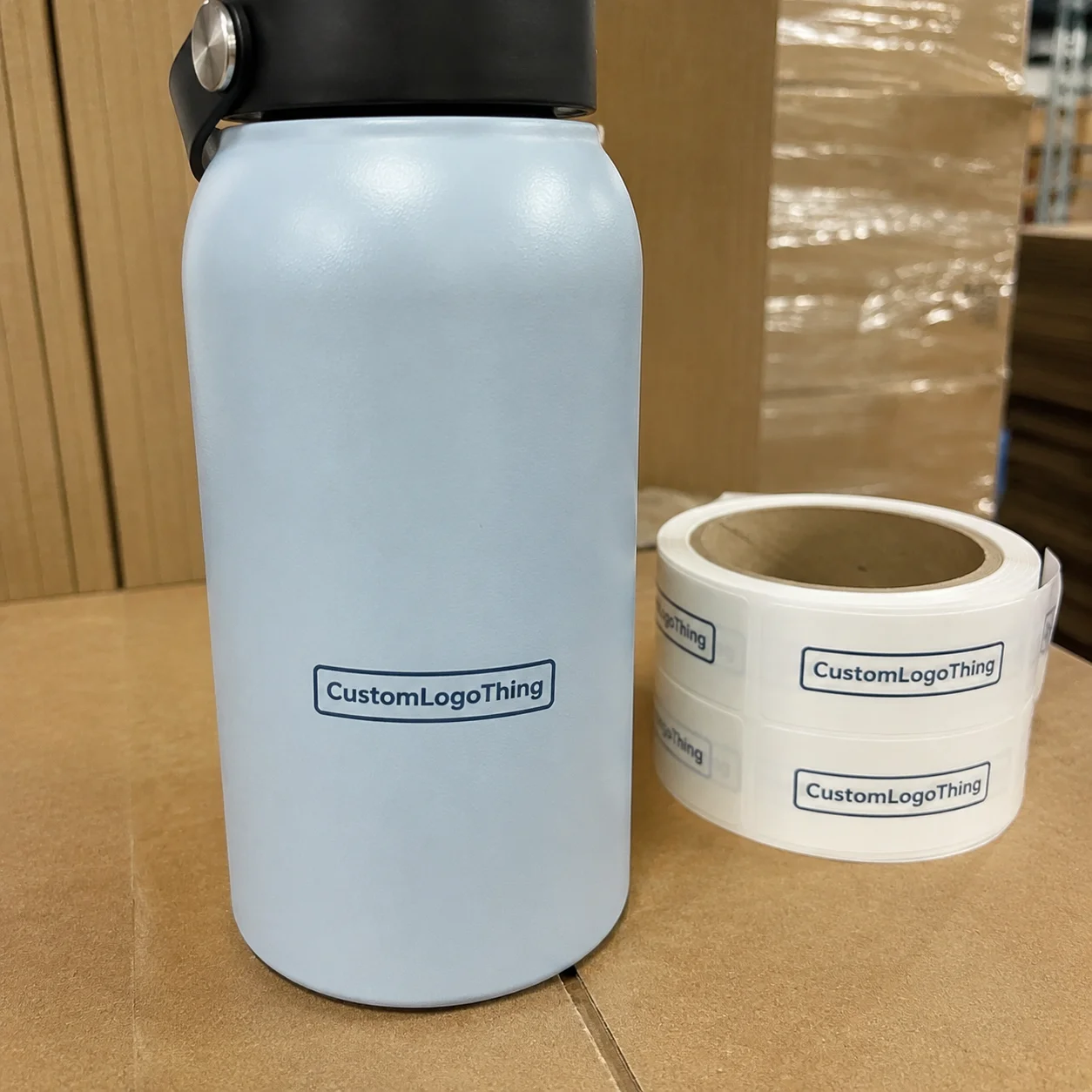
For brands comparing label formats, Custom Labels & Tags are often the most flexible route because they can be built around the container, the fill environment, and the finish the shelf demands.
Why Cosmetic Labels Matter More Than They Seem
Cosmetic labels carry branding, regulatory text, and shelf communication at the same time. That is a difficult balance, especially on small containers where ingredient lists, warnings, barcodes, and lot codes all compete for space. A design that looks calm on screen can become cramped once it is reduced to an actual label size.
The feel of the packaging changes quickly with material choice. A matte paper label can make a skincare line feel understated and clean, while a clear film with controlled white ink can make a serum bottle look more modern and precise. Gloss varnish usually reads brighter and more commercial. The same artwork can suggest very different price points depending on the stock and finish behind it.
A label is one of the few components shoppers handle directly, so adhesion, surface feel, and print clarity affect trust almost immediately.
That direct contact matters in cosmetics more than in many other categories. Products are often used with damp hands, stored in steamy bathrooms, or packed and unpacked repeatedly. If a label curls, smears, or lifts at the edge, the container starts to look older than it is. A stable label does the opposite: it makes the product feel cared for before anyone tests the formula.
There is also a practical production reason labels deserve attention early. Reworking artwork is one thing; reworking the label structure after launch can mean new proofs, new tooling, and more waste on the line. A small adjustment in container shape or label geometry can change how the package behaves far more than expected.
How Cosmetic Label Printing Works from File to Finished Roll
The process usually begins with a dieline review. Before ink hits stock, the printer checks the exact dimensions, bleed, safe area, panel spacing, and any contour details. This matters because bottles, jars, tubes, and pumps rarely have perfectly flat surfaces, and a Label That Fits a flat drawing may not behave the same way on a tapered container.
After the layout is confirmed, the production team selects the face stock, adhesive, and liner as a matched system. That combination needs to suit the container material, the product contents, and the conditions the label will face after filling. A label for a dry carton is not built the same way as one for a chilled facial oil bottle or a hand cream that will be used repeatedly in a humid environment.
The print method follows the job requirements. Digital printing is often the practical choice for short runs, pilot launches, and multiple SKU versions because setup is lighter and artwork changes are easier to manage. Flexographic printing is usually better for repeatable, higher-volume programs once the design is stable. Offset printing still has a place on certain paper stocks when detail and image quality are priorities.
Once printed, the label moves through finishing and conversion. That may include lamination, varnish, foil accents, spot coating, die cutting, matrix removal, slitting, and rewinding into rolls for application. Some projects need only a protective overprint to resist rub and moisture. Others need more complex finishing so the label can compete visually on a crowded shelf.
The main production variables usually include:
- Substrate: paper, polypropylene, polyester, or clear film
- Adhesive: permanent, removable, freezer-grade, or high-tack depending on the surface
- Ink system: CMYK process color, spot colors, or a mixed build
- Finish: matte, gloss, soft-touch, foil, or spot varnish
- Label shape: round, square, wraparound, or a custom contour
- Application method: hand applied, semi-automatic, or machine applied
For buyers trying to understand whether a supplier can handle small-batch work or more specialized finishing, Manufacturing Capabilities is usually the fastest place to check the scope of equipment and the level of production control.
Key Factors That Affect Label Quality and Performance
Substrate choice drives a surprising amount of performance. Paper can work for dry-use cosmetics, secondary packaging, and lower-moisture applications where cost matters. Polypropylene is common for moisture resistance and a smoother look. Polyester tends to be chosen when scuff resistance and dimensional stability matter more, especially on products that will be handled frequently. Clear films are popular for prestige packaging, but they leave less room for visual mistakes because every layout issue is visible.
Adhesive selection is just as important as the face stock, yet it is often under-specified. A label may hold on a dry carton and still fail on a bathroom shelf after a few days if the surface energy is low or if condensation is part of normal use. Oily products, chilled storage, and curved containers all place different demands on the adhesive. If the wrong adhesive is paired with the wrong stock, edge lift, bubbles, or premature peeling can show up quickly.
Shape has real consequences too. A small lip balm tube, a shoulder-heavy serum bottle, and a wide jar each create different mechanical challenges. Tight radii can wrinkle the label or push the corners upward. Very small label panels reduce the room available for legal copy, barcodes, and brand text. The more the container curves, the more important it becomes to test the actual die shape rather than relying on a flat mockup.
On the content side, cosmetic packaging usually needs to stay readable under less-than-ideal conditions. Ingredient lists, warnings, directions, batch codes, and barcodes should remain legible at small sizes. High contrast, disciplined typography, and enough margin around critical information matter more than decorative styling. A label that looks elegant at arm’s length but becomes difficult to scan or read at shelf distance creates problems during launch and later replenishment.
Real-world testing should include the product itself, not just an empty package. A lotion bottle, for example, can behave very differently once the surface picks up a little residue or once it sits in a humid room. The same is true for refrigeration, transport vibration, and repeated handling. Those conditions reveal performance issues that a PDF proof never will.
For transport-related validation, some teams reference ISTA methods when pack performance needs to be documented, while paper sourcing or fiber claims may point toward FSC certified options if the brand story depends on chain-of-custody language.
Cosmetic Labels Printing Cost, MOQ, and Unit Price Drivers
Pricing in cosmetic labels printing is shaped by a few variables that interact quickly: quantity, material, print method, finishing, artwork complexity, and how many SKUs are in the order. The more the project is split across versions, the more setup and handling costs tend to rise. A single design in volume is usually far more economical per label than a small mixed program with several variations.
Short runs cost more per piece because proofing, setup, and prepress work are spread across fewer units. That is not a flaw in the process; it is simply how print economics work. Digital printing is often the more practical option for pilot runs, limited releases, and frequent artwork changes. Flexographic printing tends to become more attractive once volumes rise and the artwork remains stable enough to justify press setup.
Material upgrades also affect the quote. Clear film, metallic stock, white underprint, specialty adhesive, and soft-touch lamination all add cost, though not all of them add cost in the same way. Some increase raw material spend, while others increase setup or finishing time. Foil and spot varnish can create strong shelf impact, but they also add production steps and more points of inspection.
Here is a practical way to compare common label choices:
| Option | Typical Strength | Cost Pressure | Best Fit |
|---|---|---|---|
| Paper label | Clean look, lower material cost | Usually lower | Dry-use cosmetics, cartons, value lines |
| Polypropylene film | Moisture resistance, smooth surface | Moderate | Bath products, skincare, hand lotions |
| Polyester or specialty film | Higher scuff resistance, stronger durability | Higher | Premium, refrigerated, or heavy-handling applications |
| Clear label with white ink | Invisible-edge look, modern finish | Higher | Prestige cosmetics, transparent bottles |
MOQ is not a fixed number across the board. It changes with print method, label size, material width, and the way the press is set up. A small contour-cut label with multiple finishes may have a very different minimum than a simple rectangular roll label. The most useful question to ask is not “What is your MOQ?” but “What is the minimum for this exact construction?”
For budgeting, ask for the quote in separate lines if possible. Material, print, finish, and setup should be visible enough to compare one vendor against another without guessing where the cost sits. A lower unit price can hide expensive setup, while a slightly higher unit price may be the better total value if the labels apply more cleanly and reduce waste during filling.
Production Steps and Turnaround from Proof Approval to Delivery
The cleanest label schedules begin with a complete specification sheet. That should include container photos, exact measurements, quantity, material preference, finish preference, required copy, and any special application details. If the container is tapered, textured, chilled, or unusually small, those details should be stated early rather than discovered after proofing.
A typical production path looks like this: specification review, artwork proof, material confirmation, print production, finishing, inspection, and shipping. The longest delays usually come from approvals, not from the press itself. Artwork changes after proof, missing dieline information, last-minute copy edits, and delayed sign-off on samples are the usual reasons schedules slip.
Simple jobs move faster than specialty jobs. A straightforward roll label with standard materials and one SKU can often move through production much more quickly than a multi-SKU launch that uses clear stock, foil, or variable data. If a product family includes several sizes or scents, it is usually smarter to schedule them together so the plant can run them as one coordinated project rather than stop and start around each version.
Urgent reorders can work, but they narrow the room for testing and correction. That is where risk rises. Seasonal products, launch dates, and retail commitments all benefit from built-in buffer time. Even a small revision to a bottle radius, cap height, or panel width can force a new label adjustment. That is one reason packaging teams often keep a close eye on approved container drawings before releasing any artwork.
For eco-positioned claims or material discussions, documentation matters more than assumption. If a brand is making sustainability statements, the substrate choice and any supporting certification should be checked before print approval. The right test and the right paperwork depend on the product claim, the pack, and the supply chain, so those details should be confirmed instead of left vague.
Common Mistakes That Cause Label Failure on Cosmetics
The most common failure is selecting the wrong adhesive for the surface. A label that performs well on a flat dry carton may fail quickly on an oily balm jar, a chilled serum bottle, or a textured tube. When the adhesive does not match the material and temperature conditions, edge lift and peeling are usually the first signs.
Overcrowded artwork causes a different kind of failure. Small type, low contrast, and too many claims on one face panel make the label hard to read and harder to trust. Cosmetic packaging needs enough visual breathing room to communicate the product clearly. If every message is emphasized, none of them carries weight.
Dimension errors are another frequent issue. Bottle samples can change slightly, especially when a supplier modifies a shoulder curve, neck finish, or label panel without the brand noticing right away. Even a small shift can create wrinkles, misalignment, or an off-center look once the label is applied. Wrap labels and contour cuts are especially sensitive to those small differences.
Skipping application testing is expensive. A label may pass a screen review and still fail after filling, wiping, shipping, or bathroom exposure. The safest check is a labeled sample on the actual package, filled with the actual product, and held under the conditions the consumer will likely create. That means real humidity, real handling, and enough time to see whether the edge starts to move.
Line handling matters as well. Labels that are difficult to peel, too slippery to place, or cut in a way that slows the applicator can increase waste and labor. Good label design is not only a shelf issue. It also has to work for the people applying it, especially when production lines run fast or operators are switching between SKUs.
Expert Tips for Ordering Labels That Print Cleanly and Apply Easily
Start with exact container information rather than an approximate measurement. The supplier should know the container material, diameter, finish, fill condition, and whether the product will be exposed to cold, heat, or humidity. Those details affect everything from stock selection to adhesive choice and even the best finish for the label surface.
If color consistency matters, ask for a physical sample or press proof. That is especially useful for skincare, fragrance, and prestige cosmetics where a slight shift in tone can make a product look off. CMYK can reproduce a broad range of colors, but some brand colors are more stable with spot color matching across reorders. This is less about adding complexity and more about avoiding a visible mismatch later.
Design with application in mind. Leave margin around the edges, keep a sensible peel point, and avoid label shapes that are elegant on paper but awkward on the line. A slightly simpler die cut often applies better than a highly decorative one, especially on curved containers. That practical tradeoff is easy to overlook during design and very obvious once the run starts.
It also helps to plan the label family early if the line includes multiple sizes. A coordinated set across 30 ml, 50 ml, and 100 ml containers can make the full range feel organized and easier to shop. Consistency should extend to typography, finish, barcode placement, and information hierarchy so the line looks related without becoming repetitive.
- Confirm the exact container drawing before proof approval.
- Test the label on a real filled product, not just an empty sample.
- Ask how the label will behave during wiping, refrigeration, or humidity exposure.
- Request a quote that clearly separates setup, print, finish, and shipping.
A few practical production ranges are worth keeping in mind. Standard roll labels with common materials can often move through a shorter timeline once artwork is approved, while specialty jobs with foil, clear film, or multiple SKUs usually need more room. Short-run digital work may be quoted with a lighter setup burden, but it still requires proper file checks and proof approval. Premium constructions cost more, but they can also reduce returns, relabeling, and line waste if the application is easier and the finish holds up better.
Next Steps for a Smoother Label Ordering Process
If the goal is a smoother ordering process, build a simple spec sheet before requesting quotes. Include container photos, exact measurements, label size, quantity, material preference, finish preference, and all required copy. That single document reduces back-and-forth and keeps the project from drifting into avoidable revisions.
Then confirm the dieline before production starts. If the artwork is already print-ready, that helps. If not, review the layout first so the package geometry is settled before anyone commits to color or finishing. A little discipline at the prepress stage is far cheaper than reprinting a run after the labels have been approved in the wrong size or shape.
When the quote arrives, compare the line items rather than the headline total. Material, print, finish, setup, and shipping should be visible enough that you can tell where the money is going. That makes it much easier to decide whether a clear film, foil accent, or soft-touch finish is worth the added spend for the product tier.
Before releasing a full order, test one labeled sample on the actual package and check adhesion, readability, and color under the conditions the product will face. That final check catches small issues before they become expensive ones. For cosmetic labels printing, the most dependable results usually come from labels that look right, apply cleanly, and keep performing after the product reaches the shelf.
What is the best material for cosmetic labels printing on bottles?
Polypropylene and polyester are common choices for moisture resistance and durability, especially for bathroom products or refrigerated items. Paper labels can work for dry, low-moisture applications, but they are usually less durable around oils and condensation. The best choice depends on the bottle surface, the product exposure, and the shelf look you want.
How do I know if my cosmetic labels need waterproof printing?
If the product will be handled with wet hands, stored in humid spaces, or exposed to oils, moisture resistance is usually important. Testing a sample on the actual container is the fastest way to see whether the label holds up in real use. Ask about both the face stock and the adhesive, because waterproof performance depends on the full label construction, not just the ink.
What affects the price of cosmetic labels printing the most?
Quantity, material, print method, and finishing details are the biggest cost drivers. Special effects like foil, clear stock, and heavy ink coverage usually increase the unit price. Multiple SKUs or frequent artwork changes can also raise setup and proofing costs.
How long does cosmetic labels printing usually take?
Turnaround depends on order size, finish complexity, and how quickly proofs are approved. Simple label runs are faster than jobs with specialty materials or multiple versions. The fastest way to avoid delays is to finalize artwork, dielines, and specs before production starts.
Can cosmetic labels printing handle small text and ingredient panels clearly?
Yes, but only if the layout leaves enough space and the print method supports sharp detail. High contrast, readable type sizes, and careful proofreading are essential for ingredient lists and compliance copy. Ask for a proof to confirm readability before the full run is approved.