Custom black labels can improve an apparel line quickly, but only when the material, print method, and attachment match the garment. A black label sounds simple until it is sewn into a hoodie, washed, and expected to stay legible without feeling stiff or bulky. Pick the wrong combination and the label becomes a dark rectangle that looks intentional from a distance and unfinished up close.
What Custom Black Labels Actually Change on Apparel
The first thing buyers usually notice is not the logo. It is the surface quality, the edge definition, and whether the label sits flat after sewing. That is why custom black labels can look expensive on one hoodie and generic on another. The difference usually comes down to weave density, ink coverage, border control, and the backing or fold style.
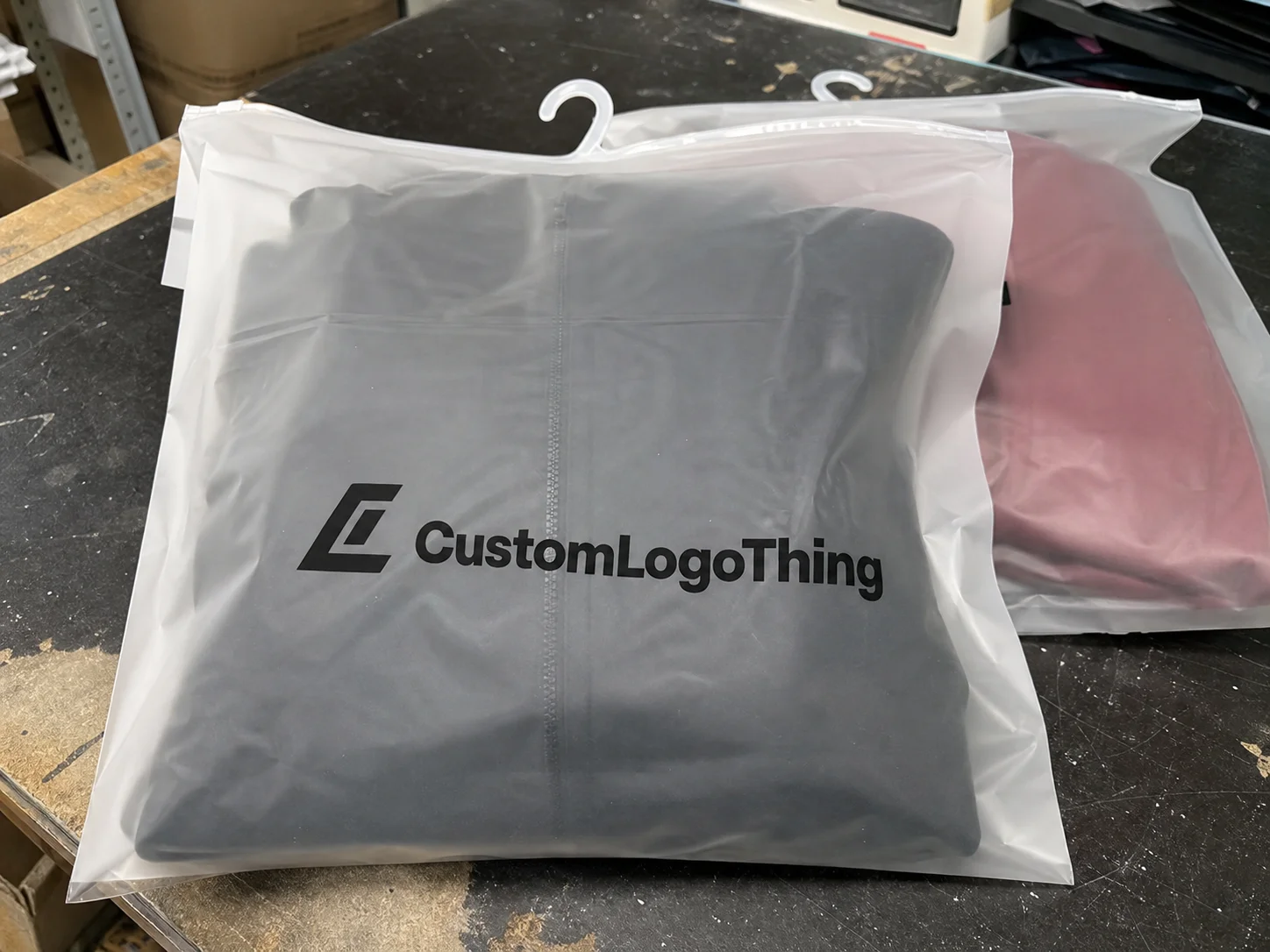
These labels show up on neck seams, side hems, cuffs, outerwear pockets, and care sections inside premium garments. They also carry more weight than people expect because they remain visible after the hang tag is gone and the box has been recycled. A label is small, but it can still anchor the rest of the brand system if the finish is consistent with the garment.
Black can hide weak design choices. It can also hide weak contrast. A thin logo, cramped lettering, or a border that is too tight may vanish once the label is cut and stitched. The task is not just to make it black. The task is to make it readable, tactile, and durable without adding bulk.
“A good label does not compete with the garment. It finishes it. If the hand feel is wrong, customers notice before they can explain why.”
That matters more on higher-priced apparel. A $20 promotional tee, a $60 hoodie, and a technical outerwear piece do not need the same label spec. Buyers who understand the product tier usually choose the label based on use case first, then refine the appearance.
How the Label Construction and Attachment Process Works
There are four common constructions for apparel labeling: woven, printed, embroidered, and heat-transfer. They do not behave the same way once they are sewn, washed, stretched, or rubbed against skin. Woven labels usually give the sharpest edge detail because the design is built from threads. Printed labels are softer and flatter. Embroidered labels add texture and visibility, although they can feel heavier. Heat-transfer labels stay low-profile and are useful when bulk matters more than texture.
Attachment method changes the result just as much as construction. Sew-in labels are the default for durability. Heat press attachment works well when a brand wants a smooth hand feel and minimal thickness. Peel-and-stick makes sense for samples or temporary use, but it is a poor choice for permanent apparel branding.
The garment itself changes everything. Stretch fabrics distort rigid labels. Lightweight tees show every wrinkle and seam bump. Heavy fleece can hide some label weight, while thin cotton will expose uneven stitching or a rough cut edge. That is why label testing should include the actual garment, not just a label proof on white paper.
Wash resistance matters too. A label that looks clean on day one but softens, curls, or bleeds after a few cycles will undermine the whole product. Apparel labels are not shipping labels, but the same discipline applies: test the actual stress the item will face. Standards used in transport and handling, such as those referenced by ISTA, are a useful reminder that durability is measured in use, not in mockups.
Artwork is another point where orders get derailed. A logo can look balanced on screen and still fail in production if strokes are too thin, counters are too small, or the border allowance is tight. In practice, the file often needs a cleaner outline, a locked size, and enough safe area for cutting and stitching. That same discipline applies across branded components, whether the job includes Custom Labels & Tags or broader Custom Packaging Products. The design has to fit the process.
Material, Print, and Finish Choices That Change the Result
Material choice does most of the work. Satin has a smoother surface and usually reads softer on the garment. Damask supports finer detail and is often the better choice for premium woven labels. Cotton fits brands that want a natural-feeling label with a matte look. Nylon is practical and durable, which is why it appears often in care labels. Recycled options are available as well, though the hand feel, print density, and color consistency depend heavily on the supplier and construction method.
Then there is sheen. A matte black label can look controlled and expensive if the rest of the garment supports that mood. Too much gloss tends to flatten the design in a different way: it can make the label look promotional instead of considered. There is no universal best finish. The right choice depends on whether the brand wants subtlety, contrast, or texture.
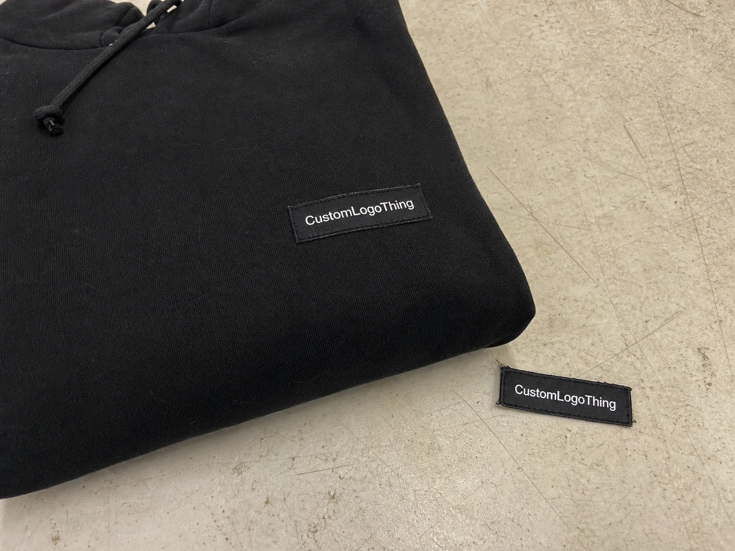
Black-on-black can work, but it needs a reason. Texture separation, edge definition, or a contrast stitch can keep it readable. Black on charcoal usually needs a stronger border. Black on white reads easily, but it changes the tone of the garment and may not fit a darker palette. The contrast decision is not just visual. It affects how quickly the label can be read in low light, after washing, and at a glance on a crowded retail rack.
Comfort matters more than the sample photo suggests. Neck labels sit against skin, so rough fibers or a stiff edge become a return risk, not just a design issue. Fold style changes comfort too. Center fold, end fold, and loop fold all alter the way the label lays against the fabric. For premium tees and hoodies, a softer printed or heat-applied label may outperform a visually richer woven version if the woven label feels abrasive.
That tradeoff is the core of good labeling work. The same artwork can look refined, ordinary, or muddy depending on the material and finish. Custom black labels should be specified by both appearance and function, not by color alone.
For buyers comparing options, the practical differences look like this:
| Label Option | Typical Look | Comfort | Best Use | Typical Cost Tier |
|---|---|---|---|---|
| Woven damask | Crisp, detailed, premium | Medium | Fashion basics, streetwear, premium merch | Mid to premium |
| Satin printed | Smooth, clean, softer appearance | High | Neck labels, soft-hand apparel | Economy to mid |
| Nylon care label | Technical, readable, practical | Medium | Care info, fiber content, compliance text | Economy |
| Heat-transfer label | Flat, minimal, modern | Very high | Lightweight tees, performance apparel | Mid |
| Embroidered label | Textured, tactile, visible | Medium to low | Outerwear, patches, exterior branding | Mid to premium |
If the goal is a premium result, the substrate has to suit the garment. That does not mean choosing the most expensive option. It means choosing the one that reads clearly, survives use, and matches the product tier. For reference on certification language and responsible sourcing, FSC is useful for paper components in packaging, but the same logic applies to apparel labels: the material should fit the job, not the mood board.
What Black Label Pricing Depends On
Pricing usually comes down to five variables: material, size, print complexity, quantity, and finishing method. Small, simple labels in larger volumes cost less per piece. Specialty materials, tight detail, low minimums, and unusual finishing raise the price quickly. That is not a markup trick. It is a reflection of setup time, waste, and production complexity.
Setup fees also show up often. So do sampling charges, proofing, and freight. A lot of buyers focus on the unit price and ignore the rest, then the final invoice looks inflated. It is better to ask for landed cost early so the quote includes the pieces that actually affect budget.
For planning purposes, simple custom black labels often land in these ranges:
- Economy runs: about $0.12 to $0.22 per label at larger quantities, usually with standard material and straightforward artwork.
- Mid-tier runs: about $0.22 to $0.45 per label for better hand feel, tighter detail, or more finish control.
- Premium runs: about $0.45 to $1.10+ per label when specialty materials, unusual folds, or low quantities are involved.
Those figures move with size and construction. A 1.25-inch neck label in bulk is a different production problem from a small exterior label on a heavyweight hoodie. So is a sew-in woven label versus a heat-applied one.
Simple designs are usually the best value. A clean one-color woven label is easier to price than a multi-texture design with fine type, layered borders, and nonstandard backing. If the label is part of a broader branded packaging system, compare the label cost against the box, insert card, and hang tag budget. In some launches, the label is the least expensive detail that still changes the perceived value of the garment.
Production Steps, Lead Time, and What Slows Orders Down
The order flow is usually predictable: brief, artwork review, proof, sample or strike-off if required, production, finishing, and shipping. The cleaner the brief, the fewer surprises later. That sounds obvious, but it is where many label orders lose time.
Lead time depends on the label type. Standard woven runs can often be completed in about 10 to 15 business days after proof approval. More detailed finishes may take 15 to 25 business days. Add custom backing, special folding, or revision cycles and the schedule stretches. Rush orders are possible in some cases, but they narrow material choices and usually increase cost.
Most delays come from predictable issues:
- Artwork is still changing.
- Finished size is not locked.
- Proof approval sits waiting for internal sign-off.
- Contrast is too weak, so the supplier asks for revisions.
- The buyer changes the finish after the sample arrives.
That last one is common. A label that looks acceptable as a digital proof may feel too stiff, too glossy, or too small once it is in hand. If the product is positioned above entry level, the sample is part of the purchase, not an optional extra.
Timing also matters if the labels are part of a larger launch. When hang tags, poly bags, insert cards, and custom packaging products are moving through the same calendar, one late proof can push the whole release. The cleanest schedules keep the label decision ahead of the rest of the package build.
A simple internal checklist helps:
- confirm artwork dimensions
- lock material and finish
- approve proof or sample
- confirm quantity and delivery date
- align the label release with the packaging schedule
Mistakes That Make a Black Label Look Cheap or Unreadable
The fastest way to weaken a black label is to make the text too small. Fine type can disappear once the label is cut, sewn, folded, and washed. If the label needs to be read against dark fabric or in low light, the design needs stronger contrast and more breathing room than a digital mockup suggests.
Another common error is black on black with no texture separation. That can work, but only if the material, sheen, or border provides enough distinction. Without that separation, the branding looks like a shadow. Sometimes that effect is subtle. Sometimes it just looks unfinished.
Skipping sample approval creates expensive surprises. Buyers sometimes approve a proof because it looks fine on screen, then discover the actual label is too stiff, too dull, or too narrow once it is attached. If the product is positioned above entry level, the sample is part of the purchase, not an optional extra.
Placement matters as well. A label that lands on a rough seam, twists after laundering, or sits right where the neck rubs will make a good garment feel cheaper than it is. Comfort is part of finishing. If the customer notices the label in a bad way, the label has failed.
Most of these mistakes are spec issues. That is useful because spec issues are fixable before production starts. A better spec saves money, reduces rework, and keeps the rest of the branded packaging system aligned. A label, a box, and an insert card should feel like they belong to the same brand, not three separate purchases made in different moods.
“If a label is hard to read in the sample, production will not rescue it. The press and the stitch line are not going to interpret the design for you.”
How to Spec the Right Label and Place a Clean Order
Start with the garment. Luxury basics, streetwear, workwear, and promotional apparel each call for a different label strategy. A premium hoodie can support a woven damask neck label. A soft tee may be better served by a printed or heat-applied version. Workwear tends to favor durability first and comfort second.
To get a clean Quote for Custom black labels, send the following:
- artwork file
- finished size
- placement location
- quantity
- preferred attachment method
- material or finish preference
- black-on-black or contrast intent
If the label will be visible on premium products, ask for a sample, proof, or mockup before approval. Do not assume the first version is final. A small change in size or a minor shift in contrast can change the whole read of the label. That is especially true on black labels, where subtle differences matter more than they do on lighter substrates.
For practical decision-making, keep four filters in view: feel, durability, price, lead time. Pick the option that balances those four factors for the actual product, not the idealized one. A label for a $60 hoodie does not need the same treatment as a giveaway tee, and treating them as if they do is how budgets drift.
If the label is part of a full brand system, keep it aligned with the rest of the package. The same visual discipline should run through product packaging, retail packaging, inserts, and shipping materials. Consistency makes the brand feel planned. Randomness makes it feel assembled from leftovers.
The cleanest order is usually the least dramatic one: clear artwork, confirmed size, one finish decision, one attachment method, and a realistic timeline. That is how custom black labels become a useful product detail instead of another revision cycle.
Are custom black labels readable on dark garments?
Yes, if the design uses enough contrast through texture, sheen, border detail, or a lighter thread accent. Black-on-black can work, but it needs deliberate design choices or the branding disappears in low light.
What is the best material for black clothing labels?
For premium apparel, woven damask or satin usually gives the cleanest result. For stretch-focused or comfort-first garments, printed or heat-applied labels can outperform stiffer woven options.
How much do custom black labels cost per piece?
Price depends on quantity, size, material, and finishing. Simple labels in larger runs are usually the least expensive, while low MOQ orders and specialty finishes raise the unit cost.
How long does production usually take?
Standard production often takes about 10 to 15 business days after proof approval, while more detailed labels can take 15 to 25 business days. Rush jobs may be possible, but they usually cost more and reduce material flexibility.
What should I send to get an accurate quote?
Send artwork, size, quantity, placement, material preference, and the attachment method you want. A reference photo or garment sample also helps reduce guesswork and usually speeds up the proofing stage.