Buyer Fit Snapshot
| Best fit | Custom Brand Identity on Boxes projects where brand print, material claims, artwork control, MOQ, and repeat-order consistency need to be specified before quoting. |
|---|---|
| Quote inputs | Share finished size, material target, print colors, finish, packing count, annual reorder estimate, ship-to region, and any compliance wording. |
| Proofing check | Approve dieline scale, logo placement, barcode or warning zones, color tolerance, closure strength, and carton packing before bulk production. |
| Main risk | Vague material claims, crowded artwork, missing packing details, or unclear freight terms can make a low unit price expensive after revisions. |
Fast answer: Custom Brand Identity on Boxes: Strategy and Execution should be specified like a repeatable production item. The safest quote records material, print method, finish, artwork proof, packing count, and reorder notes in one written spec.
Production checks before approval
Compare the actual filled-product size with the drawing, then confirm tolerance on folds, seals, hang holes, label areas, and retail display edges. Reserve space for logos, QR codes, warning copy, and material claims before decorative graphics fill the panel.
Quote comparison points
Review material grade, print process, finish, sampling route, tooling charges, carton quantity, and freight assumptions side by side. A quote is only useful when the supplier can repeat the same color, closure quality, and packing count on the next order.
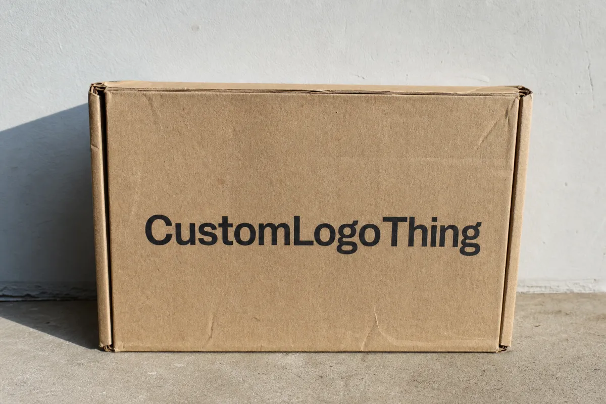
Custom brand identity on boxes is not a logo slapped onto cardboard and called a day. It is the first physical version of your brand that many customers touch. Sometimes it is the only part they remember before the product even comes out. Structure, color, typography, finish, and opening experience all pile into that first impression. Get them right and the box does real work for the brand. Get them wrong and the package looks like it was approved by someone who stopped caring halfway through.
That first impression matters because a shipping carton moves through more hands, more distances, and more moments of anticipation than the insert inside it ever will. The right package branding turns a delivery into a brand moment. The wrong one makes a good product feel forgettable. For businesses comparing Custom Printed Boxes, the real question is usually not whether to brand the box. It is how to build a system that survives production, shipping, and the occasional rough treatment from a delivery driver who is clearly having a day.
There is also a practical side that people skip too quickly. The box has to pack fast, stay readable, hold up in transit, and still look like your brand after all that. Pretty is nice. Useful is better. The best custom brand identity on boxes does both.
A box is not just a container. It is a signal. Customers read it fast.
What Custom Brand Identity on Boxes Really Means
Custom brand identity on boxes means building packaging that feels unmistakably yours the second someone sees it. The logo matters, sure. So do the color blocks, the typography scale, the material choice, the print placement, the interior reveal, and the way the box still looks like your brand after it has been stacked, scanned, shipped, and dropped on a porch. Brand identity is not one graphic. It is a pile of decisions that have to work together without fighting each other.
A plain mailer and a branded mailer can hold the same product, but they do not feel the same. One disappears. The other leaves a trace. A branded version might use a strong logo panel, a restrained repeat pattern, or a bold message inside the lid that turns opening the package into part of the product experience. That is the difference between decoration and identity. Decoration sits there. Identity creates recognition, trust, and memory.
From a packaging buyer’s point of view, the outer carton is often the first touchpoint and the hardest-working one. Customers may toss tissue paper, ignore a product card, or never see the shelf display. They almost always notice the box. For subscription programs, direct-to-consumer shipments, and retail packaging used across channels, that outer layer becomes a moving billboard for the brand. It needs to communicate quickly and cleanly. No extra decoding required.
Think of identity on a box as a system built from color consistency, type hierarchy, material choice, print placement, and opening sequence. If one piece is off, the whole thing feels off. If they all line up, even a simple structure can look deliberate and premium. That is why packaging design for boxes should be treated like a brand exercise, not a stray artwork request sent to prepress at 4:55 p.m.
There is a difference between a box that looks branded and a box that behaves like a brand asset. The second one keeps doing its job long after the initial unboxing. It supports repeat orders, shelf recognition, social sharing, and fewer confused emails from customers who can’t figure out what arrived. That is useful. Not glamorous. Useful.
How Custom Brand Identity on Boxes Works in Production
Production starts with the dieline because structure decides where design can safely live. A mailer box gives broad exterior panels. A folding carton offers compact, print-friendly faces. A rigid box supports a more premium presentation. A corrugated shipper is built to survive abuse before it reaches the customer. Each format changes the brand story as much as the artwork does, which is why the box style should be chosen before the visual system gets locked.
Once the structure is set, the artwork has to behave like a real object, not a flat poster. Safe zones matter. Bleed matters. Glue areas matter. A logo pushed too close to a fold can disappear or distort. A pattern that looks balanced on screen can feel cramped after die-cutting. Clean print files for custom printed boxes usually include vector logos, live type, resolved color builds, and any compliance copy already placed inside the correct panel boundaries. Messy files are expensive. So is pretending they are fine.
Color management deserves real attention. Screen color is light. Print color is ink sitting on a substrate that absorbs and reflects light in its own way. Coated board, uncoated board, recycled stock, and kraft all behave differently. A bright white file on a monitor will not look the same on a natural brown corrugated mailer. If the design depends on exact brand color, ask how the printer will control it. Digital print, flexographic print, litho-lamination, and other methods all produce different results, especially on large runs and textured board.
If exact color matters to the brand, do not assume the same CMYK values will behave the same across every box type. A spot ink can help when the logo has to stay consistent, but even spot colors shift a bit depending on board and coating. That is normal. What matters is controlling the variation instead of discovering it after 20,000 units are already sitting in a warehouse.
Branding elements can include exterior logos, inside-panel messaging, pattern wraps, QR codes, product care instructions, and structural details like tear strips or easy-open tabs. Those elements should earn their place. A QR code can point to a care guide, reorder page, or campaign landing page, but it has to live where the customer can actually scan it without glare, folds, or bad placement. An inside-lid message can be effective, but only if it has room to breathe and enough contrast to read like a decision, not an afterthought.
There is also a production truth that shows up fast: design has to respect the machine, not just the mockup. Boards need fold allowances. Print must stay clear of glue flaps. Cut lines and score lines introduce tiny shifts. Transit wear can scuff heavy ink coverage or crack delicate coatings. Strong results usually come from packaging design built with manufacturing in mind from the start, not corrected after someone has already approved a pretty PDF that will never fold the way they imagined.
If you are building a wider packaging program, it helps to review available Custom Packaging Products alongside your print goals. The wrong finish on the wrong structure burns budget. The right structure with a clear brand system can carry across product lines, seasonal campaigns, and reorder cycles without forcing a redesign every time the calendar changes.
Key Factors That Shape the Look and Performance
The appearance and performance of a box are shaped by a handful of variables that matter in the real world. Material choice sits near the top. Corrugated board gives you strength and transport protection. Paperboard gives you a cleaner folding-carton presentation. Rigid board supports a premium unboxing feel with more weight in the hand. Each one sends a different signal. A kraft corrugated mailer says practical and durable. A crisp white paperboard carton feels lighter and retail-ready. A rigid setup box implies presentation and care before the customer even opens it.
Typographic scale gets underestimated on packaging because it looks simple in a design file. On a box, distance and lighting change everything. Text that reads nicely on a screen can become too thin once printed on textured board or too small when the carton is stacked in a warehouse. Bold type, clear contrast, and a disciplined hierarchy matter more on packaging than on many digital assets because customers may only glance once before deciding what they think about the product. Packaging does not get a second chance to be legible.
Finish changes both perception and durability. A matte coating can soften glare and make a box feel calmer and more refined. Gloss varnish can add energy and visual punch, especially with bright color blocks. Soft-touch lamination adds a velvety feel, though it can raise cost and sometimes show scuffs differently depending on handling. Embossing and foil can lift premium product packaging, but they work best as accents. Too much finish turns a box into a costume. That is not the same thing as looking premium.
Sustainability choices matter, but they should be honest. Recycled content, FSC-certified paperboard, and lower-ink coverage can support a cleaner brand position, especially for brands in natural ingredients, apparel, wellness, or subscription goods. The FSC system is useful when you want third-party accountability for responsibly sourced fiber. Recycled or uncoated stock can also affect print crispness and color saturation, so the design may need adjustment instead of being forced to behave like coated stock. Materials are not magic. They have limits.
Shipping conditions shape the design too. A box that moves through parcel networks, conveyor systems, and multiple handling points needs stronger graphics choices than one handed directly to a shopper at retail. Heavy product weight, dense packing, and rough transit create compression, rub, and scuff issues. If the box is part of a subscription or DTC program, the exterior has to stay readable after handling because the package is often photographed, stacked, and carried more than once.
For shipment testing, it is smart to align with recognized methods such as those from ISTA. Vibration, drop, and compression tests show whether the package branding still looks intentional after abuse. That matters. A box that looks great on a computer and falls apart in transit is not a branded package. It is an expensive disappointment.
In short, the best branded packaging balances three demands at once: it must look like the brand, survive the supply chain, and stay economical enough to repeat at scale. Ignore any one of those and the whole program starts drifting.
Material and format comparison
| Box Type | Typical Use | Brand Look | Indicative Unit Cost at Moderate Volume | Notes |
|---|---|---|---|---|
| Corrugated mailer | DTC shipping, subscription kits, lightweight products | Practical, clean, durable | $0.60-$1.40 | Strong for transit; print coverage and board grade drive the spread |
| Folding carton | Retail shelves, light products, inserts, accessories | Sharp, compact, display-friendly | $0.35-$1.10 | Good for high-volume presentation; less impact resistance than corrugated |
| Rigid box | Premium goods, gifting, electronics, beauty sets | Elevated, substantial, gift-like | $2.25-$6.50 | More expensive, but powerful for perceived value and the unboxing experience |
| Heavy-duty shipper | Fragile or heavier product lines | Functional with room for bold branding | $0.90-$2.10 | Prioritize strength first; branding must fit real loading and transit stress |
Step-by-Step Guide to Building the Box Identity
The cleanest way to build custom brand identity on boxes is to treat the process like a packaging brief, not a design guessing game. Start with the audience, the product, the shipping method, and the emotional response you want to trigger. A luxury skincare brand and a rugged hardware brand should not ask the box to say the same thing, even if both use similar dimensions. The brief should also name the practical limits: product weight, storage space, assembly speed, and any retail packaging requirements.
Choose the box format first. That order matters. Too many packaging problems start when the artwork comes before the structure, which means the layout gets forced into ugly compromises later. A mailer has different flap relationships than a folding carton. A rigid box opens differently than a corrugated shipper. If the structure is wrong, beautiful artwork can feel awkward in hand. If the structure is right, the artwork can do more with less.
Next, gather the core brand assets. You will need vector logo files, approved colors, typography guidance, icon rules, and any mandatory copy such as compliance marks, recycling information, or product claims. Packaging is not a billboard, so every line has to earn its place. Long taglines can work in advertising and fall apart on a small carton. That is where package branding needs discipline instead of wishful thinking.
Then build the layout around the opening sequence. What does the customer see first? What appears next? Where should the strongest mark sit? A good box often has a clear exterior identity, then a quieter inside reveal, then a final instruction or message. That sequence makes the packaging feel intentional. It also lets you save premium details for the moment that matters most instead of sprinkling them everywhere until none of them feel special.
A prototype or proof is essential. Digital images help, but they do not fully show how a box folds, how colors shift on board, or how text behaves near cut lines. A sample can expose subtle failures: a logo too close to the seam, a pattern disappearing in a crease, a finish that looks different under warehouse light, or a return flap that fights with copy. The point is not to make the first version perfect. The point is to catch expensive mistakes before a full run exists in the wild.
Final approval should happen only after the box has been judged in two contexts: how it looks in a shelf or customer-view scenario, and how it behaves in shipping and fulfillment. A design that photographs beautifully but crushes in transit is unfinished. A durable box with no visual hierarchy may protect the product but fail to build brand recall. The best programs solve both problems at the same time.
If you want to see how different structures and finishes turn into actual programs, reviewing Case Studies can help. Real examples make the tradeoffs easier to see, especially between presentation-driven packaging and shipping-first packaging.
- Write the brief. Define product, audience, shipment path, budget, and brand goals.
- Pick the structure. Decide on mailer, carton, rigid box, or shipper before designing graphics.
- Assemble assets. Prepare logos, colors, type, compliance marks, and copy.
- Design the sequence. Map exterior, interior, and opening moments.
- Proof the package. Review printed or sampled output before full production.
Production Process and Timeline for Branded Boxes
Production for branded boxes usually follows a predictable path, but the timeline can stretch or compress depending on complexity. It starts with the brief and quote, then moves to dieline selection, artwork setup, proofing, approval, manufacturing, finishing, packing, and freight scheduling. Each step depends on the one before it. If the dieline changes late, the artwork may need to be rebuilt. If approvals drag, the production slot can slip. Planning matters just as much as design quality, which is annoying but true.
Delays usually happen in the same places. Artwork arrives late. Print files are missing bleed or conversion notes. Brand teams ask for last-minute copy changes. Specialty finishes require extra proof cycles. Custom structural work adds tooling time. None of those issues are rare, but they do eat calendar days. For fast launches, the safest move is to lock product dimensions and core copy early, then leave enough room for proofing before final approval.
Lead time depends on structure and print method. A simple custom printed box with limited colors may move relatively quickly, while a rigid structure with foil, embossing, or multiple inserts can take longer. As a planning range, a straightforward printed mailer might take about 10-15 business days after proof approval, a folding carton run may sit around 12-20 business days, and a premium rigid box program can require 20-35 business days or more if tooling or specialty finishing is involved. These are planning ranges, not promises, but they are useful for launch calendars and reorder windows.
Samples and tooling are often the hidden schedule items. A sample gives you one more chance to confirm structure and print, but it adds a stop in the process. Tooling, especially for custom cut lines or structural features, has to be created and checked. Batch scheduling can also affect timing because your order may need to wait for a press slot, converting line, or finishing operation. That is normal in packaging manufacturing. It is not a sign that someone lost your file in a drawer.
Good planning builds in buffer time for receiving, not just production. If a campaign launch depends on boxes arriving at a fulfillment center by a certain date, freight should be scheduled with margin, not hope. A packaging program can fall apart if the boxes arrive beautifully made but too late to pack. That problem shows up constantly in seasonal launches, subscription resets, and promotional bundles where the product, the carton, and the campaign all have to hit together.
For teams managing multiple SKUs, the best workflow uses a standard approval checklist and a clear reorder trigger. That keeps the process from turning into a fire drill every time demand spikes. It also helps a business stay consistent across product lines instead of reinventing the box every quarter because someone wanted “something fresher” with no plan behind it.
A practical production note: ask for a pre-production sample when the design has complex finishes, deep embossing, tight registration, or heavy ink coverage. Those are the spots where a digital proof can lie to you. The file may look perfect. The physical box may tell a different story.
Cost and Pricing Factors for Custom Box Branding
Pricing for custom box branding is shaped by the same factors that shape production: size, board grade, print coverage, color count, finishing, volume, and structure. A larger box uses more material. A thicker board costs more. Full-coverage print usually costs more than a single-color logo. Special effects such as foil, embossing, debossing, spot coating, or soft-touch lamination raise the price because they add setup steps and extra handling. More panels mean more labor. More inserts mean more assembly. Every choice leaves a cost footprint.
Volume changes the economics fast. A small run may feel expensive because setup costs, proofing, and tooling are spread across fewer units. A larger order tends to reduce the per-box price. That is why MOQ matters. A buyer may see a lower unit cost on a higher quantity but still need to weigh storage space, cash flow, and product velocity before committing. Cheap unit pricing can become expensive if the boxes sit in a warehouse too long or if the design needs revision before the inventory is used.
Quote details deserve attention. Does the price include artwork support? Are samples included or billed separately? Is freight part of the number? Are the boxes shipped flat, packed by case count, or kitted with inserts? A quote can look attractive until the hidden pieces are added back in. Fair comparison means comparing the same spec, not just the same headline price. Two quotes for “printed boxes” can represent very different materials, finishes, and service levels.
The hidden cost of poor planning is usually bigger than the printed quote. Reprints happen when artwork is approved too fast. Damaged goods happen when the box spec does not match the shipping environment. Extra freight happens when shipments are rushed or split into multiple deliveries. Over-ordering happens when demand was guessed instead of measured. A stronger box brief can prevent all of those mistakes, which makes design discipline a direct cost control tool.
Here is a rule that keeps budget decisions grounded: optimize for product protection and shipping method first, then spend premium dollars only where the customer will actually notice them. That might mean a stronger board and restrained exterior graphics for parcel shipment, or a lighter structure with more detailed finishing for a retail display piece. Either way, the box should earn its cost.
It also helps to think in value tiers rather than only unit price. A plain corrugated shipper may have the lowest cost, but a modestly branded version can improve recognition with very little added expense. A rigid box may cost much more, yet it can support pricing for a premium product line. The point is not to spend less at all costs. The point is to spend where the box supports margin, repeat orders, and a stronger customer impression.
| Cost Driver | What It Changes | Why It Matters |
|---|---|---|
| Board grade | Strength, feel, and print response | Higher grades raise material cost but can reduce crush risk and improve presentation |
| Print coverage | Ink usage and setup time | Full coverage looks stronger, but it can increase cost and expose color variation |
| Finishing | Appearance and tactile feel | Foil, embossing, and special coatings add visual impact and manufacturing steps |
| Quantity | Unit price and storage needs | Higher volumes lower per-box cost but require better demand planning |
| Tooling | Setup for custom structural features | Custom dies and inserts can add upfront expense before the first box ships |
Common Mistakes and Expert Tips for Better Results
The most common mistake is overdesigning the box. Too many type sizes, too many colors, too many message points, and too many finishes can make the package feel noisy instead of premium. The box starts arguing with itself. In packaging, clarity usually beats decoration. One strong focal point and a clean hierarchy often carry more authority than a crowded layout trying to say everything at once.
Another frequent error is checking color only on a screen. A brand blue that looks crisp on a monitor can darken on kraft board or flatten on uncoated stock. Even white backgrounds behave differently depending on the substrate. That is why print proofing is not a formality. It is the only reliable way to see whether brand color, contrast, and image detail survive on the actual material.
Structural mistakes can be just as expensive as visual ones. If the box lacks crush strength, it can deform before the customer opens it. If flap clearance is wrong, the closure may buckle. If tape placement was not considered, branding may be interrupted by a sealing strip. If opening force is too high, the customer may damage the artwork trying to get inside. These are not tiny issues. They affect the unboxing experience and the durability of the package at the same time.
Experienced teams tend to keep a few habits. They choose one clear focal point on the exterior, often the logo or a strong pattern block. They reserve richer messaging for the inside lid or secondary panels. They use contrast deliberately so the box stays legible in different lighting. They review the design as both brand managers and fulfillment operators, because a package can look beautiful and still be a pain to pack, stack, or ship.
Another useful habit is testing the packaging in real operating conditions. Put it in a cart. Stack it. Tape it. Carry it. Drop-test it within reason. Look at it under warehouse lighting. Check whether the print still looks clean after normal handling. The goal is not to punish the box. The goal is to catch the gap between a polished mockup and the actual environment the box will live in.
For brands with seasonal promotions or changing SKUs, a common failure point is version control. One old dieline, one outdated logo file, or one stale compliance line can create a whole batch of boxes that are technically correct in the wrong way. Keep a single source of truth for the artwork. Save yourself the headache. It is a very boring problem until it becomes an expensive one.
Practical tip: if budget is tight, spend first on structure, then on print clarity, then on selective finishing. That order usually returns more value than loading money into effects on a weak format.
For brands that want proof instead of theory, a few Case Studies can show how different print methods, box styles, and finishing decisions play out in real packaging programs. Real examples make it easier to see what is worth paying for and what is mostly visual noise dressed up as strategy.
Actionable Next Steps to Launch Your Box Identity
The best way to move from idea to production is to start with an audit of the packaging you already have. Look for weak recognition, inconsistent color, slow packing, missing protection, or a box that simply does not feel like the brand anymore. If the package is doing more harm than good, there is your first clue that the system needs work.
Next, write a one-page packaging brief. Include product dimensions, weight, shipping method, target audience, budget, lead time expectations, and the printed elements that must appear on the box. Keep it focused. A concise brief helps suppliers give a cleaner quote and helps internal teams make faster decisions. It also keeps the branding conversation tied to the product instead of drifting into vague opinions about what “feels premium.”
After that, collect the files your printer will need. That usually means vector logo files, brand color references, approved fonts, dielines, copy for mandatory panels, and any recycling or compliance marks. If your packaging program includes multiple sizes, note which measurements are fixed and which can flex. That saves a lot of back-and-forth during quotation and prepress.
Request samples or proofs before committing to a full run. Compare them against the actual product, not just the artwork file. Ask whether the box stacks well, packs easily, and looks correct under the light it will actually see in use. If the package has to move through a fulfillment center, test the workflow with a few units. If it is retail packaging, compare it to the neighboring shelf environment, not just a clean studio rendering that makes everything look better than reality.
Build a launch checklist that includes approval timing, inventory counts, receiving instructions, and reorder thresholds. That keeps the box program from turning reactive. It also makes it easier to scale the brand identity later if product lines expand. A good box system should be repeatable, not fragile.
For many teams, the last step is choosing a partner that can balance structure, print, and logistics without pushing every detail back onto your desk. That is where thoughtful suppliers and clear planning do the heavy lifting. If materials, timelines, and production expectations are aligned early, custom brand identity on boxes becomes a controlled part of the business instead of a scramble.
One more thing: document what worked after the first run. Keep notes on scuff resistance, assembly speed, color behavior, and shipping damage. That turns the box from a one-time project into a better system on the next reorder. Real packaging programs improve because someone bothered to record what the customer never sees.
Done well, custom brand identity on boxes turns a shipping container into a brand asset that supports recognition, protects the product, and strengthens the unboxing experience. When design, production, and shipping are planned together, the box stops being a generic expense and starts acting like part of the product itself. The takeaway is simple: build the structure first, proof the print on real material, and make every branded element earn its space.
How does custom brand identity on boxes improve the customer experience?
It creates a stronger first impression before the product is even opened, which makes the delivery feel more intentional and premium. It also helps customers recognize the brand quickly, especially when they share unboxing photos, post reviews, or receive repeat shipments. That recognition matters most when the box is the only visible part of the product journey for a while.
What materials work best for custom brand identity on boxes?
Corrugated board is usually best for shipping strength, while paperboard or rigid board can be better when presentation matters more than impact resistance. The right material depends on product weight, shipping distance, print coverage, and whether the box needs to look premium, sustainable, or highly protective. A sample is the safest way to check how a material actually prints and folds.
What affects the cost of custom brand identity on boxes the most?
The biggest cost drivers are box size, board type, print coverage, finishing details, order quantity, and whether special tooling is required. Small runs usually have higher unit costs because setup, proofing, and conversion costs are spread across fewer boxes. Freight, insert assembly, and reprint risk can change the real cost more than the headline quote.
How long does it take to produce custom brand identity on boxes?
Timeline depends on how complex the box is, how quickly artwork is approved, and whether the order needs custom tooling, samples, or specialty finishes. Simple printed mailers can move faster than premium structures, but proofing and freight planning still need buffer time. If the launch date is fixed, build the schedule backward and leave room for revisions.
What files do I need to start custom brand identity on boxes?
You will usually need vector logo files, brand colors, approved type, copy for the box panels, and a dieline for layout. It also helps to share product dimensions, shipping requirements, and any finishing preferences so the printer can build an accurate quote and proof. If the brand uses Pantone or other spot colors, include that information early.
Can custom brand identity on boxes work for both retail and shipping?
Yes, but the design priorities change. Retail packaging can spend more on display value and shelf readability, while shipping packaging has to survive abrasion, compression, and handling first. A good system can share the same brand language across both, then adjust structure and finish to fit the use case.

