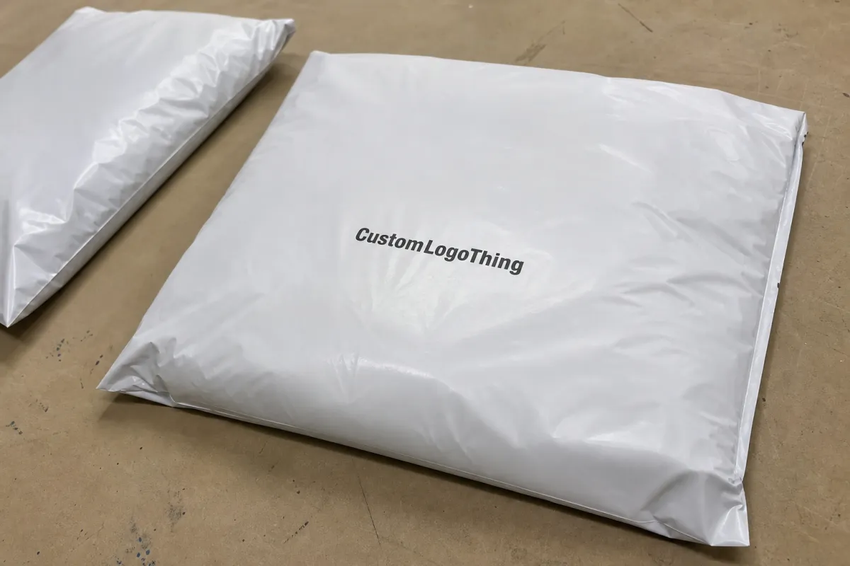
The beer printed Poly Mailers Artwork Proof Checklist is where expensive mistakes get stopped before they become expensive boxes of regret. Most buyers assume the risk starts on press. Usually it starts earlier, with a logo pushed into a seal, a barcode that looks fine on screen but will not scan after print, or a color build that turns muddy on dark film because nobody checked for underprint.
That matters more than people want to admit. A mailer is not a poster. It folds, seals, stretches, and gets handled by machines and humans who are not trying to admire the design. Brewery merch drops, promo shippers, subscription bags, and retail mailers all have the same problem: the artwork has to survive the production process, not just look good in a mockup.
A disciplined proof review catches the ugly surprises before they become reprints, delays, and awkward apologies. Pretty artwork is easy. Artwork that survives conversion, trim, and seal pressure is the part worth paying attention to.
Plain version: if the proof does not match the dieline, the press cannot fix that later.
What the Beer Printed Poly Mailers Artwork Proof Checklist Catches First
The first job of a beer Printed Poly Mailers Artwork Proof checklist is simple: catch the mistakes that are cheap to fix before they turn into costly inventory. The obvious errors are not always the most dangerous ones. A misspelled promo line is annoying. A logo sitting too close to a side seal is worse. A dark background without white underprint can flatten a clean design into a gray blur, and that is the kind of problem that only shows up after the bag is printed and boxed.
That is why the checklist should work like a gate, not a decoration. It forces the buyer, designer, and printer to check file setup, color intent, copy accuracy, and placement against the actual construction of the bag. A digital preview can hide scale. It can hide bleed. It can hide the fact that a centered layout on a laptop screen may sit awkwardly on a 12 x 15 inch mailer once the side seal and trim allowance are added.
The question is not whether the art looks nice. The question is whether it is ready for production. Those are different things. Pretty is cheap. Rework is not.
Printed Poly Mailers also deserve packaging-level review, not just marketing-level review. Brand teams care about aesthetics. Operations cares about fit and throughput. Purchasing cares about cost and lead time. The proof has to satisfy all three, which is why a structured checklist pays for itself fast.
Proof Process and Timeline: From File Upload to Sign-Off
The proof flow is usually more predictable than teams expect. File intake comes first, followed by preflight review, a digital proof, revisions if needed, final approval, and then release to production. When the file is clean, the cycle is quick. When the file needs reconstruction, the schedule stretches in all the familiar places: missing fonts, low-resolution art, wrong color mode, and too many cooks rewriting the proof at once.
For a well-prepared file, a digital proof often lands in 1 to 2 business days. That is not because the printer is rushing. It is because there is less to fix. Once the designer has to rebuild elements, outline type, or move art away from a seal or zipper area, the timeline grows. That is normal. A press-ready file is faster because nobody has to play detective first.
Revision speed depends on comment quality. If the notes are clear and consolidated, the next proof can move quickly. If marketing, operations, and purchasing send separate emails with conflicting edits, the job slows down even when the actual art is fine. One reviewer, one response, one decision. That saves more time than any fancy workflow software.
Typical approval timelines for custom mailers look like this:
- Clean file to first proof: 1 to 2 business days.
- One revision round: another 1 to 2 business days.
- Major layout cleanup: several additional days, depending on file quality.
- Production after sign-off: usually faster when no artwork changes remain open.
There are exceptions. Dark films, metallic films, heavy coverage, and special compliance requests can slow the process. If the job includes a mixed-material package, transit testing from groups like ISTA may matter. If paper inserts or secondary packaging need FSC documentation, that adds another checkpoint too. Not every order needs those layers, but it is better to know early than to discover the missing paperwork after approval.
Artwork Specs That Affect Color, Bleed, and Seal Areas
Bag dimensions come first. Always. A design cannot be approved until the printer knows the exact width, height, and construction style of the mailer. After that come bleed, safe zone, and seal placement. Those three controls decide whether the art survives trimming and converting with its dignity intact. If a logo lands too close to a side seal or zipper line, that is not a design choice. That is a production problem.
Material spec matters too. Most custom poly mailers are made from co-extruded polyethylene film, often in the 60 to 100 micron range, or roughly 2.5 to 4 mil depending on the market and construction. Thinner bags can save money and weight, but they are less forgiving. Heavier film costs more and usually feels better in hand. Recycled-content blends are common now, but they can behave slightly differently in print, so a supplier should confirm how the film handles ink holdout and opacity before the art is locked.
Color setup that actually holds up
Printed film behaves differently from coated paper. What looks crisp on a monitor may dry down flatter, darker, or more transparent on the bag. That is why color intent matters more than color fantasy. Use CMYK when the design is straightforward and the art is built for process printing. Use spot colors or Pantone references when brand accuracy matters. If the film is dark, metallic, or heavily tinted, white ink or a white underprint may be necessary so the design reads correctly.
A note like "make it pop" is not a specification. It is a guess. If the brand expects a tight color match, send a physical sample, a printed reference, or a Pantone target. The more specific the target, the fewer revision rounds you burn trying to explain what "close enough" means.
File quality checks before prepress
Vector logos are the safest choice for crisp edges. High-resolution raster images are fine if they stay large enough after scaling. Low-res images pulled from websites or social banners are trouble. So are transparency effects, hidden layers, overprint settings, and fonts that are not embedded or outlined. A file can look clean on a laptop and still fail preflight.
Small text deserves extra respect. Legal copy, promo codes, claims, and barcode numbers need room to breathe. If the type is tiny, trim and registration tolerances can make it hard to read after print. On retail-adjacent mailers, legibility is not a nice-to-have. It is part of the job.
One practical rule: review the proof at full scale whenever possible. Zoomed-out layouts hide too much. A bag that looks balanced at 20 percent can look crowded, off-center, or cut too close to a fold once it is real size.
Industry terminology and packaging basics are also worth keeping straight. The Packaging Association is useful for context if a team needs a common vocabulary for materials, print methods, and structural components. It will not clean up a bad file, but it can stop a lot of confusion before it starts.
Cost, MOQ, and Quote Variables That Move the Price
Custom poly mailer pricing usually comes down to a handful of plain variables. Bag size matters. Film thickness matters. Print coverage matters. Number of colors matters. One-sided printing costs less than two-sided printing. Special finishes can add more. None of that is mysterious once the quote is broken down, but buyers often compare only the headline number and miss the rest.
MOQ, or minimum order quantity, is another place where expectations get fuzzy. Smaller runs usually cost more per bag because setup is spread across fewer units. That is not a trick. It is math. A 1,000-piece run and a 10,000-piece run may use the same press setup, proofing time, and handling steps, but the smaller order has fewer units to absorb those costs.
Proofing fits into that math too. If the first proof needs color changes, art rebuilds, or layout corrections, the quote can move. Some suppliers include one or two rounds of art support. Others charge separately after the first pass. Ask before approval. It is easier than arguing about whether a revision should have been "included" after the fact.
Here is a cleaner way to compare offers without getting fooled by a low sticker price:
| Quote Factor | What It Changes | Why It Matters |
|---|---|---|
| Bag size and thickness | Material use and shipping weight | Larger or heavier bags raise unit cost |
| Print coverage | Ink use and setup complexity | Full coverage usually costs more than a small logo |
| Color count | Press setup and matching time | More colors usually mean more cost and more proof checks |
| Proof rounds | Artwork labor | Extra edits can add fees or delay the schedule |
| Rush timing | Scheduling priority | Shorter lead times usually cost more |
For many buyers, a realistic quote range on printed poly mailers depends on run size and coverage more than anything else. A simple one-color bag on a moderate MOQ can be very different from a full-coverage design with a white underprint and tight color matching. The lowest number is not automatically the best value if it hides revision fees, weak tolerances, or an approval process that keeps slipping.
A Step-by-Step Proof Review Before You Approve
Start with file integrity. Check that the version is correct, fonts are embedded or outlined, images are linked properly, and no hidden elements are missing. If the filename says final-final-v7 and the art is still changing, the project has already spent too long in the approval loop.
Next, compare the proof against the dieline. This is the part that gets skipped because someone thinks they can eyeball it. They cannot. Confirm bleed, trim, safe zone, and the exact location of seams, folds, and closures. If a logo is too close to an edge, move it now. If a barcode sits near a dangerous area, fix it now. The press is not the place for that lesson.
Then read every line of copy. Spelling. Product names. SKU details. Legal text. Promo codes. Regional claims. Variant names. Anything that changes from one version to another. A proof with the right artwork and the wrong text is still a bad proof.
Finally, check the proof against brand standards and consolidate comments in one reply. One reviewer. One response. One clear approval or one clear revision list. Five people sending five separate notes is how a job gets stuck in circles without improving the file at all.
- Check 1: version, fonts, and linked assets.
- Check 2: placement against dieline, bleed, and safe zone.
- Check 3: color intent, contrast, and print method.
- Check 4: copy accuracy, legal text, and barcodes.
- Check 5: final internal sign-off from the right decision-maker.
That is the core of the beer printed Poly Mailers Artwork Proof Checklist: not speed for its own sake, but speed with fewer surprises.
Common File and Layout Mistakes That Cause Reprints
The repeat offenders are predictable. Low-resolution artwork. RGB files sent as if they were print-ready. Tiny type. Logos parked too close to a seal line. Those mistakes show up all the time because they are easy to miss on a screen and expensive to ignore in production.
Packaging-specific problems cause even more pain. Artwork that wraps across a seam can split a logo in half. A design near a gusset may vanish once the bag is filled. Copy that looks centered in the proof can appear crooked when the film is folded or tensioned through production. That does not mean the printer failed. It means the proof review was too casual.
Version confusion is another classic. Sales wants a tagline updated. Marketing wants a seasonal callout. Operations wants the SKU changed. Meanwhile, the proof is already moving and someone is approving yesterday's file. That is how a bag gets printed correctly and still ships the wrong version.
Approving too fast on a screen creates its own problems. A bag can look fine zoomed out and still fail at actual scale. That is why the proof should be checked at 100 percent when possible, especially around seams, seals, and small copy. If the text is hard to read in proof, it will not magically improve on the finished mailer.
The mistakes that most often force reprints are usually these:
- Design elements too close to trim or seal areas.
- Color files built in RGB instead of a print-safe format.
- Images that look sharp on screen but print soft or pixelated.
- Unoutlined fonts that change on export or handoff.
- Multiple versions floating around without one approved master.
Material sourcing can also affect approval. Recycled-content film, compostable labels, and paper inserts each bring different specs and tolerances. If the mailer is part of a broader packaging system, make sure the proof notes capture which component is being approved. Otherwise, the team ends up arguing over a part that was never supposed to match in the first place.
Next Steps to Approve Faster and Avoid Rework
Fast approval is not about rushing. It is about removing friction. Give the job one internal reviewer. Use one file-naming rule. Set one deadline for comments. That alone cuts a lot of unnecessary back-and-forth. If the team keeps sending partial feedback, the proof process drifts. Once it drifts, the schedule follows.
Ask for layered files when the design is close but still needs cleanup. Request a second color check if the film is dark or the brand depends on a tight match. If the artwork is ready but the export is sloppy, ask for a press-ready version instead of pretending the file will sort itself out later. It will not.
Save the final proof, dieline notes, and bag size specs in one place. Reorders get easier when there is a clean record of what was approved. Future revisions get easier too, because nobody has to guess what changed last time. That is where buyer discipline shows up. Not in a flashy way. Just in fewer headaches, fewer delays, and fewer "why does this look different" conversations.
One more practical point: if the design uses dark film, metallic stock, or large solid areas, ask whether the printer will run a press check or provide a stronger digital proof with color notes. On those jobs, small differences in ink density, underprint, or film opacity can change the final result more than people expect. The art might be approved. The printed bag can still surprise you if those variables were never discussed.
Run the beer Printed Poly Mailers Artwork Proof checklist one last time before sign-off. Check the file. Check the dieline. Check the copy. Then approve with confidence, not hope. Guessing is not a production strategy.
What should a beer printed poly mailers artwork proof checklist include?
It should cover bag dimensions, dieline placement, bleed, safe zone, seam and zipper locations, color references, copy accuracy, barcode placement, and a final version check so the approved proof matches the file that goes to production.
How many proof rounds are normal for printed poly mailers?
One clean proof round is typical when the artwork is organized and the copy is final. Two rounds happen when color needs adjustment, legal text changes, or several teams need to review the same job. More than that usually means the file needs more cleanup before approval.
Does proofing change the price or unit cost of custom poly mailers?
Yes. Extra revisions, rush changes, and art rebuilds can raise the quote or add fees. MOQ, print colors, and setup costs usually matter more than the proof itself, but the proof can trigger those changes if the artwork is not ready.
What file format is best for beer printed poly mailer artwork?
Vector PDF, AI, or EPS is usually safest for logos, type, and clean line work. If photos are part of the design, use high-resolution linked images, and outline fonts before sending. A layered working file is smart to keep in reserve if the proof needs quick edits.
What is the fastest way to catch mistakes before approval?
Compare the proof against the dieline at 100 percent scale, not just on a small screen. Check the seams, seal areas, and small copy first because those are the easiest details to miss. Then have one final reviewer read the text carefully and confirm every version matches the approved file.


