Buyer Fit Snapshot
| Best fit | The Cost-Saving Logic of Custom Cereal Box Printing projects where brand print, material claims, artwork control, MOQ, and repeat-order consistency need to be specified before quoting. |
|---|---|
| Quote inputs | Share finished size, material target, print colors, finish, packing count, annual reorder estimate, ship-to region, and any compliance wording. |
| Proofing check | Approve dieline scale, logo placement, barcode or warning zones, color tolerance, closure strength, and carton packing before bulk production. |
| Main risk | Vague material claims, crowded artwork, missing packing details, or unclear freight terms can make a low unit price expensive after revisions. |
Fast answer: The Cost-Saving Logic of Custom Cereal Box Printing should be specified like a repeatable production item. The safest quote records material, print method, finish, artwork proof, packing count, and reorder notes in one written spec.
Production checks before approval
Compare the actual filled-product size with the drawing, then confirm tolerance on folds, seals, hang holes, label areas, and retail display edges. Reserve space for logos, QR codes, warning copy, and material claims before decorative graphics fill the panel.
Quote comparison points
Review material grade, print process, finish, sampling route, tooling charges, carton quantity, and freight assumptions side by side. A quote is only useful when the supplier can repeat the same color, closure quality, and packing count on the next order.
A cereal box has only a few seconds to earn trust, and that is exactly why custom Cereal Box Printing matters more than many teams expect. On shelf, the package is doing several jobs at once: it is selling, storing, signaling safety and compliance, and surviving stacking, transport, and retail handling. Decisions made before the artwork lock can determine whether a launch builds momentum or burns through budget in a week. One wrong call in material, finish, or file setup can turn a promising campaign into a preventable expense spiral.
For brands planning Packaging That Actually moves product, the useful question is not "Can we print it?" The real question is "Can we print it correctly, on time, at the right unit cost, and without triggering a reprint?" That framing turns custom cereal box printing into an operations decision with equal parts branding and manufacturing risk control. Packaging design, prepress, color accuracy, structural geometry, and retail requirements must align, because a weak link in one area can disrupt the full launch path. In practice, this is where folding carton choices and paperboard specification become just as important as the graphics themselves.
I have seen a relaunch lose a full week because the barcode sat too close to a fold line and started scanning badly once the cartons were packed. That kind of miss is maddening because it is tiny on screen and huge in the field. It is also why experienced packaging teams stop treating carton art like a poster and start treating it like a working object.
This guide maps the practical side of custom Cereal Box Printing: how the workflow is built, where money disappears, how long tasks usually take, and which checkpoints protect the brand before cartons leave the press room. If you are launching a new cereal SKU or refreshing an existing line, the checkpoints below help you ask sharper questions, catch weak assumptions earlier, and avoid the expensive "just one more tweak" cycle that always seems to arrive too late.
What Is Custom Cereal Box Printing and Why It Matters
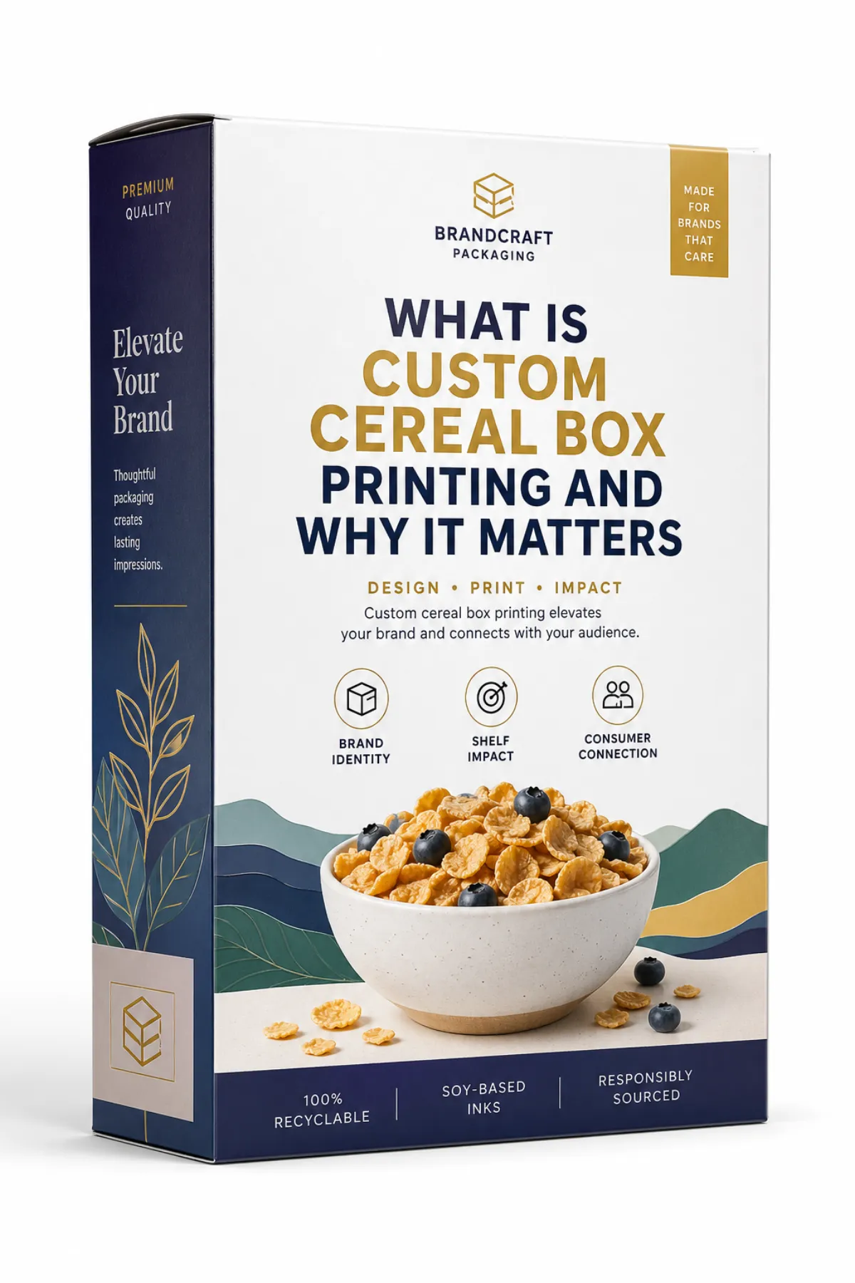
Custom cereal box printing is a coordinated prepress and packaging process in which artwork, dieline, material specification, finish choice, and printing method are tailored to one brand, one SKU, and one retail environment. It sounds technical, but the outcome is straightforward: the carton becomes a controlled communication tool instead of a borrowed shell. Generic stock cartons with adhesive labels can carry your logo; custom cereal box printing lets you decide exactly how the brand appears in the first three seconds of shopper contact.
Retail behavior is ruthless in this category. Shoppers scan color blocks, logo hierarchy, allergen clarity, and trust signals much faster than they read full copy. A polished front panel can matter more than a clever long-form story printed on the side. Custom cereal box printing can influence perception quickly because it changes how the box reads before anyone reads the nutrition panel. In test observations, shelf confidence often shifts with visual discipline before any pricing or messaging change does.
General stock cartons often force buyers into someone else's geometry: pre-set panels, fixed fold lines, and pre-decided print zones. Custom cereal box printing escapes that trap by giving real control over barcode position, fold allowances, and finish profiles that affect premium look and shelf durability. The consequence is practical. Better control reduces improvisation later, especially when legal copy suddenly expands or a campaign team adds claims after the mock-up phase.
From a packaging buyer's perspective, the advantage is not decoration. It is predictability. Custom cereal box printing helps a carton keep readability at distance and resilience at shelf level while supporting repeatable production. Once a strong dieline and print logic are locked, related SKUs can inherit that structure and reduce onboarding time for future launches. In that sense, a strong carton system is more of a reusable platform than a one-off poster.
Practical takeaway: custom cereal box printing is where marketing intent, compliance realities, and converter capabilities meet. Keep those three lanes aligned before production begins, or watch the budget shift to reproofs, corrections, and delay costs.
How Does Custom Cereal Box Printing Work From Prepress to Finished Pack?
The production chain is methodical even when teams feel the pressure to move fast. A typical flow starts with a brief, moves through dieline validation, then press-ready PDF/X files, color proofing, structural checks, plate preparation, and press calibration. None of those steps are decorative formalities. They exist to prevent avoidable defects, because the printer executes what is in the file, not what a designer had in mind at concept stage.
Prepress is the first line of budget control. Resolution is verified, spot colors are confirmed, overprint settings are validated, and legal text is positioned with adequate safety margins for folding and reading distance. In custom cereal box printing, a misplaced fold can break legibility or shift a logo half a millimeter at the edge; even tiny misalignments become visible when cartons stack in real channels. Good suppliers preflight files because they know a corrected file at this stage is cheaper than a corrected run later.
Structure is part of quality, not an afterthought. A cereal carton includes score lines, tabs, glue flaps, and movement during filling and shelf handling. If the geometry is loose, the package looks disorganized at point of sale. If it is too tight, assembly teams lose speed and product integrity can suffer. The most reliable projects involve design and structure teams sharing one working geometry from day one. That coordination is often what separates smooth first runs from repeated sample loops.
Print method selection changes both cost and aesthetics in noticeable ways. Offset printing generally performs best for longer runs where color consistency and detail are non-negotiable. Digital printing usually wins when volume is lower, revisions are expected, or versions need frequent updates; setup is lighter and feedback can move quickly. Flexographic printing becomes attractive in high-volume environments with simplified coverage and stable design. Custom cereal box printing should be matched to expected production rhythm, not to the style of a single approved mock-up.
Most serious workflows include at least two proof rounds plus first-article inspection. First-article review is where carton reality can still be corrected before large-scale production. Teams test that sample against the approved proof under controlled light, then catch color drift, trim behavior, and registration shifts before the first full pallet goes out. Skipping this checkpoint often pushes the "find-and-fix" stage directly into mass production, where every correction multiplies quickly.
File handoff quality can make or break the rest of the timeline. Reliable programs maintain clean naming standards, complete revision logs, and a clear approval sequence. Weak handoff processes produce predictable headaches: missing fonts, stale assets, and late compliance edits that appear after the press booking is made. It is common to lose more time resolving mismatched ingredient statements between spreadsheet and art file than in any pure design revision.
Another small but expensive detail is the proofing environment. A carton that looks perfect under a warm office lamp can read very differently under store lighting, especially if the finish is reflective. I have watched a supposedly subtle matte finish pick up more glare than gloss because the substrate and coating were mismatched. That is the sort of thing that does not show up in a deck and can kinda surprise a team if nobody asks for a real proof under realistic light.
Key Factors That Control Quality in Custom Cereal Box Printing
Material selection is the first and loudest signal of long-term performance. For cereal cartons, teams usually debate board weight, coating, moisture behavior, and crush resistance. Some SKUs can run well on SBS or coated folding carton board around 16-18 pt, while others need upgraded grades for longer distribution chains or harsher humidity exposure. Custom cereal box printing is not only visual; it is structural endurance after handling, stacking, and shelf rotation.
Moisture response is often underestimated and overcorrected too late. Cereal may be a dry product, but the logistics chain is not always gentle. Shipping routes, warehouses, and store environments expose cartons to heat and dampness cycles that can weaken edges and flatten coatings. A carton that looks premium under studio lighting can lose definition within the first distribution loop if the board or laminate is chosen only for initial appearance. A modest upgrade in stock can prevent repeated returns and image loss that later appear as "mystery shelf damage."
Color consistency is a second high-impact variable. Shelf identity depends on stable hues across runs, which requires practical control of ICC profiles, Pantone substitutions, and acceptable delta-E tolerance. Consumers still rely on color as an instant recognition cue. In cereal aisles, a slight shift from brand red to a muted tone or from saturated gold to dull yellow can make a SKU feel like another range entirely. That small drift can hurt recognition, especially when competing products use similar imagery.
Typography is a design element with legal consequences. Allergen text, nutrition facts, and ingredient listings must remain legible under realistic lighting and distance. Custom cereal box printing that prioritizes style while sacrificing type clarity eventually stalls at retail checks or shelf-life audits. Contrast ratio, font size, and hierarchy are not stylistic suggestions; they are usability constraints measured by shopper behavior and compliance scrutiny. A design that looks elegant on screen may fail at aisle speed if the body copy cannot be read quickly.
Finishes shape perception but can also shape risk. Matte can reduce glare in fluorescent shelving; gloss can amplify color vibrancy and make graphics pop. Selective UV, embossing, and tactile effects can elevate a concept, while adding complexity and cost. A common misread is believing any premium finish automatically fixes weak design decisions. In custom cereal box printing, finish should reinforce brand intention, not compensate for poor hierarchy or unvetted structural fit.
Registration stability deserves the same treatment as image quality. If logos, mascots, or key text drift between panels, the line looks less controlled and less premium, especially across multiple SKUs that should be linked. Press tolerance controls, inspection standards, and proof tolerances help avoid this. Quality in custom cereal box printing is cumulative: one carton looks okay on its own, yet the shelf still reads as inconsistent when several pallets arrive together.
For teams that want hard checks, compare against standards instead of impressions alone. Cereal packaging teams often reference ISTA test methods for structural behavior and transit expectations, and may choose FSC-certified board when sustainability claims and chain-of-custody tracking matter. Those frameworks do not replace production judgment, but they make technical conversations less emotional and more measurable.
One useful rule: if color tolerance, crease durability, and legibility thresholds are not defined before press, custom cereal box printing starts as guesswork. Guesswork can still ship product, but it rarely protects the budget.
Step-by-Step Guide to a Custom Cereal Box Printing Project
Every successful program starts with the buyer decision, not the artwork pass. Ask who the carton must win over, where the glance will land, and which claims are mandatory on the first panel. Family-oriented SKUs usually benefit from straightforward front clarity, while premium-oriented launches often gain from tighter contrast and restrained detail. Treat the brief as a shopper problem statement; design then becomes the execution path.
Next comes dieline approval. This should happen before layout is frozen, with tolerances, fold clearances, barcode placement, and recycling marks tested against actual carton geometry. A beautiful concept can still fail if a cut line erases a critical corner. Within custom cereal box printing, the dieline is the structural backbone, not an auxiliary file generated for a late-stage signature.
The artwork build is where many teams quietly lose discipline. Keep brand assets organized, preserve editable layers where possible, and run preflight checks for resolution, spot color consistency, and bleed settings. Layout decisions should distinguish fixed fields from variable fields in advance, especially for claims or legal text that might need updates. When a future edit lands in a flexible text zone instead of a constrained block, reruns become faster and less expensive.
Proofing should not stop at screens. Digital review helps direction, but a physical proof removes uncertainty around how color and contrast behave on board. A neutral, repeatable light setup is key. Teams often discover that a "premium" preview was actually too heavy in contrast or too busy once printed on real substrate. The extra step usually saves multiple hidden costs later.
Validation testing is still underestimated relative to its value. A controlled pilot batch can reveal fold instability, scuff points, barcode reliability, and stack behavior before a full production launch. Testing should include handling scenarios relevant to your channel, including any moisture sensitivity and any special finish behavior. Real-world stress in small volume beats emergency corrections on large volume every time.
Launch monitoring belongs in the project plan from the start. Once cartons reach retail, monitor sales pace, complaint types, and scanner reliability within the first two weeks. Packaging issues that appear at store level - hard-opening cartons, weak edge hold, scan failures - often appear long before creative teams receive consolidated feedback. Custom cereal box printing is at its best when review loops remain open after release instead of closing at final sign-off.
Supplier comparison becomes easier with aligned information. Review the Manufacturing Capabilities page before locking files, so the chosen partner can confirm capacity, board handling, finish availability, and turnaround expectations. When packaging expands beyond cereal, the Custom Packaging Products catalog helps identify where this workflow transfers to other formats without reinventing everything.
A successful carton launch is usually the sum of many small decisions made at the right time. A failed launch is often one small decision that arrives too late.
One more practical point: never approve a first proof just because the schedule feels tense. Speed is useful, but only after the file, structure, and copy are all behaving. Teams get into trouble when they start treating caution like delay. It is not. It is the difference between a clean launch and a box of surprises arriving on a pallet.
Custom Cereal Box Printing Cost: Where the Money Really Goes
Cost in custom cereal box printing combines fixed and variable components, and confusion usually starts when teams track only one side of that equation. Fixed elements include prepress preparation, plate creation, revisions, and initial proofing. Variable cost is the unit run rate, which tends to decline as quantity increases. A 1,000-piece sample can look expensive per unit, while a larger run can absorb setup costs across enough cartons to produce a stronger economics profile.
In practical terms, small batches carry a heavier fixed-cost load per carton because prepress and setup spend is spread over fewer pieces. Medium volumes often deliver the best ratio when artwork is stable and structure is standard. High volumes can justify better board or finish upgrades, provided the SKU has confidence in sustained throughput. Cost models for custom cereal box printing often surprise teams because they improve after production planning catches up with real order size.
Hidden cost drivers follow predictable patterns. Last-minute artwork edits remain the leading source of avoidable variance. Non-standard carton sizes often trigger higher die and imposition cost. Specialty varnish, embossing, foil, and multilanguage packaging can increase press complexity and delay, even when visually subtle on paper. A late change can erase early savings in a single cycle. Controlled change discipline usually saves more than first-pass design optimization.
| Print Option | Typical Best Use | Setup Cost | Indicative Unit Range | Comments |
|---|---|---|---|---|
| Digital printing | Short runs, test launches, versioned artwork | Low to moderate | About $0.28-$0.55 per carton at smaller quantities | Good for speed and flexibility; unit cost stays higher as volume grows |
| Offset printing | Medium to long runs with strong color control | Moderate to higher | Often $0.10-$0.25 per carton at common order sizes | Usually the best balance when the design is stable and the run is repeatable |
| Flexographic printing | Very high volume, simpler graphics | Moderate | Can fall lower on large volumes, depending on board and coverage | Works best when the design is not overly image-heavy and the line is optimized |
The ranges in this table are directional, not universal. Carton dimensions, ink area, finish stack, and board grade can push those values up or down quickly. A 5,000-piece run with heavy coverage plus soft-touch finish may cost more than a bare minimal SKU at the same scale. A 20,000-piece run with cleaner artwork and stable color separations can make a premium structure economically viable. Every estimate should be read as a full specification, not a single headline value.
Design strategy drives cost efficiency more often than many buyers expect. Strong front contrast, clear visual hierarchy, and better panel logic usually improve sales and recognition more than flashy accents. In this category, an extra two cents on structure or panel clarity can outperform a more expensive finish that adds surface texture but no shelf-level reading advantage.
For planning, start with a simple variable set: unit count, carton geometry, board type, print technology, ink coverage, and finish stack. Add prepress, proofing, and freight to keep comparisons honest. A shared sheet with these inputs turns supplier discussions from opinion battles into manageable trade-offs and helps explain why one quote rises after revisions while another remains stable.
There is also a quiet truth buyers learn after a few launches: the cheapest quote is not always the least expensive outcome. If a supplier underbids setup and then asks for change fees, rush fees, or revised plate charges, the final number can creep well past the original estimate. That is why a clear scope matters as much as a low starting price.
Custom Cereal Box Printing Timeline and Process Management
A typical schedule often begins with concept and positioning work, followed by prepress, proofing, a test production pass, then full run execution. A clean file stream and fast approvals can hold this process to roughly three-to-five weeks for moderate quantities. Once legal edits, new claims, or unresolved assets enter the queue, that timeline can stretch rapidly and quietly, usually where teams underestimate true calendar risk.
Delay patterns are easier to identify than people admit. Print-house peaks near retail peaks slow proof sign-off. Ingredient updates force legal review rounds. Delayed sample approvals create stop-start cycles that damage momentum. A tiny text change can move a run by days when it appears after the press has been prepped. The visible delay often arrives only after the team assumes the risk is under control.
Parallel workstreams reduce idle windows. Legal review can run while press calibration is underway. Fulfillment planning can proceed as proofs are being reviewed. This overlapping rhythm shortens turnaround because the process does not pause between departments. In this context, parallel scheduling often trims more calendar time than trying to fully complete one gate before starting another.
A clear gating checklist lowers avoidable uncertainty. The file must be complete. Proof must be approved. Compliance must be signed. Production output must match approved intent. If one gate is missing, the job should pause before moving forward. A strict gate may feel rigid on paper, yet it prevents expensive lockups after press scheduling and material commitments are already in place.
Contingency planning protects launch windows. Consider backup paper stock, alternate finish stacks, and fallback press capacity for urgent adjustments. Ask suppliers about emergency plate correction and recovery scheduling before commitment. Those questions are not pessimistic; they are operationally realistic when one-day retailer delays can cost far more than an extra stock option.
For many cartons, brief-to-delivery can still land in the three-to-five-week corridor when the project remains stable. The difference between a smooth timeline and a stalled one is usually not creativity; it is decision quality and the speed of early approvals. Custom cereal box printing rewards structured decision-making far more than late urgency.
A small scheduling habit helps more than most teams expect: put one person in charge of the approval log. Not a committee. One owner. That single point of accountability stops duplicate edits, reduces version confusion, and keeps the printer from chasing three different "final" files. It sounds boring, but boring is nice when a launch is on the clock.
Common Mistakes in Custom Cereal Box Printing
The most common misstep is treating dieline and artwork as separate tracks. Designers and production teams that keep these apart invite alignment failures, such as key graphics cut off by folds or content forced into awkward spaces. Rework then begins, often disguised as a minor adjustment. In custom cereal box printing, this usually grows into a measurable timeline and cost penalty.
Under-specifying finish behavior creates another pattern of repeated correction. Cereal dust, shelf traffic, and transport pressure can scuff a carton quickly. A finish that looks premium in controlled viewing may fail under real handling if substrate and coating do not match. Practical handling checks in early phases expose these issues before mass production converts style into recurring defects.
Some teams delay legibility review until after layout hard-lock. Allergens, nutrition tables, and barcodes are not optional design elements and should be reviewed in a physical context early. Retailers often reject scan reliability issues or unclear legal text late enough to disrupt replenishment windows. A final version packed with cramped legal copy can trigger both compliance and speed penalties.
Stock selection solely by unit cost is a recurring trap. A cheaper sheet can seem attractive on the quote line and still fail under vibration, humidity, or stacking stress. Structural collapse, edge wear, and poor fold stability quietly destroy the perceived quality advantage and can undermine a launch. Custom cereal box printing decisions should balance first cost with distribution durability and shelf condition retention.
Ignoring climate and route variation is another source of post-launch regret. Hotter routes, humidity exposure, and long storage windows require stronger moisture behavior than a single demo sample suggests. If that information is missing from the specification, the carton may perform for a week and then unravel in consistency. The package then behaves like a temporary sample, not a commercial program.
Quick diagnostic: repeated "fix it in the next revision" notes usually reveal weak documentation. Pause and tighten the spec before the next print wave; one controlled stop early can prevent several expensive reruns later.
Another common problem is assuming the art team will catch production issues after the fact. They usually will not, and they should not have to. The stronger approach is to build one shared checklist that covers copy, board, finish, barcode placement, fold behavior, and distribution conditions. That is the unglamorous bit, but it saves real money.
Expert Tips and Action Steps After Reading
Supplier comparison works best when every bid uses identical specifications. A price gap is meaningless if board grade, finish, proof standard, and carton dimensions differ across quotes. Ask for matched proofs under the same lighting conditions and request defect-rate history when available. Those two checks separate reliable custom cereal box printing partners from purely polished sales teams.
Sequence matters in design decisions. Treat glanceability as the first checkpoint, manufacture feasibility as the second, and embellishment as the final layer. This order mirrors how cereal shoppers behave and how press floors fail when they receive unbuildable art. If a supplier cannot explain process implications clearly in practical terms, the risk of downstream surprises rises.
A ten-day execution plan can help teams escape drift. Pick one flagship SKU, freeze legal text and claims early, and lock variants with complete version control. Align all decision-makers for one proof review window instead of serial email comments. Only approve pilot cartons after barcode readability is tested and geometry has been checked against physical samples. This sequence keeps custom cereal box printing from turning into an unstable loop.
Operations discipline should continue after shipment. One shared prepress checklist, one revision owner, and a fixed post-run review cycle across design, sales, and fulfillment keep each batch better than the last one. Shared feedback across departments often reveals issues that internal design teams miss, especially around scanning behavior and retailer feedback.
Packaging portfolios with multiple formats can benefit from a stable approach too. Once teams establish clear board logic, file governance, and readability standards for cereal, those practices often transfer to related retail SKUs. That is why the strongest packaging programs treat custom cereal box printing as a system of rules, not a one-off creative win.
Many brands discover a simple truth with hindsight: flashy additions are not the first performance lever. Control comes from structure, color stability, and reduced approval friction. A disciplined setup to this sequence transforms custom cereal box printing from a hope-based expense into a managed investment with clearer outcomes and fewer emergency calls.
For teams planning their next run, the most useful move is to freeze the spec before anyone falls in love with a late-stage embellishment. Lock the dieline, confirm the board, verify the barcode, and sign off on the proof in proper light. That sequence is not glamorous, but it is the closest thing this category has to insurance.
Frequently Asked Questions
What is the difference between custom cereal box printing and standard cereal packaging?
Custom cereal box printing gives direct control over dieline, artwork placement, finish choices, and claim hierarchy, while standard cereal packaging usually relies on fixed structures with narrower room for brand-specific decisions. The practical difference is how fully the package itself supports the brand message. With custom cereal box printing, barcode zones, front and side panels, and legal copy can be coordinated in a single structure, usually resulting in stronger shelf readability and cleaner retail execution.
How much does custom cereal box printing cost for a test batch?
Test batches are usually shaped more by setup and prepress cost than by production efficiency, which can make the per-unit number look high at low volumes. The total often improves once quantity reaches a practical production threshold. Compare at least three volume tiers with identical specs to separate true cost savings from quote mismatches, then prioritize controlled simplification of finishes and complexity rather than lowering standards.
How long does custom cereal box printing usually take before launch?
For many teams, a clean process lands around three to five weeks from brief lock to delivery. Legal revisions, late artwork edits, and non-standard surface effects can extend that window noticeably. Special features such as metallic or embossed treatments usually add at least one extra pass or validation layer. A calm approval flow and early alignment usually protect launch timing better than last-minute pressure.
What materials should I specify for durable custom cereal box printing?
Pick paperboard with moisture resistance and crease strength that matches your route length and climate exposure. Ask suppliers to validate rub, crush, and fold performance on the exact board you want to use, because a front-facing premium panel means little if the carton fails after transport. Durable structure and visual quality should be treated as one system in custom cereal box printing.
Can I make late changes without ruining custom cereal box printing budget?
Early text edits are usually manageable, while post-approval changes often trigger reproofing, rework, and schedule disruption. A practical change-control list narrows that risk and preserves margin. The highest-performing teams freeze all non-critical content quickly, then keep the revision chain short and documented so late changes stay exceptional instead of routine.
Actionable takeaway: treat custom cereal box printing like a controlled production system, not a design exercise. Lock the dieline first, choose board and finish based on real distribution conditions, proof under retail-like light, and freeze legal copy before press scheduling. If you do those four things in order, the launch gets a lot less dramatic - and that is usually a very good thing.

