Custom Clothing Labels for beauty brands do more than identify a garment. They shape the first tactile impression, carry care information, and quietly tell the customer whether the piece was planned with the same discipline as the rest of the product line. A robe, tee, spa wrap, or sleep set can be made from solid materials and still feel unfinished if the label scratches, curls, or looks out of place.
That is why labels sit in the same conversation as branded packaging, package branding, hangtags, and custom printed boxes. The best beauty teams treat them as part of one system, not as a late-stage compliance item. A label should support the garment, reinforce the brand, and survive repeated wear without getting in the way.
The practical payoff is real. A clean woven mark, a soft satin care label, or a low-profile heat-transfer graphic can lift perception fast. The reverse is just as true. A rough edge or misaligned print can make premium fabric feel ordinary within seconds.
Why Custom Clothing Labels for Beauty Brands Change Perception
Beauty customers pay attention to touch. They compare softness, finish, and presentation almost automatically, whether they are opening a gift set, trying on a robe in a spa environment, or seeing the product in a social clip. A label is small, but it is one of the few parts of the garment that the customer always interacts with directly.
Custom Clothing Labels for beauty brands work as a silent quality signal. They show that the garment was considered all the way through, not only at the fabric stage. That matters most for beauty-adjacent apparel: salon uniforms, hotel robes, sleep sets, promotional tees, face-washing wraps, and gift-with-purchase items that need to feel premium without relying on heavy embellishment.
Different label types solve different problems:
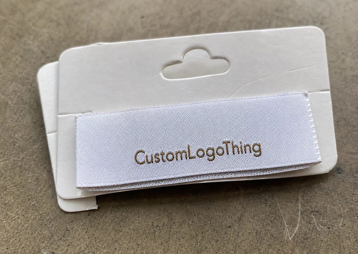
- Woven labels create a durable brand mark with a premium texture.
- Printed labels keep small text readable and reduce bulk.
- Heat-transfer labels remove the tag feel, which helps on skin-contact garments.
- Care labels carry fiber content, washing instructions, and required compliance text.
- Insert or loop labels can work for presentation pieces or limited runs.
The business case is straightforward. Changing the garment itself can mean new sourcing, regrading, and a longer testing cycle. Adjusting the label is usually much cheaper, faster, and easier to control. For that reason, many teams begin with labels before they touch the construction of the garment.
There is one detail buyers often underestimate: durability under laundering. A label that survives a studio sample but starts to peel, fray, or fade after a few wash cycles creates a weak point in the product experience. Beauty apparel often gets handled more gently than workwear, but it still needs to hold up to real use.
There is also a visual reason to care. Beauty packaging tends to rely on restraint, and labels should follow that same logic. A clean mark with enough white space will usually look more expensive than a crowded layout with too many fonts or too much text.
How Label Construction Works Across Garments and Fabrics
A label order looks simple until the spec sheet is filled out. Material, weave or print method, dimensions, fold style, attachment method, color count, and placement all affect the final result. Leave one of those vague, and the quote gets harder to trust.
For beauty brands, garment type should guide the choice. Robes and loungewear usually take woven or satin labels well because those materials support a polished finish without adding much visual noise. Stretch garments, sleepwear, and closer-to-skin pieces often do better with heat-transfer labels or very soft printed constructions because they reduce friction.
Fabric behavior matters more than many first-time buyers expect. Terry cloth hides a label differently than satin. Rib knit stretches and rebounds, so the label has to move with it. Modal blends, polyester-spandex, and brushed knits can all react differently to heat, ink, and stitching tension. A label that seems ideal on paper can behave poorly once it is attached to the actual garment.
That is why sampling on the real fabric is worth the time. A design render can show color and layout, but it will not show curling, edge stiffness, or distortion after application. One short test often exposes issues that would be expensive to fix later.
Brand consistency still matters across the line. A robe, a headband, and a promotional tee do not need identical labels, but they should feel related. The logo treatment, color family, text hierarchy, and finish should all sit inside the same brand logic. That consistency supports product packaging, retail packaging, and any other piece that customers encounter alongside the clothing.
For teams coordinating apparel with broader packaging systems, that alignment becomes even more visible. The label, the box, the insert card, and the tissue should read as one family of materials, not as separate decisions made in isolation.
A useful habit is to separate the branding question from the construction question. First, decide how the label should look and feel. Then check whether that format suits the garment, the wash requirements, and the production method. That order prevents the common mistake of choosing a visually attractive label that performs badly on the finished piece.
For broader packaging and materials context, the Institute of Packaging Professionals is a useful technical reference, especially for teams that want their clothing labels to align with the same standards used across their packaging program.
Cost, MOQ, and Quote Drivers to Expect
Pricing for Custom Clothing Labels for beauty brands follows a familiar packaging pattern: setup, materials, complexity, and quantity all shape the final quote. The main mistake buyers make is comparing two quotes that are not actually built the same way. A woven label with a custom fold and metallic thread is not equivalent to a plain printed care label, even if both are described as “custom labels.”
In practical terms, the biggest price drivers are label size, construction method, number of colors, finish, fold style, and any extra processing such as specialty backings or custom attachment. Small changes can alter the quote more than expected. A simple 1-inch printed label and a 2-inch woven satin label with edge finishing do not sit in the same cost bucket.
MOQ changes the unit math. Lower quantities carry more setup cost per piece. Higher quantities reduce unit cost, but they also raise inventory exposure if the launch changes, the garment is revised, or demand misses the forecast. That is a real concern for beauty launches, where seasonal timing and bundle strategy often move quickly.
For planning, these are reasonable working ranges, though actual pricing will vary by vendor, quantity, and finish:
| Label Type | Typical Use | Small Run Planning Range | Higher-Volume Range |
|---|---|---|---|
| Printed label | Care text, lightweight tees, short runs | $0.10-$0.35 each | Often under $0.10 each |
| Woven label | Robes, loungewear, giftable apparel | $0.15-$0.60 each | About $0.05-$0.20 each |
| Heat-transfer label | Sleepwear, stretch garments, no-tag comfort | $0.20-$0.75 each | About $0.08-$0.25 each |
| Satin care label | Beauty uniforms, packaged sets, smooth hand feel | $0.12-$0.45 each | Often under $0.15 each |
Those ranges assume simple artwork and standard finishing. Specialty threads, metallic effects, uncommon backings, or unusual folds can move the number up quickly. Rush production adds more cost as well. So does revision work after artwork has already been approved.
A good quoting process uses exact specs. Same dimensions, same material, same finish, same placement, same quantity. If those variables change from one supplier to another, the comparison stops being useful.
For teams sourcing broader packaging at the same time, it helps to align labels with other line items early. If the labels are priced in isolation and the rest of the kit is planned later, the total packaging budget can shift in ways that would have been easy to avoid. If you are also sourcing Custom Labels & Tags and broader Custom Packaging Products, the cleanest quotes usually come from one shared spec set.
Production Process and Turnaround Expectations
The production sequence is usually predictable: inquiry, spec confirmation, artwork review, proofing, sampling if needed, production, finishing, and shipment. Most delays happen before the machine run begins. Vague artwork, missing vector files, unclear placement notes, or color references that were never defined properly can slow the whole order down.
A digital proof is helpful, but it is not the finished product. It shows layout, text, and approximate balance. It does not tell you how the label will feel on skin, how the color will look under garment lighting, or whether the material will behave after stitching. If the label matters to the launch, a sample or strike-off is worth requesting.
Turnaround depends on format. Simple printed labels are usually faster than woven labels with multiple colors or special finishing. Heat-transfer labels can move quickly too, but only if the artwork is already clean and the application method is clear. Custom folds, edge finishing, and multiple components add time.
Typical planning windows, assuming artwork is approved without delays:
- Simple printed labels: often about 7-14 business days after proof approval.
- Woven or satin labels: often about 10-20 business days after proof approval.
- Heat-transfer labels: often about 7-18 business days after proof approval.
- Sample or strike-off stage: add several extra days if color or finish needs review.
Those are planning estimates, not promises. Seasonal congestion, shipping method, and revision cycles can push the calendar out. If the labels support a product launch, the safest approach is to treat them as a critical-path item rather than a final detail.
There is also a practical quality-control angle. If the item will be handled frequently or shipped in volume, it is reasonable to think in terms of transport and handling resistance. That does not require formal laboratory testing for every apparel label, but the same questions apply: will it stay attached, will the text remain readable, and will the finish still look intentional after use? For teams that want a stronger logistics lens, ISTA testing guidance is a useful reference point.
Material, Finish, and Attachment Choices That Matter
Not all labels feel the same, and in beauty apparel that difference is easy to notice. The hand feel, edge treatment, and attachment method all affect whether the product reads as polished or merely functional.
Woven labels are the most familiar premium option. They hold detail well, wear well, and give the garment a more finished look. Printed labels are better when the text needs to stay sharp and the garment should not carry extra bulk. Satin has a smooth, soft feel that works nicely for beauty uniforms and giftable apparel. Cotton feels more natural and understated. Heat-transfer labels are the lowest-profile option and often the best fit for comfort-first garments.
Finish changes the visual tone quickly. Matte surfaces feel calmer. High-sheen surfaces read brighter and more decorative. Edge softness matters too. If the edge is stiff or scratchy, the customer feels it immediately. That is a poor trade if the garment itself is meant to feel luxurious.
Attachment style should follow the same logic. A center fold in the neck is common for many garments. End folds and side-seam placements can reduce irritation. Loop folds and insert-style formats can work for presentation pieces, but they are not always appropriate for items that will be worn often or washed frequently.
- For robes and spa wraps: soft woven or satin labels usually fit the product well.
- For tees and sleepwear: printed or heat-transfer labels reduce irritation.
- For stretch fabrics: use low-bulk construction and check recovery after application.
- For gift sets: match label finish to the rest of the packaging system.
Wash conditions matter just as much as appearance. If the garment will be laundered repeatedly, the label has to survive heat, agitation, and detergent exposure. If the item is a one-time promotional piece, a softer or less durable option may be enough. The best spec is the one that fits the actual use case, not the most expensive one available.
That same discipline applies to broader product packaging. The label should echo the tone of the box, tissue, insert card, and any other materials surrounding the product. Consistency is often what makes a beauty package feel intentional rather than assembled from separate parts.
For sustainability-minded teams, fiber sourcing and certification may also be part of the brief. If your packaging or textile program uses certified materials, the official FSC site is a useful reference for chain-of-custody and certification basics, especially when paper components are part of the larger package.
Common Mistakes Beauty Teams Make With Labels
The most common mistake is designing for the mockup instead of the garment. A label can look balanced on screen and still curl, wrinkle, or sit awkwardly once it is attached to a soft or stretchy fabric. That is especially true for materials with texture or recovery.
Another common issue is overdesign. Too many colors, too much text, or a logo pushed too large can make the label feel busier than the rest of the product. Beauty customers often respond better to restraint. A quiet, well-spaced label usually reads more expensive than one trying to communicate everything at once.
Compliance is easy to delay and hard to fix late. Fiber content, care instructions, origin text, and any required symbols should be considered early, before the artwork is locked. If those details are added at the last minute, the layout often has to be rebuilt.
Color approval also causes avoidable friction. Digital screens can hide small shifts, and fabric texture changes how a color reads. Blues may cool down, neutrals may warm up, and black may print softer than expected. Once the label is attached to the garment, the mismatch becomes much more obvious.
There is also a tendency to use one label spec across every product. That works on paper and fails in practice. A label that suits a roomy robe may not suit a fitted tank. A care label designed for woven fabric may not behave well on stretch knit. Shared branding is useful; identical construction is not always sensible.
“A clothing label is not decoration first. It is the final tactile checkpoint before the customer decides whether the product feels deliberate.”
One more avoidable error is skipping a real application test. If the label will be stitched, heat-applied, or sewn into a seam, test it on the actual garment and not only on a sample swatch. That single step often catches the kind of problems that create rework, returns, or a weaker retail presentation later.
If you want a useful comparison point, review a few strong packaging or garment Case Studies. The best examples usually share the same pattern: clear structure, controlled materials, and one or two details that are used well instead of many details used loosely.
Expert Tips and Next Steps for a Clean First Order
Start with a real brief. Include garment type, fabric weight, wash expectations, label dimensions, placement, color references, and the exact copy that needs to appear. If possible, send garment photos and a dimensioned tech pack. Clear input produces cleaner pricing and fewer revision cycles.
For a first run, a small sample order is usually worth the cost. It can show whether the label feels too stiff, whether the print remains sharp, whether the edges curl, and whether the placement interferes with the garment. That matters even more for beauty launches, where apparel is often bundled with skincare, fragrance, or promotional kits and the timeline leaves little room for correction.
Think about the label as one part of a larger system. If the mailer, tissue, insert card, and outer carton all carry a refined tone, the clothing label should not feel like a shortcut. It should match the same level of care, even if it stays understated.
A simple approval checklist keeps the order moving:
- Confirm label dimensions.
- Confirm material and attachment method.
- Approve fold style and placement.
- Check care text and compliance copy.
- Review the proof on actual garment artwork.
- Lock color references before production starts.
That list is basic for a reason. Labels fail most often because one of those steps was rushed or assumed. A few minutes spent checking the spec usually saves much more time later.
For a clean first order, collect three things before requesting quotes: one garment photo, one spec sheet, and the exact care copy. That gives vendors enough detail to quote against the same assumptions. If your team is also coordinating beauty kits, apparel, and Custom Clothing Labels for beauty brands, keep the label order tied to the full packaging plan so the launch does not stall on a small but important detail.
What do custom clothing labels for beauty brands usually include?
Most orders include the brand name, size, fiber or care information, and a fold or placement choice. Some brands also add origin text, SKU codes, or a short brand line for retail presentation. The exact content depends on the garment, the compliance requirements, and how much information the label can hold without looking crowded.
Which label type works best for robes, tees, and spa uniforms?
Soft woven labels are a strong option when the brand wants a durable, premium look. Printed or heat-transfer labels are usually better when comfort against the skin matters more than texture. For stretch garments, the safest choice is generally the one with the least bulk and the best recovery after laundering.
How do MOQ and unit cost affect a label quote?
Higher MOQ usually reduces the unit cost because setup is spread across more pieces. Lower runs cost more per label, but they reduce inventory risk for launches and limited drops. Quotes are only useful when the material, size, finish, and attachment method match from one supplier to the next.
How long do custom apparel labels take to produce?
Simple printed labels often move faster than woven or specialty-finish labels. Artwork approval, sampling, and color matching usually control the schedule more than machine time. If the labels are tied to a launch, build in extra time for revisions and shipping so the garment order is not held up.
What is the biggest mistake when ordering clothing labels for a beauty launch?
Teams often approve a label before testing it on the actual garment fabric. That can lead to curling, discomfort, or a visual mismatch once the label is sewn or applied. A small sample test is usually cheaper than correcting the full run after the product is already scheduled for launch.