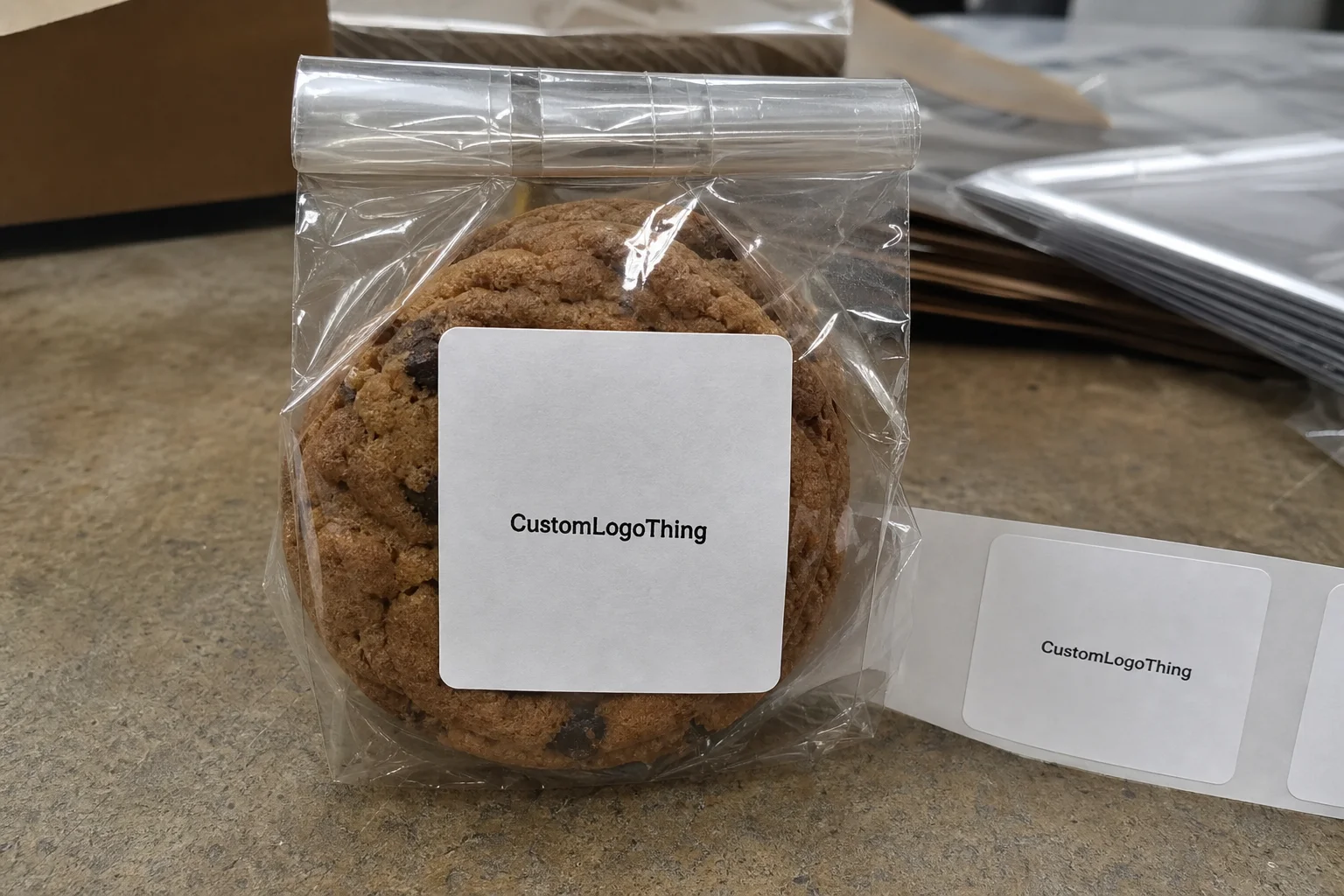
Custom cookie labels carry more weight than their size suggests. A good label can turn a plain kraft bag into packaging that feels planned, lift a simple clamshell into a retail-ready item, and handle the practical work of ingredients, allergens, and sealing without pushing a bakery into expensive custom boxes.
That is why buyers keep coming back to them. Labels are small, flexible, and relatively fast to produce. They also sit right at the point where brand image meets production reality, which means they need to look intentional and survive the conditions of a real bakery line.
Why custom cookie labels punch above their weight
Custom cookie labels often do more visual work than the package itself. A plain bag can still look premium if the label is sized well, printed cleanly, and placed with purpose. On the other hand, even a nice box can feel unfinished if the label is crooked, too small, or overloaded with text.
Most cookie label programs fall into one of three jobs. Some are mainly decorative, built to sell the product and strengthen the brand. Some are informational, carrying flavor names, ingredients, allergen warnings, barcodes, or net weight. Others act as a seal, closing a bag, sleeve, or folded pouch while also identifying the product. The best layouts are designed for one primary job first, then adapted for the rest.
That distinction matters because a label that tries to do everything usually does none of it especially well. A front-panel label needs visual balance and shelf appeal. A seal label needs strong adhesive and a simple shape. A regulatory label needs room for copy and a hierarchy that remains readable at small size. The package can still be attractive, but the structure has to match the task.
For small brands, labels are often the first place where packaging becomes visible to the customer. A $0.15 label on a $2 cookie can make the entire product feel more deliberate. The reverse is also true: a weak label can make a carefully baked product look rushed. Buyers notice that kind of mismatch immediately, even if they cannot explain it.
"A label that holds up through grease, chill, and handling does more for the brand than one that only looks good on a proof."
Common use cases are straightforward. Bakeries launching seasonal flavors need short-run flexibility. Farmers market sellers need labels that can be applied quickly by hand. Ecommerce brands need packaging that still looks clean after shipping, storage, and temperature changes. Retail programs need consistent dimensions and repeatable reorders. Custom cookie labels are useful because they can be tuned to each of those situations without changing the whole package system.
For buyers building out a larger packaging system, labels also connect naturally with Custom Labels & Tags and other Custom Packaging Products. Once the label format is working, it often becomes the visual standard for the rest of the line.
How custom cookie labels work from artwork to application
The production path is simple on paper and more specific in practice. First comes the package surface, then the size, shape, stock, finish, and adhesive. After that comes artwork setup, proofing, printing, and application. If the first choices are vague, the quote becomes harder to trust and the end result usually suffers.
Rolls and sheets are the first practical decision. Rolls work better for fast hand application, dispenser use, or semi-automated lines. Sheets are easier for small runs and low-volume packing stations. If a team is labeling 120 cookie bags at a folding table, sheets may be easier to handle. If the same operation later moves to larger batches, rolls are usually the better long-term format.
The surface matters more than many buyers expect. Paper bags, coated cartons, clear clamshells, glass jars, and plastic pouches all behave differently. A label that sticks well to kraft paper may struggle on a glossy container. Chilled product creates another issue because condensation can weaken adhesion. That is why the stock and adhesive should be selected together, not treated as separate afterthoughts.
Proofing is where avoidable problems are caught. Color on screen is not color in print. Small type can lose clarity once it lands on a tiny label. Fine lines may fill in. Dark backgrounds can make text harder to read. A useful proof is not just a preview; it is the last point where the job can still be corrected without eating time and budget later.
There is also a difference between seal labels and information labels. Seal labels should be visually simple, with enough tack and a shape that closes cleanly. Information labels need layout discipline. Allergens, ingredients, barcodes, and net weight need space and contrast. If both roles are forced into a cramped sticker, the result usually looks crowded and becomes harder to use.
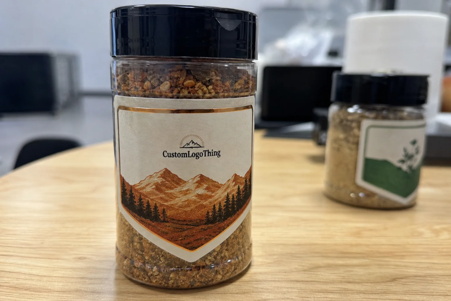
For cookie packaging, the practical details matter as much as the artwork. A label that is 1.5 inches wide may be perfect for a seal on a small sleeve, but too small for ingredient copy. A 3 x 4 inch rectangle may work well on a retail pouch, but feel oversized on a slim gift box. Good label design starts with the package, not the graphic.
Material, finish, and adhesive choices that actually matter
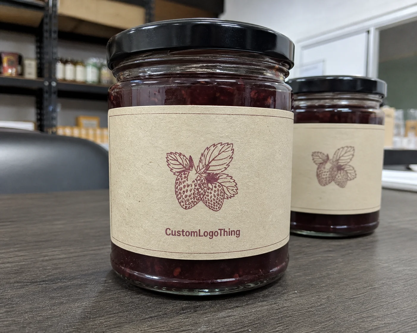
Paper, BOPP, and specialty stocks solve different problems. Paper gives a softer, more natural look and fits rustic or handmade branding well. BOPP, a common plastic film, performs better in moisture, refrigeration, and handling. Specialty stocks add texture or a premium feel, but they are usually better reserved for gift packaging, seasonal runs, or brands that need a specific tactile effect.
| Material | Look | Best Use | Watch Outs | Typical Price Impact |
|---|---|---|---|---|
| Paper | Natural, matte, simple | Dry bakery bags, short runs, rustic branding | Less resistant to grease, condensation, and abrasion | Lowest |
| BOPP | Clean, modern, durable | Plastic tubs, chilled cases, shipping, retail packaging | Can feel less tactile unless the finish is selected well | Low to medium |
| Textured or specialty stock | Premium, crafted, distinctive | Gift boxes, holiday packs, upscale branding | Higher cost and less efficient on some runs | Medium to high |
Finish changes the look more than most buyers expect. Matte finish feels calm and understated. Gloss adds brightness and can help graphics stand out under retail lighting. Soft-touch has a premium feel, but it makes the most sense on packaging that is handled carefully and not shipped through rough conditions. A finish should support the product, not compete with it.
Adhesive choice deserves the same attention. Standard permanent adhesive works for many dry applications. Stronger adhesive may be needed for coated surfaces, plastic containers, or packaging that will be chilled. If the cookies are going into a cold case or a shipping carton where temperature swings are likely, the label needs to be chosen with that in mind. Edge lift, curling, and surface failure are the problems that usually show up first.
Sizing should follow the package surface and the information load. Small round seals in the 1 to 2 inch range often work well for closures and badge-style branding. Rectangle labels in the 2 x 3 inch to 3 x 4 inch range are common for ingredient and flavor information. Larger front-panel labels are fine when the container supports them. The label should fit the package cleanly, not crowd it.
For brands that care about sourcing standards, paper-based programs can specify FSC-certified stock. The chain-of-custody framework is set out clearly at fsc.org. That does not change how the label prints, but it can matter for packaging programs that want the material story to match the brand story.
Pricing, MOQ, and unit value for cookie labels
Pricing for custom cookie labels usually comes down to quantity, size, material, shape, finish, and artwork complexity. A standard paper label with simple print requirements costs less than a custom die-cut BOPP label with multiple flavors, metallic ink, or a specialty surface. The quote only makes sense once the job is defined clearly.
MOQ, or minimum order quantity, is mostly about setup cost spread across the run. Smaller quantities carry a higher unit cost because the same preparation work is divided among fewer labels. Once a design is stable and the product line has settled, larger quantities usually bring the price down. The risk is carrying too much inventory if the cookie changes seasonally or the packaging is still in flux.
| Order Size | Typical Unit Cost | Best Fit | Risk Level |
|---|---|---|---|
| 250 to 500 labels | $0.35 to $0.90 each | Testing a new look, small pop-ups, limited runs | Lower commitment, higher unit price |
| 1,000 to 2,500 labels | $0.18 to $0.40 each | Bakery launches, local retail packaging, recurring flavors | Balanced cost and flexibility |
| 5,000+ labels | $0.08 to $0.22 each | Stable SKUs, ecommerce programs, higher-volume production | Better unit economics, less room for error |
That table only matters if the label performs in use. A cheaper label that wrinkles, peels, or smears creates labor cost that never appears on the first quote. Rework is where the real expense shows up. If a packing team has to reapply labels, sort failed pieces, or pull product from the line, the savings disappear fast.
Hidden costs are predictable. Rush fees, custom die shapes, multiple versions for flavors or allergens, color matching, proof revisions, and specialty finishes all add cost. None of these are surprising. They are just easy to miss when the order is described as "a label" instead of a specific packaging requirement.
A better way to compare quotes is to look at unit value rather than unit price alone. If one label costs a few cents more but solves adhesion issues, reduces relabeling, and improves shelf presentation, it usually earns its place. The lowest-priced option is not always the lowest-cost option once labor and waste are included.
For brands comparing labels against custom printed boxes or a broader branded packaging system, labels often win on speed and cash flow. They let a product line change quickly without replacing the entire container. That flexibility can be the difference between testing a new flavor and delaying it for a full packaging overhaul.
Production steps and timeline: from proof to delivery
A realistic label schedule starts with artwork readiness. If files are clean, the proof can move quickly. If the file includes missing fonts, low-resolution images, unclear dimensions, or no bleed, the job stops while someone fixes the basics. That delay is avoidable, and it is one of the most common reasons small packaging projects miss their target date.
For straightforward orders, proof approval to delivery often falls in the 7 to 15 business day range. Larger runs, custom shapes, and multi-version jobs take longer. Specialty finishes and unusual stocks add time as well. That is normal production behavior, not a warning sign by itself. The schedule just needs to reflect the actual job.
Speed improves when the order is simple: one SKU, standard shape, ready artwork, and quick approvals. It slows when the run includes multiple flavors, detailed compliance copy, custom dies, or repeated proof changes. If a holiday launch or market event is fixed on the calendar, build extra time into the order. One additional week is a safer buffer than most teams want to admit.
Shipping also matters. Labels need to arrive flat, protected, and ready for application. If the product will be stored in a cooler or shipped across temperature swings, the packaging should be able to handle transit without curling, edge damage, or adhesive weakness. The International Safe Transit Association publishes useful testing context at ista.org. Not every bakery needs formal transit testing, but the standards help explain why some label jobs fail only after they leave the print room.
The production path usually looks like this:
- Submit artwork and packaging specs.
- Review the digital proof carefully.
- Approve size, stock, finish, and adhesive.
- Print, cut, finish, and inspect.
- Pack, ship, and apply.
That sequence is simple. The hard part is making the first three steps specific enough that nothing gets left to chance. The more exact the order, the fewer surprises later.
Step-by-step ordering guide for bakery owners and brands
Step 1: define the label's job. Is it branding, sealing, ingredient information, promotion, or a mix of all four? If the purpose is unclear, the design will drift and the quote will be harder to evaluate.
Step 2: measure the package surface. Do not estimate. Measure the bag, box, jar, or clamshell where the label will sit. Scale is easy to get wrong on paper and obvious in production.
Step 3: choose the material and finish based on handling and storage. Dry shelf product can work well with paper. Greasy or chilled product usually needs BOPP or another moisture-resistant stock. Gift packaging can justify a matte or soft-touch finish if the budget supports it.
Step 4: build the artwork with clear type, strong contrast, and enough margin. Small-format labels punish tiny fonts. If the label also needs allergens, ingredients, or a barcode, reserve space early rather than cramming it into the last revision.
Step 5: proof it as if the production run depends on it, because it does. Check spelling, size, bleed, color balance, and adhesive format. Then choose a quantity that matches demand and shelf life. A seasonal cookie line should not sit on a giant stack of labels that can only be used for one promotion.
Labels work best when they are part of the larger packaging system instead of an afterthought. That means the bag, box, and seal should feel like they belong to the same product family. A consistent system also makes reordering easier, which matters once the line starts growing.
If the packaging program needs to expand, review Custom Packaging Products alongside the label plan. If the goal is to keep the focus narrow, start with Custom Labels & Tags and treat the package as the frame around the label, not the other way around.
Common mistakes that make cookie labels look cheap
The first mistake is size. A label that is too small looks timid. One that is too large overwhelms the package. Either direction reads as uncertain design, even if the artwork itself is strong.
The second mistake is choosing paper for a job that involves moisture, grease, or cold storage. This is where many label problems start. A cookie package may look fine when it leaves the table, then begin to fail in the cooler, in transit, or after a few hours of handling. If the edges lift or the print smears, the entire pack reads as lower quality.
The third mistake is weak contrast. Dark text on a busy background, glossy finishes that catch too much light, or pale type on a cream label all reduce readability. A premium look should still be easy to read from a normal viewing distance. If the label is hard to decode, the design has failed even if the artwork looks polished up close.
The fourth mistake is forgetting operational copy. Ingredient space, allergen declarations, lot codes, and barcodes all need room if the label has a business function beyond decoration. A label that looks elegant but leaves no room for these details is not actually finished.
The fifth mistake is overcomplicating the SKU system. Too many versions too early can turn a clean packaging program into a maintenance problem. A stronger approach is to build one base format, then swap flavor names, seasonal details, or promotional copy without changing the whole structure every time.
Expert tips to get better results on your next order
Use one master layout and make small changes for flavors, holidays, or promotions. That keeps the brand visually stable and reduces production friction. Reorders are easier too, which becomes valuable once sales start moving faster.
Choose the shape based on the job. Round labels work well as seals or badge-style markers. Rectangles are better for ingredient copy and structured layouts. Custom die cuts can add character, but only if the shape contributes to the design instead of distracting from it.
Test the label on the actual package surface before committing to the run. Not a digital mockup. The real bag, jar, or clamshell. Adhesion on a screen is theory. Adhesion on a greasy surface in a cold room is the actual test.
Keep typography larger than instinct suggests. Small labels punish tiny fonts and narrow spacing. If a line of copy cannot be read quickly from a normal viewing distance, it belongs somewhere else or should be removed. The strongest labels often look simple because the hierarchy is doing the work quietly.
If the packaging will be handled a lot, put durability ahead of decoration. That does not mean the label should be plain. It means the order of decisions should favor real use conditions first, then visual polish. A label that survives shipping, refrigeration, and hand packing is better than one that only looks good in a proof.
"The best label system is the one the packing team can use without thinking."
That is usually the dividing line between a label that looks good and a label program that actually works. The packaging should hold up in the conditions it faces, not just in a presentation file.
What are custom cookie labels used for on bakery packaging?
They brand bags, boxes, jars, and clamshells, and they can also seal the package or carry ingredient details. In many cookie programs, custom cookie labels are the fastest way to make plain packaging look finished without replacing the entire container system.
Which material is best for custom cookie labels on greasy packaging?
BOPP or another moisture-resistant stock usually performs better than plain paper on oily, chilled, or heavily handled packaging. The adhesive matters just as much as the stock, especially on coated bags and plastic containers.
How much do custom cookie labels cost per piece?
Unit cost depends on quantity, material, finish, size, and whether the shape is standard or custom die cut. Smaller runs cost more per label, while larger runs usually reduce the price enough to improve unit economics.
What is the typical turnaround for custom cookie labels?
Turnaround depends on artwork readiness, proof approval speed, order size, and whether special finishing is involved. Simple jobs usually move faster than custom shapes or multi-version label sets, especially if the files need cleanup before print.
Can custom cookie labels include ingredients or allergen information?
Yes. That is often the smartest way to combine branding and compliance details on one label. The key is leaving enough space for readable text, clear hierarchy, and any codes the packaging needs.
If you are ordering custom cookie labels for the first time, keep the spec clear, Choose the Right material for the package surface, and approve the proof with the actual packing process in mind. That is how you get cleaner packaging, fewer reprints, and a result that looks like it belongs on the product from the start.