Buyer Fit Snapshot
| Best fit | custom corrugated box branding ideas work for packaging buyers comparing material specs, print proof, MOQ, unit cost, freight, and repeat-order risk where brand print, material, artwork control, and repeat-order consistency matter. |
|---|---|
| Quote inputs | Share finished size, material target, print colors, finish, packing count, annual reorder estimate, and delivery region. |
| Proofing check | Approve dieline scale, logo placement, barcode or warning zones, color tolerance, and any recyclable or compostable wording before bulk production. |
| Main risk | Vague material claims, crowded artwork, or missing packing details can create delays even when the unit price looks attractive. |
Fast answer: Custom Corrugated Box Branding Ideas Work: Dieline, Finish, Proof, and Buyer Review should be specified like a repeatable production item. The safest quote includes material, print method, finish, artwork proof, carton packing, and reorder notes in one written spec.
What to confirm before approving the packaging proof
Check the product dimensions against the actual filled item, not only the sales mockup. Ask for tolerance on folds, seals, hang holes, label areas, and retail display edges. If the package carries a logo, QR code, warning copy, or legal claim, reserve that space before decorative graphics fill the panel.
How to compare quotes without losing quality
Compare board or film grade, print process, finish, sampling route, tooling charges, carton quantity, and freight assumptions side by side. A lower quote is only useful if the supplier can repeat the same color, closure quality, and packing count on the next order.
Custom Corrugated Box Branding Ideas That Actually Work
The box gets seen before the product, which is exactly why custom corrugated box branding ideas can move perceived value faster than another expensive ad campaign. A plain shipper makes a good product feel forgettable. A clean one-color logo, the right board, and a solid opening moment do the opposite. That matters for DTC orders, retail replenishment, subscription kits, and the unglamorous bulk stuff that moves through Custom Shipping Boxes.
This is not about turning corrugated into a billboard with delusions of grandeur. It is about packaging that has a job: protect the product, communicate the brand, and survive transit without chewing through margin. If the box does all three, it earns its place. If it only looks nice in a mockup, it is just ink with a costume.
Why custom corrugated box branding ideas punch above their weight
A corrugated box is one of the few brand touchpoints that follows the customer through the whole buying journey: warehouse shelf, truck, porch, desk, and eventually the recycle bin. That is a lot of exposure for something people usually call “just packaging.” A good unboxing experience does not need foil, glitter, or ten colors yelling over each other. It needs clarity, structure, and a visual system that feels deliberate instead of accidental.
From a packaging buyer’s point of view, the box is often the first physical proof that the brand is real. A product arriving in a plain brown carton can still be fine. It can also flatten the experience before the customer even opens the flaps. Put the same item in a branded shipper and it can feel more premium in a second. That is not magic. It is package branding doing its job.
Different channels need different levels of effort. E-commerce brands usually care about the opening moment and the abuse the box will take on the way there. DTC brands often want more story on the outside and inside. Retail packaging and replenishment cartons need handling cues, barcode space, and stack-friendly construction. Subscription boxes usually sit in the middle, since the outer carton may double as the presentation box. The best custom corrugated box branding ideas adjust to that reality instead of pretending every carton is a stage prop.
There is also a real difference between decorative branding and functional branding. Decorative branding says, “look at this.” Functional branding says, “this box belongs to us, it protects the product, and it helps the receiver know what to do next.” Functional details can include opening instructions, fragile icons, return labels, QR codes, and short brand copy. Those details tend to survive production because they earn their space.
So yes, the box can look good. It should also fold cleanly, print clearly on corrugate, survive transit, and stay inside budget. That is the bar. Anything less is packaging theater.
Process and timeline: how branded corrugated boxes move from idea to delivery
Most branded corrugated projects follow the same path: brief, dieline, artwork setup, sample, prepress approval, production, and shipping. The order looks neat on paper. Reality gets messy wherever decisions stay fuzzy. The usual slow spots are artwork revisions, print setup, structural testing, and the moment someone decides the logo should shift two inches to the left after everyone already signed off. Classic.
The first decision is box structure. A regular slotted carton, mailer box, crash-lock bottom, sleeve, or display carton all behave differently in print and assembly. If you are still choosing between formats, start there. Structure affects material use, graphics layout, compression strength, and freight cost. If the box style is wrong, no amount of branding polish will save it. That is why many teams start with Custom Packaging Products and narrow the structure before they chase artwork ideas.
Print method comes next. Digital printing is usually the fastest path for short runs and frequent design changes. Flexographic printing fits larger repeat orders with simpler graphics and steady artwork. Litho-lamination supports richer visuals and retail-ready presentation, but it usually asks for more planning and more budget. Each method changes setup, and setup changes the timeline. Annoying, yes. Predictable, also yes.
Here is a realistic planning range:
- Digital print, small run: often 7-12 business days after proof approval if the structure is standard and the artwork is clean.
- Flexo print, repeat order: often 12-20 business days, with more time if plates or color matching need correction.
- Litho-laminated box: commonly 3-6 weeks, especially if the project includes premium finishing or structural customizations.
That timeline can stretch. Sampling alone can add days if the board grade, print coverage, or structural fit needs another pass. A project with inserts, die-cuts, special coatings, or multiple proof rounds can run longer than anyone wants. The biggest delay trigger is simple: waiting too long to finalize branding decisions after the box spec is already chosen. Once the dieline is set and the job is moving, every late change costs time.
If the project has shipping performance risk, test it against the right standard before you order in volume. ISTA testing methods and ASTM packaging methods are useful references for transport stress, drop performance, and compression concerns. If sustainability is part of the brief, request FSC-certified board and confirm the claim before the quote gets approved. Fewer surprises. More boring. Better results.
One more practical point: the fastest job is usually the one with the cleanest input. Complete dimensions, a final logo file, a print target, and a clear delivery schedule remove a surprising amount of friction. Packaging teams can solve a lot, but they cannot fix a moving brief with wishful thinking.
Branding elements that make corrugated boxes feel intentional
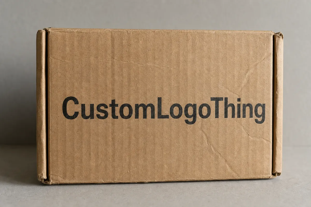
The strongest custom corrugated box branding ideas usually start with restraint. One well-placed logo does more than five competing graphics. A short message can work better than a paragraph. A crisp one-color print on kraft board can look more honest and confident than a noisy full-panel design that fights the substrate. The point is not to fill the box. The point is to make the box feel like it belongs to your brand.
Logo placement matters more than people expect. Centered top panels feel straightforward and retail-friendly. Side-panel logos help when cartons are stacked and handled from the side. Corner placement can feel modern, but only if the mark stays visible after the box is folded. If your logo disappears into a seam or gets clipped by a flap, that is not design. That is a production problem wearing a blazer.
Color is another major lever. High-contrast art usually prints better on kraft and white corrugate than subtle low-contrast art does. Dark logos on kraft create a grounded, natural look. White or pale inks on dark board can feel premium, though they need more care in proofing and ink coverage. Full-panel graphics bring energy, but they also raise print demands and can show more wear in transit. Pick color for the product and the shipping environment, not just the mood board.
Copy earns space only when it does something useful. Short product messages, a tagline, a QR code to setup or care instructions, or a clear return path can justify their place. If the box is part of a retail packaging system, add handling cues, SKU identifiers, and barcodes where needed. A customer should not need a decoding session to figure out the carton.
Texture and finish change the feel without necessarily blowing up the print budget. A simple varnish, matte coating, or soft-touch lamination can raise perceived quality. Coating should still match the use case. If the box is going through rough fulfillment, an ultra-matte finish may scuff faster than expected. Fancy is fine. Fragile is not.
A box does not need to be loud to feel premium. It needs to look deliberate, survive handling, and communicate the brand without turning into clutter.
Structural branding can be even stronger than print. Tuck styles, sleeves, interior reveals, custom inserts, tear strips, and opening tabs all shape the unboxing experience. A simple outside and a branded inside often works better than printing every surface. That gives the receiver a moment of surprise without forcing the cost of a full flood print. For many brands, that is the sweet spot.
One rule matters here: over-branding makes corrugated boxes look messy fast. Too many fonts, too many messages, too many graphic treatments, and too many surface breaks will make even expensive packaging feel cheap. Good package branding is edited. It knows what to leave off.
Another useful move is to leave deliberate negative space. A blank panel with one strong mark often feels more expensive than a crowded carton, because it gives the eye somewhere to rest. That matters on the shelf and at the doorstep, where people scan quickly and move on even faster.
Cost, pricing, MOQ, and quote basics for branded corrugated boxes
Pricing for branded corrugated boxes depends on more variables than most first-time buyers want to admit. Board grade, size, print method, color count, finish, die-cut complexity, insertion needs, and volume all affect the number. So does where the job is produced and how much freight the shipment adds. If a quote looks suspiciously simple, it may be missing something.
The biggest cost drivers are usually board strength and print setup. A larger box uses more material. Heavier products may need stronger corrugate, which raises cost. More colors raise print complexity. Special finishes raise labor and setup. Small order quantities often carry a higher unit cost because the setup gets spread across fewer boxes. That is not a scam. That is production math doing what production math does.
MOQ changes the equation quickly. A 500-unit run may make sense for a product launch or a pilot SKU, but the unit price will usually be far higher than a 5,000-unit run. The challenge is not just sticker price. It is storage space, cash flow, and how fast packaging needs may change. If the product or artwork is still moving around, buying too deep can create expensive dead stock.
Here is a practical comparison of common options:
| Option | Typical Use | Rough Unit Range | Best For | Tradeoff |
|---|---|---|---|---|
| One-color flexo shipper | Simple shipping cartons and repeat orders | $0.45-$1.20 | Brands that want low-friction branding and steady volume | Less visual impact than premium print methods |
| Digital printed corrugated box | Short runs, seasonal launches, fast artwork changes | $1.50-$4.00 | Small brands, test runs, and multi-SKU rollouts | Higher unit cost at scale |
| Litho-laminated box | Retail-ready and presentation-focused packaging | $1.80-$5.00+ | Premium brand identity and high visual coverage | More planning, more setup, more time |
| Plain corrugated with labels | Low-volume or variable information shipping | $0.25-$0.90 | Fast-moving operations and budget control | Less integrated branding, more manual application |
Those ranges are broad on purpose. A small mailer and a large double-wall shipper do not live in the same cost world. A heavy product, a white-ink print, or a full inside print can move pricing quickly. The table still gives a buyer a better starting point than “cheap,” which is not a number.
Quotes can also vary because of tooling, plates, freight, and artwork revisions after approval. Plate charges may apply in flexo work. Dielines may need a structural fee. Freight can be material, especially on bulky cartons. If a supplier is only quoting the box and not the shipping cost to your dock, ask for the landed number. Otherwise you are comparing half-quotes, and half-quotes are how budgets get quietly wrecked.
The cheapest option is not always the best once you count damage, returns, and brand perception. A box that crushes in transit or prints poorly costs more in the long run than a slightly better box with a cleaner spec. From a buyer’s point of view, the real price is not just per unit. It is per successful delivery.
If the project is large enough to matter, ask for a cost breakdown by component rather than a single lump number. Board, print, finishing, tooling, and freight can be separated in useful ways. That makes it easier to see where a change saves money and where it just creates another problem. Real purchasing decisions need that level of visibility.
Step-by-step: building a custom corrugated box branding plan
Good packaging design starts with the product, not the artwork. If the item is fragile, heavy, temperature-sensitive, or shelf-facing, those conditions shape the box before a single logo lands on the dieline. A cosmetics carton, a home goods shipper, and a subscription box each ask for different construction choices. That is why the best custom corrugated box branding ideas begin with the shipping environment.
-
Define the product and channel. Map the weight, fragility, storage time, and destination. A 2 lb DTC order is not the same as a 28 lb replenishment carton. The product packaging has to support the trip, not just the marketing story.
-
Choose the box style first. Regular slotted cartons, mailers, sleeves, and crash-lock bottoms each create different branding opportunities. Decide the structure before you force graphics into the wrong format. A structure that fights the artwork is a waste of both.
-
Build a brand hierarchy. Put the primary logo where it will actually be seen, then decide what secondary message deserves space, what support graphics help, and what utility information needs to stay readable. Brand identity works better when the box has a clear visual order.
-
Set a proofing checklist. Confirm dimensions, print zones, barcode placement, safe margins, seam breaks, and readability at arm’s length. A beautiful box with a barcode hidden in a fold is still a problem. So is a logo that looks fine on screen and tiny in real life.
-
Test with samples. Pack the actual product, close the flaps, tape or lock the carton, and inspect the real print surfaces. Then stack it, shake it, and open it. A mock unboxing gives you a much better read on alignment, legibility, and handling than a flat PDF ever will.
-
Plan the rollout. Decide which SKUs deserve full branding, which can use a simplified version, and which stay plain until volume justifies more spend. That kind of tiered system protects cash while keeping the brand consistent.
For teams that want a cleaner rollout, I usually suggest building a box family instead of one hero carton. That might mean a basic shipper for internal replenishment, a branded shipper for direct sales, and a more premium presentation box for launches or influencer kits. It is easier to manage one visual system across several formats than to redesign every box from scratch. The internal team stays sane. That alone has value.
If the project touches labels, inserts, or hand-applied codes, coordinate early with Custom Labels & Tags. A good box paired with sloppy secondary labeling still feels unfinished. Operations and marketing need to sign off together, not in separate silos with different assumptions and equal confidence.
It also helps to define what success looks like before the first sample arrives. Is the goal lower damage, better shelf presence, fewer packing errors, or a stronger opening moment? If nobody writes that down, the project can drift into a debate about taste, which is a terrible way to buy packaging.
Common mistakes that make branded corrugated boxes fail
The fastest way to ruin a good box is to design it like a flat poster. Corrugated is not flat. It has seams, flaps, score lines, folds, and surfaces that disappear once the carton is assembled. Artwork that looks tidy on a mockup may break apart when the box is built. That is why die-line review matters. The box is doing geometry whether the design file likes it or not.
- Ignoring folds and seams: Logos and critical text should never land in a fold unless bad surprises sound fun.
- Using tiny details: Fine lines and small type can blur or vanish on rough corrugate, especially on kraft surfaces.
- Overloading the panels: Too many messages make the branding feel scattered. Pick the message that matters.
- Choosing finish before function: A premium coating looks nice until it scuffs in the warehouse or on the truck.
- Skipping transit planning: Pallets, straps, moisture, and stacking pressure all leave marks. The box has to survive all of it.
- Forgetting budget and MOQ reality: A luxurious concept that cannot fit the volume or timeline is just a concept.
Another common miss is overestimating how much print detail corrugated can carry. The material can look excellent, but it still has texture. Highly detailed gradients, microcopy, and delicate linework may not reproduce the way a brand team expects. A box that looks sharp on a screen can soften a lot on fiberboard. Simple shapes and strong contrast usually age better in production.
Moisture and scuffing deserve more respect than they usually get. A matte black carton may look incredible on day one and arrive looking tired after a rough freight leg. That does not mean black is bad. It means you should know where the box will live, how it will be handled, and whether the finish belongs in that environment. Shipping is not a showroom.
Skipping prototypes is another expensive habit. Teams often assume approval on a PDF equals approval in real life. It does not. A sample exposes fit issues, print shifts, opening friction, and handling awkwardness. That is the cheapest time to catch a problem. After production starts, the problem becomes inventory.
For brands that want stronger proof before they place a larger order, ask for a press proof or a physical sample. If color accuracy matters, do not guess. If the logo has to read clearly from a distance, do not assume. Verify it. That is basic due diligence, not perfectionism.
One more mistake shows up all the time: teams choose packaging based on how it looks on the launch day and ignore month six. If the design makes replenishment harder, packing slower, or storage messier, the bill shows up later. Usually with interest.
Expert tips and next steps for better custom corrugated box branding ideas
Start with one strong visual move. That may be a bold logo on the top panel, a branded inside print, or a single color band that repeats across SKUs. One clear move usually beats three average ones. It gives the box a point of view without crowding the surface. That is why the best custom corrugated box branding ideas often feel simple after the fact. Simple is not easy. It is edited.
A tiered packaging system helps a lot. Build one version for basic shipping, one for branded shipping, and one for premium moments like press kits, subscription launches, or retail presentation. That way the package branding can scale with channel and margin instead of forcing every carton to do the same job. The brand stays recognizable, but operations keep some breathing room.
Request physical samples or press proofs whenever the project depends on color, contrast, or logo clarity. If your design uses white ink, metallic effects, or dense coverage on kraft, a real sample is worth the time. Proofs reveal whether the artwork is helping or fighting the substrate. Screen comps rarely tell the truth. Packaging does not care what looked good in a deck.
Get packaging, marketing, and operations in the same room early. Marketing wants brand consistency. Operations wants easy packing and low error rates. Packaging needs both to be true. If those teams do not align before the spec is locked, the final box usually ends up serving one department and irritating the other.
Use current standards and supplier documentation as part of the buying process. If the box needs shipping validation, ask about ISTA testing. If the carton claims FSC-certified material, confirm the certification path. If the product is being sold as retail packaging, ask how the box will behave in stacks, on pallets, and on a delivery route. That is where the real answer lives.
Here is a practical action list to move forward:
- Audit your current cartons and sort them by damage rate, brand visibility, and order volume.
- Pick one SKU that deserves a packaging upgrade first.
- Request quotes at more than one volume so you can see where the unit cost starts to settle.
- Compare digital print, flexo, and litho-lamination against your lead time, not your mood.
- Order samples, test pack the product, and inspect the box under real handling conditions.
- Use the findings to build a repeatable packaging system instead of one-off fixes.
If you want stronger brand consistency across the shipper and the rest of the packout, pair the carton with matching inserts, labels, and secondary packaging from Case Studies and Custom Packaging Products to see how similar builds are handled in practice. That is usually where the smartest improvements show up: not in a giant redesign, but in one better decision at a time.
The short version is simple. The best custom corrugated box branding ideas are the ones that survive production, shipping, and the customer’s hands. If the box looks good, protects the product, fits the budget, and supports the brand identity without creating a mess in operations, it is doing real work. That is the standard worth aiming for. Start with the structure, keep the graphics disciplined, and prove the design in a sample before you commit to volume.
FAQs
What are the best custom corrugated box branding ideas for small brands?
Start with a one-color logo print, one clear brand message, and maybe one inside-print detail if the budget allows. Use the box structure itself as part of the branding instead of trying to cover every surface. Keep the design simple enough to scale across more SKUs later without rebuilding the whole system.
How much do custom corrugated box branding ideas usually cost?
Cost depends on box size, board grade, print method, color count, finish, and order quantity. Simple one-color branding is usually the most affordable, while full-color premium finishes raise the unit price quickly. Ask for quotes at multiple volumes so you can see how the price per box changes as the run gets larger. Freight, tooling, and sampling can also change the final number.
What is the typical timeline for branded corrugated box production?
Simple projects can move quickly once the artwork and dimensions are approved, while custom structures take longer. Sampling, artwork revisions, and print setup are usually the biggest timeline risks. Build extra lead time if you need coatings, inserts, or multiple approval rounds.
What print method is best for custom corrugated box branding ideas?
Digital printing works well for short runs and fast design changes. Flexographic printing is often better for larger repeat orders and simpler graphics. Litho-lamination fits premium presentation goals but usually costs more and needs more planning.
How do I choose the right MOQ for branded corrugated boxes?
Match the MOQ to your forecast so you do not overbuy boxes that sit in storage too long. Compare unit cost against warehousing space, cash flow, and the risk of artwork or product changes. If you are unsure, test with a smaller run before committing to a larger branded inventory.
Do branded corrugated boxes need testing before production?
Yes, especially if the product is fragile, heavy, or shipping long distances. A sample or test pack reveals fit, print placement, opening friction, and how the carton holds up under handling. If the shipment has higher risk, ask for ISTA-based testing or a comparable transport test plan.

