Buyer Fit Snapshot
| Best fit | embossed rigid box branding ideas for premium packaging for packaging buyers comparing material specs, print proof, MOQ, unit cost, freight, and repeat-order risk where brand print, material, artwork control, and repeat-order consistency matter. |
|---|---|
| Quote inputs | Share finished size, material target, print colors, finish, packing count, annual reorder estimate, and delivery region. |
| Proofing check | Approve dieline scale, logo placement, barcode or warning zones, color tolerance, and any recyclable or compostable wording before bulk production. |
| Main risk | Vague material claims, crowded artwork, or missing packing details can create delays even when the unit price looks attractive. |
Fast answer: Embossed Rigid Box Branding Ideas for Premium Packaging should be specified like a repeatable production item. The safest quote includes material, print method, finish, artwork proof, carton packing, and reorder notes in one written spec.
What to confirm before approving the packaging proof
Check the product dimensions against the actual filled item, not only the sales mockup. Ask for tolerance on folds, seals, hang holes, label areas, and retail display edges. If the package carries a logo, QR code, warning copy, or legal claim, reserve that space before decorative graphics fill the panel.
How to compare quotes without losing quality
Compare board or film grade, print process, finish, sampling route, tooling charges, carton quantity, and freight assumptions side by side. A lower quote is only useful if the supplier can repeat the same color, closure quality, and packing count on the next order.
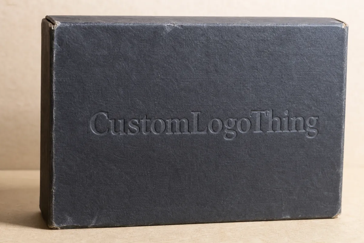
Embossed Rigid Box Branding Ideas for Premium Packaging
Embossed rigid box branding ideas change the first impression fast. Before a customer lifts the lid, the raised detail has already done part of the selling. It signals care. It signals discipline. It signals that the brand made decisions instead of stuffing the box with random decoration and hoping for the best.
For brands working with Custom Logo Things, the value goes beyond the surface effect. Embossing supports brand identity, strengthens recognition, and improves the unboxing experience without adding visual noise. That matters because a rigid box can feel expensive without acting loud. More brands should aim for that balance. Fewer should fill every inch with something shiny.
Customers judge packaging in seconds. They feel the weight first, then the texture, then the way the light catches the lid. If those cues line up, customer perception moves in the right direction almost immediately. If they do not, the box may still look custom, but it will not feel finished. That gap is where embossing earns its place in visual branding and brand consistency.
There is also a practical buying reality behind the aesthetic. A gift set sitting in retail, a skincare launch sent to press, and a corporate product reveal all need different levels of restraint. One buyer may want quiet luxury. Another may need shelf presence. Another needs a box that survives freight, handling, and repeated openings without losing the premium feel. Embossing can serve all three, but only if the design matches the use case.
Why Embossed Rigid Box Branding Ideas Stand Out
Rigid boxes already have a structural advantage. They feel substantial in hand. Add embossing, and the package starts communicating before anyone reads the copy. The raised detail creates a tactile pause. It invites touch. That touch often does more branding work than a louder color palette or a busier print layout.
Embossing lifts selected artwork, letters, borders, or shapes above the wrap surface. The effect can be dramatic or almost invisible. Either way, the box gains depth. On a rigid structure, that depth reads cleanly because the board underneath holds its form instead of flexing and softening the impression. Most premium rigid boxes use greyboard in the 1.5 mm to 3 mm range, and that stiffness gives the finishing team enough support to press crisp detail into the wrap.
From a packaging buyer's point of view, embossing is useful because it does not need to shout to feel premium. A shallow logo emboss on a soft-touch wrap can communicate confidence with very little ink. A deeper monogram on a matte paper wrap can feel more ceremonial. Both approaches work. They just serve different brand tones. One reads quiet and polished. The other feels stronger and more formal.
That makes embossed rigid box branding ideas especially strong for brands that want restraint. Luxury packaging is rarely about adding more. It is usually about stripping away everything that dilutes the message. A single raised mark on the lid can carry the whole package if the logo is strong and the material choices are disciplined.
The practical side matters too. Embossing performs best when the design leaves room to breathe. A rigid box wrapped in coated art paper, specialty textured stock, or a soft-touch laminated sheet can all take embossing well, but the final feel changes with fiber structure, wrap thickness, and pressure used during finishing. A good concept needs a physical sample. A digital mockup can only fake so much.
A box can be seen in a second and remembered for months if the touch feels deliberate. That is the quiet advantage of embossing on rigid packaging.
Common use cases show the range clearly. A skincare set may use a small embossed icon centered on the lid to support a refined brand identity. A whiskey gift set may pair embossing with foil for stronger shelf visibility. A jewelry box may use blind embossing on a deep matte wrap to keep the surface elegant and understated. Each choice affects brand recognition differently, and each one changes the unboxing experience in a physical, noticeable way.
There is no single correct style, which is probably the part that frustrates people who want packaging to behave like a spreadsheet. The best result depends on product category, distribution channel, and what the buyer needs the box to do in the real world. A box meant for direct-to-consumer shipping should not be treated the same as a box sitting under spotlights in a flagship store.
How Embossing Works on a Rigid Box
Embossing is a controlled press process. A custom die and counter-die form the raised shape by compressing the wrap material and the board surface in a specific area. The result depends on alignment, pressure, die depth, and how the box is built. If any of those pieces are off, the impression can look vague, crushed, or slightly misregistered. Packaging does not forgive laziness.
On rigid boxes, embossing usually happens on the wrap sheet before the sheet is mounted to the board, although certain structures and specialty materials can be finished after assembly. That order gives the finishing team more control over the texture and lowers the risk of distortion around edges and corners. Once the wrap is applied to the chipboard, the raised shape stays fixed and the box keeps its premium structure.
Two broad types matter most. Blind embossing raises the artwork without ink or foil. It is the most restrained option and often the most elegant for premium packaging. Registered embossing aligns the raised form with printed art or a foil-stamped area so the relief and decoration work together. The second option adds more contrast, which helps when the box needs more shelf presence or a stronger retail read.
The paper wrap changes the final effect more than many brands expect. Smooth coated papers tend to show sharper edges and cleaner line work. Textured papers soften the relief and can make the emboss feel warmer and more handmade. Soft-touch laminates create a strong tactile contrast, though they sometimes mute the crispness of very fine detail. That is not a flaw. It is material behavior. Ignoring it is how projects drift off track.
Artwork scale matters as well. Big shapes, bold logotypes, monograms, icons, borders, and repeat motifs usually emboss better than tiny serif type or dense illustration. Fine lines can disappear if the impression is shallow or if the wrap fibers are too open. Give the raised detail room to cast a shadow. Without that shadow, the effect flattens fast under normal light.
Embossing can pair with other finishes, but restraint usually wins. Foil stamping adds shine and helps the raised area read from a distance. Debossing pushes the shape inward rather than outward, which creates a grounded, architectural look. Spot UV brings contrast but can fight the matte texture if used too heavily. The strongest projects usually use one primary finish and one supporting finish, not four effects stacked like a software demo file.
For teams comparing production paths, a few industry references help. The ISTA testing framework is useful when a premium box also has to survive shipping, especially with inserts or fragile products inside. If the packaging uses paper from responsible sources, FSC certification gives buyers a clearer path for sourcing expectations. Those details do not change the emboss itself, but they shape the broader packaging program.
One more production detail deserves attention: registration tolerance. If the artwork, die, and wrap shift even a little, the embossed shape may feel off-center or weak. That is why experienced teams review the dieline, the proof, and the physical sample as separate checkpoints instead of assuming one approval covers everything. It does not.
Key Design Factors for Embossed Rigid Box Branding Ideas
The strongest embossed rigid box branding ideas usually start simple. Not every image deserves to be raised. Clean results usually come from logotypes, initials, seals, corner marks, borders, or a repeating pattern with enough spacing to hold its form. If the artwork is too detailed, the embossed layer loses clarity even when the digital file looks gorgeous on screen.
Depth is the next decision. A shallow emboss feels refined, subtle, and modern. A deeper emboss creates stronger hand-feel and heavier shadow contrast, but it can also stress the wrap if the relief goes too far. The right depth depends on paper stock, artwork scale, and brand tone. A restrained wellness label may want a soft impression. A luxury accessory brand may want something more assertive.
Material compatibility matters more than many teams expect. A 157 gsm art paper wrap behaves differently from a textured specialty stock. A 1.8 mm board behaves differently from a thicker 3 mm construction. Adhesive choice matters too, because some glue systems can flatten delicate texture or create tiny shifts if the wrap is not mounted cleanly. Once the emboss is on the box, those decisions are visible to the touch.
Placement should follow the customer's natural line of sight. Lid center is the most common and usually the safest. Corner marks can look smart and architectural. Side panels work well for subtle branding that appears during handling. Interior accents can be memorable if the brand wants a small surprise inside the unboxing experience. The best option is usually the one that lands exactly where the hand and eye go first.
Lighting changes the way embossing reads. A box photographed under soft flat light may look quiet. The same box under raking light or retail spot lighting can suddenly feel much more dimensional. That is why photographers and packaging teams should review samples under more than one lighting setup before sign-off. What looks perfect in a studio can feel different on a shelf or in a showroom.
Hierarchy matters too. What gets embossed, and what stays flat? The best answer is usually one main mark, one supporting texture, and everything else quiet. If the package tries to emboss every element, the eye loses its place to rest. Brand consistency tends to improve when the box speaks in one clear voice instead of several competing ones.
For practical reference, the most successful projects often use one of these design paths:
- Minimal mark: blind embossed logo centered on a matte or soft-touch lid.
- Premium accent: foil stamped logo with an embossed outline or shield.
- Pattern field: repeated micro-pattern embossed lightly across the lid or sleeve.
- Signature panel: a raised monogram on the top, with the rest of the box kept clean.
- Inside reveal: subtle interior embossing that appears after the outer wrap opens.
If you are building a coordinated packaging system, the box should not live alone. Matching inserts, neck cards, and hang tags can reinforce the same visual branding language. That is one reason brands often pair premium boxes with Custom Labels & Tags, especially when the outer carton and the product line need to feel like they belong to the same family.
Buyer scenario matters here. A cosmetics brand launching a hero serum may want the logo centered and barely raised so the lid feels calm and expensive. A spirits brand sending bottles to distributors may need embossing that reads from arm's length on a shelf. A jewelry brand may care more about what the customer feels in the hand after opening than what the box shouts from across the room. Same finishing method. Very different job.
Cost, Pricing, and MOQ Considerations
Embossing Changes the Cost structure, but usually in a manageable way if the design is planned early. The main drivers are tooling, setup time, box size, wrap material, finishing complexity, and whether the raised detail appears on one panel or multiple surfaces. The die itself is not the only cost. Registration work, proofing, and sampling matter too, because premium finishing needs tighter control than a basic printed carton.
For smaller rigid box programs, the per-unit price can rise quickly because setup gets spread across fewer boxes. At higher quantities, the tooling cost becomes less visible in the unit price. That is why volume planning matters. A 500-unit run and a 5,000-unit run may use the same concept, but the math changes fast once die, labor, and handling are allocated.
MOQ expectations vary by supplier and by finish complexity. A straightforward rigid box with blind embossing may fit a lower minimum than a box with foil, insert trays, and multiple wrapped panels. Custom inserts, magnetic closures, ribbon pulls, and multi-stage finishing all push the order toward more coordination. If the brand needs a very specific tactile outcome, the minimum order may matter less than whether the supplier can repeat the same detail across the run.
The table below gives a realistic planning range. These are not fixed prices, but they are useful for budgeting conversations:
| Finish Option | Best Use | Typical Setup Cost | Typical Added Unit Cost at 5,000 pcs | Notes |
|---|---|---|---|---|
| Blind Emboss | Quiet luxury, minimal branding | $80-$180 | $0.05-$0.12 | Most restrained option; works best with clean logos and open spacing. |
| Foil + Emboss | Higher shelf visibility | $150-$350 | $0.12-$0.30 | Good for premium retail or gift sets where shine and depth need to work together. |
| Multi-Level Emboss | Strong texture and detail hierarchy | $200-$500 | $0.18-$0.40 | Requires careful artwork and stronger sample review to keep lines crisp. |
| Deboss + Emboss Combo | Architectural, layered brand identity | $180-$420 | $0.15-$0.35 | Can look very premium, but only if the layout stays disciplined. |
If a brand needs to save money without losing impact, the cleanest moves are usually the most effective. Reduce the emboss area. Keep one strong logo mark instead of a full-panel texture field. Reserve premium finishing for the lid instead of every side. Choose a wrap stock that gives good relief without extra corrective work. Those choices protect the look and keep the budget from wandering off a cliff.
Sampling deserves its own budget line. A digital proof will not tell you how the paper pulls under pressure, how the light skims across the raised surface, or whether the emboss feels too shallow in hand. One or two physical samples can prevent expensive changes later. That is especially true if the box includes a tray, a foam insert, or a tight magnetic closure that needs exact fit.
MOQ also shapes the conversation between marketing and procurement. A small launch team may want to test demand with a lighter run, while a larger retail rollout may justify a higher order because the tooling cost spreads more efficiently. Neither approach is wrong. The wrong move is pretending the quantity does not affect the finish choice. It always does.
Production Process and Timeline: From Brief to Delivery
A strong project starts with a clean brief. The brand should define the package size, product weight, target retail position, finish goal, and the level of tactile emphasis expected from the emboss. Without that, design teams end up guessing whether the effect should feel subtle, dramatic, or somewhere in between. That uncertainty tends to show up later in proofing, usually at the least convenient moment.
The next step is dieline review. This is where the box dimensions, structure, wrap panels, and emboss placement are confirmed against the real build. A design that looks perfect on a flat screen may need small adjustments once the fold lines, seams, and turns of the wrap are visible. For rigid packaging, those details matter because the lid edge, side wall, and corner wrap all influence how the emboss reads.
After dieline approval comes die creation and material selection. The finishing team prepares the emboss die and counter-die, then tests the depth against the chosen wrap stock. Paper choice now becomes practical instead of theoretical. A gloss-coated paper may behave differently from a tactile matte sheet. A specialty paper with more fiber or grain may soften the relief. The sample shows what is realistic and what is wishful thinking.
Typical timeline ranges for embossed rigid box work often look like this:
- Artwork and dieline approval: 2-5 business days if feedback is fast.
- Die making: 3-7 business days, depending on complexity.
- Sampling and revisions: 5-10 business days, sometimes longer if the depth or material needs adjustment.
- Production: often 12-20 business days after final approval for many custom rigid box programs.
- Freight and delivery: varies by destination, packaging volume, and shipping method.
Those ranges can shift. If the project uses multiple premium effects, imported specialty papers, or a complex insert system, the schedule stretches. If the art is locked early and the material is available, the schedule moves faster. The most reliable projects are the ones where approvals happen in one pass and late changes stay off the table.
Quality control protects the whole investment. Teams should inspect edge alignment, corner wrapping, adhesive hold, crush resistance, emboss clarity, and insert fit. If the box is shipping with fragile product, additional transport testing helps. Many brands align their packaging tests with ISTA guidance so they can see how the package behaves under vibration, drop, and compression conditions before it reaches customers.
If the brand also has a sustainability brief, the sourcing conversation should happen early. Paper origin, board recovery content, and responsible forestry documentation all come into play. Some teams ask for FSC-certified paper or board because it supports procurement goals and customer trust. None of that replaces good design. It just makes the packaging program easier to defend internally.
The fastest projects are the ones where the design brief is specific and the approvals are decisive. Late artwork swaps, material changes, or finish revisions can add days or even weeks. A well-run production process is not about rushing. It is about removing uncertainty before the expensive steps begin.
One more timing reality: lead times often look fine on a calendar until the sample round exposes a problem. Then the schedule moves. That is normal. The brands that plan for one honest revision round usually end up with better packaging than the brands that try to skip straight to mass production and hope the first sample behaves perfectly. Hope is not a production method.
Common Mistakes That Weaken the Embossed Effect
The most common mistake is overdesigning the box. A busy layout can dilute the emboss, especially if the package already has multiple colors, foil, printed textures, and small copy blocks. The eye does not know where to land, so the tactile feature loses authority. If the goal is premium packaging, fewer elements usually produce a stronger result.
Typography causes problems more often than brands expect. Very thin serifs, narrow letters, and tiny type may look elegant on screen, but they can become fragile once pressed into the wrap. The best embossed type is usually bold enough to hold its shape, with enough negative space around it to let the light define the edges. A logo that reads clearly at 10 feet in print is not always the one that embosses best.
Another weak point is seam placement. A lot of packaging issues start where the wrap turns the corner. If a logo sits too close to a seam, the relief can distort or the fold can interrupt the shape. On a rigid box, even a small placement error is easy to see because the structure is so clean and geometric. The answer is to check the dieline against the finished structure, not just the flat artwork.
Skipping sample approval is risky. A render cannot show how pressure, grain, lighting, and adhesive behavior will interact. It cannot tell you whether the box will feel too soft or too sharp in hand. A physical sample gives real information, and that information usually saves money. In premium packaging, the sample is not a luxury. It is a control step.
There are also production blind spots that can flatten the effect after the design is already approved:
- Weak contrast: embossing on a highly reflective or overly busy surface can disappear.
- Poor storage: stacked boxes under heat or pressure may lose crispness at the edges.
- Wrong finish pairing: a texture that is too glossy or too soft-touch can hide fine relief.
- Overly deep relief: too much pressure can crush the wrap and make the box look rough.
- Insert mismatch: if the inner tray does not fit well, the premium feel drops the moment the box opens.
From a packaging buyer's point of view, the fix is simple in theory and disciplined in practice. Keep the design legible. Respect the material. Review the actual box, not only the artwork file. That approach supports brand consistency and protects the final customer experience.
Another mistake is treating the box as a print job instead of a physical product. A screen can flatter weak decisions. The real box cannot. If the brand is trying to say "premium" and the emboss sits in the wrong place or disappears under a bright finish, the customer notices the disconnect immediately, even if they never explain it that clearly.
Expert Tips and Next Steps for a Strong Launch
Start with one tactile hero element. That might be a logo, a monogram, a border, or a subtle pattern field. Once that single detail is working, build the rest of the packaging around it. That keeps the embossed area intentional instead of decorative clutter. Good premium packaging usually has a clear hierarchy, and embossing should sit near the top of it.
Test a few versions of the same idea. A deeper logo mark may feel stronger in hand, but a finer border can feel more elegant. A pattern across the whole lid might create a beautiful surface, yet a centered emblem may deliver more brand recognition at retail. Comparing two or three sample directions under real lighting is often the fastest way to decide.
Think about the full unboxing experience, not just the exterior lid. The lift of the closure, the reveal of the interior, the way the insert presents the product, and the first touch of the item all shape customer perception. Embossing works best when it supports that sequence. A beautiful lid that opens to a cluttered interior can feel unfinished. A restrained exterior paired with a neat insert usually feels far more premium.
If you are building the package with a supplier, gather your materials before the first proof. Have the logo files ready in vector format. Know the box dimensions. Decide whether you want blind emboss, foil plus emboss, or a mix with deboss. Bring in the brand color targets, the product weight, and any shipping concerns. The more specific the brief, the more useful the sample stage becomes.
For teams that want a stronger selling story, packaging can be coordinated with related pieces like inserts, sleeves, and secondary labels. That is where product presentation becomes part of the brand identity instead of a separate afterthought. If the box, tags, and internal components all feel connected, the customer reads the brand as more polished and more deliberate.
There is a useful rule of thumb here: if the emboss still feels right when the box is photographed, held in hand, and stacked on a shelf, the design is probably balanced. If it only looks good in one setting, it may need simplification. The best embossed rigid box branding ideas survive real production, real handling, and real distribution without losing shape or confidence.
For a launch that needs to land cleanly, the safest sequence is simple: pick one hero mark, confirm the material first, approve a physical sample, then lock the artwork. That order protects the budget, reduces revisions, and gives the final box the kind of presence people remember without needing a second look.
Frequently Asked Questions
Are embossed rigid box branding ideas better than foil alone?
Embossing adds tactile depth, while foil adds shine, so they solve different branding jobs. If a brand wants a quiet luxury feel, emboss alone can be enough. If the goal is stronger shelf visibility or more immediate contrast, foil plus emboss usually works better. The right choice depends on the brand tone, the viewing distance, and the budget, not on which effect looks louder in a mockup.
What kind of artwork works best for embossed rigid box branding ideas?
Simple logos, initials, icons, borders, and repeat motifs usually emboss more cleanly than tiny text or detailed illustration. Bold shapes with clear negative space hold up better because the relief edge has room to show shadow and structure. If the artwork is complex, the better move is often to simplify the embossed layer and keep the extra detail in print or foil.
Does embossing raise the cost of a rigid box a lot?
It usually adds tooling and setup cost, and the impact depends on quantity, die complexity, and how many surfaces are finished. A focused emboss on the lid is often more cost-efficient than covering the entire box with multiple raised elements. Sampling is worth the spend because it helps prevent expensive production changes later.
How deep should an emboss be on a rigid box?
There is no single correct depth. The right level depends on the paper wrap, the artwork size, and the premium feel you want to create. Shallow embossing can read elegant and restrained, while deeper relief creates stronger hand-feel but can stress the wrap if pushed too far. A production sample is the best way to judge whether the depth feels crisp, balanced, and durable.
What is the usual turnaround for embossed rigid box branding ideas?
Turnaround depends on artwork approval, die making, sample rounds, and the production schedule, so exact timing varies by project. Custom finishes usually take longer than standard box builds because embossing needs accurate tooling and careful setup. A clean brief and fast approvals help keep the schedule moving, especially when the box uses multiple premium effects. If you want the result to feel right from the first touch to the final reveal, the best embossed rigid box branding ideas are the ones planned with enough time to sample, refine, and approve them properly.
Practical takeaway: choose one strong embossed element, verify it on the actual wrap stock, and approve a physical sample before production. That single sequence prevents most of the expensive mistakes that flatten premium rigid box packaging.


