Custom Cosmetic Labels are usually judged on the proof, and that is where people get misled. The artwork looks clean, the mockup looks expensive, and then the first real bottle starts peeling at the edge, smearing under lotion, or curling after a week on a bathroom shelf. That is not a design problem. It is a materials and production problem, which is why the label spec matters as much as the artwork.
For a cosmetic brand, the label does more than decorate a container. It supports product packaging, carries the brand on the shelf, survives shipping and handling, and stays readable long enough for the product to be used. In practice, that means the material, adhesive, finish, and print method all have to work together. If you are building a full line of branded packaging, it helps to treat labels the same way you would treat Custom Labels & Tags or Custom Packaging Products: as a production decision, not just a design file.
The best first move is simple. Match the label to the container and formula first, then make the artwork fit the spec. That is how package branding survives after the box leaves the printer.
What custom cosmetic labels need to survive the shelf
Custom cosmetic labels do not live in a controlled studio. They live on curved bottles, textured jars, pump tubes, and glass or plastic containers that get touched, wiped, packed, and stored in imperfect conditions. A label that looks flawless in a PDF can fail on a real package because the adhesive was wrong, the finish was too delicate, or the substrate could not handle moisture.
The label is doing four jobs at once. It has to sell the product, support the visual language of the brand, remain readable, and stay attached. That last part sounds obvious until you see a premium serum bottle with a lifted corner after two days of shipping. Then it becomes painfully obvious. Good retail packaging does not separate appearance from performance. The two have to hold together.
Here is the practical breakdown:
- Material controls durability and feel. Paper can work on dry, low-touch items. Film is usually better for moisture, oils, and handling.
- Adhesive controls how well the label grips the container. Curved surfaces, cold storage, and slick plastics need more thought than people assume.
- Finish changes readability and resistance. Gloss, matte, soft-touch, and varnish each affect how the label wears.
- Print method affects color, consistency, and cost. Digital is usually better for shorter runs and multiple SKUs; flexo often makes sense at higher quantities.
That is why “pretty artwork” is only one piece of the result. If the label is part of a broader packaging design system, the container shape and formula should influence the spec from the start. A cream in a rigid jar, a serum in a glass dropper bottle, and a face oil in a squeeze tube do not need the same build, even if the graphics look similar on screen.
From a buyer’s point of view, the safest mindset is this: match the label to the environment first, then style it. That sounds boring. It is also what keeps reprints off your desk.
How the production process and turnaround really work
Turnaround is usually sold as a single number, but real production has more moving parts than that. The run begins with artwork intake, where the printer checks files, dimensions, bleed, and the dieline. Then comes proofing, press setup, printing, finishing, cutting, packing, and shipping. Any one of those steps can slow the order down if the files are incomplete or the material needs are unusual.
The delays usually come from the same places. Missing dielines. Low-resolution images. Color changes after proofing. A customer who wants to “just tweak one word” after approval. Late sign-off is another common one. If a launch date matters, the approval window matters more than people admit. A printer can only move as fast as the last file review.
Turnaround also depends on queue position and material availability. A simple digital order can move quickly if the stock is in hand and the proof gets approved without drama. A custom shape, specialty finish, or unusual adhesive can add days before the press even starts. That is not a delay in the sloppy sense. It is the normal result of making a custom part instead of buying a generic one.
Typical lead times often land in this kind of range:
- Simple label runs: often 5-10 business days after proof approval
- Custom shapes or finishes: often 10-15 business days after proof approval
- Rush work: possible, but it usually costs more and narrows your options
Packaging buyers who also Order Custom Printed boxes or other branded packaging pieces should coordinate the schedule early. Nothing wastes time like having cartons ready while labels are still being revised because the final bottle measurements were never confirmed. The order of operations matters.
A clean proof is not the same thing as a production-ready spec. The best jobs start with the actual container dimensions, the final formula, and a real deadline that leaves room for one correction.
For products that will be shipped in bulk or exposed to rough handling, look at transit test expectations too. Industry standards such as ISTA help you think about packaging durability in a more disciplined way. Not every cosmetic label needs formal testing, but the mindset is useful.
Custom label pricing, MOQ, and quote drivers
Price is where most label shopping gets fuzzy. One vendor quotes low, another quotes high, and everyone claims they are comparing the same thing. Usually they are not. Custom cosmetic labels are priced by quantity, size, material, shape, finish, and print method. If any of those changes, the quote changes too.
The lowest unit price is not always the best deal. A cheap quote can hide weak adhesive, limited finish options, or extra charges for revisions and shipping. A slightly higher quote with better specs often saves money once you stop reordering failed labels.
| Order type | Typical use | Approx. unit range | What drives the price |
|---|---|---|---|
| Short digital run | Test launch, seasonal scent, small batch | $0.18-$0.45 per label | Setup spread across fewer units, simple shapes, standard finish |
| Mid-volume run | Core SKU, repeat replenishment | $0.08-$0.22 per label | Quantity, material choice, one or two finish options, standard dieline |
| Higher-volume run | Multi-SKU brand line, retail rollout | $0.04-$0.12 per label | Press efficiency, simplified setup, fewer artwork changes, roll format |
MOQ is simply the point where the unit economics start to make sense for the printer. Smaller orders usually cost more per label because setup, proofing, and press time get spread over fewer pieces. That does not make small runs bad. It just means the math is less forgiving.
Quote drivers worth watching closely:
- Specialty finishes like foil, soft-touch, or spot varnish
- White ink for clear films or darker substrates
- Multiple SKUs with separate files or variable text
- Rush production that bumps the job ahead of standard work
- Custom shapes that add cutting complexity
If you want a fair comparison, ask every vendor to quote the same exact spec. Same dimensions. Same material. Same finish. Same quantity. Same format, roll or sheet. Otherwise you are not comparing quotes. You are comparing assumptions, which is a good way to buy the wrong thing confidently.
For brands building out a larger product line, the label budget should sit alongside the rest of the product packaging spend. Labels, cartons, inserts, and shipping materials all affect the final margin. A well-planned label spec often protects the rest of the budget by reducing reprints and waste.
Step-by-step: from art file to finished roll
The cleanest ordering process starts with real container specs. Measure the bottle or jar, not the mockup. Note the panel width, height, curve, and the area that stays visible once the cap, pump, or shoulder is included. If the package is round or tapered, test the wrap on the actual surface before you assume the label will sit flat.
Then move to the artwork. The file needs bleed, safe area, the correct dieline, and text that remains readable at the final size. Tiny type gets ugly fast, especially on glossy or textured stocks. If the label carries ingredients, directions, or batch code space, do not cram that copy into the margins just to make the front look cleaner. The first compliance review will punish that shortcut.
These file details matter most:
- Bleed: extra image area beyond the cut line so trimming does not leave a white edge
- Safe area: space inside the cut line where critical text should stay
- Resolution: low-res graphics break down fast on print; 300 dpi is a safer starting point for raster assets
- Color mode: CMYK is standard for most print work, but spot colors may be needed for brand consistency
- Dieline: the cut path that defines the finished label shape
Proofing helps, but it has limits. A digital proof can confirm size, copy placement, and general color direction. It cannot fully simulate how a finish will behave on a real bottle, especially if the container is curved, textured, or reflective. That is why samples still matter. A material sample in hand tells you more than a dozen screen mockups.
If the order needs a sustainability angle, ask whether the material or liner has a certified source. For paper-based builds, the FSC standard is a useful reference point for responsible sourcing. Not every cosmetic label needs an eco claim, but Buyers Should Know what they are paying for before they put green language on the package.
A practical workflow looks like this:
- Measure the container and confirm the final fill line.
- Choose the label material based on formula, handling, and shelf conditions.
- Build artwork to the dieline with proper bleed and safe area.
- Review the proof on screen, then test the size on the real package.
- Approve only after the placement, readability, and finish make sense together.
That sequence is not glamorous. It is just how custom cosmetic labels stay useful after they leave the printer.
Common label mistakes that cause peeling and waste
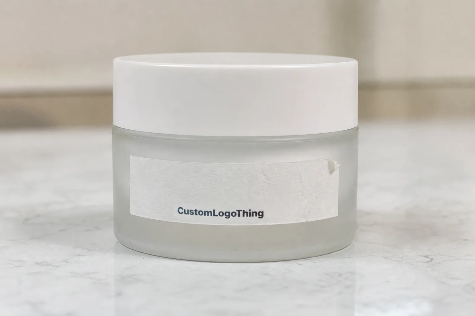
The most expensive label mistakes are usually boring. Wrong adhesive. Wrong size. Wrong finish. People like to blame the printer, but most failures start with a spec that never matched the package in the first place. If the formula is oily, the bottle is curved, or the package sits in a damp environment, a generic label stock is a gamble.
Adhesive choice is the biggest hidden issue. A label that works on a dry lotion tube may fail on a body oil bottle because oils creep under the edge. Cold storage can do its own damage by changing how the adhesive grabs the surface. If the product lives in a fridge, shower, or purse, the label needs to be chosen for that reality, not for a studio photo.
Size mistakes are the next problem. A label that is too large can wrinkle at the seam or cover important information. A label that is too small can leave too much blank space and make the product look cheap. On a curved container, even a few millimeters can change how the edge lands.
Finish can also work against readability. Soft-touch and heavy matte finishes feel premium, but they can dull small text or make barcodes harder to scan if the design is already busy. That does not mean avoid premium finishes. It means use them where they help the package, not where they create a new problem.
If you need tiny ingredient text, batch coding, or a barcode to carry real production information, do not bury it under a decorative finish and hope for the best. Hope is not a print spec.
Another common miss is skipping a real test application. A label can look perfect flat on a monitor and still fail when wrapped around a real bottle with a slight taper. Test one. Then test another after handling it with dry hands, then with slightly damp hands. That small bit of friction tells you more than guesswork does.
For brands comparing branded packaging options, it helps to separate decorative wants from operational needs. A label can still look elevated without becoming fragile. The sweet spot is usually a material and finish combination that gives you enough visual polish without forcing the consumer to baby the package.
And if your line includes several scents, shades, or formulas, consistency matters. Multi-SKU product packaging should share the same visual logic across all versions so the brand looks intentional, not like six different vendors each had a slightly different opinion.
Expert checks before you approve the art
Before you sign off, run a real checklist. Not the fake kind where you skim the PDF and think, “Looks fine.” The real thing. Confirm the bottle or jar measurements. Check the shelf-facing panel. Make sure the barcode has enough quiet space. Verify every line of copy, especially ingredients, directions, warnings, and batch code placement.
Then look at the package as a shopper would. Which panel sees the customer first? Does the logo stay legible from three feet away? Is the label fighting the shape of the container, or supporting it? Good packaging design is not just decoration. It is visual hierarchy and legibility under normal retail conditions.
Color deserves a practical check too. Cosmetic brands often push for richer, more saturated color than the package can comfortably support. In real life, cleaner contrast and slightly calmer saturation usually look more expensive than overworked color. Dark type on a soft background often reads better than fancy effects that blur under store lighting.
Before approval, I would check these points every time:
- Container measurements are correct and final
- Panel priority is clear on the shelf-facing side
- Barcode placement has enough quiet zone and contrast
- Copy is final, including ingredients and warning text
- Application method matches the actual bottle or jar shape
- Finish still allows important text to read cleanly
If your brand is already ordering custom printed boxes, keep the label system aligned with the carton system. The typography, spacing, and color treatment should feel like one family. That is how package branding starts to look deliberate instead of assembled.
One more check: think about what happens after packing. If the label will be applied by hand, make sure the format is comfortable for your team. Roll labels often make sense for higher-volume or semi-automated application, while sheets can work for smaller runs and manual placement. The right choice is the one that matches your operation, not the one that sounds fancier on a sales page.
FAQ
What material is best for custom cosmetic labels?
Choose the material based on the package surface and the product formula, not just the look. Paper works for dry, low-touch products; film is usually better for moisture, oils, and frequent handling. If the bottle is curved or the formula is slick, ask for an adhesive and finish that can actually stay put.
How much do custom cosmetic label orders usually cost?
Price depends on quantity, size, shape, material, finish, and whether the order needs special print options. Smaller runs have a higher unit cost because setup gets spread across fewer labels. Ask for quotes using the same specs across vendors, or the comparison is basically useless.
What is the normal MOQ for custom cosmetic labels?
MOQ varies by printer and production method, but digital jobs usually support lower minimums than specialty runs. The real question is whether the unit cost still makes sense at the quantity you need. If you are testing a new product, a lower MOQ can be worth it even when the per-label price is higher.
How long do custom cosmetic labels take to produce?
Turnaround depends on proof approval, material availability, finishing, and the current production queue. Simple jobs move faster; custom shapes, specialty finishes, or rush requests add time. Build in buffer time before launch so a late file fix does not wreck the schedule.
Do custom cosmetic labels need to be waterproof?
Not every label needs full waterproof performance, but many cosmetic products do need resistance to moisture, oils, or rubbing. Think about where the product lives: shower shelf, vanity, purse, refrigerated display, or shipping box. If the label will get handled often, choose a material and finish that protects both the adhesive and the print.