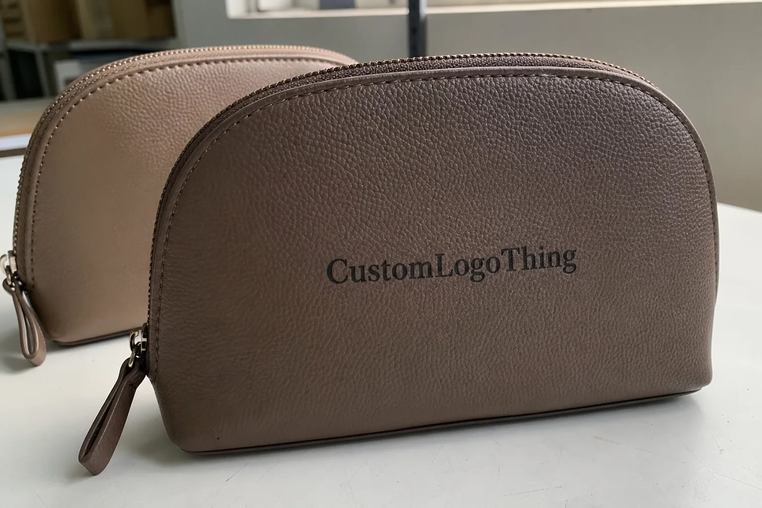
Custom cup labels look straightforward on a screen. On the cup, they meet condensation, curved walls, hurried application, and the occasional ice bath. A label that looks polished in a mockup can fail in under an hour if the stock, adhesive, and dimensions were chosen for the proof instead of the packaging environment.
For buyers, the practical job is simple: the label should identify the product quickly, stay attached, and fit the cup without looking stretched or improvised. Artwork still matters. But a strong design does not rescue a bad substrate or an adhesive that was never meant for chilled surfaces. Packaging problems tend to be physical before they are visual.
That is why custom cup labels sit at the intersection of branding and production. They are part graphic element, part material specification, part quality-control decision. If any one of those is handled casually, the result usually shows up in the first handling cycle.
Why Cup Labels Fail on Real Packaging
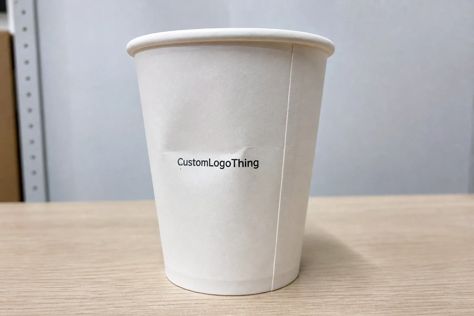
Most label failures are predictable. The cup gets cold. Moisture forms. The label edge starts to lift. Or the face stock absorbs humidity, wrinkles at the corners, and turns slightly cloudy. None of that points to a print defect first. It usually points to a mismatch between the label construction and the way the cup is used.
That is a useful distinction. Buyers often focus on color accuracy, resolution, or whether the logo has been placed perfectly in the artwork. Those matter, but they are not the failure point that gets packaging rejected in use. A clean print on the wrong material is still a failed label. A modest design on the correct stock can perform better because the real job is durability, not decoration.
“If the cup will be chilled, handled with wet hands, or stacked before use, assume the label will be tested immediately. Design for that condition, not for the proof.”
Custom cup labels also need to fit the broader packaging system. If the brand uses cartons, sleeves, or inserts, the label should match the visual logic without competing with the rest of the package. Consistency is helpful, but only if the label survives the service conditions that come with the cup itself.
There is another common mistake: treating the cup like a flat panel. A cup wall is usually tapered, curved, or interrupted by a seam, lid line, or grip feature. Labels that ignore those constraints can look fine on the art board and awkward in production. The result is often a floating effect, where the graphic seems detached from the cup because the visible area was never measured correctly.
How the Production Process and Turnaround Work
The production path is usually predictable: Request a Quote, submit artwork, review the proof, approve the job, print, finish, and ship. The delays happen in the details between those steps. Missing cup dimensions. A vague application area. Revisions to the logo lockup after the proof is already in motion. Those are the kinds of issues that slow a label order more than machine time does.
If you want the process to move quickly, send the information that actually affects production. Include the cup material, exact label size or target area, expected quantity, finish preference, and the conditions the label will face. Refrigeration, ice, condensation, hand contact, short-term or long-term use, and manual or automated application all matter. The more specific the brief, the fewer assumptions the printer has to make.
Approval speed matters too. A digital run can move fast once the proof is signed off. But a delayed proof can stall the entire schedule, even if the shop is otherwise ready. That is true whether the order is for custom cup labels, broader custom labels and tags, or a full packaging set.
Typical timelines depend on method and complexity:
| Order Type | Typical Timeline | What Slows It Down |
|---|---|---|
| Simple digital run | Often 5-8 business days after proof approval | Late file changes, missing dimensions |
| Custom shape or special finish | Often 8-15 business days | Die-cut setup, extra finishing steps |
| Larger volume or specialty adhesive | Often 10-20 business days | Material sourcing, production queue |
If the label needs testing, add time for that. A sample applied to the real cup surface is a better use of time than a large reprint. Packaging failures are expensive because they appear late, after the artwork is approved and the budget is already allocated. A quick fit test catches the obvious issues: lifting corners, poor curvature match, residue, or a finish that looks different once chilled.
Industry standards exist for a reason. Organizations such as ISTA publish testing methods because packaging is exposed to movement, pressure, and temperature shifts long before it reaches the customer. A cup label does not need laboratory treatment for every order, but it does need a reality check before bulk production.
Materials, Adhesives, and Finish Options
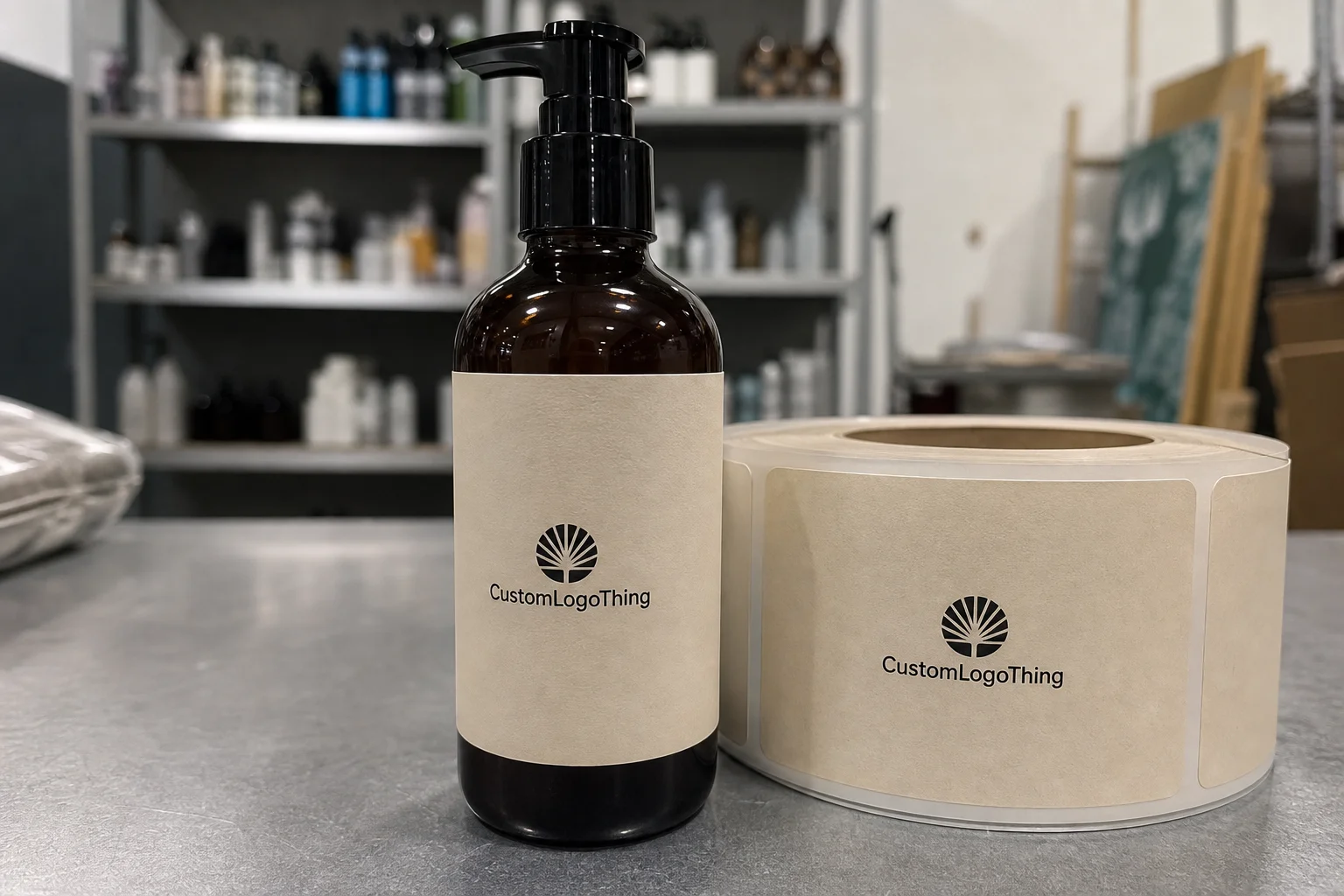
Material choice is the backbone of the job. For dry, short-life use, coated paper can work well and keeps costs down. For cold drinks, refrigeration, or environments with regular condensation, a moisture-resistant film or synthetic stock is usually the safer option. Paper is often the first thing to fail once water and friction enter the picture.
Adhesive selection matters just as much. A permanent adhesive is the default for most service applications because it resists lifting and edge failure. A removable adhesive makes sense only when clean removal is part of the requirement. That works best on smooth, compatible surfaces and shorter service windows. On textured or coated cup surfaces, removable adhesives can behave unpredictably.
There is no universal adhesive that behaves the same on every cup. Polypropylene, PET, coated paper cups, and foam surfaces all present different challenges. Surface energy changes the bond. Temperature changes the bond. Even a label that holds well at room temperature can act differently after a few minutes in a refrigerator. If a vendor does not ask what the cup is made of, that is a warning sign.
Finish changes more than appearance
Gloss finishes tend to sharpen color and read clearly under strong retail lighting. Matte reduces glare and often feels more restrained. Soft-touch and textured finishes add a premium feel, but they do not automatically improve performance. In some cases they reduce abrasion resistance or add cost without improving the label’s function.
A practical rule helps here: choose the finish for the environment first, then for the look. If the cup will be chilled, stacked, or handled with wet hands, durability usually matters more than tactile effects. If the label is only visible for a short window before the product is consumed, there is little value in overpaying for surface treatment that does not improve service performance.
- Paper labels: best for dry, short-duration use.
- Film or synthetic labels: better for cold drinks and moisture exposure.
- Permanent adhesive: best for labels that must stay in place.
- Removable adhesive: best when clean removal matters more than long-term hold.
For sustainability-focused brands, ask whether the paper component or face stock is FSC-certified and whether the claim is tied to documented chain of custody. A logo alone is not enough. The specification behind it matters, especially if the packaging is part of a broader procurement standard rather than a one-off promo order. See FSC for the certification framework.
The other tradeoff is cost. Film stocks and specialty adhesives usually cost more than basic paper constructions, but they reduce the risk of failure in cold or wet use cases. That tradeoff is usually worth it for refrigerated beverage service. It is rarely worth ignoring if the product is expected to sit in ice, travel in insulated bags, or pass through several hands before use.
Size, Shape, and Placement Rules for Cups
Size is where otherwise good orders go sideways. Buyers often start with nominal cup volume and assume the rest will follow. It does not. A 12-ounce cup from one supplier may have a different taper, rim diameter, and application zone than a 12-ounce cup from another supplier. The label has to fit the actual cup, not the category name printed on the carton.
Measure the real application area. Not the packaging box. Not the product listing. The cup. Then confirm where the label can sit without interfering with the rim, lid, handle, seam, or molded features. On tapered cups, the top and bottom widths are different, which means a plain rectangle can distort if the label is too wide or placed too close to a curve.
Front-panel labels are useful when the brand needs a clean face and minimal clutter. Wrap-around labels make sense when the cup needs more than a logo, such as ingredients, barcode space, or a short product description. Bottom marks can be used for batch codes or internal identifiers. The design choice depends on how much information needs to live on the cup and how much of that information must remain visible while the cup is in use.
Common placement mistakes
The most common error is placing the label too close to the rim. Lids can interfere, and the top edge can lift sooner than expected. The next mistake is placing it too low, where hands cover the branding and the graphic loses visibility in service. Another problem appears when the label crosses a seam or a strong curve without being adjusted for that shape. Wrinkles and corner lift are usually the result.
For a small event cup, a simple front-facing panel may be enough. For retail packaging or promotional sets, the label often has to balance branding, regulatory information, and scannable elements. That is a different design problem. The layout has to remain readable after application, not just attractive in a flat proof.
Fine type deserves caution. On most cup labels, text below 6 pt starts to become unreliable once the label is curved, printed, and handled. If the text has to be read across a counter or from a few feet away, keep it larger. Tiny copy makes a brand look underplanned, even if the logo itself is strong.
Cost, Pricing, MOQ, and Quote Variables
Price is driven by quantity, size, stock, finish, shape, and whether the job uses standard tooling or a custom die-cut. The quote becomes accurate only when those variables are clear. A vague request tends to produce a vague estimate, and that estimate usually changes once the real spec appears.
Minimum order quantities matter because setup cost has to be spread across the run. Small quantities usually carry a higher unit price. Larger runs often reduce the per-label cost, especially in digital or flexographic work where the prep cost is a meaningful part of the total. Artwork complexity rarely changes the price much unless it creates extra color handling, registration issues, or specialty finishing.
| Decision | Typical Impact on Price | Buyer Tradeoff |
|---|---|---|
| Small quantity | Higher unit cost | Lower inventory risk |
| Larger quantity | Lower unit cost | More cash tied up upfront |
| Film stock | Usually higher than paper | Better moisture resistance |
| Custom die-cut | Raises setup cost | Cleaner fit and stronger shelf presence |
| Special adhesive | Can raise unit cost noticeably | Improved hold or clean removal |
For budgeting, a small digital run of custom cup labels may land around $0.18 to $0.45 per label depending on size, finish, and material. Larger runs can fall below that range, but only when the spec stays simple and the setup is straightforward. Specialty adhesives, unusual shapes, extra proof rounds, or rush timing can push the price higher quickly. The artwork itself is rarely the main driver.
That is also why buyers sometimes compare label cost against other packaging pieces. If the cup is one part of a launch, it can make sense to keep the visual system consistent across cartons, sleeves, and related custom packaging products. Standardizing the design language can reduce production friction without forcing every item into the same construction.
Price should be judged as a function of risk, not just invoice total. A cheaper label that peels in refrigeration can cost more after relabeling, replacement, or product presentation damage. A slightly more expensive spec that survives the service window often ends up being the lower-cost choice.
Common Mistakes That Make Labels Look Cheap
Cheap-looking labels are often the result of weak specifications, not low material quality. Bad sizing, poor contrast, crowded artwork, and awkward finishes show up fast on a cup. Consumers notice. They may not identify the technical reason, but they do register when packaging feels temporary or unfinished.
Floating labels are a common problem. The shape does not match the cup curve, the artwork looks off-center, and the label appears borrowed from another product. That effect usually comes from guessing the application area instead of measuring it. The same issue can happen when a rectangular shape is forced onto a tapered cup without adjustment.
Finish choices can also create the wrong impression. A glossy label may look sharp, but if the adhesive is weak in cold storage, the corners can curl. A soft-touch finish can feel premium, then show wear after a day in service. Decorative choices only matter if the label still performs after handling, moisture, and stacking.
Operational mistakes are expensive
Skipping a real-world test is the easiest way to create a problem that should have been avoided. Print one sample. Apply it to the actual cup. Chill it. Handle it with wet hands. Stack it. Leave it alone for a while. If the label survives that, the run has a much better chance of behaving properly in use.
That test does not need to be complicated. It just needs to mimic the environment honestly. ASTM adhesion testing methods exist because packaging is not judged in a vacuum. Labels live in friction, temperature shifts, and repeated handling. If the order matters, a sample test is part of procurement, not an optional extra.
- Keep contrast strong enough for fast reading.
- Avoid tiny legal copy unless it is truly necessary.
- Do not force a rectangular label onto a tapered surface without checking fit.
- Test the label on the actual cup, not a similar one.
What to Do Next Before You Request a Quote
Before requesting custom cup labels, gather the spec details that affect performance. Measure the cup. Identify the surface material. Decide whether the label needs to hold in cold or wet conditions. Choose the finish. Estimate the quantity. Those five items are usually enough to get a realistic quote and avoid back-and-forth that adds time without improving the outcome.
A photo helps too, especially if the cup shape is unusual. Include a ruler or tape measure in the frame so the vendor can gauge taper, visible area, and any interfering features. If the cup is nonstandard, ask for a template or a sample fit before approving a larger order. That is a small step compared with a reprint.
A clean quote request usually includes:
- Cup material and size.
- Exact label dimensions or the target application area.
- Quantity and likely reorder needs.
- Finish preference, such as matte, gloss, or soft-touch.
- Service conditions, including refrigeration, condensation, or hand contact.
- Any special needs such as removable adhesive, barcode space, or batch marking.
If the cup label is part of a larger packaging system, keep the visual logic aligned across the rest of the package. A label that fights the carton, sleeve, or insert feels accidental. A label that follows the same design logic across related packaging pieces looks intentional and tends to support the brand better in hand and on shelf.
Custom cup labels are easy to order poorly and not difficult to order well. The difference is usually a measured cup, a realistic material choice, and one test on the actual surface. That is a small amount of effort compared with peeling corners, residue, and the cost of rework.
FAQ
What material works best for custom cup labels on cold drinks?
A moisture-resistant film or synthetic stock is usually the safer choice if condensation is part of the use case. Pair it with an adhesive rated for cold surfaces, then test one sample on an actual chilled cup before approving the full run. That single test catches most of the common failures.
How do I know what size custom cup labels to order?
Measure the flat or most visible area on the actual cup, not just the catalog spec. Account for taper, seams, lids, and any section that needs to stay open. If the cup shape is unusual, request a template or sample fit check instead of guessing. Guessing usually costs more than the label itself.
What affects the price of cup labels the most?
Quantity usually has the biggest impact because setup cost spreads over more labels. Material, finish, and custom die-cut shape can also raise unit cost faster than the artwork itself. Rush timing and proof revisions are the hidden costs that show up when the brief is incomplete.
How long does the custom cup labels process usually take?
Simple digital orders move fastest once the proof is approved. Special finishes, custom shapes, or larger quantities usually add production time. Fast buyer approval is the easiest way to protect turnaround and avoid sitting in the proof queue.
Can custom cup labels be removable without leaving residue?
Yes, but the adhesive has to be specified for removable use from the start. Removable labels work best on smoother cup surfaces and shorter service windows. Always test for residue on the actual cup material before bulk ordering, because expected performance is not the same as proven performance.