The visual center of a cap is not always the true center. A logo can look perfect on a flat screen and still land too high, too low, or slightly off once it meets a curved crown, a seam break, and the limits of embroidery or print. That is why a Custom Event Hats logo placement guide matters: it helps the artwork read clearly in a crowd, stay comfortable on the wearer, and stay realistic for production.
A hat can be centered on paper and still read off-center on the head. That small gap between math and perception is where most rework starts.
Custom event hats logo placement guide basics
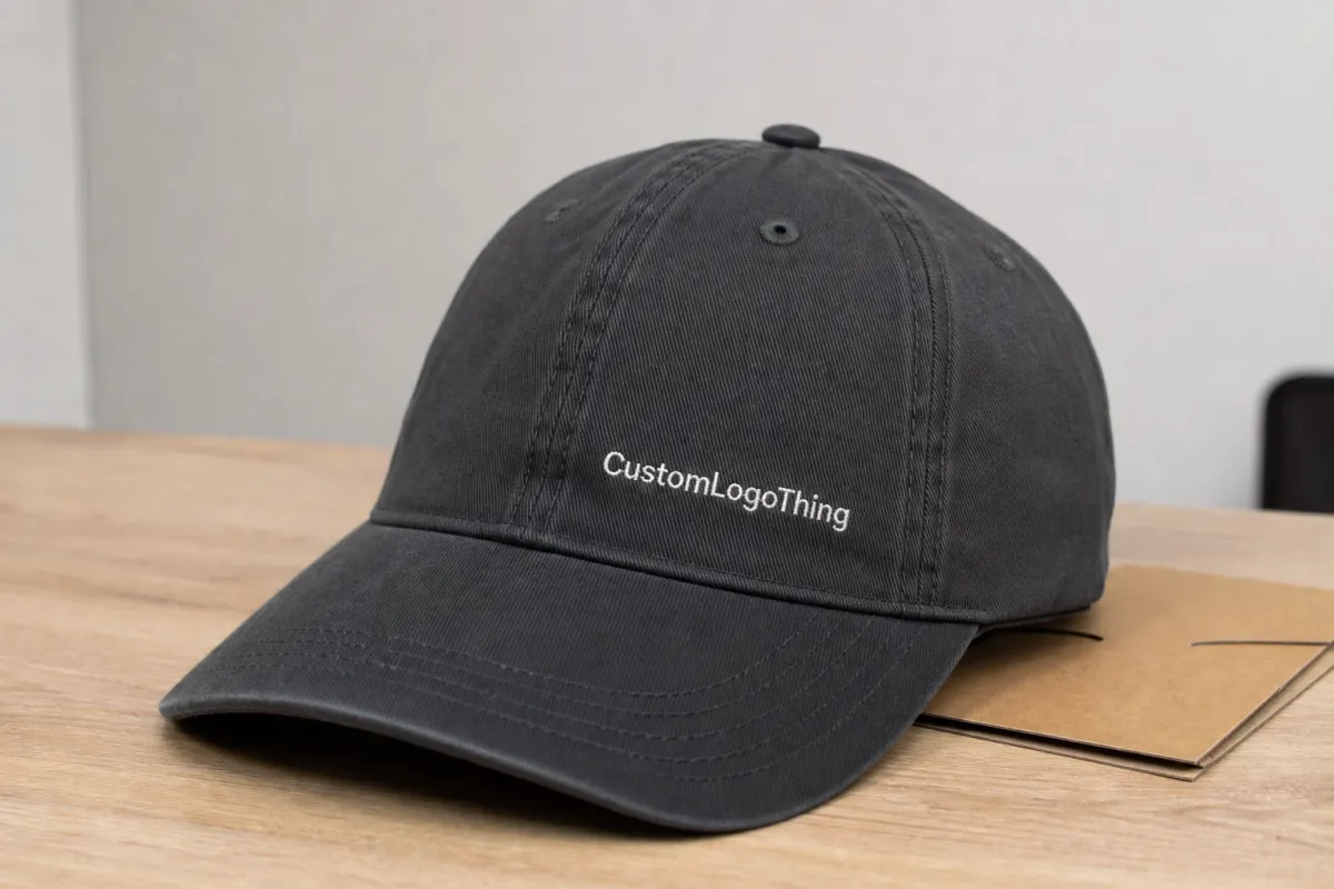
Most buyers start with the front panel, and that instinct is usually sound. Front-center placement gives the fastest brand read, photographs well, and keeps the design easy to recognize from a distance. But the front panel is only one part of the equation. Seams, eyelets, crown height, brim curve, and the decoration method all change how the logo behaves once it is sewn, printed, or patched onto the hat.
A practical placement plan starts with the zones people actually use:
- Center front - the standard choice for event names, primary logos, and sponsor-visible branding.
- Left-front - a smaller, cleaner look that feels less crowded on shallow crowns.
- Side panel - useful for dates, department marks, city names, or supporting branding.
- Back arch - often used for web addresses, short taglines, or event identifiers.
- Patch field - woven, embroidered, leather, or printed patches that need their own sizing rules.
Event hats behave differently from general promotional caps because they are seen in motion, not on a shelf. People glance at them while walking, talking, posing for photos, or passing through a line. That means the mark needs to be readable at a distance and still hold its shape when the wearer moves. A cap that looks polished in a mockup can still fail if the logo is too detailed for the decoration method or too tall for the front panel.
The best decisions usually come down to four things: visibility, fit, decoration method, and cost. If one starts fighting the others, the artwork needs another pass. Good placement is not about filling space. It is about making the hat read cleanly from the stage, the aisle, the booth floor, and the first few rows of a crowd.
How logo placement changes across cap styles
Cap style changes everything. A structured snapback with buckram support gives you a firmer front panel, which can hold a bolder mark and keep it flatter. A soft dad hat has more give and a lower crown, so the same art often needs to be narrower, shorter, or simplified to avoid a cramped look. A five-panel cap creates a wider front field, while a trucker adds mesh and a firm face that can take a strong front hit. Low-profile performance caps are the most restrictive because the crown is shallow and the usable field tightens fast near the brim.
| Cap style | Usable logo area | Best placement behavior | Main watch-out |
|---|---|---|---|
| Structured snapback | Medium to large front panel | Handles bold center-front marks well | Too much height can climb into the crown curve |
| Unstructured dad hat | Smaller, softer front zone | Works well with compact left-front or center-front art | Oversized logos can wrinkle or pull the fabric |
| Trucker cap | Firm front panel, mesh back | Good for strong front branding and back hits | Tall logos may feel crowded above the seam line |
| Five-panel cap | Wide, flatter front field | Useful for longer words and badge-style layouts | Panel seams still affect exact centering |
| Low-profile performance cap | Tight front area with less crown depth | Best for simple marks, small emblems, or side details | Dense embroidery can sit too close to the brim |
The same logo can look assertive on a high-profile snapback and cramped on a shallow crown. That is not a design flaw so much as a geometry problem. Caps are not flat billboards. They taper, curve, and pull differently from one style to the next. If the logo crosses a seam, the decorator may need to reduce the width or switch the decoration type so the art stays legible instead of fighting the hat.
Side and back placements are useful when the front needs to stay clean. They work well for sponsor marks, chapter names, city identifiers, or short event details that should not compete with the main logo. They also help keep the hat from feeling overloaded, which matters when the same event package includes signage, inserts, or other branded materials that already carry the primary message.
Cost, pricing, and MOQ drivers for event hats
Price usually follows decoration complexity more than the blank cap alone. The biggest levers are logo size, stitch count, number of colors, number of locations, and the base style of the hat. A single-location embroidery job is usually the least expensive path. Add a second location, a large patch, or a highly detailed mark, and the quote climbs because production time climbs with it.
For planning, a simple front embroidery on a mid-size order often adds roughly $1.25-$2.75 per cap, depending on stitch count and quantity. A woven patch may land around $1.50-$3.50 per hat. A second small decoration location can add another $0.75-$1.50. Oversized embroidery, metallic thread, or specialty patch construction can move higher. These are practical planning ranges, not fixed rates, but they are close enough to compare options before requesting a quote.
MOQ matters too. Many decorators become more efficient at 48, 72, or 100 pieces because setup is spread across more units. That does not mean smaller runs are impossible. It just means the same setup cost has less room to disappear. A one-location front hit often stays economical on smaller orders, while a three-location design can make sense on a larger event run and feel overpriced on a 25-piece team order.
Material choice affects the quote as well. Cotton twill, brushed chino, foam-front truckers, and performance blends do not behave the same way under thread tension or heat. Heavier fabrics usually tolerate denser embroidery better, while very light fabric can pucker if the logo is too large or the backing is too aggressive. If the hats are part of a wider event kit, that detail matters because the cap must fit the same budget, timeline, and presentation standard as the rest of the package.
A simple rule holds up across most orders: one clean location lowers risk, while multiple locations add both visual interest and cost. Neither is wrong. The right balance depends on how the hats will be worn, photographed, handed out, and stored before the event.
Process and timeline: proofing through production
Once the placement is chosen, the process should feel predictable. It usually starts with artwork review, then digitizing or layout setup, then a digital proof, revision, approval, sample if needed, and final production. Clean vector files can often move into proofing in one to two business days. If the logo arrives as a low-resolution JPG or PNG, or if it needs to be redrawn, the setup slows immediately.
Turnaround changes with the decoration method and blank inventory. If the exact cap style is in stock, a basic embroidery order may move faster than a patch program that needs extra build time. Specialty patches, 3D embroidery, and unusual thread combinations add days. A typical production window after approval often lands around 7-15 business days, though quantity, revisions, and stock availability can shift that quickly.
Most delays come from a few familiar places: unclear placement notes, artwork that is too small or too detailed, or a buyer changing the logo size after proof approval. That last one causes more trouble than most people expect. A logo approved at 2.75 inches wide is not automatically safe at 3.5 inches wide. Stitch density, edge quality, and seam interaction all change with size. Even a small adjustment can force a new proof.
For larger event orders, ask about shipping and outer packaging at the same time as the hat specs. If cartons or kits are being tested for handling, suppliers may reference distribution standards such as ISTA. If inserts or shipping components matter to the presentation, ask whether they can be sourced with FSC-certified materials. That does not change the hat itself, but it affects how the full order arrives and how consistent the unboxing feels.
The cleanest projects give the decorator enough information to confirm placement, method, and finish before production starts. That is the difference between a calm run and a lot of back-and-forth.
Step-by-step logo placement checklist for clean results
If you want a clean result the first time, build the placement brief like a production spec, not a casual note. A strong Custom Event Hats logo placement guide works best when the buyer gives the decorator the real use case instead of a vague "put it on the front" instruction. The hat style, wearer, decoration method, and event setting all change what counts as good placement.
- Name the hat style. Structured snapback, dad hat, trucker, five-panel, and performance cap all need different sizing rules.
- Measure the usable panel. Note seam lines, eyelets, crown depth, and whether the front panel is flat enough for a wide logo.
- Choose the hero mark first. Then decide whether a sponsor line, date, or secondary wordmark belongs on the side or back.
- Request placement dimensions in inches. "Centered" is not enough; ask for width, height, and the distance from brim to logo.
- Check the proof against a real cap photo. A mockup can look right on screen and still be too tall once it meets a curved crown.
- Confirm file format and simplification needs. Vector art is best, and thin lines often need to be thickened for embroidery or flat stitching.
That checklist gets better when it includes a quality-control pass. Ask where the logo starts relative to the center seam, whether the left and right placement matches the proof, and whether the edge of the design clears the brim by enough room to avoid a crowded look. If the artwork is a patch, check the border width and whether the patch shape leaves enough margin around the lettering. Small gaps matter. A design can be technically correct and still feel wrong if the spacing is too tight.
If the hats are part of an event kit, this is also the point where the rest of the presentation should be checked. A cap that looks good but ships in a mismatched carton weakens the overall impression. Pairing the hats with branded packaging or coordinated insert materials keeps the handoff consistent and makes the entire order feel deliberate rather than assembled at the last minute.
One more practical habit helps a lot: review the mockup from a realistic viewing distance, not from six inches away on a monitor. A design that reads well from 10 to 15 feet is usually the one that works best on a stage, on a trade show floor, or in a giveaway line.
Common placement mistakes that hurt the final look
The biggest mistake is centering artwork only by math. A seam break, a crown curve, or a shallow front panel can make a logo look visually off-center even if the file is lined up perfectly. On caps, the eye judges balance, not a ruler. That is why a left-front badge can sometimes feel more intentional than a perfectly centered mark that fights the hat shape.
Oversized designs on low-profile caps are another frequent problem. The logo may technically fit, but the edges can ride too close to the brim, the crown may pucker, or the text may bend harder than expected. On a soft cap, a 3.5-inch-wide mark may be fine while a 4.25-inch version becomes awkward. The difference looks minor on paper and obvious in production.
Tiny details disappear fast in embroidery. Very thin outlines, small dots, and fine script can collapse under thread, especially on lighter-weight fabric. A 1.5 mm line might look sharp on screen and then lose itself in the stitches. If the fabric is thin or the logo is busy, a one-color version with bolder shapes usually looks stronger and costs less to run.
Contrast matters too. A dark thread on a dark navy cap can flatten the mark even when the placement is correct. The reverse is true as well: a high-contrast logo can make a small placement feel larger and cleaner than it really is. Buyers often focus on size first, but color contrast and stitch density can matter more to the final read.
Finally, do not cram too much copy into one decoration zone. Event hats are scanned at a glance. The cleaner the front mark, the better the hat holds up in photos, giveaways, and quick wear. If the job needs a lot of text, spread it across the side, back, or packaging instead of forcing it into the front panel.
There is also a production error that shows up late: proofing a hat without checking the backing type. A lightweight front panel may need different stabilization than a heavy canvas cap, and the wrong backing can create visible distortion after stitching. The file may be correct and the placement may be right, but the finished surface still looks uneven. That is a quality issue, not a design issue, and it is easier to prevent than to fix.
Expert tips and next steps before you request quotes
Use one strong hero mark for the main placement and keep the supporting text short. A cap is not a poster, and it does not need to say everything. The best front hit usually follows the same discipline you would want in packaging design: one clear message, enough breathing room, and a layout that reads at arm's length.
Ask for stitch count, decoration method options, and placement alternatives before you lock the order. That gives you a real comparison between a tighter left-front badge, a centered front hit, or a patch with a little more structure. If the job is large enough to justify a sample or sewn proof, request it. A real hat shows how the crown, thread, and logo behave in production, and that is often more useful than a polished screen mockup.
Inspect the mockup with a few simple questions. Does the logo stay clear over the seam? Does the top of the artwork leave enough space below the crown peak? Does the design still feel balanced if the hat is worn by someone with a larger or smaller head size? Those checks sound basic, but they catch a lot of expensive mistakes before a machine ever starts running.
For event teams, it helps to review the design from the point of view of the person handing the hats out. Will the logo be seen from a stage, from the aisle, or from across a booth? Will the hat be worn all day or only during a short giveaway? Those questions shape the placement more than most buyers realize.
My advice is straightforward: write a placement brief, pick one cap style, confirm the decoration zone, and compare proofs before production starts. That keeps the conversation grounded in fabric, stitch, and fit instead of guesswork. It also reduces the odds of a rush fee, a rework charge, or a design that looks good on screen but wrong in the hand.
That is the real value of a Custom Event Hats logo placement guide: it helps you order with fewer surprises, approve art with clearer expectations, and produce event hats that look intentional from the first box to the last handoff.
Frequently Asked Questions
What is the best logo placement for custom event hats?
Front-center placement is the most common choice because it gives fast brand recognition and photographs well. Left-front or side placement can feel more modern and less crowded, especially on smaller caps or when the front panel needs to stay clean. The best option depends on the cap style, the logo shape, and how far away people will view the hats during the event.
How big should a custom event hats logo placement be?
Most front logos stay in a moderate size range so the design remains readable without bending too much over the crown or colliding with seams. A 2.75- to 4-inch-wide mark is common, but the right size depends on the hat profile, the decoration method, and whether the logo needs to stand alone or share space with other copy. If the hat is low-profile, smaller is often better.
Does logo placement change the price of custom event hats?
Yes, placement can affect price when it changes stitch count, adds a second location, or requires a more complex setup for embroidery or patch application. Simpler one-location designs usually keep costs lower, while oversized or multi-location decoration tends to increase the unit price. Even a small side hit can change the quote if it needs a separate production pass.
How long does the proofing and production process take for event hats?
Proofing is usually the first step and can move quickly if the artwork is clean and the placement instructions are clear. Production time depends on blank availability, decoration method, quantity, and whether the order needs samples, revisions, or specialty finishes. A clean proof cycle can save several days, especially when the order is moving on a tight event schedule.
What file should I send for custom event hats logo placement mockups?
Vector art is best because it scales cleanly for placement proofs and production setup, especially when the logo needs to be resized for the crown. It also helps to send brand colors, a preferred placement note, and any alternate version that removes small details or thin lines. A simple vector file and a clear placement note usually make the proof process much faster and keep the placement guide process on track from the start.

