Buyer Fit Snapshot
| Best fit | Custom Frosted Pouch Labels projects where brand print, material claims, artwork control, MOQ, and repeat-order consistency need to be specified before quoting. |
|---|---|
| Quote inputs | Share finished size, material target, print colors, finish, packing count, annual reorder estimate, ship-to region, and any compliance wording. |
| Proofing check | Approve dieline scale, logo placement, barcode or warning zones, color tolerance, closure strength, and carton packing before bulk production. |
| Main risk | Vague material claims, crowded artwork, missing packing details, or unclear freight terms can make a low unit price expensive after revisions. |
Fast answer: Custom Frosted Pouch Labels: Design, Cost, and Process should be specified like a repeatable production item. The safest quote records material, print method, finish, artwork proof, packing count, and reorder notes in one written spec.
Production checks before approval
Compare the actual filled-product size with the drawing, then confirm tolerance on folds, seals, hang holes, label areas, and retail display edges. Reserve space for logos, QR codes, warning copy, and material claims before decorative graphics fill the panel.
Quote comparison points
Review material grade, print process, finish, sampling route, tooling charges, carton quantity, and freight assumptions side by side. A quote is only useful when the supplier can repeat the same color, closure quality, and packing count on the next order.
Custom Frosted Pouch Labels: Design, Cost, and Process
Custom frosted pouch labels can change the feel of a package before anyone even reads the brand name. The semi-translucent surface catches light in a softer way than a high-gloss finish, and that subtle shift changes how color, contrast, and type sit on the pouch. The material stops behaving like a blank background and starts acting like part of the visual identity.
That is a big reason custom frosted pouch labels show up on snacks, coffee, bath salts, gummies, wellness products, and specialty items that need a calmer, more elevated shelf presence. The label becomes part of the package structure instead of a sticker added at the end, which gives the whole pack a more deliberate feel in retail packaging and branded packaging programs where presentation carries real weight.
Packaging buyers often like them for a practical reason too. custom frosted pouch labels let you adjust the look of a pouch without rebuilding the entire package. That flexibility matters during product launches, seasonal versions, small-batch runs, and channel-specific artwork changes. If your line also includes other formats, keeping the visual system connected through Custom Labels & Tags and the wider Custom Packaging Products range helps the brand feel coherent across the shelf and in the box.
The finish can also be forgiving in ways that help real products. It often hides light scuffing better than a polished surface, and the overall appearance tends to feel more intentional than a plain clear label. The tradeoff is that custom frosted pouch labels can expose weak artwork fast. Low-contrast type, crowded layouts, and poor placement stand out immediately, which is why design, substrate, adhesive, and application method need to be planned together rather than treated as separate steps.
A frosted pouch can look expensive with restrained artwork, because the material does part of the visual work before the customer even reads the copy.
This piece covers how custom frosted pouch labels behave, what changes the printed result, how pricing is usually built, and where projects tend to go sideways. I have sat through enough press checks to know that a label can look perfect on a screen and still miss the mark on the finished pouch, so the details below are meant to save time, reprints, and a lot of back-and-forth.
Custom Frosted Pouch Labels: Why They Stand Out on Shelf
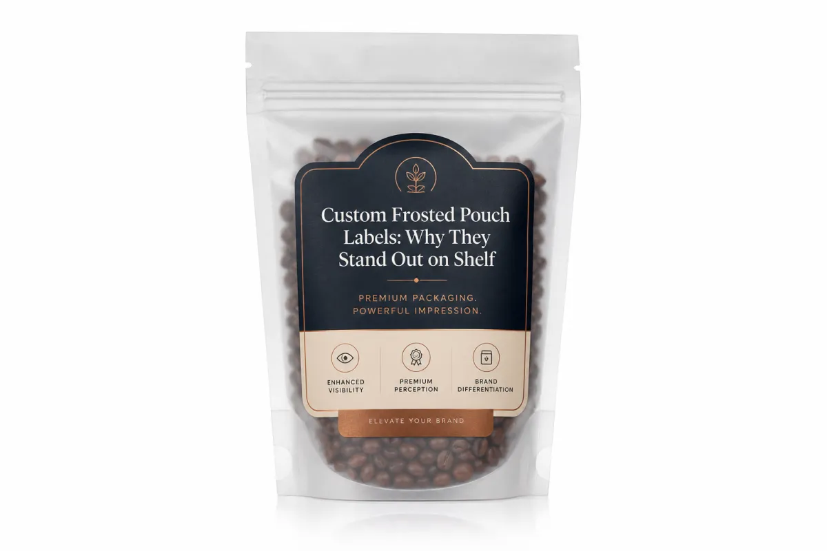
A frosted finish does something mockups rarely communicate well: it softens the edges of color while keeping enough structure for the eye to lock onto the package quickly. That makes custom frosted pouch labels feel more tactile and more considered than a standard glossy label, especially under bright retail lighting where glare can flatten the artwork. The shelf effect is immediate. Even a minimal layout can look premium if the contrast is handled with discipline.
Many brands choose custom frosted pouch labels because they want packaging that suggests quality without shouting about it. Natural ingredients, specialty blends, artisan foods, and small-batch product lines all benefit from that quieter signal. The frosted surface gives the eye less glare and a little more depth, which can make the pack feel calm, controlled, and easier to trust.
There is a branding benefit that gets missed early in the process. custom frosted pouch labels are not just a surface choice; they influence how the product sits in the hand and how the customer reads the brand before opening it. A frosted look can signal restraint and premium positioning, while still leaving room for bold typography, clean iconography, or a more technical layout if the product needs to communicate dosage, ingredients, or usage instructions.
For buyers comparing packaging design options, the frosted effect sits in a useful middle ground between clear-gloss energy and matte understatement. That balance keeps the package from feeling too shiny or too plain. In branded packaging systems, it can help one SKU line stand apart without making the whole shelf feel visually crowded. That middle ground is kinda the whole appeal: enough softness to feel refined, enough clarity to stay legible.
One point deserves more attention than it usually gets. Shoppers notice contrast faster than they read copy. If the logo, product name, and variant cue are arranged well, custom frosted pouch labels can do a lot of the work before the pouch is even picked up. If those elements are weak, the finish alone will not carry the design.
How Custom Frosted Pouch Labels Work on Different Materials
The basic structure of custom frosted pouch labels is simple: face stock, adhesive, liner, and a finish that may lean matte, gloss, or specialty. The final look changes once that label meets the pouch underneath it. On a frosted or translucent pouch, the label can appear softer, deeper, or slightly muted depending on print opacity, the amount of white ink, and the way the pouch scatters light.
That is why two labels with the same artwork can look very different on different package films. A clear or lightly tinted pouch lets more of the structure show through, while a matte laminated pouch makes the label feel more grounded and less reflective. custom frosted pouch labels need to be considered as part of the whole stack, not as isolated printed pieces, because the pouch material affects color, edge definition, and how much of the underlying pack remains visible.
Different pouch formats bring different production quirks. Stand-up pouches usually offer the most usable front-panel space, while flat pouches and resealable bags can create tighter placement challenges because of gussets, seals, and fill geometry. Once the pouch is filled, film tension changes, and custom frosted pouch labels need to conform without bridging, wrinkling, or lifting at the corners.
That is why sample testing on the actual pouch matters so much. Paper proofs can show color intent, but they cannot show how the label behaves on a curved corner, near a zipper track, or across a panel that flexes during shipping. From a production standpoint, custom frosted pouch labels should be checked against the real substrate before full release, especially if the job includes small type, tight registration, or a brand mark that has to land precisely where the pouch structure allows it.
If the project includes transport validation, some teams also compare the finished pack against a common shipping benchmark such as an ISTA test sequence. That is useful for e-commerce, palletized shipments, and carton-packed products alike, because distribution stress can reveal weak adhesion or edge lift long before the product reaches retail.
Key Design Factors for Custom Frosted Pouch Labels
Contrast is the first design decision I would inspect. Pale tones and thin typography disappear faster on frosted packaging than many teams expect, especially under strong retail lighting. custom frosted pouch labels usually need stronger contrast than an opaque white label would, which means type weight, color separation, and background treatment deserve close attention before the artwork is released.
White Ink and Underprinting
White ink often separates a label that feels crisp from one that looks washed out. On translucent surfaces, a white underprint can anchor logos, panels, and text blocks so they read clearly instead of picking up the pouch color or the store lighting. In many custom frosted pouch labels projects, the question is not whether white ink should be used, but where it should be used and how much coverage is really needed.
That choice should follow brand intent. A soft, airy appearance may only need selective underprint. Sharp editorial contrast or dark premium colors usually benefit from a stronger white base. The same logic applies to fine illustration work and reverse type. Without enough support beneath it, delicate artwork can turn muddy once it reaches the pouch.
Placement and Package Structure
Placement can make or break the final result. Labels should stay clear of heat seals, zippers, gussets, bottom folds, and any high-flex area where the pouch bends during fill, shipment, or handling. custom frosted pouch labels that sit too close to those stress points can wrinkle, lift at the corners, or distort once the package is filled.
That risk grows on smaller pouches. When panel real estate is limited, it is tempting to stretch the artwork to fill every visible inch, but that often creates more risk than value. A cleaner label footprint can look more expensive than one that crowds the edges. From a package branding standpoint, breathing room matters, especially when the finish already brings some visual texture to the pack.
Compliance text raises the bar even more. Product name, variant, benefits, ingredients, net weight, barcode content, and any required warnings all need enough contrast to stay readable through the frosted surface. custom frosted pouch labels should never force the shopper to hunt for basic information.
Typography and Visual Weight
Typography on frosted surfaces needs more muscle than many design teams expect at first. Light sans-serif fonts can work, but only if the point size, tracking, and contrast are handled with care. Hairline rules and tiny reverse-out copy are risky, because the finish can soften them to the point where they feel accidental rather than planned. With custom frosted pouch labels, strong typography usually performs better than clever typography.
That does not mean the design should feel heavy. It means the visual weight should be chosen with purpose. A restrained palette, one or two strong focal points, and a disciplined information hierarchy often deliver better retail performance than a front panel that tries to do everything at once.
If your line includes cartons, sleeves, or bottle labels too, it helps to think about the full shelf family instead of treating each format as a one-off. In that kind of system, custom frosted pouch labels should share the same language as the rest of the packaging, even when the artwork shifts to fit the pouch format.
Cost, Pricing, and MOQ for Custom Frosted Pouch Labels
The cost of custom frosted pouch labels usually comes down to a few repeatable variables: label size, adhesive type, print method, finish choice, quantity, SKU count, and whether specialty effects such as white underprint or metallic accents are part of the build. A simple design with decent volume can be surprisingly efficient. A job with multiple versions, tight registration, or specialty finishing rises quickly because the setup work and press time get spread across fewer labels.
Minimum order quantity, or MOQ, changes the cost structure in a direct way. A small run can be the right move for a launch, a seasonal edition, or a product with uncertain sell-through, but short runs usually carry a higher cost per label. Larger quantities lower unit cost, yet they also increase inventory commitment, so the right answer depends on storage space, SKU count, and how fast the product moves. For custom frosted pouch labels, the sweet spot is usually the point where unit cost stays reasonable and the brand is not overbuying artwork that may change soon.
Setup and proofing deserve attention as well. Dieline creation, prepress cleanup, sample rolls, and test prints can add line items that buyers sometimes treat as optional. They are not really optional if the job has a strict placement requirement or if the pouch material has a tricky surface. A small proofing expense is usually cheaper than a full run of custom frosted pouch labels that does not adhere cleanly or register where it should.
For packaging buyers comparing options, a practical pricing view helps. These are typical ranges, not a quote, and actual numbers depend on size, coverage, finish, and adhesive requirements.
| Run Size | Typical Unit Cost | Best Fit | Notes |
|---|---|---|---|
| 1,000 labels | $0.22-$0.40 each | Launches, test flavors, small-batch products | Highest setup burden per piece; good for short-run custom frosted pouch labels |
| 5,000 labels | $0.10-$0.22 each | Growing SKUs, regional retail, controlled inventory | Often the practical balance between cost and flexibility |
| 10,000 labels | $0.07-$0.15 each | Established products with stable demand | Better economics, but less room for rapid artwork changes |
If you are comparing custom frosted pouch labels to other packaging formats, remember that the label is only one piece of the package cost. A clean label spec can still be more efficient than changing a whole pouch structure, especially if you are trying to keep multiple versions moving without adding too much inventory risk. For broader sourcing conversations, some brands compare label cost against Custom Labels & Tags for other product lines or against Custom Packaging Products if they want the artwork language to stay aligned across cartons, inserts, and outer packaging.
One more practical point: dark solids, white text, and heavy coverage put more pressure on print control. Those designs are less forgiving of poor setup than simple single-color copy. That is one reason custom frosted pouch labels often sit in a mid-to-premium price band; the look is elevated, but it also asks more of the print process.
Process and Timeline: From Artwork to Finished Labels
The production path for custom frosted pouch labels usually starts with one practical question: what is the exact pouch surface and what area is safe for print? Once that is clear, the rest of the workflow becomes much easier. A good process runs through pouch measurement, dieline creation, artwork review, proof approval, print, application testing, and then full production.
Artwork Handoff
The cleanest jobs are the ones where the design file arrives with clear bleed, safe zones, and panel references. If the art is built for a flat rectangle but the pouch has a zipper, a curve, or a gusset, the finished label can land off balance even when the print quality is strong. With custom frosted pouch labels, the handoff between design and manufacturing matters because the artwork has to respect the actual structure of the pouch, not just the mockup.
Late copy changes create delays fast. A new net weight statement, a different barcode, or a revised ingredient list can force a fresh proof cycle if the layout has already been approved. Packaging design teams save time by locking the technical information before the art is finalized whenever possible.
Proofing and Sampling
Proofing is where a lot of costly mistakes get caught. Digital proofs help with layout, but they do not replace the behavior of a printed label on the actual pouch material. A sample roll or press proof gives a much better read on color, opacity, adhesive grip, and how the label edges behave once the pouch flexes. For custom frosted pouch labels, that test is often the difference between a smooth launch and a reprint.
Lead time depends on complexity, but straightforward jobs often move in roughly 10-15 business days after proof approval, while multi-SKU orders, specialty finishes, or extra sampling can extend the schedule. If the pouch supplier is separate from the label printer, allow extra time for coordination. The fastest jobs are the ones where the dimensions, copy, and approval path are already settled before the first proof is issued.
If the package needs distribution testing, it helps to think ahead to handling conditions. An EPA resource can support sustainability language, while the ISTA standards library is the more relevant reference for shipping durability and transport stress. That matters when custom frosted pouch labels have to survive fulfillment, cartoning, pallet movement, and retail handling without edge lift or abrasion issues.
In practical terms, the best timeline advice is simple: give the supplier exact pouch measurements, one clean artwork file, and clear feedback on the proof the first time. If you do that, custom frosted pouch labels move through prepress and production with far fewer surprises.
Common Mistakes with Custom Frosted Pouch Labels
The most common error is designing for a flat screen instead of a real pouch. A label that looks elegant in a presentation deck can still fail once it wraps around a curved film body, sits under store lighting, and gets handled repeatedly. custom frosted pouch labels are especially sensitive to that gap because the finish softens contrast and can make tiny flaws more visible, not less.
Another mistake is overusing fine detail. Hairline rules, tiny reverse type, and long gradients can look impressive in a concept file but turn muddy on a semi-translucent surface. If the design depends on that detail to function, it is probably too fragile. Good custom frosted pouch labels usually rely on clear hierarchy and disciplined spacing rather than visual noise.
Adhesion problems also show up more often than brands expect. If the label is too rigid, too small, or placed over a flex point, corners may lift during transport or after repeated handling. That is why the actual pouch shape, fill level, and application method matter just as much as the print method. With custom frosted pouch labels, a poor adhesive choice can undo an otherwise strong design.
The label may look beautiful on press, but if it sits across a zipper, a seal, or a heavy bend line, the package will tell the truth long before the customer does.
Compliance content is another place where teams sometimes cut corners. Ingredient panels, warning text, lot codes, barcodes, and required claims still need readable contrast and enough quiet space around them. A frosted finish should not make legal copy harder to use. If anything, custom frosted pouch labels should be laid out so the compliance area feels integrated and easy to scan.
One last mistake is relying too much on the digital mockup. A mockup can sell the concept, but it cannot tell you whether the label will survive warehouse handling, fit the pouch panel, or keep the barcode readable under real light. For that reason, I always tell buyers to treat the mockup as a design tool, not a production guarantee.
Expert Tips and Next Steps for Custom Frosted Pouch Labels
If you want custom frosted pouch labels to land well on the first run, start with a preflight checklist. Confirm the exact pouch material, front-panel dimensions, seal zones, zipper placement, and whether the label will sit on a flat area or need to clear any curvature. Those measurements sound basic, but they prevent more reprints than most other steps combined.
- Measure the usable panel, not the full pouch face.
- Confirm the final artwork area before the dieline is built.
- Choose the adhesive for the real surface, not the mockup.
- Review barcode, lot code, and compliance placement early.
- Ask for a sample or press proof whenever the design uses small type or critical color.
Another useful habit is to compare two versions of the artwork. One version can be tuned for stronger shelf impact, with bolder contrast and a more assertive hierarchy. The other can be tuned for technical clarity, with more conservative spacing and easier readability. That side-by-side review helps teams make a grounded decision instead of guessing which version will perform better in retail packaging.
It also helps to think about the broader packaging system. If the pouch is part of a family that includes cartons, labels, or secondary packs, the visual language should stay aligned. That is where package branding starts to feel intentional rather than patched together. The best custom frosted pouch labels support the line instead of competing with it, and they do that by matching the product story, not only the logo color.
For packaging teams that want a practical reference point on terminology, performance, and industry language, the Institute of Packaging Professionals has material worth reviewing. A cleaner vocabulary usually leads to cleaner specifications, especially when several suppliers are involved in the same project.
My advice is simple: measure the pouch, define the print area, note the quantity, and prepare one clean artwork file before you request pricing. If you do that, custom frosted pouch labels move through quoting and proofing faster, and the final result is much more likely to look like the brand team intended.
Custom frosted pouch labels work best when they are treated as part of the package structure, not an afterthought. The actionable takeaway is straightforward: lock the usable panel size, build the hierarchy around strong contrast, and request a proof on the actual pouch before you commit to a full run. That is the difference between a frosted pouch that merely looks nice and one that carries the product with real clarity.
FAQ
Are custom frosted pouch labels better than printing directly on the pouch?
Labels are often the better choice when you need flexibility across multiple SKUs, because you can change versions without replacing the entire pouch inventory. Direct print can look cleaner in some cases, but custom frosted pouch labels usually give you more room for short runs, faster updates, and targeted design changes. The right answer depends on quantity, budget, and how subtle or defined you want the frosted effect to feel.
What should I check before ordering custom frosted pouch labels?
Measure the exact label area and make sure it avoids seals, zippers, and other high-flex sections of the pouch. Confirm the pouch material and finish so the adhesive, opacity, and print setup match the real surface. If the label carries small type, a barcode, or important compliance text, ask for a proof or sample test before approving custom frosted pouch labels for full production.
How do custom frosted pouch labels affect color accuracy?
Frosted and translucent surfaces can soften color, so bold tones usually hold up better than very pale palettes. White underprint can improve clarity and help logos stay crisp, especially on dark artwork. The most reliable way to judge color is still a real proof on the final pouch material, because custom frosted pouch labels often look different in hand than they do on screen.
Why does the MOQ matter for custom frosted pouch labels?
MOQ affects unit cost because setup and press time are spread across the run, so larger quantities usually reduce the cost per label. Smaller orders are useful for testing a new product, but they often cost more per piece and may have fewer finish options. Brands with several flavors or sizes should compare one larger run against multiple smaller ones before deciding on custom frosted pouch labels.
How long does it usually take to produce custom frosted pouch labels?
Lead time depends on artwork readiness, proof approvals, label complexity, and how many SKUs are in the order. Straightforward jobs move faster when dielines and copy are final, while custom finishes and sample testing add time. The quickest way to avoid delays is to provide exact pouch measurements, clean artwork, and clear approval feedback up front for custom frosted pouch labels.

