Custom Iron On Labels: Buyer’s Guide to Sizing and Ordering
custom iron on labels tend to fail for ordinary reasons, not dramatic ones. The art file is rarely the problem. More often, the issue is heat, pressure, dwell time, or the wrong assumption about how a specific fabric will react after washing and wear.
That is why buyers compare them alongside hangtags, inserts, and branded packaging rather than treating them as a minor finishing detail. A label may only be a few square inches, but it affects how a garment feels in hand, how it presents at retail, and how much work the production line has to do. If the inside of the garment feels clean and consistent, the product reads as more finished.
The ordering process is usually simpler than people expect. Get the garment spec right, match the label to the fabric, and confirm how it will be applied. Once those three pieces are aligned, the rest becomes a controlled production decision instead of a guess.
What custom iron on labels are and why they outlast basic tags
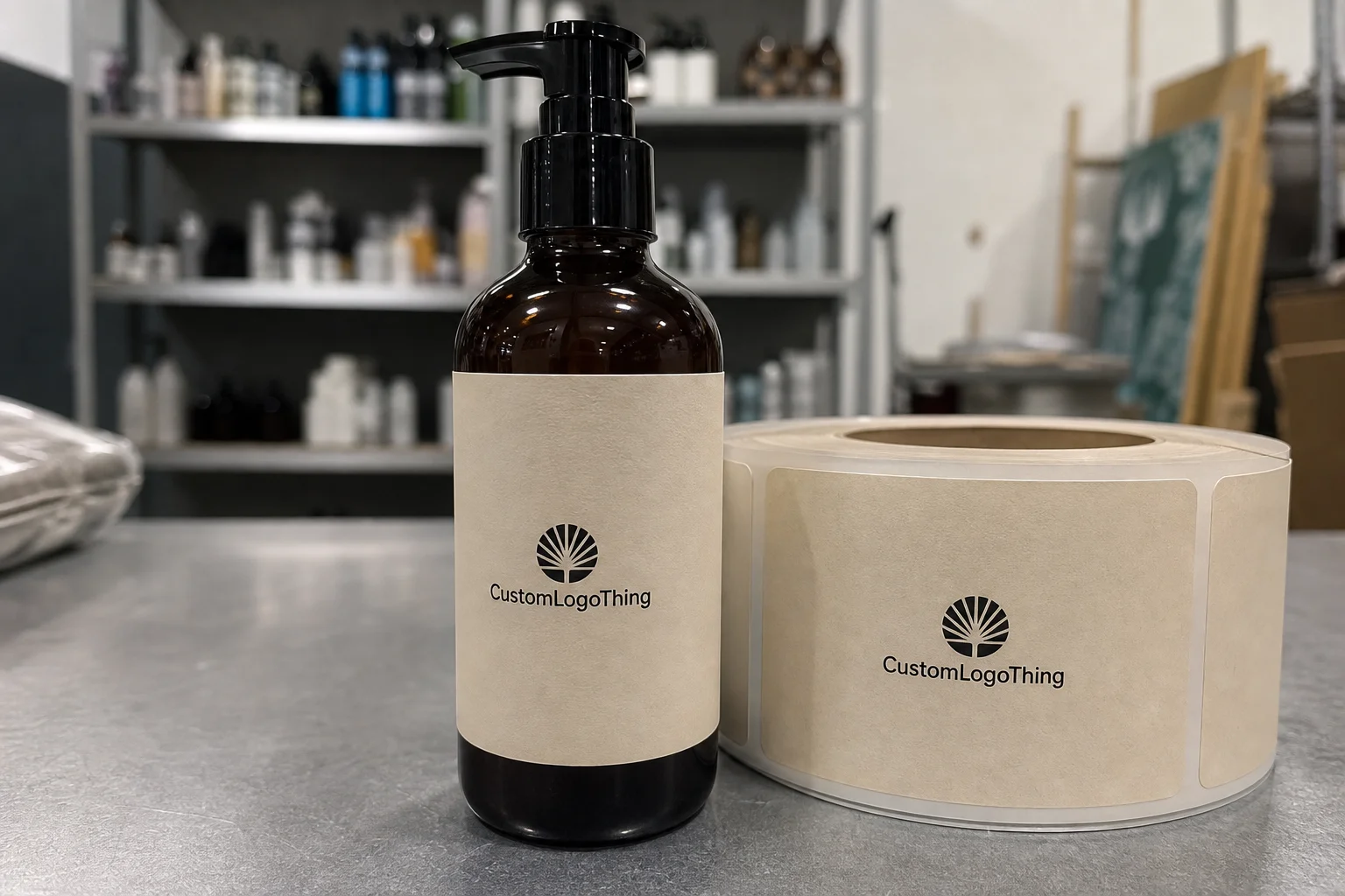
Custom iron on labels are heat-applied graphics or information panels that bond directly to fabric without stitching. They can carry a brand name, size mark, care information, or a short compliance panel. For many apparel teams, the attraction is obvious: a cleaner inside finish and one less sewing step.
That cleaner finish matters more than it sounds. Sewn-in tags can twist, scratch, or bunch up at the neck seam. A well-made transfer label sits flatter and avoids the bulk that some customers notice immediately on lightweight tees or soft kids’ apparel. For brands building a private-label look, that difference can be as visible as the logo on the outside.
They are not a universal answer. Heavy abrasion, rough wash routines, and fabric surfaces with a lot of texture can shorten the life of any heat-applied label. A cotton jersey tee is a very different job from a fleece hoodie or a coated performance textile. Still, for many launches, the balance of speed, appearance, and comfort makes custom iron on labels a practical choice.
The biggest mistakes usually happen before production starts. A label that looks perfect on screen can still fail if the fabric, press settings, and artwork scale were never tested together.
There is also a production-side advantage. Heat application is fast enough to fit small and medium runs without dragging the line into extra sewing work. That is useful for Brands That Need flexibility across multiple SKUs, or for teams that want the garment, hangtag, and outer packaging to feel like part of one system instead of separate jobs.
How the transfer process bonds the label to fabric
Most custom iron on labels are built from three layers: the printed design, an adhesive or transfer layer, and a protective carrier that releases under heat. The carrier is removed after pressing, leaving the graphic attached to the fabric. The bond has to grip the textile fibers or coating well enough to survive wear, washing, and folding. A label that looks adhered on day one is not yet proven.
Temperature, pressure, and dwell time all matter. They are not interchangeable, and changing one usually changes the others. A hotter press can compensate for a shorter dwell time in some cases, but the same setting may damage a synthetic fabric or make a soft garment feel stiff. A lower temperature can protect a delicate textile, yet leave the adhesive underactivated. The right setting is the narrow point where the transfer cures cleanly without scorching or distorting the garment.
In practice, the numbers are usually specific to the supplier and the adhesive chemistry. Many production setups work in a range around 280 to 330 degrees Fahrenheit, with medium to firm pressure and a press time measured in seconds rather than minutes. That said, the supplier’s spec sheet should always win over a generic rule of thumb. Performance fabrics, stretch blends, and coated surfaces often need their own settings.
Testing on the actual fabric is the non-negotiable step. Cotton is usually forgiving. Polyester is often stable, but it can show heat marks if the press is too aggressive. Blends can behave differently from one colorway to the next. Fleece, rib knit, and performance stretch materials deserve extra attention because texture changes the surface contact area and can affect edge adhesion.
For broader production logic, the same discipline used in packaging validation applies here: test the system before scaling it. If the first sample fails, that is useful information. If it passes, the full order becomes much easier to trust.
One detail buyers often miss: the label does not just need to stick, it needs to stay visually clean. Edge lift, dull cracking on fine details, and slight distortion at the corners are often early signs that the bond is marginal even if the label survives the first press.
Key specs that affect fit, feel, and durability
Size is the first spec people underestimate. A label should fit the garment, the placement area, and the reading distance. A neck label that is too wide can crowd the seam. A side-seam mark that is too tall can twist with movement. A care panel that is too small can become unreadable once it is reduced to actual production scale.
Placement changes the effective size. A neck mark, a hem tag, a side-seam logo, and a care panel each call for different proportions. A neck label may work well at roughly 1.25 by 2 inches, while a care panel needs more room if fiber content, laundering icons, and origin information all have to fit. Side branding often reads better as a narrow vertical piece than a wide rectangle.
Finish is not cosmetic only. Matte surfaces usually look quieter and hide glare under store lighting. Glossy finishes can sharpen color contrast, but they can also read as too shiny on premium basics. Fine text, borders, and tiny icons benefit from clean edges and enough open space around them. If a logo was originally designed for hangtags or carton art, it may need to be simplified before it works as a label.
Material compatibility matters just as much. Cotton and cotton-poly blends are usually the easiest starting point. Polyester is often stable but can be sensitive to heat. Stretch knits need more forgiveness in the adhesive layer because the fabric moves after application. Fleece and textured fabrics add another complication: the label has less uniform contact with the surface, so edge durability becomes more important.
There is a reason experienced buyers ask about construction instead of only asking for a price. A good spec is not the flashiest one. It is the one that can be applied consistently and still hold up after laundering. If the label is part of a wider brand system, it should also match the look and tone of the rest of the product package, not fight it.
Practical sizing cues
If you are deciding between two sizes, choose the one that gives the art breathing room. A small margin around the edges usually performs better than a crowded layout with tiny type pushed to the border. Extra space also helps when the garment surface is slightly textured or when the press is not perfectly centered.
For any readable copy, test at actual size, not at designer zoom. A font that looks fine on a monitor can disappear on a dark garment or break apart once it is reduced. If the label has to include care text, build it for legibility first and decoration second.
- Use the garment itself to judge spacing, not just the artwork file.
- Keep the layout simple if the label has to live on stretch, fleece, or textured fabric.
- Check contrast against the final garment color before approving the proof.
- Leave room for application tolerance so the edges do not sit too close to seams.
Cost, MOQ, and quote factors that shape unit price
Pricing usually comes down to quantity, size, color count, construction, and packing format. A simple one-color size mark in a large run can be very efficient. A multi-color neck label with tiny text, special finishing, and individual bagging is a different economic problem entirely.
The main driver is setup. Once the production line is ready, every additional piece spreads that setup cost thinner. That is why a 250-piece test order can carry a much higher unit price than a 2,500-piece production run, even if the artwork is identical. The small order is not overpriced; it is just carrying more of the fixed cost.
Minimum order quantity matters for the same reason. A lower MOQ is useful when you are launching a new line, testing a new fabric, or comparing label styles before scaling. The tradeoff is that lower quantities usually increase the per-piece cost. That is normal. Paying more per label on the front end can be cheaper than reworking a full season later.
For a useful quote, send exact dimensions, artwork format, the intended garment fabric, the placement location, the target quantity, and any packaging or sorting requirements. If the labels need to be grouped by style or packed with other branded materials, say so early. Sorting and handling can change both the labor and the lead time.
| Order Factor | What It Changes | Typical Buyer Impact |
|---|---|---|
| Quantity | How setup cost is spread across the run | Higher volume usually lowers unit cost |
| Size | Material usage and print area | Larger labels generally cost more |
| Color count | Print complexity and proofing time | More colors often increase cost and revision time |
| Finish | Surface look and protective layer | Special finishes can add both cost and lead time |
| Packing format | Labor, sorting, and handling | Individual bagging or SKU sorting increases cost |
There is also a labor offset that gets ignored too often. Heat-applied labels can reduce sewing time and simplify finishing. If your production line is already built for quick application, the real comparison is not label price versus label price. It is label price versus the labor it replaces.
A realistic buyer usually thinks in ranges, not absolutes. A small pilot run may be expensive per unit but safer operationally. A larger order may be cheaper on paper but more costly if the spec is wrong and the garments have already been assembled. That is the kind of tradeoff worth making explicit before the quote is approved.
Step-by-step ordering: from artwork to approved sample
Start with the garment, not the graphic. Measure the application area, define the placement, and decide what information the label actually has to carry. A neck brand may only need a logo and size. A care panel may need fiber content, laundering instructions, and origin information. If the label is part of a broader packaging system, the same logo rules should carry across the garment, hangtag, and insert materials.
Artwork should be prepared in vector format whenever possible. That keeps edges sharp at small sizes. If fonts are used, outline them or supply the font files so the proof does not substitute something unexpected. Check line thickness, contrast, and color references before sending the file. A detailed illustration that looks crisp on screen can turn muddy once it is reduced to label scale.
Color control deserves its own pass. Screen colors are not production colors. If brand accuracy matters, send Pantone references or another agreed standard, not a vague description like “deep navy” or “soft red.” The same caution applies to white on dark garments, where contrast can be weaker than expected after pressing.
Then comes proofing. This is the point most buyers rush, and it is where a lot of avoidable mistakes show up. Check spelling, spacing, border width, placement marks, and any care or compliance text. If the label includes regulated information, confirm the requirements for your market before the file is approved. A quick review now prevents a more expensive correction later.
After the proof, ask for a sample on the intended fabric. A PDF proof tells you the layout; a physical sample tells you how it behaves. That includes touch, edge definition, color appearance, and how the label responds to the press. If the sample passes, the production run becomes much more predictable.
Teams that already manage custom printed boxes or inserts usually understand this logic. The difference is that apparel labels are handled more aggressively. They are stretched, folded, washed, and rubbed. That makes the sampling step more valuable, not less.
The cleanest first order is usually the one with the clearest spec and the fewest assumptions. Simplicity cuts errors faster than clever artwork does.
A short internal checklist helps. Keep the fabric type, label dimensions, approved art, target quantity, and test status in one place so design, buying, and production are reading the same document. A lot of label problems are really handoff problems.
Production steps and turnaround: what happens after approval
Once the proof is approved, the workflow usually moves through preflight checks, production, curing or finishing, inspection, and packing. The exact method varies by supplier and print system, but the sequence is predictable. Files are checked first because a clean file saves a cleaner run.
Turnaround depends on quantity, artwork complexity, revision cycles, and whether samples are included. Straightforward repeat orders can move quickly. A first-time order with sample testing, changes, or SKU sorting takes longer. If the labels are being packed with other branded materials, the handling step can add time even when the print itself is simple.
A useful planning rule is to leave room for one revision cycle and one shipping delay. That buffer is not excessive. It is the difference between a schedule that survives routine friction and one that collapses the first time a proof comes back with a correction.
Most delays come from a familiar set of issues: unclear artwork, late color changes, incomplete fabric details, or a test that reveals an adhesion mismatch. None of those are unusual. They are just expensive when they surface after the production calendar is already tight.
For launch work, conservative timing is safer than optimistic timing. If the labels need to arrive before garment assembly begins, the production schedule should assume the order can move slower than the mockup promised. That is not pessimism. It is normal process discipline.
Inspection matters here as much as print quality. Look for clean edges, consistent color, correct placement marks, and no lifting at the corners. A label can pass a casual glance and still fail under closer handling. The inspection step catches those small defects before they become inventory problems.
Common mistakes that cause peeling, cracking, or wasted stock
The most common failure is the wrong press setting for the garment. Too little heat, too little pressure, or too short a dwell time can produce partial bonding. Too much heat can distort the fabric, gloss the surface, or make the transfer brittle. The label then peels at the corners, cracks along the fine details, or starts to fail after only a few wash cycles.
Another expensive mistake is overdesigning the label. Fine lines, tiny type, and dense artwork look impressive in a proof and then turn unreadable at actual size. A label is not a poster. If it has to communicate a brand and a size, clarity is the priority. Buyers sometimes try to cram a full marketing message into a space that can only support a logo and a few lines of text.
Skipping wash tests is the fastest route to wasted stock. One wrong assumption can ruin a batch or create returns after launch. That risk gets worse when the labels are already attached to finished garments. A single sample on the wrong fabric is inexpensive. A rework on 1,000 units is not.
Operational mistakes show up too. Some teams forget to check the garment colorways, so the label disappears on dark fabric or clashes on light fabric. Others assume one application setting will work across cotton, fleece, and stretch pieces. It usually will not. Different materials react differently, even when the label art is identical.
The same pattern shows up in packaging programs. One template gets forced onto too many SKUs, and the result is avoidable damage or rework. Standardize where the product allows it, then isolate the exceptions instead of pretending the exceptions do not exist.
- Write down the press settings so operators are not relying on memory.
- Proof the artwork at final size, not just on a full-scale design sheet.
- Run a sample on each new fabric before full production.
- Keep separate specs if cotton, polyester, and stretch styles behave differently.
Good control also means documenting the failures, not just the wins. A label that curled after the first wash tells you something valuable about the adhesive, the temperature, or the fabric surface. The point is to catch that pattern while the order is still small.
Expert tips and next steps for a cleaner first order
Standardize the label spec across as many SKUs as you can. If the same size, placement, and application settings work for multiple garments, the line gets simpler and reorder risk drops. Consistency also helps when labels need to coordinate with Custom Packaging Products or other branded materials that are part of the same product family.
Create a one-page press sheet for the production team. Include the fabric type, press temperature, dwell time, pressure, placement, and any warnings about delicate garments. A document like that may feel dull, but it is one of the fastest ways to prevent a costly application error.
Keep a modest overage for rework, size-run adjustments, and damaged units. Ordering the exact minimum every time looks tidy in a spreadsheet, but apparel production rarely stays tidy. A small cushion absorbs the normal churn that happens in real production.
For a first order, a controlled pilot run is the safer path. Request a Quote, test a sample on the actual fabric, review the proof line by line, then approve a limited production quantity before scaling. That sequence takes more discipline than impulse buying, but it gives you data instead of assumptions. It is the most reliable way to learn how custom iron on labels behave in your own line.
One final comparison is useful. A label that looks slightly conservative on the mockup can still be the better commercial choice if it reduces returns, improves perceived quality, and fits the rest of the product packaging system. Unit price matters. So does how the product feels once it is in the customer’s hands.
Used well, custom iron on labels give apparel a cleaner interior finish, faster application, and a more controlled brand presentation without adding sewing complexity. The best results come from matching the label to the garment, testing on the real fabric, and treating the proof as a production document rather than a formality.
Are custom iron on labels better than sewn-in labels?
They are usually better for a smoother inside finish and faster application on short or medium runs. Sewn-in labels still have advantages for heavy abrasion, heritage styling, and garments that will see very aggressive laundering.
What fabrics work best for custom iron on labels?
Cotton, polyester, and many cotton-poly blends are the easiest starting points. Stretch, fleece, coated, and heavily textured fabrics should always be tested first because adhesion and edge durability can change with surface structure.
How long do custom iron on labels last after washing?
Durability depends on the label construction, the fabric, and the application settings. A properly applied label can hold through repeated wash cycles, but a physical wash test is the only reliable way to confirm performance on your garment.
What is the minimum order for custom iron on labels?
MOQ varies by supplier, size, and print method, so there is no single minimum. Smaller orders help with testing and launch runs, while larger quantities usually reduce the unit price by spreading setup costs over more pieces.
Can I apply custom iron on labels at home?
Yes, but a heat press is more consistent than a household iron because it controls pressure and temperature more accurately. Always test one sample first on the actual fabric before pressing the full batch.