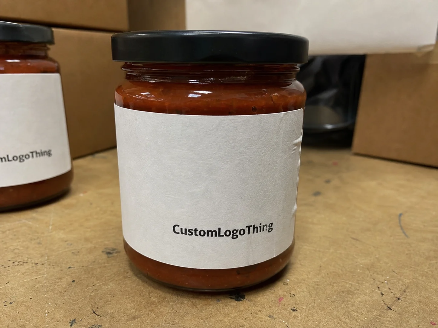
Custom Jar Labels: How to Order Labels That Stick Fast
Custom Jar Labels fail for ordinary reasons, which is why they keep surprising buyers. Condensation, oils, cold storage, and curve stress do more damage than most design flaws ever will. A proof can look clean on screen and still lift at the edge after one trip through refrigeration, packing, and transit. The gap between a nice mockup and a label that survives real handling is where most reprints start.
That gap closes when the spec matches the container and the environment. A dry pantry jar, a chilled sauce jar, a honey jar with sticky residue, and a cosmetics jar wiped down in a retail case do not need the same construction. From a packaging buyer’s point of view, the label is not just branding. It is a small materials decision with consequences across shelf life, labor, returns, and launch timing.
Good labels do not draw attention to themselves. They stay flat, remain legible, and keep the package looking deliberate after filling, shipping, stocking, and a few customer hands. That is the benchmark. Not “looks fine in the file.” The real standard is whether the label still looks right after the jar has lived a little.
What Custom Jar Labels Need to Survive
The first thing to accept is simple: a label does not fail because the artwork looked bad. It fails because the surface, adhesive, and environment were mismatched. Glass, PET, and PP behave differently. Straight-sided jars, tapered jars, and wide-mouth jars each change the amount of wrap stress the label has to absorb.
Before asking for quotes, Buyers Should Know four things:
- What the jar is made of
- Whether the product will be chilled, heated, or washed
- Whether labels are applied by hand or machine
- Whether the jar will see oils, condensation, or transit abrasion
If any of those answers lean toward harsh conditions, paper usually stops being the cheapest option. That sounds counterintuitive until you count relabeling, damaged inventory, and the brand hit from a peeling edge. A low-cost label that fails in the field is not inexpensive. It is just deferred spending with freight attached.
For retail packaging, the best labels are the ones nobody notices because they kept their shape. That is the practical definition of quality here. A label should support the product, not compete with the physics of the container.
There is also a margin question hiding underneath the visual one. A premium sauce, candle, or skincare jar can usually justify a stronger film, sharper edge quality, or more refined finish. A short-run promo item may not. The right spec is not the fanciest one. It is the most durable one that still fits the economics of the SKU.
Material, Adhesive, and Finish Choices
The three decisions that matter most are face stock, adhesive, and finish. Everything else sits on top of those. Paper is usually the lowest-cost route. Film stocks, especially BOPP, hold up better against moisture, oils, and handling. Specialty films add clarity or visual impact when the design needs it, but they can also increase cost quickly if the rest of the package does not justify the upgrade.
Paper labels work well for dry, short-life use. They can be a good fit for pantry goods, spice jars, and products that never leave a shelf in a climate-controlled room. Their weakness is predictable: water vapor, condensation, and scuffing. If the jar sits in a refrigerator or gets handled often, paper starts to fail where it matters most, usually at the edge or corner first.
BOPP labels are the safe middle ground for many jar programs. They resist moisture, oils, and abrasion far better than paper, which is why they show up constantly in food, bath, and personal care packaging. White BOPP gives strong color and opacity. Clear BOPP creates a cleaner, more minimal look on glass. Both are common when the jar needs to survive retail handling without looking overbuilt.
Adhesive choice matters just as much as face stock. Permanent adhesive is the default for long-life retail. Removable adhesive makes sense for seasonal promotions, short-run launches, or jars intended for reuse. Cold-temperature adhesive is worth the extra spend for refrigerated products because a standard adhesive may not wet out properly on a cold surface. That failure mode is predictable, which makes it expensive when ignored.
Finish changes both the look and the abuse tolerance. Gloss pushes color and contrast under bright lighting. Matte reduces glare and often reads as more restrained. Soft-touch can feel premium, but it is not always the best choice for jars that get wiped down regularly. Clear finishes are useful for a minimal look, though readability can suffer if the design depends on background contrast that disappears once the jar is filled.
For brands building a broader packaging system, consistency matters. If the jar label is matte, the carton should not feel like a different product line. The same logic applies to Custom Labels & Tags used on secondary packaging and to Custom Packaging Products when the jar is part of a larger family. Packaging works best when the parts look like they were planned together.
One buyer rule keeps proving useful: choose the toughest spec that still fits the margin. There is no credit for ordering a fragile label and paying for rework later.
| Material | Best Use | Typical Cost Signal | Durability Notes |
|---|---|---|---|
| Paper | Dry shelf products, short promotions, low-moisture pantry items | Lowest base price; often roughly $0.12-$0.25 per unit on modest runs | Good print clarity, weaker around condensation, oils, and scuffing |
| BOPP | Food jars, bath products, refrigerated packs, frequent handling | Usually about 10% to 25% above paper depending on coverage | Much better moisture and abrasion resistance; common sweet spot |
| Clear or specialty film | Premium retail packaging, minimalist glass looks, stronger shelf impact | Often 15% to 40% above paper, plus premium finishing if used | Strong visual effect, but readability and surface contrast need care |
For sustainability, paper from responsibly managed sources can be a sensible choice when the application allows it. If that matters to the brand, ask for FSC-certified paper options and make the claim visible in the spec rather than buried in a sales sheet.
Shipping performance matters too. A label that survives a shelf test can still get damaged in transit. For finished jars moving through distribution, it is worth checking the pack against a recognized shipping standard such as ISTA protocols. The label does not need to be overtested, but it should behave like the real pack, not an idealized version of it.
Production Steps and Turnaround Expectations
The production path is usually straightforward, which is why delays are so frustrating. A normal job moves through quote, artwork review, proof approval, print setup, production, finishing, packing, and shipment. One missing detail can stall the whole sequence. A missing dieline, blurry image, or unresolved color issue can cost days while files get chased down.
Artwork problems are the most common cause. Low-resolution logos, tiny type, vague Pantone calls, and late copy edits create friction early and keep creating it. If ingredients, warning text, or SKU names keep changing after proofing begins, the schedule stops being a schedule and becomes a series of corrections.
Turnaround depends on print method and spec. Digital runs can move quickly on smaller quantities when the art is clean and the material is available. Flexographic printing usually makes more sense at larger volumes, but the setup takes longer. Special finishes, custom shapes, white ink, and laminated film all add time. Those variables are not hidden; they are simply easy to underestimate.
Before approving anything, ask four direct questions:
- What proof type am I reviewing?
- What ship date follows approval?
- Which carrier method is planned?
- Is rush processing available for this spec?
The answers sound basic because they are. A surprising number of delays come from assumptions that were never written down. In packaging, assumptions are expensive.
If the label needs custom die-cutting, premium film, or cold-temp adhesive, treat it like a real production schedule, not a rough guess.
That matters most for launch-driven work. A late label can hold up filling, kitting, or retail rollout. When the jar is one part of a bigger package set, keep the vendor inputs aligned so the label, carton, and outer pack arrive as a single system rather than three separate interpretations of the brief.
Teams new to the process can benefit from the material and workflow references at packaging.org. It is not glamorous reading, but it reduces avoidable mistakes.
Cost, MOQ, and What Actually Moves Unit Price
Unit price is driven by a short list of variables: label size, material, finish, print coverage, quantity, and whether the shape needs custom cutting. Bigger labels cost more. Heavier ink coverage costs more. Metallic stock, white ink, lamination, and specialty adhesives all push the number upward. There is no mystery there, only tradeoffs.
MOQ tends to frighten buyers because it sounds like a barrier. Usually, it is just the point where setup cost gets spread across enough labels to make the run viable. Digital printing supports lower minimums, often in the 250 to 1,000 range for straightforward jobs. Higher-setup methods make more sense once volume rises. The exact threshold depends on the printer, shape, and finishing stack.
Low unit cost can still be the wrong answer. A paper quote may look attractive until the labels fail in refrigeration or scuff during packing. Then the project pays twice: first for the original run, then for the reprint. That is not a savings strategy. It is a lesson with a freight charge.
Common hidden cost triggers include:
- Extra proof rounds
- White ink or spot-color matching
- Metallic or clear stock
- Soft-touch or matte lamination
- Special adhesives for cold or humid storage
- Complex custom cut paths
The better way to compare quotes is total landed cost. Include freight, setup, proof delays, and the cost of excess labels that may never get used. A quote that looks lower on paper can still become the most expensive option once the real variables are added back in.
For jar programs with multiple SKUs, ask for price breaks at 250, 500, 1,000, 2,500, and 5,000 pieces. That shows where the efficiency actually starts. It also reveals whether an upgrade in face stock changes cost by cents or by enough to matter. More often than not, the jump is smaller than buyers expect, which is useful information.
How to Measure, Template, and Apply Labels Cleanly
Measure the usable flat area on the jar, not the full circumference and not the widest point you can find with a ruler and optimism. Leave room for seams, shoulder curves, and any recessed panel. On jars with a narrow neck or rounded shoulder, the safe labeling zone is often smaller than it looks from a distance.
Wrap tests matter because geometry is unforgiving. A design that feels balanced in a file can overlap itself, bunch up, or leave a gap once it is wrapped around an actual container. That is especially true on glass jars with a slight taper. The printed label does not care about the render. It cares about the surface.
Template basics are straightforward:
- Bleed lets the artwork extend beyond the cut line so white slivers do not appear.
- Safe area keeps text away from the edge where trimming variation can hit it.
- Corner radius matters on curved or rectangular jars because sharp corners lift sooner.
- Dieline shows the exact cut shape so the art team is not guessing.
Application method changes tolerances. Hand labeling can absorb a little more variation, but only up to a point. Semi-automatic and automatic application need tighter control over roll direction, label gap, liner choice, and unwind tension. If the labels will run through equipment, mention that before the spec is locked. That detail affects everything from liner choice to cut registration.
A clean approval process looks like this: print one mockup, apply it to the real jar, fill the jar to operating weight, and inspect it under the same lighting and temperature the customer will see. If the jar is refrigerated, test it chilled. If it gets wiped down, wipe it down. A room-temperature paper test on an empty jar does not tell you much. It is a guess in a lab coat.
That step gets skipped more often than it should. Then the team is surprised when the label shifts after fill level changes or condensation hits the surface. The jar is the system. The label is only one part of it.
Common Mistakes That Cause Lifts, Wrinkles, and Reprints
The classic mistake is choosing paper for a cold jar or oily product and hoping the adhesive will outrun chemistry. It will not. Condensation gets under the edge, the adhesive loses grip, and the label starts to lift. That failure mode is predictable, which makes it preventable.
Oversizing the label on a curved jar is another common issue. Too much wrap tension creates wrinkles near the shoulder or seam, especially on narrow containers. Designers often push for a larger visual panel because it looks stronger in a mockup. On the actual jar, that extra millimeter can ruin the fit.
Skipping samples is a bad habit. Swatches and digital proofs do not show how the adhesive behaves on a real surface. They also do not show how a matte finish catches light in a retail case. If the job matters, sample it. That test is cheaper than a reprint.
Low-resolution artwork and weak contrast create a different kind of failure. Tiny type, thin serif fonts, and pale text on a busy background can look acceptable on a monitor and disappear in print. That is a design issue as much as a production issue. Once the label is on the jar, there is no zoom function for the shopper.
The reprint trap shows up when buyers approve one label spec for every SKU without checking fill level, storage temperature, or jar variation. A sauce jar and a scrub jar may sit in the same product line, but they do not behave the same. One may live in a dry aisle. Another may spend its life in a cold case or a wet bathroom shelf. Same brand, different physics.
That is why experienced buyers test the highest-risk SKU first. If the hardest version passes, the easier ones usually follow.
Packaging consistency matters here too. The jar label should speak the same language as the carton, shipper, and any insert card. If the label says premium and the outer packaging says budget promo, the mismatch is obvious. Consumers may not articulate it, but they feel it.
Expert Tips and Next Steps Before You Order
Test the label on one finished jar, not an empty template. Fill weight changes how the container sits in the hand. Shape can shift slightly. Texture, condensation, and even the color behind a clear label change the final appearance. A real jar test removes a lot of uncertainty quickly.
Ask for a spec sheet that lists face stock, adhesive type, finish, and expected use conditions. That may feel tedious, but it is the fastest way to avoid vague claims. “Water-resistant” means different things to different vendors. “BOPP with permanent cold-temp adhesive for refrigerated glass jars” means something useful.
Use proofing for actual corrections, not for free design cleanup. If the file is still shaky, fix it before the proof stage. Proofing should catch print, fit, and copy issues, not rescue a label that was never production-ready. That keeps the schedule honest and the cost contained.
Compare vendors with identical inputs. Same size. Same quantity. Same material. Same finish. Same shipping destination. Without those variables locked, quote comparisons are noise. A higher bid may simply reflect the spec you actually need, while the lower number quietly left out the essential parts.
If the jar sits inside a larger launch, keep the label, carton, and shipper aligned. That includes the broader branded packaging around the product, because packaging consistency is part of the customer experience. A strong jar label paired with mismatched cartons still reads as unfinished.
The practical next step is plain: lock the container dimensions, define the storage environment, set the budget, request a sample or proof, and order custom jar labels only after the real jar test passes. That is how the label stays flat, looks right, and avoids becoming a last-minute reprint problem.
FAQ
What makes custom jar labels peel off glass jars?
Condensation, oils, and weak adhesive are the usual causes, especially on refrigerated or frequently handled jars. The cleanest fix is to test the label on the exact jar, with the actual fill and storage conditions, before approving a full run.
Are custom jar labels waterproof or just water-resistant?
It depends on the face stock, adhesive, and finish. Film labels generally handle moisture far better than paper, but if the jar will see fridge humidity, condensation, or wiping, choose a spec built for that use instead of assuming all labels perform the same.
How long does custom jar label production usually take?
Simple jobs can move quickly after proof approval, but special materials, custom shapes, and extra finishing add time. Artwork corrections and approval delays are usually the main schedule risk, not the press itself.
What is the minimum order quantity for custom jar labels?
MOQ depends on size, material, and print method, with digital runs usually allowing lower quantities than more setup-heavy options. Ask for unit cost at 250, 500, and 1,000 pieces so you can see where the pricing makes sense.
How do I choose the right size for custom jar labels?
Measure the usable flat area on the jar and leave room for seams, curves, and any recessed panel. Print a test wrap and check it on the real container before final approval, because measurements on paper are cheap and mistakes on jars are not.