Most buyers judge custom juice labels in the worst possible environment: a cold cooler, bright store lighting, condensation on the bottle, and only a few seconds to notice the brand. In that setting, the label has to hold its shape, stay readable, and still look like a purchase-worthy product.
Good juice labels do three jobs at once. They identify the flavor fast, survive refrigerated handling, and stay readable long enough to matter. That means stock, adhesive, finish, size, and layout all need to work together. Pretty artwork helps, but construction is what keeps the label from failing after a day in the cooler.
Why custom juice labels work in cold, wet retail
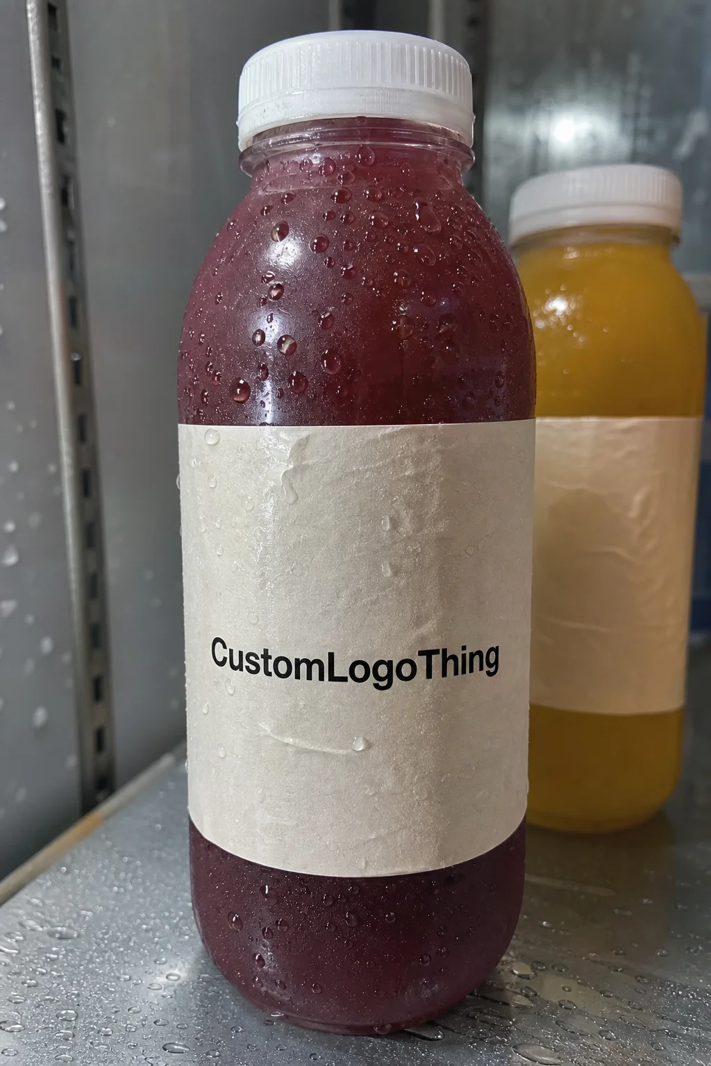
Juice is rarely sold in a dry, controlled setting. It lives in coolers, ice buckets, refrigerated cases, and delivery trucks. Moisture is normal, so is handling. The label has to survive all of that without curling, lifting at the corners, or losing contrast.
That is why label selection starts with the environment, not the artwork. Paper labels can work for dry storage or very short promotions, but film stocks usually hold up better in chilled retail. White BOPP is common because it resists moisture and keeps print sharp. Clear film can look premium on the right bottle, but weak contrast shows up fast if the design is too subtle.
The brand side matters too. A juice label is the front panel of the product. It has to carry the name, flavor, sometimes compliance copy, and enough visual structure that a shopper can identify it in a glance. If the layout is crowded, the cooler effect gets worse. A bottle with too much copy starts reading like a form, not a food product.
There is also a packaging-system issue. If the juice line uses Custom Labels & Tags for multipacks or sits inside broader Custom Packaging Products, the label should feel like it belongs to the same family. Consistency is a production cue as much as a design choice.
From artwork to finished roll
The cleanest label jobs start with the bottle, not the design file. Measure the label panel, shoulder taper, and any curved areas that might distort text. Then build the dieline around the real shape. Guessing is expensive. A label that is even slightly too wide can wrinkle on a tapered bottle, and one that is too short can leave a visible gap.
File setup should be boring. That is the point. Keep a standard bleed, usually 0.125 inch, and leave critical text inside a safe zone, often around 0.0625 inch from trim. Barcodes need quiet space around them. QR codes need enough contrast to scan after chilling and handling. Small type needs more breathing room than designers usually give it.
Print method changes the production path. Digital printing makes sense for shorter runs, seasonal flavors, and versioned SKUs that may change quickly. Flexographic printing usually works better for larger, repeatable orders where setup costs can be spread over more labels. The better choice depends on order size, label changes, and whether speed or consistency matters more.
Application matters as much as printing. Hand-applied labels give smaller launches more flexibility. Machine-applied labels need tighter tolerances, predictable roll direction, and the right core and unwind setup. If the line is running at speed, confirm roll diameter, core size, and unwind direction before print approval. A perfect label that jams an applicator is still a production failure.
A label can look fine in mockup and still lose the shelf if it fights the bottle or the cooler.
The basic order of operations is simple: define the bottle, define the application method, then build the artwork around the real label area. Do it backwards and you pay for it later in reprints, slowdowns, and avoidable corrections.
Specs that drive durability and shelf appeal
Material choice is the first hard decision. For chilled juice, film usually outperforms paper because it handles condensation better. White BOPP is a common starting point. It has good moisture resistance, supports strong color, and stays legible under cooler lighting. If the bottle is transparent and the design is minimal, clear film can work, but only if the text and imagery have enough contrast to survive at shelf distance.
For brands that care about sourcing claims, ask for documentation. If you need FSC-certified paper, verify it rather than assuming every paper label qualifies. Certification is paperwork, not a design feature. You can check FSC’s standard here: FSC.
Adhesive is where a lot of first-time buyers get burned. A cold-temperature permanent adhesive is usually the safer choice for refrigerated juice bottles because it is meant to bond after the bottle surface is dry and cold. Removable adhesives are useful for short-term promotions or reusable containers, but they are a weaker bet for products that sit in a cooler. The failure mode is subtle: a corner lifts, then a seam wrinkles, then the label looks tired before the product sells through.
Finish changes both appearance and behavior. Matte cuts glare and makes small type easier to read. Gloss boosts color and gives fruit imagery more punch. Soft-touch and tactile finishes can add a premium feel, but they also add cost and can show scuffing if the bottles are handled a lot. A protective laminate or varnish is often worth it on retail juice, especially if the bottle is chilled, moved frequently, or stacked during distribution.
Shape is not a side issue. Narrow bottles, steep shoulders, and wrap labels create distortion risk. Curved surfaces can push copy out of alignment or lift the edge of the label over time. QR codes need space. Nutrition panels need room. Barcodes need contrast and clean margins. If the front panel is carrying too much, the label starts to look dense instead of deliberate.
Shipping and handling deserve the same discipline used in broader packaging work. Testing for vibration, drop, and environmental stress is not overkill. It is standard practice for anything that has to survive a real supply chain. The label has to hold up from carton to cooler to customer hand.
Custom juice labels pricing
Pricing usually comes down to five variables: quantity, material, finish, shape complexity, and version count. Specialty inks, metallic effects, clear film, and added protection all push the cost upward. A simple rectangular BOPP label in one version is one thing. A multi-flavor launch with different artwork, a custom die, and premium finishing is another.
Setup charges are the part many buyers underestimate. New dies, color matching, and prepress corrections can create one-time costs before the first label is printed. For small runs, setup can matter more than the per-label price. It is normal to see a setup range around $50 to $250 for straightforward jobs, with higher costs for more complex shapes, extra proofing, or specialty finishes.
MOQ changes the math quickly. Lower quantities give flexibility for test launches, seasonal runs, and new flavors that may not stick. Larger runs usually reduce the unit cost and improve consistency. If the product is likely to reorder in the same format, a bigger first run often makes more sense than paying a premium for a tiny batch and starting over later.
| Label option | Typical use | Indicative unit cost | What drives the price |
|---|---|---|---|
| Paper label with basic finish | Dry storage, short promotions, low condensation exposure | $0.08-$0.18 | Simple shape, fewer inks, lighter protection |
| White BOPP film | Refrigerated juice bottles, coolers, general retail use | $0.12-$0.26 | Moisture resistance, permanent adhesive, standard die cut |
| Clear or specialty film | Premium shelf presentation, transparent bottles | $0.16-$0.34 | White ink, opacity control, tighter layout requirements |
| Film with premium finish | High-handling lines, retail packs, stronger shelf impact | $0.18-$0.40 | Lamination, specialty coatings, tighter press control |
Quotes only mean something if the specs match. If one vendor is quoting paper and another is quoting film, the numbers are not comparable. Match the size, adhesive, finish, roll direction, quantity, and any compliance text before deciding which quote is actually better. A lower number that leaves out a needed feature is not a bargain.
For a label to fit into a full launch budget, review it alongside carton, shipper, and secondary packaging costs. The cheapest line item is not always the best production decision. The right quote keeps the launch moving and avoids a second print cycle.
Process and timeline
The production sequence is predictable: Request a Quote, confirm bottle dimensions, review proof, approve artwork, print, finish, pack, and ship. Most delays happen before the press run. Missing dimensions, incomplete artwork, or uncertainty about storage conditions can stall a job long before ink hits the stock.
Turnaround depends on complexity, but a standard job often lands around 12 to 15 business days after proof approval. Simple digital orders can move faster. New dies, multiple versions, or heavy proof revisions stretch the schedule. Rush service is possible in some cases, but the shortcut usually costs money and often requires cleaner files and fewer revisions.
Last-minute changes are the main schedule killer. Swap a barcode, change a nutrition panel, or rename a flavor and the proof has to be rebuilt. A missing bottle photo creates the same problem. So does a request like “make it fit” without a dieline or actual measurements. If machine application is involved, the roll spec needs to be final before production starts.
The best schedule is built backward from the launch date. Subtract time for proof review, internal approvals, shipping, and a sample check if the design is new. That matters even more if the label has to coordinate with a filler date, warehouse receiving, or retail placement. A late label can hold up the whole launch chain.
Treat the label as a production part, not a design afterthought. The teams that plan backward usually get the first run right. The teams that treat labels like a finishing touch usually end up paying for rush freight, rework, or both.
Mistakes that lead to reprints
The biggest mistake is choosing a stock that looks acceptable in a mockup and fails in a cooler. Paper can be fine in the right setting, but it is often the wrong default for refrigerated juice. If the stock absorbs moisture, the edges can lift and the label loses its structure.
Overloaded design is another easy way to waste money. Too much copy, tiny type, and weak contrast make the bottle harder to buy. Juice labels have limited space. The point is to communicate quickly. If shoppers have to study the bottle to identify the flavor or format, the label is doing too much and saying too little.
Bottle shape errors cause more trouble than most teams expect. Tapered shoulders and curved panels can distort copy or force the edge of a label to peel. A wrap label that crosses into a steep curve may look clean on the computer and wrinkle on the bottle. That is why the physical sample or exact bottle drawing matters so much.
- Skipping the dry-surface assumption, which leads to adhesive problems after chilling.
- Leaving out the bottle photo or dieline, which makes the proof less reliable.
- Ignoring barcode and QR spacing, which can create scan issues at retail.
- Ordering the wrong material for the storage condition, which increases reprint risk.
If the label is fighting the bottle, the design has already lost half the shelf battle.
The quiet mistake is a vague quote request. Include the label area, bottle dimensions, quantity, finish, storage conditions, and whether the application is hand-applied or machine-applied. That makes the quote usable. Without those details, vendors have to guess, and guessing is how production errors start.
Practical checklist before you order
Build a spec sheet before asking for pricing. Keep it simple and complete: bottle dimensions, exact label area, target quantity, final copy, finish preference, and storage condition. If the product will live in a cooler, say that. If the design needs a premium look on a clear bottle, say that too.
Ask for two material options instead of one. A useful comparison usually includes one practical option and one upgraded option, such as white BOPP versus a premium film with added protection. If the design is new or the bottle is curved, request a printed proof. That small step can catch spacing issues, contrast problems, or barcode placement errors before the full run is committed.
For new flavors or seasonal launches, a small test batch often makes sense. It lets the team check fit, readability, and shelf presence in real conditions instead of guessing from a flat layout. That is especially useful if the bottle will sit near ice, move through a busy store, or share launch timing with other packaging like trays, cartons, or display units.
Here is the checklist I would use before ordering:
- Final bottle dimensions and label panel measurements
- Final copy, barcode, QR code, and compliance text
- Quantity, finish preference, and target ship date
- Storage condition, application method, and version count
- At least one sample image or dieline for verification
If the label is part of a broader line, keep the system consistent. That means aligning the label with the rest of the product packaging, including cartons, trays, and display pieces. If the launch needs a structured packaging set, start with Custom Labels & Tags and build the rest of the packaging around the same visual and production logic.
For brands that care about sourcing claims, ask for documentation instead of assuming. If FSC-certified paper is required, request the certificate or chain-of-custody details. If the labels need durability testing, use the same discipline you would use on a full retail carton program.
Bottom line: the best custom juice labels are matched to the bottle, the cooler, and the launch schedule. Gather the dieline, final copy, bottle photos, and target quantity first, then use those details to move from concept to quote with fewer revisions and a better chance of getting the first run right.
FAQ
What do I need to order custom juice labels?
You need bottle dimensions, a clear label area measurement, final copy, barcode or QR files, and the quantity. It also helps to state the finish you want and whether the bottles will be refrigerated or stored at room temperature, because that changes material and adhesive selection.
Which label materials work best for refrigerated juice bottles?
Film-based stocks usually perform better than paper when condensation is part of the use case. A cold-temperature permanent adhesive helps the label stay down in coolers and ice buckets, and a matte or gloss protective finish can improve durability depending on glare and handling.
How much do custom juice labels usually cost per unit?
Unit cost falls as quantity rises because setup is spread across more labels. Complex shapes, specialty finishes, and multiple versions increase the price. Compare quotes only after the material, adhesive, size, and finish are identical.
How long does juice label production usually take?
Proofing often takes the first part of the schedule, especially if artwork needs revisions. Production and finishing depend on the print method, order size, and queue, but simple files usually move faster than jobs that need a new die or multiple proof rounds.
Can custom juice labels handle condensation and ice?
Yes, if the label uses a moisture-resistant stock and the right adhesive. The bottle should be dry at application so the adhesive can bond properly, and durable inks or lamination help keep the label readable after chilling, handling, and transport.