A jar can look polished in a mockup and still fail on shelf. Custom honey labels have to survive curved glass, condensation, sticky fingers, and the fact that honey is a simple product. Simple products expose weak packaging fast.
The label is not just decoration. It is part of the product, part of the pricing story, and part of the trust signal. If the edge curls, the type disappears against amber glass, or the jar looks cramped, buyers notice. They may not explain why. They just pick up the other jar.
Why Custom Honey Labels Can Look Premium and Still Fail on Shelf
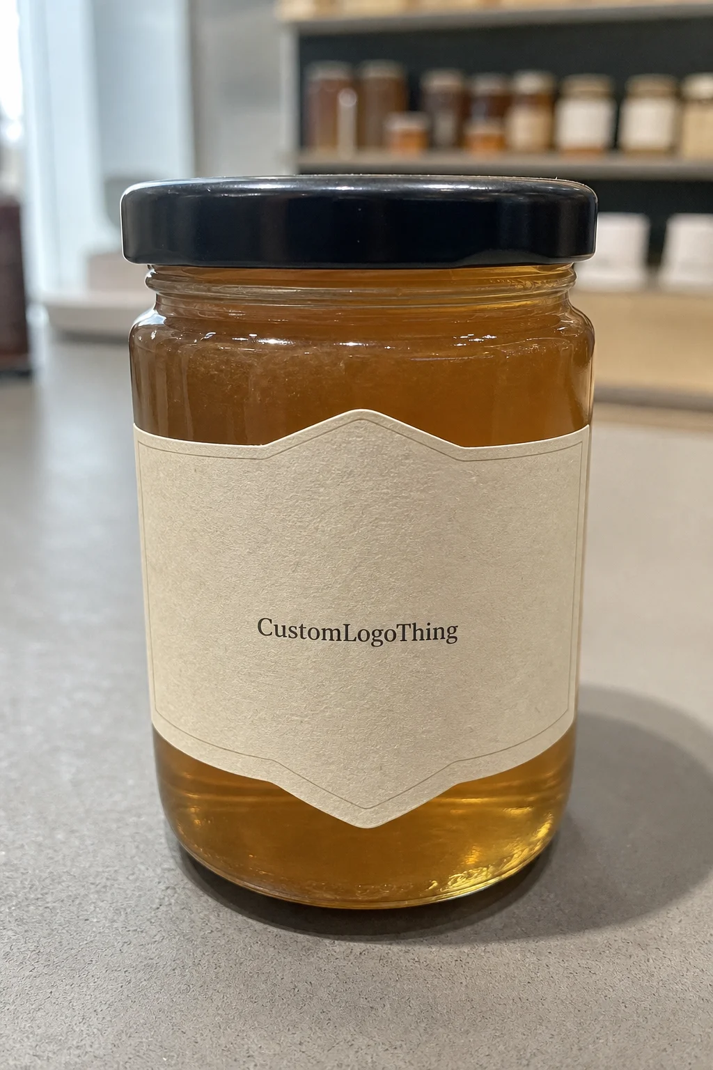
Honey is a brutally honest category. The product itself is visually plain, so the label has to carry more weight than it would on a snack bar or beverage bottle. It needs to show the brand, the varietal or floral source, the net weight, and enough personality to justify the price. That is a lot for a few square inches.
A design that looks strong on screen can collapse in the real world. Amber glass reflects light. Curved shoulders distort small text. If the label is too wide, it fights the seam. If the margins are too tight, the whole thing starts looking amateur. One damp market morning or a few cold cases are often enough to expose the mistake.
That is why custom honey labels need to be treated as packaging engineering first and branding second. Good branding matters, but it has to sit on top of a label that actually behaves. A jar should feel intentional, not busy. Product name first. Varietal second. Net weight easy to find. Producer details where buyers expect them. The best labels feel calm because the hierarchy is doing its job.
A honey label has to earn its space. If it cannot read from a few feet away and survive a damp table, it is decoration, not packaging.
For brands that sell across multiple categories, the label also needs to fit into a broader system. If the same brand uses Custom Labels & Tags for jams, teas, or sauces, the visual language should stay consistent. If the line is expanding into Custom Packaging Products, the honey jar should not feel like it belongs to a different company.
One practical observation: honey labels are often judged next to much more expensive-looking products. That makes clutter especially expensive. When the package is competing on a farmers market table or in a specialty shop, a disciplined design usually beats a crowded one. Fancy effects can help, but they do not rescue weak structure.
What Makes a Label Stick, Read, and Survive Handling
A working label has four parts: face stock, adhesive, finish, and cut shape. Most buyers focus on artwork and typography. That is backwards. If the material or adhesive is wrong, the best design in the world still looks bad after one rough handling cycle.
Paper labels can work well for dry indoor storage, pantry jars, and low-risk retail packaging. They are usually the most economical option and can look excellent when the jars are handled carefully. But paper is not forgiving. Moisture, refrigeration, and friction will show up quickly as scuffed corners, stained fibers, or lifting edges.
For jars that may be chilled, transported in mixed cases, or handled at markets where condensation is normal, BOPP or another durable film is often the better choice. White BOPP gives a clean opaque base. Clear BOPP lets the glass show through, which can look elegant if the artwork is built for it. The catch is simple: clear film needs stronger contrast, or the label disappears against amber honey and tinted glass.
Readability deserves more attention than it usually gets. Honey jars are often small, and the usable print area shrinks once the shoulder curve and seam gap are accounted for. Thin script fonts, light gray text, and crowded copy all get harder to read on the shelf. Dark type, enough white space, and a clear hierarchy solve more problems than decorative tricks ever will.
Adhesive choice is where a lot of first-time orders go wrong. Glass itself is a good labeling surface, but only if it is clean and the adhesive is suited to the environment. Cold jars, slightly damp jars, and jars handled by greasy or wet hands all need stronger performance than a dry pantry label does. If the product will be shipped in mixed cartons or jostled in transit, it helps to think in practical test terms rather than marketing terms. Standards from ISTA are a sensible reference for handling and transit stress. For paper-based stocks, FSC certification matters if sustainability claims need to be real rather than decorative.
Finish is another place where the real-world version diverges from the mockup. Matte reduces glare and usually reads better under market lights. Gloss can give the jar more punch, but it also highlights reflections on curved glass. Soft-touch feels premium in hand, though it is not always the best fit for jars that will be touched often or stored in damp conditions. The right choice depends on how the product is actually sold, not just how it looks in a pitch deck.
One more constraint: the label should fit the jar without forcing the glass to do the design work. If the jar shape is dramatic, the label needs to be calmer. If the jar is simple, the label can carry a little more visual interest. Either way, the construction has to stay balanced.
Pricing, MOQ, and What Actually Moves Unit Cost
Unit price starts with quantity. That is the first thing buyers underestimate. Setup, proofing, cutting, and handling do not disappear just because the run is small. They get spread across fewer labels, which is why short runs can feel expensive even when the print price looks reasonable on paper.
For planning purposes, simple short-run honey labels often land around $0.12 to $0.22 per label at roughly 1,000 to 5,000 pieces on standard paper stocks. Durable films usually move into the $0.14 to $0.30 range depending on size, coverage, and finish. Specialty shapes, heavier ink coverage, foil accents, or multiple SKUs can push higher. A 250-label run can be surprisingly pricey because the setup cost has nowhere to hide.
Minimum order quantity matters more than people want it to. Lower MOQs make sense for seasonal honey, test flavors, local market packaging, and early-stage brands that are still learning what sells. Larger runs reduce unit cost, but only if the design and inventory will stay stable long enough to use them. If the brand redesigns every few months, a huge label run just becomes slow-moving stock.
| Label Option | Typical Use | Approx. Unit Cost at Mid-Size Runs | Watch-Out |
|---|---|---|---|
| Paper C1S | Dry pantry jars and low-moisture retail packaging | $0.12-$0.20 | Can scuff, stain, or lift at the edge if exposed to moisture |
| White BOPP | Jars that may be chilled, handled often, or shipped in mixed cases | $0.14-$0.28 | More durable, but the wrong finish can look too plastic if the artwork is not handled well |
| Clear BOPP | Brands that want the glass to show through | $0.16-$0.30 | Text and logo contrast have to be planned carefully or the label disappears |
| FSC Paper with Matte Varnish | Natural, earthy package branding with a paper story | $0.13-$0.24 | Better for dry storage than wet markets or condensation-prone jars |
Hidden costs are where budgets drift. Multiple proof rounds, Custom Die Cuts, SKU changes, and rush shipping all add friction. If you are comparing vendors, compare the real cost to get usable labels onto jars, not the first line on the quote. That is the number that matters.
There is also a quality-cost tradeoff that buyers should be honest about. Paying a little more for a material that survives handling is often cheaper than reprinting after the first market weekend. On the other hand, over-specifying a premium film for shelf-only pantry jars can waste money with no visible gain. The right answer depends on the channel.
Production Steps and Timeline: From Proof to Packed Cases
The fastest label jobs are the ones that arrive organized. The slow ones usually start with missing dimensions, low-resolution artwork, or copy that keeps changing after the quote. For custom honey labels, the clean sequence is straightforward: artwork prep, dieline confirmation, proofing, approval, production, finishing, packing, and shipment.
If the artwork is ready and the specs are clear, proofing can move in a day or two. Production often takes several business days for standard runs. Add revisions, new dies, or specialty finishes and the schedule stretches. That is normal. What causes trouble is pretending a launch date is fixed before the label spec is fixed.
Most delays come from the same places. Jar measurements that were guessed instead of measured. Files that only exist as screenshots. Last-minute wording changes. Someone deciding the barcode can go anywhere. It cannot. Once the design gets crowded, the barcode, ingredient text, producer address, and net weight all need planned space.
For seasonal honey or product lines sold through local markets, a sample run is cheap insurance. It shows whether the label curls, smears, or lifts when the jar gets handled or chilled. If condensation is part of the environment, the sample often reveals problems that a mockup never will.
When the packaging system includes matching cartons or secondary retail pieces, keep the family consistent through Custom Printed Boxes and related labels. Separate design rules for every SKU create extra work and make the shelf story weaker. A unified system is easier to manage and easier to recognize.
A Step-by-Step Ordering Method That Prevents Reprints
Start with the jar, not the artwork. Measure the flat panel or usable wrap area, check the shoulder curve, and note the lid style. A label built around the actual glass dimensions will sit flatter, waste less material, and look more deliberate. Guessing from the jar name is how people end up with overlaps, wrinkles, and weird blank margins.
Next, define the use case. Pantry jars, refrigerated jars, and market-day jars do not need the same construction. A dry indoor shelf can tolerate paper. A jar that will be handled with damp hands or moved in and out of a display fridge needs tougher stock and a better adhesive. That one decision removes a lot of unnecessary options.
Then lock the content before asking for a quote. Finalize the honey name, floral source, net weight, ingredient language, producer details, and barcode placement. If the copy is still moving, the proof cycle gets messy and setup costs creep. Packaging buyers lose time when they treat content as a later step. It is not later. It is the order.
A practical ordering sequence looks like this:
- Measure the jar and confirm the label panel.
- Decide on paper, film, or a specialty finish.
- Lock the text and barcode location.
- Request a proof at actual size.
- Check the label on a real jar, not just on screen.
- Approve a short test run before scaling up.
The last step is the one people skip and then regret. Print a sample, wrap it around the jar, and look at it from arm's length. If it feels crowded in a kitchen, it will look crowded on a market table. If the seam fights the design, the dieline needs adjustment. Catching that early is cheap. Catching it after a full run is not.
If the brand is building a broader product packaging system, keep the label style aligned with inserts, lids, and any retail-ready carton. The best packaging design is consistent before it is clever. A consistent system also makes reorders faster, because the specs stay stable.
Common Label Mistakes That Make Good Honey Look Cheap
Overcrowding is the big one. Honey is a simple category, so the label should breathe. When buyers cram too much text into a tiny face, the jar starts to look like a spreadsheet with a lid. That is not a compliment.
Decorative fonts cause the next round of problems. Script can work in a logo or short headline, but fine print has to stay readable. If people need to rotate the jar and squint to find the varietal or net weight, the shelf test is already lost. Pretty does not compensate for slow reading.
Condensation is another expensive lesson. A label that peels at the edge or blurs after chilling sends a blunt message: the brand cut corners. Buyers may forgive a flavor profile they do not prefer. They are much less forgiving about packaging that looks careless after one cold day. That kind of damage is obvious and hard to walk back.
Then there is the mismatch problem. Rustic kraft graphics on a sleek glass jar can feel confused. Heavy foil on a farmstand honey jar can look like it is trying too hard. The label should fit the positioning of the honey, not fight it. If the brand is modest and natural, the package should not suddenly dress like luxury perfume.
Another mistake is designing only for the first batch. A smart label system leaves room for seasonal honey, new jar sizes, and retailer-specific SKUs. If every variation triggers a full redesign, production slows down and cost rises. Good custom honey labels should support growth without forcing a restart every time the line changes.
And yes, the compliance side still matters. Local rules can differ on ingredient statements, producer details, and net weight formatting, so labels should be checked against the markets where they will actually sell. A nice-looking label that misses required copy is not a finished product. It is a reprint waiting to happen.
What to Do Next Before You Request a Quote
Assemble the basics first: jar dimensions, lid style, expected quantity, target finish, and the exact copy that has to appear. That turns a vague idea into a usable quote and reduces the back-and-forth that inflates setup time. It also exposes gaps before they become expensive.
Decide whether the label needs moisture resistance, freezer resistance, or just shelf appeal. That one decision narrows the material list quickly. Paying for durability you do not need is waste. Skipping durability you do need is worse, because the reprint comes after launch, not before it.
Prepare one clean design direction and one backup. If the first option looks too busy once it is scaled to jar size, the backup keeps the order moving instead of stalling in creative limbo. That matters for small producers balancing sales, packing, and fulfillment at the same time.
Ask for a proof and inspect it at actual size, not only on a laptop screen. This is where spelling mistakes, barcode placement problems, and tiny copy issues surface. It is also the point where they can still be fixed without paying for a bad batch.
If the goal is a package that sells instead of a package that just exists, gather the specs, compare the materials honestly, and order custom honey labels only after the details are locked. That is the cleanest way to get a jar that reads fast, looks credible, and holds up in the real world.
What size should custom honey labels be for standard honey jars?
Measure the usable flat area on the jar instead of guessing from the bottle name. For round jars, leave a small gap at the seam so the label does not overlap or wrinkle. Small 8 oz jars usually need narrower panels than 12 oz or 16 oz jars, but the shoulder shape matters more than the nominal volume.
Do custom honey labels need waterproof material?
If the jars may be refrigerated, rinsed, or handled at wet markets, moisture-resistant film is the safer choice. Paper can work for dry indoor use, but it is easier to scuff, stain, and lift at the edges. A durable adhesive matters as much as the face stock if the jar surface is cold or slightly damp.
What affects the price of custom honey labels the most?
Quantity is the biggest factor because setup costs are spread across the run. Material, finish, label shape, and whether you need multiple SKUs also move the price quickly. Short runs and special cuts usually cost more per label than standard sizes on common stock.
How long does the custom honey label process usually take?
If your artwork is ready, proofing can move quickly, sometimes in a day or two. Production commonly takes several business days after approval, then shipping adds its own time. New dielines, revisions, or specialty finishes can extend the schedule, so plan ahead for seasonal sales.
Can I order multiple honey varieties in one label run?
Yes, as long as the size and material stay the same. That is a good way to control cost while varying names, flavors, or harvest details. Keep the layout system consistent so the brand looks unified across the line.