Buyer Fit Snapshot
| Best fit | Custom Kraft Box Printing projects where brand print, material claims, artwork control, MOQ, and repeat-order consistency need to be specified before quoting. |
|---|---|
| Quote inputs | Share finished size, material target, print colors, finish, packing count, annual reorder estimate, ship-to region, and any compliance wording. |
| Proofing check | Approve dieline scale, logo placement, barcode or warning zones, color tolerance, closure strength, and carton packing before bulk production. |
| Main risk | Vague material claims, crowded artwork, missing packing details, or unclear freight terms can make a low unit price expensive after revisions. |
Fast answer: Custom Kraft Box Printing: Board, Finish, Dieline, and Unit Cost should be specified like a repeatable production item. The safest quote records material, print method, finish, artwork proof, packing count, and reorder notes in one written spec.
Production checks before approval
Compare the actual filled-product size with the drawing, then confirm tolerance on folds, seals, hang holes, label areas, and retail display edges. Reserve space for logos, QR codes, warning copy, and material claims before decorative graphics fill the panel.
Quote comparison points
Review material grade, print process, finish, sampling route, tooling charges, carton quantity, and freight assumptions side by side. A quote is only useful when the supplier can repeat the same color, closure quality, and packing count on the next order.
A plain kraft mailer can disappear fast. One clean logo, the right ink choice, and a smart interior detail can turn it into packaging that feels deliberate instead of default. That is the real value of Custom Kraft Box printing: it gives an ordinary carton a job to do before the product even gets touched.
Most buyers do not start by asking for artistry. They want packaging that ships safely, looks sharp, and does not eat the margin alive. That is why custom kraft box printing keeps showing up in ecommerce, retail, gifting, and subscription work. It gives you a natural paper look, a lower-contrast visual style, and enough flexibility to work across channels without pretending every brand needs a glossy white finish.
People decide whether packaging feels premium in seconds. Kraft can look expensive, restrained, and confident if the print system is chosen well. It can also look muddy and half-baked if someone designs it like a white carton and hopes the paper will cooperate. It will not. Paper has opinions.
What Custom Kraft Box Printing Actually Means
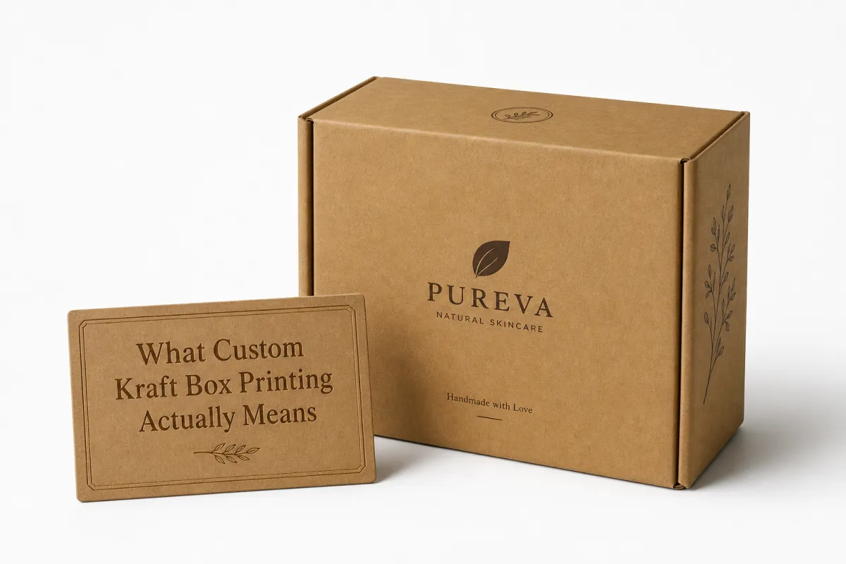
Custom kraft box printing means printing logos, patterns, product details, or artwork directly on kraft board or on a kraft-finish box structure. That can be a simple one-color logo on a mailer, a full wrap on a retail carton, an inside-print reveal on a subscription box, or a set of printed boxes for seasonal launches. The box might be corrugated, folding carton stock, or a kraft wrap over another board, but the idea stays the same: the packaging carries the brand before the product does.
From a packaging buyer's point of view, the appeal is obvious. A blank kraft box says "we shipped something." A printed kraft box says "we planned this." That difference matters in ecommerce, wholesale, gifting, and retail. It also matters if you are trying to keep package branding steady across channels without jumping into a high-gloss finish that clashes with the product or the brand story.
Kraft behaves differently from white or coated stock because it absorbs ink more aggressively and reflects less light. Bright colors usually mute a bit. Fine details can soften. Warm neutrals, earthy colors, black, deep green, rust, and dark blue often hold up best. That is not a flaw. It is the look. Good custom kraft box printing uses that warmth instead of fighting it.
Here is the part people miss: a kraft box does not need a lot of ink to feel premium. Sometimes one solid mark, enough white space, and a thoughtful structure do more than a crowded full-color layout ever could. In practical packaging design, restraint is often what makes the box feel expensive. Not because it is fancy, but because it looks certain.
I have seen brands overwork kraft so badly that the box looked tired before it even left the warehouse. Then they cut the art back to one color and the whole thing suddenly breathed. That is not magic. It is good editing.
Packaging reality check: if the box looks better on a mockup than it does in the hand, the design is not finished yet. Custom kraft box printing lives or dies by how the paper, ink, and structure behave together.
If you are comparing options across structures and finishes, our Manufacturing Capabilities page breaks down the formats we can support. That matters because not every box style is a clean fit for every print method, and yes, that is one of those annoying details that saves money later.
For brands looking at product packaging as a growth tool, the practical question is not whether kraft can be printed. It is what the box should say, how much production complexity you can tolerate, and what visual tradeoff you are willing to make. That is where custom kraft box printing starts to get useful.
How Custom Kraft Box Printing Works
Custom kraft box printing starts with the dieline. Before anyone prints anything, the box structure has to be mapped so the artwork lands on the right panels, folds, flaps, and glue areas. A solid prepress review checks safe zones, bleed, fold lines, and any hidden areas that disappear after the box is cut and assembled. If the artwork ignores those limits, the box will still print. It just will not print correctly. That is an expensive way to learn geometry.
The main production methods are digital printing, flexographic printing, and litho wrap or offset printing for higher-end presentation work. Digital printing is usually the fastest and most flexible for short runs or designs that may still change. Flexo is a better fit for repeat orders and larger quantities because the setup cost gets spread across more units. Litho wrap, which often sits in the offset printing family, gives a sharper presentation when the box needs a cleaner retail feel and the budget can support more setup.
Color behavior on kraft is its own thing. A proof on screen can make the design look crisp, but the actual box will absorb light differently once it hits brown board. That is why a physical proof matters so much for custom kraft box printing, especially if the brand uses pale ink, gradients, fine typography, or a logo that depends on exact contrast. A monitor can lie with a straight face.
Timelines depend on structure, artwork readiness, and print method. Simple digital short runs can move from proof approval to shipment in roughly 7-10 business days. Repeat flexo jobs often run closer to 12-18 business days. Tool-heavy structures, special coatings, inside printing, or litho wrap work can stretch into 3-5 weeks once approvals, setup, and finishing are counted. If a supplier claims every job is fast, that usually means they have not been burned enough yet.
What slows things down? Artwork revisions. Structural changes. Busy production queues. Freight distance. Inserts. Kitting. Special finishes. One small change can push a job from straightforward to irritating. That is normal. Good custom kraft box printing plans for that instead of pretending the first file upload is the finish line.
If the packaging also needs transit validation, ask about testing against standards like ISTA methods. That is especially relevant for ecommerce boxes that will get handled, stacked, dropped, and generally treated like they owe someone money. A box that prints beautifully but fails transit is just expensive confetti.
Custom Kraft Box Printing Costs And Pricing
Pricing for custom kraft box printing is driven by a handful of variables that matter more than people want them to. Quantity, box size, board thickness, number of ink colors, print coverage, finish level, insert requirements, and structural complexity all affect the quote. If a buyer says, "It is just a simple box," I usually know the quote is about to become very specific.
Short runs cost more per unit because setup time has to be recovered across fewer boxes. That is not a punishment. It is just math. A 250-unit digital run can look expensive next to a 5,000-unit repeat order, even if the smaller run is the smarter move for testing, launch timing, or seasonal packaging. In custom kraft box printing, unit price without volume context is a trap.
Below are rough ranges to help frame the discussion. These are not universal, because every factory and every structure is different, but they are useful for planning. I am not going to pretend otherwise.
| Print Method | Best For | Typical Quantity Range | Approx. Unit Cost Range | Notes |
|---|---|---|---|---|
| Digital printing | Short runs, fast artwork changes, multi-version campaigns | 100-1,000 units | $0.95-$2.75 | Higher unit cost, lower setup burden, good for revision-heavy projects |
| Flexographic printing | Repeat orders, higher quantities, simpler artwork | 1,000-10,000+ units | $0.35-$1.20 | Efficient at scale, but setup and plate decisions matter |
| Litho wrap / offset printing | Retail packaging, premium presentation, sharper color control | 500-5,000+ units | $1.20-$4.00 | Better visual polish, but more setup and finishing steps |
| Blank kraft stock with one-color print | Simple branded packaging and budget-conscious launches | 500-20,000+ units | $0.25-$0.90 | Strong value when the design uses the kraft background well |
Heavy ink coverage, white ink, foil, spot coating, embossing, and inside printing push the cost up. So does a more complicated structure, like a rigid setup or a specialty mailer with a custom insert. Even within custom kraft box printing, there is a big difference between a single-color logo on one panel and a fully wrapped box with a printed interior and a matched insert. One is a print job. The other is a small production project.
There are also hidden costs. Dieline revisions. Extra proof rounds. Rush fees. Freight. Reprints after a bad approval. Sometimes buyers think they found a bargain, only to discover that the cheap quote excludes the things they actually need. That is why I always tell people to compare total landed cost, not just unit price. A box that is cheap on paper and expensive on the truck is still expensive.
For brands building a packaging program, the smartest move is often to ask for three quote tiers: basic one-color, mid-tier two-color, and premium presentation. That gives a real sense of what the market is charging and where the step-ups happen. If you need to compare a larger packaging line, our Custom Packaging Products page is a useful place to see where different box styles fit into the budget.
Custom kraft box printing also gets affected by fulfillment choices. If the supplier is inserting product, kitting multiple SKUs, or packing retail bundles, that labor shows up somewhere. The box price may look fine while the assembly cost quietly climbs. Same box. Different invoice. That is the kind of detail people only notice after the credit card has already cooled off.
Design Choices That Affect Custom Kraft Box Printing
Custom kraft box printing rewards designs that respect the substrate. Earth tones, dark neutrals, strong black marks, and simple line work usually print beautifully. Pale grays, thin gradients, tiny reversed type, and low-contrast logos need more caution. Kraft is warm and slightly absorbent, which means the artwork should be built for the paper, not forced onto it.
Typography matters more than most people think. Fine scripts, hairline fonts, and condensed text can get messy after printing, cutting, folding, or handling. In packaging design, a logo that looks crisp on a laptop can turn muddy once it sits on a brown board with a soft print edge. Keep the type legible at real-world sizes. Then test it again at real-world distances, because customers do not hold a shipping box three inches from their face.
Negative space is your friend. A crowded kraft box rarely feels premium unless there is a deliberate reason for the crowding. One strong logo, one product cue, and a restrained palette often outperform a box that tries to explain the entire brand story in one rectangle. That is not minimalism for its own sake. It is clarity. And clarity is what makes custom kraft box printing feel more intentional than decorative.
Structure and finish choices shape the final look as much as the artwork does. A tuck-end mailer feels different from a sleeve. A window cutout changes how the box behaves on a shelf. Matte surfaces tend to support the natural kraft look. Gloss can fight it. If the box has folds running through key artwork, move the important elements away from those break points or redesign the layout so the fold becomes part of the composition instead of ruining it.
Custom kraft box printing also has compliance and use-case questions. Food-contact packaging may need different inks, coatings, or barrier layers. Ecommerce boxes may need barcodes, SKU marks, and shipping labels that stay readable through handling. Retail packaging may need a cleaner front panel and space for regulatory copy. Sustainability claims should match the actual board and finish. If the board is FSC-certified, say so only if it is. If it is not, do not fake a virtue badge and hope nobody notices.
For buyers who care about certified materials, the FSC system is a sensible reference point. It does not solve every packaging decision, but it helps separate real sourcing from greenwashed wallpaper. Customers notice the difference pretty quickly, too.
Good design rule: if your kraft box still looks strong in one ink color, it will usually look even better in production. If it only works with every possible embellishment, the design is probably carrying too much baggage.
Step-By-Step Custom Kraft Box Printing Process
Start with the brand goal. Is the box meant to sell in retail packaging, protect a shipped product, support a subscription reveal, or simply make the unboxing feel worth sharing? That answer changes the structure, the print method, and the finish. Custom kraft box printing works best when the packaging job is clear before the artwork gets pretty.
Next, choose the box style, size, and order quantity. Do not start with a logo file and hope the structure will sort itself out. It will not. Measure the product, account for inserts or tissue, and leave room for tolerance if the item varies slightly. For custom printed boxes, even a few millimeters can change whether the product sits cleanly or rattles like it is trying to escape.
Then prepare the artwork on the correct dieline. Check bleed, safe zones, fold lines, and any areas that will get hidden or distorted by the build. A good prepress file is half the project. A bad one can turn custom kraft box printing into a chain of apology emails. Use vector artwork whenever possible, and keep raster files high enough resolution to avoid soft edges in the final print.
Request a physical proof whenever the job is color-sensitive, structural, or high-value. Monitor color is not production color. A sample on real board tells you whether the logo needs more contrast, whether the dark ink fills too heavily, and whether the type still reads after folding. For longer-run product packaging, this is one of the cheapest insurance policies available. Cheap, in packaging terms, means "less painful than a reprint."
Approve the proof, lock the timeline, and then move into print, finishing, inspection, packing, and delivery. If the supplier offers assembly or kitting, confirm that the sequence is right before the run begins. For example, some projects need printed sheets cut first and glued later, while others need preassembled boxes with inserts packed by SKU. The more moving parts, the more important the final quality check becomes. Custom kraft box printing is not just ink on paper. It is a controlled process with a lot of ways to drift if nobody is watching.
For transit-sensitive work, the right testing standards matter. ISTA protocols, especially for ecommerce and parcel shipping, help establish whether the box can survive real handling rather than just standing still on a table. That is not glamorous, but neither is a crushed shipment. Packaging is supposed to protect the product. Strange concept, I know.
If you are sorting through multiple box types, finishes, and order volumes, compare the print method against the product requirement instead of guessing. Digital printing can be the right call when speed and flexibility matter. Flexographic printing can be the better fit when the art is stable and the order repeats. Litho wrap or offset printing can carry the most polished retail look, but it should earn its place. Custom kraft box printing has enough options that a blind choice is usually the wrong choice.
Common Custom Kraft Box Printing Mistakes
The biggest mistake is designing kraft boxes like they are bright white cartons. That approach usually produces artwork that feels muddy, flat, or under-contrasted. A white-box design depends on the paper doing one job. Kraft does another. If you do not account for that, custom kraft box printing will expose the gap immediately.
Another common mistake is trying to use too many colors, too much coverage, and no negative space. The result is usually a box that looks busy instead of premium. On kraft, busy can get ugly fast because the paper tone already adds visual texture. You do not need to over-explain the brand. One strong mark often does more than a wall of graphics.
Skipping the sample stage is an expensive habit. A logo on a fold can disappear. A barcode can print too small to scan reliably. A line of text can land too close to the edge and get trimmed. A color can shift enough to look off-brand even if the screen proof was gorgeous. Custom kraft box printing rewards the people who test before they commit. Everyone else gets to learn by paying twice.
Quote-shopping is another trap. Buyers compare only unit cost and ignore setup, freight, rejects, and the cost of reordering after approval goes wrong. That is a lazy way to buy packaging. It also produces ugly surprises when the shipment lands and the real total comes into view. The cheaper line item is not always the cheaper project.
There are also production mistakes that show up all the time: wrong file format, board thickness ignored, artwork changed after approval, and rush orders that leave no margin for correction. If the timeline is tight, the room for error shrinks. That is true for every packaging project, but custom kraft box printing makes it more obvious because the board and ink interact so visibly.
- Do not place critical copy across folds or glue areas.
- Do not use tiny reversed text unless you have tested it on the actual board.
- Do not assume recycled kraft and coated kraft behave the same way.
- Do not approve a box based only on a digital mockup.
- Do not forget that shipping labels, barcodes, and handling marks still need room.
One more thing: recycled-content claims, compostable claims, and recyclable claims are not interchangeable. A kraft look does not automatically mean a sustainable construction. If the board, coating, or adhesive changes the recovery path, say so honestly. Buyers are getting better at spotting the gap between marketing copy and actual material performance. The package only gets one chance to be trusted, and trust is hard to print.
Expert Tips And Next Steps For Custom Kraft Box Printing
If you want a clean, premium result, start with one strong ink color and let the kraft background do part of the work. That is one of the best moves in custom kraft box printing because it keeps the production simple and the visual story clear. You can do more later if the brand needs it. First, earn the right to complicate the box.
Ask for print tests on the actual board whenever color accuracy matters. A sample on kraft will reveal things a screen never will: duller greens, softer edges, deeper absorption, and whether the logo has enough contrast to survive handling. For many brands, that sample is the difference between a decent-looking prototype and a packaging system that actually holds up in production.
Build a buffer into the order plan. If the launch needs 5,000 boxes, do not order 5,000 boxes and call it wisdom. Leave room for defects, growth, or reorders so the next run does not become a fire drill. In real product packaging programs, a small reserve saves more time than people expect. Custom kraft box printing is much easier to manage when the brand is not running on fumes.
When you are ready to request quotes, follow a simple order of operations: measure the product, choose the box style, collect logos and artwork, request pricing from more than one supplier, compare landed cost, and review a physical proof before approval. That sequence keeps the project grounded. It also reduces the number of bad assumptions hiding inside the quote. Our printing and finishing capabilities page can help you narrow which formats are realistic before you lock the design.
Here is the practical mindset I recommend. Judge the project by fit, print quality, timeline, and total cost together. Not by one flashy sample. Not by the cheapest line item. Not by a supplier saying, "we can make anything." Custom kraft box printing works best when the box, the artwork, and the production method are chosen as one system. Otherwise, you are just collecting carton-shaped problems.
For brands that want packaging to feel honest, custom kraft box printing is hard to beat. It can look warm, direct, and premium without pretending to be something it is not. Used well, it supports branded packaging that feels thoughtful in retail, durable in shipping, and controlled in cost. Used badly, it looks like a compromise. That is the whole game, really.
If you are planning a launch, the next move is simple: lock the structure first, then proof the artwork on real kraft, then make the final color call. Skip that order and you will probably spend more money than you meant to. Packaging likes discipline. Not drama.
What is the minimum order for custom kraft box printing?
Minimums depend on the print method and box style, but short-run digital jobs are usually the most flexible. If you are under a few hundred units, expect the per-unit cost to rise because setup fees get spread across fewer boxes. For smaller launches, it is worth asking whether the supplier can combine print setup with a stock box program.
Is custom kraft box printing cheaper than printing on white boxes?
Not always. Kraft sometimes needs different inks or tighter color control to get the result you want. Simple one-color designs on kraft can be very cost-effective because the natural board does part of the design work. Heavy coverage, white ink, or specialty finishes can make custom kraft box printing more expensive than a basic white carton.
Which print method is best for custom kraft box printing?
Digital printing is usually best for small runs, fast changes, and designs that are still evolving. Flexographic printing is often better for repeat orders and larger quantities where setup costs can be spread out. Litho wrap or offset printing is often the better fit for retail packaging that needs a sharper presentation and can support the extra setup.
How long does custom kraft box printing usually take?
Simple jobs can move quickly once the proof is approved, but sample revisions and artwork changes can add days or weeks. Short-run digital work is usually faster than tool-heavy or specialty-finish orders. Ask for a timeline that separates proofing, production, and shipping so you can see exactly where delays are most likely.
Can custom kraft box printing include inside printing or special finishes?
Yes, many suppliers can print inside the box, and many can add foil, coating, or spot effects. Those details usually add cost and can extend production time, so they should be used with purpose rather than decoration for decoration's sake. If the inside print is part of the unboxing moment, confirm the artwork, registration, and inspection standards before approval.

