Custom Kraft Paper Labels: How to Spec, Price, and Order Plain paper bags do not need a dramatic redesign to stop looking generic. Most of the time, a better label does the job. Custom kraft paper labels give bakery bags, coffee sacks, takeout packaging, and small retail mailers a more deliberate look without pushing the budget into nonsense territory. That is the appeal. The catch is that kraft is friendly to design and picky in production. If the stock, adhesive, or print spec is off, the label can lift, scuff, or read cheaper than the bag it is sitting on.
Why Kraft Labels Look Premium on Plain Paper Bags
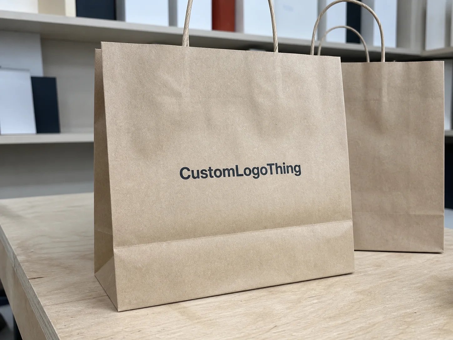
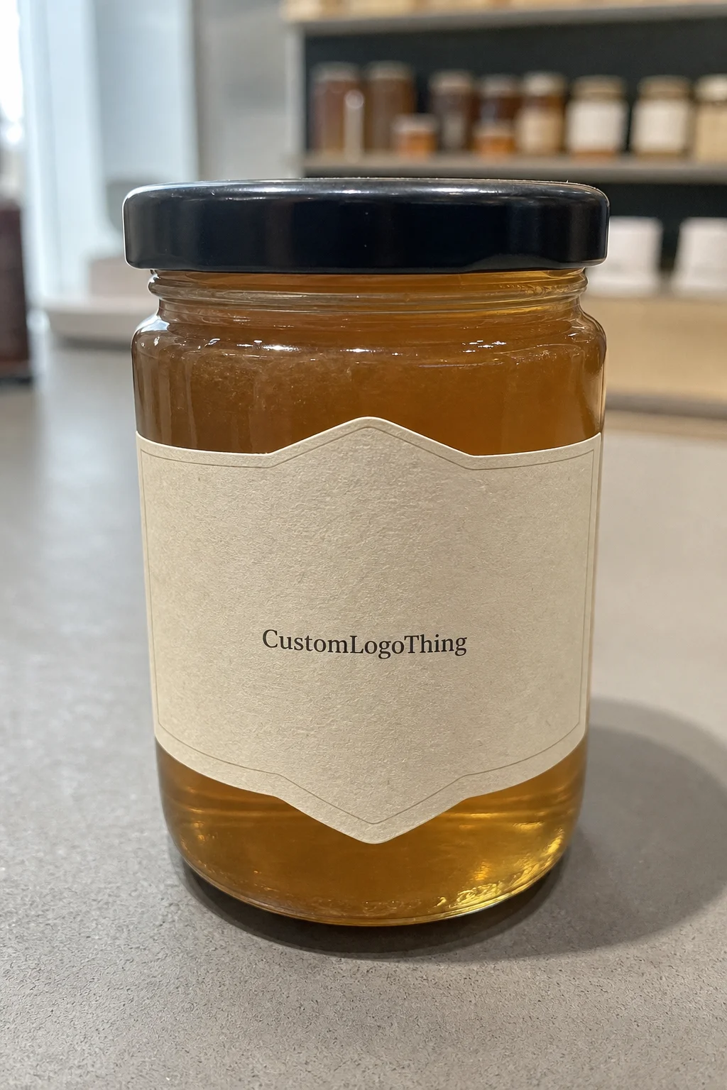
Kraft works because it has texture and restraint. Brown paper naturally softens a brand mark, so a simple logo or seal looks more considered than overworked. That is why custom kraft paper labels show up everywhere from bakery sleeves to coffee pouches to retail bags for candles, soaps, and dry goods. The material gives a handmade cue without forcing the rest of the package to pretend it is handmade.
Design choices that feel loud on white stock often feel balanced on kraft. Black ink is the obvious choice, but muted colors like deep green, rust, navy, charcoal, and warm gray also sit well on the surface. White ink can work too, though the print method has to support it and the contrast needs to be tested on the actual paper. On kraft, the base color is part of the design. Ignore that and the result usually looks flat.
There is a practical reason brands keep returning to kraft labels:
- They make simple typography look intentional.
- They suit natural, organic, and artisanal positioning without forcing the issue.
- They hide minor visual imperfections better than glossy white labels.
- They pair well with paper-first packaging systems.
The limits matter just as much. Kraft is not the right substrate for photo-heavy artwork, neon color, metallic effects, or delicate gradients. Fine lines can soften, and small type can lose clarity if the stock is too porous. If the design depends on high-gloss finish or sharp color saturation, kraft is probably the wrong starting point. Texture is the point here. Not spectacle.
For packaging design, that tradeoff is usually worth it. Kraft gives warmth, credibility, and a more grounded visual tone. It also keeps the packaging system from feeling overproduced, which is useful if the brand story leans natural, local, or handmade. That is the reason it keeps working. It does not try too hard.
How the Production Process Works From Proof to Delivery
The production flow for custom kraft paper labels is simple on paper and easy to mess up in practice. It starts with artwork intake. The supplier checks file format, size, bleed, safe area, and whether the design will still hold up at the final dimensions. Then comes proofing. A proper proof should show trim lines, finish notes, roll direction or sheet format, and any special instructions for adhesive or backing.
After approval, the shop builds the press setup for the selected stock and print method. That may mean digital printing for smaller runs, flexographic printing for higher volumes, or another setup depending on the plant. Once printed, the labels are die cut or kiss cut, then packed on rolls or sheets. From there they are boxed and shipped. If the label is going onto paper bags in a tight application line, those final steps matter more than most buyers expect. A small setup mistake can turn into a very visible problem once the labels hit the floor.
Proof review is worth slowing down for. Check the exact label size, not just the artboard size. Confirm that the bleed is real and not just assumed. Look at the color callouts and remember that kraft is not white stock with a brown filter on top. Review how the label will be wound if it will be machine applied. And if the bags are textured, dusty, or recycled-looking, make sure the adhesive note reflects that surface instead of a generic paper spec.
Lead time depends on complexity, quantity, and how quickly approvals move. Simple repeat jobs can ship in about 5 to 8 business days after proof approval. First-time custom runs usually take 10 to 15 business days. Add an unusual size, specialty adhesive, or extra finishing, and the schedule stretches. That is normal. The part that causes headaches is expecting every variable to move on the same timeline.
Delays usually come from three places: missing artwork, late design changes, and slow proof approval. Shipping distance matters too, especially for larger packaging programs that need labels delivered to multiple sites. If the labels need to survive transit and handling, ask whether the supplier uses relevant packaging test methods, including practices associated with ISTA. That is more useful than a vague promise that the product has been “tested.”
Custom Kraft Paper Labels: Cost, MOQ, and Quote Drivers
Pricing gets fuzzy fast because a low quote can hide a pile of extra charges. With custom kraft paper labels, the unit price is driven by size, quantity, print colors, adhesive, finish, and whether the labels ship on rolls or sheets. Short runs always look expensive on paper because setup cost gets spread across fewer pieces. That is manufacturing, not a trick.
For a standard 2 x 3 inch label on uncoated kraft, the market usually lands in a range like this:
| Order Size | Typical Unit Price | Best For | What Usually Raises Cost |
|---|---|---|---|
| 1,000 pieces | $0.18-$0.42 each | Testing a new bag line or seasonal promotion | Multiple colors, custom shape, specialty adhesive |
| 5,000 pieces | $0.06-$0.16 each | Small retail packaging programs and repeat use | Heavy ink coverage, tighter registration, varnish |
| 10,000 pieces | $0.03-$0.10 each | Established brands with steady throughput | Nonstandard sizes, rush production, premium finish |
Those numbers are rough, not a promise. Larger dimensions, unusual die shapes, specialty coatings, and higher-tack adhesives can push the cost up quickly. Matte finish is usually the safest value choice. A scuff-resistant coating or varnish costs more, but it can save the label if the bags are handled a lot or stacked tightly in transit.
Minimum order quantity is where small brands usually feel the pressure. Setup, plates, and proofing create the floor, so the MOQ is often about efficiency rather than material cost. If you are testing a new paper bag program, keep the first run simple: one size, one stock, one adhesive, one color set. If the label holds up in application testing, scale after that.
Comparing quotes means looking past the unit price. Ask what is actually included:
- File setup or prepress.
- Proofing and revision rounds.
- Plate or die charges.
- Roll orientation or sheet packing.
- Freight and any remote delivery fees.
For buyers building a broader branded packaging system, compare the label quote against the rest of the package family too. A label line that looks cheap can become the expensive option once freight, setup, and reprints are counted. That is especially true if the label program sits next to other items such as Custom Labels & Tags or related Custom Packaging Products.
Choosing the Right Stock, Adhesive, and Finish
Stock selection shapes both the appearance and the print result. Uncoated kraft gives the most natural look. It also absorbs more ink, which softens edges and lowers contrast a bit. Coated kraft prints sharper and looks cleaner, but it can pull the design away from the rougher, handmade feel some brands want. Recycled-looking kraft sits somewhere in the middle visually, though not every paper that looks recycled actually has a high recycled content. If sustainability matters, ask for the spec sheet. If you want FSC-certified material, ask for that directly instead of assuming the brown surface tells the whole story. It does not.
Adhesive is just as important as stock, and it gets ignored all the time. Paper bags vary a lot. Some are smooth. Some are fibrous. Some shed dust. Some have a slightly waxy or recycled surface that changes how the adhesive grabs. A standard permanent adhesive works for many retail and takeout applications, but it is not a cure-all. Textured surfaces often need a higher-tack option. Cold storage needs a freezer-safe construction. If the label needs to come off cleanly, removable adhesive makes sense, but only if the removal requirement is real. Otherwise you are paying for behavior you do not need.
A practical shorthand helps:
- Permanent adhesive for most retail packaging and takeout use.
- Removable adhesive when the label has to peel away cleanly.
- Freezer-safe adhesive for chilled or frozen goods.
- High-tack adhesive for rough, dusty, or uneven kraft surfaces.
Print method affects the result too. Digital printing is usually the cleanest route for smaller runs, short lead times, and variable artwork. Flexographic printing makes more sense at scale when the same label repeats across thousands of bags. If the color has to be precise, ask for a proof on the actual stock. A monitor can only tell you so much. Paper tells the truth faster.
Finish is the last call, but it changes more than people think. No finish keeps the label close to raw kraft and works well for a natural or low-gloss brand system. Matte varnish can reduce scuffing without making the surface look coated. A heavier protective layer improves durability but changes the feel in hand. If the packaging is meant to feel tactile and understated, the finish should support that. If the bags are going through friction, stacking, or repeated handling, protection matters more than romance.
Step-by-Step Ordering for Paper Bag Projects
Start with use case, not artwork. Ask where the label is going, how the bag is handled, whether moisture is a factor, and whether the customer will peel it off or keep it on. A bakery bag sitting in a warm display case behaves differently from a mailer that gets stacked, rubbed, and shipped across the country. The same label spec rarely works for both without testing.
Then measure the application area. Do not trust the mockup alone. A label can look correct on screen and still bridge a fold, cross a seam, or interfere with a handle. That is how a decent design ends up looking careless. Measure the flat area, then leave enough margin so the label sits cleanly instead of fighting the bag structure.
Prepare the file with bleed and a real safe zone. Keep line weights sane. Keep small text readable. If the logo relies on crisp edges, review the proof at full size and in context. The difference between a decent label and a weak one is often a few millimeters of margin, not a dramatic redesign.
A sensible ordering sequence looks like this:
- Confirm the final bag stock and surface texture.
- Choose the label size based on the actual application area.
- Select stock, adhesive, and finish.
- Request a proof that shows exact dimensions and orientation.
- Approve a pilot run before committing to volume.
If the label is going onto a new paper bag style, the pilot run is not optional. Test a few bags and check edge lift, corner curl, print contrast, and whether the label stays flat after handling. If the same artwork will also live on cartons or corrugated cardboard in the fulfillment stream, test those surfaces too. Paper bag programs and box programs do not behave the same way, even when the branding is identical.
Order with the application method in mind as well. Hand-applied labels can tolerate a different roll orientation than machine-applied labels. If the line runs fast, liner format and roll winding suddenly matter a lot. That is the kind of detail that keeps production moving instead of backing up at the labeling station.
Common Mistakes That Cause Peeling, Smearing, or Reprints
The most common failure is also the most boring one: the adhesive does not match the substrate. A label that sticks fine on a smooth paper bag may fail on a rough kraft surface because the fibers break the bond. The reverse happens too. A very aggressive adhesive can overgrab and make placement difficult, especially if someone is applying labels by hand and trying to align them straight. Either way, you end up paying for a reprint.
Storage conditions matter more than many buyers expect. Heat can soften some adhesives. Cold slows the initial tack. Humidity changes the feel of the bag and the label stock. If rolls sit in the wrong warehouse conditions before use, the job can fail even if the spec was technically correct. That is why quality control should cover storage and handling, not just proof approval.
Artwork causes its own share of problems. Weak contrast on kraft can make type disappear. Thin lines can break up. Tight crops can make the final cut feel cramped. None of that is mysterious. It happens when file prep gets rushed and nobody checks how the design behaves on brown stock instead of white.
These are the mistakes I see most often:
- Approving the design on a white background and forgetting the substrate is brown.
- Picking a finish that looks fine on screen but scuffs in normal handling.
- Ordering labels for a bag surface that was never tested.
- Ignoring roll direction, liner format, or machine compatibility.
- Skipping the pilot run and paying for a full reprint later.
When you compare suppliers, ask for specifics instead of adjectives. A supplier should be able to tell you the stock spec, adhesive type, intended surface, and turnaround in plain language. If they cannot do that, the quote is too vague to trust. Packaging gets expensive when people confuse confidence with detail.
Expert Tips and Next Steps Before You Place an Order
Ask for a physical sample. A PDF is useful, but it is not enough. Kraft behaves differently in hand. You want to see print density, edge quality, adhesive feel, and how the label looks under real light. That is especially true if the labels sit inside a broader packaging system with bags, wraps, inserts, and boxes all sharing the same brand tone.
Test on the exact bag style you plan to use. Not something close. The exact one. Check corner lift after a few hours, then check again after handling. Look for scuffing where the bag folds. See how the color settles once the paper fibers and ink live together. That tells you more than a polished mockup ever will.
Compare suppliers on the variables that actually affect the outcome:
- Unit price at your real quantity.
- Setup and proofing charges.
- Turnaround after approval.
- Adhesive options for your bag surface.
- Support for a pilot run before the full order.
If your packaging program spans more than one format, keep the label spec aligned with the rest of the materials. A kraft label can look right on a bag and feel out of place next to glossy cartons or bright white inserts. The goal is consistency, not sameness. Those are not the same thing.
Labels fail more often as production components than as design elements. A vague spec costs money later. A tight spec prevents reprints, awkward application, and avoidable waste.
For most brands, the smartest move is a small pilot run of custom kraft paper labels. Check adhesion, scuff resistance, edge lift, and color on the real bag before you commit to volume. It is the least glamorous step in the process, which is probably why it works.
Are custom kraft paper labels good for paper bags?
Yes, especially for bakery, coffee, retail, and takeout bags that need a natural look. They work best when the surface is clean and the adhesive matches the bag texture. They are less useful if you need ultra-bright color or a glossy finish.
What affects the price of kraft paper labels the most?
Size, quantity, print colors, finish, and adhesive type are the main drivers. Smaller runs usually cost more per label because setup gets spread over fewer pieces. Custom shapes and specialty materials also raise the price.
How long does production usually take for kraft labels?
Simple repeat orders are faster than first-time custom jobs. Proof approvals, artwork changes, and specialty finishes add time. Ask for the estimated turnaround before you approve the final spec.
What adhesive should I choose for kraft paper labels?
Use permanent adhesive when the label needs to stay put on paper bags. Use removable adhesive only when the label must peel off cleanly. If the bag surface is textured or dusty, ask for a higher-tack option and test it first.
Can I use custom kraft paper labels on recycled paper bags?
Yes, but the surface matters more than the recycled content. Rough or porous bags may need a stronger adhesive and a wider test window. Always test on the exact bag stock before placing a full order. That is the cleanest way to confirm the labels will hold in real use.